Guilty pleasures

I can’t remember how this poster came to my attention, but it’s been waiting for me to post it for a while. It’s interesting for a couple of reasons.

Well, three really, because one of them is that it’s stark raving bonkers. Photographic bedwarmers, to advertise petrol. How very modern, and yet curiously not. Brilliant.

The first more sensible reason is that it’s the work of Maurice Beck, who I’ve written about before, albeit very briefly. Working with Helen McGregor, he was a key photographer at Vogue between the wars. They took the well known series of images of Virgina Woolf wearing her mother’s dress.

You can see more of his works in the National Portrait Gallery. And he did a few, very interesting posters for London Transport.

Maurice Beck Staff Insurance vintage London Transport poster 1931

What I’ve discovered more recently is that he was also Jack Beddington and John Betjeman’s preferred photographer for the Shell Guides.

This isn’t entirely surprising, because he also contributed photos to the Architectural Review.

Possibly his contribution has been under-rated because John Piper took so many great photographs for his own guides. Still, the two men got on, because the Tate holds pictures of Beck, taken by Piper, clearly church-hopping together for a guide.

Given those connections, it’s surprising he only did one poster for Beddington at Shell. Perhaps the oddity of it was more than he’d expected, and he preferred to send him out photographing Regency architecture and churches.

What’s also surprising is that I can’t find out much more about him. He had a daughter, who married into the lower reaches of the aristocracy, but by whom I do not know. All these stories are about his step-mother, Lily Adams Beck, who was popular esoteric novelist at home in Canada, travelled widely and was a strict Buddhist vegetarian who despised the west and died in Osaka. She’s quite the distraction.

So, any information, please do let me know.

But that’s not the only thing this poster made me consider. Junior Crownfolio – I am no longer permitted to call her small – raised a very interesting point the other day, which is should we be collecting these posters at all. After all, they are promoting the consumption of fossil fuels.

But, but, but– I hear you cry. These are works of great design, classics, they look great on my wall. Yes, but will people think differently in ten years time?

The truth is, I suspect they might. As anyone with even a passing knowledge of Quad Royal will know, Mr Crownfolio and I are massive fans of Daphne Padden. And yet there are a pair of her posters which we’ve never considered buying.

Because they advertise cigarettes. We’d never even think about hanging them on our wall.

So I can’t help thinking that my offspring may be onto something. Perhaps, in the future, most people will feel the same way about posters promoting carbon fuels. Let’s see, shall we.

the taste sensation

Really quite a long time ago, I put these two posters up on here.

Dan Fern Vintage Cadburys Crunchie poster 1960s

Mainly because they’d appeared on eBay and I rather liked the look of them.

Dan Fern Vintage Cadburys Crunchie poster 1960s

And also because they fantastic, and furthermore because they are by Dan Fern, who was Professor of Illustration when I was at the RCA.

I am clearly the only person ever to have noticed them because a few weeks ago, someone emailed Quad Royal HQ to ask me about them and how they were sold. I knew nothing more than I had said, but a brief bit of googling came up with this rather splendid image which is pretty much all of the answer I needed.

You send off your 3’/-, along with three Crunchie wrappers, and get four posters, and a mind bending experience to boot. The other two are by Chris McEwan, who also had a long career in illustration after this.

And I, at least, also learned that Crunchie bars were once made by Frys rather than Cadburys.

So I thought you should know as well.


I am what I am

Sigh.

I really, really didn’t want to be right about Lilian Dring; that she was forced into the female arena of needlework after being pushed out of the world of poster design.  But I am.  That’s exactly what happened, and I am furious.

David Bownes, of Twentieth Century Posters fame, scanned and sent over images of the (small) catalogue for what I believe is the only exhibition of her work, at the Orleans House Gallery in Richmond in 1989.

The very first paragraph sets out the stark truth.

It was never Lilian Dring’s intention to be an embroiderer.  She has not in over fifty years ceased to think like the graphic designer she was trained to be and which circumstances beyond her control prevented.

The biography gives the exact details of how this happened.  She was a very able art student, who excelled at Kingston School of Art and then got a scholarship to the Royal College of Art, as one of the first four students on the Poster Design course (has this course ever been studied, or do the archives not exist?  If anyone can tell me the answer to this, I would love to know).

Some of the pictures reproduced in the catalogue may be of her student work, although the book, I think, was published.

Lilian doing student work 1920s

She studied at the RCA for three years and, as a promising talent, was offered a fourth, but had to turn it down because of her mother’s failing health.  Men, I will note, aren’t often expected to make this kind of choice.

The next section of the catalogue is entitled ‘What Might Have Been’.

For Lilian the 1930’s were “the lean, mean years”, when all the talk was of depression, recession, dole queues and the gathering clouds of war.  It was the worst possible time for a young free-lance graphic designer to establish herself.  She had done some fine work at College and now, lugging her portfolio up and down Fleet Street, she showed her stuff to anybody who could be persuaded to look at it, but the answer was always the same: they liked her work but could not use it – at least not at present.

The catalogue seems to suggest that the only two commissions she ever received were the Youth Hostelling posters preserved at the V&A and the London Transport poster which was never produced.

So instead she got married, made toys for her friends’ children out of scraps and gradually turned this craft into a way of making a living.  (She divorced after the Second World War and so supported herself by her work all her life).

I’m not going to talk much about her needlework, because plenty of other people have and it’s not really the business of this blog.  But I would just like to show you one of her works from 1947.

Lilian Dring 1947 embroidery.

It melds together past and present, eighteenth century and twentieth.

The text on the left is by the Countess of Winchelsea and reads:

My hand delights to trace unusual things/And deviates from known and common ways/Nor will in fading silks compose/Faintly the inimitable rose.

On the right is Dring’s own response to this.

O Kindred Spirit, I do agree/Expressions should be unhampered, free/Admit few conceptions, keep less rules/Be individual, not set in schools.

On the one hand, quite literally, this is her artistic manifesto, her statement that she can do what she likes with embroidery – and she did, kettle fur and all.

But the texts can be read in more than one way; at the same time, there seems to be to be a mourning, and perhaps even a rage against her lot..  Because composing in fading silks is exactly what she did end up doing.  Her expression was never unhampered and free; instead she was put into a box marked ‘suitable artistic expression for women’  and made to stay in it.

The story is all too common: the most unusual thing about Lilian Dring was that she told the truth about what had happened to her.  And every single one of you should be as filled with feminist rage at this as I am.

It’s 1949, OK

I was, of course, on the trail of something else altogether when I found this.

New Posters Exhibition 1949 Moma

It’s an exhibition at MoMA, New York in 1949, displaying – as the wall tells you – new posters from sixteen countries.

Second view of new posters exhibition Moma 1949

I’m very taken with the sparse layout.  If this show had been appeared in Britain in 1949, I’d have assumed that the design ended up this way because of the privations of post-war austerity.  But in fact it doesn’t work like that at all.  Britain, in 1946, with no money, raw materials or time to expend on exhibition design, produced Britain Can Make It.

Shop Window Street at Britain Can Make It 1946

Which was, in truth, mental.

America, with all the plasterboard, paint, metal and ingenuity it can want, produces this instead.

MoMA 1949 poster exhibition

Go figure.

The pictures here are all from MoMA’s website, but perhaps even more interesting is that they have also reproduced the exhibit checklist from the show as well.

So I can tell you that in the middle picture above, the posters on the right hand side are all RoSPA posters, just as they look to be.  But better than that, we can start to seek out some of the exhibits.

The brief for the exhibition was to show non-commercial designs, in part as a response to the use of posters for propaganda purposes during the war.  Their publicity notes that there is increasing use of well designed posters, particularly in England.

The British are well-represented in the exhibits, predominantly by RoSPA posters like this Schleger.

Hans Schleger Wait Till It Stops ROSPA poster

Along with this less well known George Morris example.

Dermatitis George Morris poster for ROSPA 1949 ash

There’s also a Manfred Reiss GPO poster about helping the export drive, which might well be this one, although there is at least one more in the series.

Manfred Reiss, vintage GPO poster 1950 helps the export drive

Others are harder to track down.  There’s an Abram Games poster whose only description is ‘London Transport’.  This doesn’t narrow things down very much, but given that this one is of the right date and in the MoMA collections, I’ll take a punt. (If you want to know more details of the punt, it looks as though lots of the works in the 1949 exhibition entered the MoMA collections as ‘gift of the designers’ in 1953.  Which this one did as well.  So there.)

Abram Games LT poster 1947

It’s also sparse enough.  The more I look through these posters, the more I can see that the aesthetic of the exhibition design is also that of the exhibits as well.  The curators have chosen minimalist posters, with some elements of photography in places.  The whimsy of the British early 1950s is hard to find, although traces do exist.

Peter Hatch come to the design fair poster

If only just.  That’s by Peter Hatch, and you can see it on the right in the first picture.

But British neo-Romanticism is almost nowhere to be found.  That’s not what posters do, at least not in MoMa-world.  The only exception is this wild card, by Nora Kay for London Transport.

Nora Kay London Transport Pair poster 1948 wild flowers

Nora Kay went to the Royal College of art, that’s all I can tell you about her.  (The picture is similarly anonymous, as it came from Pinterest, although I think via Rennies, but it’s not on their website any more so I hope they don’t mind.  The poster seems to be as elusive as its designer.)

If I had more time, I’d try to reproduce the entire exhibition, if only so that I could walk round it in my head and see what late 1940s America thought the future might look like, at least in terms of graphic design.  But that will have to wait for another day.

Untitled

I’ve been thinking a lot about hoarding recently – of various different kinds – which reminded me that this post probably deserved another airing.  Two questions, has any more been written on this subject, and just what is the etymology of a poster hoarding anyway?


What do these four posters have in common?

John Burningham for London Transport vintage poster autumn
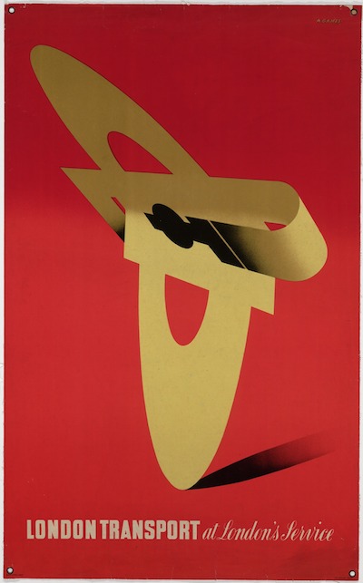
John Burningham, London Transport, 1961

Andre Amstutz Camping Coaches poster British Railways
Andre Amstutz, British Railways, 1956

Royal Blue Daphne Padden Coach Poster c1957
Daphne Padden, Royal Blue Coaches, c. 1957

McKnight Kauffer for Shell 1934
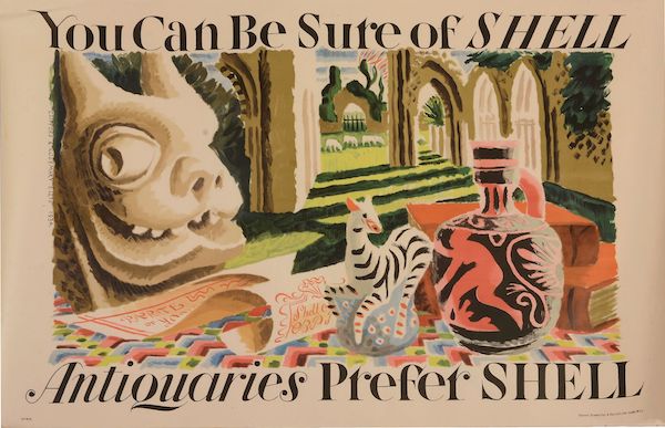
Edward McKnight Kauffer, Shell, 1934

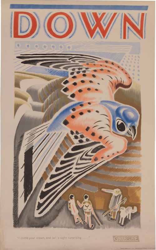
Well, three out of the four of them are on the walls here, but you’re not really expected to know that.  Perhaps more to the point is that they represent four out of the five areas of ‘collectable’ posters: railways, London Underground, Shell and coach* posters (the fifth for me would be World War Two posters, for what it’s worth).

*This may be wishful thinking on my part, but we do seem to have quite a lot of them now (thanks to Malcolm Guest, mainly) and so they are at very least collectable by us.  Anyone else?

But those four areas also share something more than just being collectable.  In each case the companies they are advertising owned the hoardings that the posters went on.

South Kensington Station January 1938

That’s reasonably obvious for the bus, tube and train stations – but Shell posters were also designed to be displayed on the vans which delivered petrol to the garages.

Shell van displaying poster on side 1925

Now set down like that it doesn’t seem like so much of a blinding revelation.  But it isn’t, as far as I know, something which has been much commented on.  And yet it had a big impact on their posters.

The most obvious example is that all of these companies had a much greater incentive to produce posters than anyone else.  Not only was this in effect a subsidised form of advertising for them, but they also needed to churn them out in order to fill up spaces when they hadn’t sold enough commercial advertising.

Enfield West station with advertising visible

Here’s Enfield West Station in 1934, with a McKnight Kauffer poster for Eno’s Salts clearly visible on the hoardings.

They also continued to produce posters in great numbers later on, when the poster had ceased to be the main medium for advertising, because the spaces were still there and still needed filling.

In addition, there may have been more reason for the companies  to produce ‘artistic’ and possibly also more subtle posters, because this will have a very direct effect on the station environment.  Although this probably worried Frank Pick more than it did the owners of Victoria Coach Station.

Victoria Coach Station 1962

I’ve also read an interesting suggestion that in the early days, London Underground commissioned lots of posters of wide open spaces to counteract the perceived claustrophobia of the tube, but I don’t think there’s any proof of that.

Burnham Beeches walter spradbury 1912
Burnham Beeches, Walter Spradbury 1912

Now originally this was going to be my only point, that all of these people owned their hoardings and so had to invest more in posters and poster design than other companies, which in turn may be one reason why their posters are collectable.  And that this hadn’t really been noted until now.

But then I found a really interesting article by David Watts (insert Jam or Kinks record into your head here as you wish) about pre-war depictions of Yorkshire in railway posters.  It’s an exemplary look at how posters worked and were consumed, rather than just what they looked like, and backed up by a ton of research.  The world of posters could do with a lot more of this kind of rigorousness (not that I’m volunteering to read 200 volumes of railway company internal correspondence, you understand).

One of his points is that the context of railway posters is all-important.  They didn’t need to have pictures of trains on, because they were posted up in stations.  The fact that they were advertising railway travel rather than just the location pictured could be asssumed.

Woodhall Spa vintage railway poster
Andrew Johnson, no date

The same is true of London Transport posters.  They can just say Go to Uxbridge.

Uxbridge London Transport poster Charles Paine, 1921
Charles Paine, 1921

That you’d use the underground to do so is implicit in the fact that the poster is displayed at a tube station.

But, as Watts points out, this contextualisation of the posters has other implications.

…omitting any visual reference to rail travel allowed posters to be detached easily from their ‘mundane commercial purpose’.

So the companies, as I’ve mentioned before, could promote their posters as examples of good design for the masses, and even as fine art, in part because they didn’t need to say Go By Train in large letters at the bottom.

Now Watts argues that this made railway posters at least a rather poor form of advertising.  And he does put forward some evidence that the train companies themselves thought this way by the early to mid 1930s too.  Images of trains, or at least the idea of train travel did become more prominent after then – as in the Tom Purvis that is coming up at Christies next month.

Tom Purvis 193o LNER poster

But he also says – and I think that this is entirely right – that the fact that the posters were semi-detached from their commercial purposes is one of the factors that has made them so collectable.  They exist in a limbo between fine art and outright commercialism, and are so more appealing than an advertisement for Eno’s Fruit Salts or Gilette Razors.

Although it is worth remembering that it’s only because the companies were promoting them as ‘art’ that these posters are available to collect at all.  Shell, Underground and railway posters were all available for sale to the public when they were first produced, so they do survive in attics and collections, while the most commercial billboard posters weren’t and so aren’t.  (I’ve mentioned this in passing before, but really ought to pull together all the sources on this one day, because it’s not said often enough.  Even here.)

But I think there’s also another way in which the context affected railway posters in particular (although the same is probably also true of London Transport and coach posters to some degree as well).  Watts points out how much the railway posters are selling an image of ‘deep’ England, by which he means an archaic, un-modernised and highly rural vision of the countryside.  Now whenever this vision is called up at this time, it is almost always intended as a direct contrast to the modernity, ribbon development and speed of the 1920s and 30s.

Edwin Byatt Vintage railway poster 1940
Edwin Byatt, 1940

But in the railway station, that contrast is always there anyway.  Most of these poster would have been displayed in an urban setting, and even where they were put up at local stations, there was the machinery and bustle of the railway itself.  So the posters are also using their context to suggest that there is an alternative, an escape.  And that’s something else that they don’t need to spell out in words at the bottom.

A sight surprising

I was going to try and say something clever about this auction that’s coming up at Bloomsbury/Dreweatts first thing tomorrow, but there isn’t really much point.  Because what’s coming up – at least the interesting part of it – is a collection of posters designed by Clifford and Rosemary Ellis, and almost every single one of them is a gem.

One or two of their series of different bird habitats for London Transport appear relatively often at auction.

Clifford (1907-1985) & Rosemary (1910-1998) Ellis Wood (Woodpecker) Colour lithographic poster, 1932, printed by Sanders Phillips & Co. Ltd, The Baynard Press, London

But this one is almost entirely new to me, and it’s the best one of all.

Colour lithographic poster, 1932, printed by Sanders Phillips & Co. Ltd, The Bayard Press, London Underground Electric Railways Company Ltd

Of course this has the entirely predictable results that a) I want it and b) it’s too expensive to buy because everyone else is likely to feel the same.

Also for London Transport is this slightly odder image.  I’m not entirely sure what it wants me to do, and I definitely don’t know where it’s suggesting I go.  Except possibly mad.

Clifford (1907-1985) & Rosemary (1910-1998) Ellis Travels in Space on your Doorstep Colour lithographic poster, 1937, printed by Curwen Press 102 x 64cm (40 1/8 x 25 1/4in) Unframed Commission by London Transport

Only slightly less peculiar is this variation on the ‘Shop Early’ posters which suggests that we should shop earlier in the month.  Why?  Can anyone explain?

Clifford (1907-1985) & Rosemary (1910-1998) Ellis It Is Better To Shop Early Colour lithographic poster, 1935, printed by Waterlow & Sons Ltd. London & Dunstable 101 x 63.5cm (39 3/4 x 25in.) Unframed Commission by London Transport

Lovely though they are on their own, the LT posters are just a small slice of what’s on offer.  You could, for example get yourself almost an entire set of Empire Marketing Board posters.  Here are just two of the five, to give you the idea.

Clifford (1907-1985) & Rosemary (1910-1998) Ellis Empire Buying Begins At Home (Tomatoes) Colour lithographic poster, printed by Jordison & Co Ltd, London & Middlesborough 101 x 63cm (39 3/4 x 24 3/4in.) Unframed Commissioned by the Empire Marketing Board.

I have two things to say about these posters.  One is that the latter one is described in the auction catalogue as ‘The Market Stall’ when it is clearly a County Show, and as these are some of my favourite things in the world I will not be gainsaid on that.  Secondly, if you want more info about how the full set fitted together on a billboard, I’ve posted about it not once but twice; and if you’re worried about the ethics of Empire promotion – although these are fairly inoffensive examples – you can find my thoughts here.

That’s not the end of it either.  The Ellises designed posters for Shell, and these are in the auction too.

Clifford (1907-1985) & Rosemary (1910-1998) Ellis Antiquaries Prefer Shell Colour lithographic poster, 1934 , printed by Vincent Brooks, Day & Son Ltd, London 76.5 x 114cm (30 1/8 x 44.5in.) Unframed Commissioned by Shell-Mex and B.P. Ltd.

Clifford (1907-1985) & Rosemary (1910-1998) Ellis Angler's Prefer Shell Colour lithographic poster, 1934 76.5 x 114cm (30 1/8 x 44 7/8in.) Unframed Commissioned by Shell-Mex and B.P. Ltd.

Along with some more Shell posters.

Clifford (1907-1985) & Rosemary (1910-1998) Ellis Lower Slaughter Colour lithographic poster, 1934 76.5 x 114cm (30 1/8 x 44 7/8in.) Unframed Commissioned by Shell-Mex and B.P. Ltd.

Although just for a change there is a – rather wonderful – BP poster as well.

Clifford (1907-1985) & Rosemary (1910-1998) Ellis Whipsnade Zoo By Car Using BP Plus

With a final garnish of GPO posters too, including this one.

Clifford (1907-1985) & Rosemary (1910-1998) Ellis A Miserable reflection, why aren't we on the telephone? Colour lithographic poster , 1935, printed by The General Post Office, GPO

Which I have been forced to mention in despatches before, on account of its slightly deranged title. Why indeed are we not on the telephone.  Except we are.

Clearly I owe the Ellises a proper blog post of their own, and even more now that I have discovered – thanks to a newspaper article about this auction – that they came from Bath, just up the road from Crownfolio HQ.  Here they are in Lansdown, being artists in 1937.

Clifford and Rosemary Ellis in Bath

They’re sitting amongst their work for the British Pavilion at the 1937 Paris Exposition.  I will come back to this, I promise.