Great Central Railwayana have a new auction coming up on 4th June, and the catalogue is now up on The Salesroom if you want to take a peek.
There are a couple of quite desirable items on there, my favourite probably being this Tom Purvis because – as any regular readers may have worked out – I am somewhat obsessed with the idea of camping coaches.
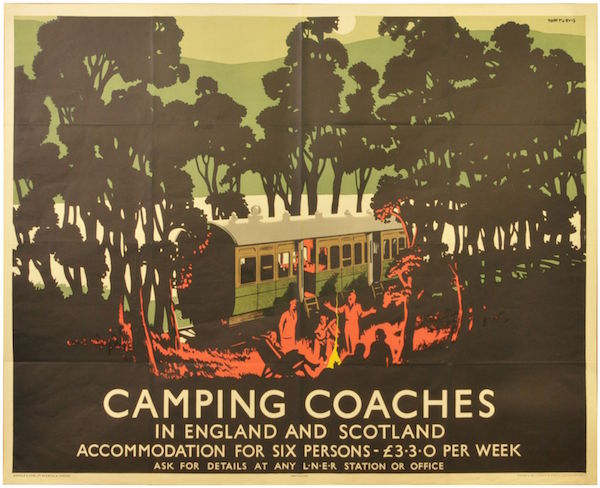
Tom Purvis, 1930s, est. £600-900
That does make it look particularly fun though.
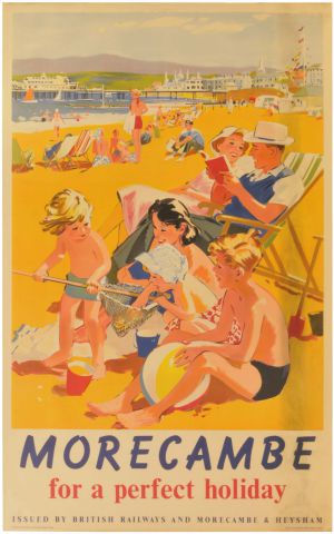
I’m always a sucker for a nice Lander, and there are two good ones up this time round.
Lander, 1950s, est. £100-200
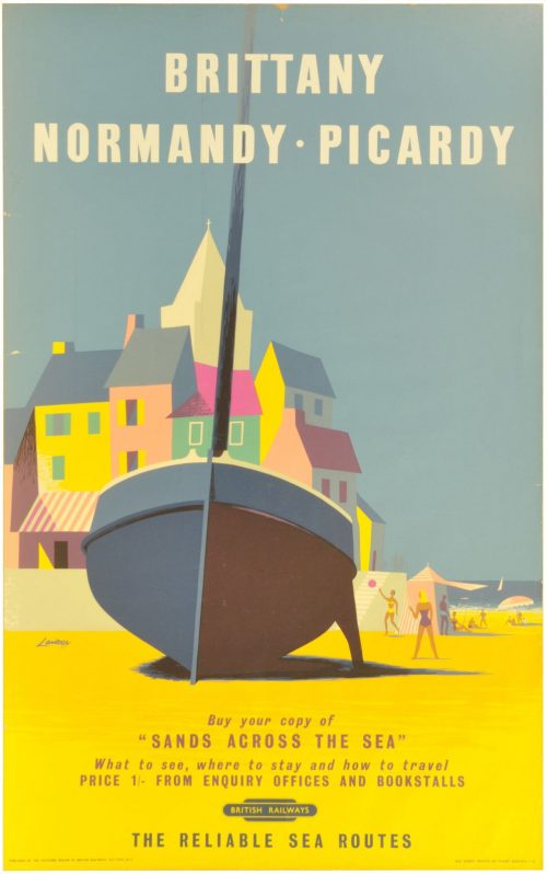
Lander, 1950s, est. £100-200
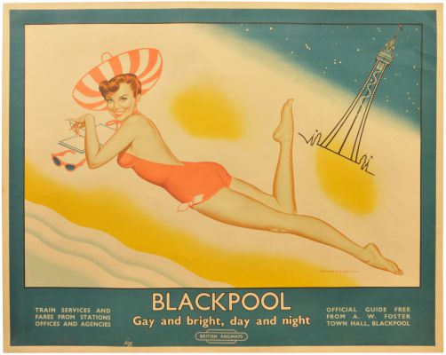
This, meanwhile, is of the same kind of vintage but a) is by someone called Harris about whom I know nothing, and b) isn’t actually a railway poster at all.
Harris, est. £80-120
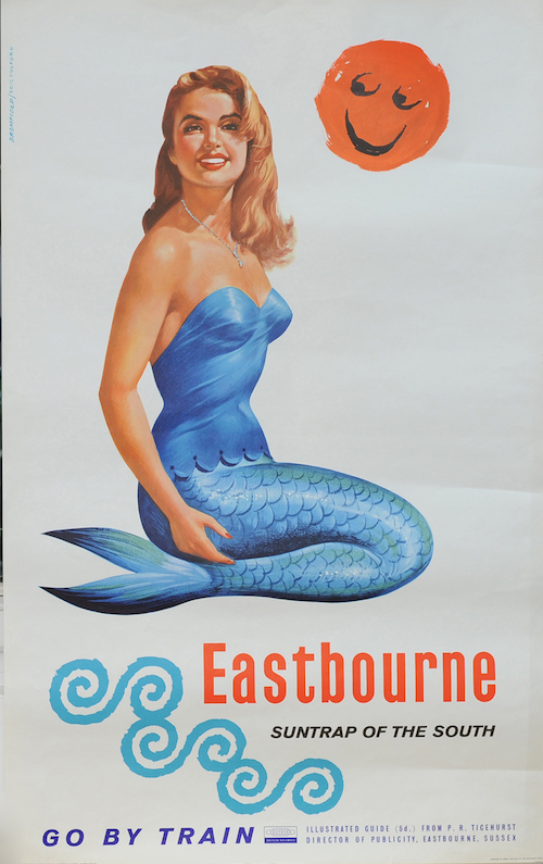
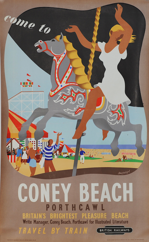
Meanwhile, after years of invisibility, another copy of this has popped up six weeks after the last one. I will tell you all about Armengol one of these days, I promise.
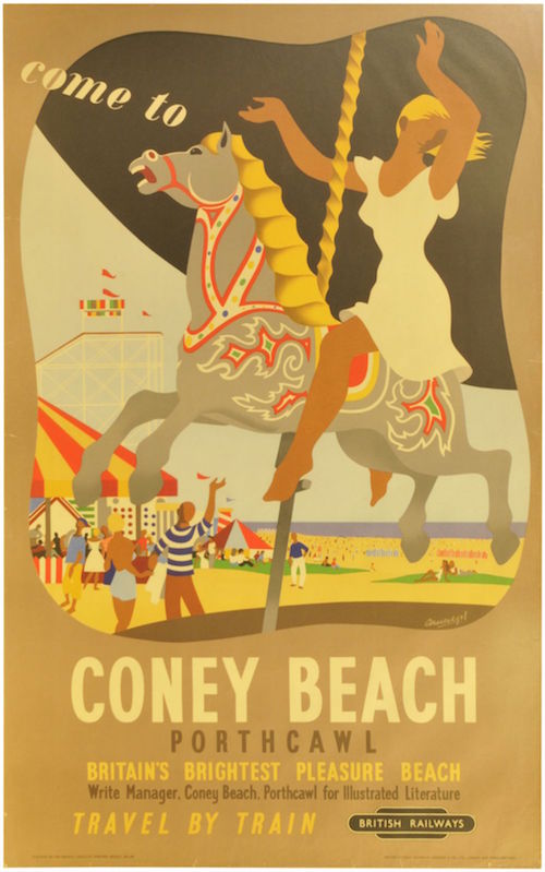
Armengol, 1952, est £150-300
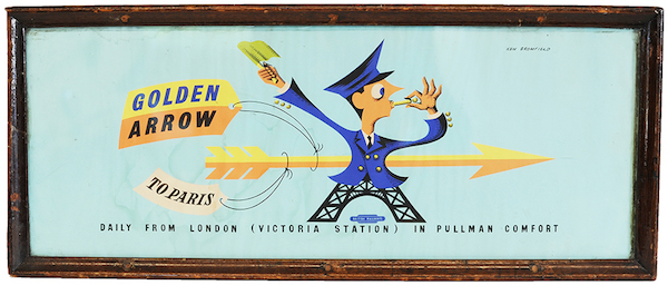
You need to pay attention to this one too, because I also will be writing more about this series in the next week or so. And it’s rather good to boot.
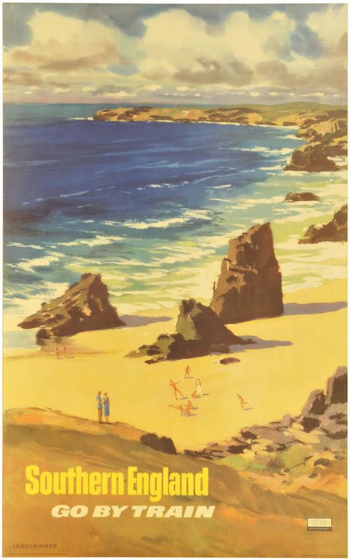
Langhammer, c.1960, est £150-300
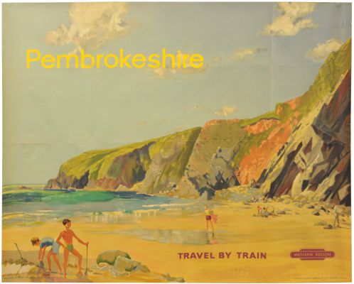
Meanwhile this one may not be the best bit of design ever, but seeing as it both dates from 1946 and isn’t actually a railway poster, I reckon it’s probably quite rare.

Orr, 1946, est. £150-300
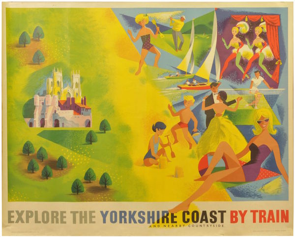
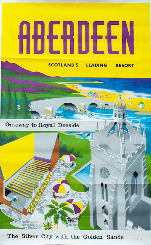
Finally, this is worth a mention simply for making explicit the thought process behind so many landscape-depicting railway posters.
Ronald Lampitt, c. late 1950s, est. £100-200.
In an interesting development, Lampitt has his own Twitter account. Life is a perpetual source of surprise to me.
While all those posters are very lovely, they’re not the most interesting discoveries about this auction. When I went onto the Great Central site to look at what posters they had, the link, accidentally, took me to the auction just gone past in March. It took me a few clicks to work out what had happened, which meant that I ended up looking at quite a few sold prices. And those turned out to be really rather interesting.
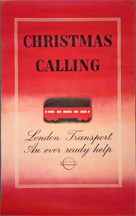
Quite a lot of ‘classic’ railway posters went pretty much for their estimates. I’ve pulled this one out simply as an example.
The estimate was £200-350, and it sold for £260. All fine and well there.
Here’s another, later example, which went for £360, with a top estimate of £300
I reckon that a good two thirds of the sale went in this way. A couple came in under and only one failed to sell at all. A normal day at the auction house.
That is, except for the posters that remained – perhaps ten or fifteen – where the bidding went mental. Estimates were being smashed all over the place.
Sometimes this can be accounted for by a poster being old and rare.
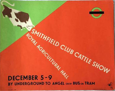
Hewins, est. £400-600, sold for £1,300
While others were design classics of one kind or another.
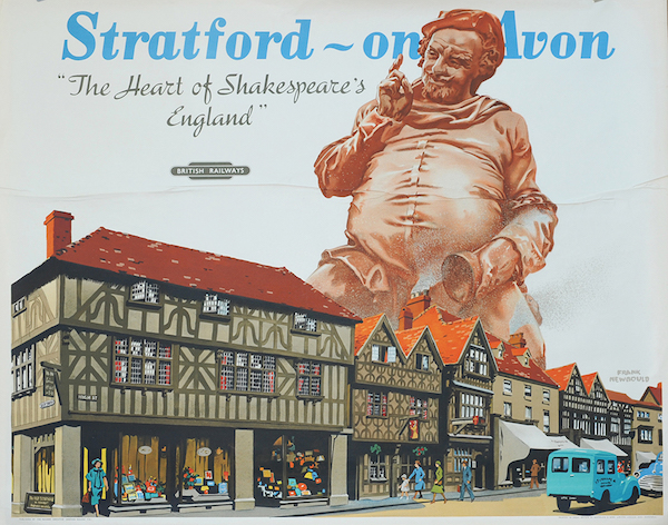
Frank Newbould, est. £150-300, sold for £1050
Daphne Padden, est. £80-120, sold for £270
This is a really stylistically interesting and unusual poster, and the only example I’ve ever come across of the design at auction, so I can see why it went so high.
Dickens, 1960, est. £150-300, sold for £780.
Other posters behaved less explicably. Why is this seaside poster better than any other?
Anon, est. £100-200, sold for £460.
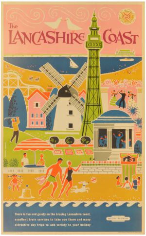
These boats don’t look particularly exceptional either, but people seem to want them.
A J Wilson, est £100-200, sold for £500.
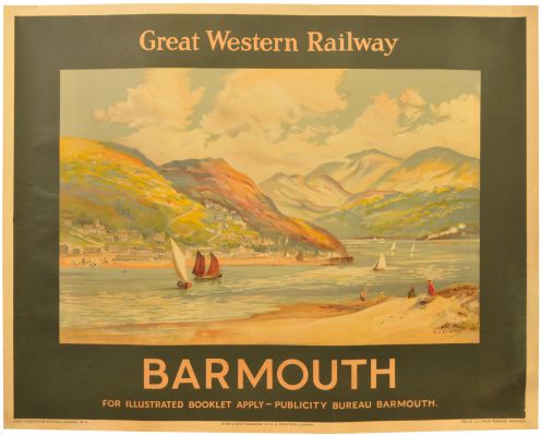
There is a theme developing here, which is that posters of the Lancashire coast go for a lot of money. It’s a good theory, but doesn’t account for everything.
Frank Mason, est. £150-30o, sold for £540
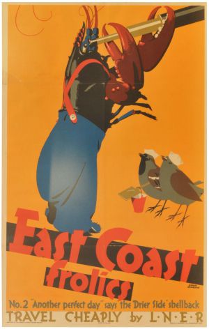
While nothing at all can account for this.
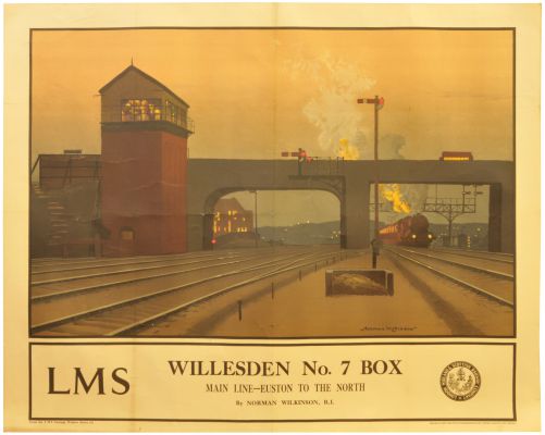
Norman Wilkinson, est. £250-400, sold for £1800
I know, people like pictures of trains, and signal boxes, but I still find it bewildering.
So what have we learned from my trawl through auctions past? I’m not entirely sure, to be honest. One interpretation might be that the market is moving upwards a bit. That’s certainly true from the point of view of the railwayana auctioneers. Ten or fifteen years ago, posters were a small and rather disregarded sideline for them: now they are bringing in serious money.
But making a generalisation about values as a whole, I’m less sure about. The other piece of auction news that has come in recently is that Christies are closing down their entire poster department. On the one hand this, to paraphrase Morrissey, says nothing to me about my life. I can’t afford the prices, and don’t want most of the posters in their sales. I’m not even sure it’s a vote of any kind about the market; I suspect this is more about posters being small fry compared to the Very Expensive Art that they would prefer to sell.
So all I am left with is questions? Are posters getting cheaper or more expensive? Who’s going to sell the expensive posters now – are they all going to go at Railwayana auctions? And where will the London Transport Museum get rid of their surplus holdings now?
Any answers, please do type them out in the box below, because I certainly don’t know.
