Odds and ends, including string

This has appeared on eBay.

Modern House In England cover Eckersley Lombers

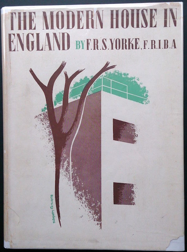
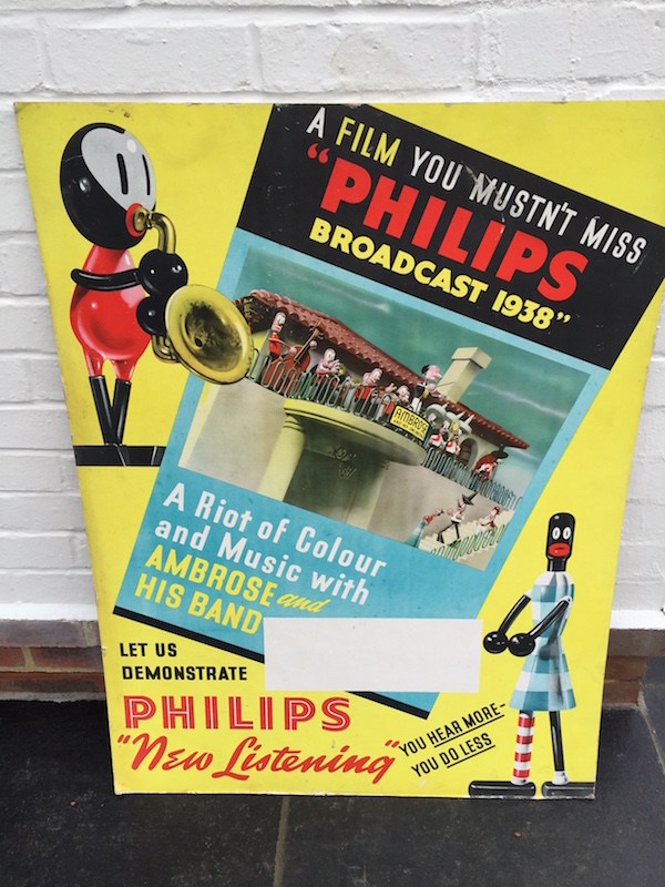
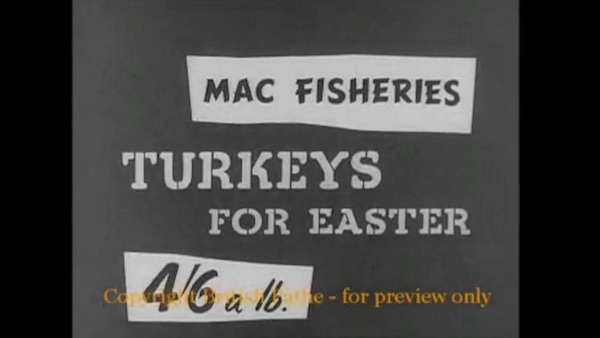
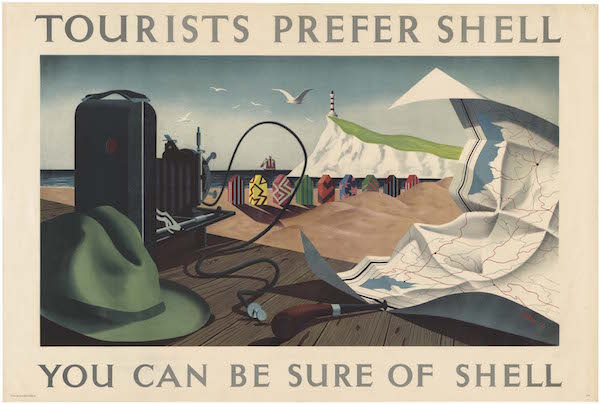
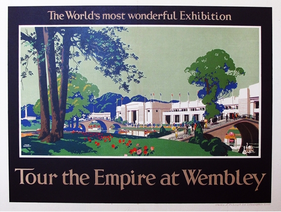
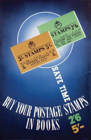
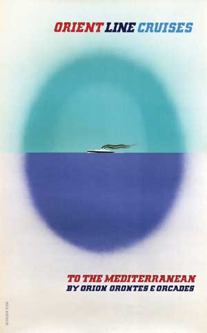
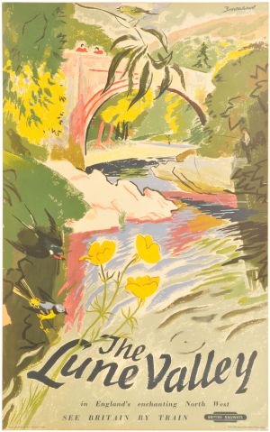
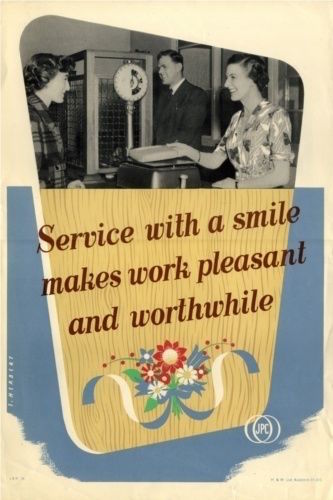
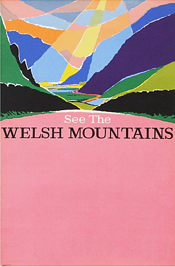
It’s fearfully expensive, with a starting price of £125, but I thought it was worth drawing to your attention, because it’s an Eckersley-Lombers design that I can’t recall having seen before.  And it is wonderfully modern.

I haven’t been scrutinising eBay as much as I used to, mainly because the bargains are pretty thin on the ground these days, and there are only so many times I can post about over-priced posters and unauthorised reproductions without losing my faith in human nature.   But – for an edifying lesson in a dealer’s mark-up, it’s worth looking at these.

Service with a Smile GPO poster

cm.ltd, who seem to be philatelists, have clearly picked up some of the many GPO posters that have come on the market recently.  I would guess that these had come from the Onslows sale, not least because of the presence of this poster of Norwich market, which seemed to be included with every single lot there.  (I like to imagine a teetering pile of these posters in the corner of the archive, having to be sold in the end for reasons of health and safety.)

Norwich Market, GPO poster

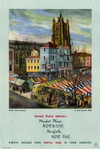
Yours for £20, and they’ve sold two already, which makes me even more likely to suspect Onslows as the source.

But I’m not entirely sure, because I don’t remember seeing this going past at any point, and a quick rifle through the catalogues hasn’t left me any the wiser either.

Tom Eckersley postcards beach GPO poster

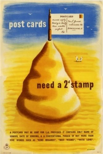
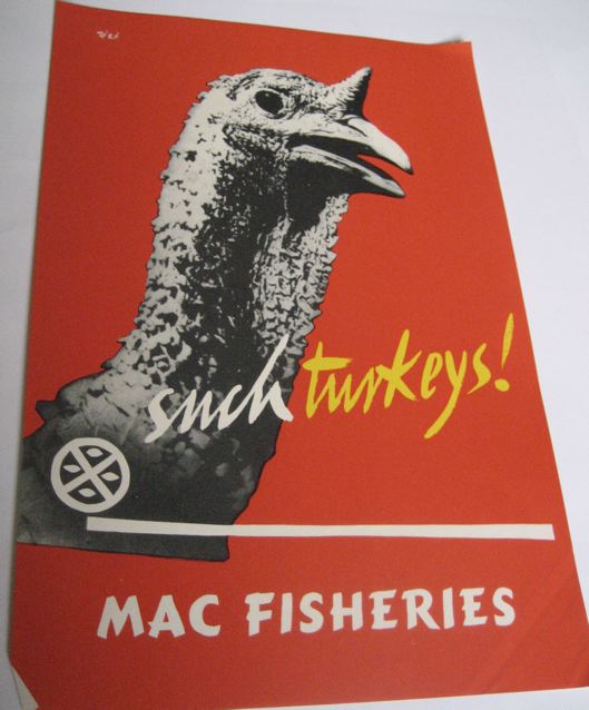
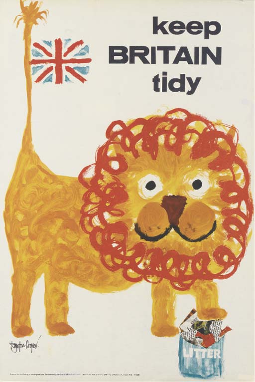
However hard I try to get the thought out of my mind, I can’t help being reminded of of a flag stuck in a giant dog poo.  But despite that it is on offer for a rather more chunky £150.

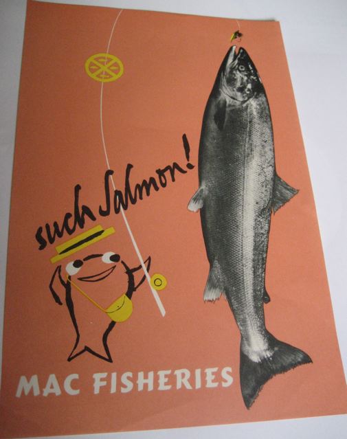
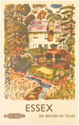
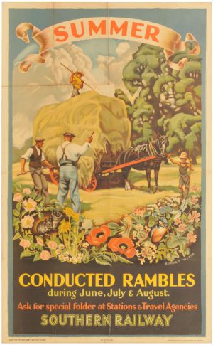
I also don’t recollect this one either, and I would have thought I would, seeing as it’s related to one of my favourite subjects string.

GPO saving usable length of string

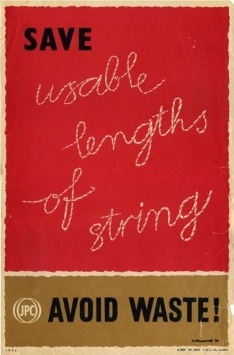
For reasons too complicated to explain, I found recently myself googling the story of the pensioner whose wartime economies included a drawer marked ‘lengths of string, too short to be of use’.  I’d always thought it was an urban legend, but found people swearing it had been true of their own parents.

That’s going for £55, and I’d be surprised if the poster cost much more than £20 to the dealer concerned, if that.  I’ve been forced to think about dealer’s mark-ups recently, because I’ve had to explain to someone who got in contact with the blog that, just because there is a Harry Stevens poster on sale at Fears & Kahn for £495,

Harry Stevens welsh mountains bus poster

…that doesn’t mean that their smaller bus poster is therefore worth £100.  I hope I didn’t disappoint them too much.

This is partly  because I don’t believe that the Harry Stevens is actually worth that much, although Fears & Kahn clearly do, and are happy to wait for long enough until the right buyer comes along who wants it at that price.  Which is also something that has to be factored into the valuation.

But this is also how a dealer makes their money.  They have to pay for premises, storage, advertising, web presence, fairs and all of the malarkey that comes with being a business, so the added value is fair enough.

Now I can hear you protesting that none of this is exactly news, and is how the antiques trade has been working for generations.  But what this does make me wonder what the actual value of a poster is.  Is it the price it might fetch at auction, or is it the price that a dealer might get for it?

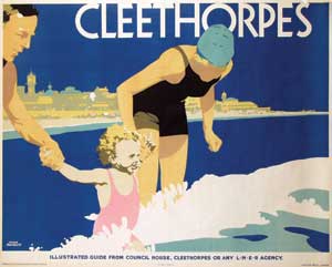
I’ll give you one more example, because it’s a poster I can track quite easily (and am pre-disposed towards, because it hangs in our bedroom being cheerful).

Royston Cooper lion keep britain tidy

Fears & Khan have it on sale for £675, and frankly that’s what I think it should be worth.  And in the past it has sold for that amount of money at Christies.  Yet when it last popped up at Onslows a couple of years ago it went for £70.  Which means that the seller probably didn’t get much over £50 for their trouble.  So, what’s it worth?

All of which means that I am a bit wary of telling people what a poster is worth any more.  Because I don’t think there is one single answer any more.

Hear more, do less

Now here’s something interesting, albeit thoroughly of its era in its attitude to racial difference.  (A riot of Colour and Music reads rather differently to us today with those images attached).

shop display card for Philips Broadcast of 1938

Nonetheless, here it is and so, like the Volkswagen and Empire Marketing Board posters, we shall consider it.

This was emailed to me by Kerry, who found it in her attic and – this is probably a relevant piece of information – lives in Guildford, which is home to the Philips head office in Britain.

What it isn’t, though, is a poster, as the rear view shows.

Philips broadcast 1938 back view

It’s a shop display card, although admittedly quite a big one.  Which means that I can’t seem to discover very much about the image or the design.

However, what I can find, which is in some ways even more interesting, is the actual thing it is advertising, the Philips Broadcast 1938.

This turns out to be a five minute animated film, by early and renowned animator George Pal (lots more info out there if you are interested).  Which, joy of joys, is available on YouTube, and turns out to be utterly wonderful.

https://www.youtube.com/watch?v=jQmiqymo7Og

What we have here – and it’s a useful reminder for those of us, like me, who tend to look only at posters – is a pre-war multi-media campaign.  The shop card is advertising a cinema short which in turn wants you to buy a radio.  (I do have a few questions as to why a colour film is a good way of persuading you to buy a radio, but I think we’ll just have to accept that things were different then.)

Posters, it’s worth remembering, didn’t exist in splendid isolation.  They lived alongside newspaper and magazine advertisements, as well as cinema ads, part of a whole advertising package.

Coincidentally, I discovered another example of this only last night.  I haven’t mentioned the MacFisheries graphics by Hans Schleger for a while, which I probably should have done as they are classic, brilliant and criminally unknown.

Hans Schleger salmon Macfisheries poster

But then, on a Pathé showreel, I found something really interesting – and yes, if you want to imagine me and Mr Crownfolio sitting in of a winter evening and watching 1950s cinema ads, feel free: it’s what happened.

It turns out that Pathé, as well as producing newsreels, also made advertisements themselves, and quite a few of them, up to two hundred a year (there’s a blog about it here).  A small sample were edited together to show to prospective advertisers, and you can take a look at this here (sadly it’s on the Pathé website, so I can’t embed it like a YouTube video).

In amongst them you will find a Macfisheries advert, using the Schleger graphic styleat the start and end, to persuade you to think about serving turkey for Easter as well as Christmas.

MacFisheries tv ad Schleger graphics

end of 1950s macfisheries ad

Here’s another of posters for reference (any excuse).

Macfisheries Hans Schleger turkey poster

The ad is at 11’30” in, but I heartily recommend watching the whole thing for added entertainment.  Dry Hair for men doesn’t seem to be a problem now, but they were very worried about it then.

Why Bring That Up?

Sometimes I make promises which turn out to be quite rash.

When this poster came up for sale a few weeks ago, I said that I would find out more about both Tristram Hillier and Jezreel’s tower and report back.

vintage shell poster HILLIER, Tristram (1905-1983) - YOU CAN BE SURE OF SHELL, Jezreel's temple, Gillingham lithographic poster in colours, printed by The Baynard Press

In both cases this has turned out to be a more difficult task than I thought.  (I do also have a residual bitterness, because we tried to bid on this poster and were thwarted by the internet, and so it went to someone else for only £120, but I shall try not to let this cloud what comes next, even though I am a bit narked by it all.)

I thought Jezreel’s Tower would just be the ruin of some seventeenth century folly.  If only.  The building is modern, made from steel beams and concrete, while its story turns out to be far more complicated, with cans of worms concealed within other cans of worms, along with eccentricity, delusion and religion.  And the Co-op.  So what follows here is a very abridged version, with plenty of links to people who will tell you more.

The tower was begun in the late 1880s, by James White, who had become a follower of the prophetess Joanna Southcott (you can read her teachings here if you like – do report back as I haven’t gone that far).  White changed his name to James Jershom Jezebel, decided that he was a Messenger of the Lord and set up his own church in Gillingham.  This new sect had its headquarters in Gillingham, and combined religious fervour with a certain commercial acumen, as they managed to run several successful businesses in the town, including carpenters, joiners and printers, as well as a dairy, along with a greengrocers in Marylebone.

All of this meant that the sect had enough money to think about a headquarters, and White/Jezreel, bolstered, inevitably, by a vision from God, wanted this to be a grand one.  The tower was planned in accordance with the Book of Revelations, although scaled down slightly after intervention by the architects (that must have been an interesting meeting) and the foundation stone laid in 1885.

The building was intended to hold many things, including acres of printing presses to spread the word and a 5,000 seater amphitheatre, along with bakeries, reading rooms and lifts, and the concrete construction was to ensure that the tower survived the conflagration of the Day of Judgement.

But it was never completed; Jezreel himself was dead before the foundations had been finished, and his wife Esther, who took over the sect, died only three years later.  Work on the tower never restarted, and the buildings were sold in 1903.  The new owners tried to demolish it, but gave up as the building was so solidly built.  So what Hillier depicts on the poster, although it looks substantial, is only a part of what was constructed, and an even smaller part of what was planned.

The land and buildings were bought by the C0-op in 1920, who used the basements for a shoe repairing factory.  There was also, at some point, a small factory on the site, producing hose clips stamped ‘Jezreel Tower Works.’  The last remaining buildings were demolished as late as 2008.

All of this would be worth telling for its own sake, as a reminder of just how much strangeness lives alongside us in daily life.  But it also helps to explain why the tower might have appealed to Hillier.  His painting is always informed by a sense of intense oddness in otherwise everyday objects.  But as a Catholic schooled by monks at Downside, he also seemed to have an awareness of the closeness of death and judgement.  Perhaps.  He might just have liked the view.

I’m not sure I want to write much more than that about Hillier himself.  Usually the more I find out about someone, the more interesting they become to me.  But having read Hillier’s biography, I actually like the painting less.  I’m not sure why that is: it turns out that he was enormously successful in the 60s and 70s, producing and selling huge numbers of his odd, humming paintings.  And he lived only fifteen or so miles from here, so I can understand his images of these hedges and lanes too.  But I still don’t like them.

I came out the other end concluding that in fact I liked his commercial work more than anything else he produced.  I’ve gone on about the Shell Nature Studies before now.

Tristram Hillier Fossils shell educational poster illustration

But he also produced a couple more posters for Shell, both of which are wonderful too.

Tristram Hillier shell tourists

Tristram Hillier shell seamen

I’m not entirely able to explain why this is the case – and why I am so clearly out of step with the picture buying public who snapped up his works back in the day.  It could be that I expect more than just a frisson of surrealism from a painting, and so end up disappointed.  But perhaps it is the other way round.  Hillier seemed able to bring the same level of oddness to his commercial works as to his fine art.  There are many strange artists, but here in the world of posters, he ended up doing something almost unique.

All of which is a bit of a falling note to end on, so to cheer you up, have this.  From the splendidly titled series, Why Bring That Up? (why indeed), Pathé News will now explain Jezreel’s Tower.

Lovely bombs

You may need to bear with me on this post.  I’ve been thinking about writing it for at least a year, possibly longer.  I’m sure all the ideas made a lovely linear argument when I first had them, but I’ve pondered them so long that they’ve all turned into some kind of thought soup.  The ingredients include bombs, posters and a very famous John Betjeman poem.  Only writing will tell me if they still make sense together, so here goes.

The easy part is the poster, which is this design by Edward McKnight Kauffer, commissioned by the Air Raid Precautions Department of the Home Office in 1938.

McKNight Kauffer vintage propaganda poster ARP 1938

Every so often I come back and think about this poster, and not just because we’ve got a copy framed on our walls.  I’m intrigued by what living through those years of the late 1930s must have been like, with people trying to live their normal lives as much as possible, but all the time knowing that war was looming dark and unavoidable in the very near future.

I’ve always thought that the allusiveness of the poster – you are invited to join ARP without any clue about what you might be joining or what the organisation might do – was because no one was very clear about what the war in the air might involve.  Pat Keeley’s companion poster is similarly vague.

Pat Keely vintage arp world war two propaganda poster 1938

Perhaps it was the misunderstandings behind the Keep Calm and Carry On poster which led me to think that no one really foresaw the reality of bombing raids, but that’s certainly what I believed.  The posters show nothing because back then no one really knew what was to come.

How wrong I was, it turns out.  People, not just the army, not just the government, but ordinary people in the streets, newspaper readers and casual observers, knew exactly how the bombers would come when war was declared.  It had been shown to them for years, and the evidence was actually there in plain view, if only I knew where to look.

The first clue to this came in a history of the inter-war years, which I was reading for another reason altogether, but piqued my interest by mentioning ‘London’s Great Air Battle’ which was staged in 1925.  Here’s the account from the News of the World, as reprinted in the book.

Powerful searchlights…stabbed into the path of darkness overhead, sweeping the skies for the menacing machines….Guns manned by alert teams rattled away as they spat out their imaginary stream of shells into the heavens and the invaders circled round and round loosing their cargoes of destruction from the heights.

Someone clearly had a very good idea of what the next war would do to London.   But who?  I nearly broke Google trying to find out (London’s Great Air Battle wasn’t actually what it was called, so this made life a bit more difficult than it might have been).

Until I eventually – and really this did take a couple of days – found a perfect blog.  It’s called Airminded, and it’s subject is Airpower and British Society 1908-1941.  I’d say that it couldn’t be more perfect, were it not for the fact that the author of the blog, Brett Holman, has also written a book called The Next War in the Air: Britain’s Fear of the Bomber, 1908-1941.  Which is exactly what I needed to know.  Except it’s an academic book, and so costs £75.   But never mind, the blog gives us more than enough information to look at the posters in a new light.

It turns out that these displays were put on as part of the British Empire Exhibition in Wembley in 1924 and 1925.

newbould-wembley

One of the many attractions was that No 32 Squadron of the RAF simulated the bombing of London in a thrilling display of pyrotechnics that included anti-aircraft guns and fire engines.  And not just one display either, these ran six days a week for nearly a month.

London Defended wembley programme

As Holman points out, this was a lot of time, energy and aeroplane for the RAF to commit, so they must have been convinced that there was a propaganda purpose in all the spectacle.  They wanted people to know that the RAF was the most modern and exciting of the fighting forces, they wanted people to understand that the next war would be fought in the air and so the RAF would be essential.  But a side effect was that it made clear to people that, should the next war ever come, London would very definitely be in the firing line.  (It’s also notable that the Air Raid Precautions Department that commissioned the posters was also founded in 1924, which given the propaganda nature of the displays may be rather less than coincidence).

This wasn’t the only place that the RAF were showing their workings either.  The RAF Aerial Pageants had been held in Hendon since 1920 – and it’s worth noting that a lot of lovely London Transport posters were produced to advertise them too (this image from Kiki Werth).

hendon-1923

In 1926 and 1927, one of the high points of the spectacle was set piece displays of the bombing of London.  The pageants, too, were large scale events – 150,00 people visited in 1926 alone.  None of this was a secret.

However, back then in the twenties it wasn’t necessarily clear then that another war was imminent.  So the shows could just be seen as hypothetical displays.  Perhaps even the results of the Air Defence Exercises that ran alongside the Wembley and Hendon events were not as frightening as they seem now with hindsight.  Each summer, starting in 1927, the RAF High Command tried to bomb London with some squadrons, while others tried to defend it.  The results were clear each time, the bomber almost always got through.  And this conclusion was widely reported in the newspapers when it happened year after year.  By 1932, the results must have felt at least a bit ominous though.

As the decade turned and the 1930s rolled on, it must have been apparent to even the most casual observer that was would be very different next time round.  No more trenches, no more stale mate.  The new war belonged to bombers, and the bombs would not be falling on soldiers alone, everyone in Britain would have to be prepared for what might come.

The final piece of evidence for this is John Betjeman, and perhaps his most famous lines of all.

Come friendly bombs and fall on Slough!
It isn’t fit for humans now,
There isn’t grass to graze a cow.
Swarm over, Death!

Come, bombs and blow to smithereens
Those air -conditioned, bright canteens,
Tinned fruit, tinned meat, tinned milk, tinned beans,
Tinned minds, tinned breath.

These lines aren’t the result, as somehow I’d always assumed, of hindsight, the poet summoning the bombs back in the 1950s to do their work again.  Although Betjeman published the poem in 1937, he actually wrote it in 1928.  This is ten years before those ARP posters, and yet there’s no explanation in the poem, no need for him to explain what the bombs will do. Everyone understands.

All of which means that when I now look at the posters again (this is a third one, produced for the WRVS but in 1938 as well) I have to see them in a very different way.

ARP WRVS poster air raid 1938 world war two propaganda

Their vagueness isn’t the result of evasion at all.  On the contrary, everyone is so clear about what the next war will involve that the realities don’t need to be mentioned at all.  No one wants to see the blasted corpses, the broken homes, the dead children.  All that needs to be said are the three letters of ARP, and the viewer of the poster knows what has to be done.  Because war is coming, and this time the war will come from the air and no one will be spared.

Too small

The next Van Sabben auction is tomorrow, but we are only going to pay it a very brief visit.  This is partly because it is, as ever, vast and with few British posters tucked away in there.  But also because they’ve changed the format of their website, and the pictures are tiny.  How can I persuade you to care about a poster when the image is this small?

GPO poster Buy your postage stamps in books
Anonymous, est. €90-150

Actually it looks better there than it does on their website, but even so, I’m not sure I’d want to buy a poster on the basis of that few pixels.  I can also tell you that it dates from 1948,  but they are abroad so it’s not fair to expect them to know that.

There are a few other posters of interest out there too, like this Lewitt Him.

Lewitt Him AOA poster airlines poster
Lewitt-Him, est. €120-200

There are also a tiny set of British railway posters, like this example of Frank Newbould doing Tom Purvis impersonations for the LNER.

Frank Newbould Cleethorpes LNER railway poster
Frank Newbould, 1932, est. €1200-2500

Although that is preferable to Frank Newbould doing Frank Newbould, at least in the case of this poster.

Frank Newbould Plymouth GWR poster 1945
Frank Newbould, 1945, est. €280-450

And both of those images really are too small to be any use at all.

But my favourite has to be this one; yet another classic from the Orient Line department of tasteful modernism.

De Holden Stone orient line cruises to the mediterranean poster
De Holden Stone, est € 220-450

This is still the only poster I have ever seen by James de Holden Stone, and all I know about him is contained in a short paragraph here, so any further info would be much appreciated.


Mountain sand and sea

Still in catch up mode, there is also a GCR railwayana auction on Saturday (yes, the kind of Saturday that is tomorrow).  There are lots of posters up for grabs but, it has to be said, no real surprises, though it’s still worth a tour.

What we do have is a fair number of tourist towns on offer, mostly rendered in pastel shades.

A BR(E) double royal poster, SOUTHWOLD, NEAR HALESWORTH, East Coast Landmarks, by Frank Mason
Frank Mason, est, £150-300

A BR(S) double royal poster, CHICHESTER, by Claude Buckle British Railways
Claude Buckle, est. £100-200

Which is probably why I like this rather more flamboyant attempt better.

A British Railways (E) double royal poster, ESSEX, by Hooper.
Hooper, est. £80-120

With this exuberant Brookshaw a close second.

 BR(M) double royal poster, THE LUNE VALLEY, by Brookshaw British Railways
Percy Drake Brookshaw, est £80-120

Note that the ones which I like are much cheaper, clearly because I have no taste at all.

You will also find a whole heap of seaside posters.

A BR(W) double royal poster, BARMOUTH, for Mountain, Sand and Sea, by Harry Riley British railways
Harry Riley, est. £300-500

Many of which are by Harry Riley, although, curiously, a large proportion also seem to feature people standing on the promenade.  What can this mean?

A BR(W) double royal poster, ABERWYSTWYTH, by Harry Riley British Railways
Harry Riley, est £150-300

A BR(W) double royal poster, PORTHCAWL, by Harry Riley British Railways
Harry Riley, est. £250-400

A BR(NE) double royal poster, BRIDLINGTON, by George Ayling British Railways
George Ayling, est. £150-300

But all is not entirely lost to the world of Ladybird picture book style illustration.  To start with, there are three posters by Studio Seven.  We might own a copy of the first one, but I don’t rightly know as the cataloguing system on the computer has keeled over.  Must fix that one day.

A BR(M) double royal poster, BUXTON, by Studio Seven British Railways
Studio Seven, est. £80-120

A BR double royal poster, CAMPING COACHES, by Studio Seven British Railways
Studio Seven, est. £100-200

A BR(M) double royal poster, THE CALEDONIAN, a new fast train, London and Glasgow, by Studio Seven British Railways
Studio Seven, est. £80-120

I don’t know anything about Studio Seven at all, even though I do like their style, so if anyone can enlighten me I’d be very grateful.  Lots of other people have called themselves Studio Seven over the years, so the internet doesn’t prove very useful on this one.

In a similar style, there is also a Lander.

A BR(M) double royal poster, ISLE OF MAN, by Lander British Railways
Lander, est. £80-120

I have to say that I’ve never thought of the Isle of Man as a continental resort before now, and I don’t think this poster is going to change my mind.

After that, we are pretty much down to any other business, like this Southern Region poster that I like for no particular reason.

A Southern Railway double royal poster, SUMMER CONDUCTED RAMBLES, by Audrey Weber railway poster
Audrey Weber, est. £200-350

Along with this frankly rather frightening late Newbould, which can’t have done wonders for Nottingham’s tourism figures.

A BR(E) double royal poster, NOTTINGHAMSHIRE, by Frank Newbould British railways
Frank Newbould, est. £150-300

And finally, for those of you who want to spend a four figure sum on a poster, there is also Newbould’s reworking of the Hassell classic.

A LNER royal quad poster, SKEGNESS IS SO BRACING, by Frank Newbould, after J. Hassall. The classic image of the Jolly Fisherman Railway poster
Frank Newbould, est. £1,500-2,000