9th December

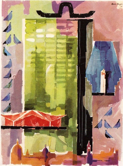
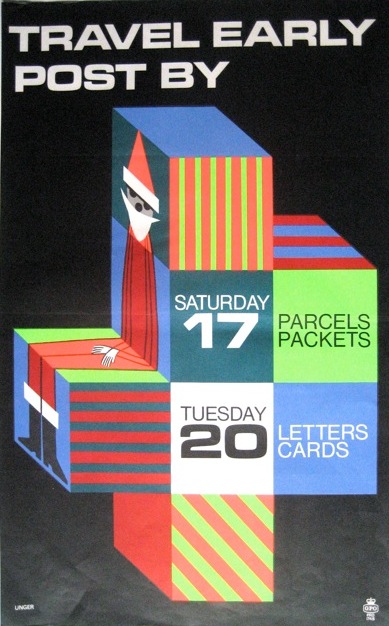
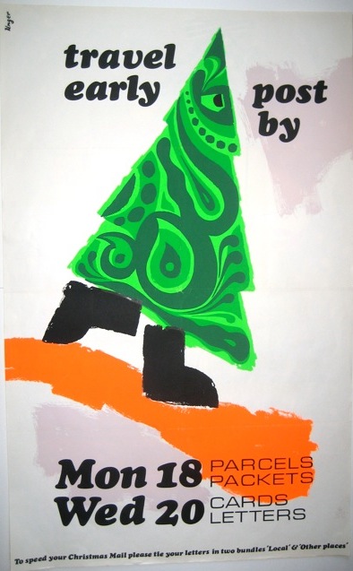
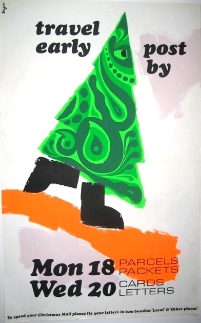
The GPO kept Hans Unger busy in the 1960s, and here are a couple more of his designs for them.  I particularly like this psychedelic Christmas Tree from 1967.

Hans Unger fearsome Christmas Tree poster GPO 1967

Although I also slightly fear the determined gleam in its eye.  Where is it going? And is it after me for not posting my cards yet?

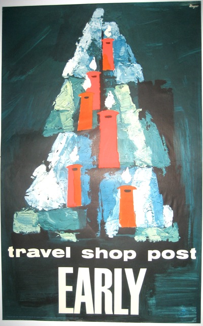
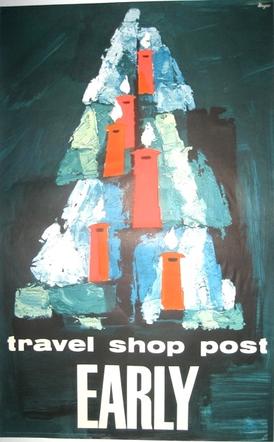
This rather gentler image is from 1962.

Hans Unger Vintage GPO poster 1962 post early

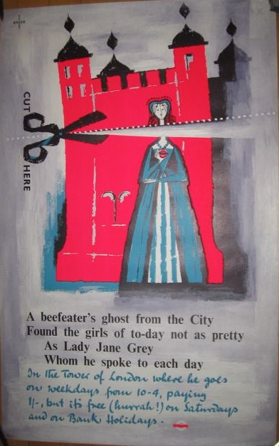
Unger did seem to like fluorescent inks on his posters – there’s another one coming up later in the calendar too.  He used them for London Transport as well in 1956, and I’m sure for others as well.

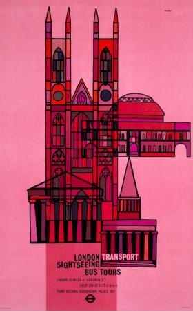
Vintage Hans Unger London Transport poster 1956 Tower of London

Tomorrow, a chicken.  Very Christmassy, I’m sure.

Door 6

We’re still posting early, oh yes we are, but this week it’s all a bit more modern.  Today, for example, we’ll be doing it in 1966.

Hans Unger Post Early vintage GPO poster 1966

This is by Hans Unger; it’s rather different to most of his work that I’ve seen, but it’s still good.  And you can buy this one as a Christmas card too.  More of Unger’s work to come later this week, as well.

Commentary

Today, I’m turning the blog over to the floor, because there have been lots of interesting comments recently.  Some of them are thought-provoking enough to need whole blog posts in reply (like yesterday’s).  But there are also plenty more which deserve attention too.  So here goes.

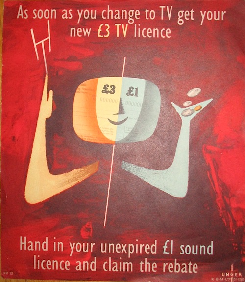
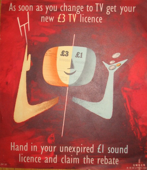
Hans Unger vintage GPO TV licence poster 1954
Hans Unger, GPO, 1954

Firstly, the post on Hans Unger and his life attracted an evocative reminiscence from D.E., which I definitely didn’t want to leave languishing at the bottom of an old post from last month.

I lived in Hans’s house in Muswell Hill with my parents from shortly before his death until the late 70s. Hans rented us the upstairs of his semi-detatched, furnished the whole place for us all the way down to the linens, plates, and cutlery, and was very kind. My mum, herself a Jewish escapee from Nazi Europe, and an artist, marveled at him and his work. It wasn’t long after we moved in, sadly, that we became concerned at not seeing him for a few days, and… well… led to his discovery with a bottle of sleeping pills by his bedside, with a goodbye note. Needless to say, shocking for a 14 year old. Still, we stayed in the house for about 4 more years, and had Hans’s giant outdoor mosaic to look at in the back yard, the stained glass over the front door, and several of his LT posters scattered throughout the house.

Hans’s spirit was complemented well by the woman who moved into the lower part of the house afterwards. I believe that she knew Hans, and herself was a Jewish South African illustationist – Lixi Darvall. She filled the house with art and laughter, but sadly, she too died while we lived there, in her case from cancer.

I remember the house well, full of art and artists, and of the odd collection of Jewish survivors, and am fond of all those creations by these wonderful people.

It’s wonderful to hear him remembered as a person as well as a designer.

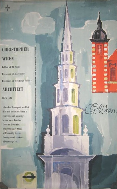
Hans Unger vintage London Transport poster Christopher Wren 1957
Hans Unger, London Transport (half of pair poster), 1957

But comments can also be corrections, and I was put right after complaining that a whole host of London Transport posters on eBay didn’t look linen mounted to me.  I now know that I was wrong, as Martin Steenson told me that old-fashioned linen mountings were often trimmed to the size of the poster.  Mike Ashworth gave an explanation of just why these particular posters might have been mounted this way, too.

I suspect many of the posters such as these currently on sale at Ebay have, over time, been released from the spares held by the old LT Publicity stocks by the LT Museum. I recall that many of these ‘information’ posters (rather then pictorial posters) were linen backed so that they could be trimmed and then used on a more semi-permanent basis at offices, stops, etc. A good example would be the LT ‘you are here’ posters (the area maps for tube stations) that were printed in 10s or 20s (as spares/replacements) and that were seldom replaced. The ‘spares’ were released to dealers etc by LTM some years ago and now show face on Ebay and at dealers – they’re often linen backed, either trimmed or not.

We have this one, also linen mounted, and now I know why it is the way it is, so thank you.

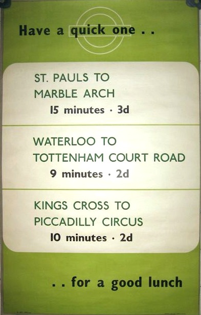
Vintage London Transport poster

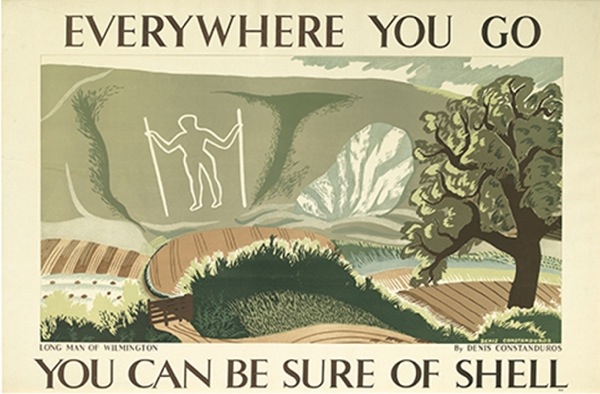
Finally, more of an addendum.  When I wrote about Denis Constanduros last week, I couldn’t work out whether the artist of the Shell posters was the same man who went on to adapt Jane Austen for the television in the 1960s.  It turns out – perhaps not surprisingly given his rather less than common name – that it was.

Denis Constanduros long man of wilmington better pic shell poster

I found out thanks to the wonder that is our local library system, which lets me order books online from about six different counties around.  So, from the depths of the Somerset Reserve Stacks, I called up My Grandfather by Denis Constanduros on the offchance that it might reveal something.  I can’t tell you anything about the merits of the book itself yet, but it did contain this biography of Denis himself.

Born in 1910, Denis Constanduros escaped a formal education and had, instead, a succession of private tutors.  He was only 15 when he sold his first cartoon caricatures of Wimbledon players and characters to the press.  Later, he went to Chelsea Art School and produced Shell posters at the same time as Graham Sutherland and McKnight Kauffer.

At the age of 27, he had his first radio play produced, although he had already collaborated with his aunt, Mabel Constanduros, on some of the Buggins Family sketches.

The mother of Denis Constanduros was a daughter of Richard Tilling of the successful Tillings Transport group.  The two daughters married two sons of the Constanduros family.  Denis’ father was an unqualified architect and a compulsive gambler, and his mother and father parted company after the First World War.

In 1938, Denis Constanduros married Barbara Neill and moved to Wiltshire.  Classified unfit, although he had at one time been mixed doubles champion of Portugal, he spent much of the Second World War working in the office of a munitions factory.  in 1948, he had his first television play accepted and My Grandfather was published.

The West Country radio serial Denis Constanduros created and wrote, At the Luscombes ran for 16 years. He adapted many classic novels for television during the 1960s and 1970s, including works by H.G. Wells, Henry James and Jane Austen, and died in 1978.

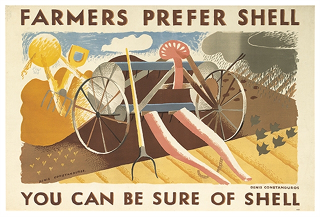
Denis Constanduros Farmers Prefer Shell poster

So now we know.  The Shell Art Collection at Beaulieu tells me that he did six artworks for Shell, but I haven’t been able to find images of any of the others.  Still, these two are so lovely that I, for one, am very happy to see them again.

Finally, a dilemma, posed by “mm” last week.

I’ve got mixed feelings about all this pre-auction promotion…Of course, if you alert me to something I’ve missed it’s great. But if you alert everyone else to something I’ve spotted and I’m hoping has slipped under everyone elses radar it’s not so good! I’m not sure what the answer is…Only discuss items post auction?

Now I have to admit that I have the advantage here, because if I spot a potential bargain coming up, I do only mention it once the auction has been and gone – as with the Constanduros above.  Which means that I can’t really judge this one fairly.  Although my personal suspicion is that no one takes the blindest notice of what I write on here, and one of these days I’m going to go back over all of the things I’ve highlighted on eBay to prove this, as I will happily bet that loads of them don’t even get a bid.

But what do you think?  Would you rather hear about auctions coming up and take the risk that I might reveal one of your carefully-spotted bargains?  Or would you rather I shut up until it’s been and gone?  And have you ever gone for something because I mentioned it?  Answers in the box below, if you don’t mind.

While I write this, incidentally, the Christies Auction is rattling away in the corner of Mr Crownfolio’s screen and it is officially Going Bonkers, with everything way over estimate.  More next week.

How to get there

It’s auction time again.  Or, as an email I received this week would have it, Reminder Poster Auctioneer.

“We are pleased to offer these posters at call prices far below their value.” they go on to say.  ” Don’t hesitate, come and discover for yourself – we are convinced that everybody will find what they are looking for.”

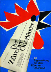
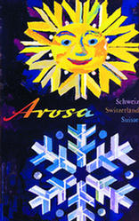
Sadly, we probably won’t though, because they are trying to entice us to bid at a Swiss auction, Swiss not only in the sense of being held in Zurich, but also in that it is almost entirely comprised of Swiss posters.  Hundreds of them.

Hotz Emil	Der Zürcher Oberländer 1961

1955 vintage travel poster	Hausamann Wolfgang Arosa

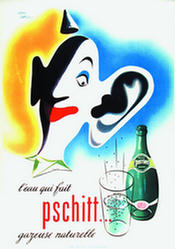
There are some nice things, like the Emil Hotz and Wolfgang Hausaman above, but nothing really to detain us.  Except of course, being British, a poster that says Pschitt.

Jean Carlu vintage Perrier poster 1952

It shouldn’t be funny, really, but it is.

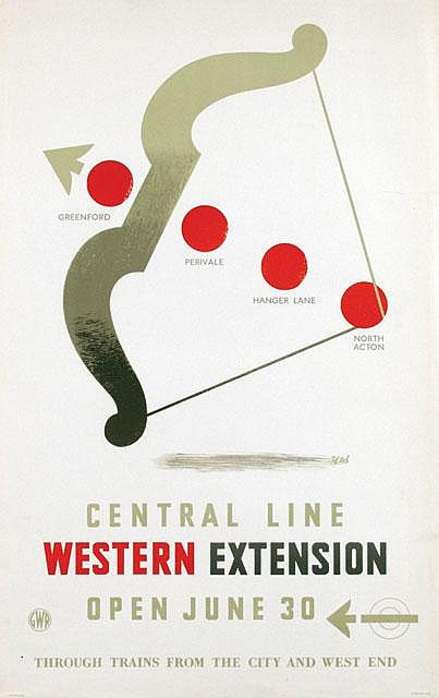
More locally, though, Cameo Auctions are having a travel, advertising, railway and everything but the kitchen sink auction next week.  And in amongst a soup of Olympics and Austrian travel posters are a couple of real gems.  This Zero from 1947 is my favourite.

Zero Hans Schleger vintage London Transport poster Central Line Western Extention

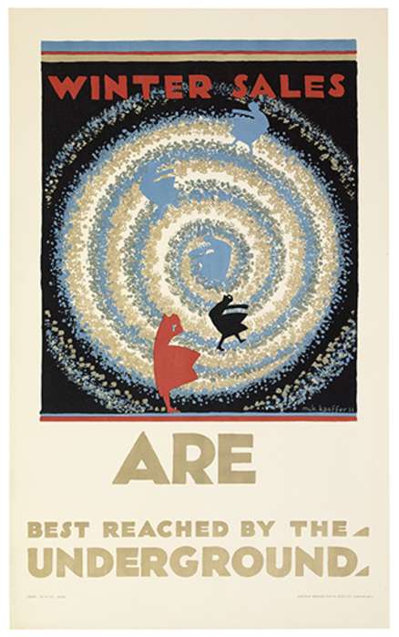
But for a real modernist design classic, you couldn’t do much better than this – McKnight Kauffer at the peak of his powers in 1922.

McKnight Kauffer winter sales vintage London Transport poster 1922

It has an estimate of £3-5000 though, so I probably won’t be bidding on it.

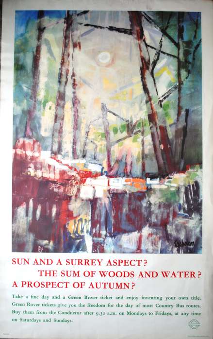
If that’s a bit too painful for your purse there are also a range of London Transport oddities for a more reasonable price (mostly under £100).  This 1962 poster by J E Kashdan is probably my favourite.

London Transport poster country bus routes surrey 1962 Kashdan

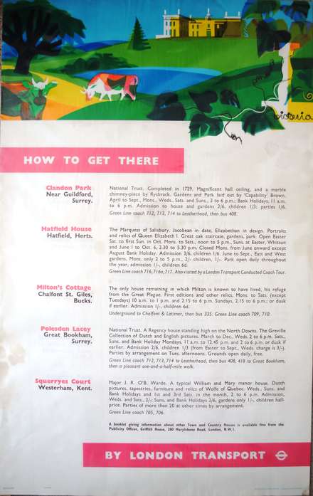
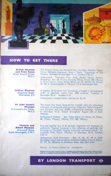
But there are also these three ‘How to Get There posters’ from the same period.

Victoria Davidson vintage London Transport poster 1961

Victoria Davidson vintage London Transport poster 1961

vintage London Transport poster Hans Unger

The first two are by Victoria Davidson, the last by Hans Unger.

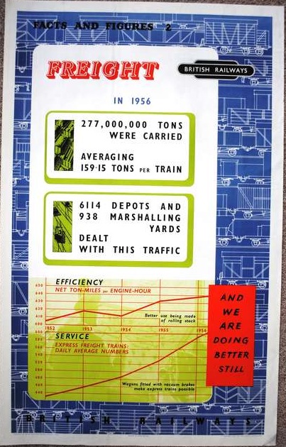
Plus this rather over-informative British Railways poster on the subject of freight, by Blake.

Blake 1956 vintage British railways poster freight

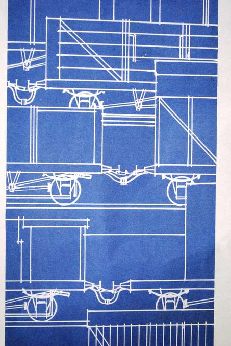
But what really grabbed my attention was the close-up of the background.  They really should release that as wall-paper.

Freight poster detail of train pattern

As if that wasn’t enough, Christies have also released the catalogue for their November poster auction.  At first glance, it looks as though the new higher minimum lot price has excluded almost anything that I might be interested in. But I’ll take a proper look at it over the weekend and report back next week.


1962 and all that

Our subject today is this, which arrived in the post the other day.
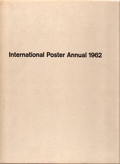
International Poster Annual 1962 - cover

It’s a book which does what it says on the cover. Posters, lots of them.  And most of them from 1960 or 1961.  Can’t argue with that.

Unfortunately, the vast majority are reproduced in black and white.  The only artists to earn some colour coverage for Britain are Ronald Searle and Hans Unger.
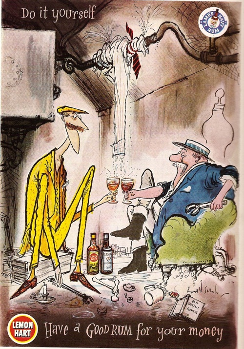
Ronald Searle rum advertisement from IPA 1962

Unger coach poster IPA 1962

(The Unger is a poster for coach travel, but you’d be hard pressed to guess that as there is no text in the reproduction at all.)

Sadly, most of the rest of the pictures are not only monochrome, but also small; I’ve found better images where I can but, as you will see, this hasn’t always been possible..

Now I do like these kind of annuals, and not simply because they’re a lovely wallow in a golden past of poster design.  It can also be thought-provoking to see a cross-section through time like this.  For a start,  you get a good overview of where design was.

And 1962 turns out to have been quite an interesting time; the whimsy of the mid to late 1950s hadn’t quite departed yet, but the tide of sans-serif modernism was definitely on the rise.  Which means that the Ronald Searle illustration above was paired with these three Alan Fletcher designs on the opposite page.
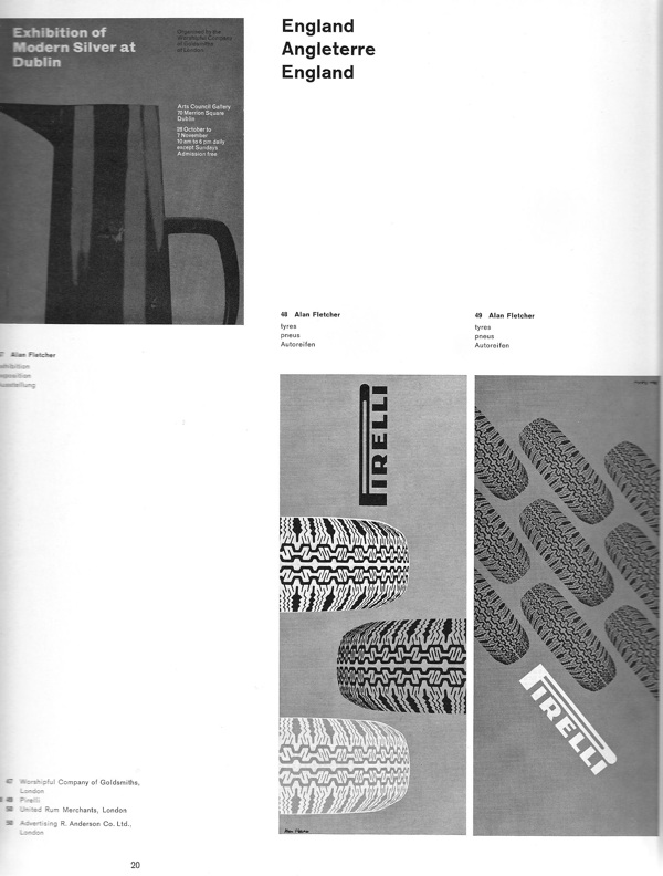
Alan Fletcher designs in IPA 1962

And London Transport could win commendations for this,
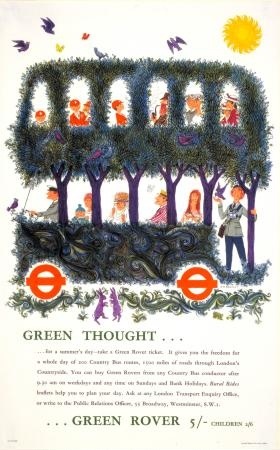
Bartelt vintage london transport poster 1960

as well as this – which was, incidentally, produced by an agency, S.H. Benson Ltd, rather than a designer.
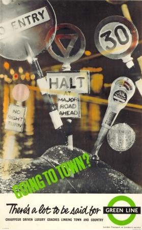
Vintage LT poster S W Benson agency, IPA 1962

The times they are indeed a-changin’.

But there’s another way in which this selection is worth our attention; the posters included are not simply an archaeological sample of posters past, they’re also a picture of what 1962 thought was important then.  Which isn’t always what you might expect now.

There are some things on which past and present do agree.  London Transport posters are good – these two are by Dorrit Dekk and G.B. Karo.
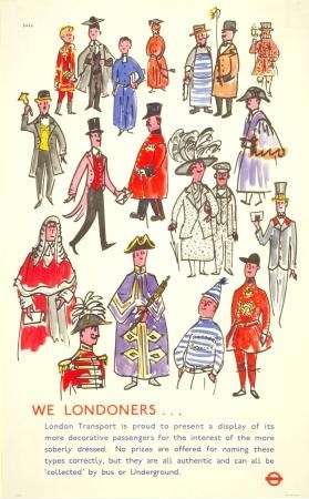
Dorrit Dekk london transport poster from ipa 1962

G B Karo vintage London Transport poster from IPA 1962

In total, over a fifth of the posters shown were designed for London Transport, which is an impressive proportion.  But just to prove that posterity (or archival survival) doesn’t always get it right, there are even more coach posters than there are LT exhibits (by one), including these two Royston Coopers.
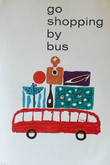
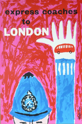
Royston Cooper go shopping by bus

Royston Cooper Express coaches to London

The same is true of the designers: Abram Games, Hans Unger, FHK Henrion and Tom Eckersley are also all, unsurprisingly, feted.

Abram Games conducted coach tours London Transport poster 1962

Abram Games for London Transport

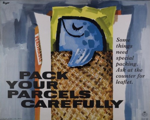
Please Pack Parcels Carefully Unger GPO poster

Hans Unger for GPO

But then there are a few designers included that might not be the first to spring into your mind today.  1962 really liked four of these coach posters by Christopher Hill.
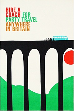
Coach poster Christopher Hill from International Poster Annual 1962

Coach poster Christopher Hill from International Poster Annual 1962

His stuff doesn’t seem to come up much these days(apart from at Morphets, of course, what didn’t) but these two are both available at Fears and Kahn for the right kind of money.

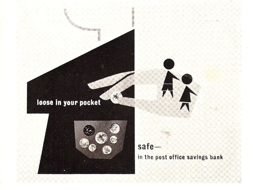
I’ve never heard of Donald Smith before at all, but he has five posters in the book in all, including these three very delightful posters for the Post Office Savings Bank below.  (Where is the Post Office Savings Bank archive, does anyone know?)
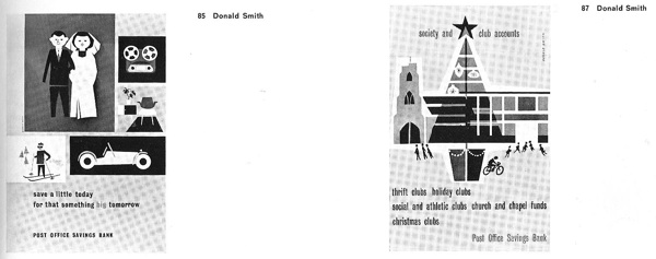
Donald Smith Posters in IPA 1962

Donald Smith posters in ipa 1962

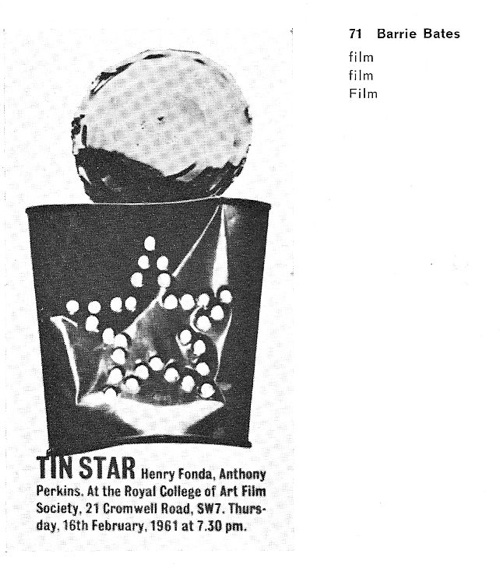
But most mysterious of all was Barrie Bates.  He had four posters included, and they’re all very striking.
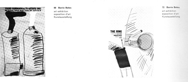
Barrie Bates posters in ipa 1962

Barrie Bates from IPA 1962

So why had he not turned up elsewhere?  It transpires that there was a very good reason for this.  Because in 1962, he became someone else altogether.
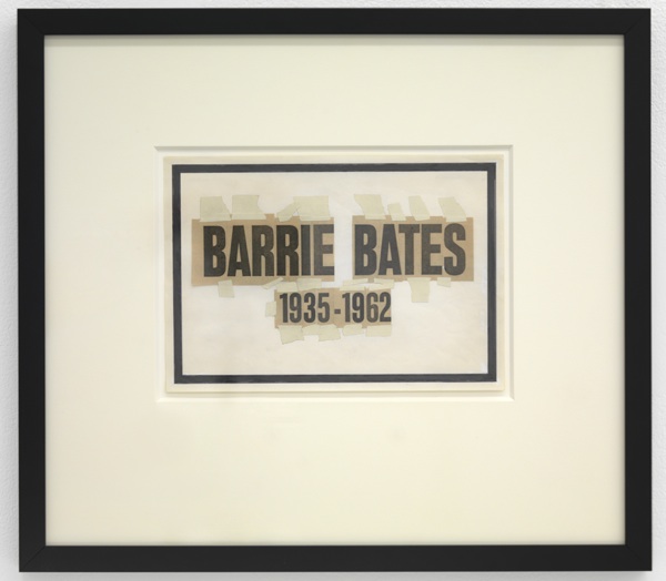
Billy Apple artwork

When he came to the end of his graphics course at the Royal College of Art, Barrie Bates bleached his hair and eyebrows in order to become Billy Apple, conceptual and pop artist extraordinaire.
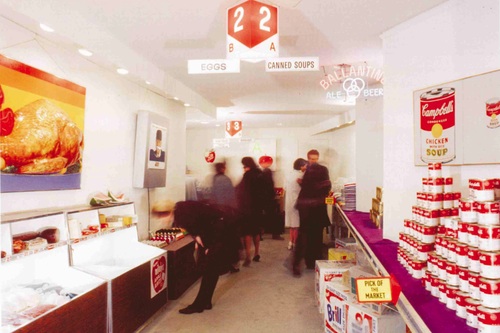
American Supermarket exhibition 1964

This is American Supermarket, the 1964 New York show, a landmark Pop Art exhibition.  With exhibits by, amongst others, Andy Warhol, Claes Oldenburg, Tom Wesselmann, Jasper Johns and one Billy Apple.

Apple/Evans was working for Madison Avenue advertising agents at the same time, which rather pleases me, as he was eliding the difference between product and art even more than the exhibition might have suggested.  And it’s also good to know, given how good his 1962 work was, that he hadn’t given up on graphics altogether.

P.S.  You’ll be pleased to know that Billy Apple is still working as an artist in Auckland, New Zealand, and there is plenty more information about him and his work out there if you’re interested.
A life in pieces

Once more, a post around a book, although a bit more tangentially this time.

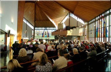
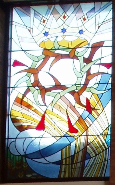
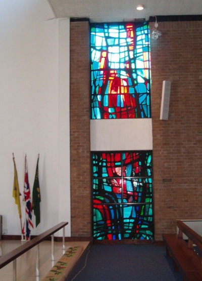
Mr Crownfolio is reading Electric Eden, a book about British folk music (in the widest sense as it seems to include the god-like genius of Julian Cope as well).  And when he was reading about Fairport Convention, he made a rather surprising discovery, which was that Richard Thompson (a.k.a. Mr British Folk) had, for a year, been Hans Unger’s assistant, making the windows for St Columba’s Roman Catholic Church in Upton-on-Chester sometime in the mid 1960s.  Here’s the church and all of the people.

St Columbas Catholic Church Upton on Chester wide shot

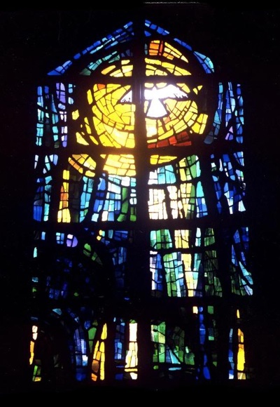
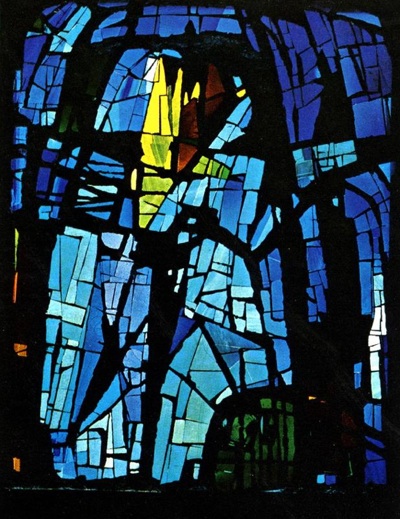
And here’s one of Unger’s windows.

Hans Unger window for St Columba's Chester

Now quite apart from the unsuspected folk/Hans Unger overlap, my surprise was also because I had no idea that Unger made stained glass.  He did do a lot of wonderful posters.  The best known are for London Underground, like this fishy gem from 1956.

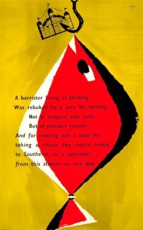
Hans Unger London Transport poster 1956

I’m also rather fond of this little GPO one from 1954.  Apparently this format was designed to be displayed in telephone boxes.

Hans Unger TV licence GPO poster 1954

These later (1962/1967) GPO ones were up at the most recent Morphets sale, and prove that his style evolved a great deal over the decades.

Hans Unger Post Early 1962 GPO Christmas poster

Hans Unger 1967 GPO Post Early Christmas poster

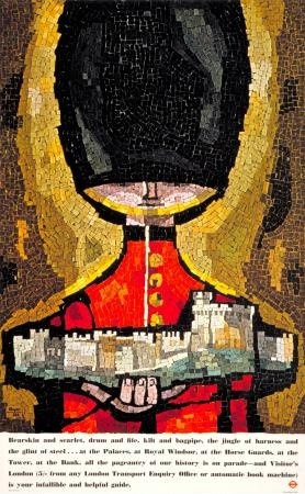
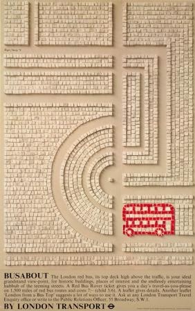
But perhaps I shouldn’t be amazed about the stained glass, because at the same time that he was producing the GPO posters, Unger also did a number of mosaic posters for London Underground,.  And mosaic is, after all, just a different way of making patterns with glass.

Hans Unger guard mosaic poster for London Transport 1962

Hans Unger Mosaic bus poster London Transport 1970

What’s interesting about these, is that they are jointly signed by Hans Unger and Eberhard Schulze.  Once again, it’s Richard Thompson who can tell us a bit more.

Hans was a terrific designer, who made some memorable posters for London Transport, amongst other things. He took his own life in the late 70s. I believe his partner, Eberhard Schultz, went back to Germany.

A sad ending.  But before that happened, it seems that they were very productive together.  Here’s St Stephen’s Astley, a Manchester church which was consecrated in 1968.

Unger Schulze St Stephens Astley window

Unger Schulze St Stephens Astley

And the chapel of the Rochdale Pallottine Convent.

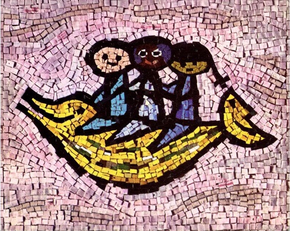
But the stained glass was clearly a sideline in comparison to their main work in mosaics.  Here’s a mosaic for UNICEF,

Unicef Mosaic Unger Schulze

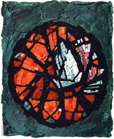
and a 1964 Christmas card for the BBC.

Unger Schulze 1964 Christmas Card for BBC

How about a mosaic of Elvis?

Unger Schulze Elvis mosaic

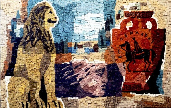
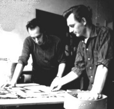
And this is just a tiny sample of what they produced together (there is a huge archive here if you want to take a look for yourself).  Their partnership became very well known, and their smaller works were apparently much in demand by collectors.  Here they are working together in about 1964.

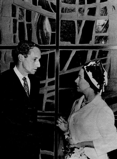
And here is Unger being presented to the Queen with some great piece in the background.
He looks rather worried really.

So, a whole side of Hans Unger’s life and work that I had no idea about.  But there’s a rather odd coda too.  Sadly, soon after Unger’s death, Eberhard Schulze injured his back and had to give up mosaics.  But he clearly wasn’t someone who relished early retirement.

He went on to develop a successful career as a specialist aquarist, becoming England’s leading discus fish breeder and even carried out aquarium installations for the rich and famous, such as the Saudi Royal Family and the Sultan of Brunei. He now lives in Nonthaburi in Thailand.

If anyone can add to this, I’d love to hear from you, as I feel rather as though I’ve only just scratched the surface of the subject here.  And also, if anyone can explain why all these new churches were being built in the north, I’d also love to know.

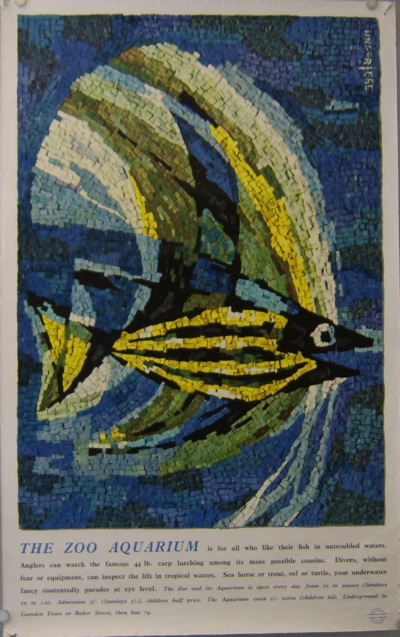
And if you’re inspired enough to want to buy one for yourself, Martin Steenson at Books and Things has this Unger/Schulze fish poster for sale for just £30.

Unger Schulze London Transport poster fish

It’s a bit battered, but still lovely.