Be really cool, man, archive

The recent announcement from the British Postal Museum and Archive announcing that they have upgraded their online catalogue may not have been the most retweeted 140 characters in the history of Twitter.  But the news is actually quite exciting.

On an entirely practical level the images are now larger than a postage stamp. The particular joy of this is that I can now get a proper look at the van posters, which are some of my favourite things in the world.

henrion-reindeer-long

I wonder if any of these have survived outside of the BPMA’s collections?  I’ve never come across one out in the wild.

1951 Alick Knight post early robin poster GPO

More than that, a whole lot of new material also seems to have been catalogued for the first time.  I had no idea that Barbara Jones had ever designed a poster for the GPO, but the evidence is there in full colour.

Barbara Jones GPO poster mermaid inland postcards

It’s from 1956, since you ask.

In addition, for the first time the catalogue now includes some Post Office Savings Bank posters.  This is clearly still a work in progress as, currently, there’s nothing in there by Daphne Padden and she did some of her best work for the POSB.

Daphne Padden post office savings bank poster with rabbits and owl.

What is in there, though, when you search for POSB posters, is a lot of work by Stan Krol, quite a bit of which I’ve never seen before.

Stan Krol post office savings bank poster 1960 guitar

With both posters and artwork included.

Stan Krol eureka gpo poster artwork 1960

All of which is a salutary reminder.   It’s not just that archives themselves are important, but also the way they are arranged and made accessible.  Because both of these things can change the way we think about the past.

Let’s just start with the contents.  A couple of years ago, I wrote about Stan Krol, saying that I couldn’t find out that much about the man or his output.  Obviously, pages of Stan Krol posters in the BPMA catalogue rather changes things.

stan krol telephonists job artwork GPO 1951

Morever, in the new, exciting BPMA catalogue, the results also come up differently.  Back in the day, the archive used to sort the results, so that the artwork would come up first, then the posters.  So I would skip through the artwork, and just look at the posters instead.

1968 Tom Eckersley detector van van poster

But now the two come up intermingled, which means that I don’t miss items like this Tom Eckersley internal poster, which shows as artwork but not as finished poster.

Tom Eckersley GPO internal poster mailbags 1950

All of which will, I am sure, make other differences to the way I think as well, even if I I don’t entirely know what the results will be yet.  Watch this space.

The biggest change of all, of course, is just the fact that online archives exist in the first place.  This blog, and I’m sure much else besides, simply wouldn’t exist without them.

GPO Gay Christmas van poster

If I had to travel from London to York and all points in between simply to see posters, it’s just not going to happen without a private income or a job that is prepared to pay for me to do it.  Neither of which things exist.  So online archives enable me, and many many other people, to think more widely and to see more points of reference.  But there is another more subtle benefit too, which is that they also allow people like me to choose.

Prior to this, the only way I would have been able to see any GPO posters would have been either in auction catalogues, or in books.  In each case, the posters would have been pre-selected.  But give me an archive and a computer, and I am at liberty to decide which items I find interesting.  So, perhaps, I am less likely to fall in with the accepted canon of ‘good’ posters as a result, and history ends up being written slightly differently.  Which is clearly a good thing.

Schlegel export drive gpo poster 1950

So hurrah for the lovely new BPMA catalogue and archives in general.

Games Giant postcards van poster 1961

But wonderful as all of this is, we mustn’t let this blind us to the fact that not everything is archived.  This may sound like a truism but it’s actually a really important point, and it’s something I think about a lot in connection with Daphne Padden.

Daphne Padden POSB poster knight

Her work has been massively under-recognised over the years, and her profile still isn’t as high as it should be.  Now there were plenty of reasons for this – and being a woman working on the outskirts of London must have played a considerable part.  But a big part of it has to be because she just worked for the wrong people.

Daphne Padden lytham st Annes British Railway poster

Railway posters were sold and collected when they were produced, and nowadays they are traded at auction, reproduced in books and as fridge magnets, and kept in a socking great archive in York (now there’s an interface that could still do with taking a long hard look at itself).  But she only ever did a few of those.

Daphne Padden isle of Man BRitish railways poster

Instead her main customer were the coach companies.  And where is the coach archive, I hear you ask?  Well exactly.

Daphne Padden Royal Blue vintage coach poster sailor 1957

There isn’t a collection of these anywhere; hardly any survive and it’s possible that the most comprehensive selection (now that the Malcolm Guest collection got sold) is in our spare room.  Which is ridiculous.

Coach tour rabbits Daphne padden coach poster

And because my spare room doesn’t have an archivist or – more to the point – doesn’t actually contain more than a couple of dozen coach posters when hundreds were produced, people don’t know about these designs.  So they don’t get reproduced in books, or as fridge magnets, and in the end they disappear from view.

Daphne Padden Southend coach poster

Along with the designers, like Daphne Padden, who produced them.

Spring coach poster Daphne Padden

So while we can have a lot of fun with the archives that are there, it’s always worth using them with half a mind to the ones that don’t exist.

See London

Onwards and upwards then, onwards and upwards.   Which today means London Transport Auctions, whose next auction is on November 1st.

As ever, along with the opportunity to buy a conductor’s hat or the radiator grille from a Routemaster, there are also a fair number of posters, some of them being rather good.  Really rather good – I would quite happily buy any or all of the posters on today’s blog, the only exception being the one we already own.  So this is going to be a relatively straightforward scoot through what’s taken my fancy, with the posters being allowed to speak for themselves.  For a change.

As I’ve been mentioning John Bainbridge quite recently, shall we start with him?

Original 1953 London Transport double-royal POSTER 'Buckingham Palace' by John Bainbridge (1919- 1978) who designed posters for LT from 1953-1957.
John Bainbridge, 1953, est. £75-90

Original 1956 London Transport double-royal POSTER 'Epping Forest' (Dick Turpin) by John Bainbridge (1919-1978) who designed posters for LT from 1953- 1957.
John Bainbridge, 1956, est. £40-60

And look, we have not only dates but proper estimates too from these lovely people.  Although the estimates, even allowing for some edge wear, do seem quite conservative, so it will be interesting to see what these actually go for.  I’m less likely to live with a royalist guardsman, but I’d happily pay £60 for Dick Turpin any day.

There are a couple more posters from the same year as the second Bainbridge, both excellent, which makes me wonder if someone went on a buying spree that year, and the results have just emerged from the attic.

Original 1956 London Transport double-royal POSTER 'The Tower' by Hans Unger (1915-1975)
Hans Unger, 1956, est. £75-100

Original 1956 London Transport double-royal POSTER 'Visitor's London' by Frederic Henri Kay Henrion (1914-1990) who designed posters for LT from 1942-1956.
F H K Henrion, 1956, est. £75-100

I have, briefly, written about this Henrion series before, but they deserve some more attention really, for being both insane and at the same time very, very ahead of their time.  But now is not the moment.

And that’s not the end of the 1950s classics either; there are also these two to take into consideration.

http://vintageposterblog.com/2010/09/17/ahead-of-his-time/#.VFEX_4d3agQ
Victor Galbraith, 1959, est. £75-100

 Original 1953 London T ransport double-royal POS TER from Coronation Y ear 'Kensington Palace' by Sheila Robinson (1925- 1987) who designed posters for L T 1951-53.
Sheila Robinson, 1953, est. £70-90

Or if you fancy something smaller, there is this Harry Stevens bus poster for the Lord Mayor’s Show.

Original 1959 London Transport POSTER 'Lord Mayor's Show' by Harry Stevens (1919-2008)
Harry Stevens, 1959, est. £50-100

On a price per square inch value (I’m estimating here, I haven’t actually worked it out) I don’t think that Stevens is worth that much more than Unger – or indeed than most of the posters I’ve already mentioned above.  But, as ever, I am quite prepared to be proved wrong.

Now I do tend to prefer post-war graphics but I’m not leaving out the earlier posters from the sale, it’s just that there really are very few of them in comparison.  There are one or two wartime ones, of which this Bruce Angrave blackout poster is probably my favourite.

Original 1942 WW2 London Transport POSTER 'In the Blackout.....make sure it is the platform side' by Bruce Angrave (1914-1983)
Bruce Angrave, 1942, est. £75-125.

Plus there is also this rather lovely little 1938 bus poster, but I’m sure I like it because it’s not so much of the thirties as pointing the way forward to the Festival of Britain styles of the early fifties.

Original 1938 London Transport POSTER 'A.A.A. Championships, White City' (Amateur Athletics) by Harry Blacker (1910-1999) who designed posters for London Transport in 1938/39.
Harry Blacker, 1938, est. £75-125

Apparently after being a designer before the war, Blacker gained fame in the 1960s as a cartoonist, particularly for the Jewish Chronicle.  But he did a number of posters, so I will keep an eye out for him.

Meanwhile, these were issued in the early 50s, but aesthetically are a product of the decade before.

Pair of original 1951 London Transport POSTERS 'Men Conductors Wanted' & 'Women Conductors Wanted' featuring an illustration of a speeding double- deck bus with a conductor hanging on to the platform pole. By an unknown artist.
Anon, 1951, est. £60-75

And obviously, you need two, because no man would become a bus conductor if the poster were addressed to women, or vice versa, would they.

There are, as ever, more posters, so do go over and have a look at their catalogue.  Meanwhile, I will be back next week with the Christies auction, and, possibly, some more thoughts too.


Designer’s eye

So here I am submerged in house renovations when there are poster auctions which I need to tell you about.  First in the line, mainly because it’s in just a few days time, is the forthcoming Swann Auction of Modernist Posters.

Now, with their being in New York, there are usually only one or two items of interest for us in a Swann auction, things like this, which although wonderful are somewhat outside the Quad Royal remit.

WALTER ALLNER (1909-2006) SUISSE ÉTÉ / WAGONS - LITS // COOK. travel poster
Allner, est. $1,500-2,000

HERBERT MATTER (1907-1984) ALL ROADS LEAD TO SWITZERLAND. 1935 travel poster
Matter, 1938, est. $2,000-3000

There are also a set of Theyre Lee-Elliott posters for the embryonic British Airways.

THEYRE LEE-ELLIOTT (1903-1988) BRITISH AIRWAYS / PARIS & SCANDINAVIA. 1938. Travel poster

M26145-31 001

M26145-29 001

All three are from 1938 and estimated at $800-1,200.  While we’re on the subject of British Airways, there is also this, which is apparently a very early example of photography in an airline poster.

DESIGNER UNKNOWN IT'S SMART TO FLY BRITISH AIRWAYS. Circa 1938. travel poster
Anonymous, c.1938, est. $800-1,200

If only flying were so glamorous now.

The main reason we’re here, however,  is lots 185-222 which are, in the main, from the collection of F H K Henrion.  There is one piece of his own work.

FREDERIC KAY HENRION (1914-1990) ARMY EXHIBITION. 1943. propaganada poster
F H K Henrion, 1943, est. $600-900

But what’s really going on is Henrion looking at the work of his fellow designers.  So there are examples from Reginald Mount, Pat Keely, Hans Schleger, Eckersley and many others – so many that I can’t include all of the ones I like.

REGINALD MOUNT (1906-1979) BONES MAKE EXPLOSIVES. Circa 1944.  world war two poster
Reginald Mount, 1944, est. $600-900

PATRICK COKAYNE KEELY (?-1970) GEARWHEELS CATCH CLOTHES / KEEP YOUR GUARD ON. 1941.  rospa poster
Pat Keely, 1941, est. $400-600

ZERO (HANS SCHLEGER, 1898-1976) NATIONAL ASSETS / BE SPARING IN THEIR USE. Circa 1940. GPO poster
Hans Schleger, 1940, est. $400-600

As well as a substantial selection of Abram Games’ designs; I don’t know if they were friends or whether Henrion was a particular admirer of his work.

ABRAM GAMES (1914-1996) RADIOLOCATION. 1941. World war two poster
Abram Games, 1941, est. $2,000-3,000

ABRAM GAMES (1914-1996) CIVIL RESETTLEMENT UNITS. 1945. army poster
Abram Games, 1945, est. $700-1,000

ABRAM GAMES (1914-1996) MEN LEAPING AHEAD IN INDUSTRY READ THE FINANCIAL TIMES EVERY DAY. 1955. poster
Abram Games, 1955, est. $2,000-3,000

I’ve even found a rare example of an Ashley Havinden poster.

ASHLEY HAVINDEN (1903-1973) KEP / DELICIOUS WITH FISH. Circa 1950.
Ashley Havinden, 1950, est. $400-600

Not everything is by a big name, either.  This very striking wartime image is simply by A.R., about whom I can tell you nothing.

A.R. (MONOGRAM UNKNOWN) POST OFFICE SAVINGS BANK. Circa 1942. poster
A.R., 1941, est. $500-750

Henrion clearly never stopped looking at posters and thinking about them as long as he worked, because there are a host of later examples too.

ALAN FLETCHER (1931-2006) D & AD 21ST. 1983. poster

So I strongly suggest you go over there and take a peek, not only for the insight into a designer looking, but also because Swann’s catalogues are properly written and informative.

MANFRED REISS (1922-1987) BE COURTEOUS. Circa 1955.  ROSPA poster
Manfred Reiss, 1955, est. $400-600

And now if you’ll excuse me, I have to order a skip.

Don’t mention (all of) the war

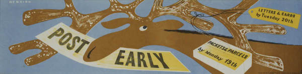
Back in my student days, now rather some time ago, I was sent to chaperone some Belgian friends of the family when they made a short visit to London, to assist with the language and the mysteries of the London Underground. There are three things that I remember clearly from this trip: a meal out at an Aberdeen Steakhouse (an experience I have never found it necessary to repeat), seeing what was apparently ‘the last bomb site in the City of London’ on a guided tour, and taking them to the Imperial War Museum. From the last I brought back souvenirs, postcards of World War Two posters.

Vintage World War Two Make do and Mend poster c1943

This has to have been one of the experiences which turned me into a poster collector, although at the time I had no idea that such a thing was even possible. I just bought the postcards and stuck them on the wardrobe door in my student rooms.

James Fitton Turn Over A New Leaf vintage world war two posters

I have said this before, but it is very satisfying to now have a genuine copy of the James Fitton hanging on the wall when it was one of the ones which I had picked out as a postcard.

But this isn’t just an anecdote about one of the ways in which I discovered posters, I remembered it because I’ve been thinking about how World War posters are used.  Both then and now, it seems that we only want to see in them a highly selective version of the Home Front experience. This is something I say about poster history often enough, but I do find these choices and omissions particularly revealing.  There were a huge number of posters produced during the war, and so the relatively few we pick out end up telling us as much about ourselves and our present day anxieties as it does about the war.  After all, why would we need propaganda anyway these days?

Churchill speech vintage world war two propaganda poster

That there is a ‘myth’ around this era, a vision of World War Two as the high point of the British nation when everyone pulled together selflessly and class-consciousness disappeared in the heat of the battle, is not a new idea. It was first expounded by Angus Calder in The Myth Of The Blitz in 1991 and is now an established part of historical thinking about the period.

Myths don’t arise just by accident, though, they always have their uses. Calder, in his preface, is completely open about why he wants to question the established story of Britain during the War,

My anger, firstly over the sentimentalisation of 1940 by Labour apologists, then over the abuse of ‘Churchillism’ by Mrs Thatcher during the Falklands War, led me to seek, every which way, to undermine the possibility of the mythical narrative.

Even though Calder exposed its mechanics, the myth has refused to disappear. The darkest days of World War Two still represent an apotheosis of Britishness, and one of the ways by which we maintain this idea is through the Home Front posters that we choose to like.

People certainly do like them. Not only do they fetch increasingly high sums at auction when they appear, but a single Home Front poster, Keep Calm and Carry On, has become the Athena poster for the start of the twenty-first century, reproduced, parodied, everywhere. So why do we want to keep repeating these stories, and what use are they to us now?

Keep calm and Carry on original image 1939 not the reworking

The core belief is the same as it was when Calder described it:

a myth of British or English moral pre-eminence, buttressed by British unity.

This is still the ideal which has singlehandedly sold almost every copy of Keep Calm and Carry On. But there is not just pride in our achievements here, behind it also lurks anxiety. We wouldn’t need to keep reminding ourselves that Britain was once great if that was still indisputably true. The fear is now that we may be a second-tier nation, dependent on others; perhaps also we are afraid that we have lost our traditional grace under pressure. Perhaps, even, we are afraid that if we were tested so severely again we might be defeated this time. And so we need to keep reassuring ourselves with the story of the war and how well we did.

These are thoughts which are not often articulated elsewhere in our culture. So the posters function like dreams, dragging thoughts up from our subconscious which are not quite safe to express in any other ways. Like dreams, they are visual more than verbal too, so we don’t have to put into words the ideas they express, which might force us to analyse these uncomfortable truths.

Behind other posters lurk other fears too. Still much-loved are those for the various kinds of salvage and austerity; we repeat the slogans and reprint the images.

Mrs Sew and Sew Make do and mend vintage world war two propaganda poster

Some of these, particularly ‘Make Do and Mend’ weren’t in fact popular then – housewives felt that they were already doing as much as they could to reuse and repair and some of the tips were therefore a bit insulting. But they are popular now. Even as we buy more phones, more fast fashion and throw more food away, we also know that we consume too much and waste too much. Perhaps we would be better people if we did not, perhaps we might even be more British.

Any Old Iron salvage vintage world war two propaganda poster

The other really popular category are those about food, and in particular, growing your own.  It’s no surprise really that the ‘Dig for Victory’ posters are popular in an era where allotments are over-subscribed and the provenance and Britishness of food is becoming more important.

A E Halliwell vintage world war two poster Dig for Victory

Their message seems quite clear if we want to read it, that we are too dependent on the supermarkets, we don’t know where our food comes from, that self-sufficency has to be a good thing.

WW2 pig food vintage propaganda poster

But there’s also a deeper undertow at work here. One of the cores of Britishness is an identification with the land and the countryside (see David Matless and Patrick Wright if you want to read some much deeper thinking than mine on the subject). So there is also a fear that as we become more urban, more detatched from the land and its produce that we are losing sight of our essential selves. If we all had a spade and a piece of soil, might we also be better Britons too?

WW2 dig for victory vintage photographic propaganda poster

At this point you may be thinking, yes, well, this is all fine and good but isn’t it reading just a bit much into some old posters which people like because they are pretty and cheerful? Another way of making the point, though, is to look for the absences, the posters that we don’t tend to look at and remember.

A fascinating example of this came with the MoMA exhibition about kitchens earlier this year, which included a set of British Home Front posters by Henrion and the mysterious Herbert Tomlinson.  They don’t tend to get reproduced much in this country, even though they are on the perennially popular subject of food.

Anti vermin poster world war two home front propaganda Herbert Tomlinson

World war two anti vermin propaganda poster home front herbert tomlinson

MoMA has as its founding principle a wholly other myth, which is the inescapable rise and total superiority of International Modernism. These posters (unlike the vast majority of Britain’s wartime output) fit into that very nicely, so the museum has collected and displayed them. Over on the other side of the Atlantic, though, this is not how we want to remember the war, as a grubby fight against vermin in bomb-damaged homes.

Two posters by Henrion telling you to turn nice fluffy rabbits into PIE

And we certainly don’t even want to think about eating rabbits which have, in the last seventy years, almost completely made the journey from food group to pet. So we have edited them out of the collective record (despite the fact that these are all in the IWM collections too).

The same might be said about posters informing people about VD. This design by Reginald Mount is a design classic, but that still doesn’t mean you’re likely to see it republished very much.

REginald Mount VD vintage world war two propaganda poster

Nor, indeed, this one, for slightly more complicated reasons. The lines are from G.K. Chesterton, the sentiment almost impossible to imagine nowadays.

Early world war two vintage propaganda poster oddly indeed

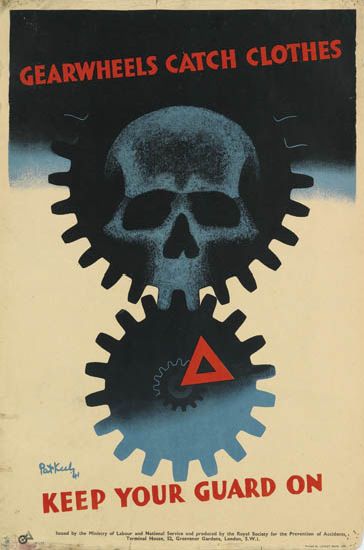
A more subtle example is provided by this Zec poster, which is one of the ones I bought as postcards from the IWM all those years ago.

Zec women of Britain come into the factories vintage world war two home front propaganda poster

Then, it was very popular, but this was a time when feminism was more vocal and more active, campaigning for greater workplace equality for women rather than proposing pole-dancing as a form of liberation. So the war could and was represented as a time of emancipation for women when they could do any job they chose, including the dirty factory ones. Nowadays we believe, whether it is true or not, that this particular battle is over and women can do whatever they want; there is no anxiety there any more so we no longer need the poster to express our thoughts and it has sunk below the horizon once more. Its Sovietesque stylings may also have been its undoing too, now that there is little of the heroic to be found in Communism any more, not even for students.

Sometimes the myth requires that we ignore the evidence which is in front of our eyes.  One of the reasons that we want to remember the Home Front is the sense of collective effort, the idea that every single person’s attempts to salvage or save or grow some greens made a difference to the common cause.  It’s a satisfying idea, and not a belief which is easy to have today.

But at the time, the British self-image was very much one of individualism, in clear contrast to Germany, where the individual was subsumed into the masses of the Nazi state.  So if you look at these, and indeed almost any World War Two poster, what you will find time and again is a single person (or indeed elephant) doing their bit out of choice, not as part of a mass movement.

Eckersley Lombers green vegetables poster vintage world war two propaganda

Even in the case of the forces, where you might think that it was good to show that we did have plenty of man-power, the image is much more likely to be of a single ship than a whole marching platoon of men.  The poster below is perhaps one of the more populated ones that British propaganda ever produced.

The Few Vintage world war two propaganda poster

But even then, the men are not only clearly represented as individual people, but also characterised as ‘The Few’.  However much we like the idea of the wartime social spirit, we’re never really going to find it in the posters.

A more complex example are the set of posters by Abram Games imagining post-war life in comparison with what had come before. They are (and I will come back to this aspect of Games’ work during the war another day) quite exceptional, in that generally British posters and propaganda avoided considering the world after the war had ended.

Vintage World War Two ABCA poster Abram Games your Britain fight for it now

The poster of Finsbury Health Centre below is particularly famous, mostly because Churchill very much took against it. He ordered the poster to be suppressed, complaining that it was a ‘disgraceful libel on the conditions prevailing in Great Britain before the war’.

Abram Games abca Finsbury Health Centre rickets vintage ww2 poster

It could be argued that it was the controversy which made the poster’s mark on history. But other poster controversies during the war ended up forgotten; these posters are remembered because they have important resonances as well. For a long time World War Two has been seen as the crucible which dissolved class consciousness and lessened ingrained inequalities, an achievement which was an essential part of the myth. For Calder, this was one of its redeeming qualities.

…at least the Myth had fostered the notion of the mutual responsibility of all for the welfare of all.

But there are not many posters which reflected this ideal, so the few which do are particularly valuable.

Vintage world war two poster ABCA Abram Games

Or at least they were. We live in a time when many of the egalitarian achievements of the post-war reconstruction – universally available higher education, council housing, a moral investment in state education and social care – are being undone, will these posters in their turn disappear from view? I hope not. Now more than ever we need the reminders that these values are still very much worth striving for.

(Almost all the images are from the Imperial War Museum collections on VADS).

life : henrion : rabbit

I called up this book out of our library’s reserve stores the other day (you can easily enough find it on Amazon if your library isn’t so obliging).

World War Two posters book cover Imperial War Museum 1972

It’s from 1972, so I wasn’t hoping for too much from it, but actually I was surprised.  There’s a short introductory essay, but then the bulk of the book consists of short biographies of some of the designers who produced propaganda posters during World War Two – not just those from the UK but also Russians, Europeans and Americans as well.

Reading them has been a salutary lesson for me.  I tend to assume that all of the knowledge in the world is out there on the internet for me to find.  And if it isn’t there, it’s not known.  Well I’m wrong.  Because there is plenty of information in here which is new to me.  Like a proper biography of James Fitton, for example, which told me that he left school at fourteen and worked on the docks in Manchester, attending art school in the evenings.  All of which makes me admire him even more.

James Fitton vintage London Transport poster World War Two Moving Bus

So today’s post was going to be all about the these biographies.  But then I got distracted by this.

F H K Henrion vintage WW2 propaganda poster rabbits can be fed on

Which is fabulous, and by FHK Henrion.  In fact it’s so fabulous that it’s currently on display at MoMA in New York, along with some of its brethren. (Well rabbits will breed, won’t they).

F H K Henrion big rabbit vintage World War Two Home Front poster

The exhibition is Counter Space : Design and the Modern Kitchen and if I could get over to New York to see it, I would.  Every bit of it, from early functionalist design to artworks about domesticity sounds brilliant.  And it’s on until early May, so if you do get the chance to go, please do and let me know all about it.

But for the purposes of Quad Royal, the really interesting thing is that there is a whole section of British Home Front posters about food.  Hence Mr Henrion and his rabbits.  There are in fact three, as they also have the pair of the first poster, which explains why that rabbit is looking behind so nervously.

vintage World war Two poster FHK Henrion rabbit pie

Now under normal circumstances I’d just go on about these, but MoMA themselves have written an excellent blog post about these posters, which I really couldn’t improve on.

But fortunately for those of us who aren’t going to make it to New York this month, there is at least a handlist of all of the exhibits online.  Which means that I can tell you that, in addition to the Henrions, they are also exhibiting a few old friends like the Vegetabull.

Lewitt Him Vegetabull poster world war two home front

Which means that we have something hanging on our wall which is also up in MoMA.  Get us.

In addition, though, the exhibition is displaying a really intriguing set of posters which I have never seen before.  Herbert Tomlinson rat posters from MoMA Counterspace

By Herbert Tomlinson about whom I know nothing.

Herbert Tomlinson rat poster world war two home front

This pattern of absence and presence is really interesting.  On one hand, it’s easy to see why these posters have ended up in MoMA; they fit very easy into the narrative of International Modernism which the museum itself has done so much to construct.

Herbert Tomlinson mice poster MoMA more ratty micey propaganda stuff

What I understand less is why these posters seem to have disappeared over here.  This may be no more than random chance: these weren’t posters that anyone much wanted to collect or keep, by a designer that no one much remembered so they disappeared into oblivion as soon as they were torn down.  Or perhaps a rat and mouse-infested world isn’t how we want to remember the war?

Whatever the reason, it’s yet another reminder of two important facts about posters.  One is that the history which does exist is very much constructed, and that the story may differ wildly depending on who’s doing the telling.  The other is that all of these histories are made from a very partial and unrepresentative sample.  So few posters survive, and for such random reasons, that it will perhaps never be possible to tell the complete tale of posters at any point in time.  But that doesn’t mean we can’t have  a lot of fun trying in the meantime.

Over-modern and over here

An interesting comment appeared a week or so ago on a older post about Beverley Pick.

He was a man.  Bless him… He was my uncle and a very clever man..He also did the original Moby Dick… Beverley was originally from Austria and lived many years in Sunningdale during the winter. Autumn he would visit his House in Cork and in his latter years he and his wife would live in France where they had a gorgeous home. He is now buried in the Churchyard at Sunningdale. There was so much to this man we will never know it all…

I’ve written to Odile Walker, who posted those intriguing memories, and I hope she’ll come back and tell us more.  But in the meantime, one thing that I never knew stands out.  Despite his British-sounding name, Beverley Pick was an emigré from Austria.

Beverley Pick pig waste vintage WW2 propaganda poster
Beverley Pick, WW2 poster

Now, I’ve been thinking for a while about the degree to which post-war British graphic design was shaped by people who were one way or another foreigners. There are so many of them that it would be hard not to really.  But finding that this is also true for Beverley Pick has pushed me into action.

So here is a roll call of as many emigré designers as I can think of who worked in the UK in the decade or so after the war.  It’s an impressive selection. With, for no particular reason other than that’s the way it turned out, lots of GPO posters as examples.

Andre Amstutz

Whitley bay poster Andre Amstutz vintage british railway poster
British Railways, 1954

Dorrit Dekk

Dorrit Dekk vintage GPO wireless licence poster 1949
GPO, 1949

Arpad Elfer

Arpad Elfer design for DH Evans poster 1954
D H Evans, 1954

Abram Games

Abram Games vintage London Transport poster at your service 1947

F H K Henrion

Henrion Artists and Russia Exhibition 1942
1942

H A Rothholz

H A Rothholz stamps in books poster vintage GPO 1955
GPO, 1955

Pieter Huveneers

Pieter Huveneers fleetwood poster 1950 vintage railway poster
British Railways, 1950

Karo

Karo vintage GPO soft fruits by post poster 1952

Heinz Kurth

Heinz Kurth design for Artist Partners brochure divider
Artist Partners

Lewitt-Him

Lewitt Him Pan American vintage travel Poster

Manfred Reiss

Manfred Reiss vintage GPO poster 1950
GPO, 1950

Hans Schleger

Hans Schleger vintage GPO ww2 poster posting before lunch
GPO, 1941

Hans Unger

Hans Unger 1951 vintage GPO poster
GPO, 1951

Together they make up pretty much half the content of this blog most months.  And I am sure that there are plenty more I have left out – please feel free to remind me who they are.

That’s all I am going to say for now, partly because this is quite long enough as it is, but also because I am in the process of working out what the story might be.  So if you have any thoughts on why British design became such an emigré profession, I’d love to hear those too.