String Theory

This has recently arrived in the post, contradicting my previous assertion on here that there are no more eBay bargains to be had.

Lander british railways luggage poster
Admittedly it is not an outstanding piece of graphic design history (although I quite like it) and is rather battered round the edges too.   But it’s by Lander, which is always a good thing, and it’s also a rather intriguing bit of social history.  Because it’s a reminder of the days when things had brown labels and were tied up with string, or in this case cord.

Nobody does that any more, do they?  I have sometimes been known to wrap a parcel up in brown paper, but I don’t think I’ve ever tied it up with string.  This is something I’m sure that my mother could do though, coming as she does from an age before jiffy bags and sellotape.

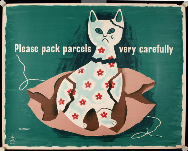
Without all these modern parcel technologies, it was clearly possible to wrap a parcel very badly.  At least that’s the only conclusion I can arrive at from the sheer volume of posters that the GPO put out on the subjects.  Most of these are quite general, and I’ve written about the Properly Packed Parcels series on here before.  But there were plenty of other similar exhortations too, and here’s just one.

Tom Eckersley cow jug pack parcels carefully GPO poster

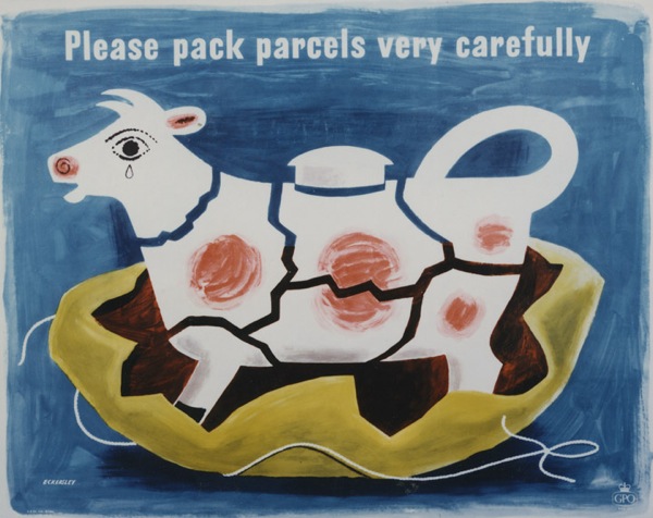
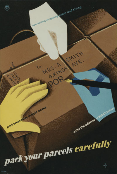
Actually, seeing as it’s Tom Eckersley, let’s have two.

Tom Eckersley cat ornament poster GPO pack parcels carefully

Judging from the posters though, (these are all from between 1950 and 1953) there was a Post Office standard approved way of packing parcels carefully.

Caswell 1953 GPO poster

Dennis Beytagh 1952 parcel wrapping poster

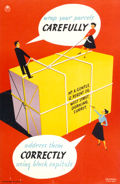
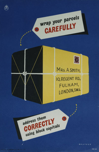
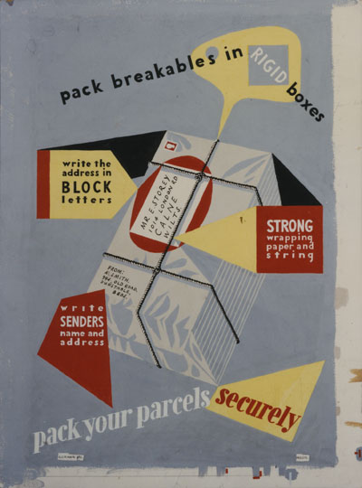
So that’s two pieces of string round the long side, one round the other, although I still have no idea how to knot it.   Hans Unger, meanwhile, is even more specific about rigid boxes and string in 1950.

Hams Umger 1950 poster wrapping parcels GPO

This one, though, is the most instructional I have managed to find (it’s artwork by the way, artist not known).

Artwork for a poster. Subject: Careful packing of parcels. Artist: Not known. GPO 1950

I think even I could have had a go at the process now, although I still don’t know how to knot the string.

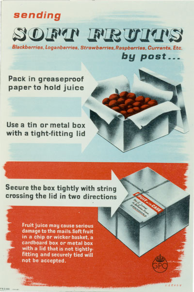
Of course (and you might have guessed that the whole post has been leading up to this) the real challenge that faced the Post Office was blackberries.  Sent in a non-approved fashion.

Karo soft fruit by post genius GPO poster

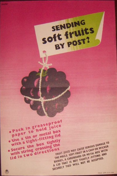
Did people really send them in a basket?  And expect them to get there?  I am boggled at that thought.  But the GPO weren’t, they produced more than one poster, which means that it must have happened at least twice…

soft fruit packing gpo poster

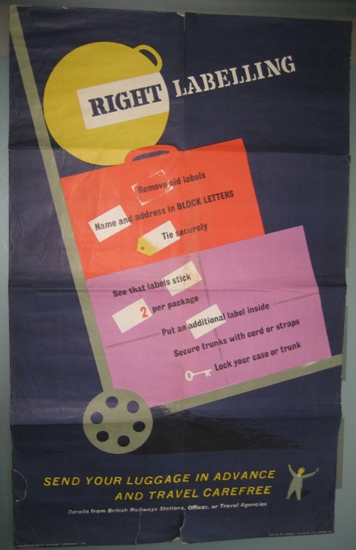
The GPO weren’t alone though, British Railways also had problems with parcel packing and addressing.

'Address your package clearly and help the Railway Staff to help you'. Poster produced for Great Western Railway (GWR), London, Midland & Scottish Railway (LMS), London & North Eastern Railway (LNER) and Southern Railway (SR) to remind customers to address packages clearly, as illegible addresses cause delays. Ar'Address your package clearly and help the Railway Staff to help you'. Poster produced for Great Western Railway (GWR), London, Midland & Scottish Railway (LMS), London & North Eastern Railway (LNER) and Southern Railway (SR) to remind customers to address packages clearly, as illegible addresses cause delays. Artwork by Miles Harper.twork by Miles Harper.

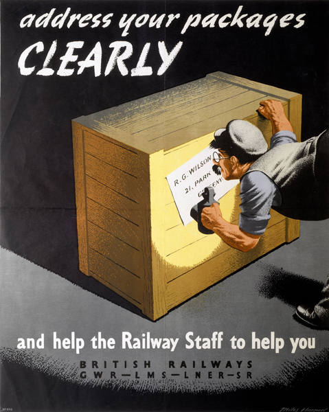
The problems might have been similar but it has to be said, the GPO’s poster design was infinitely superior.

You also get the feeling from their posters that they don’t actually like parcels that much.  They’re just trouble really, when your main business is really running trains.

British Railways staff poster. 'Don't Accept Packages which are Unfit for Transit', BR staff po'Don't Accept Packages which are Unfit for Transit', BR staff poster Artwork by Frank Newbould.

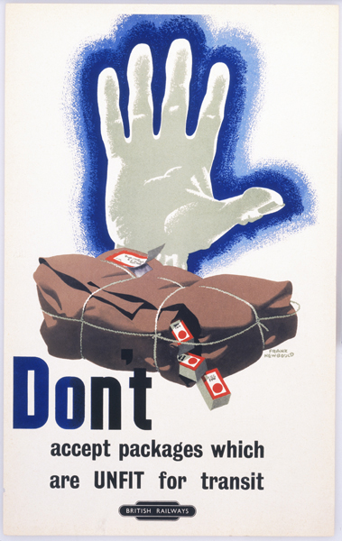
That, incidentally is apparently a late Frank Newbould from 1960,  It’s also quite mild in tone compared to some.

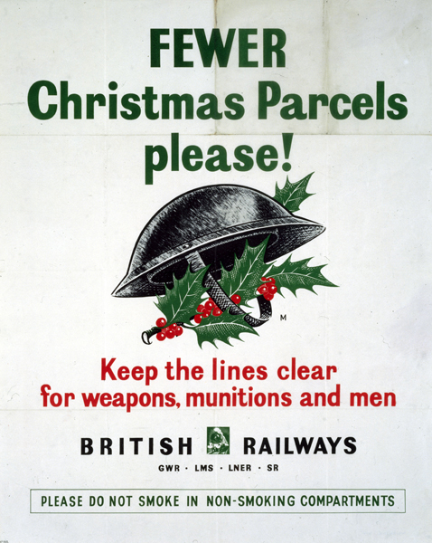
But nothing gave them an excuse like the war.  At last they could say what they really thought.

Fewer parcels World War two christmas poster british railways

Can you even send a parcel by railway now?  Probably only if it is tied up with string.

Give that penguin a fish!

A recent acquisition on eBay was a few copies of Modern Publicity from the late 1950s and early 1960s.  I was going to share their delights with you anyway, but when I looked into the archives I realised that I’ve never actually blogged about this properly at all. Then when I looked a bit harder I discovered that Designers in Britain has only ever been mentioned in passing as well.  As both are rather fabulous resources, I will endeavour to put at least some of this to rights over the next few weeks. But first, a brief introduction.

Modern Publicity is an international annual, published by The Studio group, which covers what would now be called graphic design – posters, printed material, packaging and trade marks – from around the world.  In contrast, Designers in Britain does what it says on the tin and only deals with UK design and designers, but includes everything from letterheads to large pieces of industrial machinery.  While both of them suffer from being predominantly printed in black and white, they are nonetheless well worth your attention.  Not only do you get to look at lots of wonderful pieces all in one place, but they’re also fascinating insights into what critics and designers thought was good at the time it was produced.  Which isn’t always the same as the things we like now.

So, what did people admire in the late 1950s and early 1960s?  Or to be more precise, which pieces of graphic design were considered good enough to stand next to the cream of international design?  One answer is not the designers that you might expect.  Tom Eckersley gets just one poster included in the two Modern Publicity annuals from the 1950s.

Eckersley Aer Lingus vintage European route poster

You’ll be relieved to hear that he does rather better in 1962, with three designs included, amongst them this Omo poster which I’ve never seen before.

Tom Eckersley Omo poster 1962 Modern Publicity

Abram Games also receives a rave review in 1958 for this Guinness poster, which is chosen to open the entire book.

Abram Games Guinness poster 1957 big G

Only where both name and product are already household words is such a method possible.  To adopt the plan for an unknown advertiser would be to court disaster.

After that, it all gets a bit more unexpected.  I’ve mentioned before that Harry Stevens is very popular in these kinds of publications, and that’s as true in these annuals as it ever was.

harry Stevens tilling group luggage poster 1958

harry Stevens victoria coach station poster 1957 from Modern Publicity

Printed in lemon, vermilion, cobalt, orange, pink and black, the caption says.  I don’t think black and white is really fair on it, do you?  And should you have a copy in colour, please do let me know, I’d love to see it.

An even more surprising regular is Ken Bromfield.  Now he comes up every now and then on here, mostly as a designer of quite nice railway posters.  But the editors of Modern Publicity love his work – he gets four pieces of work in the 1959 edition alone, including this poster.

ken bromfield artwork for windsor poster 1960 it says on NMSI

This is the artwork from the NMSI collection, because I can’t find the actual poster anywhere.  But he’s clearly an artist I should take a proper look at one of these days.

There are also a few unexpected gems to be discovered, like this poster by Lander.

R M Lander Folkstone poster 1958 in black and white sadly

I can’t find a decent picture of this anywhere, which is really frustrating as it looks great, and must look even better in colour, (and I am getting quite close to having another rant about the inadequacies of the National Railway Museum catalogue as a result of my looking too).  Again, any pointers gratefully received.  Or indeed copies of the poster.

There are others of this ilk as well – it’s always worth being reminded of this London Transport poster by Edwin Tatum.

Vintage London Transport Poster natural history museum Tatum 1956

I’m also happy to see anything at all by Arpad Elfer, although these penguins are particularly splendid.

Arpad Elfer penguins DH evans poster 1958

There’s plenty more where that came from.  Here, just as an example, are Karo and Zero together on one page (did you see what they did there?).

Karo WH Smith ad and Zero Macfisheries ad from Modern Publicity

What a world it must have been with those advertisements in it.

Then there are the people I’ve just never heard of before.  Who, for example was Petronella Hodges?  She did this.

Petronella Hodges G Plan booklet 1958

And this too.

Petronella Hodges cutlery leaflet J Walter Thompson 1958

But she appears precisely nowhere in Google.  A mystery, it seems.  But the clue lies in the small print.  Both of these designs were produced by J Walter Thompson, so my guess would be that Petronella Hodges was an art director there at the end of the 1950s.  Quite apart from conjuring up images of a British version of Mad Men, it’s also a pointer to a very specific change that was going on.  The jobbing freelance designer would become an increasingly rare species, with only the very best surviving.  More and more, this kind of design would be done in house at the agencies, by this new breed of Art Director.

In amongst all of this, I realise that I’ve hardly even mentioned the 1962 edition, and there’s lots going on in there, as even the British make the move from whimsy to modernism.  So that will have to get a post to itself another day.  In the meantime, have a couple more rare gems from the late 50s, by Abram Games and E Tatum, again.  There’s someone else I’m going to need to find out more about, isn’t it…

Abram Games green rover ticket poster 1958

E Tatum train to the continent poster 1958

Travel, send, deliver

Please accept my apologies in advance, but Quad Royal is going to be a bit flakey for the next few weeks.  Not only is it the summer holidays, but we are apparently moving house next month too.  A normal service will resume in September, I hope.

None of which is the reason for the short state of today’s post, that’s all eBay’s fault.  The summer holidays have got to them before they have me, and there really isn’t very much out there for the picking.  But I did want to point out this.

Karo Book here coach poster 1950s from eBay

It’s a bit expensive at £150 (or possibly quite a lot expensive if I’m honest) but it’s by Karo, and it’s rather good.  Now I know very little about him, and haven’t been able to find out much more, but what I can say is that pretty much every single bit of his work that I come across, I like.  He seems to have done quite a few bits for the GPO during the 1950s and 1960s, including a few very wonderful Properly Packed Parcels Please posters.  Unfortunately the BPMA’s catalogue is down right now, so you’ll have to put up with our slightly more homely photographs of the couple we have.

Karo Properly Packed Parcels Please Vintage GPO poster 1968

Karo Properly packed parcels please vintage GPO poster 1968

They’re both from 1968 and one day when we have enough walls that top one will be framed and up on them.  This one already is.

Karo Sending Soft Fruit by post 1952 vintage gpo poster

I know I’ve posted that before, but it still amuses me far more than it should, as well as being a lovely thing to look at too.

Karo also did quite a few coach posters as well as the one which is up for sale – a good dozen at least must have come up in the last Morphet’s Malcolm Guest sale.  This went for £140.

Karo Happy Christmas Travelling from Malcolm Guest Morphets

But in amongst all of that, I can find out almost nothing about him and his life.  So if anybody does know something, please do get in touch.

And finally, given the recent discussion of vans, this.

Austin van lovely brochure from eBay

At just 99p right now with only a day and a half to go, it’s a bit of a bargain.  But it’s also a reminder that the modern design wasn’t the only game in town back in the 1950s, and the Ladybird Books school of illustration was probably as equally ubiquitous.

Throw a Coach Party

It’s here.  The much anticipated Morphets everything-you-ever-wanted-to-own-from -the-sixties-and-seventies Malcolm Guest catalogue has arrived at The Saleroom and on their website.

Wales and Coach tours 2 vintage posters from morphets
Donald Smith, two posters for Hants and Dorset Coaches

My brain is going to take a while to absorb it all, especially in this heat – there are over a thousand lots, and with many of them multiples of between two and fifteen posters, I haven’t a clue how many posters are actually for sale.  Really quite a lot I should think, and all I’ve been able to do is skim through them.  So, for the moment, here are a few nice items chosen at random for your entertainment.  And a few first thoughts too.

Bruce Angrave, Party Travel for 8 or more, vintage rail poster morphets sale
Bruce Angrave, Party Travel, British Railways poster

There are huge numbers of posters which I certainly have never come across at auction or illustrated before, from, the whimsical to the modern.

Longman Party Outings By Rail vintage railway poster from Morphets
Longman, Party Outings By Rail, British Railways

JOHN WRIGHT Rail Rover Tickets vintage railway poster from Morphets
John Wright, Rail Rover Tickets, British Railways

And a few which seem to have fallen off the first sale, like this rather lovely bit of GWR modernism.

RALPH MOTT Factories and Factory Sites vintage GWR railway poster from Morphets
Ralph Mott Factories and Factory Sites, GWR

There are also a lot of coach posters in addition to the railway collection – well over three hundred.

Studio Seven Hire A Coach 2 x vintage posters from Morphets sale
Studio Seven, Hire a Coach

KARO/JACQUES Luxury Coach Tours; Send Your Parcels by Bus vintage coach posters from Morphets
Karo/Jacques, Luxury Coach Tours; Send Your Parcels by Bus

But mostly it’s the sheer quantity of posters itself that I find overwhelming.  I could – and probably will – do a whole post just about the Royston Coopers that they have, most of which I’ve never seen before.

Royston Cooper Marble Arch vintage coach poster Morphets sale

I should also point out that, once again, the estimates are insanely low.  That Royston Cooper is estimated at £50-100, as are the two Daphne Paddens below.

Daphne Padden 2 x spring vintage coach poster from Morphets sale

If even half the lots go for close to these estimates I will a) eat my hat and b) need a removal van to bring all of my purchases down from Harrogate.

It gets even madder when you start to look at the multiples.

Unger Eckersley Games from Morphets sale

Anyone fancy the Games, Eckersley and two Ungers above for £100 to £150?  I do, but I also don’t rate my chances too highly on that.

A full appraisal will follow in due course, but it really is worth going to take a look yourself – and then please do come back and tell me what you think.

Properly Designed Posters Please

Today, a wallow in some lovely designs for no good reason at all

I’ve been meaning to write about the Post Office’s ‘Properly Packed Parcels Please’ series for ages, ever since finding them praised in Design Magazine.

Properly Packed Parcels Please vintage GPO poster woman out of hat

There’s a whole series of these posters (they seem to stretch from 1962 until the early 70s), and what I like about them is that they’re still trying to do great modern poster design at a time when most other institutions have more or less given up.

Perhaps the most arresting are this psychedelic series from about 1967-8.

Properly Packed Parcels Please Tom Bund poster 1967

Paul Rennie has the first one down as being by Negus Sharland; ours (hence the rather grim photos, apologies as usual) are signed either Tom Bund or Bund/Negus and Negus, so go figure.

Properly Packed Parcels Please tom bund 1968

Unfortunately I don’t know enough about the organisation of British advertising and design in the 1960s to be able to shed much light on this.  However, a bit of light Googling has told me that Tom Bund is alive and working, so I’ve dropped him a line and perhaps he can help.

There were also some more cartooony designs by Andre Amstutz and Harry Stevens in 1965 and 1963 respectively (from the BPMA catalogues).

Andre Amstutz Properly Packed Parcels Please GPO 1965

Harry Stevens GPO parcels poster 1963

But I do have to confess to a slight pleasure that we’ve got a few of these posters that the BPMA don’t (I know it’s mean, but they’re a museum, and we’re not, so it’s not something I can often do).  They do have this 1968 one by George Karo.

G B Karo vintage GPO poster properly packed parcels

But not this, from the same year.

George Karo {Properly Packed Parcels please GPO poster

And just in case you’re wondering why people need so much telling about packing their parcels properly, an earlier, 1952 poster by Karo gives us an insight into the strange things that the British public get up to with their postal service.

Karo soft fruit by post genius GPO poster

Remember, fruit juice may cause serious damage to the mails.  Now there’s a lesson to take away with you for the weekend.