Or is it?

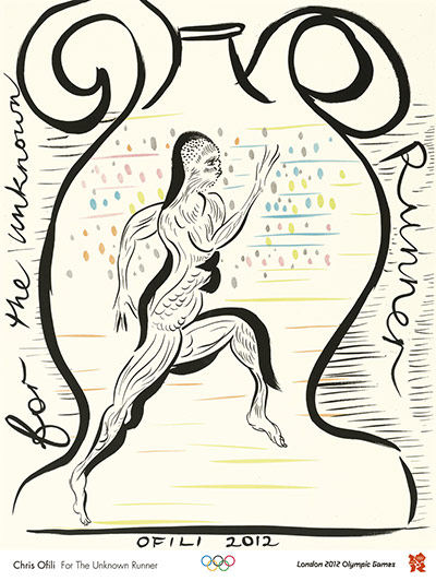
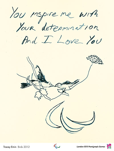
It certainly claims to be a poster, as one of the set commissioned for the 2012 Olympics, in this case designed by Chris Ofili.
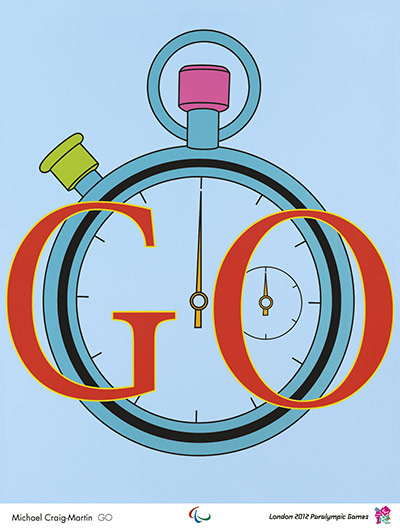
Rather against my will, I have to consider these on an almost daily basis, because a selection are on display in a shop window just a couple of hundred yards from our house. Mr Crownfolio says that he’s quite enjoying them; I’m less sure. Here’s Michael Craig Martin’s offering, which I like a bit more but isn’t there.

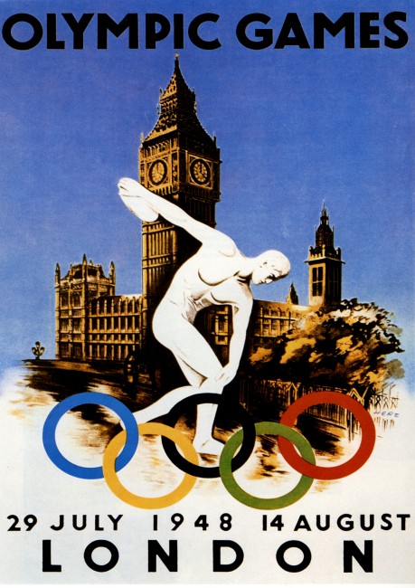
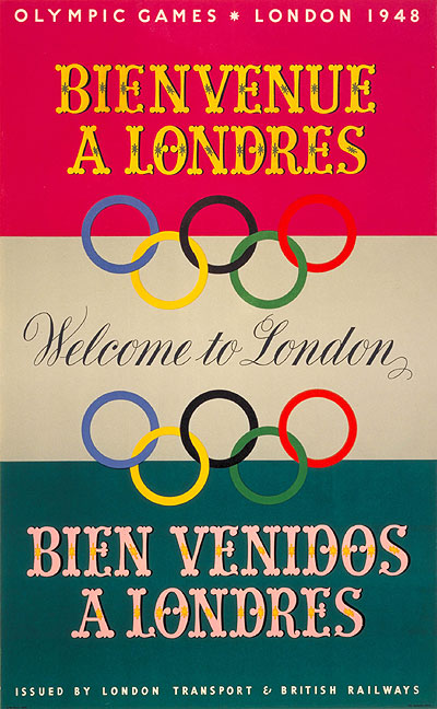
The thing is, I’m wrestling with the idea of them being posters. Here’s the 1948 Olumpic poster, designed by Walter Herz, which is a very different beast.

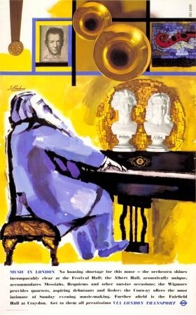
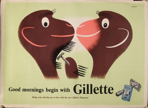
As is London Transport’s only Olympic offering from that year.

They’ve been created by designers, not artists. They’re big and informational and no one wanted you to frame them. So what’s happened in between?
The way that the meaning of the word ‘poster’ has changed over the last sixty or so years was pointed out by the Catherine Flood book which I mentioned a few weeks ago. It’s one of the most thought-provoking ideas in it. A poster was once something that was displayed in public as a form of advertising or information, but somewhere in the 1960s it became a smaller-scale object that was bought in shops and displayed on domestic walls.
In some ways, this is a statement of the blindingly obvious. Even though I knew the facts at some level, I’d never really thought about them properly. But it’s well worth the effort.
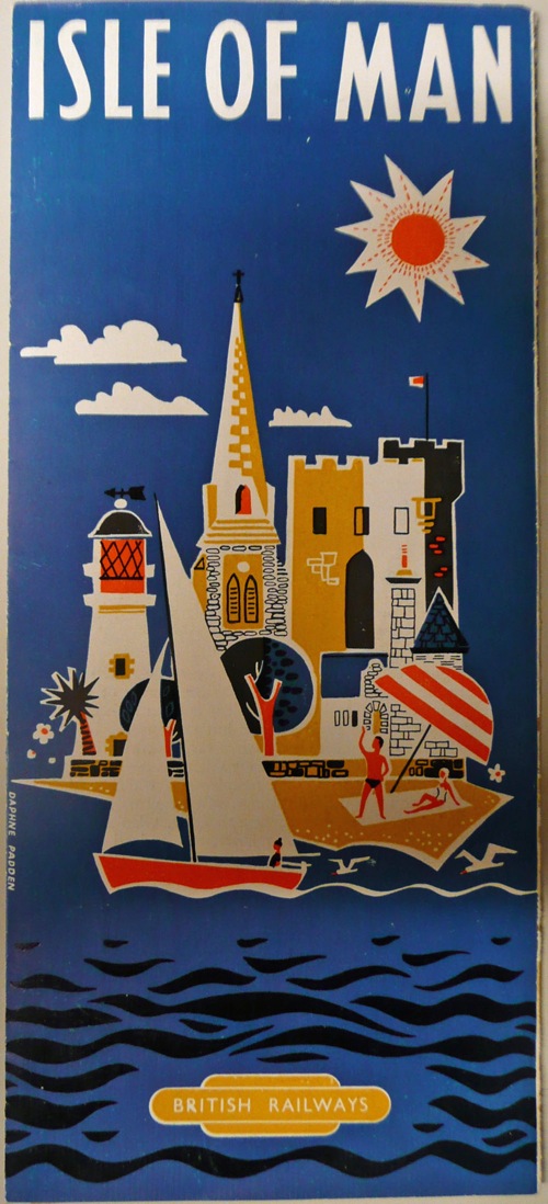
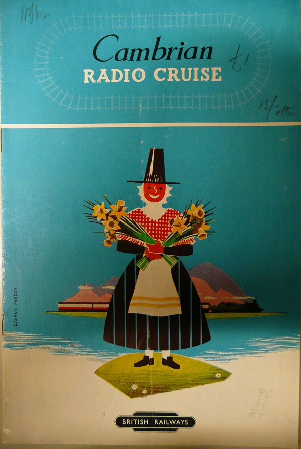
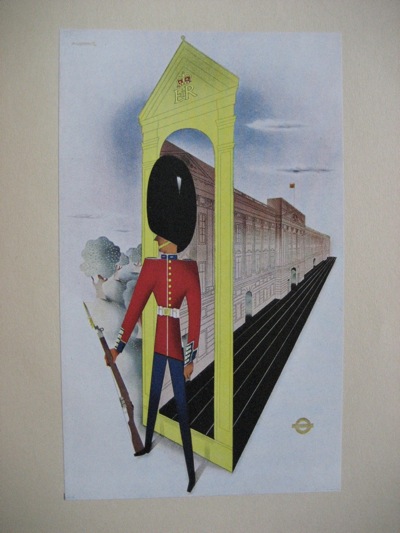
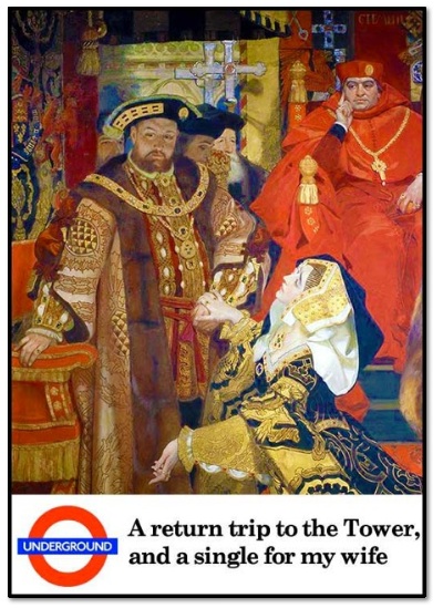
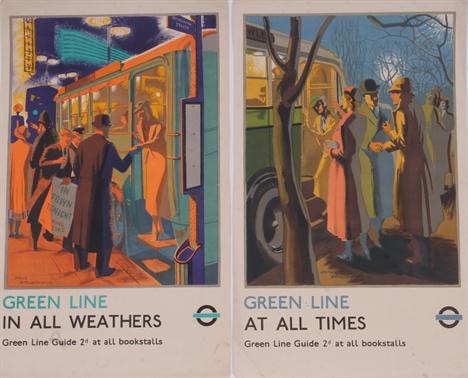
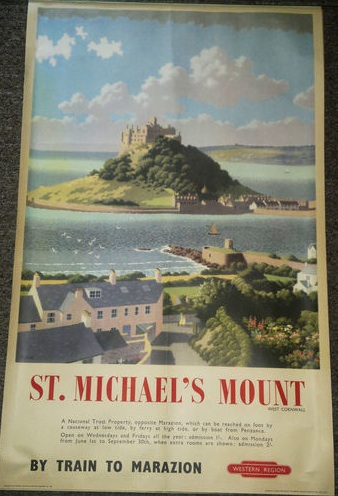
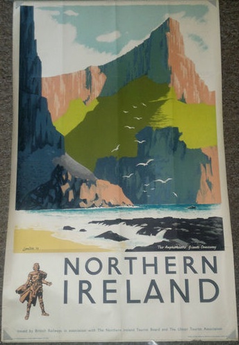
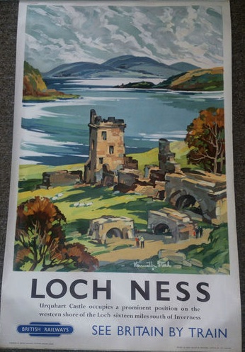
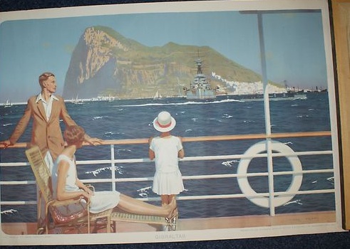
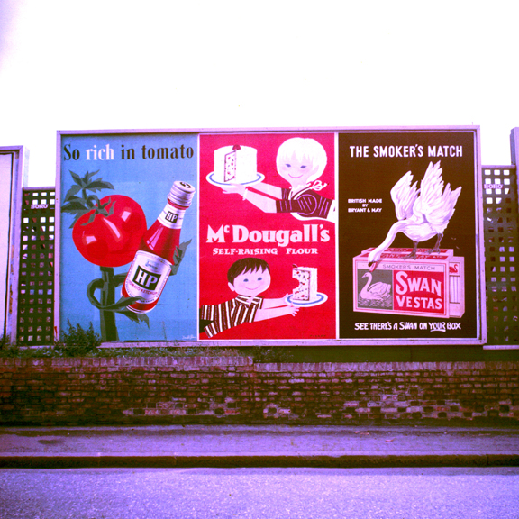
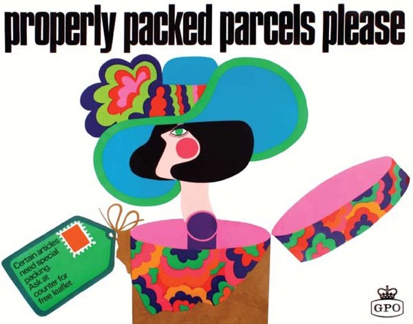
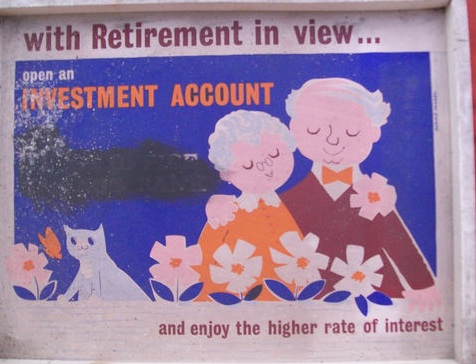
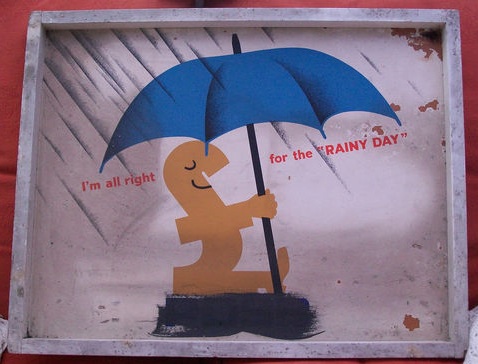
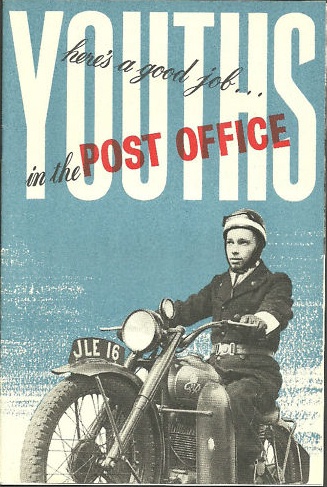
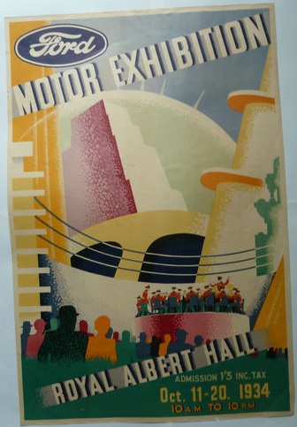
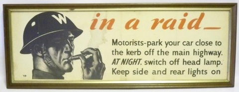
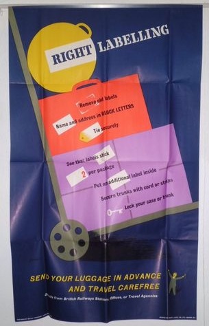
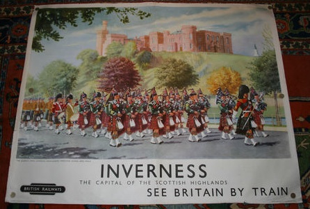
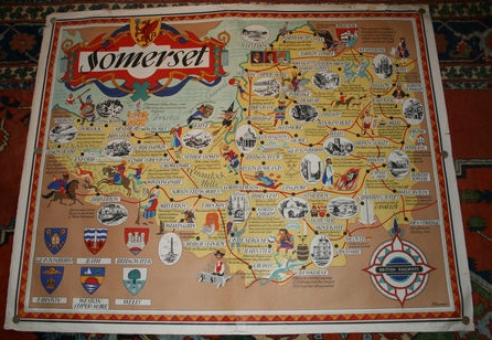
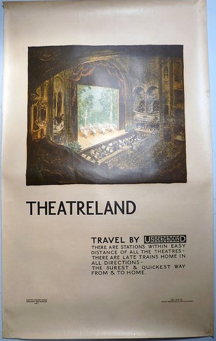
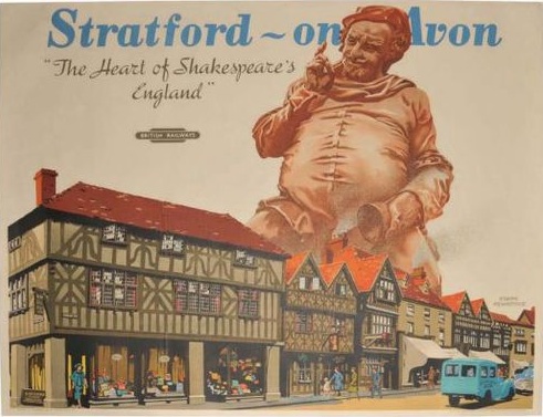
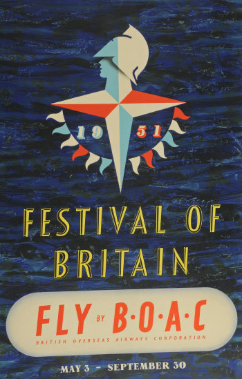
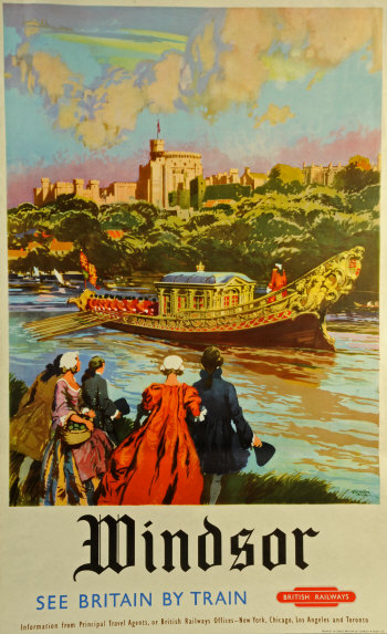
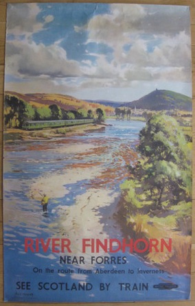
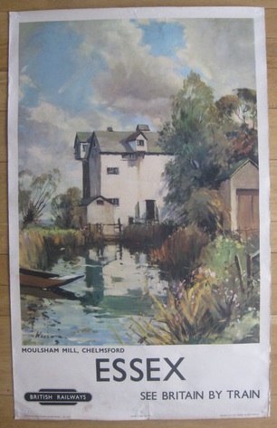
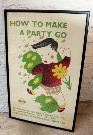
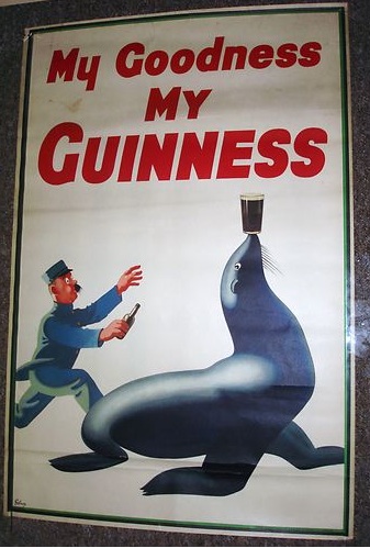
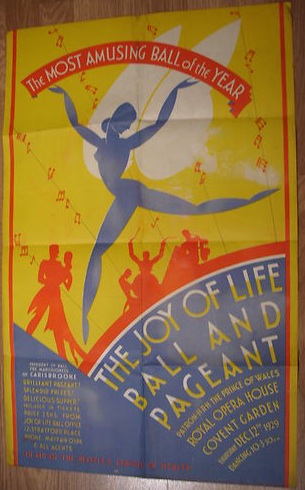
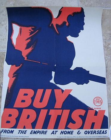
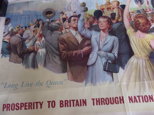
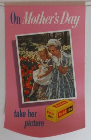
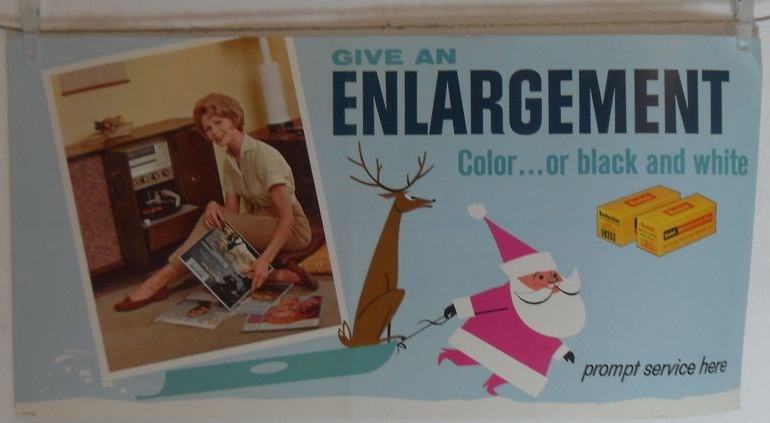
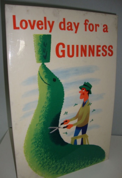
We begin in the 1950s, when the display poster is the most prestige form of advertising you can get. There are specialist poster artists, annuals and competitions and posters are in every urban scene, out there, communicating. This, then, is a poster.

And another three, seen here in their natural habitat.

At some point in the 1960s, however, things begin to change. Catherine Flood devotes an entire chapter to this, so I will very much be paraphrasing her descriptions and arguments, but here’s her assessment of where it all begins.
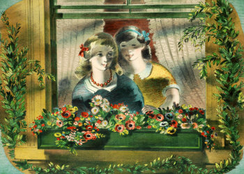
The first flutterings of a consumer love affair with the poster were evident around 1965 in Tom Salter’s trendy Carnaby Street boutique Gear, which was selling comically quaint Victorian advertisements for medicines and corsets blown up to poster size.
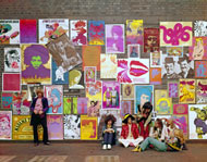
The later 1960s are then a very interesting time, in which there is a constant exchange of ideas between these increasingly psychedelic screen prints and posters produced for home display, and the more traditional advertising poster. Below is a great photograph from the Observer magazine in 1967, illustrating a George Melly article on Poster Power. I’m only sorry that I can’t find a bigger image.

Even so, take a squint at the top left corner. In amongst the products of the counter-culture are a couple of images you might recognise. GPO posters to be precise.

That photograph is recording a transitional moment when the poster is just about to become an object for the home, but a few great display designs still exist. So is this one of the last ‘proper’ posters ever? It certainly feels that way to me.
The newer kind of designs were certainly seen as interesting cultural artefacts even at the time. The Daily Telegraph ran its own article about posters in 1968 about how ‘posters are selling in a very pop way’. They noted that they were
expendable art, the perfect child of the consumer age, that costs as little as five shillings to five pounds, can be thrown away if you are tired of it, framed if you want it forever.
It’s hard not to think about Walter Benjamin at this point. I’ve expounded on his ideas about reproduction on here before, but the gist of it is (extreme summary of a dense text here) that the nature of art will change absolutely now that images are infinitely reproducible.
the technique of reproduction detaches the reproduced object from the domain of tradition. By making many reproductions it substitutes a plurality of copies for a unique existence. […]. These two processes lead to a tremendous shattering of tradition.
Benjamin had hoped that reproduction would, in the end, lead to revolution. In fact, what we ended up with was this instead.

The Athena poster of the 1970s is the apotheosis of his ideas, an infinitely reproducible and reproduced image that has no original. They are a genuinely mass market art form, a true popular culture. I don’t think Benjamin would be particularly delighted. (It is intriguing that at the very height of Athena’s domination in the early 1970s, John Berger was popularising Benjamin’s ideas in Ways of Seeing on the BBC. But it’s probably only coincidental.)
What’s notable is that this kind of design didn’t sustain. Since the 1970s, the poster has increasingly crept back towards the domain of fine art. If you imagine most of the contemporary posters you see displayed in other people’s houses today, they are most often for fine art exhibitions of one kind or another. The aura of the work of art had, in the end, too strong a pull to resist; we would still prefer have an image which is associated, however indirectly, with that aura rather than one which just exists in its own right. (Mr Bourdieu would have a lot to say about this too, but if I go down that line of thought we’ll be here all night and then a bit longer too.)
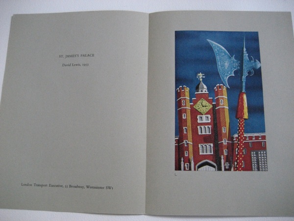
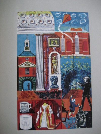
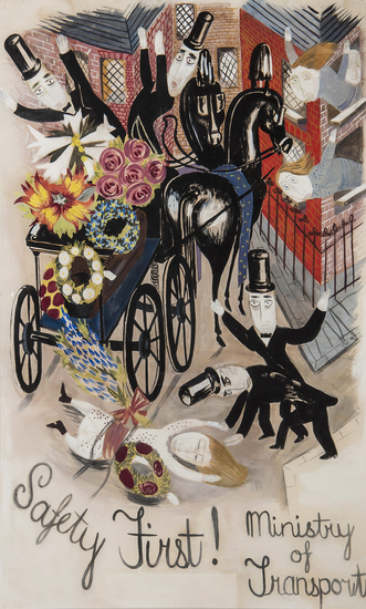
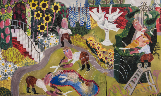
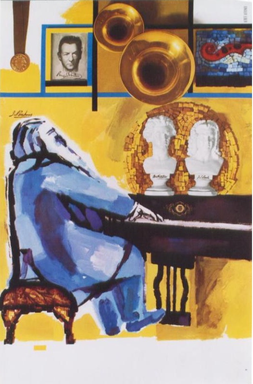
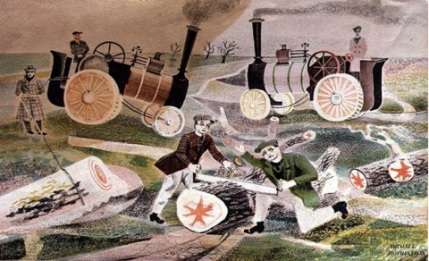
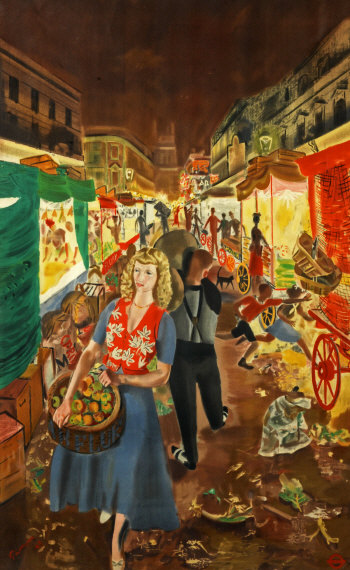
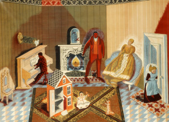
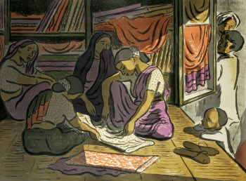
In a way, though, this is just us coming full circle. Because the mass-produced piece of art already existed long before the word ‘poster’ shifted over to meet it. Once upon a time – just before and after the second world war to be precise – they were called art prints, and the School Prints and Lyons Tea Shops series were prime examples of this. These were not reproductions of old masters, but images designed for unlimited reproduction and to be displayed in public. They just weren’t called posters, that’s all.

The one above is by Michael Rothenstein and dates from 1948.
The journey from display poster and art print back to art print via the diversion of popular imagery is a fascinating set of shifts, and one which I’ve only skimmed the surface of here. But to return to our original starting point, there are also a set of Olympic posters which show us the transition exactly as it is happening, and those are the posters for Munich 1972.
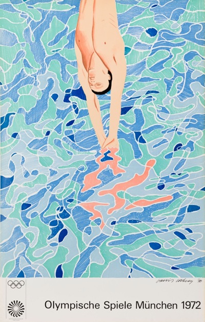
Two different sets of posters were produced for these games. The first feel utterly familiar to us today, because they were designed by fine artists and are, in the end, art prints for collecting. David Hockney, for example, depicted swimming

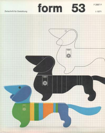
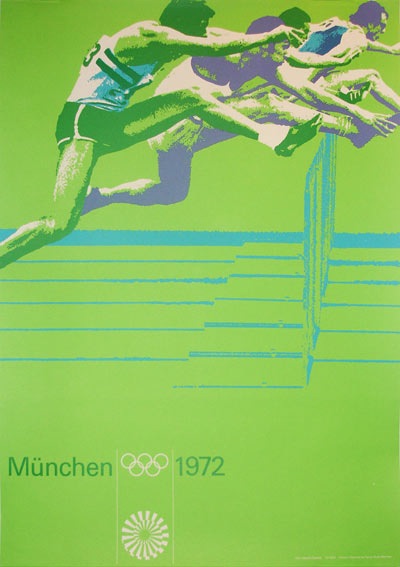
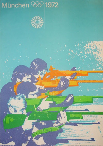
But there are a whole other set of posters too. Designer Otl Aicher created an entire and rather wonderful graphic identity for the games which even included an infinitely reproducible mascot.

If you want to read more about Aicher and his designs there are good articles here and here as well as an entire website here. But part of the graphic scheme was a set of posters.


Which are, I think, still posters. And that is the journey that takes us from the 1948 Olympic poster to Tracey Emin.

Or not if you don’t want to.
