Be discerning

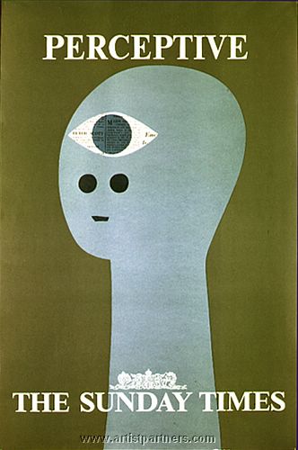
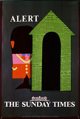
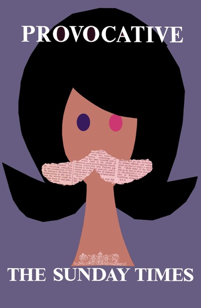
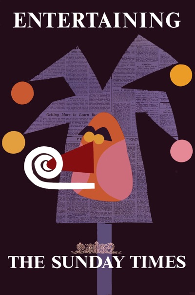
When I first mentioned Artist Partners, I included a couple of the posters that Patrick Tilley had designed for the Sunday Times.

Patrick Tilley Sunday Times poster Provocative

Pleasingly, Patrick got in touch to tell me the story behind the posters .

BBDO – the agency – commissioned me to design one poster using the line “You are more interesting to know when you read the Sunday Times”.

I thought this was a bit of a mouthful so came up with the idea of illustrating a desirable quality possessed by the newspaper and its readers and offered six roughs which were all commissioned.

Patrick Tilley Sunday Times poster Entertaining

They were reduced to their simplest form and made with cut out paper. BBDO won a prize. My name was removed from the printed versions. But they made quite an impact at the time.

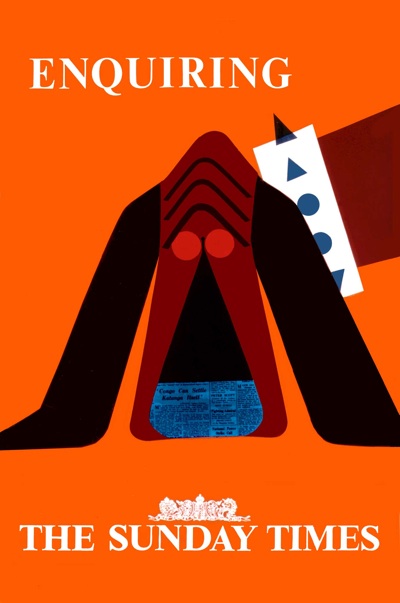
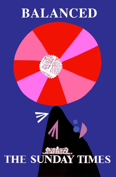
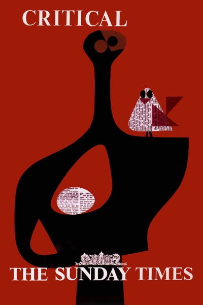
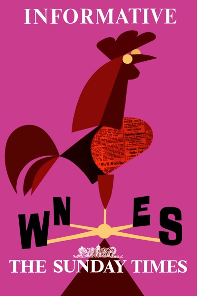
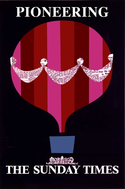
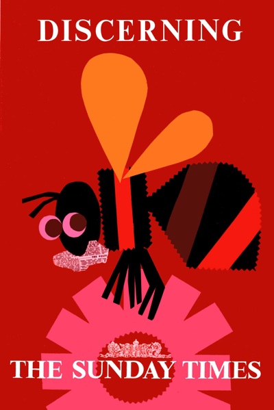
But there is a sequel.  He was also commissioned to produce a further set of six posters, which were paid for but never used.  So here they are, for the very first time.

Sunday Times poster dog Patrick Tilley

Sunday Times poster seal Patrick Tilley

Sunday Times poster statue and bird Patrick Tilley

Sunday Times poster cockerel Patrick Tilley

Sunday Times poster balloon Patrick Tilley

Sunday Times poster Patrick Tilley bee

What on earth were they thinking of?  They’re better than the first set.  The colours, in particular, are stunning.

I wonder how many other unused but brilliant posters there are out there?  Anyone got any thoughts?

Trouble with Harry

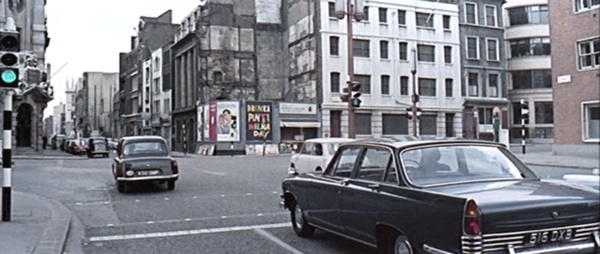
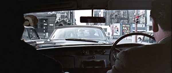
When I posted the still from the Ipcress File with Patrick Tilley’s Drinka Pinta Milka Day poster in it, I thought it was just an amusing chance to see a poster in situ.

Ipcress File screen shot 1

What I didn’t know was that I’d stumbled on a coincidence of hilarious and ironic proportions.  Patrick Tilley wrote to give me the full story.

Thanks for your last two posts. Who was the sharp-eyed fan who noticed the poster in the Ipcress File? Clever stuff.

Just by the by, I was at the time and for several years later closely involved with Len Deighton who I chummed up with when he was briefly represented by Artist Partners – and involved somewhat disastrously with the Ipcress File in its scripting stage.

Len had received the draft script which he hated and asked me to write an assessment of it (as withering as possible). I did so on the promise that it would be “for his eyes only”. So I took a fairly strong line but still a professional one.

What I did not expect was that he would pass it to Harry Salzman (then a movie mogul and partner in the Bond Films with Cubby Broccoli. They didn’t come bigger). I got a call from Harry to come and see him that evening at his house in Mayfair re the script and went with high hopes of a promising career in the industry.

Wheeled in to his presence I was confronted by Harry in statesman-like mode who demanded how “a member of the public” (me) had obtained a copy of the script to which I had no right and that he, the director and scriptwriter had been so offended by my critique that they had no wish to work with me and prophesied I would never ever work in the industry again!

Taken totally by surprise I was lost for words but felt unable to defend myself by saying Len had given me the script and asked me to critique it. (Industry phrase). Basically because with Len – having cut a three-picture deal – was on the verge of making it big.  I didn’t want to jeopardise his position. Result, I was ushered out into the night – feeling I had been run over by a bus. Bla, bla, bla…

With hindsight, the situation was completely illogical. Since Len had given him my assessment, he obviously knew how I had acquired the script. I think it was some kind of a test. What I should have done was to stand my ground and respond with a few expletives to show I wasn’t prepared to take any s***.

Looking back, it is hard to understand the awe in which he and Cubby were held by anyone connected with the industry. There’s an  ironic postscript to this story  The screenplay as filmed incorporated several of the recommendations I made in my report to Len.

But, hey – that’s showbiz. I did go on to write screenplays but those stills from the Ipcress File brought back the memories of that encounter. Definitely a night to remember.

I wonder how impressed Harry Salzman would be to know that he’d immortalised one of Patrick’s posters in the film.  Not very, I suspect.

Ipcress File screenshot 2

A football, a train and a pint of milk.

I’ve been sent a couple of nice things recently by readers. (Only via email though. No real bribery has yet been attempted but please do feel free, posters particularly welcome.)

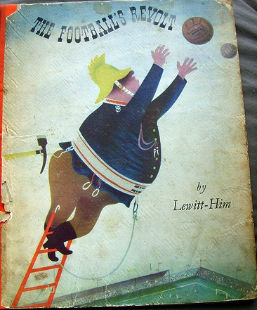
Anna pointed out that there was another Lewitt-Him children’s book out there, which she knew of as her mother had kept it from her own childhood.  It’s The Football’s Revolt,

Cover shot of Lewitt Him Football's revolt children's book

and it looks to be as lovely as the others.

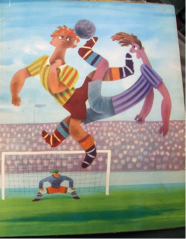
Lewitt Him Football's revolt illustration

There are a few more photos on the Flickr set if you like these.  This is certainly the only way I’ll be looking at it, as prices on Abebooks start at £67 and from there only go up.  It was published in 1944 under wartime restrictions, so I’m guessing there were never that many copies in the first place, hence the premium.

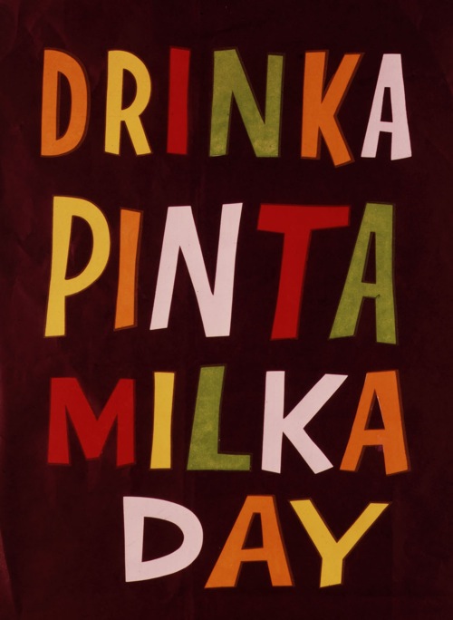
Patrick Tilley also got in touch after we featured some of his designs for AP.  He’ll be the subject of a post or three in due course, but in the meantime, a reminder of what lovely stuff he was producing.

Patrick Tilley drinka pinta milka day

The agency (Mather & Crowther..?) removed my name from the border.  Possibly because the slogan was theirs not mine.
They just asked for some coloured cut-out lettering and I obliged.

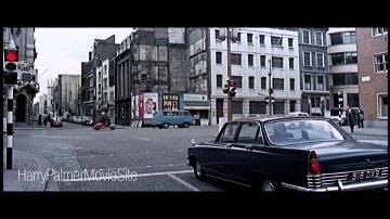
Amusingly, you can see the poster hard at work on a hoarding (centre, behind the blue Volkswagen van) in this still from The Ipcress File.

It's a still from a film, like I care

It’s the scene where Carswell is shot in his car, and if you want to know more (including Google Earth co-ordinates), it’s all here.

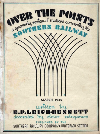
Paul Rennie, meanwhile has sent over the cover of a railway magazine.  Fortunately this is better than it sounds.

Southern Railway magazine cover

It’s not a poster, it’s quite early and  it’s by Victor Reinganum who was more of an illustrator than a poster designer, but it’s rather lovely so I’ve decided to show it anyway.  Reinganum did design one poster for London Underground too, in 1950

Victor Reinganum only LT poster bus excursions

so there you go.

Mr Rennie has also, very kindly, sent over a proof of his new poster book.  But as this is both very big and very comprehensive (as well as being packed with lovely posters) I may take a while to digest it.  But I will.  In the meantime, here are a few pretty pictures for your entertainment.

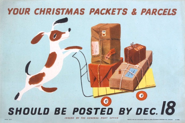
Lewitt Him post early with dog and trolley vintage GPO poster

Lewitt-Him, Post Early for GPO, 1941

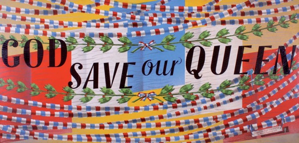
Barnett Freedman, God Save Our Queen

God Save our Queen (original artwork), Barnett Freedman, 1953, 19 x 39″, Shell Mex & BP.

Boat Race from Rennie book

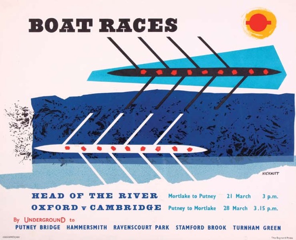
Boat Races, Anne Hickmott, 1959, panel poster, 10 x 12″, London Transport.

AP2 Part Two

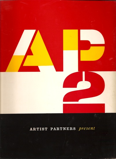
Today, a second helping of the AP2 Artists Partners book.  (Is it a brochure?  a catalogue?  I’m not entirely sure how to address it).

Artists Partners cover image Patrick Tilley

I ran through a few of the obvious highlights by the big names like Hans Unger, Saul Bass and Tom Eckersley last time, but there are plenty more treasures for your entertainment.

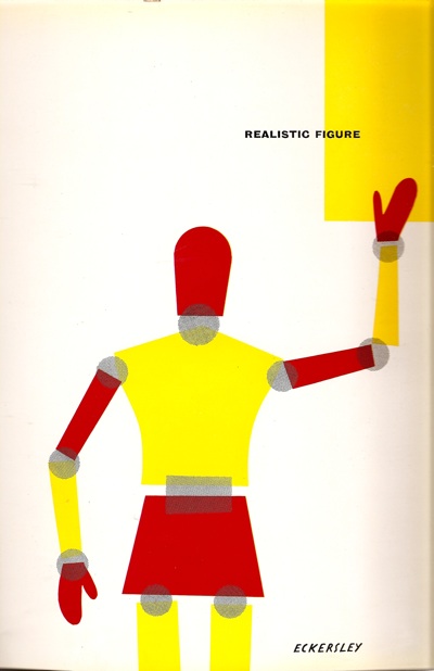
In fact, the sheer quantity of other stuff is one of the notable things about the book.  Most of what would now be seen as the big names are in the creative design section, but there are six other categories in the book, including realistic figure, humour and whimsy (section cover by Reginald Mount)
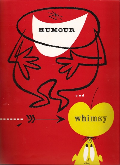
Reginald Mount AP2 artwork

fashion and sophistication, photography ( a wonderful graphic by Heinz Kurth)
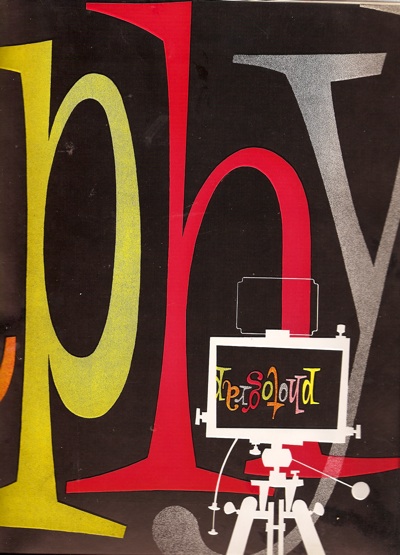
AP divider photography Hans Kurth

scraperboard, still life and industrial,
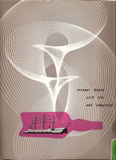
scraper board and industrial divider ap

and finally architecture, landscape and nature.

It’s a reminder, once again, how easy it is to recreate the past in terms of what we like best now.  For every classic bit of graphics, one equal and opposite bit of kitsch was created (although this is not just any old figure illustration kitsch, it’s Artist Partners kitsch by Rix).
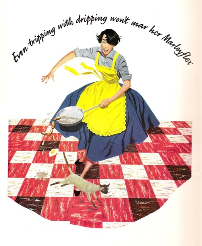
AP tripping with dripping image

Good to know that about the dripping, too.

But that’s not to say that there aren’t some stylish things in the other categories too, such as this Christmas card for ABC Television, by Bruce Petty.
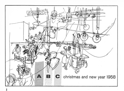
ABC christmas card AP

Or once again, Patrick Tilley, this time with a cover for a Shell almanac, filed under Humour and Whimsy.  No one would ever admit to doing whimsy any more, would they, it’s hardly cool; I think that’s rather a shame.
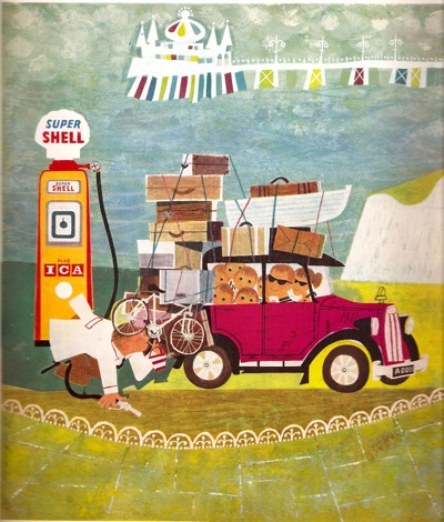
PAtrick Tilley for shell almanac graphics

Patrick Tilley is, incidentally, not only still alive but has spent the last forty years working as a scriptwriter and science-fiction novelist, rather than as a designer.  Perhaps that’s why his work has rather disappeared off the radar, despite being really rather good.  (And he’s got in touch with the blog too, which is very exciting, so there may well be some more of his work on show here in due course).

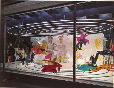
Almost as strange as that career change are these two window displays by George Him, for De Bejenkorf  (which seems to be a department store in Amsterdam).  The first one in particular, looks almost impossibly modern.
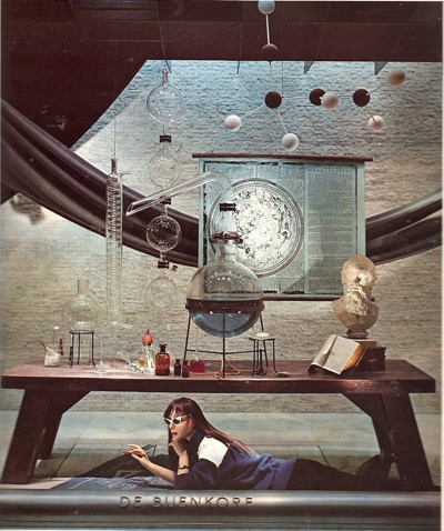
George HIm Shop Window AP

The second is just brilliantly odd.

George Him shop window 2

More of this kind of thing please.

Even all this hasn’t exhausted the almost bottomless reserves of this book.  So, next time the scanner and I get some quality time together, there will further delights to come.
Find me an artist. From 1953 please

Sometimes, writing about graphics can feel like a constant harking back to a golden age of British graphic design, long since lost to the evil forces of photography, Photoshop and general bad taste.  But not everything from that time has disappeared.

Like Artist Partners for example, who are not only still going but have set up a usefully informative website which covers their past as well as their present.  And their past was very glorious indeed.

Founded in 1950, the agency represented some of the biggest names in illustration, graphics and photography from the fifties onward.  There’s no point repeating their entire history, because they’ve done the job already.  Although I was particularly interested to see that Reginald Mount was one of the founding partners.  He’s a fascinating character who seems to pop up at all sorts of interesting points in the history of graphics, and I’d be interested in finding out more about him one of these days.

They’ve put together a small retro section on their website as well, with a few nice images, like these Sunday Times advertisements by Patrick Tilley.

Patrick Tilley vintage sunday times advertisement Patrick Tilley vintage sunday times ad

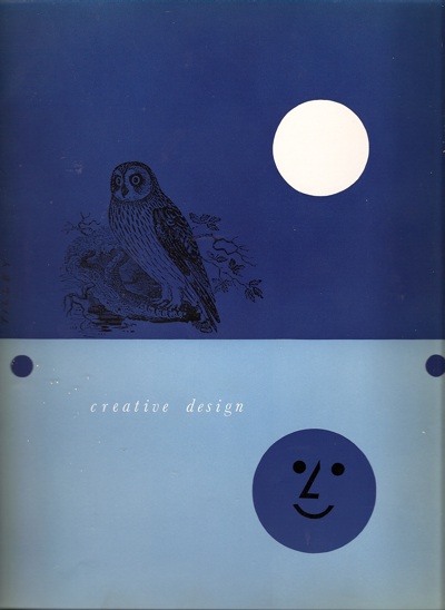
But it’s not the website that made me want to post about them, it’s this (the cover also, incidentally, designed by Tilley), which we’ve had on the bookshelves for a while now.

Cover of Artist Partners graphic design brochure

Dating from, I guess, the early to mid 50s, it’s a brochure for the artists represented by AP, and a very delightful book in its own right.  Here’s one of the section headings for example.

Divider from Artists Partners graphics book

Or this one, by none other than Tom Eckersley

Eckersley Artist Partners graphics book divider

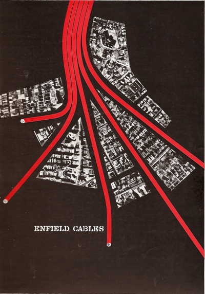
Oh to be sitting at at an advertising agency desk in 1954 and trying to decide who to commission.  Because there is such as wealth of wonderful talent in this book.  Amongst other people, Artist Partners represented Eckersley, Hans Unger, George Him, Eileen Evans, and of course Reginald Mount.  And even Saul Bass.  Here’s a trade advertisement for Enfield Cables.

Saul Bass Enfield Cables ad Artist Partners book

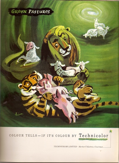
And a rather fetching advertisement for Technicolour by George Him.

AP George Him technicolour ad

My main sadness is that it’s only partially in colour, because there are simply hundreds of pieces which I haven’t ever seen before.  For every page like this

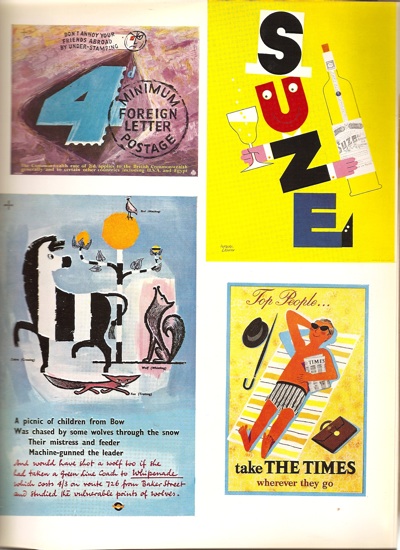
AP content various

(Two Hans Ungers – one GPO, one London Transport, a Leupin and another Patrick Tilley)

there are ten like this.

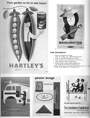
AP eckersley page

I’ve managed to find the peas one in colour at least for your entertainment.

Tom Eckersley Hartleys peas graphics

That’s more than enough for now, but I’ve still only barely scratched the surface of this wonderful book.  I’ll post some more images from it next week.

But if you can’t wait that long, Abebooks is offering one copy for sale.  I can’t tell you anything about the condition as it’s all in German – but let me know how it is if you can’t resist anyway (or, indeed, if you speak German).  Well it was there this morning, but now it’s gone.  Hope you like it.