AP Again

As the piles of boxes grow around me, here are some more Artist Partners delights from the archives.

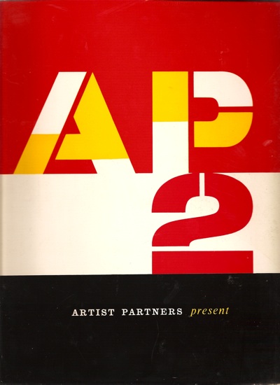
Today, a second helping of the AP2 Artists Partners book.  (Is it a brochure?  a catalogue?  I’m not entirely sure how to address it).

Artists Partners cover image Patrick Tilley

I ran through a few of the obvious highlights by the big names like Hans Unger, Saul Bass and Tom Eckersley last time, but there are plenty more treasures for your entertainment.

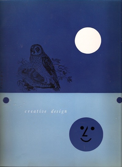
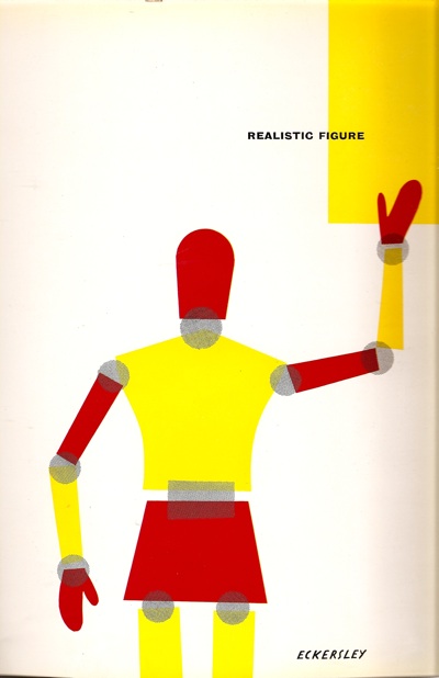
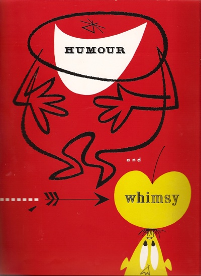
In fact, the sheer quantity of other stuff is one of the notable things about the book.  Most of what would now be seen as the big names are in the creative design section, but there are six other categories in the book, including realistic figurehumour and whimsy (section cover by Reginald Mount)

Reginald Mount AP2 artwork

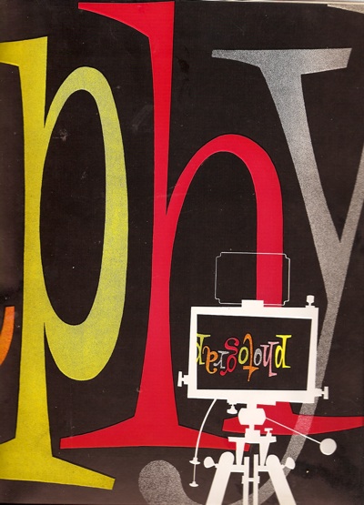
fashion and sophisticationphotography ( a wonderful graphic by Heinz Kurth)

AP divider photography Hans Kurth

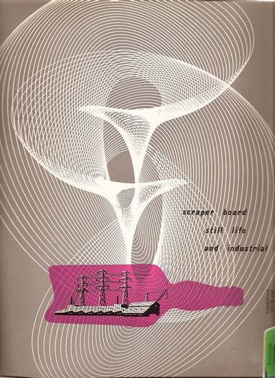
scraperboard, still life and industrial,

scraper board and industrial divider ap

and finally architecture, landscape and nature.

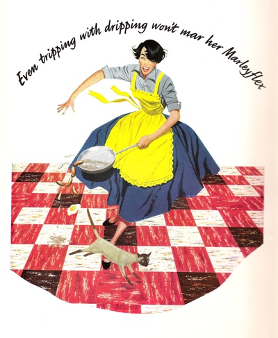
It’s a reminder, once again, how easy it is to recreate the past in terms of what we like best now.  For every classic bit of graphics, one equal and opposite bit of kitsch was created (although this is not just any old figure illustration kitsch, it’s Artist Partners kitsch by Rix).

AP tripping with dripping image

Good to know that about the dripping, too.

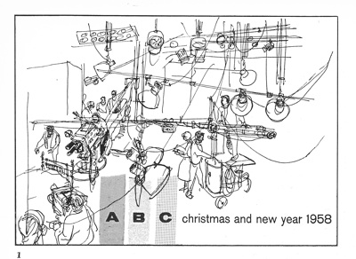
But that’s not to say that there aren’t some stylish things in the other categories too, such as this Christmas card for ABC Television, by Bruce Petty.

ABC christmas card AP

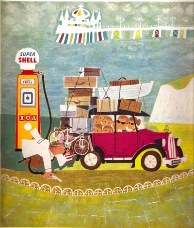
Or once again, Patrick Tilley, this time with a cover for a Shell almanac, filed under Humour and Whimsy.  No one would ever admit to doing whimsy any more, would they, it’s hardly cool; I think that’s rather a shame.

PAtrick Tilley for shell almanac graphics

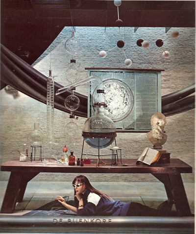
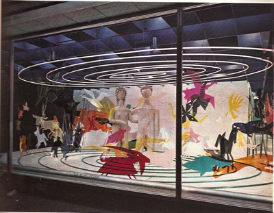
Almost as strange as that career change are these two window displays by George Him, for De Bejenkorf  (which seems to be a department store in Amsterdam).  The first one in particular, looks almost impossibly modern.

George HIm Shop Window AP

The second is just brilliantly odd.

George Him shop window 2

More of this kind of thing please.


AP, again

While everything is in flux here at Quad Royal central (I am writing this in a room already stacked with boxes and wev’e still got a week to go) I thought I would dig out a few posts from the earlier days of the blog which are worth revisiting, especially as not everyone will have seen them first time round.  This one seemed like a good place to start, especially as it was Artist Partners’ own website who first alerted me to the existence of the Patrick Tilley posters.

Sometimes, writing about posters can feel like a constant harking back to a golden age of British graphic design, long since lost to the evil forces of photography, Photoshop and general bad taste.  But not everything from that time has disappeared.

Like Artist Partners for example, who are not only still going but have set up a usefully informative website which covers their past as well as their present.  And their past was very glorious indeed.

Founded in 1950, the agency represented some of the biggest names in illustration, graphics and photography from the fifties onward.  There’s no point repeating their entire history, because they’ve done the job already.  Although I was particularly interested to see that Reginald Mount was one of the founding partners.  He’s a fascinating character who seems to pop up at all sorts of interesting points in the history of graphics, and I’d be interested in finding out more about him one of these days.

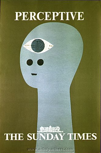
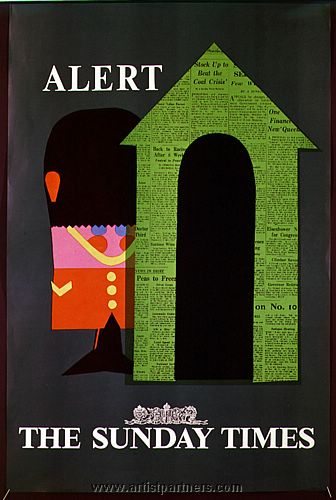
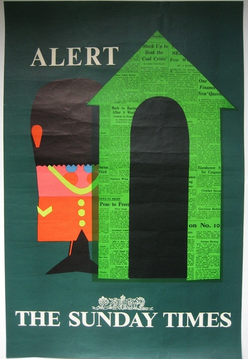
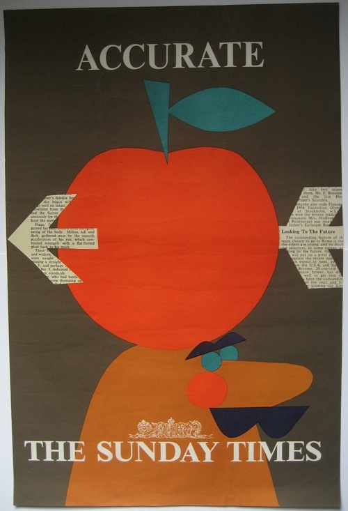
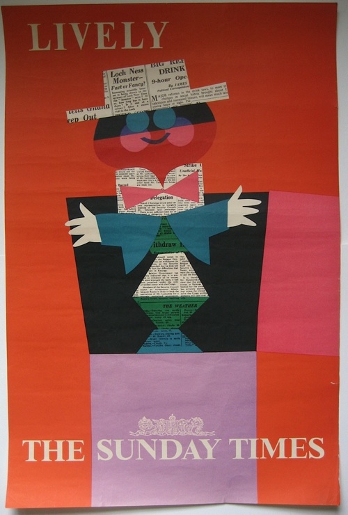
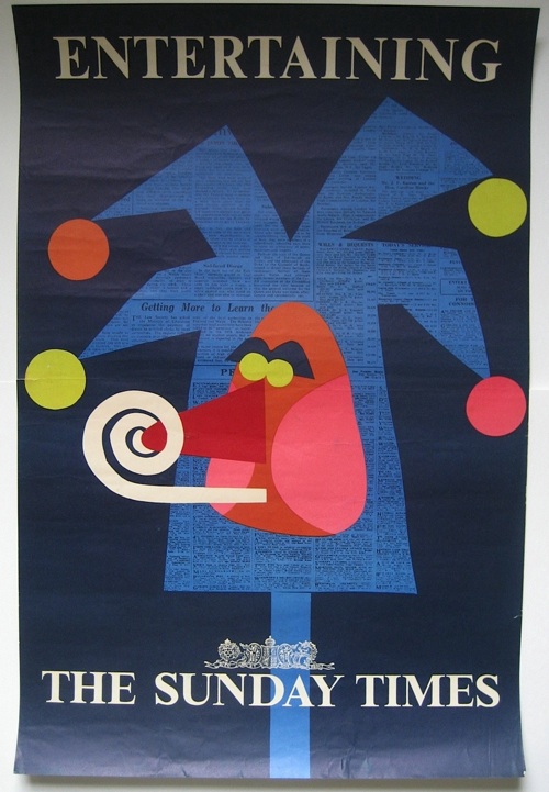
They’ve put together a small retro section on their website as well, with a few nice images, like these Sunday Times advertisements by Patrick Tilley.

Patrick Tilley vintage sunday times advertisement Patrick Tilley vintage sunday times ad

But it’s not the website that made me want to post about them, it’s this (the cover also, incidentally, designed by Tilley), which we’ve had on the bookshelves for a while now.

Cover of Artist Partners graphic design brochure

Dating from, I guess, the early to mid 50s, it’s a brochure for the artists represented by AP, and a very delightful book in its own right.  Here’s one of the section headings for example.

Divider from Artists Partners graphics book

Or this one, by none other than Tom Eckersley

Eckersley Artist Partners graphics book divider

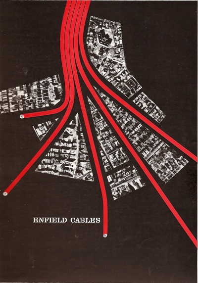
Oh to be sitting at at an advertising agency desk in 1954 and trying to decide who to commission.  Because there is such as wealth of wonderful talent in this book.  Amongst other people, Artist Partners represented Eckersley, Hans Unger, George Him, Eileen Evans, and of course Reginald Mount.  And even Saul Bass.  Here’s a trade advertisement for Enfield Cables.

Saul Bass Enfield Cables ad Artist Partners book

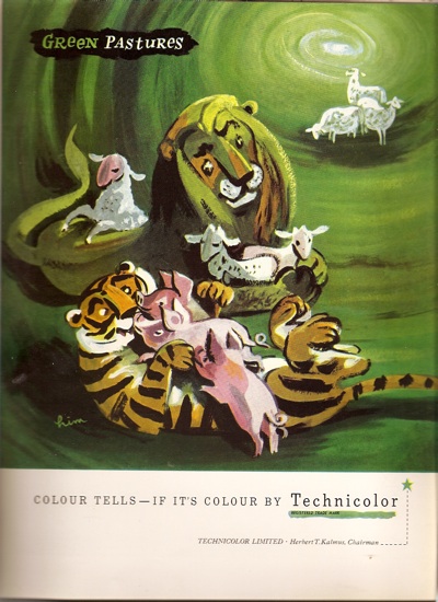
And a rather fetching advertisement for Technicolour by George Him.

AP George Him technicolour ad

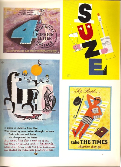
My main sadness is that it’s only partially in colour, because there are simply hundreds of pieces which I haven’t ever seen before.  For every page like this

AP content various

(Two Hans Ungers – one GPO, one London Transport, a Leupin and another Patrick Tilley)

there are ten like this.

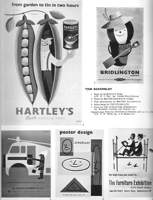
AP eckersley page

I’ve managed to find the peas one in colour at least for your entertainment.

Tom Eckersley Hartleys peas graphics

That’s more than enough for now, but I’ve still only barely scratched the surface of this wonderful book.

Advanced or gimmicky?

It’s a bit unfair to apply too much hindsight to other people’s critical judgements.  Classics are sometimes not spotted as such at the time, while designs that are feted often don’t stand the test of time.

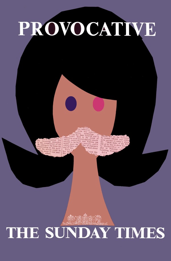
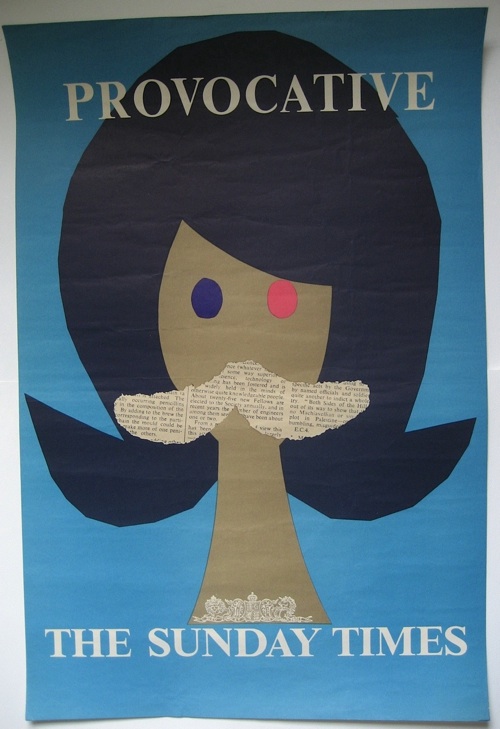
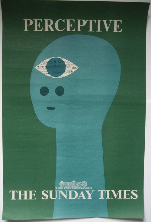
But in the case of posters, it’s so rare to get any kind of contemporary reaction to them that I really can’t resist.  The posters in question are Patrick Tilley’s series for the Sunday Times from 1960, of which this is possibly the most famous.

Patrick Tilley provocative Sunday Times poster 1960

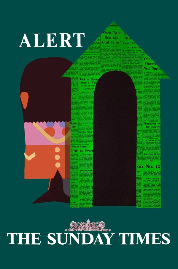
Now I’ve mentioned them on Quad Royal a few times before (here and here for example) and every time I have, the posters have been enormously popular.  As is only right, because they are great bits of design, especially considering how early they were produced.

Alert Patrick Tilley sunday times vintage poster 1960

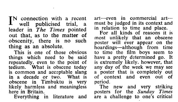
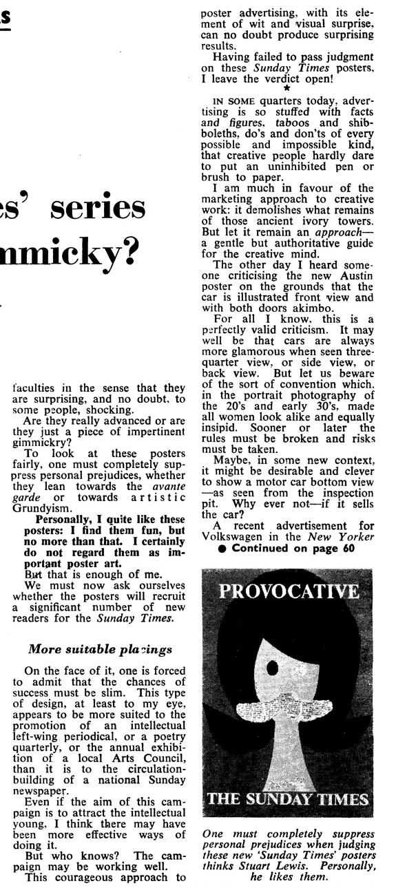
But at the time, the reaction was a bit more snitty.  The critic, one Stuart Lewis writing in Advertisers’ Weekly, is fairly certain about that.

I certainly do not regard them as important poster art.

He also doesn’t think they’ll sell the product, because the style is ‘more suited to the promotion of an intellectual left-wing periodical, or a poetry quarterly’ than a national newspaper.  Although, in the end, he is generous enough to leave the verdict open.

Sunday times vintage poster patrick tilley 1960

I don’t know whether they sold newspapers or not, but I think the jury would be finding pretty emphatically in favour of the posters these days.  They certainly wouldn’t find them shocking, as the article suggests that people did at the time.  (I’ve put the complete review at the bottom, if you want to read the whole thing for yourself.)  I find it pretty hard to be shocked by any of the series of posters, but that’s one reason why it’s good to come across articles like this now and then.  Because the way we see posters, and indeed any other kind of design now, may not be anything like the way they were perceived at the time.  Which has to be borne in mind if we want to read anything into them.

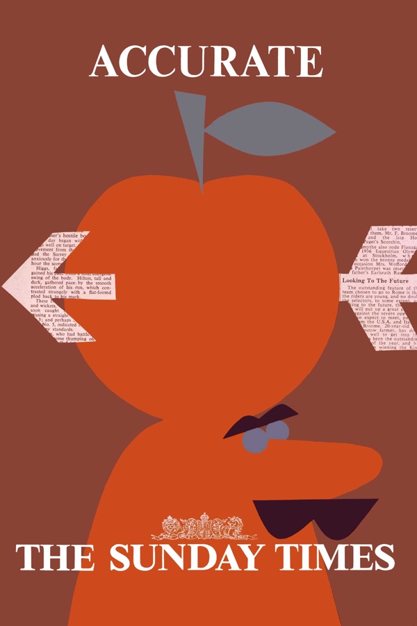
Accurate sunday times poster patrick tilley 1960

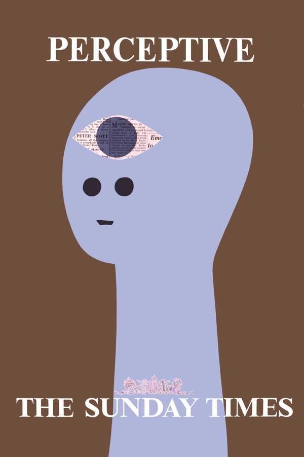
A couple of extra points by way of an addendum.  Firstly, the perceptive poster was quite comprehensively plagiarised a few years ago for Modest Mouse (evidence here if you want to see) and so I suppose must be a design classic.  Also, if you were wondering how these posters look quite so neat and tidy (and indeed digital) despite being more than fifty years old, Patrick Tilley cleaned up the scans and adjusted the colours himself.  So this is what they would have looked like if they’d been made now.

And now over to Mr Lewis.

Tilley review part 1

review part 2

Hoarding

Today, a very unusual sight.  Yet it’s one that shouldn’t be a rarity at all, because it’s posters doing what they are intended to do, advertising things.  Here on hoardings sometime in the mid 1950s.
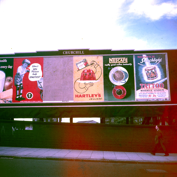
Advertising hoarding c1955/6 with several ads on it including Patrick Tilley

Mostly, this is such an everyday scene that no one takes any notice, never mind a photograph.  But this time, an up and coming poster designer was recording some of his work appearing.  That designer was Patrick Tilley, and he’d designed the Hartley’s Jelly ad in the centre.
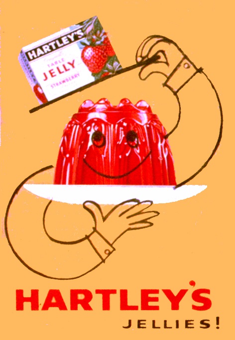
Patrick Tilley Hartleys Jelly poster 1950s

I can’t tell you how excited I am to see these.  It’s not just that Tilley’s posters are lovely, these photos are also a great chance to see posters in the wild, rather than collected and curated and hung on people’s walls.  Which means we can find out a bit more about how they really functioned at the time.  Take this set.
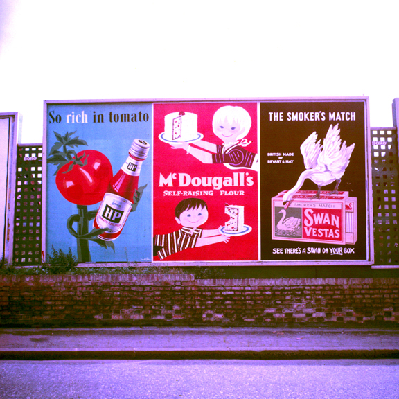
More Posters on Walls including Patrick Tilley and Donald Brun

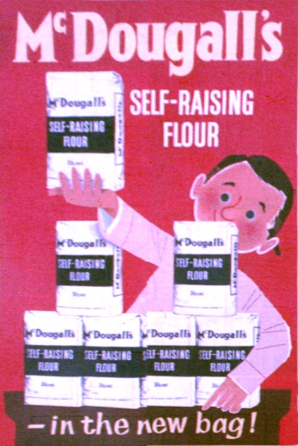
The Patrick Tilley design is for MacDougalls flour.
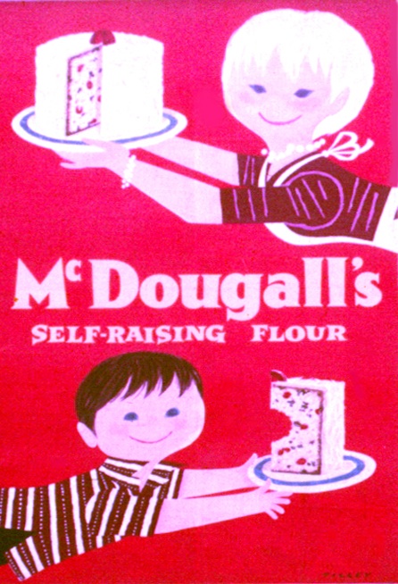
Patrick Tilley vintage poster McDougall's self raising flour 1950s

But take a look to the left. The HP Ketchup poster seems to have been signed by Donald Brun.
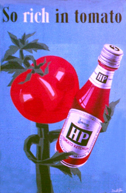
HP Tomato Ketchup poster Donald Brun 1950s vintage

I sort of half knew that some of the great European poster artists of the 1950s had worked in Britain, and had come across it happening here and there.  But it’s still odd to see their work on a British poster hoarding, advertising a very British brand.  And the image seems vaguely familiar, but I can’t trace it anywhere.  Because that’s the other thing about these posters, they’re also very rare.
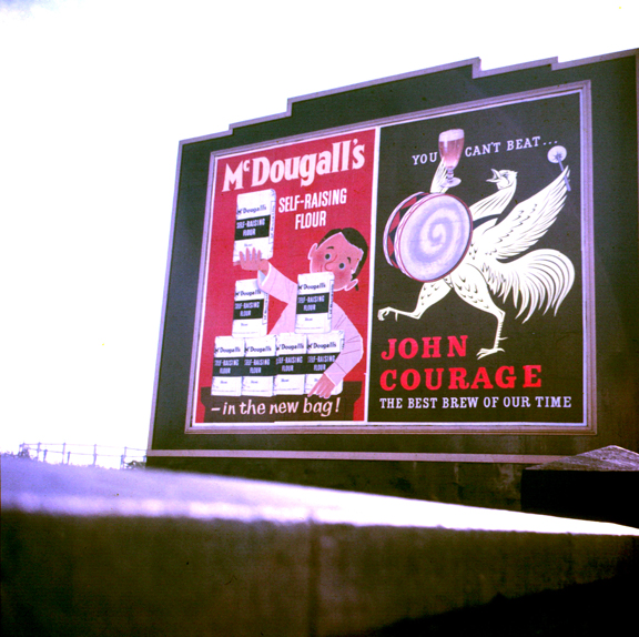
Patrick Tilley McDougalls flour advertising poster on hoarding 1950s

Unlike in Europe, Britain’s commercial posters were never (with the exception of Guinness) made available to the public or collected.  So it’s not even that only a few survive, probably most of these posters have disappeared entirely.  They might be in the archives of the company they’re advertising or the agency that created them; they may even have been recorded in a magazine or design annual.  But I’d be prepared to bet that a fair proportion of these posters have disappeared without trace, or at least would have done without these photos.

Mostly, it seems, it’s the artists that keep the records (as was the case with Daphne Padden’s packaging designs).  Patrick Tilley kept not only these photographs, but also the original artwork that he presented to the agency, The London Press Exchange, to get the commission.
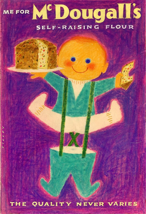
Patrick Tilley MacDougal flour design pitch

But not everything is sweetness, light and good design on the hoardings.  Once again, the photographs are a reminder that, along with the award-winning posters by great designers that we choose to remember, there was also quite a lot of dross too.  Like the tattoo and charity adverts in the first photograph, or that for Swan Vestas next to the McDougalls ad.
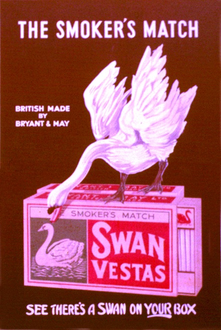
Swan vestas vintage billboard advertising poster from photograph

I mention this quite a lot, and in a way it’s an obvious truth, but the presence of all these rather average posters must have affected how people saw the good posters too, even if I’m not sure how.  Perhaps people got used to just tuning out posters, and so everything got ignored; or perhaps the good posters looked even better because they had a dull picture of a box of matches next to them.  I don’t know, I really don’t.

But the other reason that its important is that, by allowing only the good posters through our filter, we distort what they tell us about their times.  We will see only classy posters, probably for up-market products.  Which means that we’ll miss some things entirely.  Take a look at this set below.
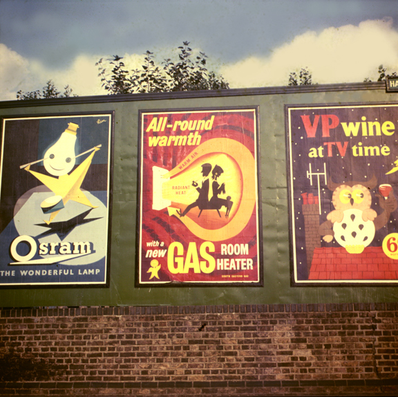
Osram Gas VP wine posters on billboard 1950s

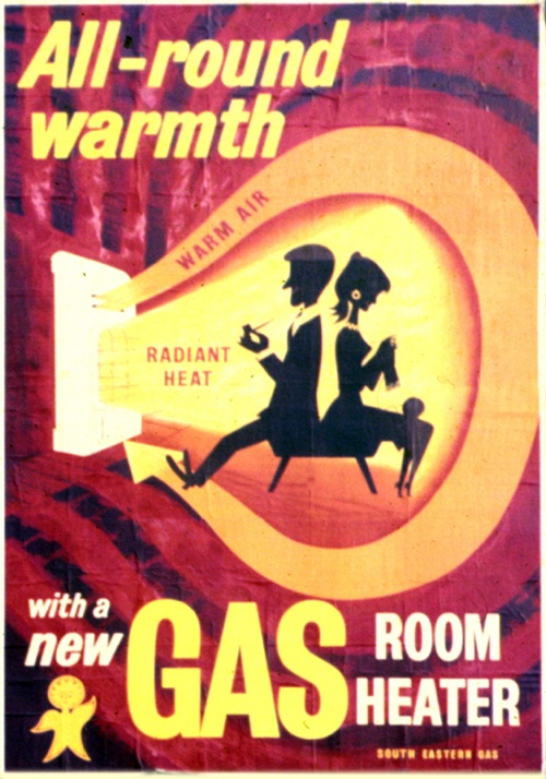
The Osram and Gas posters are both very good.
Patrick Tilley Gas poster 1950s

Vintage Osram hoarding poster

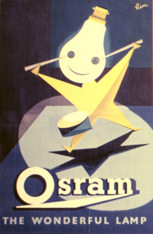
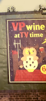
The top one is by Patrick Tilley, the Osram advertisement by ‘Rim’ which raises a whole set of other questions (if you can tell me who this is, I would love to know).  But it’s the one on the far right which intrigues me most.  It’s neither bad nor good, but take a closer look at what it’s advertising.
VP wine 1950s vintage advertisement

Drink fortified British Wine when you sit down in front of the television (tv being clearly a new and exciting innovation).  Now there’s a thought you’d never get from anywhere else.
Patrick Tilley vintage McDougalls advertisement 1950s

And thank you very much to Patrick Tilley for taking the photographs, and keeping them, as well as allowing me to use them here.

Alert

I mentioned a while ago that we’d got something interesting on eBay.  Well now they’ve arrived so you are going to have to suffer a bit of crowing.  Because it’s not only this.

Patrick Tilley Sunday Times Vintage 1960s Posters Perceptive

But also this.

Patrick Tilley Sunday Times Vintage 1960s Posters provocative

And this too.

Patrick Tilley Sunday Times Vintage 1960s Posters alert

Along with the other three posters in the set.  As mentioned before on here, they were designed for the Sunday Times by Patrick Tilley sometime in the 1960s, and I’ve never seen one in the wild before, never mind six.

Patrick Tilley Sunday Times Vintage 1960s Posters Accurate

Interestingly, they look much better in reality than as scans or digital images; something I think to do with the collaged newsprint showing much more.

They came from a dealer in the U.S. who had in turn bought them from the widow of a man who had worked in the print industry and travelled to Europe a lot on business. He clearly brought back things that he liked from his travels.  And then kept them.

Patrick Tilley Sunday Times Vintage 1960s Posters Lively

They were originally up for sale on eBay, and as I mentioned on Monday there’s an interesting cautionary tale here about the ways in which eBay can fail.  Which is mostly that if something isn’t already popular, people won’t be searching for it and so it won’t be found.

I’ve never seen a Patrick Tilley poster up for sale, so we never search for them – and nor, I will hazard, do many other people.  So, up on eBay without the right keywords and no one finding them, this amazing set of posters only reached $20, which wasn’t anywhere near the reserve.  We then did a bit of negotiation and got them for rather more than that.  Although it still feels like a fair price. But maybe only to us, who knows.

Patrick Tilley Sunday Times Vintage 1960s Posters Entertaining

Telegraphese

Such is the confusing nature of the modern world that telegrams have been arriving in my inbox.  I’d rather they were delivered by a messenger with brass buttons on his jacket, but I guess that’s not really an option any more.  Nonetheless, all of them are still very much worth looking at.

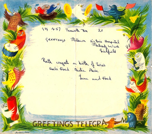
Laura Figiel sent me these two.  The first, from 1957 is by Barbara Jones.

Barbara Jones GPO greetings telegram

Excellent owl-work there.  Just in case you were wondering as I did, the news is that  the twins are now both 52, and one of them is Laura’s mother.
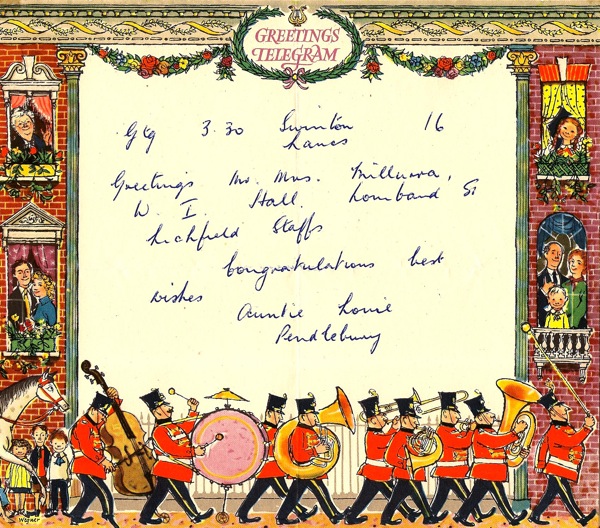
This 1956 example, meanwhile, is by Fritz Wegner.

Fritz Wegner GPO greetings telegram

Now I can’t tell you very much about him, I’m afraid, except that he has quite possibly gone on to illustrate children’s books, including some by Allen Ahlberg.  Which might lead me on to a post tomorrow.  I shall say no more until then.

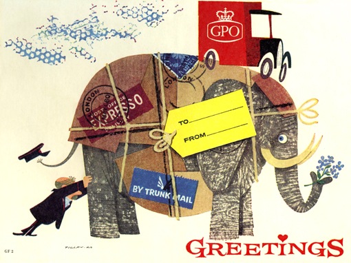
This isn’t strictly a telegram, but it is a greeting.  It’s by Patrick Tilley, and was designed to send postal orders in.

Postal Order artwork by Patrick Tilley

Now these do come up on eBay every so often and aren’t expensive at all – the Wegner sold a couple of months ago for just £6.  So if you want lovely graphics for not very much money at all, the telegram is your friend.  And no one will ever say that about an email.