Sitting on the dock of the eBay

End of the week already, and so time for a workmanlike round up of what’s floated to the surface on eBay recently.

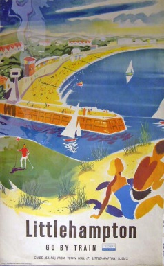
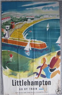
Exhibit A is this Littlehampton poster from the States, which is a bit battered but not beyond the work of man to restore (for something which is, see below).  Following on from yesterday’s thoughts,  I wonder how it got to the States, and how many Americans holidayed in Littlehampton rather than the Hamptons as a result?

Littlehampton railway poster on eBay

It’s by Studio 7 (whose work has recently started to cross my radar, does anyone know anything about them?) and dates from 1960 says the National Railway Museum.  Here’s their copy looking quite nice.

Littlehampton Studio Seven Railway poster NRM

And it’s filed in America under Transportation Collectables/British Airways, so might not get that much notice, should you be hoping for a bargain.

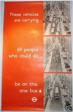
Next, a 1960s/1970s London Transport poster, which is not bad, although would be better for not being the 1973 reprint with added text.

London Transport poster buses

I can’t better the eBay description:

This is an original 1973 copy of the famous poster by well-known industrial photographer Dr Heinz Zinram. First issued in 1965 and then re-issued in 1973 with the added slogan ” First published 8 years ago; still true today”, it shows three versions of a street scene; the first full of cars, then the people from those cars on the street and, finally, one Routemaster bus which has soaked up all 69 people.

Its message would do as well today as in 1965 and 1973.  So perhaps posters don’t work that well after all.

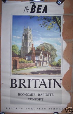
And finally, proving that a) everything which has a named designer is not necessarily gold and b) people will try to sell absolutely anything on eBay, a Daphne Padden poster.  Or at least some of one.

Daphne Padden Britain travel poster

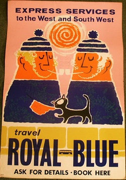
Now Daphne Padden is an under-rated designer, but that poster is not typical of her normally much less traditional style:

Daphne Padden western poster

Unlike the BEA one, this is wonderful stuff, and Padden deserves more appreciation than she currently gets.  If you want to see more of her graphic style, there’s a good collection of her work on Flickr and not really anywhere else.  A set (quite possibly this set) came up on eBay a couple of years ago, and the more I look at these, the more I wish we’d bought at least one of them.  Especially the one above with the cat.  Ah well, next time.
Just when you thought it was safe to come out of the signal box

The dust has hardly settled since Harrogate, but notheless, it’s railway poster time again.  Oh goody.

Coming up in just over a month’s time, another giant auction of picture-perfect railway posters, this time at Bloomsbury Auctions in New York.  And once again, I am trying to be enthusiastic, but not quite managing it.

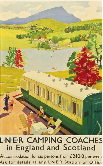
This one’s quite fun, although mostly because I quite fancy the idea of a holiday in some camping carriages (preferably in the style of the Amstutz on the ‘About Us’ page please).

anonymous camping coaches railway poster

But in the main I can’t even get enthusiastic enough to post them on the blog.

Don’t get me wrong, there’s tons of wonderful and collectable posters there, and I’m sure I’d love to see them on someone else’s walls, a few at a time.  But, just like with Morphets, all of that lovely landscape and pretty pastel colours and sheer niceness ends up overwhelming me, and I don’t want to buy a single one of them.  Not that I could afford it anyway.

Plus there’s a lot of Terence Cuneo, which is always a bit of red flag for me.  Or perhaps I should say signal.  He’s a sign that we have tipped over the border of art and are now firmly in the land of people who like pictures of trains.  Lovely detailed pictures of trains on tracks where you can see what model it is and where it is going.  (We did once accidentally own a Cuneo picture, which was of the ICI Works in Cheshire at night., a picture so uncompromisingly industrial and ugly that it earned my respect.  Although we still sold it.)

But nonetheless, there are lots of people who like buying these kind of posters and paying lots of money for them, so I am sure the sale will do very well.  And the fact that I can’t see this is the number one reason why I’m not a poster dealer and never will be.

One final word: what is truly odd and unique about this sale is the fact that this was one man’s collection and every single one of these 198 posters is framed.  My mind is well and truly boggled.  Where on earth did he (I assume it’s a he) live?  In a hotel?  Or a mental asylum?  How else would he have had enough wall space?  Answers in the comments box please.

Vintage design for modern times

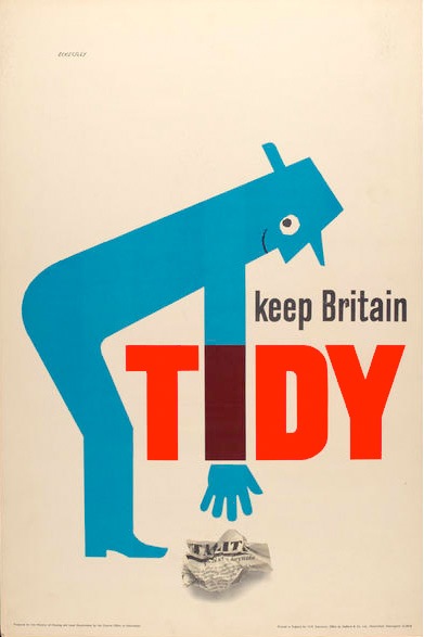
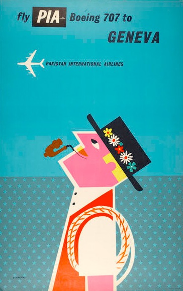
Tom Eckersley is all over the web at the moment.  Yesterday he was here on Grain Edit (and hence tweeted and reposted hither and thither).  And over the last few months, he’s also been herehereherehere and even all the way over here in Italy.  (There are loads more, I just lost the will to look at them all).  The two images below are currently spreading across the web like a virus.

Tom Eckersley Keep Britain Tidy vintage poster

This is in part – a big part – because the Eckersley Archive is both so big and so available.  But it must also be because there is something about Eckersley which is particularly appealing to today’s designers and students.

What’s noticeable about the posters which have, mostly, been chosen from the archive is that they tend to be Eckersley’s much more simple and graphic work, from the 60s and later.

Tom Eckersley Pakistan Airways vintage poster

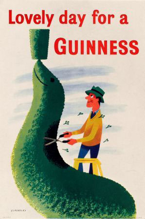
What’s missing from the tides of Eckersley’s work ebbing and flowing across the web are the earlier, more whimsical posters.  Posters like this one:

tom eckersley seal guinness vintage poster

Or even this:

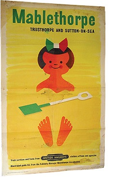
tom eckersley mablethorpe vintage poster

(This just went for £110 at Talisman Railway auctions, which is a bit of a bargain, even if it is a bit battered).

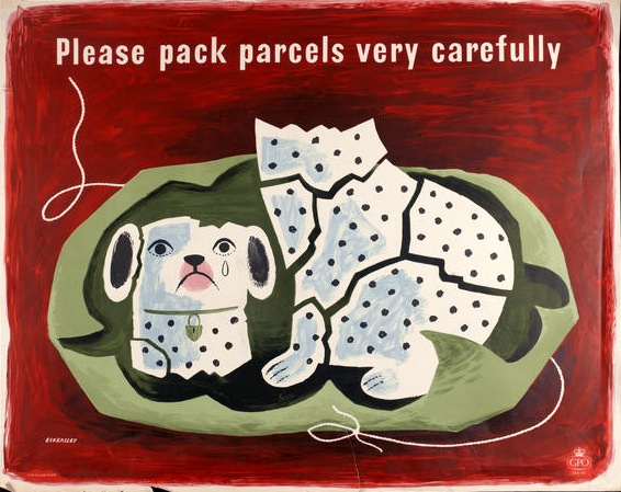
There is one exception to this, which are his Please Pack Parcels Very Carefully series, which the BPMA have been using quite a bit recently.  If I am truthful, I’m a bit cross about this.

Tom eckersley china dog vintage poster

It’s not that it’s not a lovely poster, it is, and of course everyone should get a chance to see it, if only to prove that Tom Eckersley did a bit more than just sparse modernism.  But it’s mine.  This was the first poster I ever bought (more on that some other time) and it’s sitting watching me as I write right now.  So hands off everyone.  Go and find another poster to tweet about please.

Here’s one to start with, another lovely piece of sparse modernism.

Mr Crownfolio and I are off to turn this into a twitter button.  We may be gone some time.  In the meantime, you can follow me on Twitter here.

A lesson in poster sizes – from Tom Eckersley

I got told off the other day for being poncey, because I described the Post office ‘Properly Packed Parcels Please’ posters as Quad Crowns.  Now this is close to being a fair point, but at the same time I think the proper names for poster sizes are lovely things and should be used more.

So, in the spirit of inclusivity and fairness, here is a brief guide to the commonest poster sizes.  Then I can keep being poncey when I talk about posters, and everyone will know what on earth I mean.  And there’s the added benefit that the title of this blog, and my posting name, may make a bit more sense if you’ve just stumbled here at random.

Our tutor for this lesson will be Tom Eckersley OBE (courtesy of his 1954 book on Poster Design).

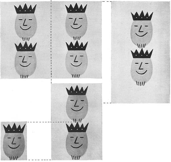
Tom Eckersley vintage poster sizes

The most general proportions of poster sites in Britain are illustrated here:
Extreme lower left: Crown (15 x 20 inches)
Lower left: Double Crown (30 x 20 inches)
Top left: Quad Crown (30 x 40 inches)
Right: Double Royal (40 x 25 inches)

Most of the advertising, GPO posters, film advertising, public information posters and so on were made in the left hand sizes and their variants.  They also went bigger – many advertising posters were a 60″ x 40″ single sheet.  (We accidentally bought one on eBay once.  It’s big. Very big.)

Mr Eckersley has also left out the half size Crown Folio, which I love so much that I have not only taken as my name but will blog about properly one day.  This seems to have been the default size for display advertising in Post Offices, and so you find National Savings posters this size, as well as the GPO’s own.

Meanwhile, on the right, the Double Royal (and its bigger sibling, the 40″ x 50″ Quad Royal) were mainly used by the railways and London Transport.  I believe that LT posters are still Double Royal these days, although I haven’t actually ventured onto the tube with a measuring tape to verify this.  So pretty much any railway or LT poster will be one of these sizes.

Eckersley also mentions two other poster sizes which don’t fit these proportions.  One is the London bus poster (as seen for sale elsewhere), which is 10″ x 13″.

Clifford Barry Dairy show vintage bus poster

And the other is a “long van strip poster”.  I’ve only really mentioned this so that I can include a colour version of the poster he uses as illustration (with thanks to the BPMA once again).

Lewitt Him post earlier GPO vintage van poster

It’s by Lewitt Him, from 1940 and I want it.  But I’ve never ever seen one of these van posters for sale – they were presumably just chucked out when they went out of date.  Unless anyone happens to have one that they might want to get rid of…

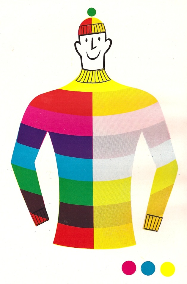
And a final word from Mr Eckersley.  This is how he illustrates lithographic colour printing.  It could have been a poster in its own right.

Tom Eckersley colour printing image

Mr Bawden designs a railway poster

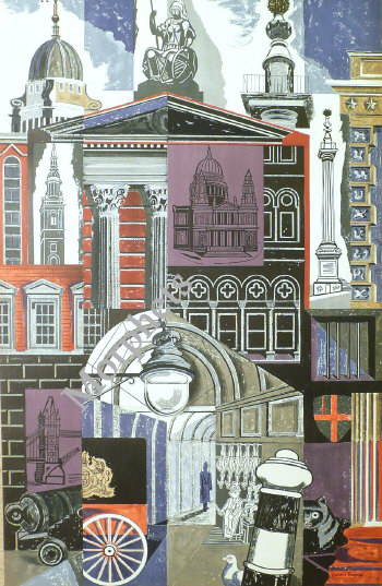
You’d think that the subject of the Morphet’s auction had been well and truly exhausted – it was only a poster sale after all.  But there was one more thing I wanted to say about it, and that’s Edward Bawden.

I knew he’d done some rather wonderful London Transport posters before now.

Edward Bawden London Transport half pair poster

This one was also in the Morphets sale (estimate £150-£200, sold for £1200, I say no more).  It’s half of a pair poster from 1952 and is rather wonderful.

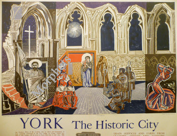
But what really surprised me was this.

Edward Bawden York railway poster

For the very simple reason that I had no idea that he had ever designed a railway poster.  It’s from 1954 and is a Quad Royal depicting the York mystery plays*. The National Railway Museum collection only has this one.  Are there any more out there that I don’t know about? Or is it unique?

*And it only went for £440, so with hindsight I wish I’d bit a bit more bravely on it.  Never mind.

Railway posters vs design

It was a long day, watching the Morphets auction.  And as all of those posters went buy, one after another going for way more than the Crownfolio budget, I found myself getting more and more jaded.  Until, by the end of the auction, I was quite glad that we’d only bought one single lot.

It wasn’t just that I was gorged on posters – although the experience was a bit like trying to eat a whole box of chocolates at once.  Seeing so many ‘classic’ railway posters together made me realise that (heresy alert here) the majority of them are not actually great pieces of design.

Of course, your average railway poster does have a lot of things going for it.  Nice watercolours, pictures of pretty parts of the countryside or heritage; a nostalgic vision of a Britain long gone.  A lovely thing to hang on your wall.

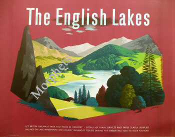
But when you look at them as pieces of poster design, it’s hard to get enthusiastic, particularly about the post-war breed.  The typography is average at best, and not integrated into the poster, while the images themselves are hardly cutting-edge illustration.  Of course there are some wonderful posters, like the one below, but they’re the exception rather than the rule.

lander english lakes poster auction

In the end – faced with five hundred of them laid end to end at the Morphets auction – it’s hard not to see the vast majority of railways posters as not only safe, but even a bit reactionary.  A nicely drawn vision of a Britain of plough-horses and fields, ancient cathedrals and Georgian towns, and, of course, steam trains.  Easy on the eye, not modern, not threatening – and not much different to buying a Victorian sketch of trees and a few cows to go over the fireplace.

This may seem a bit harsh, but I think it’s fair.  Because the other distinguishing factor of the auction was that some of the more striking and modern posters were the ones that didn’t get the highest prices.  The Lander above (which I love) only went for £300.

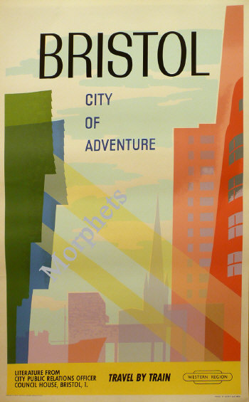
And Crownfolio’s only purchase of the whole long day was this.

Bristol poster auction

Which is lovely – and was also one of the only posters not even to reach its estimate.   So perhaps it’s a good thing that railway poster collectors aren’t in it for the design, it may yet still leave a few bargains for those of us who are.