Postal Art

There is more to life than auctions. as proved by what Mr Crownfolio found on his internet wanderings recently.

GPO Art

What that link takes you to is a short Pathe film about, amazingly, the poster art of the GPO, dating from 1959.  Which means that you get treated to things like this Ruskin Spear.

Ruskin spear postman painting for GPO poster from pathe newsreal

This is the original, sitting on the walls of the GPO Head Office, where you can also find this rather lovely view of Iwerne Minster by John Minton as well.

John Minton painting of Iwerne Minster for GPO poster design on Pathe newsreel

But don’t worry, as the very period commentary will tell you, if you want to see art works like this without travelling to London, just pop into your local Post Office where these posters will be on display.

GPO posters on display from pathe newsreel 1959

The featured set of posters, mostly done by ‘arty’ artists, were apparently intended to give the viewer an awareness of place, which would in turn lead them to address their letters in the correct fashion.  Apparently.

But that’s not all there is on offer, the film also features the range of Greetings Telegrams which the GPO now offers, and it’s possible to play the game of Spot-the-Barbara-Jones-birdie (posted before here if you want a closer look).

Mixed GPO greetings telegrams from Pathe film including Barbara Jones

Sadly, the designer that they choose to feature isn’t Ms Jones herself, but one Shirley Thompson.  She’s shown working with F.B. Savage, head of the design department, on a Valentine’s Telegram.  But oh, just look at that office.

GPO art office from pathe film

I’d happily take anything they’ve got in there.  Frustratingly, though I can’t quite work out what they’ve got tucked down the side of the desk there.  It ought by rights to be one of these.

Tom Eckersley cat ornament poster GPO pack parcels carefully

Tom Eckersley toby jug please pack parcesl carefully GPO poster

Except neither of them quite match.  Is it a first draft?  Or is it something else altogther?  I can’t find anything more likely in the BPMA catalogue so if anyone can provide a positive identification, please do.

This film is by no means the end of things either, I can see just from its own page that there is another short film entitled ARP Posters.

Early ARP poster woman from Pathe newsreel


It’s a soundless set of rushes, just showing a set of early ARP posters in various ways.  But it’s valuable nonetheless.  I’ve never seen some of these posters before.

ARP egg timer poster from Pathe newsreel


I wonder what else lurks within their archives, waiting to be discovered?

Looking a gift book in the mouth

A short Barbara Jones announcement for all of you who, like me, think that she deserves more recognition.  At last it seems to be happening.  Not only is the Black Eyes and Lemonade exhibition running at the Whitechapel until September, but now Jennings Fine Art are holding a selling exhibition of her work at the start of next month.  Including lovely things like this.

Barbara Jones gift book artwork neil jennings

It even comes with a caption:

Barbara JonesThe Gift Book

Watercolour and pen & ink, 1964. Original artwork for the front and rear covers of the book co-written with Isobel English. Extensively annotated by the artist. Reference: Artmonsky A6, illustrated p.129.

Provenance: The artist’s studio. 

I have no idea what it will cost, mind you.  Annoyingly, I can only find a teeny-tiny image of what the finished product looked like .

Barbara Jones gift book cover

This comes from the very useful Barbara Jones page at Ash Rare Books, which, by some oversight, I don’t think I’ve pointed out before.

There are more nice things in the exhibition too.  Here’s another.

Barbara Jones watercolour of horse on beach

 Seaside Pony & Cart

Watercolour.  Studio stamp verso.  Provenance: The artist’s studio.

James Russell has also posted, very interestingly, about Barbara Jones.  Mostly I will let you go and read it yourself, but there are two interesting facts in it that are worth repeating.

One is that Little Toller books are publishing a new edition of her book The Unsophisticated Arts, which you can read about here.  To my consternation, it includes additional drawings, ephemera and other material from her studio, which means that we’re going to have to buy it, despite having an original copy already.

The other, related fact is that her studio is, apparently, still extant.

Her studio has remained largely untouched since her death; most of the artwork has gone, but her sketchbooks and ephemera remain.  We spent hundreds of hours cleaning up the images and making them good for publication. it was a joy to work on because you look so closely at every single image and you see each page in a new way.

I’m boggled.  How has it survived and who is looking after it?  More to the point, I want to go and see it.  Now.

The selling exhibition, meanwhile, is from 5-9 and 12-17 June at the Peggy Gay Gallery, Burgh House, Hampstead.  Apparently Barbara Jones’s studio looked out onto Burgh House.

Barbara Jones sketch

 Mural Design for the Cake House, St James’s Park

A series of watercolour, gouache, pencil and pen & ink drawings, c.1969.  The New Cake House was opened by Mrs. Harold Wilson on 23/2/70.  The mural, constructed in ceramic tiles by Richard Parkinson, depicts the George III Jubilee celebrations held in the park in 1840.  We would like to thank Anthony Raymond and English Heritage for their assistance in cataloguing this work.  Provenance:  The artist’s studio.

Reference: Artmonsky pp.109-110; English Heritage Archive. (please note that this is only one drawing from the series)

I know I said that she deserves more recognition so I ought to be pleased about this, and for the most I am.  But at the same time, a small part of me minds that someone who I feel I stumbled upon by accident, along with a few others, is now becoming mainstream.  Still, I am sure Barbara Jones herself would have been very pleased, she was a fan of the popular after all.  So I will try to be pleased as well.

Who knew?

Today’s news is that I did something to something yesterday and discovered a whole new online archive.  For a collection that I had no idea even existed in real life.

It turns out that the British Council owns a socking great heap of posters.  Made up of things like this McKnight Kauffer.

SOCRATES AT THE BRITISH MUSEUM. BY UNDERGROUND 1926 Edward McKnight Kauffer

And this Purvis.

EAST COAST JOYS 1932 Tom Purvis

And even this anonymous psychedelic gem.

Beat the breathalyser smoke pot

These – and the many hundreds of others which go with them – come from the Alan Mabey archive, whose story is told on the British Council’s website as follows.

Mrs Phyllis Mabey donated this collection of over 300 posters to the British Council in August 1977. At the time she wrote “I should be very glad to hand the collection to The British Council as a gift, as I feel sure that it could not be in better hands, and it will be kept as a collection and not broken up.I wish that the collection be preserved as an entity and that it should be known as the Alan Mabey Collection.

I’ve tried to Google Mr and Mrs Mabey without finding anything out at all, least of all why they failed to give the whole lot to me.  But I can tell you one or two things about Alan Mabey just from looking at the archive.

The first is that he liked McKnight Kauffer very much indeed, because he must have owned pretty much every poster that Kauffer ever produced.  At leas that’s what it looked like.

SPRING CLEANING: EAposter - EASTMAN'S THE LONDON DYERS AND CLEANERS 1924 Edward McKnight Kauffer

There are acres of Kauffer’s designs for London Transport on the site, which I won’t bother illustrating because you’ve almost certainly seen them before.  But Alan Mabey also picked up some other designs of Kauffers which don’t come up anything like as often.  These two are new to me.

poster - READ 'CRICKETER' IN THE MANCHESTER GUARDIAN 1923 Edward McKnight Kauffer

vintage poster POMEROY DAY CREAM 1922 Edward McKnight Kauffer

I think more modern advertising should be along these lines.

The archive would be worth your time simply for these, but there is plenty more, because Alan Mabey had the kind of catholic taste that I can only approve of.  He liked Shell posters and London Transport too, although interestingly there aren’t many railway posters.  Amongst these are plenty enough of the recognised heroes and heroines of graphic design – not just Kauffer, but also Dora Batty, Austin Cooper and Frank Newbould.

poster ORIENT LINE CRUISES Frank Newbould

But he also bought some less obviously collectable posters, the kind of commercial art, in short, which is so often left out of the record.  The first of these is by Robert Gossop from 1928, the second is dateless and anonymous.

poster THE WAY ABOUT HEALS AT THE SIGN OF THE FOUR POSTER 1928 Robert Percy Gossop

JAMAL THE FREEDOM WAVE vintage poster 1930s

This F Gregory Brown is also rather fine.

WITNEY BLANKETS "FLEECY, LIGHT AND WARM" NO DATE F Gregory Brown

What doesn’t tend to be represented as much is the kind of post-war poster that I love most of all.  There are one or two, to be sure, like this 1963 Abram Games.

poster KEEP BRITAIN TIDY 1963 Abram Games

Again, this is matched with some of the more commercial work of the time.

PASCALL SWEETS MAKE LIFE SWEETER 1947 advertising poster

CHRISTMAS WISE D H EVANS 1946 Barbosa poster reindeer

The first is anonymous, but the second one is by Barbosa, and the website gives a rather wonderful biography for him.

Artur Barbosa was born in Liverpool, the son of the Portuguese vice-consul and a half-French mother. He studied at Liverpool School of Art and the Central School of Art in London. Whilst still a student he produced illustrations for Everybody’s Weekly and The Radio Times, in addition to producing book covers. He is probably best remembered for his cover illustrations for the Regency romances of Georgette Heyer. In addition to cover illustrations, Barbosa also designed for the stage, produced drawings for fashion magazines and the leading advertising agencies. Barbosa was at school with Rex Harrison, the friendship endured into adulthood when Harrison commissioned Barbosa to design the interiors of his villa in Portofino. This in turn led to a commission to refurbish Elizabeth Taylor’s yacht, the Kalizma.

What is present though, as the poster at the top has hinted, is a major collection of psychedelic posters from the 1960s.

FAIRPORT CONVENTION 1968 Greg Irons  poster

What I can’t tell you is whether any of this this represents Alan Mabey’s taste or not, because the British Council has been augmenting the collection over the years.

 Since the bequest the collection was augmented by post-war works by leading British artists and designers acquired by General Exhibition Department.

They must have been doing that quite heavily too; they say that the bequest was over 300 posters, but the online catalogue runs to 843.  Which is quite a lot.

F Godfrey Brown Ideal Home Show exhibition 1930s poster

There are two things to say about the archive.  One is that only about a quarter of the poster are illustrated.  However much I have tried to work through the full list of titles, my feel for the collection is still very much based on what I have seen rather than read.  I actually found the collection when looking for a Tom Eckersley Post Office Savings Bank poster from 1952, so there is plenty more treasure within.  How about this wartime Edward Wadsworth lithograph, produced by the Council for Encouragement of Music and the Arts?

SIGNALS 1942 Edward Wadsworth  lithograph CEMA

I need to know more.

The other point worth making is that this is actually one of the major British poster collections.  It may not be quite as large as the V&A’s, but it has some of the same scope and ambition.  But I had no idea that it even existed.  So what else is out there that I need to know about?

Loves a sailor

An errand sent me rummaging through our stack of Daphne Padden bits and bobs the other day.  This made me realise two things.  One is that they really ought to be in an archive box, something which has been on my to do list for too long. The other – more relevant here – is that I never got round to scanning much of it in order that you lot could take a look at them.  It’s time to make amends, clearly.  Here’s a thoughtful bird to start with.

Daphne Padden sketch of bird

For those who weren’t around last year (where were you?), the executive summary is as follows.  After Daphne Padden’s death in 2009, a lot of her posters came up for auction in 2010.  We got in contact with the executors after this, and ended up buying a miscellany of drawings, sketches, designs and, well, other stuff which hadn’t been included in the auction.

Most of the archive has gone to the Brighton University Archive of Art and Design where it can be consulted by historians and designers (more exciting developments on this next month too) but we kept a few small pieces that we might want to display one of these days.  I posted pictures of a few of them when they arrived, but but promised more.  That was some time ago.  Oops.

This was the item which particularly made me feel remiss.  I swear I had never seen it before, although Mr Crownfolio assures me I have.

daphne padden design for sailor coach poster 1950s

It’s done in real detail but very small (just over 10cm high) and in a little paper folder, so I like to think that this was what she presented to the coach company as a proposal.  This is of course the poster commission which resulted, although it does exist with a couple of different varients in its lettering.

Daphne Padden Royal Blue vintage coach poster sailor 1957

She obviously liked this series of posters a great deal.  I’ve posted this study before, but it was all part of the same collection of things she kept over the years.

Daphne Padden old salt artwork

Along with this much rougher sketch, on a torn piece of brown paper.

Daphne padden sketch of sailor on brown paper

There’s nothing similar for any of her other designs, so she must have felt a real sentimental attachment for this one.

Also of interest are a couple of proofs for British Railways leaflets.  This one is helpfully stamped 1963.

Daphne Padden proof for British Railways leaflet 1963

Along with them is one finished leaflet, which looks as though it’s from a slightly different series.

Daphne Padden British Railways leaflet 1960s The English Lakes

(In case you also worry about these things as much as I do, the BR in-house printing department definitely did the inside on this one, it’s not very exciting at all.)

Once again, I would have had no idea that she’d designed these without this evidence.  I also have no idea where to start looking for them in the great sea of ephemera out there, so if anyone can point me at some more, I’d be very interested to see them.

Finally, there is this.  I have no idea what it is for or even if it was by her at all, but  I rather like it.

A sketch.  Possibly by Daphne padden

What do you think?


Lend a hand

There’s a certain inevitability about the fact that now I’ve written the Home Front Posters book, a whole heap of new information about World War Two posters has popped up in various places.  This isn’t entirely a painful discovery, and not just because I am now resigned to the fact that while research could go on indefinitely, books do have deadlines.  Because today’s exhibit is that particular joy, a brand new archive.

What’s happened is that the National Archives have digitised a significant chunk of their wartime posters and are distributing them via Wikipedia.  (There’s a full explanation here if you want to know more).  It’s very exciting because there are a large number in there that I’ve never seen before.  Here’s a rather nice Dorrit Dekk to begin with.

Dorrit Dekk World War Two propaganda poster Staggered Holidays

This isn’t just an act of altruism but also a kind of crowd-sourcing, because the archives don’t have much information about many of these posters and they’re asking for people to help with everything from attributions to translation of foreign-language posters.

Part of the challenge, particularly with matching artists to designs is that these aren’t printed posters but the original artworks, quite often without the signatures that the finished item would have.  So it ends up being a process more like finding the provenance of a painting.  For example, we have this Eileen Evans, signed.

Lend a Hand on the Land Eileen Evans World War Two propaganda poster

Which makes it a fairly reasonable guess that these two posters in the National Archives are also by her.

Lend a Hand potato harvest farming holiday camp poster artwork eileen evans national archives ministry of information

Lend a hand with the potato harvest farming holiday camp world war two poster eileen evans ministry of information artwork

In fact I’m confident enough about that to have amended the description for each of those.

Only 350 of the 2,000 designs in the National Archives have been uploaded so far, but what’s already striking is how many of these I’ve never even seen before.  Take this Pat Keely for example.

Pat Keely wait for daylight world war two blackout poster artwork national archives

I think he owes McKnight Kauffer an acknowledgement on that one. Keely’s quite well-represented in the selection that are up so far, again often with previously unseen posters.

Cross at the lights world war two blackout poster national archives Pat Keely

What’s difficult, though, is to interpret what these previously unknown designs actually mean.  Are these for posters which were printed but are as yet unreported – whether that is because a copy never survived, or perhaps does exist but has not yet been digitised by the Imperial War Museum?  Or are they designs which were not actually ever produced?  In many ways. my bet would be on the latter.  Artworks which never went to the printers would be far more likely to survive.

Then on the other hand, this artwork is in there, for a poster which was very definitely printed in quite large numbers.

Make do and mend world war two poster ministry of information artwork

There’s not an obvious conclusion to be had.  Except perhaps that – because of wartime haste, limited record-keeping and the only accidental survival of what were intended to be very ephemeral bits of paper – we’ll probably never have the definitive list of World War Two Home Front posters, never mind their dates and artists.

It’s also worth remembering that this collection is very partial. The artworks all came from the Ministry of Information, but they were by no means the sole source of posters during the war.  Both National Savings and the Ministry of Food, two of the highest-spending departments at the time, commissioned their own advertising, so very few of their designs, if any, would turn up in the MoI’s archives.   And that’s without considering other poster producers, from British Railways to the Army.  Even so, there are still some delightful surprises in there.  It may not be the greatest design ever – apparently by the mysterious Xenia – but I love the idea of Village Produce Associations a lot.

Xenia poster artwork village produce associations

So I am very happy to report that Google reveals many VPA’s founded during the war are still going today.  Hurrah.

That kind of continuity after the war is also apparent in the poster designs.  It’s easy to believe, as I’ve said on here before, that all wartime posters stopped as soon as hostilities ceased, but that’s far from the truth.  Many campaigns, from salvage to fuel saving, just continued unchanged.  This fuel saving poster – in the great tradition of bossy shouty slogans – could date from during or after the war.

Turn that Gas down World War Two austerity fuel saving poster national archives

Other campaigns, meanwhile, were reversioned for the peace.

Dig for Plenty world war two poster reversioned for austerity post war national archives

Dig for plenty world war two austerity poster national archives artwork

It’s also fascinating to see some of the very definitely post-war designs produced by the new Labour Government to persuade people that the continuing austerity was necessary – a much harder job than wartime propaganda.

We work or want post world war two propaganda poster national archives

Wages and salaries can only go up with production post war propaganda poster national archives

These seem to me to be much rarer than the wartime posters, presumably because, by this stage of post-war austerity, no one at all wanted to keep them as a souvenir.

There’s plenty more to be seen in there too – including this Percy Drake Brookshaw artwork for – well for what?

Percy Drake Brookshaw apple picking artwork for something national archives

So why not take a look and see what I’ve missed out.


People do love huge pieces of paper

So, finally, after several advance mentions it’s time to have a look at the new V&A book about posters, British Posters: Advertising, Art and Activism.

Catherine Flood British Posters Advertisting Art and Activism

I don’t think that the fact that this has been sitting around on my desk for a week or two is just an accident of circumstances.  It took me a while to start reading it, even though I knew I ought to.  Every time I picked it up and flicked through it, I wasn’t inspired to carry on.  When I’d made myself read it, I then didn’t really know what I wanted to say about it.  I’m still not sure whether I like it or not.

To some degree this is as much my fault as the book’s.  The title sets out its range quite clearly – art and activist posters as well as the commercial design that I tend to prefer – which means that large swathes of the book are not really my cup of tea.  Although I do also think that it could have tried to persuade me a bit harder that these things are worth my time.  At the same time the things I am most interested in – commercial posters pre and post war – don’t get enough of a treatment for my tastes.

Tom Eckersley vintage war ROSPA poster 1940s

But let’s accentuate the positive.  The book does have some thought-provoking ideas in it.  I’ve already mentioned the fact that it sets out a very useful history of outside display.  While reference to the Town and Country Planning Act of 1947 may sound dry, it actually matters.   The decline of the poster during the 1950s can be seen not just as result of the rise of television, but also of the restriction of poster sites.  Throughout the 1950s and 60s, local authorities used the act to ‘clear poster sites from rural and residential areas’.  There were arguments for the poster as an integral part of the urban scene, but mostly the planners won.  Poster sites were no longer huge billboards, but instead decorous display columns in shopping centres.  No wonder the power of the poster was on the wane.

Another one seems blindingly obvious, which is that the meaning of the poster changed significantly between 1950, say, and 1970.  No longer did it mean a piece of advertising, instead a poster was something that you bought from Athena to decorate your room (students, this means you).  While this is something that we all understand at some level, it’s important to articulate it, as it has all sorts of interesting implications for how we think about posters.  So interesting in fact that I’m going to give them a blog post all of their own one of these days.

Another thought worth holding on to is the way that posters have, for a whole host of reasons, been singled out from the greater mass of graphic design. Flood ascribes this to the vogue for posters in the late 19th century, which set the habit of collecting, cataloguing and admiring them.  I’d also argue that now it is also because they are most like art, in that they are flat pictures which can be framed and hung on the wall.  But at the same time they are also very unlike art – I’m thinking here of railway posters in particular which continued the British tradition of landscape art when the vast majority of fine artists had abandoned it entirely.  Work that one out then.

Eric Fraser vintage London underground poster town joys in the country

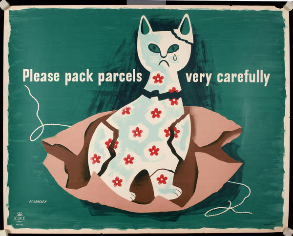
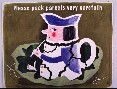
The development of the poster market is also something I’ve never seen considered before either.  I was particularly interested in the account of a man named Bob Borzello, who ran a poster import export business from Islington during the 1960s psychedelic boom.

1967 psychedelic band poster Michael English

He selected British posters for the American market: posters for theatre companies, London Transport and the General Post Office proved popular, and he claimed he could charge more for anything with London on it.

Where have all these GPO posters gone then?  I need to know.

Properly Packed Parcels Please tom bund 1968

In between these flashes of interest, though, there is a lot which isn’t quite so enthralling.  In part this is because this book is trying to cover an awful lot of ground in not that many words, so ends up being very general by default.

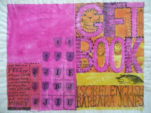
There is also the fact that I cannot bring myself to care about 1970s agit-prop posters in the way I care about Tom Eckersley or Barbara Jones.  I would guess that the slightly scattergun choice of subjects is a function of the V&As collecting policy.  I can see the political reasons why, if you’re a curator at the V&A, there would be a political reason for taking the collections as both a reasonable depiction of a subject and a fait accompli, but for the rest of us on the outside, it makes for a bit of a disjointed read.

Back in the days when I was doing my time in the V&A, their entire depiction of the ceramics of the 1950s consisted of the studio pottery of Bernard Leach, Hans Coper and Lucie Rie.  It was all lovely stuff, but I wouldn’t have liked to write a history of 1950s tableware on that basis.  They also had failed to collect any mugs at all.  It’s all very different now, but museum collections do still have their biases and absences, and it’s perhaps better to address these rather than take a collection as gospel.

The other problem, though, is that curse of academia generally, the use of a language so abstract that it ends up utterly disconnected from its subject and floating away into the ether.  Here is one sentence, on my current favourite topic of World War Two posters, as an example.

Abram Games your britain fight for it now vintage world war two propaganda poster

By balancing themes of collective sacrifice and citizenship with increased state responsibility for informing and protecting the people, war posters had set out a form of social contract between the government and the British people.

The only concrete noun in all of that is the word poster, although I might also allow contract at a push.  But this does at least tell us something.  Where I find the abstraction particularly galling is when the abstraction is given precedence over the posters.  Take this, a fine piece of London Transport pair poster from 1950.

James Arnold vintage London Underground Pair poster farms and farming

The poster is introduced by the idea that – oh it’s so abstract I can’t even paraphrase it – here you go in her own words.

[posters] encouraging people to travel out of London had helped to foster an idea of the British countryside as a site of collective heritage and recreation. This romantic but democratic idea of the land gained institutional currency after the war with the creation of National Parks, Green Belt policy and the expansion of the National Trust, but was offset by the urgent need to increase agricultural production and drive forward the mechanisation of farming.

Land.  I know what that looks like at least.   But the language itself is not so much the problem – there is a point here and I can discern it floating high up there in the abstractosphere – as the conclusions it leads to.

Tractors and stockbreeding, two king-pins in the modernisation of farming, have a prominent place in the composition.

Now I could say a lot of things about this poster – probably starting with the implicit contrast of rural life when depicted in the very urban and mechanised environment of the underground, moving on to the neo-Romantic rather than modernist style, possibly influence of Stanley Spencer in the apple-picker and generally that it is rather good.  If we were looking at the text too, perhaps it would also be worth noting that the poster feels the need to instruct the Londoner on why the countryside is good and how to behave in it, showing an estrangement between urban dwellers and the countryside.  But the mechanisation of farming is hard to see in it, especially given that the steam powered thresher – given far greater prominence than the tractor – was even in 1950 a relic of the last century.

James arnold OUt and About the Farms 1950 vintage London Tranport poster

What’s happening here is one of my bugbears, an argument into which posters have been dragooned as supporting evidence. I’d far rather start with the poster and see what it might have to tell us.

So should you buy this book?  I still don’t really know the answer to that question if I’m honest.  If you’re more interested in art and protest posters than I am, then yes probably.  If you’re me, or something akin to that?  Well then yes, I do still think you should.  Not only will you end up knowing more about the history of poster display, you may even end up having a creative argument with it to boot.


(Most of the images illustrating this post, incidentally, come from the V&A’s online archives.  Now this is not only a selection by curatorial choice, but also further limited by the fact that only some of the entries have images with them.  Even so, I find it strange that I couldn’t find a single English railway poster in there – the Welwyn one above was as close as I could get.  It’s a very partial story indeed.)