Not here

I’ve tried to write a sensible blog post today, I really have, but my brain just isn’t co-operating.  So my thoughts on Catherine Flood’s British Posters: Advertising, Art and Activism will have to wait for another day. When I might actually have some thoughts to relate.

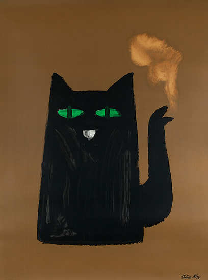
So I was just going to give you a poster of a cat by way of apology.

A poster of a cat about which I can remember nothing at all

But I can actually do a bit better than that.  Because the Brighton Design Archives have been putting up some of their holdings on Flickr, and they tweeted the other day that set of Henrion’s work had just gone up.  And so it has.

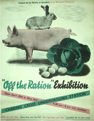
Henrion vintage poster worldwar two 1941

It’s only a small set, but it provides a neat overview of Henrion’s career, beginning with wartime posters and illustration work.

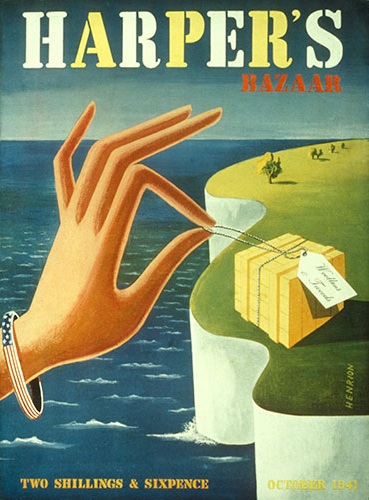
Henrion Harpers Bazaar cover 1941

As the decade moves on, the poster is no longer king and the designs that Henrion produces are increasingly part of a whole corporate identity.

F H K Henrion ‘Taylor Woodrow built this airport’, 1955. Poster artwork showing Henrion’s characteristic wire-frame model.

Coincidentally, the set is in fact illustrating one of the arguments in the poster book, that only a very few designers in the 1950s remained poster artists, while many more set up companies and set about creating corporate brands instead.

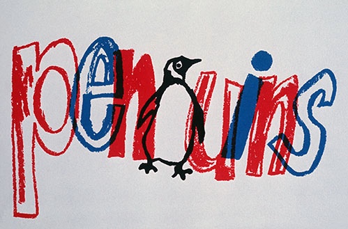
F H K Henrion ‘Penguins’, part of a range of work for the publisher in the 1960s, including a number of book covers.

A point that is very true of Henrion.

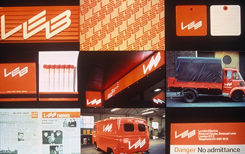
 Examples of London Electricity Board corporate identity work by Henrion. 1970

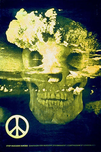
The illustrations are all informatively captioned, and it’s well worth going to look at the set yourself.  I learned two things, one is that Henrion designed this famous CND poster.  (I knew the poster very well, just had no idea that it was his)

‘Stop Nuclear Suicide’, a poster for the Campaign for Nuclear Disarmament, 1960,  F H K Henrion

The other is that there is apparently one of those petite design books out about Henrion.  Has anyone read it?  Is it any good?  Shall I buy it? If you want to know more about him for free, though, there is a fine interview from Blueprint in 1986, which is here.

Meanwhile a normal service will resume later this week when I hope to have my brain back and working.

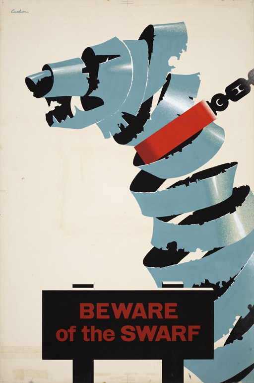
Beware of the Swarf

Attic find of the year has to be awarded to RoSPA, who went into their warehouse  last year and discovered 700 old posters.  I dream of doing something like that.  Especially if it produces posters like this one.

Leonard Cusden RoSpa poster  1951

This is by Leonard Cusden from 1951, and it’s the original artwork, as is, it seems, much of what was discovered in the back of the warehouse.

Not everything is of quite such high quality graphically, although this Bruce Angrave from the 1940s is rather fine.

Courtesy is Infectious, hand-rendered artwork, road safety, Bruce Angrave, 1940s © The Royal Society for the Prevention of Accidents.

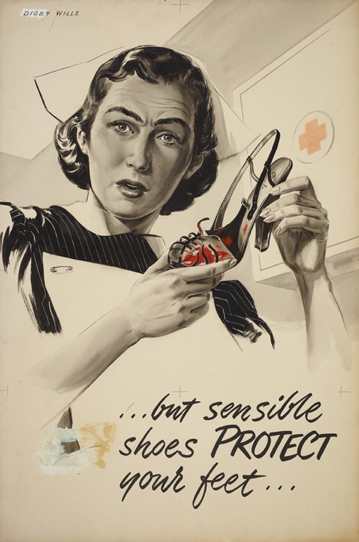
While this poster by Digby Willis is just rather fantastic quite regardless of the style.

But Sensible Shoes Protect Your Feet, hand-rendered artwork, industrial safety, Digby Wills, 1954 © The Royal Society for the Prevention of Accidents

I may be needing a copy of that when small Crownfolio hits the teenage years.

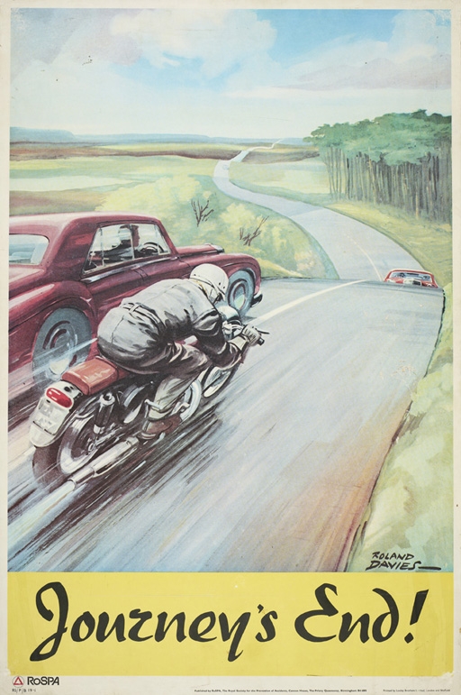
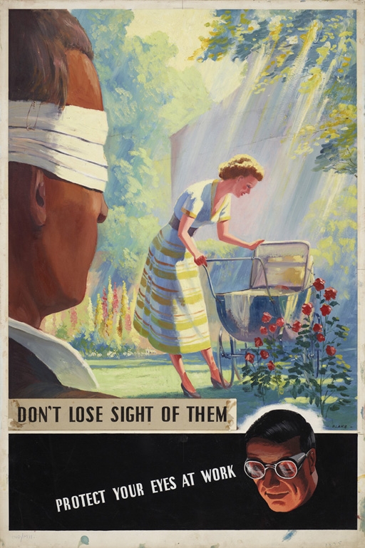
Many of the rest, like these two by Roland Davies and F Blake respectively, are more from the Ladybird books or Woman magazine school of design than high graphics.

Journey’s End, poster published by RoSPA and printed by Loxley Brothers, Sheffield, road safety, Roland Davies, 1960s © The Royal Society for the Prevention of Accidents.

Don’t Lose Sight of Them, Protect Your Eyes at Work, hand-rendered artwork, industrial safety, F Blake, 1954 © The Royal Society for the Prevention of Accidents.

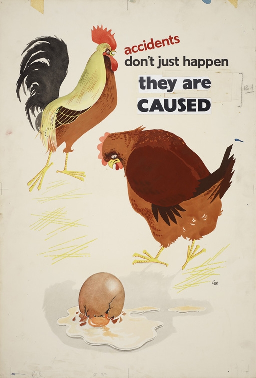
While this one, by Gus from 1963, is just plain odd, mostly because it makes me feel very sorry for the hen.

Accidents Don’t Just Happen, They are Caused, hand-rendered artwork, general safety, Gus, 1963 © The Royal Society for the Prevention of Accidents.

Maybe it’s the gender politics making me uneasy.

Overall, though, the impression that these posters give is that RoSPA’s quality control systems, so thorough during the Second World War and in the years after, disappeared later on.

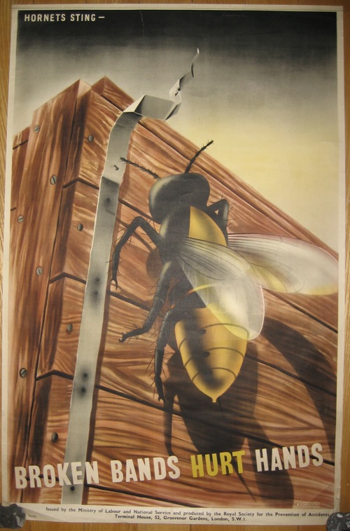
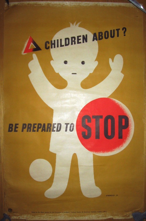
And they really did have a quality control system; their Publicity Committee was staffed by, amongst others, Tom Eckersley and Ashley Havinden, whose keen eyes really did let little dross through.  Here are the couple of posters that we own from this period, by G R Morris and Eckersley himself.

G R MOrris vintage RoSPA safety poster broken bands hurt hands

vintage Rospa child road safety poster tom eckersley

RoSPA are a really interesting organisation: there is a lot more to say about their posters and I’m rather surprised to discover that I’ve not written anything about them properly on the blog yet.  This is even more surprising given that their wartime posters get a mention in the book (did I mention the book? that I have written one? and that you can order it from Amazonalready?).  But most of what we tend to come across are the later posters, and these in the main would have caused the sensitive disposition of Ashley Havinden some pain I think.

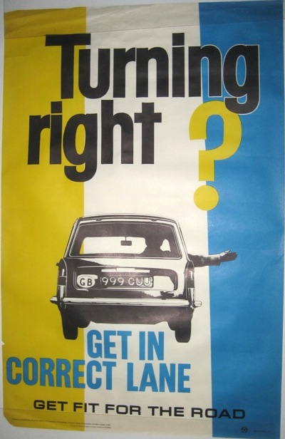
Vintage ROSpa road safety poster 1960s

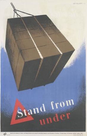
More posted here if you are a glutton for punishment.  To make up for that, I’ll go through some archives and dig out a few gems one of these days, because there are some great ones to be seen, most notably on VADS.  This one, which I’d never seen before now, is by Theyre Lee Elliott.

Theyre Lee Elliott vintage Rospa safety poster

However, I am a mere amateur in this field, because if you really want to know about RoSPA, the person you need to be reading is Paul Rennie,who wrote his PhD thesis on their wartime poster output, and has condensed this into a couple of articles which you can find here and here.

Rothholz vintage WW2 RoSPA poster

You can even –  such are the wonders of the internet – download his entire thesis from the British Library if you like.  I’d recommend it, it’s a good read.

If you’d rather form your own opinions about the posters, RoSPA are exhibiting 40 of their finds in Birmingham next week.  Two words of warning, though.  Firstly the exhibition is only on for three days.  But perhaps more importantly, RoSPA are mostly exhibiting reproductions rather than the originals themselves.  That said, it would probably still be pretty interesting, so if anyone goes, can you let me know all about it please?

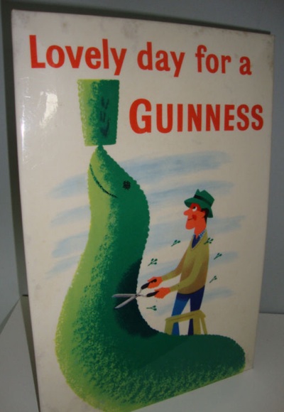
Finally, from one Eckersley to another.  I mentioned this showcard last week when it appeared on eBay.

Tom Eckersley vintage Guinness poster showcard

The starting price was 99p; it finally went for £317.  I know it’s easier to display than a poster but even so, I’m still astonished.  Thoughts and explanations – along with corresponding valuations of the poster itself – in the comments box please.

Float Or Fly

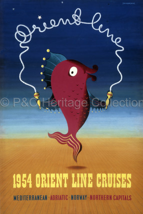
I’ve mentioned the P&O archive before now, but I was led back to it the other day when I was on the trail of John Bainbridge.  This delightful fish is his, dating to 1953.

John Bainbridge fish poster P&O 1953

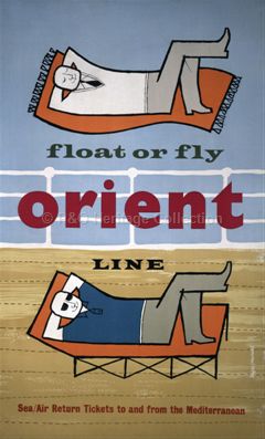
But to my joy, I’ve discovered that they’ve added to what’s online since I was last there.  New arrivals include this Negus/Sharland poster from 1955, which is, I think, the earliest example of their work that I have come across.

Float or Fly Negus Sharland orient line poster 1955

This Fritz Buhler, which is just dated 1950s, is also good.

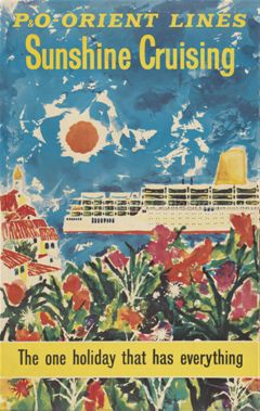
Fritz Buhler vintage Orient Line poster 1950s ship

While this last poster is just intriguing.  It’s not signed, but it doesn’t half look like a Royston Cooper to me.

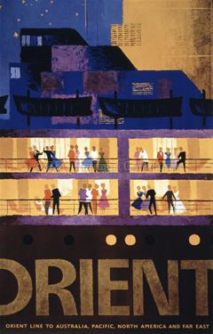
Vintage Orient line poster 1965

What do you reckon?

But that’s not all.  The Printed Ephemera section has also been extended.  It now not only includes a few delights that have been seen before on Quad Royal, like these menus by Dorrit Dekk and Daphne Padden.

Dorrit Dekk P&O Menu 1971 front

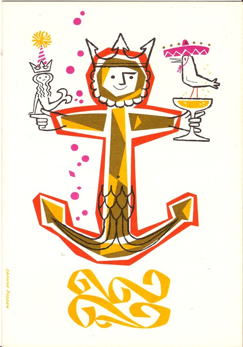
Daphne Padden P&O menu from estate sale

There are others as well, and amongst them this Daphne Padden menu, which is new to me.

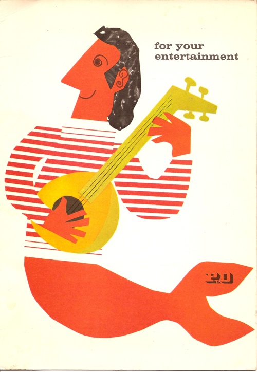
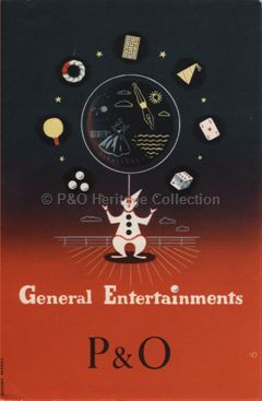
Daphne Padden entertainments menu P&O 1956

And dating from 1956, it’s quite an early example of her work too.

There’s plenty more to be found on the archive too, but it’s leading me into such digressions that they may need a whole post of their own. But I will explain more another day.


Bunny’s Dinner

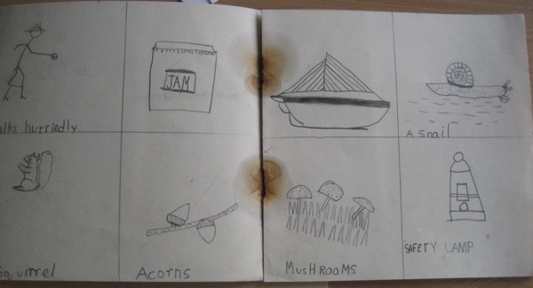
Now here’s something I never ever thought I’d see.  Daphne Padden’s sketch book from when she was just six years old.

Daphne Padden's first drawing notebook

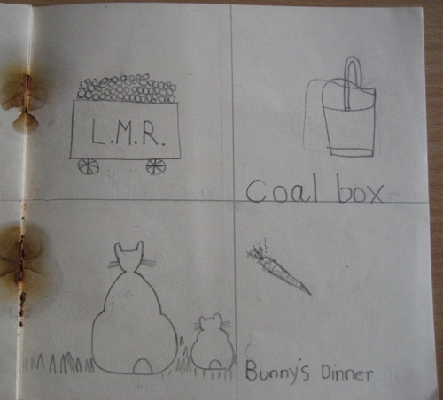
Note period detail of LMR coal truck below.

Daphne Padden juvenilia

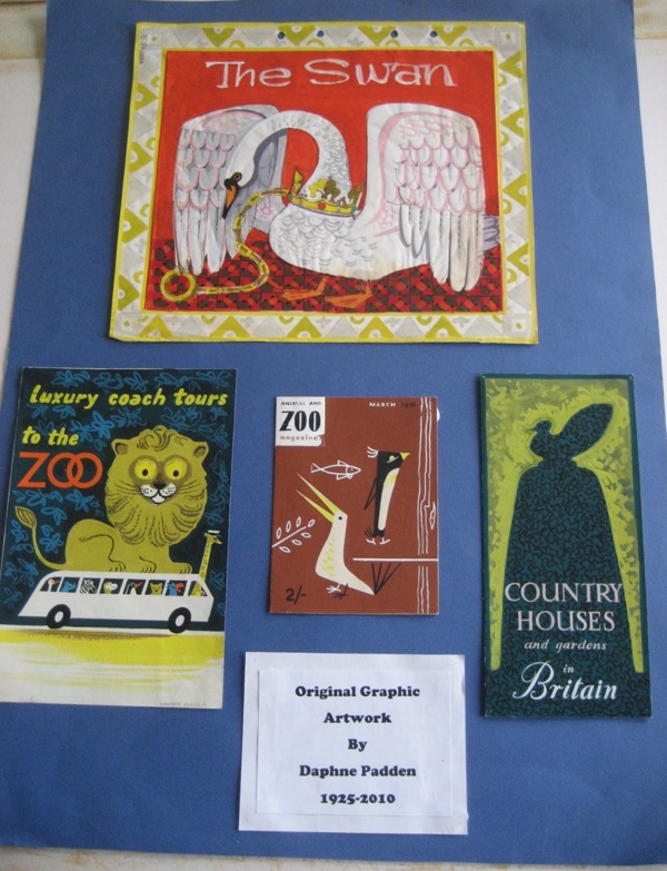
This would be a fantastic thing on its own, but what it means is that some more of Daphne Padden’s archive has turned up (with many thanks to Dan from Modernish who put it and me in touch).

I’ll post some more of it next week, when I’ve had a chance to get my thoughts together, but here is a taster for now.

padden on display

Anyone seen Animal and Zoo magazine before?  I haven’t.

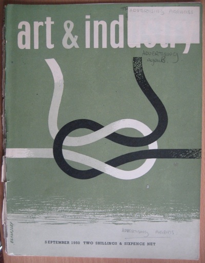
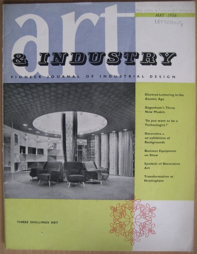
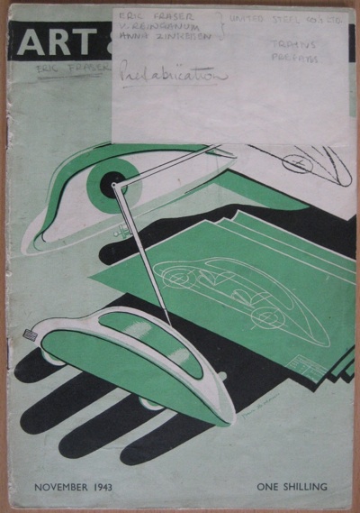
But with all of these designs was also a stack of art and design magazines, including some lovely Graphis Annuals, and then these – a selection of little Art and Industry magazines from the early 1940s until late 1950s.

Art and Industry Magazine cover tom Eckersley

And yes, that cover is by Tom Eckersley.

Now it’s not a complete run and the magazines are tatty, but they are interesting in part because they’re tatty – the notes at each top corner are Daphne Padden’s own indexing system.

Art and Industry magazine

I would also imagine that these wartime editions have to be quite rare too, as I doubt that many were printed in the first place.

early art and industry magazine

These – along with the rest of the stuff – have been left to Oxfam who now have a duty as a charity to maximise the value of the bequest.  The Graphis magazines will probably go on eBay, but if anyone wanted to make a generous offer for the Art & Industry heap, let me know and I will pass it on.  Otherwise they will probably go to an auction.

On Display

Having already written in praise of the ephemeral last week, it’s time to explore some more things that can never be recreated.

I ordered this book ages ago, but it arrived just before Christmas after a slow sea crossing of the Atlantic.
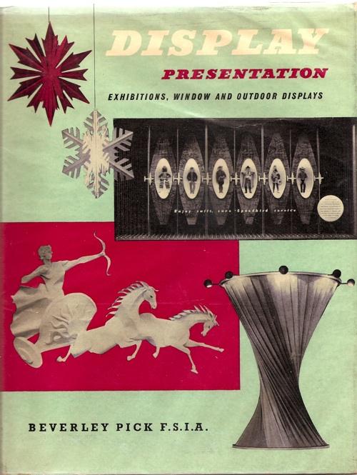
Beverley Pick, cover image of display presentation book

The wait was worthwhile, because it is full of wonderful things, even if, sadly, the cover is the only bit of colour there is.

The book covers the full range of display and design, ranging from grand stands at trade shows, like this one for English Electric at the Radio Show at Olympia,
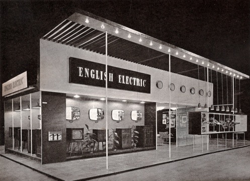
Beverley Pick exhibition Stand for English Electric at Radio Show at Olympia

to small portable displays and shop windows.
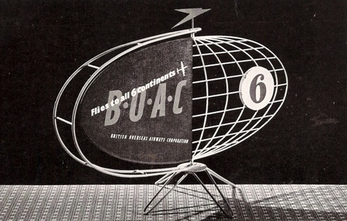
Beverley Pick BOAC small counter display object

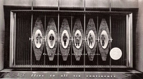
Beverley Pick BOAC five continents window display

In addition, there’s plenty of practical advice too, with examples of Pick’s own models for his designs – this one intended for shop windows.  He’ll even tell you what glue he used to keep a particularly difficult model together.
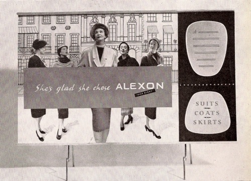
Beverley Pick design for Alexon shop display board

But it’s the exhibition stands I love the best.  This is another one from the Radio Show, for a manufacturer of wireless components.
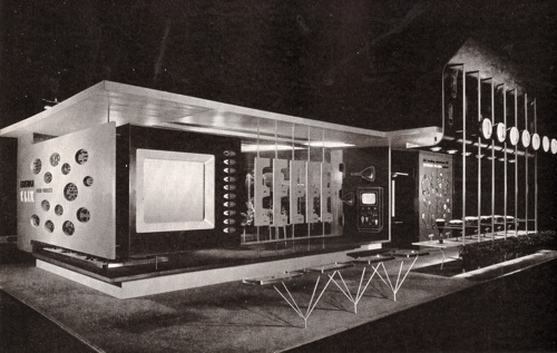
Beverley Pick Ediswann stand Radio Show

This love isn’t just about a wallowing in ephemeral nostalgia on my part, I also think that the exhibition stands are architecturally important, and too often forgotten.

Pick’s book was published in 1957, at a time when British architecture was only just getting on its feet again after the war.  Although a great deal of buildings were being built, houses and flats in particular, the pressures of wartime reconstruction meant that they were mass-produced and kept simple as a result.  Almost everything being built was commissioned by governments and local authorities, with private building licences almost impossible to procure, so the scope for architectural innovation was very limited indeed.

Schools were almost the only buildings which allowed for any kind of experimentation, and even this was constrained by the limited materials available, along with the pressure for  quick and low-cost rebuilding of war damage.  This is Great Barr School in Birmingham, finished in 1958.
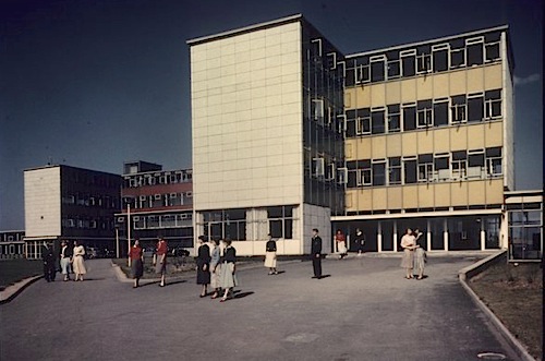
Great Barr School, Birmingham, designed by architect A.G. Sheppard Fidler, 1958

All of which meant that the architecture of the first half of the decade (what tends to be called ‘The Festival Style’) never really got built. By the time that less urgent, more extravagant buildings were being commissioned, the architectural fashion had changed, and Brutalism was coming to the fore.  It’s been said that Coventry Cathedral (commissioned n 1951 but only finished in 1962) is one of the few buildings outside the South Bank to be a full expression of the style.  Certainly it was seen as old-fashioned even before it was completed.
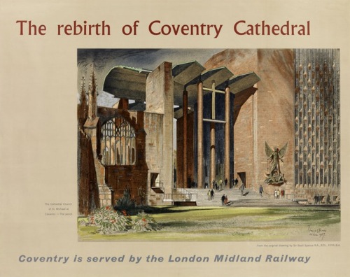
BAsil Spence vintage British Railways poster

Although, I personally do have to nominate the Toast Rack building in Manchester as another classic in the style, even if Pevsner calls it the first Pop building ever.
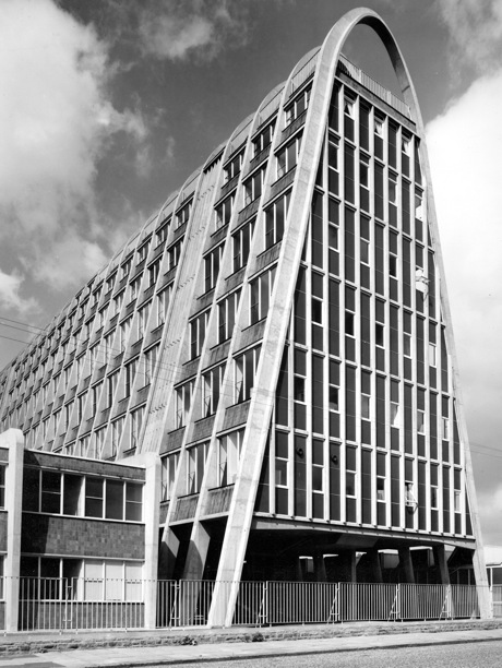
Manchester Hollings Building toast rack

This used to house the Domestic Science College, and thus also had the fried egg building next door.
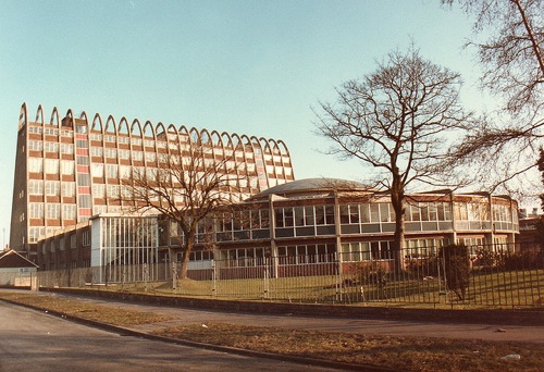
toast rack and fried egg building

Arguments about the precise number aside, the fact that there are so few of these huildings is why the exhibition stands are worth looking at.  Because for the first five years of the 1950s, perhaps even longer, exhibition design was the main expression of cutting-edge architectural taste in Britain.
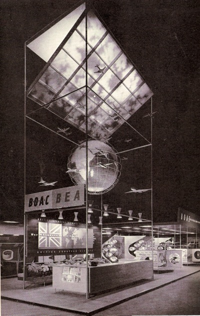
Beverley Pick BOAC stand British Industries Fair

These stands are not buildings, they never will be, and often they were designed by different people, exhibition designers rather than architects.  But they are still among the best expressions of the style of the early and mid 1950s that were ever built, and perhaps all the more exuberant because that architectural imagination simply couldn’t be channelled anywhere else.
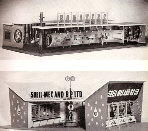
More beverley pick exhibition stand models

Beverley Pick, in his book, is mostly concerned with the design process and mechanics of display rather than the theory, but even he acknowledges that architecture and exhibition design were very intermingled at this point.

In the years after the war, many architects, forced by building restrictions to devote much of their time to exhibition work, by necessity, acquired valuable training in display and presentation.  Conversely, display designers, entrusted by their clients with the responsibility of producing their exhibition stands, became well versed in architectural and structural matters.

This is also a reminder that Pick was just one of many designers working in the field.  His book only illustrates his own work, but there are plenty more to be found (and goodness only knows I have spent enough time poring over them) in the Designers in Britain series.  I particularly love this Farmers’ Weekly stand by Misha Black and Alexander Gibson from about 1950.
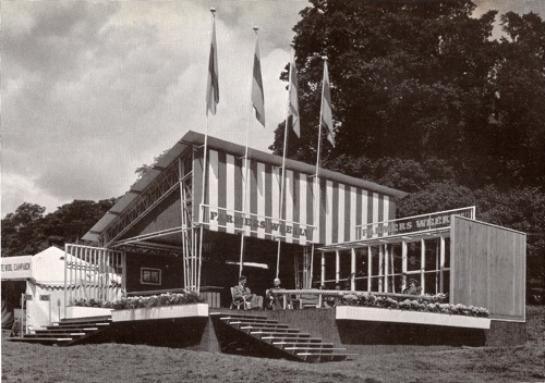
Farmers Weekly exhibition stand c1950 Mischa Black

This Robin Day design for ECKO dates from about the same year too.
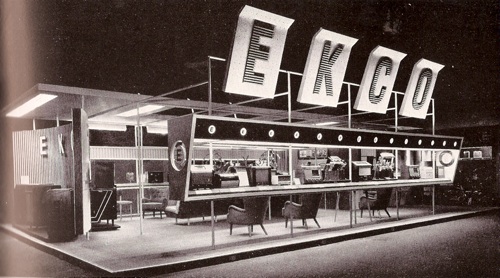
Robin Day ecko stand Radio exhibition

Day also did this ICI pavilion for the Royal Agricultural Show in 1955 or 1956; here the spindly festival style is developing into something sleeker and a bit closer to International Modernism.

Robin Day exhibition stand for ICI Royal Agricultural Show

I would like to live in this as my house please, with a giant Quad Royal logo towering over the roof.

More seriously, I am really surprised that more attention hasn’t been paid to these exhibition designs, however ephemeral they were.  The start of the 1950s – and indeed what is seen as the birth of serious design at this time – is always constructed in terms of exhibitions: Britain Can Make It in 1946 (below), and then of course the Festival of Britain itself in 1951.
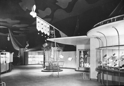
Shop Window Street at Britain Can Make It 1946

Both of these exhibitions are very thoroughly documented, which does help.  But all sorts of exhibitions on every scale continued throughout the decade and, mostly, their design has been completely  ignored.

This amnesia goes back in time, because a lot of pent-up architectural design was being channelled into exhibition design during the war as well.  Here are a couple of rather striking Army exhibitions.
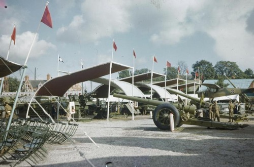
Ministry of Information Army Exhibition in Cardiff 1944

The one above is in Cardiff in 1944, that below on the site of the bombed-out John Lewis department store on Oxford Street a year earlier.
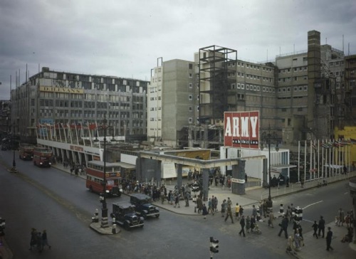
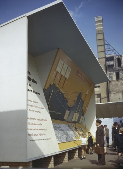
Ministry of Information Army Exhibition Oxford Street 1943

Ministry of Information Army Exhibition Oxford Street 1943

It’s clear that the Festival of Britain style was already in the making during the war, rather than springing out of nowhere on the South Bank.

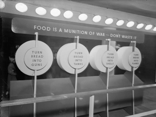
As well as the big budget extravaganzas, there were smaller ones too, many of which were held at Charing Cross Station (did they tour in the provinces after, or was the newspaper coverage enough I wonder?)
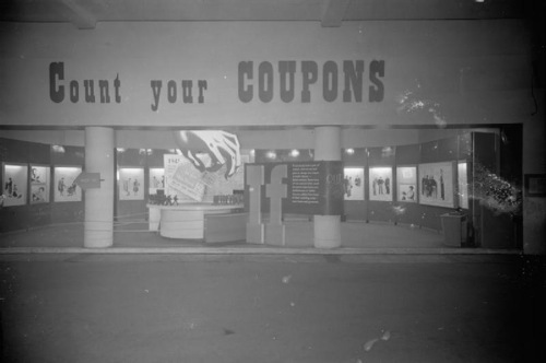
Ministry of Information Coupons Exhibition at Charing Cross Station

Ministry of Information Bread is a munition of war exhibition Charing Cross Station

Again, the wartime exhibitions are also a subject which has not been much covered as far as I can tell (and if I’ve missed something please do let me know).  All I’ve found so far is this article, and the fact that it was produced as part of a Henry Moore Institute Study Day about Sculpture in the Home shows just how much the subject has slipped between the cracks of different disciplines.  It’s a shame for what seems to me to be a really important piece of the design history of Britain.  There’s a lost architectural story to be told out there for the telling, if only we can be bothered to look in different places to find it.

Extended Christmas Greetings

More Christmas joy from the BPMA, which today comes to you in the form of lovely long van posters.

vintage GPO post early poster Eric Fraser 1942

This first offering, from Eric Fraser in 1942, may well not be a Christmas poster at all, but I liked the elephants so much that it can stay anyway.

Beaumont post earlier 1943 vintage gpo poster

This Beaumont also has that wartime urgency a year later, and he’s still exhorting people to post early in 1947 too.

Beaumont 1947 vintage GPO christmas poster

While finally, these Alick Knight robins must be the flying cousins of the skating robin I posted the other day, even though they’re from 1951 rather than 1946.

Robins vintage poster gpo 1951 post early

For more info about van posters, there was a discussion about them here earlier in the year, although one which wasn’t entirely conclusive.  So if you do know anything about these great posters and the vans they travelled on, please do say.