Surf, psychosis and Audrey Hepburn

Remember I asked last week where all the traditional railway posters have gone?  Well now I know the answer: they’re all in the forthcoming Onslows Sale.
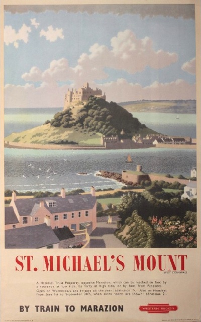
Ronald Lampitt (1906-1988) St. Michael's Mount, original poster printed for BR(WR) by British Colour Printing c.1948
Ronald Lampitt, 1948, est. £500-600

There’s no shortage of them yet, that’s for certain.  In fact, in some wierd inversion of the natural order of the world, Onslows are currently offering a much more traditional set of posters than Sotherans.  Strange, and yet true.
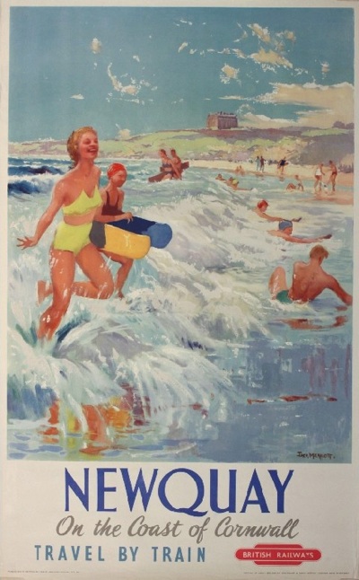
Jack Merriott (1901-1968) Newquay, original poster printed for BR(WR) by Waterlow c.1954
Jack Merriott, 1954, est. £800-1,000

There are hundreds of them, really, please do go and see for yourself.  In fact I’d quite like it if you did as there are almost certainly some goodies which have passed me by.

All of which is not to say that there aren’t some other kinds of gems in there as well.  My pick of the sale has to be this, which is fabulous and I think underpriced.
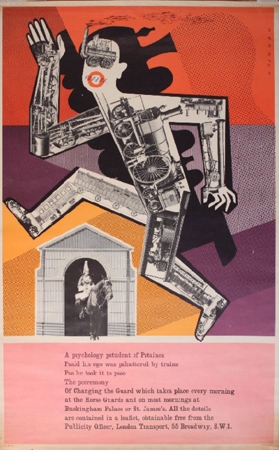
F K H Henrion (1914-1990) Changing the Guard, original poster printed for London Transport by John Swain 1956
F H K Henrion, 1956, est. £100-150

But I’m more than happy to point you at this because we already have a copy and very nice it looks in its frame too.  As the estate agent said, it’s the foreshadowing of Pop Art in 1956, while at the same time insane genius at work.  Go on, you know you want to.

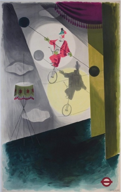
I also have no designs on these two James Fittons, because we’ve bought quite a bit of his work over the last year – by quite a bit I mean two or three posters, and we don’t have the wall space for even those.  I’m a bit less keen on the blackout poster; and while the clown is lovely, I suspect that it is lovely enough to fetch quite a high price too.
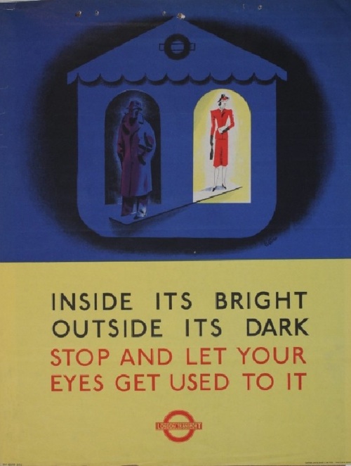
James Fitton (1899-1992) Inside its bright outside its dark, original poster printed for London Transport by Waterlow 1941
James Fitton, 1941, est. £200-300

James Fitton (1899-1992) Its safer by London Underground, (Clown on Tight rope) original poster (without title) printed for LT by Baynard 1937 - 102 x 63 cm
James Fitton, 1937, est. £400-600

Now I do rather want this Royston Cooper, although probably not at that price.
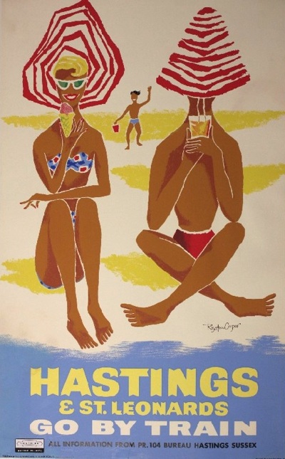
Royston Cooper Hastings & St Leonards, original silk screen poster printed for BR(SR) by Planet
Royston Cooper, est. £250-300

Hastings never looked so Continental.  It’s not alone either; there’s a fair amount more late 1950s early 1960s travel posterage  in there alongside the traditional stuff.
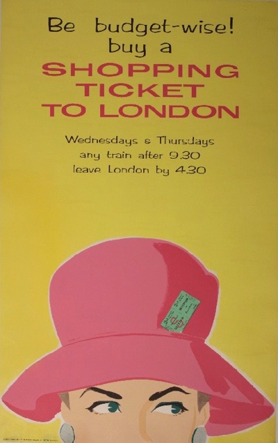
Anon Be Budget-wise ! Buy a Shopping Ticket to London, original poster printed for BR(SR)
Anonymous, est. £100-120

(Audrey Hepburn on a cut=price day return if you ask me.)
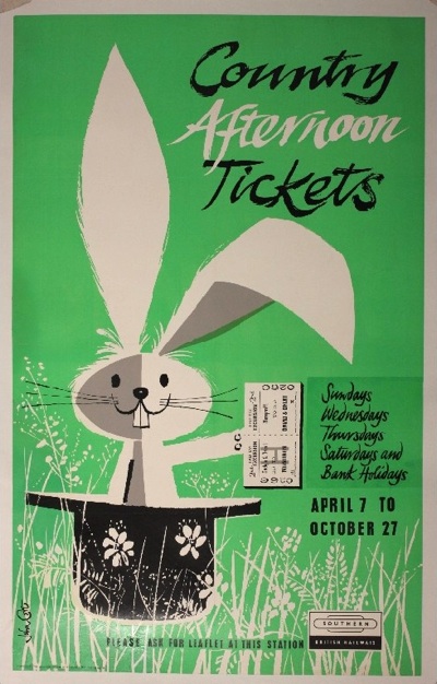
John Cort Country Afternoon Tickets, original poster printed for BR(SR)
John Cort, est. £100-120

Not only railway posters but also coach travel too.
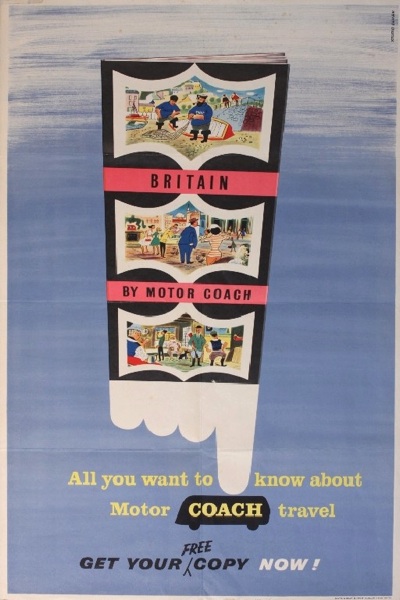
Studio Seven Britain by Motor Coach, original poster printed by Waterlow -
Studio Seven, est. £40-60

I can’t work out whether the Morphets Sale is still feeding through into the rest of the market, or the rest of the market has woken up to the potential of this kind of design.  Either way, I rather like it.

The kitschier side of the 1950s is also represented here, and at prices only slightly lower than you might find at Sotherans too.
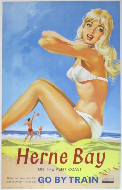
Alan Durman (1905-1963) Herne Bay on the Kent Coast, original poster printed for BR(SR) by Baynard 1962
Alan Durman, 1962, est. £600-700

I will be watching this kind of poster closely to see what they actually make.  I’m not entirely sure I approve of the trend here – are these posters actually that much better than the ones above them –  but that’s a thought for working out on another day in another post.

Although this Bromfield does get the Quad Royal seal of approval, even if it does look as though she’s standing in front of a giant bee.
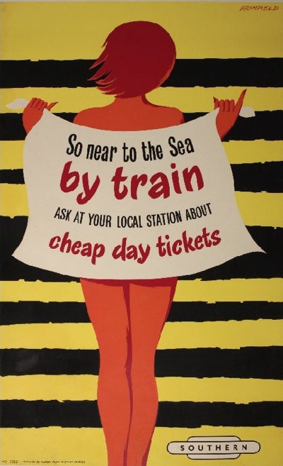
Bromfield So near to the sea, original poster printed for BR(SR)
Bromfield, est. £160-180.

And it’s cheaper too.

There’s plenty more in this catalogue too, not least the World War Two posters, but this post has gone on for quite long enough already.  So I’ll deal with the rest of it next week, which gives you plenty of point me at all the interesting posters that I’ve missed too.  Then I’ll also explain why we’re probably not going to be buying anything from Onslows this time round (it involves a rabbit and pony, that’s all I’m saying for now).
Service Please

I’ve been meaning to post these two small items for ages.  They came to us with the assorted collection of Daphne Padden design materials which we got earlier this year, but what with them not being flat and all, I’ve only just got round to photographing them.

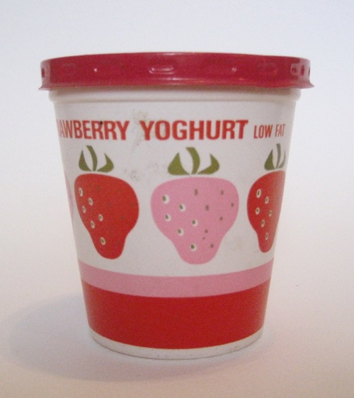
They’re both designs for Marks and Spencers.  This first one was I think a working design.

Daphne Padden Yoghurt pot design for Marks and Spencer

Although the main image on the pot is printed, there’s a small piece of paper stuck on the back which says 5 ¼oz  (150g).  Perhaps it’s the start of metric weights requiring a small redesign.
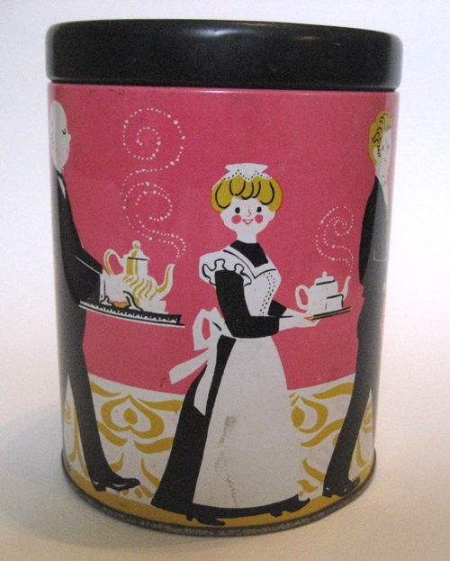
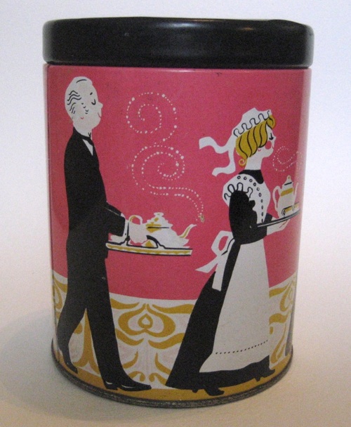
The second is very much the finished article though.  It’s a tin, although I can’t say for certain what it ever had in inside, because all it says on the bottom is Marks and Spencers.  Most likely tea though.

Daphne Padden tin design for Marks and Spencers

I particularly love the way that some of the staff are looking out at us as they do their rounds.

Daphne Padden tin design for Marks and Spencers
The Marks and Spencer archive (which will be opening in a spanking new building in Leeds next year) must have tons more of this kind of thing.  Although the company has used some of it recently (if you go into its store cafes, there are large wall panels with a montage of old packaging images, but they’re all cropped and so a bit frustrating),

I think they could do more, like give some of their packaging the Sainsburys treatment.  I’d buy it, anyway.

And a final point, my local library is fantastic.  In the course of writing this, I thought I’d could do worse than look at the Marks In Time book that came out in 2009.  So I ordered it online.  Before I’d finished this piece, the email had come through saying that it was waiting for me whenever I wanted to come and get it.  Who needs Amazon when you’ve got libraries that good.

Novel and Inexpensive

Today I want to show you an archive, but it isn’t one which is chock full of images, or bringing us rare images of gorgeous graphics.  It wins a post of its own, though, simply by existing.

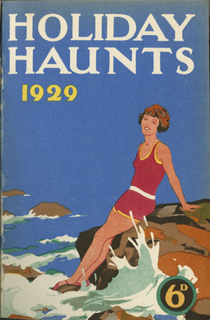
Holiday Haunts cover 1929 From Birmingham City Railway Collection

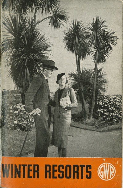
May I introduce you to the City of Birmingham’s Railway Collection.  They came to my attention when I was researching Holiday Haunts a few weeks ago, because they’ve put together a small online exhibition of the same name, from which all of these images come.

Winter Resorts 1930s poster

Now I’m not only pointing at them because they clearly have a rather enviable collection, which looks as if it might include posters as well as brochures and ephemera.

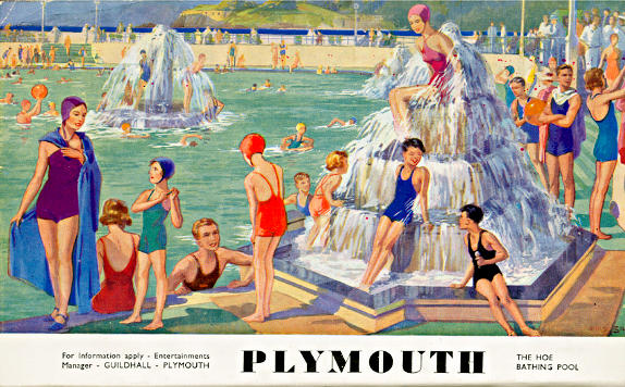
Plymouth Hoe Bathers from Birmingham City Railway Collection

Or because they haven’t always gone for the obvious choices in putting their exhibition together.

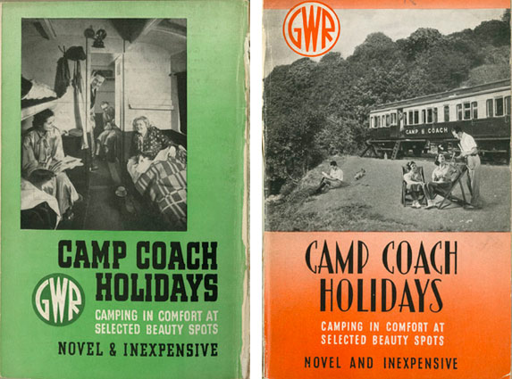
Camp Coaches from Birmingham

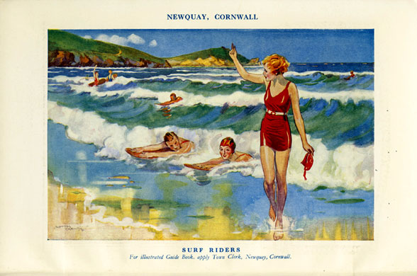
Or even because I had no idea that surfing was such a craze in 1932.

1932 surfing

I just love the fact that the collection exists at all.  5,000 books and periodicals, 20,000 pictures of trains and stations.  And, clearly, a large quantity of posters and lovely brochures too, but all owned by the City of Birmingham, and proudly displayed with their shelving numbers on the website.

What could be more brilliant or unlikely than a municipal railwayana collection?  We should campaign until every town and city in the country has one.  Until then, hurrah for the City of Birmingham and their archives.

What is the range of activity of the commercial artist in Britain?

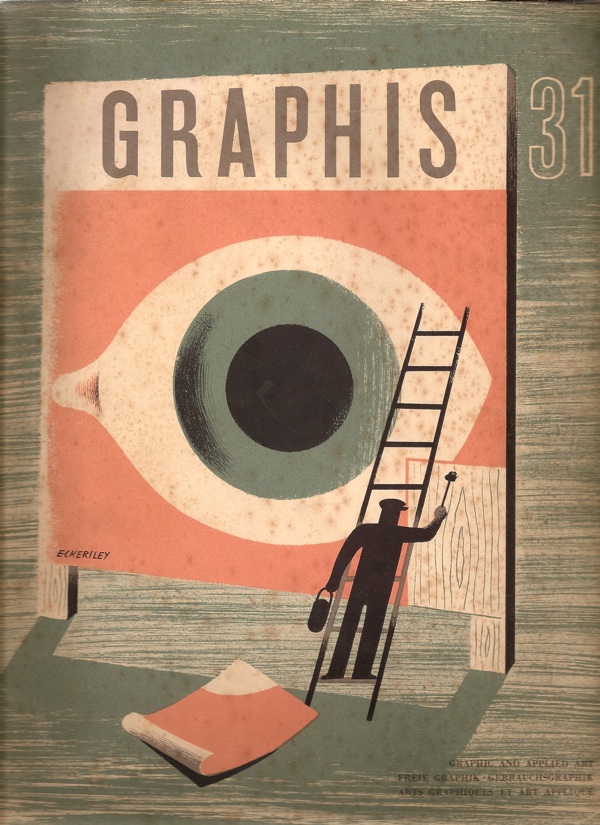
That’s what this copy of Graphis is asking in 1950. (And yes, the cover is by Tom Eckersley).

Cover of Graphis 31 1950 Tom Eckersley cover

Unfortunately for us, most of the answers are in black and white, apart from this design for Kia-ora by Lewitt-Him.

Lewitt Him Kiaora advertisrement 1950

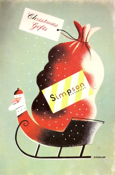
And this Christmas advertisement for Simpsons of Piccadilly.

Simpsons of Piccadilly advertisement 1950

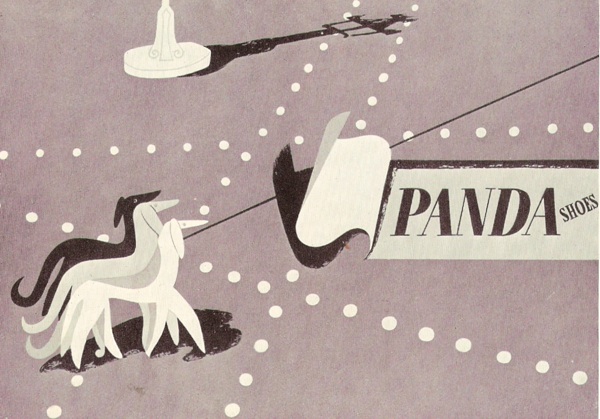
I think there may have been some more at some point, but my copy seems to have a page missing.  By way of compensation, I’ll try and find colour versions of the posters and illustrations they’ve reproduced where I can.  Still, it’s worth putting up with the black and white because there is some wonderful stuff included in their survey of British design.  I would like this Lewitt-Him showcard whatever colour it turned out to be.

Lewitt Him panda showcard from Graphis

Oddly, one of the things that makes this article particularly interesting is the small print.  Each image is credit twice, once to the artist and/or illustrator and once to the advertising agency which commissioned it.  Which means that, for a change, it’s possible to see how posters and advertisments came into being.

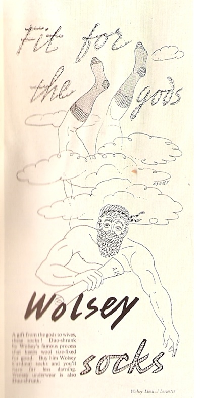
Let’s take Crawfords, for example (I would happily take almost anything from Crawfords’ considerable output if anyone is offering).  Their art director was Ashley Havinden, who did produce some of the illustrations for his own press advertisements.

Design for Wolsey advertisement, illustration by Ashley Havinden

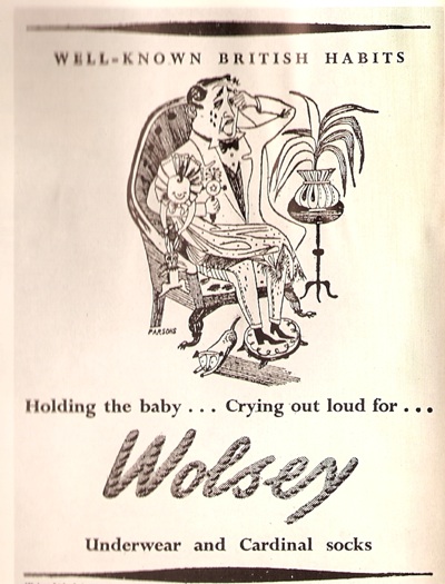
Even within a single campaign, more than one artist might be used though; so this cartoon is by John Parsons.

Wolsey advertisement illustration by John Parsons

(Apologies for the wobbliness of the scans, but I don’t want to damage the magazine.)

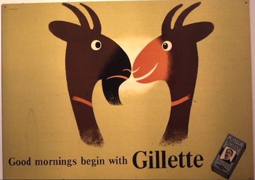
At the same time, Havinden was also commissioning entire campaigns from other designers, like Tom Eckersley’s work for Gillette.

Tom Eckersley vintage poster Gillette goat 1950

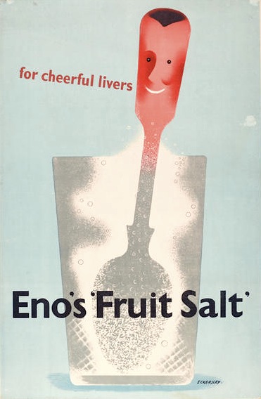
As well as Eno’s Fruit salts, which was also produced by Crawfords.  A different format of this advertisement is reproduced in Graphis;  the French caption provides the extra explanation that Enos is ‘un digestif’.  I think, if forced to make a choice between some French pastis and a glass of Enos, the pastis would win every time.

Tom Eckersley Enos Fruit salts ad 1950


These double attributions of the advertisements, thougb, are a useful reminder that designers of the period were not artists, producing whatever they liked, but were working within a very commercial framework, receiving commissions from people they knew, often, I imagine, to quite a tight brief.  This is something that can get forgotten as we collect and admire posters today; increasingly they become detached from their original purpose and seen as artworks rather than functional pieces of design.  But that’s not how they were originally produced at all.

This is a point also made, in a slightly different way, in the essay which goes with these illustrations.  The author, Charles Rosner, thinks that the standard of posters and other commercial art has declined considerably since the war. The only high points are provided by what he calls ‘the cultural and social activities in advertising’, by which he means commissions from the BBC, London Transport, the Arts Council and the GPO.  By which he is also implying designs which aren’t contaminated by the need to sell things.

it's a wartime poster by hans schleger and we've got one too

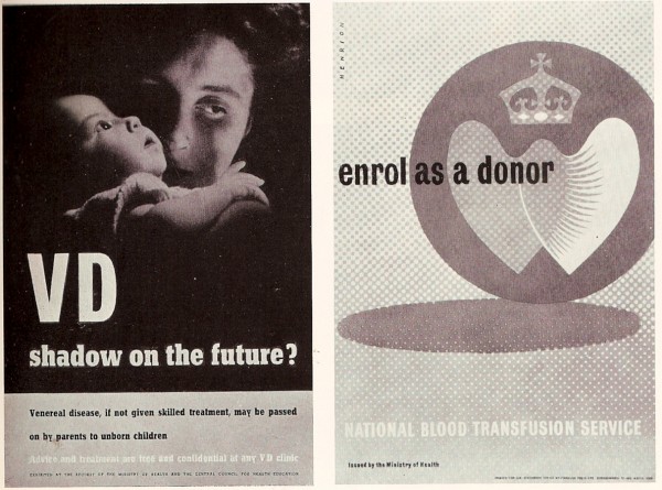
But were these high-minded designs really better?  From this distance it’s hard to say for sure because so little British commercial advertising survives.  But take this page of F H K Henrion’s work.  The poster designs for the government health campaigns are more in the international modernist style with which I tend to associate him.

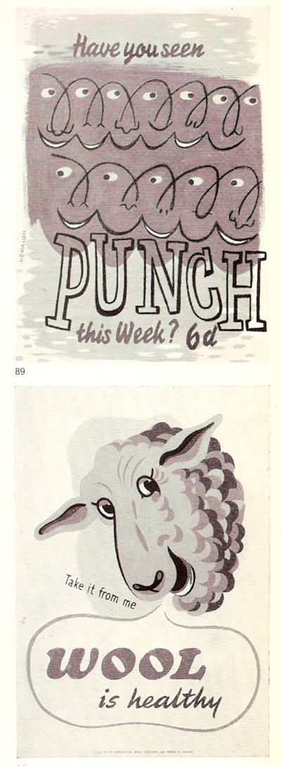
This wasn’t all he could produce though.   Take these fine fish for example.

(I’m rather fond of the sheep too, which is why it’s here, even though it’s not actually by Henrion).

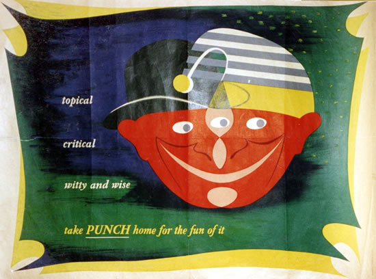
On the opposite page are also a couple of his better-known designs for Punch.

a punch poster by henrion

But which of these are better?  Public information edges or Punch decorative? I find it hard to say, but then my pro-modernist bias probably isn’t as strong as some people’s.  What do you lot reckon?

The text makes an interesting point about posters as well.  Remember, this is 1950, and television advertising hasn’t been imagined yet, but posters are already seen as being in decline, and for reasons I’ve never seen put before.

 Posters are victims of the great speed of modern traffic, congestion of town streets, squeezing out of hoardings from town centres to areas with less appeal in publicity value, and town and country planning regulations, with only vague definitions of the places where hoardings are still allowed to stand.

So the golden age of the poster was partly caused by the fact that people were moving slowly enough to look at them.  Now there’s a thought.

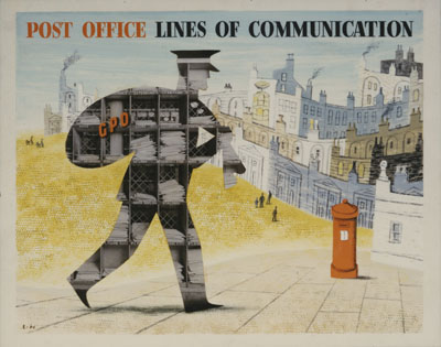
But the article isn’t all about answers, it’s also made me ponder a couple of questions too.  This post is going on a bit, so I’ll return to them in the next few days.  For now you can just have this rather wonderful Lewitt-Him artwork as a clue about the first.  It is illustrated in Graphis, but if anyone has sighted it anywhere else other than the GPO archive, I’d like to hear from you.

GPO vintage Poster lewitt him lines of communication 1950

The eyes of the past

Today we are once again singing the praise of an archive, but one at a slight tangent to our usual interests.  The Persephone Post alerted me to the existence of English Heritage’s Viewfinder, which is the online archive of their photographic collections.

The title suggests that you’re meant to put in a place and see what you can discover; I decided (unsurprisingly) to see what happened if you put in poster.  It’s much more interesting.

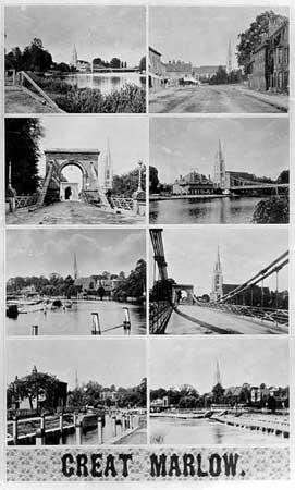
Once you’ve got past the odd collection of turn of the century topographic posters,

Great Marlow poster from oxfordshire CC collection on EH viewfinder

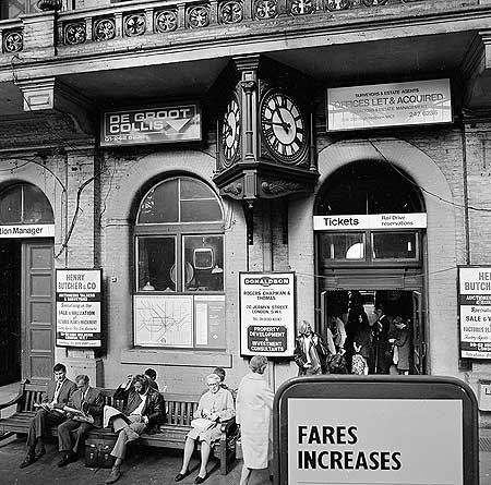
And the 1970s.

Charing Cross Station in 1970 from EH viewfinder

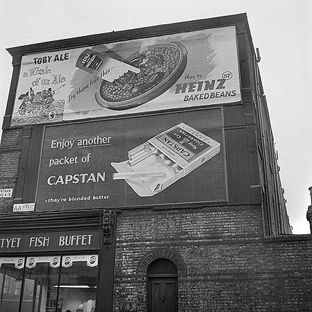
As well as the numerous four poster beds (I won’t actually bother), there are a few gems, of which the best of all is this.

Fortnam Road, Holloway in late 50s from EH viewfinder

It’s Fortnam Road, Upper Holloway, probably facing onto the Holloway Road.  I used to live round there, once upon a time, although long after this picture was taken.

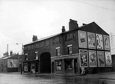
These posters, meanwhile, are in Manchester in 1956.

Failsworth Manchester 1956 from EH viewfinder

Notably there isn’t a decent piece of design to be seen on a wall anywhere.  I wish I liked earlier posters a bit more, because then I’d find this picture mesmerising.

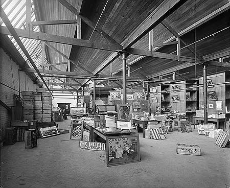
Port Sunlight poster storeroom 1897 from EH viewfinder

It’s the poster and publicity storeroom at the Port Sunlight works in 1897 and its stock is probably worth hundreds of thousands of pounds today.

Although for those of us who like our graphics a bit more modern, the archive does have one intriguing piece of design.

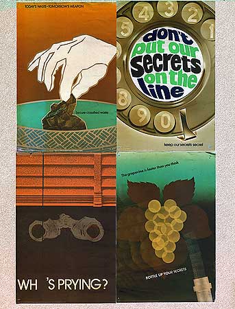
Cold war posters from eH Viewfinder

Four CoI posters, probably designed for within the Civil Service, and photographed for a mysterious Cold War project.  I would love to know more about what English Heritage was about with that, and where the rest of it is.

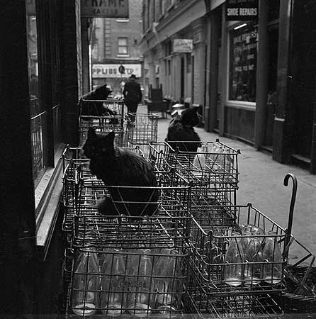
But there are plenty of other words to put in too.  ‘Cat’ is entirely off-topic for Quad Royal really, but produced this fine trio in Shephards Market in Mayfair.

Cats in Shephards Market Mayfair from c1960 EH viewfinder

The works or office cat is something which has now entirely disappeared, but when H V Morton walked the City of London at night in the 1930s, the streets were alive with office cats, free to be wild now that the workers had gone.

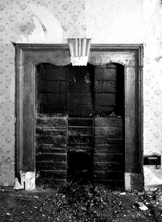
While inputting the obvious place name did at least bring me this fine fireplace from 1680.

Trinity Street fireplace from  EH Viewfinder

It apparently lives in the next street from us. For the next three weeks at least.

Redirection

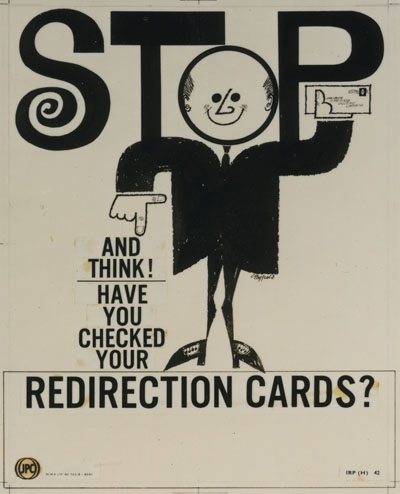
The British Postal Museum and Archive have changed their website.  Now I know that this may not count as the most earth-shattering information you have ever received, but from where I am standing it’s good news indeed.  And when my old bookmark retrieves their new website, I am perhaps appropriately now greeted with this, which is by Graham Byfield and dates from 1954 but which I have never knowingly searched for in my life.  Although I’m starting to rather like it.

Grahamm Byfield 1954 vintage GPO internal poster

The BPMA have always been among the good guys in the sense that their archive is mostly digitised, online and searchable.  The only problem has been that the pictures have been, well, postage stamp sized.  Which has its uses, but is a bit taxing when you are looking at posters.  But not any more.  So now I can say, see this lovely Hans Unger from 1950, and it’s worth you taking a look.

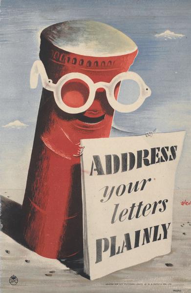
Hans Unger vintage GPO poster correct addressing 1950

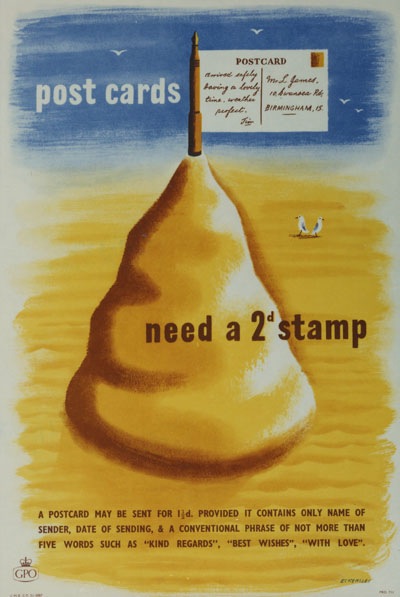
What’s even better news, though, is that a whole heap more stuff has been added to the archives too.  So should you type a (slightly less than) random word such as Eckersley into the search box, all sorts of new delights come up.  I have a vague sense that I have seen this summery 1953 poster before.

Tom Eckersley postcards need a 2d stamp vintage GPO poster

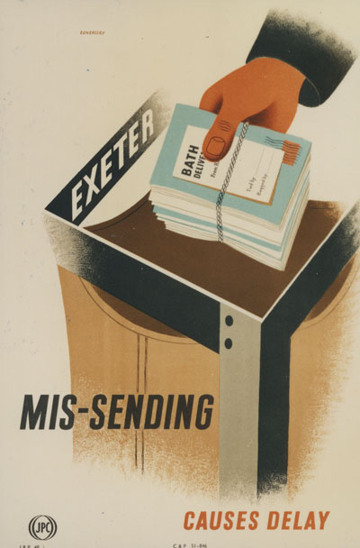
But I definitely haven’t seen this (an early effort from 1951 and reminiscent of his wartime ROSPA posters).

Tom Eckersley mis-sending vintage GPO poster 1951

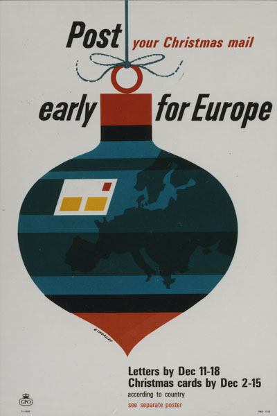
Nor this more modern bauble from 1964.

Tom Eckersley Christmas post early for europe vintage GPO poster 1964

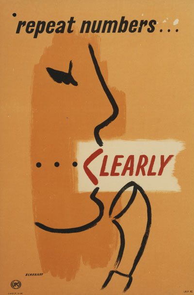
And I definitely haven’t seen this 1954 one anywhere before, not ever.

Tom Eckersley repeat numbers clearly vintage GPO poster 1954

What fun, and I’ve hardly started.  My only small gripe would be that images have a standard width, which works fine for most posters, but the van strips (for use on side of small vans: Morris minor vans) are still a bit squinty.   Which matters a bit for this lovely 1968 detector van (Eckersley again).

Tom Eckersley television detector van poster 1968 GPO

But a lot more for these Lewitt-Him dogs.  Truly I do  need a copy of this poster, and I don’t care that it will be a very long frame.

Lewitt Him post early dogs vintage GPO van poster 1941

One day, I’d like to see a picture of one of those van posters in use, on a Morris Minor for preference (adds to list of bits of aimless research which may get done one day).

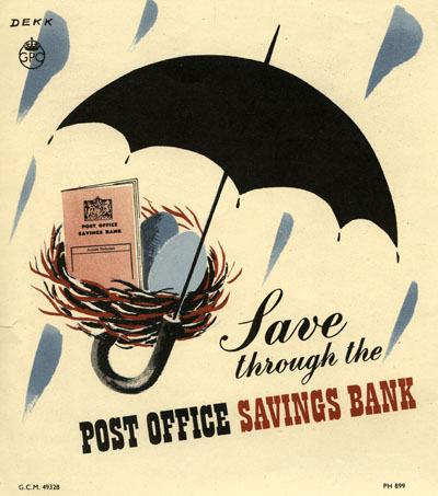
But it’s not just Tom Eckersley of course, there’s also Dorrit Dekk, here from 1950.

Dorrit Dekk vintage Post Office Savings bank poster 1950

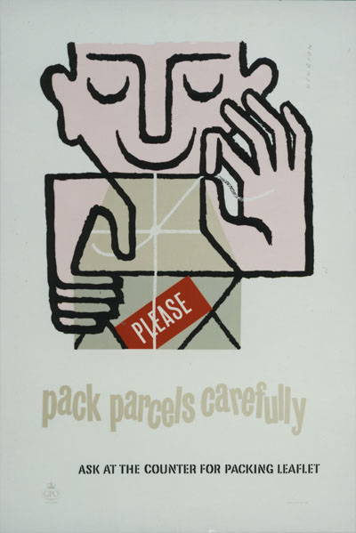
And this Henrion too, from five years later.

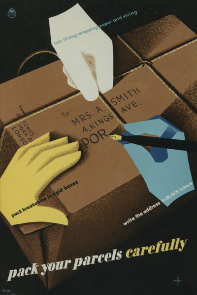
F H K Henrion Pack Parcels Carefully vintage GPO poster 1955

What’s also interesting is that the search function has changed slightly – by which I mean improved.  Now when I search the catalogue for Henrion, I don’t just get the posters, but also records of the time that Henrion Associates were employed in 1967 to redesign the whole GPO.  There’s some proper research that could be done one day.

There are still some things missing; my understanding is that not all of the 60s posters have yet been digitised, nor the tiny phone-boxed sized square posters, and there’s still only a small smattering of Post Office Savings Bank images in there too.

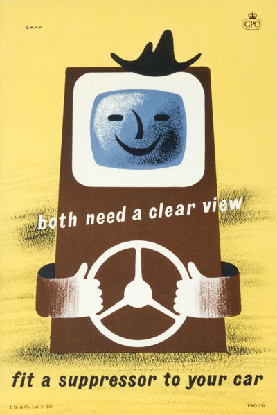
For most people though, what’s already there will be plenty enough to be going on with.  What I’ve posted here is just a first scratching of the surface, and I am sure there are still plenty more treasures to be turned up when I rummage further.  In the meantime, I will leave you with this, by someone called Gapp, and once more from 1954, for no better reason than I like it.

Gapp Suppressor car vintage GPO poster 1954

Of course all images are with thanks to the BPMA and their lovely shiney new website.

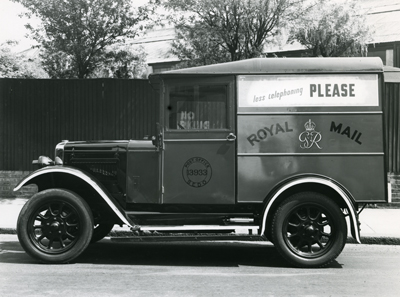
Edit: further to the conversation below, I have now raided their website once again to find pictures of a Morris Mail Van (70 cu ft, not a Minor sadly) with a poster displayed on its side.  And here it is, from 1944.

Morris Van GPO with vintage poster on side

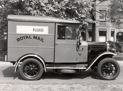
Inexplicably, there is another picture of what looks like a different version of the van, but with exactly the same poster on.

Vintage GPO morris van with poster on side

I am also rather tickled by the poster they’re displaying, which couldn’t be more British if it tried.  I imagine it being said in very clipped and understated tones.

Less telephoning please vintage GPO poster from BT archive

There ought to be more advertising like that these days.  Incidentally, that, because it concerns telephones and only telephones comes not from the BPMA but from the BT Archive, which I wrote about ages ago but clearly need to revisit.

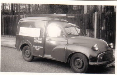
And finally, from a specialist GPO van website (I say no more) a Morris Minor GPO van.  Sadly I can’t see the poster though.

Morris Minor GPO van with poster display

My next question has to be, does anyone have one of those van display posters preserved, apart from the BPMA that is?  This is the closest we have, from the same year as the polite poster above, but much smaller at 6″ x 20″.

Telegraph less Austin Cooper vintage GPO poster

But some of the longer ones are twice that length – did they all disappear?  I need to know.