Bossiness is in the eye of the beholder

Bossiness, it seems, is all a matter of context.  After musing on bossy World War Two posters the other week, I’ve been doing some more digging, and found John Gloag considering the subject of propaganda as it was happening in 1941.

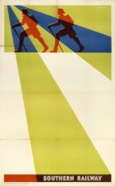
Now, I find posters like these (once more from the Imperial War Museum, via VADS)  at the very least, a bit abrupt.

Take Your food with you railway long train journey vintage WW2 poster

Be brief on the telephone vintage GPO WW2 poster

But to Gloag, they are the very epitome of restraint.

Unlike the admonitions, threats, boasts and hysterical appeals that foam and froth from totalitarian propaganda departments, offical propaganda for home consumption in Britain has been sober, restrained and well-planned. […] There have been suggestions, not bleak instructions, often conveyed with real human understanding.

Now I don’t think Gloag is necessarily wrong – he also makes some very good points in the same essay about humour being the secret weapon of British Propaganda which I think are definitely true.  What interests me is the gap between how he sees the propaganda of the time, and how we perceive it now.

Austin Cooper vintage GPO poster Telephone less WW2

Sixty years on, we have a very different attitude to authority, and we don’t much like our posters giving us orders, however understated they are about it.  Although I am sure that the note of this one would have wound me up even under the conditions of total war.

Housewives, know your place, vintage World War Two propaganda poster

There are suggestions, too, that I wouldn’t have been alone in my resentment.  This slogan – used on a range of posters –  caused an exchange in Parliament that seems strangely contemporary.

Be like dad, keep mum, vintage WW2 propaganda poster

Dr. Edith Summerskill asked the Minister of Information whether he is aware that the poster bearing the words “Be like Dad, Keep Mum,” is offensive to women, and is a source of irritation to housewives, whose work in the home if paid for at current rates would make a substantial addition to the family income; and whether he will have this poster with drawn from the hoardings?
Mr. Cooper I am indeed sorry if words that were intended to amuse should have succeeded in irritating. I cannot, however, believe the irritation is very profound or widely spread.
Dr. Summerskill Is the right hon. Gentleman aware that this poster is not amusing but is in the worst Victorian music-hall taste and is a reflection on his whole Department?
Mr. Cooper I always thought that Victorian music-halls were then at their best.
Dr. Summerskill Is the right hon. Gentleman aware that if he goes to modern music-halls, he will find that this kind of joke is not indulged in and that this suggests that he is a little out of date for the work he is doing?

There are also signs of a more general resentment.  One Mass Observation reporter wrote in 1941,

Taking a short walk from the office where this report is being written, you will see forty-eight official posters as you go, on hoardings, shelters, buildings, including ones telling you:

to eat National Wholemeal Bread
not to waste food
to keep your children in the country
to know where your Rest Centre is
how to behave in an air raid shelter
to look out in the blackout
to look out for poison gas
to carry your gas mask always
to join the AFS
to fall in with the fire bomb fighters
to register for Civil Defense duties
to help build a plane
to recruit for the Air Training Corps
to Save for Victory.

It’s hard not to hear a note of brow-beaten exasperation in there.  Probably intensified by the fact that, while we tend to see only the most memorable and best designed posters of the time, the vast majority of that list wouldn’t have been much to look at.

Fall in with the firebomb fighters vintage ww2 propaganda poster

So was Gloag right or not?  I don’t really know.  He was writing in the middle of the war, so his essay was itself a piece of propaganda, keen to show the differences between the propaganda of the totalitarian regimes, and the gentle, herbivore suggestions of good old democratic Britain.  And I think he’s keen to protest so loudly, partly because there is an underlying fear that this total war, which requires conscription, directed labour and mountains of propaganda, might seem to be turning Britain into a less gentle and more authoritarian place.

But how would we react to Gloag’s suggestions now? Or get the British public to mobilise in this way?  Now that I really don’t know.

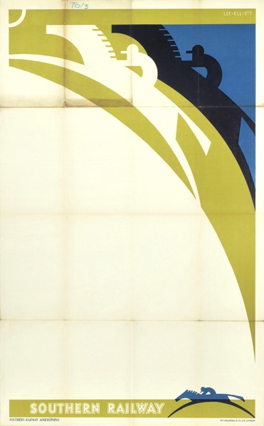
Finally, I have no idea at all what this poster wants me to do, but I do like the design.

Give a Hand To cotton vintage propaganda poster

Next week, more auctions I think.

Save Your Bit

I’ve been rummaging around in the VADS picture archives again, and to my delight have discovered that the Imperial War Museum have uploaded many, many more war posters recently.  I’m not even a quarter of the way through them yet, but this set did particularly amuse me.  They start off fine, even if I don’t actually know what the first one is on about.

Burn Your Cinders vintage WW2 Board of Trade propaganda poster VADS IWM

Even the next one seems fairly reasonable, if a bit depressing.

Fewer Hot Baths vintage WW2 Board of Trade propaganda poster VADS IWM

But they won’t stop there, oh no.

Go To Bed Early vintage WW2 Board of Trade propaganda poster VADS IWM

And although I can find it funny now, it probably wasn’t then.  From this distance it’s easy to rhapsodise over the Blitz Spirit and everyone pulling together, but sometimes the Second World War must have felt like really grindingly hard work.  Especially when you were being ordered about by posters like that one on every street corner and in every shop.  It would have been enough to make me stay up late out of defiance.  Perhaps it’s fortunate that they weren’t reliant on me to win the war.

Save Your Bit vintage WW2 Board of Trade propaganda poster VADS IWM

March Mad Hatters

Real life has rather got in the way of blogging for the last week, so apologies for that.  It’s also meant disorder here at Crownfolio Towers.  Yesterday, an unopened envelope turned up underneath a pile of newspapers.  It turned out to contain this.

Dorrit Dekk Mad Hatters Menu card SS Arcadia design

We bought it on eBay for no better reason than it looked rather fun, but it turned out to be by Dorrit Dekk; her signature’s on the reverse.

Dorrit Dekk menu SS Arcadia Mad Hatters Ball reverse

It’s another P&O menu, this time for the Mad Hatter’s Ball Dinner on the SS Arcadia in 1962.  The chef recommends Jellied Turtle Soup.

I, meanwhile, recommend the P&O archive.  This is something that I’ve been meaning to mention for a bit, after it suddenly appeared in amongst a Google search a few weeks ago.  There are posters, brochures, luggage labels and much more.

SS Oronsay travel brochure 1951 P&O Collection

The online selection is by no means comprehensive – there are, for example, only about 6 menu cards on show, which is about as many as we’ve got ourselves.  But it’s still much better than nothing at all.

P&O Koala luggage label from collection

And there are some truly wonderful posters in there as well.  But I’ll come back to those in the next couple of weeks, because they really do deserve their own post.

The website also has a rather useful guide to where you can see pieces from the P&O collection in museums.  I can heartily recommend a trip to the River and Rowing Museum in Henley, which houses John Piper’s Landscape of the Two Seasons, designed for the Oriana in 1960.

Mural designed by John Piper for Oriana 1960 in River and Rowing Museum

The painting is much more spectacular in real life, not least because it’s monumentally large.  But it’s a very rare reminder of the almost industrial quantities of design and and art which were produced for P&O’s liners in the late 1950s and 1960s – other than that, it really is just the menus which remind us of the style in which it was once possible to sail.

One of the many, many things I have to do this week is book a trip on Brittany Ferries; I don’t think the experience will bear much comparison with the golden days of P&O.

Things. In archives.

Now that there are posters in archives doesn’t exactly count as hot news.  But it’s worth revisiting nonetheless, for a couple of reasons.

One is that new delights can appear.  It’s been said before, but I love the VADS archive as a model of how digitisation can work brilliantly.  And every so often I go back and discover that items have been added.  I’m sure I’ve never seen this Lewitt-Him ROSPA poster before as I would have remembered a puss in boots as fine as this.

Lewitt Him vintage ROSPA safety poster world war two propaganda

Puss can be also found in the Jan Le Witt and George Him: Design book which is one of the vast backlog of books which I’ve failed to mention on here.  Like every other title in this series I’ve seen, it’s a very good outline introduction to their lives and work.  So that’s one down, unfortunately another three arrived this week.

Elsewhere, new archives spring up.  I was moaning very recently that the Wellcome collection had a fine digital catalogue but no images.  But now there is Wellcome Images.  Almost an entire universe from germs to tattoo designs, but also containing posters.  Which is where I found this. Once again, modernism is exactly the right style where progress can be celebrated – and a fall in infant mortality can only be good.

Infant Mortality poster Wellcome images

This very pure, almost continental modernist design is by Theyre Lee-Elliott, who I’d never come across before.  But it turns out that  he also designed the archetypal airmail wings.

Theyre Lee Elliott airmail wings design in use on airmail stamp

As well as the Imperial Airways Speedbird logo, a design which endured beyond Imperial’s incorporation into BOAC and well into the time of British Airways.

Imperial Airways speedbird logo designed Theyre Lee-Elliott

Those two designs alone – both classics which survived well past World War Two and beyond – should have been enough to secure Lee-Elliott more fame than he currently has.  But Lee-Elliott also designed some rather good posters.  Some of these were expansions of his logo designs for Imperial and the GPO.

Theyre Lee Elliott Imperial airways vintage travel poster showing speedbird logo

Theyre Lee Elliott Airmail poster for GPO 1936

But he also designed a pair of really rather wonderful posters for London Transport in 1936 (from the wonderful LT Poster archive).

Theyre Lee Elliot vintage London Transport poster light 1936

Theyre Lee Elliot vintage London Transport poster Four times the number carried 1936

As well as these posters for Southern Railway, all from 1937 (from the more idiosyncratic NMSI archive).

Theyre Lee Elliott Stock rambling vintage poster for Southern Railway 1937

Theyre Lee Elliott Stock Horse racing poster for Southern Railway 1937

Theyre Lee Elliott Navy Week Vintage poster for Southern Railway 1937

A set of work which makes it all the more mysterious that he is not celebrated as one of the great modern designers in this country.

His later life may be one reason for this.

Theyre Lee Elliott Trooping the Colour Vintage London Transport poster 1952

Although he designed one more poster for London Transport in 1952, he seems to have given up graphic design for fine art – in particular paintings of dancers. Here’s a brief biography as told by one of his nephews:

David Theyre Lee-Elliott went from Winchester to Cambridge and thence to The Slade School of art and lived in Chelsea all his life, dying at the age of 85 in 1988. He never married but had seven nephews and nieces. Before the war he painted the scenery and backdrops at Sadlers Wells and met all the stars and painted hundreds of action pictures of them. Whenever he came to stay he always painted pictures for us of our toys and where we lived during the war and after. A lot of his paintings were bought by the stars of stage and screen of yesteryear.

This recollection – as well as many others – came from a dance blog, Oberon’s Grove – which has articles on Lee-Elliott’s dance paintings (here and here) which are a worth investigating if you want to know more about the man.

But he did more than paint dancers – there’s an interesting commentary one of his paintings held by The Methodist Church Collection of Modern Christian Art (a new discovery for me) which describes his compulsion to paint religious imagery despite, apparently, having no religious faith.

I’m clearly just scratching the surface here; Theyre Lee-Elliott was clearly a very complex and unusual person – apparently he had a novel written about his life at some point too – and I find it extraordinary that he has disappeared so completely from the history books, at least as far as graphic design is concerned. So if anyone can shed any more light on his life and work, as ever, I’d love to hear from you.

This has rather digressed from the simple post about online archives that I’d intended when I started writing.  But, in the course of it all, I did discover one more.  The Smithsonian Museum in Washingon has a collection of Air Travel posters online, called Fly Now! which is worth some of your time. Or possibly quite a lot of your time, given that there are 1,300 or so posters in their catalogue.

The collection is brilliantly omnivorous too, containing everything from design classics to high kitsch.  I will definitely have to come back to it one day when I’ve picked through it properly. But in the meantime, have some surprised llamas to brighten your Friday.

Llamas for Braniff.  Lllamas for all.

The Volkswagen Problem

For some time I’ve been meaning to post a link to the Empire Marketing Board Archive at Manchester Art Gallery.

It’s an exemplary online resource for a really interesting collection.  The Empire Marketing Board was what Stephen Tallents did before he came to the GPO, and in many ways is one of the first attempts at the kind of ‘soft’ advertising and propaganda that we now take for granted.

Empire Marketing Board poster Christmas produce bear
Austin Cooper, 1927

In his time at the Empire Marketing Board between 1926 and 1933, Tallents (working with Frank Pick and William Crawford of Crawfords advertising agency) commissioned some of the very best designers and artists working in Britain at the time.  These included those such as Austin Cooper, Frank Newbould and Fred Taylor who were best known for their work for the railway companies,

Good Shopper Empire Marketing Board Poster Frank Newbould
Frank Newbould

as well as fine artists like Paul Nash.

Paul Nash Empire Marketing Board poster

But I’ve been holding off writing about it for months.  Why?  Because these posters constitute an ideological problem of the first order, and it’s not one I have an easy answer to.

The issue at stake is, of course, Empire.  The Manchester Art Gallery website describes the collection as ‘challenging and fascinating’.

Created during the 1920s and ’30s to promote trade and understanding between empire countries, the posters present a view of the British Empire that, from today’s perspective, is often uncomfortable.  Although visually stunning, the posters contain images that would today be considered offensive. As a product of their time, they raise difficult questions about the legacy of empire.

I’m not proposing to get into a discussion about the legacy of Empire and the historic wrongs involved.  What I’m interested in is how much ideology can adhere to images, in particular to these posters.

There is no denying that there are some posters in the collection which can only be interpreted as racism of the highest degree.  This vision of the white man bringing civilisation is by Adrian Allinson.

Allinson Empire Marketing Board poster African Transport

It gets worse, too – the implicit comparison is with the companion poster.

Allinson Empire Marketing Board African transport

But these posters are by no means in the majority in the archive.  To start with, a good portion of the posters are images of either produce,

Bacon Factory Empire Marketing Board poster
Anonymous

or pictures of Britain that wouldn’t look out of place on a railway poster.

Home Agricultural Show Empire Marketing Board poser
Gregory Brown

Or quite possibly both.

Frank Newbould Empire Marketing Board poster
Frank Newbould

So my questi0n is, can a poster like this Fred Taylor of Market Day be interpreted as loaded, racist even?

Fred Taylor Market Day Empire Marketing Board Poster

I’ve had quite an interesting email conversation about this with Melanie Horton, the researcher who’s been working on the archive.  She would argue that it is, that all the posters have to be seen as whole and cannot be separated from the politics of how they came to be produced.

I’m not going to tackle her arguments now as she has a booklet about the collection coming out soon (Empire Marketing Board Posters: Manchester Art Gallery ) and it only seems fair to read them in detail first.  But I do have a few broader thoughts to raise before then.

Because what we are debating here isn’t in any way a new question.  T.S. Eliot was undoubtedly a small-minded anti-semite, but does that devalue The Four Quartets, in which there is nothing of the sort?  Or if you want a more modern version of the same problem, try yesterday’s Guardian, where Brett Easton Ellis is freely admitting to misogyny, sexism and generally being a rather unappealing bit of work.  But what does that do to our opinion of his novels?  As it happens, I love The Four Quartets but loathe American Psycho, so my answer is different in each case.

But this problem also came up when I studied Design History, in perhaps its most taxing presentation.  Here it was known as the Volkswagen problem.  And it is quite a problem.

The Volkswagen Beetle is a great piece of design which produced one of the most popular small cars of the twentieth century, and was also technologically very innovative.  However it was also, and there is no too ways about this, a product of Nazi ideology.  As if the name Volkswagen itself wasn’t enough of a clue, the Beetle was originally known as the KdFwagen – the Strength Through Joy car. Adolf Hitler commissioned it, approved it and set it into production.   And yet we are not only prepared to forgive the Beetle, but clasp it to our hearts as one of the best-loved cars there has ever been.

Channel Island Pea Harvest poster Empire Marketing Board
Keith Henderson

So where does that leave images like these?

Oat Harvest Empire Marketing Board Poster
George Houston

Can we separate them out from how and when they were produced, and only see the oats and the peas and the pears?

Empire Marketing Board Poster
Anonymous

Or is it only the Volkswagen that can ever achieve that kind of forgiveness?

Festival time

Mr Crownfolio has been fossicking in the furthest depths of the internet again.  And he’s found this.

British painting vintage poster for arts council exhibition 1951

And this.

Town planning exhibition vintage poster 1951

As well as this.

Ten decades of British taste vintage poster 1951

What links them all is this.

Festival of Britain map poster 1951

The Festival of Britain.  Or, to be more precise, the Museum of London’s rather wonderful Festival of Britain online exhibition and archive.  Not only does it have photos and reminiscences, it also has a searchable catalogue stuffed to the gills with wonderful posters and other ephemera.

Now I fell in love with the Festival of Britain when still in primary school, I have a vivid memory of the Radio Times doing a feature on the Festival in 1976, on its 25th anniversary, and wishing that I could have walked around in all of that primary coloured optimism myself.  It looked a great deal more fun than the 1970s.

Festival of Britain postcard

This was clearly a formative experience, too, leading to a whole mis-spent life of 1950s collecting, a thesis, and, in the end, here.  The Radio Times has a lot to answer for.

If only I’d had all of this wonderful material to play with then.  The Museum of London’s archive is a result of a gift from Peter Kneebone, who combined being a key player in the Festival Office with being a keen epehemera collector.  Perfect.

There are some great things in there.  Mr Crownfolio says he has seen this Abram Games before, but I’m not sure that I have.

Abram games poster for model railway exhibition 1951 festival of Britain

Or you might want to consider this Reginald Mount.

Reginald Mount exhibition poster Industrial Power Glasgow 1951 Festival of Britain

What’s particularly interesting about what Peter Kneebone collected is that it doesn’t always conform to our images of the Festival, which can tend to be stereotypical, generally involving the South Bank and the Skylon, possibly also the Festival Hall if you’re lucky.  The Reginald Mount poster above is a reminder that exhibitions and events were occurring all over the United Kingdom.  In Ulster, you could find out about Farm and Factory as well.

Ulster Farm and Factory exibition poster 1951 festival of Britain

Furthermore, not all of the Festival disappeared in a puff of smoke at the end of 1951.  This ‘Living Architecture Exhibition’ (proof that Grand Designs Live is not a new idea in the slightest),

Another poster for Lansbury FoB architecture 1951

became the Lansbury Estate, which is still there.

New Homes living architecture exhibition 1951 festival of Britain

The images are also a reminder that, without hindsight, the Festival wasn’t the victory for soft Scandinavian modernism that it now seems to be.  Quite a few designers are harking back to the Great Exhibition of 1851 as much as they were looking forward.

Festival of Britain in Bristol poster Eric Fraser 1951

In this case, Eric Fraser, producing a generic poster to be used across Britain.  Some of the designs seem to refer even further back to the Regency, like this Birmingham leaflet

Birmingham city Festival of Britain leaflet

A vein of British  eccentricity and folk art also ran through the whole Festival; corn dollies and unicorns lurked within the modern buildings of the South Bank and elsewhere.  Here’s the incomparable Barbara Jones (about whom I will write one of these days), whose poster combines both Victoriana and whimsy.

British popular art 1951 exhibition poster Barbara Jones

What’s also great about the archive is the display; these are real, slightly battered pieces of ephemera, rather than air-brushed scans.  It’s good.  (And also reassuring given the condition of most of what we own.)

My only gripe would be that not enough designers are named.  I’m pretty sure that the Ulster Farm and Factory poster is by Willy de Majo, who designed the whole exhibition, but the Ten Decades poster has a signature that I just can’t read, or find anywhere else, and it would have been good to know.  But that’s my only, tiny quibble, so hurrah for the Museum of London, Peter Kneebone and their lovely archive.