The poster in the hat

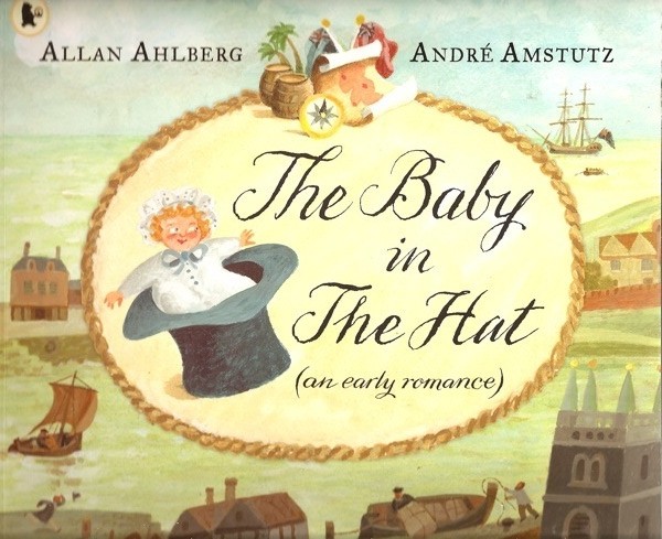
Recently, Crownfolio junior and I were in the library together and found this.

Andre Amstutz Allen Ahlberg The Baby in the Hat

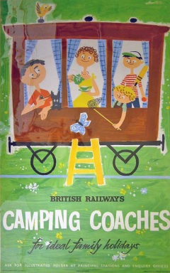
Now, surely this has to be the same Andre Amstutz who was designing posters for British Rail, the GPO and others in the late 50s and 1960s.  Posters like this one.

Amstutz camping coaches railway poster

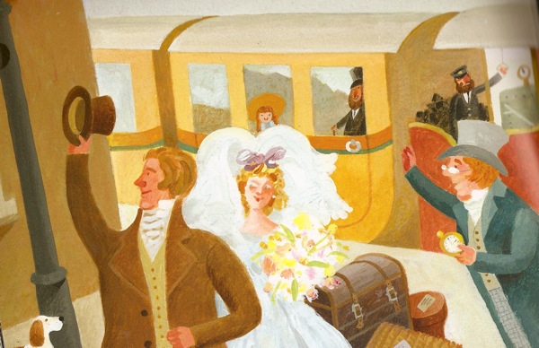
There just can’t be that many people called Andre Amstutz to start with, never mind ones who can draw such delightful people.  Here’s another scan from the book, to compare and contrast.

Andre Amstutx baby in the hat end page

The progression makes sense as a career path; when posters weren’t being commissioned any more, that designers went into illustrating books instead.  It looks as though that’s what Fritz Wegner (see yesterday’s post) did, and it looks as though that’s what Amstutz did too.  Here’s his biography from the Penguin website.

Andre Amstutz was born in Brighton. He studied art and design at Brighton School of Art and then joined an animation film company. He later began a career in advertising, becoming Art Director at an advertising agency. Since 1960 he has worked freelance, designing posters and illustrations for a wide variety of clients, and more recently has moved into publishing, primarily as an illustrator of children’ books.

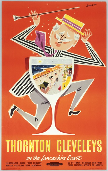
Now, I think Amstutz is a very under-rated artist.  This may be because he didn’t do that many posters – I can only find a handful of British Railways ones.

Andre Amstutz thornton Cleveleys British Railways poster

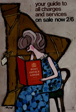
Along with a few for the GPO.

Andre Amstutz GPO guide poster

(He also did a Properly Packed Parcels Please one, which I’ve posted previously.)

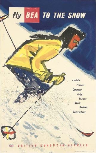
And this BEA poster, which is the only one of his which I can track at auction anywhere.  Doesn’t go for a lot, but comes up regularly.

Andre Amstutz BEA poster 1957

But the ones he did do are great, so I can’t understand why he is so overlooked.  Perhaps making cheerful posters doesn’t necessarily do a lot for your reputation; people see them as cheesy and a bit uncool.

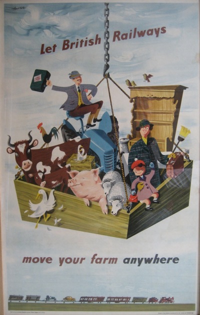
But however dour and serious you are about posters, how could you resist this?  It’s from 1947-ish, and is utterly wonderful.

Andre Amstutz Move Your Farm railway executive poster

This isn’t the best picture of it ever, I’m afraid (the colours are much crisper in real life) but ours is framed, and I’ve never ever seen it anywhere else, so I’ve had to photograph it through the glass.  Apologies.

But if anyone is able to tell me anything about British Railways moving farm by train, I would genuinely like to know.  Or, for that matter, if you can tell me more about Mr Amstutz himself.  He deserves more recognition.  And now you must excuse me, because I have a few pigs and a tractor to pack up.
Country pleasures

The car broke down on the way home last night, and real life is generally intruding in one way or another, so proper posting will resume tomorrow.
In the meantime, have this by way of an apology.

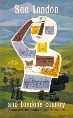
See London and london's country Sheila Stratton vintage London transport poster

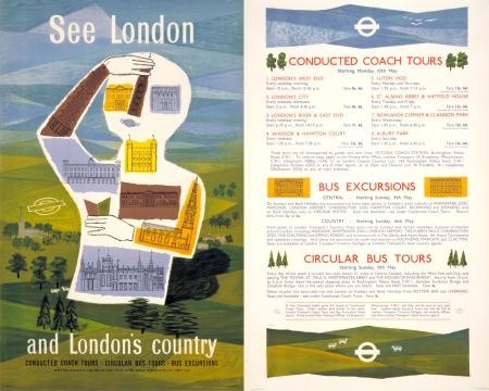
It’s by Sheila Stratton, it’s from 1954 and it’s one half of a pair poster, thus.

Sheila Stratton London's Country pair poster 1954 London Transport

And that’s pretty much all I can tell you about it, other than it is completely wonderful.

I tripped across it by accident in the LT collection a while back, and was so taken with it that I saved it for a day like today.  But I can’t seem to find out any more about Sheila Stratton, and this seems to be the only poster design of hers I can turn up, so if anyone has any more information, please do let me know.  And, even better, if you’ve got a spare one, the contact form is on the tab above.  I have a very good bit of wall just waiting.

Great Northern Games

Today, a public information broadcast for those of you in the North of England.

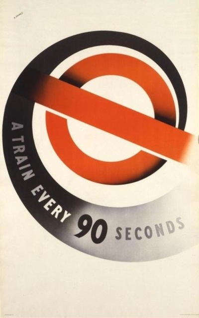
Abram Games a train every 90 seconds vintage London Underground poster

No, not that the London Underground is more efficient than trams. Rather, Abram Games : Maximum Meaning, Minimum Means is opening at the Dean Clough Crossley Gallery in Huddersfield (actually the gallery is in Halifax I am told, sorry about that) on Saturday.

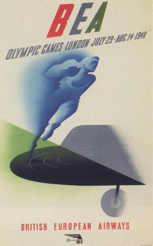
Abram Games BEA olympic poster 1948

This is a Design Museum touring exhibition, of posters, sketches, product designs and so on, and has to be well worth the price of admission, because it’s free. Rude not to if you ask me.

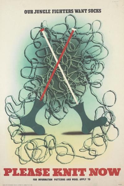
Abram Games knit socks vintage WW2 poster

A couple of caveats though.  One is not to look at the Dean Clough website if you want to find out about it, as there’s nothing there – I got the information about the exhibition from here instead.

And I also can’t promise you that any of these posters will be there; I’m afraid that I’ve just been pleasing myself and finding some less well known of his designs.  But do let me know what they are showing if you do go.

Such posters

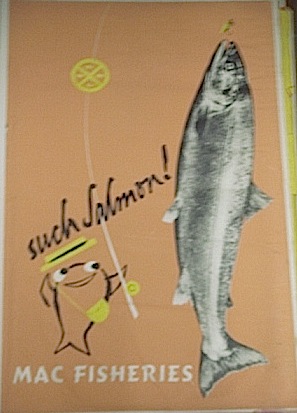
Now, bear with me.  I know that I’ve gone on about Hans Schleger’s design work for Macfisheries before, and I also know that some of these photographs are a bit duff.  But I still can’t resist showing you some more of these.

Macfisheries poster Hans Schleger.

They are simply too wonderful to resist.

Hans Schleger Macfisheries Mackeral poster

Once again, the images come from Colin French, who runs the meticulously-researched Macfisheries site.   In this case, he managed to track down the son of the company’s former logistics director, who’d kept a whole archive of these display posters.

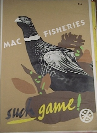
Some, like the poster above, I’ve seen illustrated before; others are completely new to me.

Macfisheries poster such game hans schleger

Macfisheries Christmas Club Hans Schleger poster

He apparently rescued them from a skip at Macfisheries’ head office.  They’re a fascinating slice through the kind of work that Schleger’s studio was producing – not just the ‘show’ posters like the ones above, but more workaday examples of marketing too.

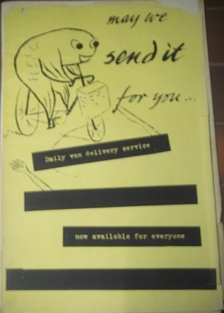
Macfisheries poster Hans Schleger send it for you

Hans Schleger Boned Kippers Macfisheries poster

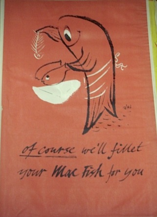
A few of these posters do worry me though.  A fish entreating me to eat other fish is getting dangerously close to cannibalism.

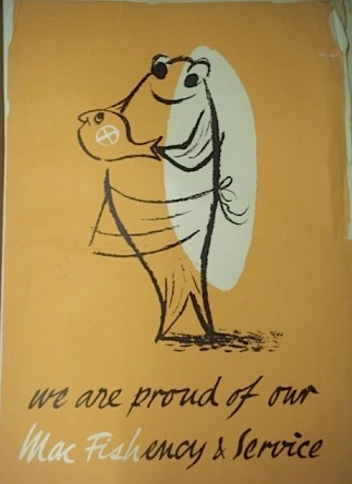
We are proud of our service Macfisheries poster Hans Schleger

Especially when it starts filleting its brethren.

Filleting Macfish poster Hans Schleger

Mind you, I used to feel the same way about blackcurrants advertising Ribena, so perhaps I worry about these things too much.

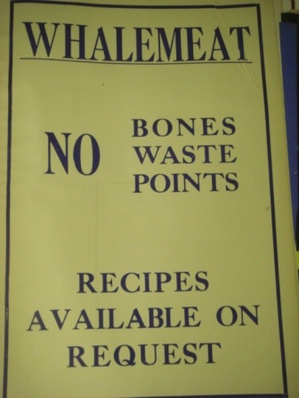
One of the many interesting things about these pictures is that the collection doesn’t just cover the Schleger-era designs.  There are examples of work from (I’m guessing) the early 1920s right up to World War Two.

Old fashioned Macfisheries poster for Oysters

Whalemeat poster Macfisheries WW2

And then goes on to what I suspect are designs that came afterwards as well.

later Kipper fillets Red Ring poster Macfisheries

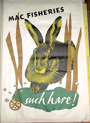
But perhaps the most fascinating story is that some of the posters were just design trials, and never made it into the shops.  Unfortunately, I have no idea which ones they are.  Perhaps this rather hypnotic hare,

Wonderful Macfisheries Hare poster Hans Schleger

which is far too much like a pet to consider eating.

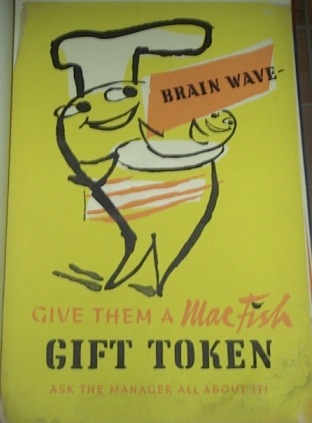
Or possibly the brainwave that you might want to give a MacFish token.

Macfisheries gift token poster Hans Schleger

The posters do also make me mourn what the posters present as a golden age of fish shopping, when native oysters and pheasant could not only be bought on the high street but also delivered to my door.  But I wonder whether it tasted as good as the posters looked? Remembering the smell of the fish sh0p in the Midlands market town where I grew up, I’m not totally sure that it would have done.

Daphne Padden

After posting briefly about her a while back, I’ve been trying to find out more about Daphne Padden and her very individual poster designs.

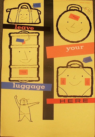
Daphne Padden coach left luggage vintage poster

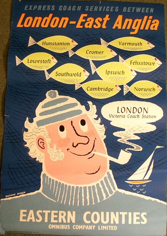
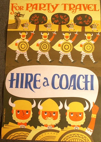
Some of my favourites are the ones she created for British coach companies in the late 1950s and early 1960s.

Daphne Padden coaches to east anglia fish vintage poster

Padden coach party travel vikings vintage poster

They’re almost child-like in their simplicity and delight – I’ve never seen such an unthreatening bunch of Vikings out on the rampage – but are nonetheless sophisticated pieces of design.

To my surprise, although plenty of people really love her work, I couldn’t really find anything on the web about her, so I’ve been forced into doing some proper research.  Sadly, what I discovered is that I’d begun just a bit too late, as she died in September last year.  I really hope she knew that people liked her earlier work so much.

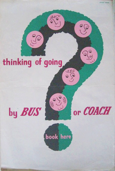
Daphne Padden bus or coach question mark vintage poster

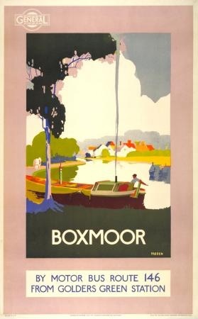
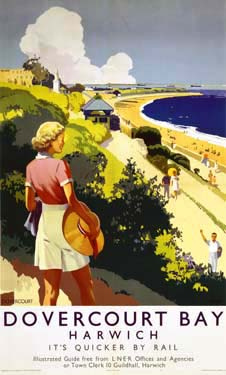
But I have been able to find out a few more details about her life.  Daphne Padden was born on 21st May 1927, and was the daughter of Percy Padden ARCA who was both a fine artist and a poster designer himself.  Here are a couple of his designs – the bus poster is from 1921, I am guessing that the railway one is from the late twenties or early thirties, but I can’t find a date.

Percy Padden 1921 vintage bus poster boxmoor from LT

Percy Padden Dovercourt Bay vintage railway poster

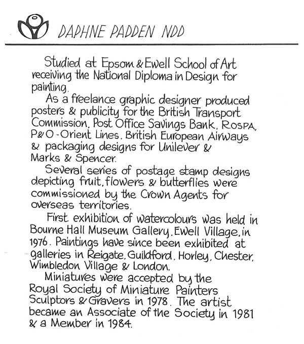
As for most of the rest of the story, perhaps it’s best if she tells it in her own words – quite literally.  This is the information which she produced for exhibitions of her work.

Daphne padden biography in her own hand

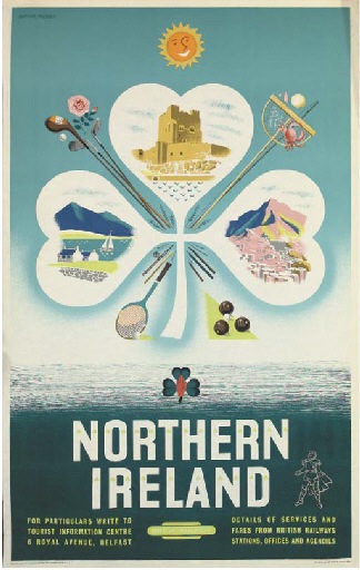
She worked as a graphic designer from the mid-fifties until, I think, the mid-1970s.  Here are a couple of poster designs from 1956 and 1957 respectively.

Daphne Padden Northern Ireland vintage travel poster

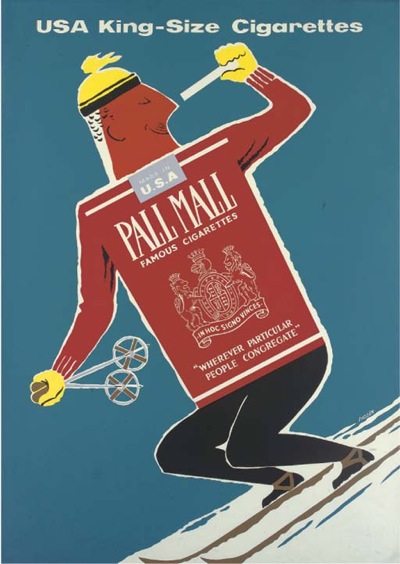
Daphne Padden Pall Mall cigarettes vintage poster 1957

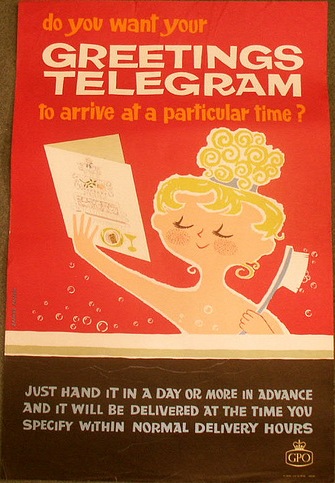
As her work evolved, she developed a very sharp and distinctive graphic style, mostly created using cut-paper collage.

Daphne Padden greetings telegram poster GPO

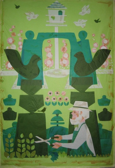
Here’s one of her originals.

Daphne Padden original collage

Unfortunately the glue hasn’t aged as well as the design.

As she mentioned above, she also did some more corporate design work.  Here’s some in-store display material for M&S, in a world where sell-by dates were an exciting new invention.

Daphne Padden in store display material for Marks and Spencer

But sometime in the 70s, she changed direction and became a fine artist, producing wildlife paintings on a miniature scale.

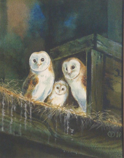
These barn owls are only 6″ x 5″ in real life, and if you want to see more, her gallery has some here.

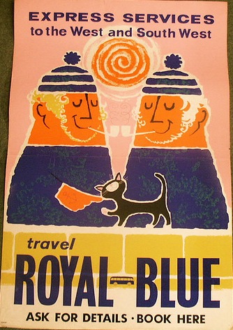
It’s not a completely surprising departure, because there are animals in quite a few of her posters, from this cat,

Daphne Padden Royal Blue coaches vintage poster

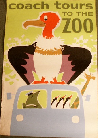
to this oddball collection of travellers (I am a particular fan of the mole driver).

Daphne Padden Zoo coach trips vintage poster

She didn’t do much work in the last five or six years because of ill-health, and she died on 21 September 2009.

Now I have to confess that I’ve been sitting on this information for a few weeks now, because Daphne Padden’s own archive of designs and posters has been up for auction.  I’m pleased to say that we did win some, but unfortunately it’s all still in transit and so I can’t show you any of them yet.  So there will be another post in due course when they arrive.  I’m also hoping to be in touch with some of her friends as well, in which case I will post a more extended biography when I can.

Thanks to Lincoln Joyce Fine Art and Gumersalls Solicitors for help with information, and to Allison for the borrowing once more of her Daphne Padden Flickr set.

Looking at Things

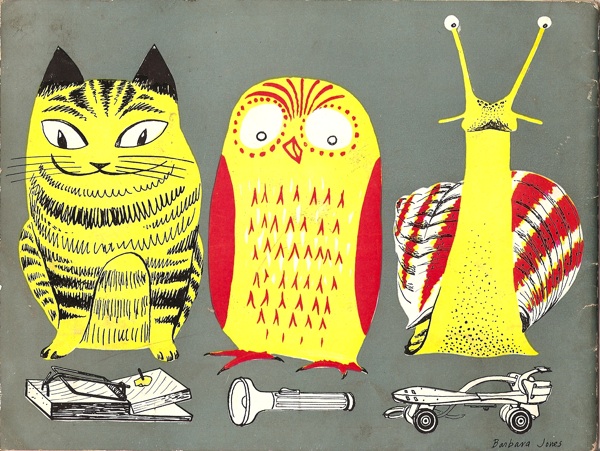
This arrived in the post the other day.

Looking At Things BBC Schools Brochure Barbara Jones back cover

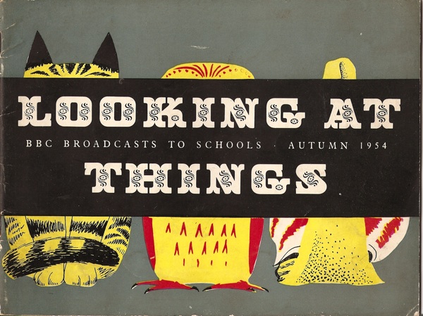
How fantastic is that?  I can’t decide which of the three I like best.   Although that is in fact the rear view – this is the front.

Looking at things BBC Schools Brochure Barbara Jones

As it explains for itself, this is a leaflet for a BBC Schools programme called Looking at Things, and it’s by Barbara Jones.

One of the unfortunate side-effects of blogging is that we actually end up buying even more stuff than we would have done otherwise; I had no idea that these brochures even existed until I wrote about Barbara Jones last week.  But now I do, and from there it’s only a short step to Abebooks, ephemera and even more stuff around the place.

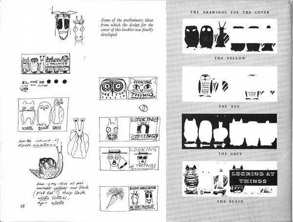
But this is a particular gem.  It’s worth far more than the £2 it cost for the cover alone, but inside is also Barbara Jones explaining how a book cover is designed and printed, using our friends above as the examples.

Looking at things Barbara Jones designing book cover BBC schools

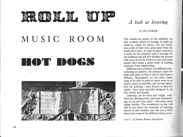
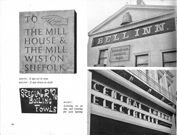
And there is also a spread about lettering and signs, which could have come from one of her own, grown up, books.

Looking at things BBC booklet signs Barbara Jones

Barbara Jones looking at things BBC schools booklet inside signs

The aim of the programme – which had noted industrial designer Milner Gray as a consultant – was “to awaken the child’s interest in the shape and colour of things around him,” and “to look at the things around you with a ‘seeing’ eye.”

I don’t suppose anything as random and purposeless but yet important as this is taught in schools these days.  Although please feel free to tell me that I’m wrong.  And now I must go and look for some more booklets to educate my eye.