A moving story

This, as it turns out, is an appropriate message from James Fitton.

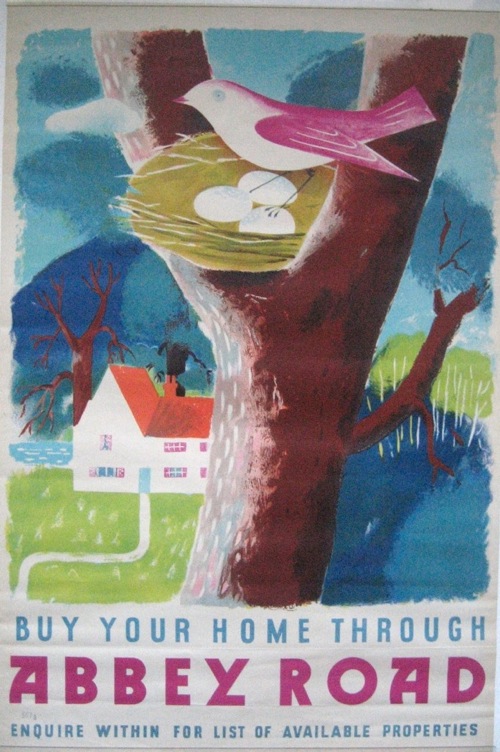
James Fitton abbey Road poster

We bought it at the last Onslow’s auction (in the after sale, to be precise) but have only just got round to picking it up.  Fitton’s sense of colour is as brilliant and unique as ever; the more I see of his work, the more I like it.

The timing is perfect though, as family Crownfolio are moving house in exactly two weeks.  So Quad Royal may be a bit erratic for the rest of August as broadband is transferred and I try to pack a rather excessive amount of stuff into boxes.  Apologies in advance, and a normal service will definitely resume in September.

Advanced or gimmicky?

It’s a bit unfair to apply too much hindsight to other people’s critical judgements.  Classics are sometimes not spotted as such at the time, while designs that are feted often don’t stand the test of time.

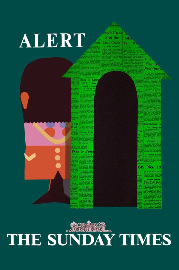
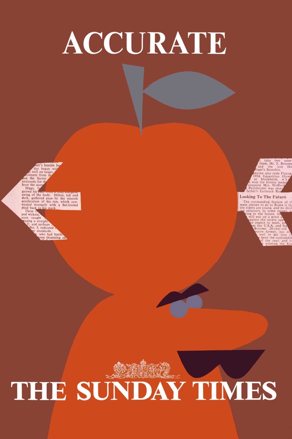
But in the case of posters, it’s so rare to get any kind of contemporary reaction to them that I really can’t resist.  The posters in question are Patrick Tilley’s series for the Sunday Times from 1960, of which this is possibly the most famous.
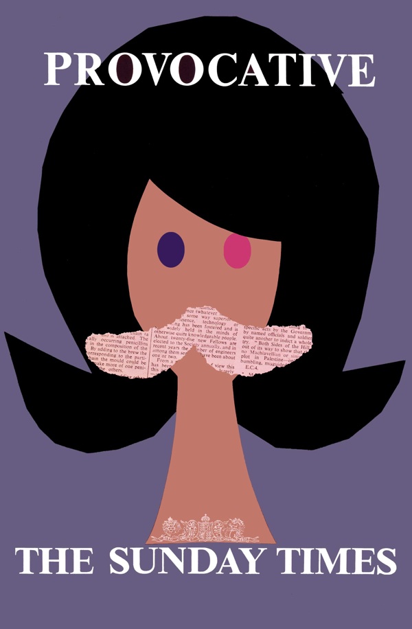
Patrick Tilley provocative Sunday Times poster 1960

Now I’ve mentioned them on Quad Royal a few times before (here and here for example) and every time I have, the posters have been enormously popular.  As is only right, because they are great bits of design, especially considering how early they were produced.
Alert Patrick Tilley sunday times vintage poster 1960

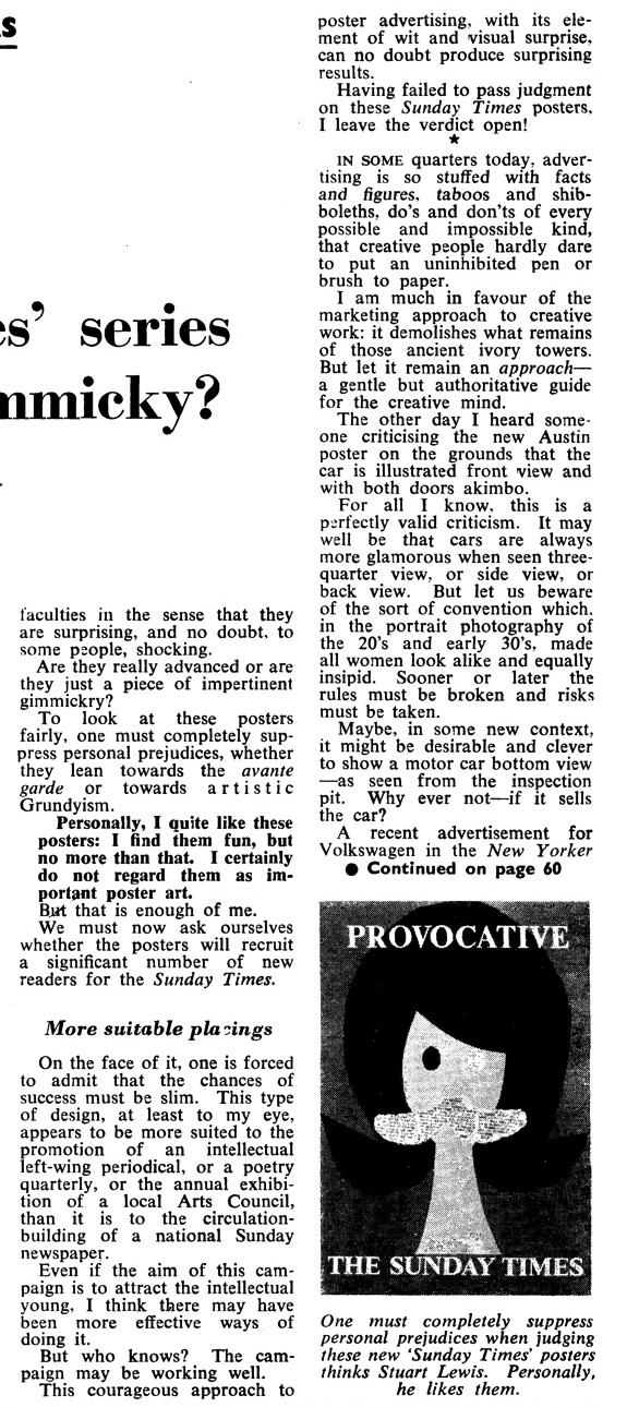
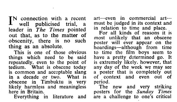
But at the time, the reaction was a bit more snitty.  The critic, one Stuart Lewis writing in Advertisers’ Weekly, is fairly certain about that.

I certainly do not regard them as important poster art.

He also doesn’t think they’ll sell the product, because the style is ‘more suited to the promotion of an intellectual left-wing periodical, or a poetry quarterly’ than a national newspaper.  Although, in the end, he is generous enough to leave the verdict open.

Sunday times vintage poster patrick tilley 1960

I don’t know whether they sold newspapers or not, but I think the jury would be finding pretty emphatically in favour of the posters these days.  They certainly wouldn’t find them shocking, as the article suggests that people did at the time.  (I’ve put the complete review at the bottom, if you want to read the whole thing for yourself.)  I find it pretty hard to be shocked by any of the series of posters, but that’s one reason why it’s good to come across articles like this now and then.  Because the way we see posters, and indeed any other kind of design now, may not be anything like the way they were perceived at the time.  Which has to be borne in mind if we want to read anything into them.
Accurate sunday times poster patrick tilley 1960

A couple of extra points by way of an addendum.  Firstly, the perceptive poster was quite comprehensively plagiarised a few years ago for Modest Mouse (evidence here if you want to see) and so I suppose must be a design classic.  Also, if you were wondering how these posters look quite so neat and tidy (and indeed digital) despite being more than fifty years old, Patrick Tilley cleaned up the scans and adjusted the colours himself.  So this is what they would have looked like if they’d been made now.

And now over to Mr Lewis.
Tilley review part 1

review part 2

Travel, send, deliver

Please accept my apologies in advance, but Quad Royal is going to be a bit flakey for the next few weeks.  Not only is it the summer holidays, but we are apparently moving house next month too.  A normal service will resume in September, I hope.

None of which is the reason for the short state of today’s post, that’s all eBay’s fault.  The summer holidays have got to them before they have me, and there really isn’t very much out there for the picking.  But I did want to point out this.

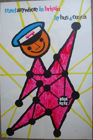
Karo Book here coach poster 1950s from eBay

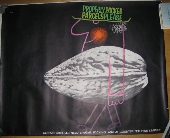
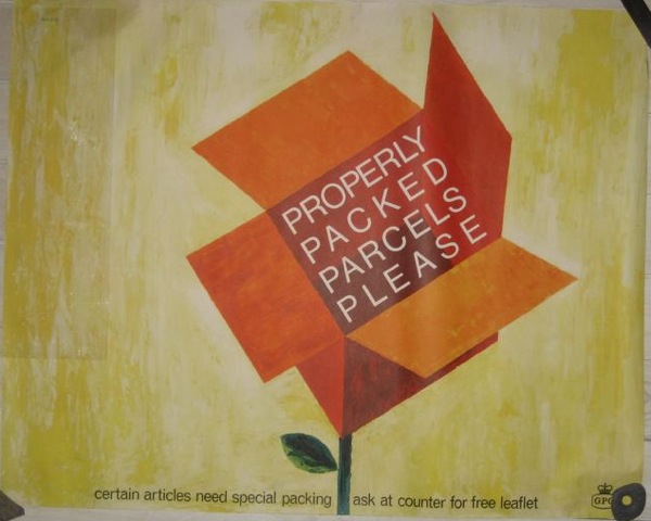
It’s a bit expensive at £150 (or possibly quite a lot expensive if I’m honest) but it’s by Karo, and it’s rather good.  Now I know very little about him, and haven’t been able to find out much more, but what I can say is that pretty much every single bit of his work that I come across, I like.  He seems to have done quite a few bits for the GPO during the 1950s and 1960s, including a few very wonderful Properly Packed Parcels Please posters.  Unfortunately the BPMA’s catalogue is down right now, so you’ll have to put up with our slightly more homely photographs of the couple we have.

Karo Properly Packed Parcels Please Vintage GPO poster 1968

Karo Properly packed parcels please vintage GPO poster 1968

They’re both from 1968 and one day when we have enough walls that top one will be framed and up on them.  This one already is.

Karo Sending Soft Fruit by post 1952 vintage gpo poster

I know I’ve posted that before, but it still amuses me far more than it should, as well as being a lovely thing to look at too.

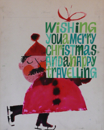
Karo also did quite a few coach posters as well as the one which is up for sale – a good dozen at least must have come up in the last Morphet’s Malcolm Guest sale.  This went for £140.

Karo Happy Christmas Travelling from Malcolm Guest Morphets

But in amongst all of that, I can find out almost nothing about him and his life.  So if anybody does know something, please do get in touch.

And finally, given the recent discussion of vans, this.

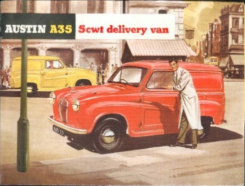
Austin van lovely brochure from eBay

At just 99p right now with only a day and a half to go, it’s a bit of a bargain.  But it’s also a reminder that the modern design wasn’t the only game in town back in the 1950s, and the Ladybird Books school of illustration was probably as equally ubiquitous.

Shiny happy people

Or at least one person.

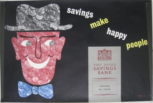
Manfred Reiss Vintage post office savings bank poster

He’s by Manfred Reiss and I would guess dates from some point in the late 50s, although as he’s not yet in the BPMA catalogue I can’t give you an exact date.

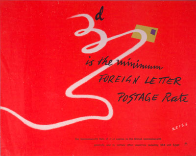
Reiss did quite a few designs for the GPO, as well as for ROSPA during and just after the war, but the Post Office seems to have been his main source of work.  I’ve been meaning to post this 1949 image for a few weeks now, simply because I like it.

Manfred Reiss vintage GPO poster 1949

There is also a small biography on wikipedia as well if you’re interested.  I suspect I may be able to dig up more, but that may have to wait until later on as events are slightly conspiring against me today.  More on Reiss, and some slightly convoluted thoughts about the afterlife of WW2 Home Front posters when they stop.


U-Turn (on the river)

As I am sure many of you will remember, when we debated the subject of reproduction posters, and London Transport reproductions in particular, I said something about how I really wouldn’t want to buy a poster with ‘This is a Reproduction’ stamped all over the bottom.

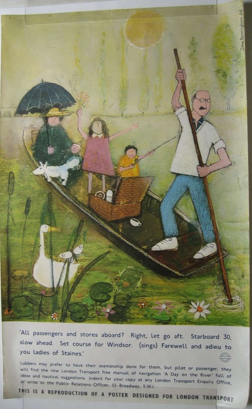
It turns out that I am wrong, because we’ve just bought two.  Worse than that, we might even frame them.  It’s all down to the quality of the illustrations though, and these are spectacularly great ones by John Burningham.

John Burningham A Day On the River vintage London Transport poster 1965

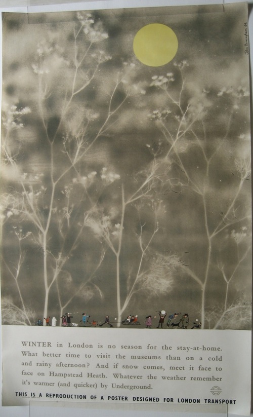
The originals are both from 1965 and were probably both reprinted in about 1971.  Above is A Day On The River, but I like Winter even better than that.

Winter John Burningham vintage London Transport poster 1965

While I am on the subject of John Burningham, can I also recommend his illustrated and very good autobiography.  Not many artists or designers are able to write so fluently about the process of designing and making, so it is well worth the (slightly coffee-table) price.  From this you can find out that designing posters for London Transport in the early 1960s was his first real leg-up to a career in illustration.   This is his first ever poster, from 1961, courtesy of the London Transport Museum site.

John Burningham Rush Hour vintage London Transport poster 1961

Even though the posters are lovely, I’m still a bit surprised at our volte face.  The only consolation is that we are in illustrious company, as Rennies have a copy of A Day on the River on sale on their website.  Perhaps reproductions are the new vintage poster.  Or perhaps just John Burningham reproductions are.