Oh what an unprofitable war!

Hello everyone.  My attendance really isn’t getting much better, is it?  We’ll have OFSTED round soon if I’m not careful.

Anyway, I thought I’d better post something about last week’s poster event at the National Army Museum.  Lots of people who know about posters spoke; more frighteningly, lots of people who knew about posters also sat in the audience.  And for light relief after lunch, they all got me, rattling on and trying to fit everything I had to say about Home Front Posters into 40 odd minutes.  There were some very odd minutes in there too.

Much of the content wouldn’t have  come as much surprise to anyone who has been reading my posts on here, but the basic thesis was that most of our shorthand generalisations about Home Front Posters are wrong.  That in itself isn’t exactly news, but it’s all too easy to imagine that all Second World War posters came out of a giant, all-powerful Ministry of Information determined to tell the public what to think.  I think we have George Orwell to blame for that, but the truth was rather less like 1984, and, well, rather more shambolic and British.

Lewitt Him Shanks Pony world war two home front poster

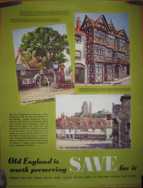
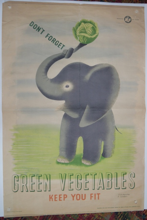
Most obviously, posters didn’t just come from the Ministry of Information.  In fact they came from everywhere but.  To start with, the two biggest-spending government departments, the Ministry of Food and National Savings, didn’t bother with the MoI and made their own.

Tom Eckersley elephant poster ministry of food world war two

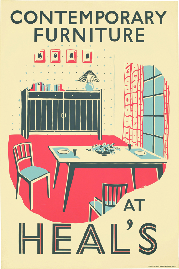
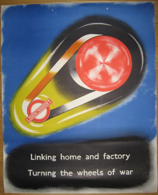
Then there were the London Transport posters…
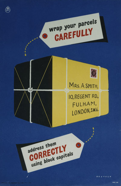
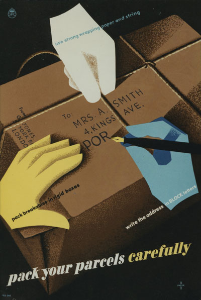
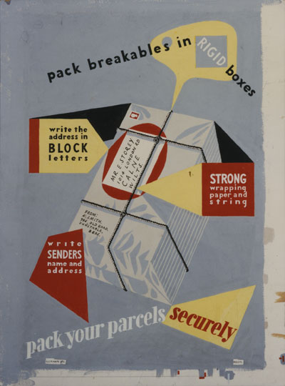
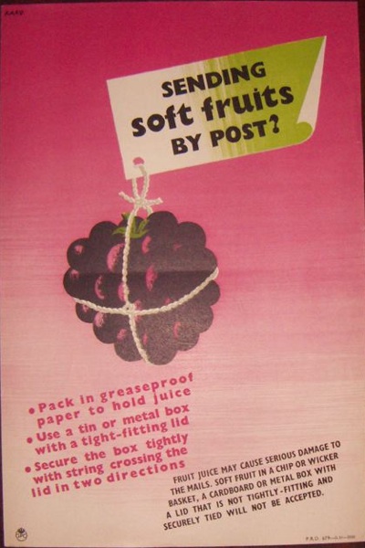
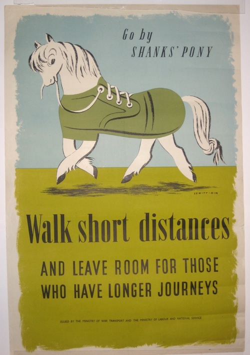
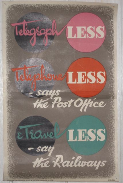
IMG_1701

…the GPO posters…

IMG_3583

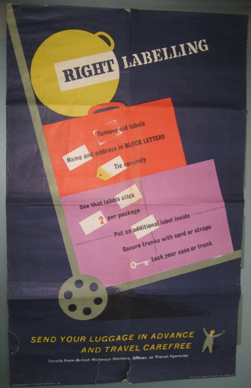
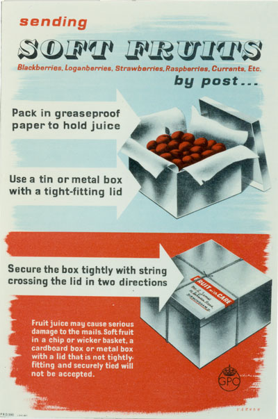
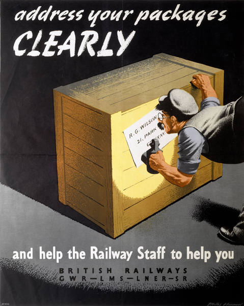
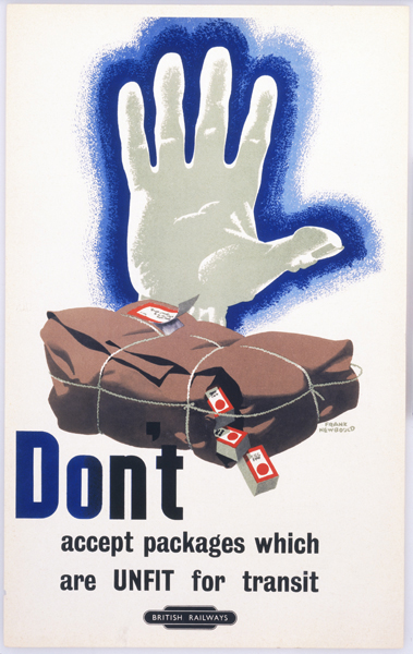
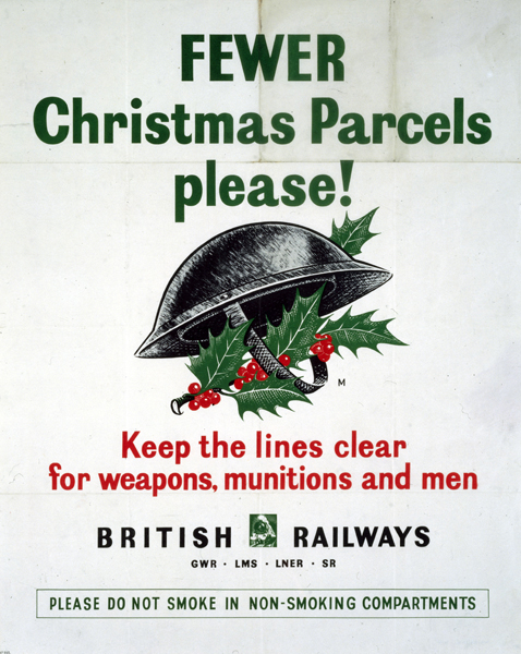
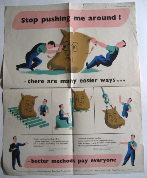
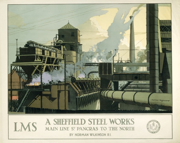
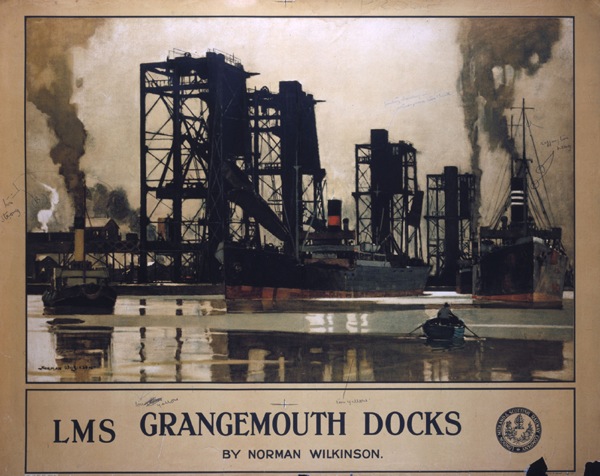
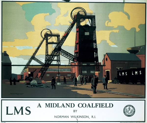
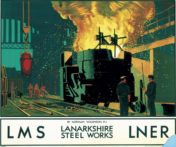
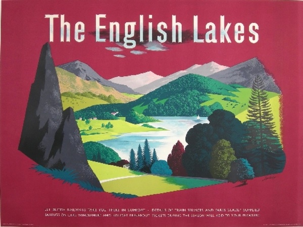
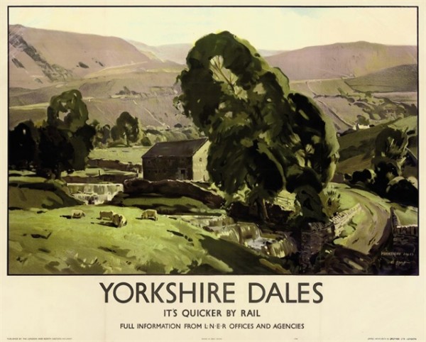
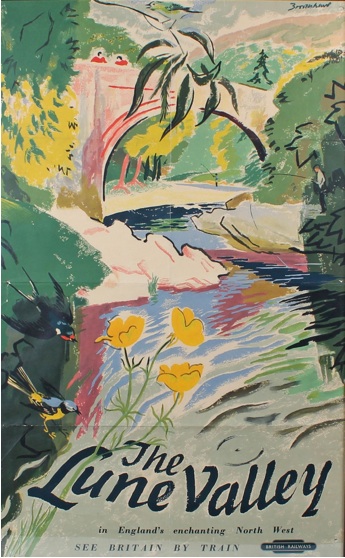
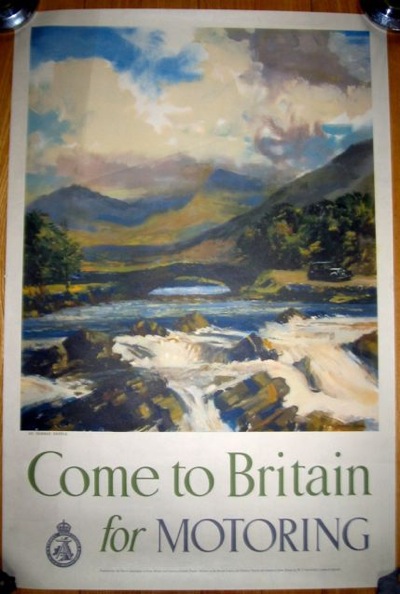
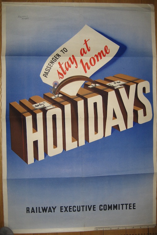
…the railway posters…

British Railways wartime holiday at home poster

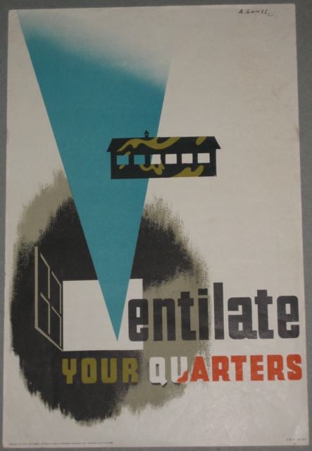
And that’s before we’ve even mentioned Abram Games’ posters produced for and by the Army.

Abram Games Ventilate your quarters poster

Or RoSPA’s innumerable workplace safety posters.

Tom Eckersley goggles RoSPA poster

But the reason I’m telling you this, is that one of the people who attended, Kirill Kalinin pointed me at some Home Front posters I hadn’t seen before, posters which were produced by private companies.

Now why, you might be asking, would private companies spend money on advertising during war, when everything was rationed, production was centralised and it was nigh-on impossible to buy anything inessential?  It’s a good question, and the answer lies in taxation.

One of the prevailing views then about World War One was that large companies had profiteered from the war, and it had made the rich richer.  So, at the start of World War Two, a tax of 100% was levied on any company whose profits rose above their pre-war levels..  Clearly there was no incentive to make any extra profits, and companies looked for ways to spend the money rather than give it to the government.

One easy thing to spend it on was advertising.   Hence the pages and pages of adverts like this in every wartime newspaper and magazine, either for goods that were in such short supply that they didn’t need advertising or, quite often, weren’t available at all.

World war two ad for Bovril

Despite the restrictions on paper use, a few posters were also made.  I’d included this one in my talk.

Fougasse World war two poster for fillings

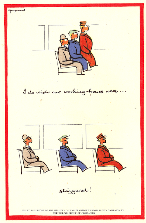
I think this is a result of Tillings donating poster space in their coach stations to the war effort, although in the absence of any real archives it’s hard to tell.

But Kirill has now introduced me to these, which are produced by the Motor Industry Association, and which I’d never seen before.

Motor Industry Association world war two poster torpedo


Motor Industry Association world war two poster bomber

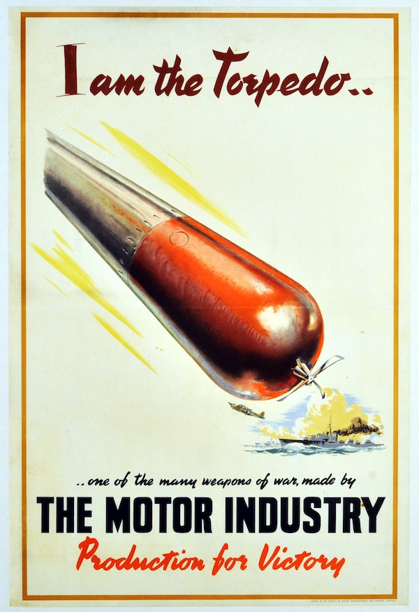
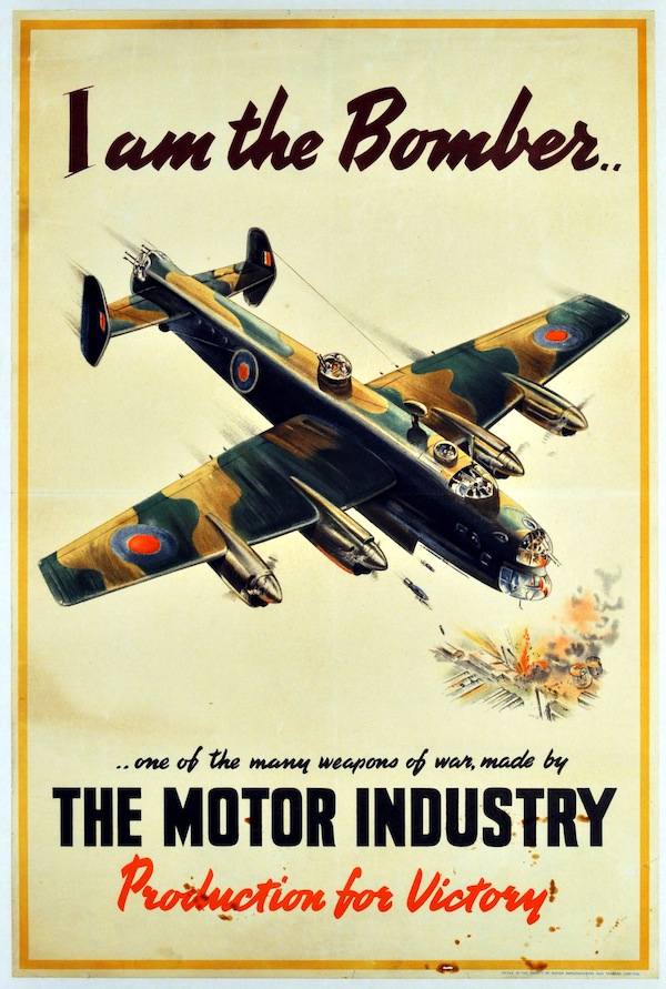
I have no idea where they were displayed or anything about them at all.

Motor Industry Association world war two poster tank

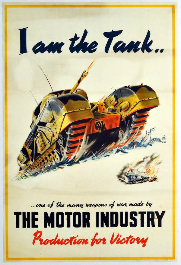
They’re also interesting because they show the ironmongery of war, something which most Home Front posters, with the exception of National Savings, avoided almost entirely.

All of which pretty much proves my overall point from last Saturday, which was that whatever generalisation you make about Home Front posters, it’s always possible to find a poster to disprove it.  So if you have any more oddities you’d like to point out, please send them this way.

And if you like the Motor Industry posters, Kirill has them for sale on his website.

String Theory

This has recently arrived in the post, contradicting my previous assertion on here that there are no more eBay bargains to be had.

Lander british railways luggage poster
Admittedly it is not an outstanding piece of graphic design history (although I quite like it) and is rather battered round the edges too.   But it’s by Lander, which is always a good thing, and it’s also a rather intriguing bit of social history.  Because it’s a reminder of the days when things had brown labels and were tied up with string, or in this case cord.

Nobody does that any more, do they?  I have sometimes been known to wrap a parcel up in brown paper, but I don’t think I’ve ever tied it up with string.  This is something I’m sure that my mother could do though, coming as she does from an age before jiffy bags and sellotape.

Without all these modern parcel technologies, it was clearly possible to wrap a parcel very badly.  At least that’s the only conclusion I can arrive at from the sheer volume of posters that the GPO put out on the subjects.  Most of these are quite general, and I’ve written about the Properly Packed Parcels series on here before.  But there were plenty of other similar exhortations too, and here’s just one.

Tom Eckersley cow jug pack parcels carefully GPO poster

Actually, seeing as it’s Tom Eckersley, let’s have two.

Tom Eckersley cat ornament poster GPO pack parcels carefully

Judging from the posters though, (these are all from between 1950 and 1953) there was a Post Office standard approved way of packing parcels carefully.

Caswell 1953 GPO poster

Dennis Beytagh 1952 parcel wrapping poster

So that’s two pieces of string round the long side, one round the other, although I still have no idea how to knot it.   Hans Unger, meanwhile, is even more specific about rigid boxes and string in 1950.

Hams Umger 1950 poster wrapping parcels GPO

This one, though, is the most instructional I have managed to find (it’s artwork by the way, artist not known).

Artwork for a poster. Subject: Careful packing of parcels. Artist: Not known. GPO 1950

I think even I could have had a go at the process now, although I still don’t know how to knot the string.

Of course (and you might have guessed that the whole post has been leading up to this) the real challenge that faced the Post Office was blackberries.  Sent in a non-approved fashion.

Karo soft fruit by post genius GPO poster

Did people really send them in a basket?  And expect them to get there?  I am boggled at that thought.  But the GPO weren’t, they produced more than one poster, which means that it must have happened at least twice…

soft fruit packing gpo poster

The GPO weren’t alone though, British Railways also had problems with parcel packing and addressing.

'Address your package clearly and help the Railway Staff to help you'. Poster produced for Great Western Railway (GWR), London, Midland & Scottish Railway (LMS), London & North Eastern Railway (LNER) and Southern Railway (SR) to remind customers to address packages clearly, as illegible addresses cause delays. Ar'Address your package clearly and help the Railway Staff to help you'. Poster produced for Great Western Railway (GWR), London, Midland & Scottish Railway (LMS), London & North Eastern Railway (LNER) and Southern Railway (SR) to remind customers to address packages clearly, as illegible addresses cause delays. Artwork by Miles Harper.twork by Miles Harper.

The problems might have been similar but it has to be said, the GPO’s poster design was infinitely superior.

You also get the feeling from their posters that they don’t actually like parcels that much.  They’re just trouble really, when your main business is really running trains.

British Railways staff poster. 'Don't Accept Packages which are Unfit for Transit', BR staff po'Don't Accept Packages which are Unfit for Transit', BR staff poster Artwork by Frank Newbould.

That, incidentally is apparently a late Frank Newbould from 1960,  It’s also quite mild in tone compared to some.

But nothing gave them an excuse like the war.  At last they could say what they really thought.

Fewer parcels World War two christmas poster british railways

Can you even send a parcel by railway now?  Probably only if it is tied up with string.

Sad sack

This post is very simply two good things which have arrived on my desk recently.  The first is this Central Office of Information poster from 1950, photographed as well as I can manage under the rather folded circumstances.

CEntral Office of INformation Production poster 3

I know it’s from 1950 because that is when, apparently, the Anglo-American Council on Productivity produced their report on Materials Handling.  Now I have researched this quite a bit more in the hope of finding an interesting backstory, but have to report that there is no such thing; the truth is entirely dull and intermittently depressing.

Post-war American aid to Europe, including Britain, didn’t just consist of dollars, it also came in the form of technical assistance, of which the Angl0-American Productivity Committee was just one part.   At this point, American companies were two to three times more efficient than British ones, so you would have thought that paying attention might have been worthwhile.  But British companies didn’t want to hear: they thought they knew best, that you bullied and cajoled your workers not co-operated with them, that specialists were inferior. And so nothing happened.

Which is sad, because it means that this rather endearing little poster is actually a portent, the first sign of what would in the end happen to British industry in the 80s and beyond, as companies never put their raw materials on rollers but carried on heaving the sacks instead.

Meanwhile, on the further subject of inefficiency, how to run a railway.

Royston Cooper Railway leaflet want to run a railway?

The truthful answer to the question posed by this little booklet is no I don’t, thank you.  But it has gained houseroom because it is by Royston Cooper, who designed the insides too.

Royston Cooper railway leaflet fault spread

The whole thing is excellent, and dates from 1962, as this final page tells us.

Royston Cooper railway leaflet end design

The content, funnily enough, despite my almost total lack of interest, isn’t bad either.  The point of it is to prove that it’s actually harder than you think to run a railway, lots of things can go wrong and so please can you be very nice to Southern Railway when they do.

Royston Cooper Railway leaflet spread

We could probably do with a reprint now.

Royston Cooper but

The Seen

Today, a miscellany of stuff which has arrived here over the last few weeks and around which I may or may not be able to construct a narrative thread.  Watch and see.

To start with, lots of you responded to Paul Durham’s request for images of posters from Heals’ Mansard Gallery.

Heals Mansard Gallery potters posterHeals Mansard Gallery prints and glass

So thank you to Kiki Werth, Martin Steenson and Mike Ashworth, as well as other people who have offered other kinds of help.

Heals Mansard Gallery poster from McKnight Kauffer Art of the Poster

The image above is by William Roberts and is taken from McKnight Kauffer’s Art of the Poster Book.

Martin Steenson, who sent that one to me, also included this rather wonderful image with it too.

H S Williamson London Transport exhibition poster 1922

It’s by Harold Sandys Williamson and dates from 1926 (the London Transport Museum have it on their website).  Now quite apart from being a lovely poster, and an exhibition I’d rather like to have seen, it’s also further evidence of Underground Posters being exhibited quite heavily during this period, and in a more varied set of galleries than I had imagined.  Was it because Frank Pick had the contacts, or where gallery owners and curators (and furniture store owners) genuinely inspired by his vision of a popular form of modern art.  Perhaps someone will come along who knows more about this and tell me.

Of course there are still exhibitions now.  I haven’t bothered to mention the London Transport Museum’s current one. on 150 years of Underground design, simply because it has been in every newspaper in the country, and so I assumed you would have heard by now.  What you might not know, however, is that as a result you can now buy poster stamps.

London Transport posters on stamps

Which is a novelty.  And I’ve always liked the James Fitton on the right below.

More London Transport posters on stamps

If you want to know more, there is a full and factual BPMA blog here.

Finally – and this has no link to anything else at all apart from just being interesting – a leap back to a post from nearly two years ago, in which I rhapsodised about some wonderful drawings of shops by John Griffiths, from Motif magazine.

motif smith umbrella

Any excuse to show them again.

But the most mysterious and intriguing, despite being in black and white, was always this one, for an animal costume shop off St Martin’s Lane.

Theatre Zoo John Griffiths Motif 3

I got an email the other day, from someone who, as a big Beatles fan, was very pleased to see this.  It turns out, you see, that the costumes for Magical Mystery Tour were purchased here in 1967.  And what’s more, the receipt is floating around out there on the internet.

Theatre Zoo beatles receipt

One walrus mask, hood, feet and flippers.  I am the Walrus indeed.


Modern Tendencies

Reader request day today on Quad Royal.  This isn’t something I often do, but Paul Durham has asked for some help from you lot.  He’s trying to find as many images as he can of the posters that were issued by Heals for their exhibitions in the Mansard Gallery.  This was right at the top of the Heals Building in Tottenham Court Road, and they held exhibitions there from 1917 until the late 1970s.

It’s an interesting request on several fronts: partly because the posters are good and aren’t something I have ever covered on here until now, and partly because it doesn’t seem that anyone really knows how many there are and who designed them. Not even Heals can say for sure exactly which exhibitions were held there.  So we can, perhaps, add to the sum total of human knowledge.  Here’s one I dug up that was auctioned at Onslows a few years ago, by Rhoda Dawson, and for one of their less assertively modern exhibitions.

Rhoda Dawson flower paintings heals mansard gallery

There’s also the fact that I’m sympathetic to anyone in the grip of a completist collecting mania.  These things need to be encouraged.  So let’s see what we can do to help.

Paul has sent me a few over as starters.  This is by McKnight Kauffer from 1918, and is the earliest one he’s managed to track down so far.

McKnight Kauffer London Group Mansard Gallery 1917

There were earlier exhibitions though.  The second one ever, Poster Pictures, in June 1917, displayed the original paintings for many London Transport posters, in aid of prisoners of war in Germany.  Which is very interesting as it proves that the dissemination of posters as art wasn’t just limited to what LT themselves put on show.

When I first read about the Mansard Gallery, I thought, oh, art exhibitions at the top of Heals, fair enough.  But actually the idea was a bit more interesting than it initially sounds, being as it was part of the great between-the-wars project of making everyone like elitist art.  (I’ve posted about this so often that I simply can’t put all the links on; one day I must index this monster).

Obviously the Mansard Gallery held art exhibitions, it’s what galleries do, after all.  But the aim of having them in a furniture store – and of displaying the art in the first place – was to persuade people buying furnishings that they might benefit from art work as part of the house decorations and how it may work within the home.   That’s another McKnight Kauffer below, by the way, from 1918 this time.

McKnight Kauffer Mansard Gallery London Group 1918

Part of me thinks this is all a bit, ‘books do furnish a room’, but that’s probably unfair.  Not least because Heals really did want to persuade you that art would improve your home.  So much did they want to persuade people of this, that there was not merely a gallery up in the top of the building, but also the Mansard Flat, which was furnished to the very apex of Heals taste, and was used to show how art might work in a domestic setting. Which then makes sense of a picture I have seen (but don’t ask me where) of a McKnight Kauffer London Underground poster being used in a Heals furnishing display.  I wish I could find that, as it would tie up all the loose ends quite neatly.

Heals Mansard Gallery posters

But as you can see from the posters above, the demarcations were nothing like as neat as that; just as art crept into the furniture displays, so did furniture make its way into the gallery.  I’d be intrigued to know what furniture too, presumably the stuff that was a bit too advanced to actually sell to the English, even in London.  That’s what seems to be on display here; it’s another poster by Rhoda Dawson, from the same lot at Onslows.

Heals Mansard Gallery Modern tendencies poster 1928

But of course these divisions aren’t so neat and tidy outside of the gallery either, because Heal’s also produced rather good posters for their furniture as well as the gallery.  These are rather outside our remit, but then they are so good that I can’t leave them out entirely.

Heals contemporary furniture 1950s poster

They’re also quite liberally scattered over the web as Heals produced reproductions a few years ago.  How did that pass me by?

That however is by the by.  Can anyone point me, and more to the purpose Paul, at any more.  I have a feeling that there will be more lurking in books and catalogues than there will be out there on the net, so if you know of any, please do let me know.  For myself, because I’m interested now, if there are any pictures of the exhibitions, please send them along too.

Addendum:

Here’s another one, by William Roberts, which Martin Steenson found in McKnight Kauffer’s Art of the Poster.

William Roberts Mansard Gallery poster from McKnight Kauffer art of the poster


Thank you for that one.

Northern return

Last year, I wrote about depictions of the industrial North of England in posters, or rather I pointed out their rather conspicuous absence.  At which point I got quite a lot of comments, mostly saying that I was wrong, and pointing me at posters like this.

Norman Wilkinson Sheffield Steelworks LMS poster

Which is, I am forced to admit, is exactly what I was complaining didn’t exist, a railway poster of Northern industry.  There are, as it turns out, a whole series of Norman Wilkinson posters doing the same sort of thing, including the Runcorn design that I included in the original post, and  a few more to boot.

‘Grangemouth Docks’, LMS poster, Norman Wilkinson industrial  'A Midland Coalfield', LMS poster, c 1935.

'Lanarkshire Steel Works', LMS/LNER poster, c 1935.

I have to say that that last one is the best Norman Wilkinson I’ve ever seen, and if anyone wants to send me a copy feel free.

But Wilkinson wasn’t the only artist working in this series – this poster is by Frederick Cayley Robinson.

Frederick Cayley Robinson Cotton poster LMS 1924

Now on the one hand I clearly am wrong, there are quite a few posters of Northern Industry.  At the same time, though, I don’t think this changes the argument.  The Cayley Robinson poster is dated to 1924, which is the same date as I have seen given to a couple of the Norman Wilkinson posters.  Railway poster dating is not an exact science – the NRM itself dates them to 1923-48 – but I’d hazard a guess that these are all part of the same series.  Which means that putting these kind of images on a poster was, possibly, tried once as an experiment and then never done again.

Now this might have been because the Board of Directors of the LMS thought it unseemly, but it might be because they discovered that this kind of poster didn’t play well with the public.  And at this time, they were able to be reasonably certain about what was and wasn’t popular, because not only did the company sell copies of its posters to the public, it took some notice of how they were doing too.  In 1924, they were able to comment that this poster, by Maurice Greiffenhagen, was selling to the public “in large numbers” (more on this here if you’re interested).

‘Carlisle, the Gateway to Scotland', LMS poster, 1924. Maurice Greiffenhagen

There may be an implicit comparison here with the industrial scenes, or at least I’d like to think so.

None of this can be proven, of course, but what is the case is that this series does seem to have been the only one, which I think means that my overall point about the scarcity of these images (and especially after World War Two when a new technological and manufacturing Britain was going to take over the world) still stands.

But what about the Lake District and the Yorkshire Dales, people complained in the comments.  What about posters like this (any excuse)?

Lander (Eric dates unknown) The English Lakes, original poster printed for BR(LMR) by Waterlow

Or indeed these, and many others like them?

Edwin Byatt Vintage railway poster 1940

Lune Valley 1950 poster Percy Drake Brookshaw

They are northern, granted, but they aren’t industrial which is the real gap in the imagery.  But as ‘mm’, who commented, points out there is another interesting divide to be found between northern and southern landscapes.  It’s a diversion, but it’s one well worth taking.

Maybe the northern landscapes are too wild and untamed to be fondly remembered in the sense you mean. Perhaps it is a safe, cultivated landscape we yearn for or think of as British!

I think this may be true, and it’s worth remembering that the Lake District only became popular, rather than being seen as a rather frightening and uncivilised wildness at the start of the eighteenth century.  There is definitely an ‘otherness’ to these places.

There is something else going on here too, which is a kind of conflation.  Englishness becomes a shorthand for Britishness.

Britain Land of Gardens poster for American tourism early 1950s

While England in its turn tends to be represented by the Southern.

Old england National Savings poster heritage

I thought we should have a few dog-ugly posters by the way, as it was all getting a bit safe and pretty further up there.

All of which means that, however much we admire the Lake District, or Scotland, or the Peak District, it would look a bit odd to have one of the images of these areas with ‘Britain’ or ‘England’ stuck at the bottom.  Although like all good generalisations, there are of course exceptions.

Come to Britain for motoring vintage tourist poster

All of this is covered in much more depth and complexity in David Matless’s peerless book Landscape and Englishness, and now that this has emerged from storage (hurrah) I will have to reread it and, I suspect, post on the subject again.

For the last word, however, I must return to the comments.  Nick S posted this wonderful bit of writing by Harry Pearson which comes, it turns out from a book about football.  But bear with me on this one, it’s not simply relevant, it sums the whole thing up to perfection.

In the North-East, England, or the notion of England, seems a long way off. The North-East is at the far corner of the country but it is separated by more than just miles. There is the wilderness of the Pennines to the west, the emptiness of the North Yorkshire moors to the south and to the north, the Scottish border. The nearest major city to Newcastle is Edinburgh, and that is in another country. Sometimes the North-East seemed more like an island than a region. And there was more. As a boy, I can remember looking through one of those colour illustrated encyclopaedias and coming upon a full-page picture that caught my attention. There were cottages festooned with hanging baskets, burgeoning gardens, white picket fences, a village green, a duck pond, a cricket match, a district nurse on a bicycle, and, doubtless, a future prime minister sitting outside a thatched pub sipping warm beer. The caption underneath read ‘An Everyday English Village Scene’…. this caption was clearly a mistake. Because I lived in an English village and it didn’t look anything like that!

“Twenty years later I went to see a friend of mine in Sonning-on-Thames. It was a hot June day and as we walked across the churchyard I realised that this was, spiritually if not figuratively, the village in the encyclopaedia…. This was England. England, their England. It wasn’t like the North-East at all.

Which is why you won’t often find a picture of a Northern scene with the caption ‘England’ or ‘Britain’ on it.  And even if you do, it definitely won’t be showing their industries.