Over-modern, over here
I know I mentioned it in passing, but what with one thing and another, the 1950s Modern book that I wrote for Shire hasn’t really had much of an outing on here, despite having hit the shops before Christmas.
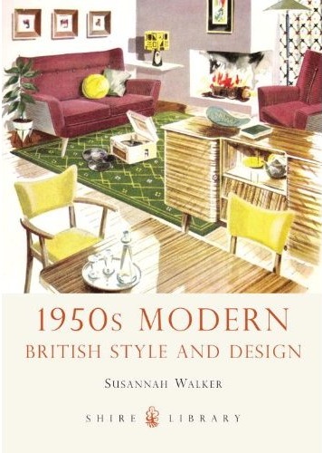
You can buy it on Amazon if you like, but the nice people at Shire have promised me a couple of copies to give out as prizes, so if that’s not an excuse for a post and a competition, I don’t know what is.
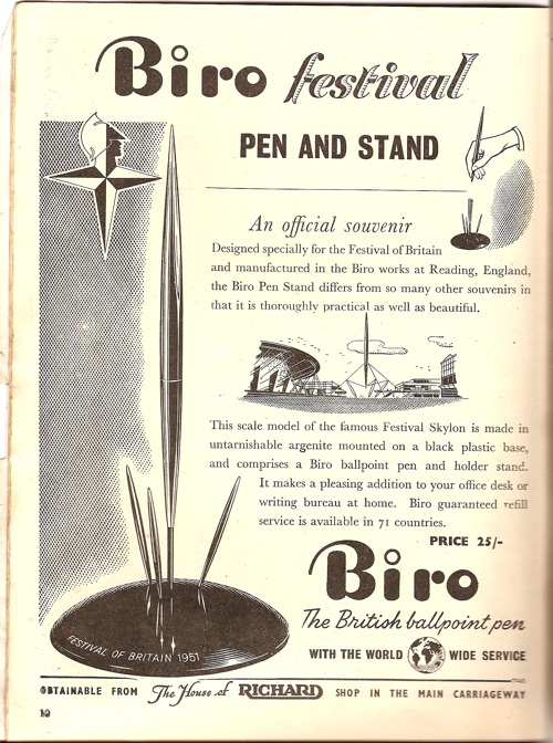
The book takes a look at the many and various ways in which that nebulous concept ‘the modern’ took shape in design during that decade. Everything from the obvious, like the Festival of Britain.
To the more ambiguous.
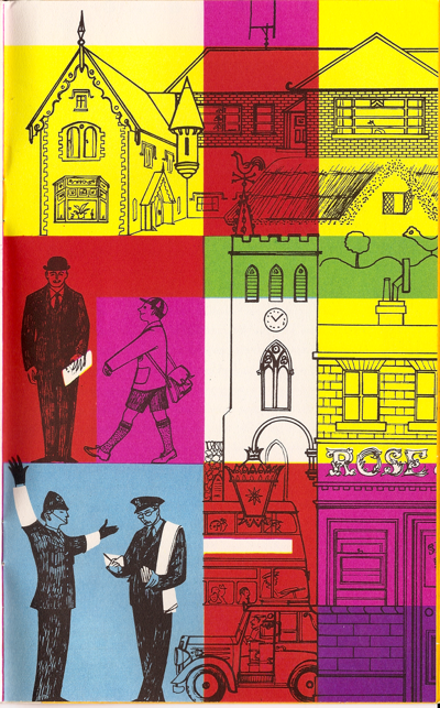
This rather interesting mix of trad and modern is by Barbara Jones, by the way, and is one of her illustrations for the British exhibit at the 1958 Brussels Expo (more here if you’re interested).
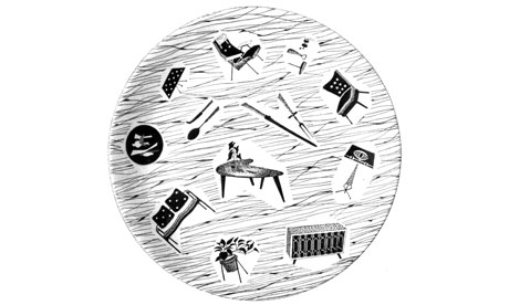
One of the many things that amuses me about the design of this period is the strenuous efforts people made in pursuit of the modern. Take this plate, for example, made by Stoke pottery firm J&G Meakin.
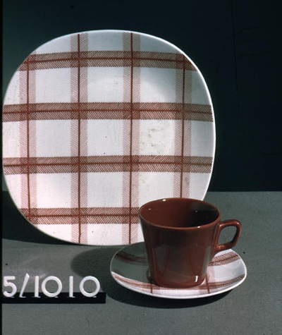
These kinds of designs are pretty familiar to us nowadays, but at the time they were strikingly different. And this wasn’t just because the designs and colours had come over from America, it’s also because it’s a determined effort to be as different as possible to a conventional plate as it could be. Shall we list the charges against it?
First is the shape. Most plates are round; this one is squarish. Plates aren’t round by accident, they are round because they are thrown on a wheel. You can’t throw a square plate (well, you can, but to break it rather than make it), you have to cast it, a much more difficult and expensive process. The same is true of the decoration; round plates tend to have circles on them because they’re much easier to paint that way – again you spin the plate round, hold the paintbrush still, Bob’s your uncle. These straight lines take a great deal more effort.
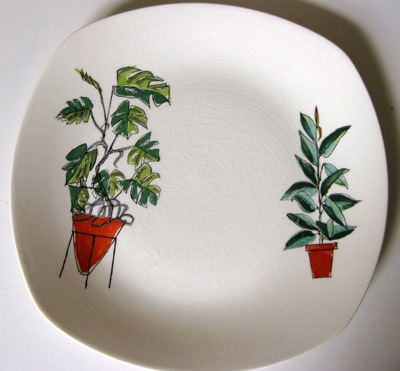
Finally, there’s the kind of decoration. 1950s ceramics acquire their motifs from pretty much anywhere except traditional tableware motifs. In this case they’ve used a tablecloth pattern, which is actually not entirely unreasonable, but I’ve also seen Formica designs and dog-tooth checks. Then of course there are the pictorial ones. The most famous tableware of all from this period has to be Homemaker.
Looks fine, doesn’t it? It’s so much a symbol of the times that we’re accustomed to it. But wait a minute, how much do you really want to eat your food off a picture of a television? And a television that’s staring back at you, to boot.
Homemaker is of course a visual dictionary of all the most up-to-date things that you could possibly put in your sitting room: so that modernity outweighs any scruples you might have about eating off the furniture. And if it’s modern, it almost certainly appeared on a plate. Everything from the Continentally modern aubergine to spider plants, New Look fashions to sharp colours that can’t have made the food look appetising, they all appeared on plates during the 1950s. You can say what you like about the results, but they were definitely trying to be modern.
That digression into tableware, quite apart from being one of my other obsessions (I will refer you to my MA thesis unless you’re careful) is by way of demonstrating the sheer, teeth-gritting commitment that designers had to modernity in the 1950s, even in the face of what would seem to be common sense.
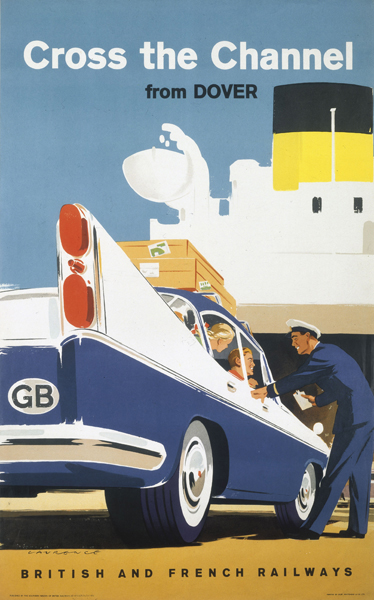
Your mission, if you want to win a copy of the 1950s Modern book, is to find a poster which illustrates that same, barking, modernism in graphic form. Here’s one I quite like.
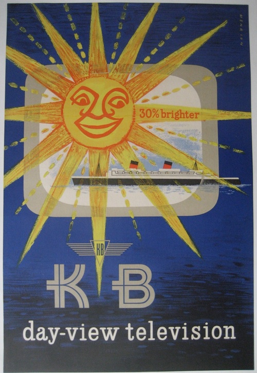
But I still don’t think that quite encapsulates what was going on. Although it does have a television on it, and there wasn’t much that was more modern than the television in those days.
So, can you do better? If you can, post your thoughts in the comments box and the winner – chosen by me according to my own prejudices – gets a copy of the book. Entries close on Wednesday 30th January. British posters probably score more highly than furrin, too.
If that all sounds a bit taxing, there will also be another competition on the brand new Quad Royal Facebook page at the end of the week. Why not pop over and like that now, then you won’t miss it when it happens. In the meantime, I await your entries.