‘Tis the season

Sleigh bells, holly, Santa, etc.  You know the drill.

But right now, as someone rather brilliantly defined it on Twitter, it’s the brief and shining season between the bumper Christmas Radio Times coming out and the realisation that there’s nothing you want to watch in there at all.

So to celebrate, some Christmas covers from the past.  When graphic design was much, much better.

Hans Unger radio times cover

That one’s Hans Unger, not unsurprisingly.  I can’t tell you who the next two are by, but the date from 1965 and 1966 respectively.

Christmas Radio Times cover 1965

Christmas Radio times cover 1966

I particularly like the latter one, and wouldn’t mind finding the original artwork under the tree, should someone happen to have it lying around.

But things were good before the war too – take this McKnight Kauffer from 1926.   As I am sure many of you would like to.

McKnight Kauffer radio times christmas cover 1926


For those of you who would like to do a proper trawl, the full Flickr set is here.  But be warned, there are more than a thousand photos.

And finally can I note that this blog post was produced without any co-operation at all from my ‘y’ key, so apologies for any typos.

Getting the measure

I got somewhat over-excited towards the end of last week, when Mr Crownfolio pointed out this in a forthcoming auction.

Paul Nash 1960s reprint of rye marshes shell poster

Clearly this is a framed Paul Nash Shell poster of Rye Marches, and the reason I was getting into such a tizzy about it was that it had turned up at an automobile auction near Chippenham, with a valuation of just £80-120, and with a seeming mis-dating to the 1960s.

Now given that these posters usually go for several hundreds of pounds, sometimes thousands, I thought that this might be our only chance to buy one, so I started eyeing up the Crownfolio savings (still currently earmarked for things like doors and carpets) with a view to bidding on both that, and the Ben Nicholson which was accompanying it in the sale.

Ben Nicholson guardsman poster shell 1960s reprint

It seemed – almost – plausible that an auctioneer who specialised in cars might get this wrong, even if we might have been outbid at the actual sale itself.  (The internet is, after all a double-edged sword; it allows us to find things in obscure auctions, but it also lets every other blighter find them too.)

But then I took a closer look at the listings.  And it turned out that the auctioneers were right after all, curse them.

These aren’t 1930s posters at all, they are much later reprints.  How could I tell?  From the measurements.  A ‘proper’ Shell poster has dimensions of 30″ x 45″, their own rather unique size meant to fit the side of a lorry.  But the posters on sale here are 20″ x 30″.  So there is no way that they can be the real thing.

At which point I calmed down.  But it did make me realise how often Mr Crownfolio and I use the measurements as a way of judging when we’re considering posters, and I thought that this was something worth pointing out on here.

This probably isn’t a new idea to most of you, and of course there are lots of other ways of evaluating a poster when it’s there on paper and can be examined properly.  But should an apparent bargain turn up at a far-flung auction, or appear on eBay, the size can be a very big clue as to whether this is the bargain of all time or a great big flapping turkey of the first order.

Of course, we’ve nonetheless still bought a few turkeys in our time (at least one of which has been a reprinted World War Two poster), but I think that probably goes with the territory of buying from eBay.  Sadly Mr Crownfolio and I both have the amnesia caused by acute embarrassment, and can’t remember the details.  Sorry about that; maybe I’ll go and dig it out one day and you can all laugh at us.

That said though, if you do want to look at the Paul Nash or the Ben Nicholson on your wall, and you’d like it to take up a bit less space than normal, then there will be a couple of bargains going at Castle Combe later this week.  Just as long as you know what you’re getting.

Greetings

Today,  I think have the cheapest item ever presented on Quad Royal.  Instead of paying hundreds of pounds for a poster, you can get one of these little beauties for just £2.50.

Daphne Padden southend bus poster card Beast In Show

Or if that doesn’t tickle your fancy, how about this one instead?

Daphne Padden go shopping by  bus poster card Beast In Show

Once again, these appear thanks to the sterling work of Beast In Show (the non-teatowel wing of To Dry For) who, as you may well remember, have already worked with us to turn Daphne Padden’s designs into tea towels and placemats.  In case you don’t remember, they go something like this.

To Dry For Daphne Padden Gardener tea towel

Daphne Padden Autumn place mats Beast in Show

They are so enthusiastic about her designs (and frankly why wouldn’t any sane person be) that there is now a range of Daphne Padden cards available as well.

coach-knights-padden

They are all lovely, and I can’t really choose a favourite, but I do just have to draw your attention to the one below, because there just aren’t enough psychedelic breakfasts in the world.

Carlton-card-Padden

There are loads and loads of them – way more than I can stuff into one blog post, however hard I try.

Daphne Padden vintage bus poster design Scarborough card

You can see them all – and indeed buy them – on the Beast In Show website.  You have nothing to lose (at least compared to buying a poster you don’t).

I was Lord Kitchener’s Thing

Exhibit A today is an ad from our local paper.

newspaper ad with Lord Kitchener From World War One Poster

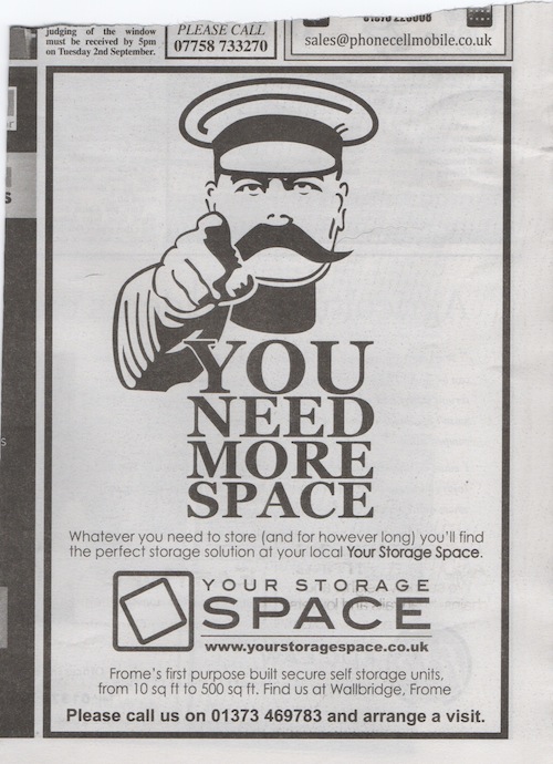
It’s here, clearly, to illustrate the after-life of posters.  The slogan and image derive, after all, from a poster which will be a hundred years old next year, and yet is still part of our mental furniture.  What’s going on?

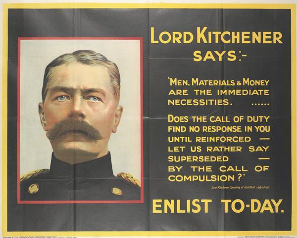
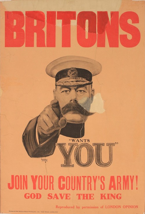
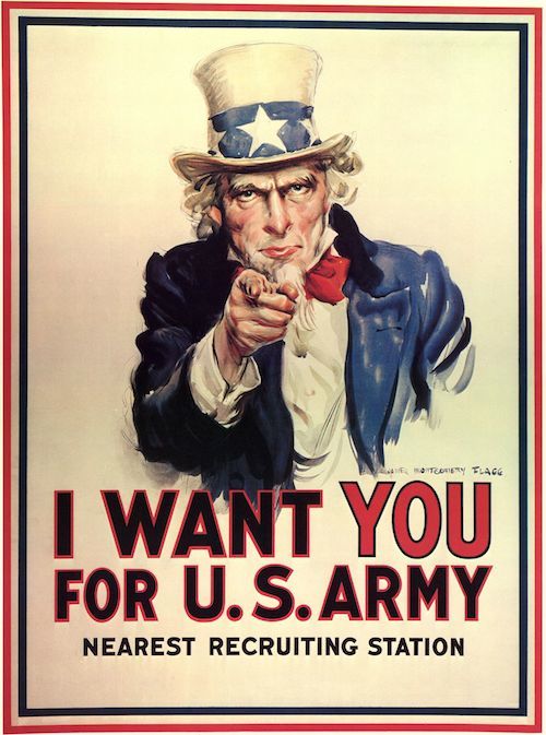
The original is of course this design by Alfred Leete.

Alfred Leete Lord Kitchener poster as we all remember it

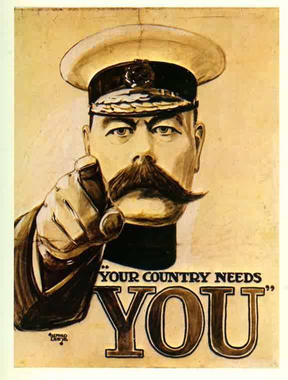
Except it isn’t what you might think.  Despite the images that we all carry around in our heads, this drawing almost certainly never existed as a poster.  It was designed as a front cover for the mass market magazine  London Opinion, and was so popular that it was turned into a postcard and also a print.

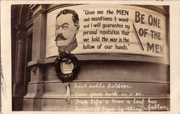
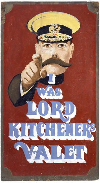
There were certainly lots of pictures of Lord Kitchener plastered out on the streets in 1914.

Lord Kitchener says WW1 recruiting poster

Not just in Britain, either.  Here he is being forceful in New Zealand.

Kitchener banner in New Zealand

There were also lots of posters using the slogan ‘Your Country Needs You’.

Your Country Needs You anonymous World War One recruiting poster

Your Country Needs You anonymous World War One recruiting poster

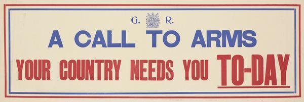
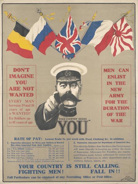
But they never existed together on the same poster.  This – as sold at Onslows earlier this summer – is as close as they got to being in the same place.

Alfred Leete (1882-1933) Britons (Kitchener) "Wants You" Join Your Country's Army ! God Save the King, original recruiting poster printed by the Victoria House Printing Company Co. Ltd. September 1914

Plus there is also this number, which does at least combine the wording at the image.

Lord Kitchener world war one recruiting poster leete

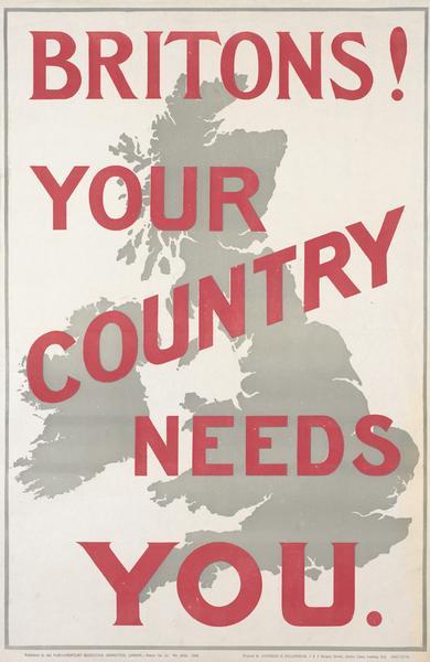
Neither of which, however, are the poster of our popular imaginations, though.  That’s this one, isn’t it?

Another Lod Kitchener poster

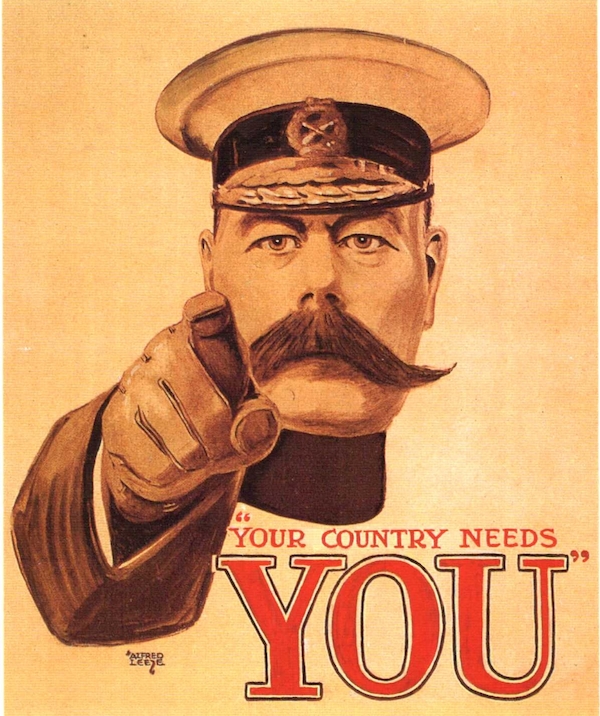
Except this is in fact a mock-up, produced quite recently.   Aaargh.  So how did this poster, which didn’t exist, end up in my newspaper?

The argument about the exact form and origin of the poster has raged all over the internet and newspapers in this centenary year.  I mentioned it before, when the Britons poster came up for sale at Onslows, and I don’t pretend to understand the precise ins and outs of it.  But that’s OK, because this isn’t really what interests me the most.  What I find intriguing is why this particular version – which may or may not have been pasted on walls in 1914 – still haunts us today.  I’m not sure I have a definitive answer, but the search does take us along a few interesting byways.

The first of these does, however,  involve going back to the argument.  An entire book has been written about Lord Kitchener and his pointing finger, Your Country Needs You, which I have read so that you don’t have to.  The conclusion is that there may have been a very few privately printed versions out there, although these were few in comparison with the millions of government posters that rolled off the presses, and researchers have yet to find a photograph of one glued to a wall.

But old soldiers being interviewed in the years after the war, when asked about why they volunteered, reply with some regularity that it was because of the poster of Lord Kitchener pointing his finger and saying ‘Your Country Needs You’, which they tend to remember as being plastered on every available surface.  So what’s going on?  It’s easy to see how people might conflate the slogan and the pictures of Kitchener, and maybe even mix those up with the London Opinion cover.  But it seems unlikely that everyone performed exactly the same trick of memory on their own.

The book argues convincingly that this is all the Imperial War Museum’s fault.  The museum was founded in 1917 specifically to record the events of the Great War and as a commemoration of all of those who died.  As part of this, it collected the recruitment posters of the time  (there were quite a few out there to be collected, warehouses full of them in fact, left over after conscription had been introduced).  It also managed to collect the London Opinion print, and mis-catalogued it as a poster.  Thus categorised, the iconic image was displayed as a poster in a number of post-war exhibitions.  And by these means the memories of returning soldiers were collectively constructed.

Imperial war museum poster exhibition poster graft on galleries

All of which is interesting and starts to explain why a non-existent image has entered the collective consciousness in the first place.  But why did it persist, and for so long?

One reason that the book suggests is that pictures of a person looking directly at you while pointing their finger are very effective.  Which is true.  (There’s a good selection on the Wikipedia page on the poster if you want to test this theory out.)  Which is probably why the U.S.A copied the Kitchener image for its own recruitment purposes in 1916.

Uncle Sam wants you original poster

Once this has happened, the two posters probably start feeding off each other.  The Uncle Sam poster is, if anything, an even greater icon in America than the Kitchener poster is over here.  It has been reproduced and parodied in an almost infinite number of ways since 1918, particularly where wars and governments are concerned.

Time magazine cover Bush as Uncle Sam

Some of which, I am sure, travels over here and makes us remember our own iconic pointing finger in the form of Kitchener.

Uncle Sam and Kitchener parody

But there’s more to it than that.  Because one of the interesting things about the Kitchener image is that it isn’t always there.  Once all the soldiers have returned, and the patriotic lies of the propaganda have been dismissed, the poster seems to have been mostly forgotten about for a good forty-odd years.  People have looked, but not found any visual references in the inter-war period and then for another decade or two after World War Two has ended.

So what happens to change this?  The answer is the 1960s, or to be more precise 1963-4, when two specific things happen.

One is a boutique on Portobello Road.

I was Lord KItchener's Valet shop sign v&A

This first shop was such a roaring success that they expanded to Carnaby Street and, later, the Kings Road, where the shop had the even better name of ‘I Was Lord Kitchener’s Thing’.

I was Lord Kitchener's Thing Kings Road

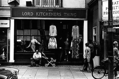
I have very nearly written this entire blog post just so that I can post that photo, but never mind.

But why, why Lord Kitchener?  The answer, I think, lies in both the specifics of the early 1960s and the almost universal adolescent urge to get up your parents noses.

I’ve written about the early 1960s before.  It’s the moment when the first generation comes of age who didn’t live through the war, not even a little tiny bit of it.  They’re bored of hearing about the deprivations and the community spirit, they’re bored of self-sacrifice and drab.  And most of all they are bored of hearing about the army.  Because what does Lord Kitchener’s Valet sell at first?  Surplus army uniforms.

And was this meant to irritate the grown-ups?  Of course it was.  A contemporary magazine article makes this clear.

Lord Kitchener of Khartoum would undoubtedly turn in his grave if he knew he was giving his name to a “with-it” boutique in London’s Portobello Road, and he would probably be even more horrified if he knew the boutique was selling the uniform of the British Army as the latest ‘mod’ gear.

The goading worked, too.  In 1966 a ‘Muswell Hill youth’ received a conditional discharge after being stopped for wearing a Scots Guards tunic.  But by  then it was far too late: John Lennon, Eric Clapton and Mick Jagger all bought uniforms there and the red tunics and gold braid were everywhere.  ‘I think it looked fashionable and smart,’ said Muswell Hill Youth, and it almost certainly did.

So the overwhelming urge to stick two fingers up at the British establishment, at their parents’ generation and the war is clear, but why did Lord Kitchener have to be brought into it all?  Why wasn’t he old hat, so to speak?

The answer is, I think, that there was still a problem with attacking the Second World War, even for these bolshie youths.  This was because those who had fought in World War Two had been very, very Right.  They had vanquished Hitler, brought peace and prosperity, liberated the concentration camps. No one could argue with that.  So instead the children of the 1960s had to skip back twenty five years, and pick their enemies from a much more equivocal war, where the generals had made mistakes, where little had been achieved and one in which those soldiers who had returned lamented the futility of the whole thing.  In short, you wouldn’t dare say a word against Montgomery, not for a long time yet, and so it is Lord Kitchener instead who acts as proxy for that entire wartime generation.

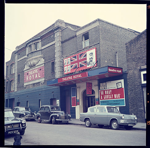
All of which makes even more sense in the light of the other early 1960s appearance of Kitchener.  This was 1963, and it happens in Oh What A Lovely War!  He was on stage.

Murray-Melvin-in-Oh-What--A Lovely War

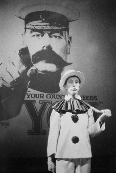
And more importantly, he was all over the publicity and posters.

Exterior of Theatre Royal during the original production of Oh What a Lovely war

Joan Littlewood’s entire career sprang from the urge to go against established opinion.  And by turning her fire on the army, this also allowed her to take aim at various other previously sacrosanct institutions like the Empire and the upper classes.  But even for an iconoclast like her, picking a fight with the most recent war would have been a step too far.  And so, once again, it is Lord Kitchener’s image, with all that this represents, which takes the flak.

By this point, the meaning of the poster has gone through several transformations.  At first – for most people, there were of course always dissenters – this was a simple appeal from a national hero.  After the war, returning soldiers revolted against the high-flown patriotic rhetoric that had brought them into the basest hell of the trenches, and the posters became a prime exhibit of how they had been lied to, Kitchener included.

But by the time it returns in the 1960s, the posters now stand for even more than this, representing upper class twittery and the follies of the gold-braided, Empire ruling establishment.  For a long time, the poster gets parodied (and this is true of the American version too) when someone wants to point out that our rulers are taking us on the wrong path.  This is true even today.

Cameron Kitchener poster

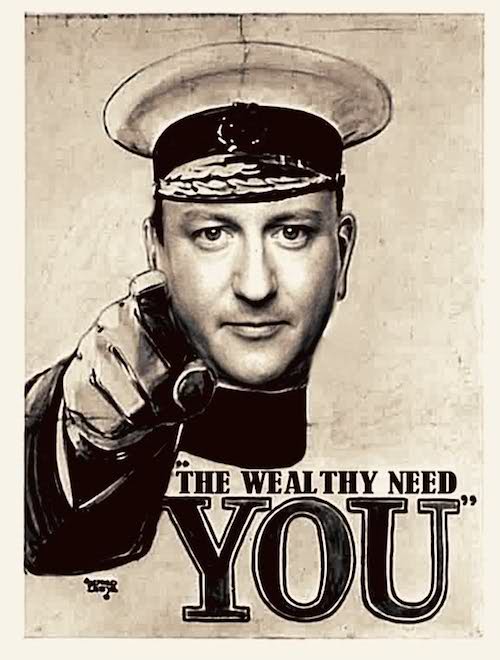
But now the image is so much part of our mental equipment that it can be used for almost anything.  Including, it seems advertising storage.  Which is where we came in.

This is such a complicated issue that I’ve left out lots of relevant things, including the repeated rise and fall of Kitchener’s own reputation.  I’ve also been forced well out of my normal range, and so owe particular thanks to a couple of other internet sites, including this great post about I Was Lord Kitchener’s Valet and this long but very expert discussion of the Kitchener poster.  It’s also become clear that I would like to know a lot more about Joan Littlewood and the reception of Oh What A Lovely War! but then I have to stop somewhere, at least for now.  So if you do have any thoughts to add to this, I’d love to hear them.

Dressing for the beach

With the summer approaching, beachwear is a topic on the minds of many blogs. Fear not, I am going to spare you my opinion on bikini vs swimsuit; in fact this post is more about suit versus swimsuit.  Or, to put things a different way, why we look at so many seaside posters with too much of a modern eye.

Posters like this, for example.

vintage railway Poster `Margate - Britain`s Finest Resort - Go By Train`

For an audience today, seeing this poster from the distance of fifty years or more, what is being advertised is the joy of Margate beach.  And this is true, except that we are missing something very crucial.  These people are being daringly  modern and middle class, not just in their choice of sunglasses but in their entire choice of beach wear.  Because when we take a look at actual people on Margate beach in the 1950s, they look rather different.

Margate beach

Children and teenagers might wear swimming costumes, but everyone else wears clothes, and quite a lot of them too.

This wasn’t a peculiarity of Margate beach either, smart formal was the dress code up and down the country in the 1950s.

Filey beach 1950s

In Filey not even the children got swimsuits it seems.

Now, there are some interesting reasons as to why this might be.  Back in the 1950s, your smartest clothes didn’t automatically equal ‘working clothes’.    Working clothes were grimy, hard-wearing and, well, blue-collar overalls.  So your suit was something that you could relax into, an alternative, a sign that you were no longer at work.  More than that, it was a status symbol which proved that you could afford clothes that went beyond the simply practical.  In some ways, the suit and smart dresses were the sartorial equivalent of the ‘best parlour’ at home: not necessarily the best use of resources and often overly formal, but essential if you wished to be respectable.

Paradoxically, though, the suit on the beach is at the same time a sign of being working class, of not having unlimited means.  Because while it may be telling people that the wearer owns more than just their working clothes, it also indicates that they don’t have the means to afford ‘leisure’ clothing either.  These well-dressed beach goers occupy a very particular place in the British class structure, and their clothes speak of it.

All of which puts a very different slant on posters like these.

Hunstanton British Railways poster 1960

These families are not average, they are modern and aspirational.

And look at this trio, they are so upmarket that they not only have swimsuits but leisure clothes as well.

R M Lander Morecambe British Railways poster

Mind you, Morecambe always fancied itself as an upper-class resort.  Although not so posh that everyone was expected to have a cozzie.

Morecambe anonymous holiday poster family on beach

The family here are quite happy to conform to the cultural norms of the time, although I do think he must be quite hot in that tank top.

In fact, when I start to peer at the 1950s holiday posters, there is more clothes wearing going on than I had expected.

Aberystwyth, BR (WR) poster, 1960. Artwork by Harry Riley.

Poster produced for British Railways (BR) Eastern Region (ER), promoting the Humberside seaside resort of Cleethorpes, showing an aerial view of the town and coastline, overlayed with images of holidaymakers engaged in various activities. Included are children making sandcastles, riding on donkeys and carousel horses, families relaxing in deckchairs, a man playing golf and the winner of a beauty contest. Artwork by Blake. Printed by Jordison & Co Ltd, London & Middlesbrough.

All of which may help us to look at these posters differently, and so it should, but that’s not the half of it.  Because if the swimsuit wearers of the 1950s were middle class and modern.

Glenn Steward Teighnmouth British Railways poster

What does this then make Tom Purvis’s swimsuit wearers of the 1930s?

ÔEast Coast by LNERÕ, LNER poster, 1930s.Poster produced for London & North Eastern Railway (LNER) to promote rail travel to the East Coast of England. The poster sows two women sitting under a large red beach umbrella. Artwork by Tom Purvis (1888-1957), who rallied for the professionalisation of commercial art. In 1930 he was one of the group of artists who founded the Society of Industrial Artists, which campaigned for improved standards of training for commercial artists in order to broaden their scope of employment. He became one of the first Royal Designers for Industry in 1936. Dimensions: 1016 mm x 1270 mm.

Very posh and very modern indeed, that’s what.  They can afford swimwear at a time when, it seems from the photographs, most people went to the beach in their overcoat.

working class seaside

There are, of course, so many signifiers of modernity in a Tom Purvis poster that one could write an entire thesis about them: the love of the outdoors, the new fashion for getting a sun tan, the flat bright colours – I could go on almost indefinitely, and probably will some other day.  Nonetheless I do think the swimming costumes would have been very striking at the time and would have made the poster dramatic and innovative in a way that we simply cannot appreciate today without putting some thought into it.

For me, though, the posters that most benefit from this reappraisal are Fortunino Matania’s posters for Southport, which until now I’ve considered to be rather dull workings out of Art Deco which fetch too much money at auction.

 Cheshire Lines Railway poster. Southport by Fortunino MataniaÕ, railway poster, c 1930s.

Just look at these people.  They have a lido, modern hats, swimming costumes and shorts; they are wearing not enough clothes while outdoors.  In short, they could not be more fashionable, upper class and modern if they swanned up to the swimming pool in a Rolls Royce car.

Of course they’re saving that for the next poster, when they get to the hotel.

Poster produced for the London, Midland & Scottish Railway (LMS) to promote winter travel to Southport, Merseyside. The poster is illustrated with a painting of fashionably dressed women and men leaving the Garrick Theatre in Lord Street. Artwork by Fortunino Matania, who was born in Naples, but from the age of twenty worked in Paris and then in London. King George V (1865-1936) was impressed with Matania's work and invited him to cover his tour of India. 'Southport, For a Holiday In WintertimeÕ, LMS poster, 1925.

Southport, like Morecambe, rather fancied itself as being a cut above some other resorts (not least its near neighbour Blackpool) so Matania wasn’t the only poster designer to dress it up in the costumes of high fashion.  Here’s Alfred Lambart’s take on a very similar theme.

 Liverpool Overhead Railway poster promoting cheap fares via ÔThe Most Interesting RouteÕ. The LOR (1893-1956) became the first electrically-worked elevated railway, the first to use an escalator, automatic signalling and a colour light system. Until its closure in 1956 the line remained independent, even from nationalisation. Artwork by Alfred Lambart.  SouthportÕ, LOR poster, 1923-1947.

You might have thought that trippers from Liverpool might have lowered the exclusive tone somewhat, but then who am I to say?

If you want to judge for yourself, this is what Southport Lido looked like in reality; I think there is actually quite a lot of clothes-wearing going on beyond the front row.

Southport lido in 1930

Further proof of how exciting and different these swimsuit posters would have seemed comes in the form of other posters of a similar period, which were very happy to show beach goers wearing a more normal amount of clothes, at least by inter-war standards.

London & North Eastern Railway (LNER) poster. Artwork by Dame Laura Knight (1877-1970) 'The Yorkshire Coast', LNER poster, 1923-1947.

This one is by Dame Laura Knight, proving that you can be modern even without swimsuits for all.

But this is my total favourite, by Stanislaus Brien.

Poster produced by London & North Eastern Railway (LNER) to promote train services to the East Coast of England. Artwork by Brien. East CoastÕ, LNER poster, 1932.

This is not just on account of the fact that all the adults are fully covered in smart clothes and hats, but also because the beach is full, crammed with families and children and grandparents.  In fact it’s the only poster I’ve ever seen which bears any resemblance to photographs of a day out at the beach between the wars.  And yet it is done in the style of Leger: modern, but clothed and truthful.  And, it has to be said, pretty much unique in the poster record.  I’m not sure it looks that enticing to modern eyes.

But it is our modern eyes that are the problem.  Because just as we fail to see swimsuits as daring and signifiers of the future, we shrink with horror at a crowded beach.  (Why the beaches were so crowded is another story for another day, but one which is intimately connected to the railwayness of railway posters.)  And in doing so, we completely fail to see these posters, both from the 1930s and the 1950s, as they were intended at the time.  Does that matter?  In the end, perhaps not really, especially if you simply want an amusing print to hang on the wall.  But if we do take the time to see what they might have meant in their own time, how much more interesting they become.

In a field of their own

I really ought to be writing about the latest Great Central Railwayana catalogue, but  that will have to wait for now, as my attention has been grabbed by a pair of rather fetching animals instead.

This delightful pig is being sold on eBay by the previously mentioned Postercollection.

Hass, British bacon and ham poster early 1960s

It’s by Derrick Hass, it’s probably from the early 1960s and because it’s being sold by Postercollection it comes without linen on backside and is yours for a rather eye watering £198.  Or they will apparently take an offer.

Meanwhile, I’ve never seen this somewhat bewildered sheep before, and I feel as though I should have, because it’s the work of Mount Evans.

81AmDPY4KDL._SL1500_

He is included in a brand new book of public information posters from the National Archives, called Keep Britain Tidy.  I have no idea whether it just contains pictures of posters or whether there is some kind of informative text too, but I probably need to get my hands on a  copy to find out.  Although the subtitle – and other posters from the nanny state – is almost enough to put me off.  But if I manage to swallow my disquiet, I will report back in due course.

While I have your attention, there are a couple of interesting posters coming up at an auction in Nottingham on Saturday.  Amongst the offerings are yet another Lander that I’ve never seen before, and which we would be bidding on were it not so a touch holed.  (It’s estimated at £60-90, so may yet be worth your while)

R M Lander North Wales poster

Along with this Cornwall poster too, which we failed to get an auction, possibly Morphets, some time back and I still hanker after for its general levels of insanity.

Cornwall trumpet of holiday joy poster

Yours for a mere £40-60 if they’ve got their estimates right.

And finally, a question for you.  Who’s doing the looking in this picture?

Woolacombe and Morthoe Harry Riley poster British Railways

Seriously.  The whole family is outside the window, so who’s inside looking at them?  Granny?  A voyeur?  Or should I assume that there is a third child, some sulky teenager lurking inside with their copy of Jane Eyre?  Answers on the usual electronic postcard below, please.