Winners

As promised, the results of last week’s compeitions.   The first thing I need to say is thank you, because this has afforded me a great deal of entertainment; a high standard of entries came in, almost none of which had been seen before on here.  We should do this more often.

All of which has made the judging a bit difficult.  A couple of themes did recur, one of which was the idea that an unseen Daphne Padden poster was bound to be chosen.  I suspect James had his tongue just a little bit in his cheek when he suggested this one.

Daphne Padden Royal Blue artists proof

It’s ours, and as it’s an odd proof copy I rather suspect that there isn’t another one out there either.  Very good.

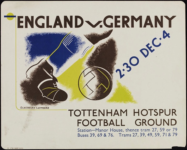
Other themes included football (which I don’t think I have ever mentioned on here before so it’s a fair cop) and pre-war posters, both of which come together in this 1935 Eckersley-Lombers suggested by medieval modernist.

1935 vintage London transport poster Eckersley Lombers football

I will try and remember that quite a few of you like 1930s modernism a bit more than I do when I’m posting from now on.

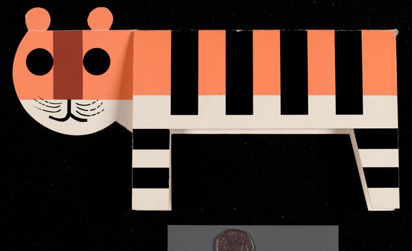
Another mention also has to go to medieval modernist for putting forward the best thing by a poster artist which isn’t a poster, this card by Tom Eckersley.

Tom Eckersley Tiger card 1982

It’s great, but it’s definitely not a poster.  So it doesn’t win.

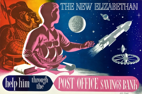
But I can’t keep you on tenterhooks forever.  The winner, then, has to be this, for being so completely Quad Royal that I am bashing my head repeatedly against the desk in bewilderment that I haven’t put it on here before.

Vintage post office savings bank poster eric fraser 1953 genius

And that’s before I award the extra points for Diamond Jubilee topicality.  So congratualations to self-confessed ‘new kid on the block’ Nick Morgan, who will get a copy of the book by post at some point this week, when buying the new Crownfolio Towers allows.

There was only supposed to be one winner, but then the publishers, Shire, came through and offered another prize.  That will be going to this piece of ‘Ralph Mott’ (aka artists agents’ Ralph and Mott, aka probably Reg Lander who was their studio manager), which although pre-war has to win for being not only modernist and bizarre, but also the worst piece of photoshopping ever done before the invention of Photoshop.

Ralph Mott railway poster prewar odd cow

Just look at the legs on that cow.  Another book will be off to Sanderson in due course.

That’s actually the original artwork, which is currently on sale at Liss Fine Art.  It’s worth following the link as there are some other crackers there, shown alongside the finished posters.  Oddly, the railways don’t seem to have produced a poster from the image above. Can’t think why.  What’s also strange is the lorry says ‘British Railways’ down the side, over what looks like Tippex, while the other posters were commissioned by the big four pre-war companies.  Perhaps this one was never produced because of the war and then they thought about having another go afterwards.  And then looked at the legs on that cow and shook their heads.

Finally, there was one more copy going in a general draw for comments/tweets/followers and that’s gone to @NemesisRepublic on Twitter.

So thank you again to everyone who took part.  Normal service will finally resume later this week, with a good look at the new Onslows sale.


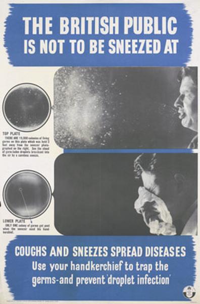
Not to be sneezed at

Apologies for the radio silence, I have had raging tonsillitis and not been able to string even a simple sentence together until now.

Imperial War Museum poster world war two propaganda poster british public

Competition results will appear on Monday, and there’s still time to squeeze some last entries in before the 5pm deadline.  See you next week for some proper posts.  Cough.

Competitive

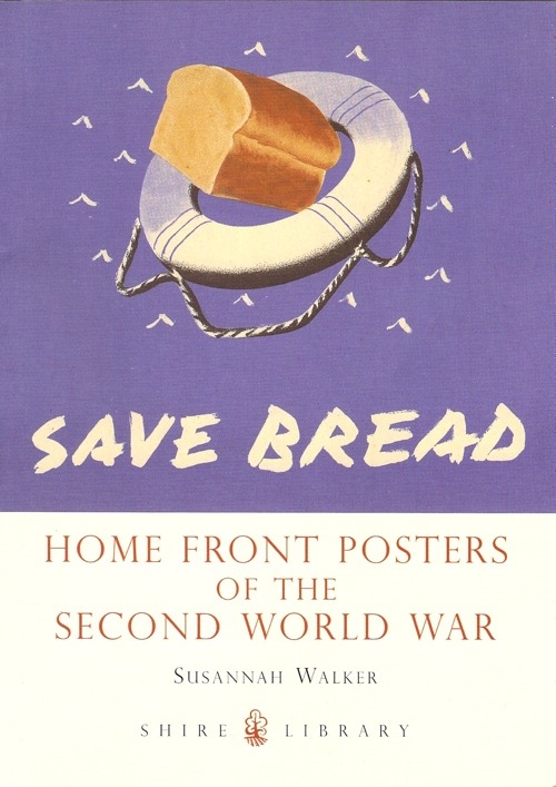
Today is the day that the book officially goes on sale (although if we’re honest here, Amazon have been selling it for a while).

Home Front Posters Shire books Susannah Walker front cover

Even so, I thought I’d mark the day with a competition.

So, there are two copies up for grabs here.  One you can win in a simple draw – all you need to do to enter this is either leave a comment here, or follow me on Twitter; for those who follow me already, then just RT my tweet about the competition.

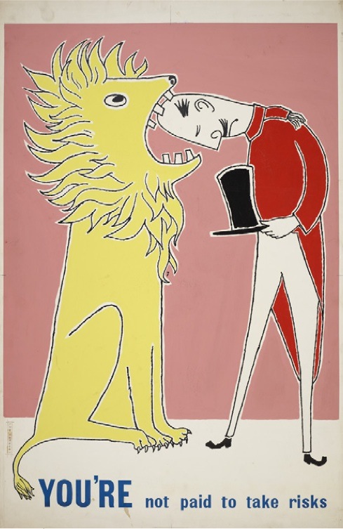
Getting hold of the second requires a bit more skill and discrimination.  This copy will go to the person who sends me (link or image, don’t mind) the best poster I haven’t yet put on the blog.  Here’s my entry.

Leonard Woy You are not paid to take risks Rospa poster 1961

All of this high jinks closes on 5pm on Friday, winners announced on Monday, judges decision firm, fair and final.

Singing Together

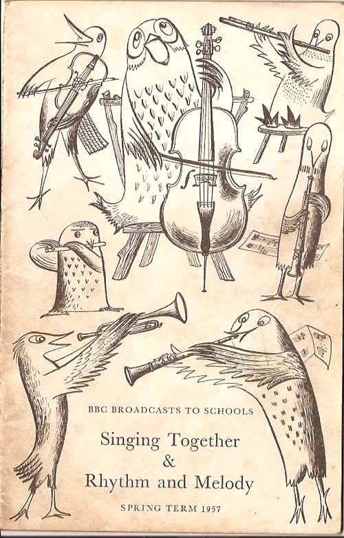
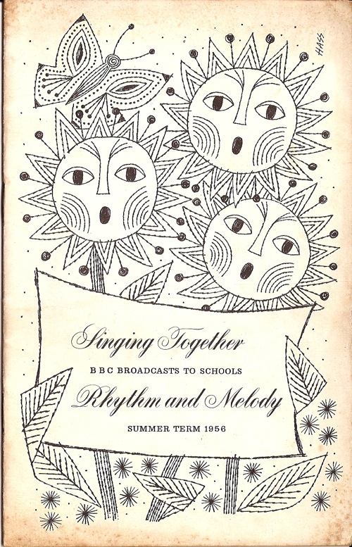
Friday, so what could be better than some Barbara Jones birds, even if they are a bit grubby round the edges.

Barbara Jones Singing Together BBC Schools booklet 1957

Todays flock are pretty self-explanatory, playing in another lovely BBC Schools booklet of songs and music for children.  (I have actually mentioned these before, but now a copy is in my own hands, so you get to see it again).

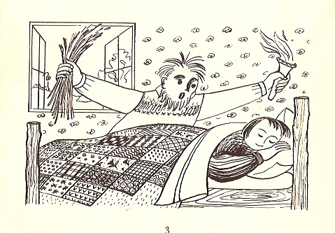
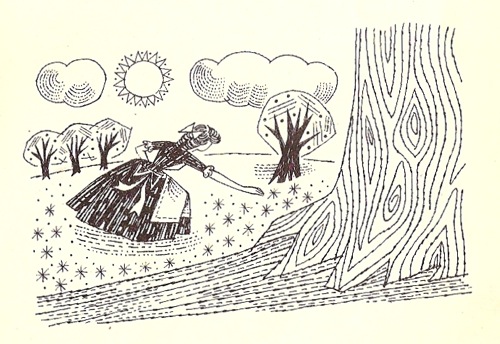
Along with the songs ,there are further Barbara Jones drawings inside. These are in a much freer style, but still with her trademark exccentricity.

barbara jones green broom illustrations from BBC Singing Together schools booklet 1957

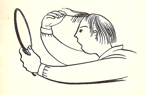
Mind you, the songs invite it.  The illustration above is for a traditional folk song called Green Broom which – as you might guess from the illustration – is pretty much a pagan welcome to spring.  While the young man worrying about his hair below goes with  Benjamin Britten’s setting of Begone Dull Care.

Barbara Jones illustration from BBC Singing Together schools booklet 1957

Also in there are bits of Schubert and Grieg, along with Victorian ballads and Norwegian folk songs. It’s almost as though Barbara Jones has had a hand in the selection process too.

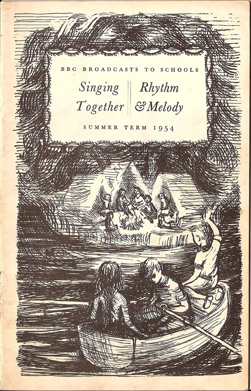
The birds came as part of a selection box of these leaflets, all from the 1950s.  They’re all interesting, but a couple of them particularly so.  Summer 1954 was done by Derrick Hass.

BBC Singing Together booklet Summer 1954 Derrick hass illustrations

We’ve discussed him on here before (see the comments too for some memories of him) but he’s worth mentioning again in the context of what designers went on to do in the 1960s and beyond.  The prevailing story is that the rise of the all-in advertising agency put paid to the old-style poster designer:  a few – like Eckersley and Games – carried on, some like Henrion and Pick formed corporate identity consultancies, and who knows what happened to the rest.  But Derrick Hass bucked the trend by not only going into agency work but becoming an enormously successful and respected creative director who worked and won awards right up until retirement age, forty years after he did these.

BBC singing together Derrick Hass Summer 1954 small illustration

That’s quite an achievement.

Meanwhile I just like this Heather Lacey illustration, perhaps because it reminds me of illustrations in Puffin books.

Heather Lacey BBC Singing Together booklet 1950s

I can find nothing out about her at all, mainly because half of the internet seems to be called Heather Lacey.  If anyone knows more, please let me know.

These booklets, taken all together, were quite an achievement.  Every term, a school would get a new set of illustrations along with their music, perhaps not all of as wonderful as the ones I have chosen but certainly all good.  I’ve said it before but I’m quite happy to say it again; I’d love it if I thought my daughter was being exposed to both music and illustration of this quality in her primary school lessons.  But I’m pretty sure she isn’t, and that’s a profound loss.

We’ve grown used to seeing this kind of top-down culture (this is great art, you must know about it and I am right) as being elitist, discriminatory and rife with snobbery.  We don’t believe any more that the BBC or indeed any kind of media should be exposing us to high art, rather that they should be giving us what we want.  There is some truth in all of this, and in any case we can’t turn the clock back.  But we should also remember that sometimes, just sometimes, the result was profoundly democratic, and particularly so in things like these booklets where the art just arrives without any comment.  All children should be given the chance to see and hear illustrations and music like this.  They don’t have to like them – and we shouldn’t think any the less of them if they don’t. But if we just give them photocopied sheets of popular songs, we are taking away from them the chance of knowing these things exist.  And for a few children that might be the chance of knowing who or what they wanted to become.

People do love huge pieces of paper

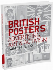
So, finally, after several advance mentions it’s time to have a look at the new V&A book about posters, British Posters: Advertising, Art and Activism.

Catherine Flood British Posters Advertisting Art and Activism

I don’t think that the fact that this has been sitting around on my desk for a week or two is just an accident of circumstances.  It took me a while to start reading it, even though I knew I ought to.  Every time I picked it up and flicked through it, I wasn’t inspired to carry on.  When I’d made myself read it, I then didn’t really know what I wanted to say about it.  I’m still not sure whether I like it or not.

To some degree this is as much my fault as the book’s.  The title sets out its range quite clearly – art and activist posters as well as the commercial design that I tend to prefer – which means that large swathes of the book are not really my cup of tea.  Although I do also think that it could have tried to persuade me a bit harder that these things are worth my time.  At the same time the things I am most interested in – commercial posters pre and post war – don’t get enough of a treatment for my tastes.
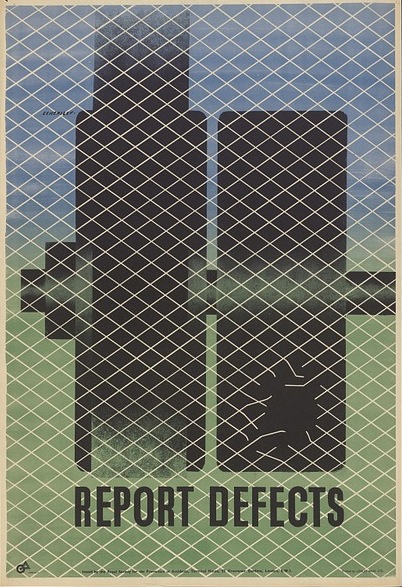
Tom Eckersley vintage war ROSPA poster 1940s

But let’s accentuate the positive.  The book does have some thought-provoking ideas in it.  I’ve already mentioned the fact that it sets out a very useful history of outside display.  While reference to the Town and Country Planning Act of 1947 may sound dry, it actually matters.   The decline of the poster during the 1950s can be seen not just as result of the rise of television, but also of the restriction of poster sites.  Throughout the 1950s and 60s, local authorities used the act to ‘clear poster sites from rural and residential areas’.  There were arguments for the poster as an integral part of the urban scene, but mostly the planners won.  Poster sites were no longer huge billboards, but instead decorous display columns in shopping centres.  No wonder the power of the poster was on the wane.

Another one seems blindingly obvious, which is that the meaning of the poster changed significantly between 1950, say, and 1970.  No longer did it mean a piece of advertising, instead a poster was something that you bought from Athena to decorate your room (students, this means you).  While this is something that we all understand at some level, it’s important to articulate it, as it has all sorts of interesting implications for how we think about posters.  So interesting in fact that I’m going to give them a blog post all of their own one of these days.

Another thought worth holding on to is the way that posters have, for a whole host of reasons, been singled out from the greater mass of graphic design. Flood ascribes this to the vogue for posters in the late 19th century, which set the habit of collecting, cataloguing and admiring them.  I’d also argue that now it is also because they are most like art, in that they are flat pictures which can be framed and hung on the wall.  But at the same time they are also very unlike art – I’m thinking here of railway posters in particular which continued the British tradition of landscape art when the vast majority of fine artists had abandoned it entirely.  Work that one out then.
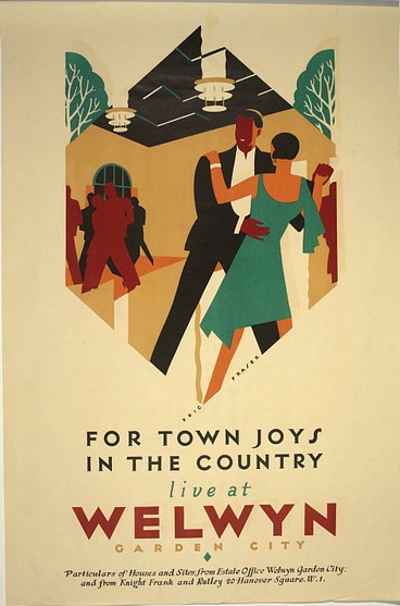
Eric Fraser vintage London underground poster town joys in the country

The development of the poster market is also something I’ve never seen considered before either.  I was particularly interested in the account of a man named Bob Borzello, who ran a poster import export business from Islington during the 1960s psychedelic boom.
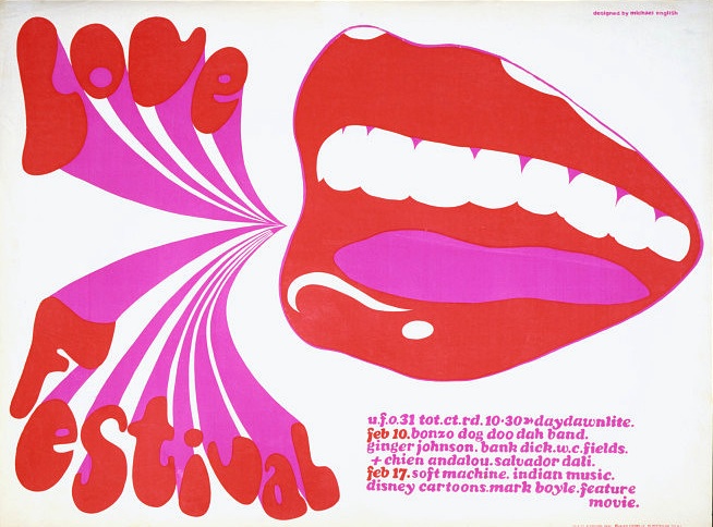
1967 psychedelic band poster Michael English

He selected British posters for the American market: posters for theatre companies, London Transport and the General Post Office proved popular, and he claimed he could charge more for anything with London on it.

Where have all these GPO posters gone then?  I need to know.
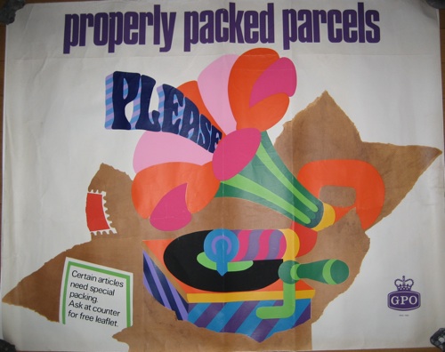
Properly Packed Parcels Please tom bund 1968

In between these flashes of interest, though, there is a lot which isn’t quite so enthralling.  In part this is because this book is trying to cover an awful lot of ground in not that many words, so ends up being very general by default.

There is also the fact that I cannot bring myself to care about 1970s agit-prop posters in the way I care about Tom Eckersley or Barbara Jones.  I would guess that the slightly scattergun choice of subjects is a function of the V&As collecting policy.  I can see the political reasons why, if you’re a curator at the V&A, there would be a political reason for taking the collections as both a reasonable depiction of a subject and a fait accompli, but for the rest of us on the outside, it makes for a bit of a disjointed read.

Back in the days when I was doing my time in the V&A, their entire depiction of the ceramics of the 1950s consisted of the studio pottery of Bernard Leach, Hans Coper and Lucie Rie.  It was all lovely stuff, but I wouldn’t have liked to write a history of 1950s tableware on that basis.  They also had failed to collect any mugs at all.  It’s all very different now, but museum collections do still have their biases and absences, and it’s perhaps better to address these rather than take a collection as gospel.

The other problem, though, is that curse of academia generally, the use of a language so abstract that it ends up utterly disconnected from its subject and floating away into the ether.  Here is one sentence, on my current favourite topic of World War Two posters, as an example.
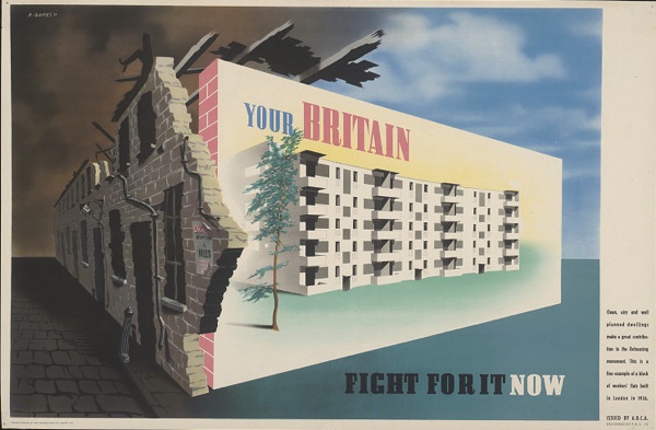
Abram Games your britain fight for it now vintage world war two propaganda poster

By balancing themes of collective sacrifice and citizenship with increased state responsibility for informing and protecting the people, war posters had set out a form of social contract between the government and the British people.

The only concrete noun in all of that is the word poster, although I might also allow contract at a push.  But this does at least tell us something.  Where I find the abstraction particularly galling is when the abstraction is given precedence over the posters.  Take this, a fine piece of London Transport pair poster from 1950.
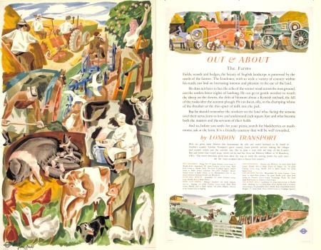
James Arnold vintage London Underground Pair poster farms and farming

The poster is introduced by the idea that – oh it’s so abstract I can’t even paraphrase it – here you go in her own words.

[posters] encouraging people to travel out of London had helped to foster an idea of the British countryside as a site of collective heritage and recreation. This romantic but democratic idea of the land gained institutional currency after the war with the creation of National Parks, Green Belt policy and the expansion of the National Trust, but was offset by the urgent need to increase agricultural production and drive forward the mechanisation of farming.

Land.  I know what that looks like at least.   But the language itself is not so much the problem – there is a point here and I can discern it floating high up there in the abstractosphere – as the conclusions it leads to.

Tractors and stockbreeding, two king-pins in the modernisation of farming, have a prominent place in the composition.

Now I could say a lot of things about this poster – probably starting with the implicit contrast of rural life when depicted in the very urban and mechanised environment of the underground, moving on to the neo-Romantic rather than modernist style, possibly influence of Stanley Spencer in the apple-picker and generally that it is rather good.  If we were looking at the text too, perhaps it would also be worth noting that the poster feels the need to instruct the Londoner on why the countryside is good and how to behave in it, showing an estrangement between urban dwellers and the countryside.  But the mechanisation of farming is hard to see in it, especially given that the steam powered thresher – given far greater prominence than the tractor – was even in 1950 a relic of the last century.
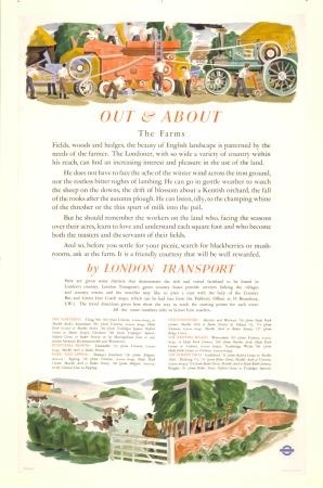
James arnold OUt and About the Farms 1950 vintage London Tranport poster

What’s happening here is one of my bugbears, an argument into which posters have been dragooned as supporting evidence. I’d far rather start with the poster and see what it might have to tell us.

So should you buy this book?  I still don’t really know the answer to that question if I’m honest.  If you’re more interested in art and protest posters than I am, then yes probably.  If you’re me, or something akin to that?  Well then yes, I do still think you should.  Not only will you end up knowing more about the history of poster display, you may even end up having a creative argument with it to boot.


(Most of the images illustrating this post, incidentally, come from the V&A’s online archives.  Now this is not only a selection by curatorial choice, but also further limited by the fact that only some of the entries have images with them.  Even so, I find it strange that I couldn’t find a single English railway poster in there – the Welwyn one above was as close as I could get.  It’s a very partial story indeed.)
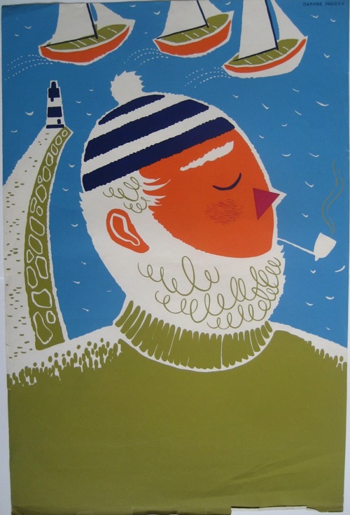
Odd and odder

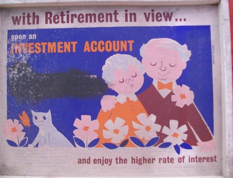
This week, Ebay seems mostly to be selling oddities.  And the oddest of the odd has to be this, a redacted Daphne Padden poster for £9.99.

Daphne Padden post office savings bank poster which has been redacted

It would be rather nice if they hadn’t done that, wouldn’t it?

The listing does at least give a bit of provenance:

we understand that this advertisement was displayed in the Post Office Savings Bank Kew until it closed down , 1975 we believe.

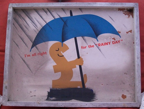
My guess was that they rather liked this poster, and so when the Post Office Savings Bank changed its name, they just blacked it out and carried on.  There’s another example from the same place and seller as well.

Vintage GPO savings bank poster redacted

Neither, I’d suggest, are worth buying, but still an interesting object.

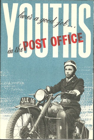
As is this.  Which isn’t a poster so I strongly suggest that you don’t spend the best part of £30 on it.

Youths in the post office vintage leaflet

I can’t tell you anything useful about the design either, other than that it is rather good and I would guess prewar.  Does anyone know any more? I may also return to addressing youths in that way too.

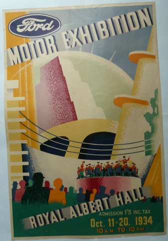
Meanwhile this poster is odd in every which way: it’s a rare survival of a commercial advertisement, it’s for an event I’ve never ever heard of and I had no idea such things went on at the Albert Hall.

Ford at the Albert Hall poster

It also doesn’t look very British, by which I think I mostly mean that I’ve never really seen anything like it.  It’s actually just finished as I was writing this piece, but sold for just £58, and I would think it’s worth a lot more than that to the right classic car owning buyer.

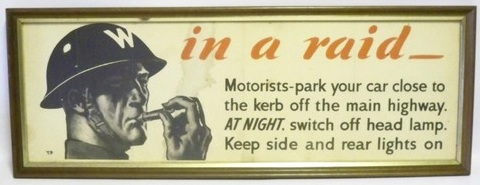
Is this Tom Purvis – well they say it is – World War Two poster odd or not?  I can’t decide.

Tom Purvis vintage world war two poster air raid information ebay

Perhaps the frame makes it look a bit strange, because it is after all a workaday poster which was just there to tell people what to do, not be a work of art.  Good to see it, though, because very few of these kinds of things do survive precisely because they aren’t as good to look at as an Abram Games or Lewitt Him from the same period.

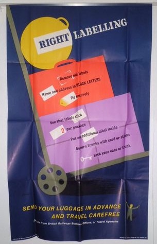
There are one or two sensible things too, like this British Railways poster  for Right Labelling which the seller has down as 1960s but I might put a bit earlier.

Vintage British Railways poster right labelling 1950s

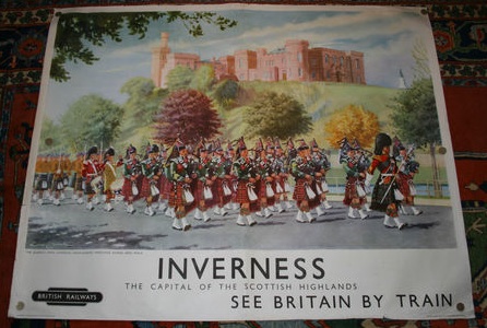
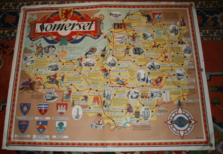
Along with this pair of classic railway posters for Inverness and Somerset respectively.

Vintage British Railways poster 1950s lance Cattermole Inverness

Vintage British Railways map poster somerset by bowyer

There are a couple of other map posters being sold by the same seller too, so if that’s your kind of thing, you know where to go.

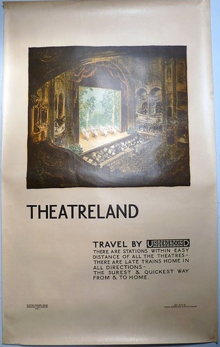
But I do wonder whether he’s going to get any offers.  Recently I said that prices on eBay seem to be matching those at auction.  This was a hostage to fortune, and eBay has since then concentrated on proving me wrong.    Take this classic London Transport poster, for example.

Vintage London Transport poster theatreland 1921 Jan Poortenaar

It got plenty of bidding attention, but at £188 failed to reach its reserve.

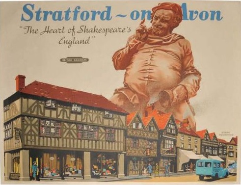
Elsewhere, this British Railways poster failed to sell at just £48.

Frank Newbould vintage British Railways poster Stratford on avon 1950s

One of Frank Newbould’s more peculiar turns if you ask me.

What’s to blame for this?  Is it the new Greek market turmoil, or just the good weather keeping everyone away from their computers?  Answers in the comments below please.