Blackpool, camels and shandy

I’m posting like fury this week to try and catch up with all the auctions that are going on.  Although this post is in fact about a couple of auctions that have already happened, but are still worth noting.

The first of these is the recent GWRA auction, where we had been hoping to get this Daphne Padden, but were outbid and it went for £280.

Daphen Padden Lancashire coast British Railways psoter

I don’t think we’ve seen that one before ever, so I am a bit sad about that.  We also failed to buy this Lander too.

Royal Mail Boats Lander poster

Although as it went for just £140 you may deduce that we weren’t trying that hard.

We did, however get this Lander, which I am rather pleased about.

Morecambe British Railways poster RM Lander

Again, it’s not one that you see very often (something I have mentioned on here before now).  But it’s a brilliant piece of what I believe people now refer to as ‘mid-century’ and will look rather good framed.

The auction was chock-full of posters including, interestingly, another two for Blackpool – as far as GWRA knows, both anonymous.

Blackpool Britsh Railways poster anonymous

blackpool2

The first one went for £300, the second for a whopping £700, which was almost the record for the entire sale.  The actual top price, though was £750, which was paid for this.

GWR-Cambrian

With this Fred Taylor coming a close second at £720.

lincoln-taylor

But if you just wanted a nice pictorial seaside poster, quite possibly with a bit of kitsch in it, and you wanted to pay £200-300, you would have been spoiled for choice.  Here’s just one of the dozens.

llandudno

That went for £240, and for ten pounds less you could have had yourself another Daphne Padden as well.

Daphne Padden isle of Man BRitish railways poster

I do like that cat.

But there were a few bargains here and there, at least if you like Peterborough.

Peterborough

Just eighty of your pounds.

There are even one or two bargains still to be had as well.  This rather striking Bromfield failed to sell, and is now on offer with a reserve of just £50.

bromfield - hampshire

Surely that must have some midcentury appeal somewhere; I’m sure it would go for more than that on eBay.

Also passed and worthy of note is the recent Christies sale, which I did manage to blog about beforehand.

Apart from the obvious conclusion that expensive posters are expensive, what has most caused me to raise an eyebrow here is the price of the little bus posters.  Several, like this Anna Zinkeisen, went for more than a thousand pounds.

Anna Katrina Zinkeisen (1901-1976) WIMBLEDON TENNIS lithograph in colours, 1934

Although interestingly, this Herry Perry, which had an estimate of £1000-1,500, only fetched £875.  And not everything sold either, although I haven’t had the time to do the forensics and find out exactly what.

Herry (Heather) Perry (1893-1962) BOAT RACE lithograph in colours, 1935

All of which will make it particularly interesting to see how this Anna Zinkeisen will do on eBay.

Anna Zinkeisen bus poster motorcycle show

It’s currently at £9.99, but with 6 days to go and a reserve that hasn’t been met yet.  Watch that space.

While we are watching that eBay space, a few more things that have turned up.  This Quantas poster is mostly of interest because it is quirky, has a picture of a camel on it and is not overpriced at £39.

Quantas Camel poster from Ebay

While someone by the name of prbs1929 is also selling a job lot of coach posters at very reasonable prices.  This is my favourite.

Late holiday coach poster

This, on the other hand, does seem a bit expensive to me.

poster for Maltese shandy

Although I know nothing about the Maltese poster market and may turn out to be completely wrong about that.

Finally, I think we have a collectable in the making here.

Can safety poster

I have no idea what it is trying to tell me, but that’s part of the fun.  I think. And there are plenty more to be had if that tickles your fancy.

Small but perfectly formed

So, back on the auction rounds once more, and first in our sights is Van Sabben, on December 11th.

I’ve already skipped through a few of the French ones in passing last week, but there are also a small selection of British posters in there which are worth looking at.

Lewitt Him Vegetabull poster vintage WW2 on sale Van Sabben
Lewitt Him, c.1947, est. €250

Like the Vegetabull, to start with.  Everyone should own this poster.

But in addition to that, it’s a small, but quite interesting selection.  There’s something for everyone.  Some railway posters, like this faintly murky Fred Taylor.

Fred Taylor cambridge vintage LNER railway poster from Van Sabben 1930
Fred Taylor, 1930, est. €450

And this rather wonderful piece of glamour.  In as much as Felixstowe can do glamour.

Nicoll Gordon vintage railway poster 1930 van sabben felixstowe
Nicoll Gordon, 1930, est. €2,000

There’s a really lovely Abram Games too, which I’ve always rather liked.

Abram Games civvy street vintage WW2 poster from Van Sabben
Abram Games, 1944, est. €450

As well as a few more of his posters which, while brilliant pieces of design, I nonetheless wouldn’t much fancy having up on the wall.

Abram Games vintage ww2 safety poster 1943
Abram Games, 1943, est. €650

Especially if I have to pay €650 for the rather morbid pleasure.

But one thing that I really like about the Van Sabben auctions is that, even though they don’t have that many British posters, they’re not just comprised of the usual suspects.  So in addition to Abram Games and Tom Eckersley,

Tom Eckersley vintage London Transport poster 1947 from Van sabben
Tom Eckersley, 1947, est. €250

there are also posters by Henrion.

Henrion exhibition poster 1945 from Van Sabben
FHK Henrion, 1945, est. €280

And Beverley Pick and Reginald Mount too.

Beverley Pick vintage London Transport poster 1947 from Van Sabben
Beverley Pick, 1947, est €250

Reginald Mount vintage WW2 home front poster 1946 from van sabben
Reginald Mount, 1946, est. €650

And even Robin Day.

ROBIN Day RAF poster c 1950 from Van Sabben vintage poster
Robin Day, c.1950, est. €450.

I’m assuming that’s the furniture designer rather than the interviewer.

It’s not just that they have a good mix of designers, they also get posters from different sources.  Like these two from the GPO, which are also both large format rather than 1o x 15.

Zero Hans SChleger remember the country name vintage gpo poster 1942
Zero, 1942, est. €300

Manfred Reiss GPO helps the export drive vintage poster 1950
Manfred Reiss, 1950, est. €300

I’d love to know where they source their posters from, but I don’t suppose they’ll tell me.

My only minor complaint is the pricing.  It’s hard to work out how the Vegetabull can be worth so much less than this Hans Schleger, for example, when they’re both in similar condition.

Hans Schleger blackout vintage ww2 poster London Transport 1943
Zero, 1943, est. €500

It does sometimes feel as though estimages are obtained by sticking a pin into a roulette wheel.  Mind you, I shouldn’t be complaining; that’s the way that bargains are made, after all.

Modern or British?

“It may be clever and modern and progressive.  But it certainly isn’t English.”

That’s the incomparable Patrick Wright quoting from a ‘heritage journal’ called This England.  He’s talking about landscape and memory, but it struck a chord with me.

Because ever since I wrote about Paul Rennie’s Modern British Posters, I’ve been thinking about the relationship between modernism and British design.  It’s a very important undercurrent in the book, but one that he only spells out at the end.

Our collecting began, back in about 1982, with an interest in modern design. We discovered that, where the market existed, it was conceptualised around an idea of modernism as an international phenomenon of people, ideas and products that connected Moscow, Berlin, Paris and New York. In 1982, the words British and Modernism seemed like a contradiction in terms… Our interest in graphic design quickly began to define itself as an attempt to gather together irrefutable material evidence of British Modernism.

McKnight Kauffer BP Ethyl poster 1933

So in essence, the whole book – and of course the Rennies’ whole collection of posters around which it is based – is didactic.  His argument is for the existence of a specifically British approach to modernism, from early McKnight Kauffer to late Eckersley.

Tom Eckersley Cutty Sark London Transport 1963

There can be no doubt that this home-grown kind of modernism existed; the evidence is there in the shape of posters like these (Powers, 1934 and anon, 1938) and many, many more.  Just take a look at the book.

Powers Aldershot Tattoo poster

Anonymous LT swimming poster

Rennie is in good company when he wants to place Britain within the modernist tradition, as it’s a path that many other writers have taken before him.  Pevsner’s Pioneers of Modern Design has exactly the same aim.  Here the argument is that Voysey, Owen Jones and even William Morris are the fore-runners of German architectural, steel and glass, functional modernism.

But Rennie and Pevsner have more in common than just that.  They position themselves as swimming against the tide, having to make an argument for a kind of modernism which isn’t seen as naturally British.  (In the case of posters, it isn’t very British anyway; emigree designers must outnumber the home-grown modernists by at least three to one, but that’s another story for another day).

Edward McKnight Kauffer GPO poster
Edward McKnight Kauffer, GPO, 1937

This isn’t a view that only applies to buildings or posters, either.  It’s been said that Utility furniture scheme during World War Two and after was a chance for modernism to be imposed on the unsuspecting British public, who weren’t showing much inclination to embrace it any other way.  It’s also possible to argue (as I have before) that much modernism in posters operates in the same way.  During the 1930s institutions such as the GPO,  London Transport and Shell commissioned modern design in a seemingly medicinal fashion, because it was Good For the general public.

Graham Sutherland Shell poster
Graham Sutherland

I’m intrigued most, though, by what’s implicit here.  If modernism is seen as improving, then what is it trying to make better?  If modern design is being imposed on mainstream taste, then what is this style that it’s fighting against?  Can we say  what exactly is this natural British design?

Strangely, the answers to these questions aren’t as easy to find out as you might imagine.  Design history tends, even now, to think in terms of the narrative of modernism alone.  It’s a clean-lined and minimalist version of the Whig view of history, in which everything leads towards the ultimate fulfillment of civilisation, which can only be some  monochrome combination of Le Corbusier, the Bauhaus and Helvetica Neue standing triumphant over the death of ornament.  All of which tends to create some oddities in the stories they tell.

One is a kind of tortured argument, as designs and designers are jemmied into place to fit the party line.  Tim Mowl (a man who knows; his book Stylistic Cold Wars: Betjeman Versus Pevsner is worth quite a lot of your time, if not the £69.99 that someone wants for it on Amazon) calls Pevsner’s attempts to turn William Morris into a proto-modernist “obvious nonsense”.  Harsh, but fair.

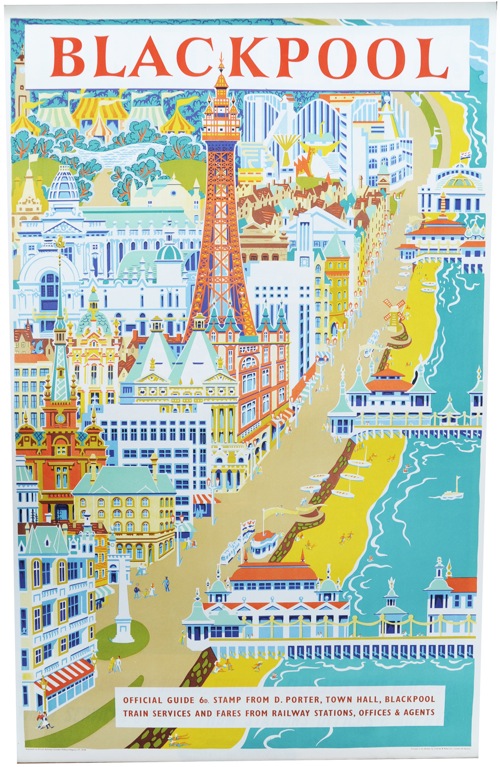
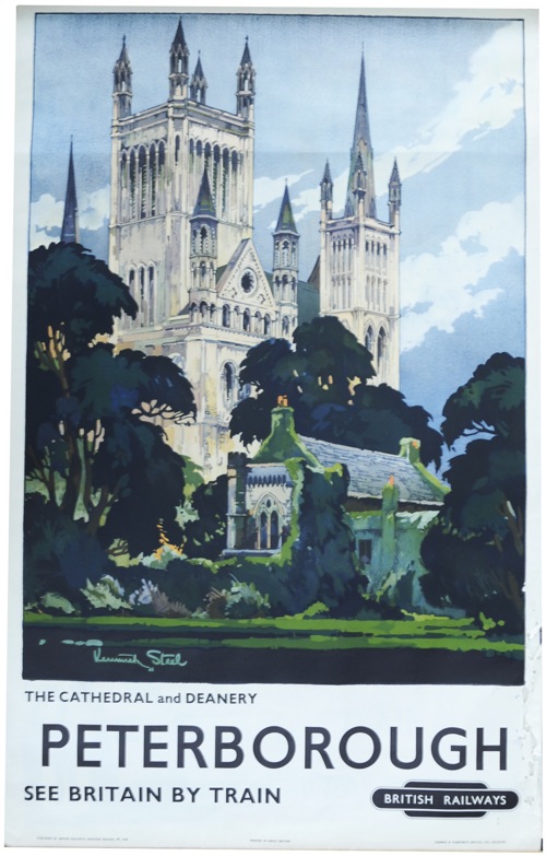
Modern British Posters isn’t having to strain so hard, as the designs were there.  But, in Britain, if you only write about the modernist experience, quite a few designers and posters don’t make the cut.  Like railway posters, for example.

Alnwick castle fred taylor railway poster 1933
Fred Taylor, 1933

Because this is the other problem with surveying the material world only through the lens of modernism, particularly in Britain.  The vast majority of objects don’t get seen.  If you wanted to find out what furniture people who didn’t care for the Bloomsbury Set and pale wood were buying just before the war, or how the average, non-Arts-and-Crafts Victorian papered their walls, you’d be hard pressed to find out.  The books won’t tell you and nor, in the main, will the museums either (The Geffrye Museum is a notable democratic exception here).

It’s not even as though these things are criticised, or even described.  They are invisible, utterly absent from the story.

Yet such objects did exist, in their hundreds and thousands, these wing-back chairs and flock wallpapers, these Crown Derby dinner sets and aspidistra stands.  Which takes us back to the question I asked earlier.  Exactly what is ordinary British taste if it isn’t modern?  And if we don’t know, how can we find out?

These questions aren’t here just to be difficult (although of course that is part of the fun).  I’m also raising them because, perhaps, posters can give us some clues.

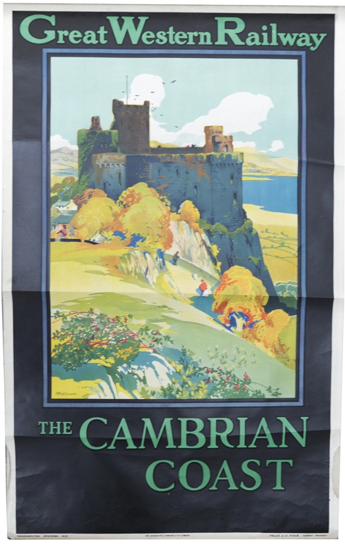
After all, not all graphic design flew the modernist flag.  In the same year that McKnight Kauffer produced his machine age version of BP petrol above, 1933, there were other styles and other designers at work too.  I’ve raided the National Railway Museum’s collection to find a selection from the same year.

Some of them are modernism incarnate.

Midland Hotel Railway poster 1933

While others act like it had never happened at all.

Railway Poster Frank Mason 1933
Frank Mason

Meanwhile yet more are modern, but at the same time not modernist.

Snowdonia Charles H Baker railway poster 1933
Charles H Baker

This view is about as far from a celebration of steel, movement and urban frenzy as it is possible to get.  But at the same time it is still modern.  Go figure.

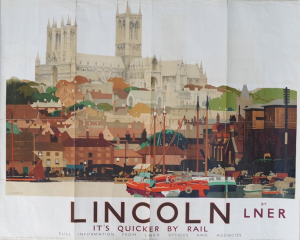
There are many many more too, from Fred Taylor to lesser known artists like Margaret Hordern below.

Fred Taylor, Jervaulx abbey railway poster

Margaret Hordern Railway poster 1933.

Now it’s not an accident that I’ve chosen railway posters as a comparison.  Because railway posters were popular.  They were popular then, when they were sold over the counter as art as well as being displayed in stations. (There’s a good description of how this worked in Yale’s Art for All book if you’re interested).

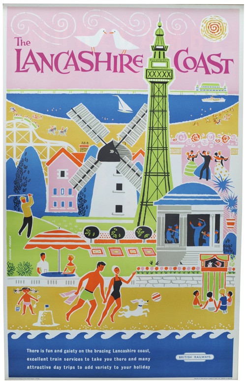
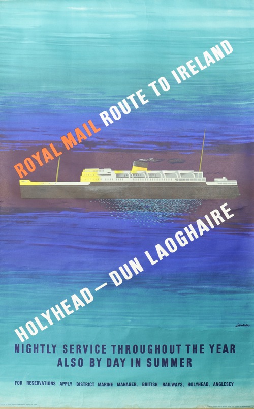
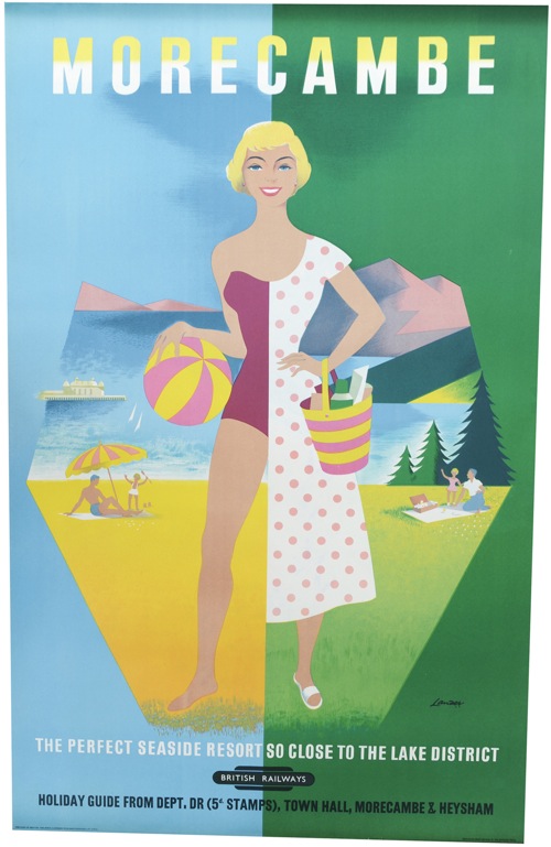
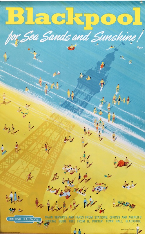
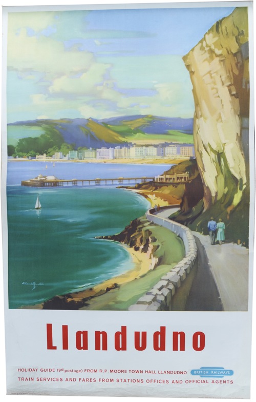
And they’re popular now.  Railway posters are probably the most collected and traded posters there are (and if you take eBay as any kind of sample, they’re certainly the most reproduced and pirated too).  Lots of people like railway posters, and I suspect they like them for all the reasons I’ve railed against them before.  They’re pretty, nice to hang on the wall, they look like a proper picture.  And by far the most popular of all are the pictures of the countryside.

Somerset Frank Newbould 1936
Frank Newbould, 1936

Which starts to give us some clues about the nature of mainstream British taste.  It’s not the first time that this has been said, but railway posters seem to suggest that it prefers the rural to the urban, likes representation and tradition.  In which case, by the by,  modernism, with its paens to the city and the machine, never was going to have much of a chance, was it?

Now I know that this is an immensely contentious generalisation, and I’m rather hoping that lots of people will pile in with examples to prove me wrong.

But for the moment I still think it holds water; I might even argue that mainstream British taste hasn’t changed a whole heap since 1933 or before.  It still prefers the rural to the city, it likes flowers, leaves and pictures of things it can recognise.  And it still gets mostly ignored by writers and designers, architects and museums.  But you can easily find it if you look.  Here for example.

Interior of National Trust shop

The inside of a National Trust shop.  Does it get any more British than that?

The Volkswagen Problem

For some time I’ve been meaning to post a link to the Empire Marketing Board Archive at Manchester Art Gallery.

It’s an exemplary online resource for a really interesting collection.  The Empire Marketing Board was what Stephen Tallents did before he came to the GPO, and in many ways is one of the first attempts at the kind of ‘soft’ advertising and propaganda that we now take for granted.

Empire Marketing Board poster Christmas produce bear
Austin Cooper, 1927

In his time at the Empire Marketing Board between 1926 and 1933, Tallents (working with Frank Pick and William Crawford of Crawfords advertising agency) commissioned some of the very best designers and artists working in Britain at the time.  These included those such as Austin Cooper, Frank Newbould and Fred Taylor who were best known for their work for the railway companies,

Good Shopper Empire Marketing Board Poster Frank Newbould
Frank Newbould

as well as fine artists like Paul Nash.

Paul Nash Empire Marketing Board poster

But I’ve been holding off writing about it for months.  Why?  Because these posters constitute an ideological problem of the first order, and it’s not one I have an easy answer to.

The issue at stake is, of course, Empire.  The Manchester Art Gallery website describes the collection as ‘challenging and fascinating’.

Created during the 1920s and ’30s to promote trade and understanding between empire countries, the posters present a view of the British Empire that, from today’s perspective, is often uncomfortable.  Although visually stunning, the posters contain images that would today be considered offensive. As a product of their time, they raise difficult questions about the legacy of empire.

I’m not proposing to get into a discussion about the legacy of Empire and the historic wrongs involved.  What I’m interested in is how much ideology can adhere to images, in particular to these posters.

There is no denying that there are some posters in the collection which can only be interpreted as racism of the highest degree.  This vision of the white man bringing civilisation is by Adrian Allinson.

Allinson Empire Marketing Board poster African Transport

It gets worse, too – the implicit comparison is with the companion poster.

Allinson Empire Marketing Board African transport

But these posters are by no means in the majority in the archive.  To start with, a good portion of the posters are images of either produce,

Bacon Factory Empire Marketing Board poster
Anonymous

or pictures of Britain that wouldn’t look out of place on a railway poster.

Home Agricultural Show Empire Marketing Board poser
Gregory Brown

Or quite possibly both.

Frank Newbould Empire Marketing Board poster
Frank Newbould

So my questi0n is, can a poster like this Fred Taylor of Market Day be interpreted as loaded, racist even?

Fred Taylor Market Day Empire Marketing Board Poster

I’ve had quite an interesting email conversation about this with Melanie Horton, the researcher who’s been working on the archive.  She would argue that it is, that all the posters have to be seen as whole and cannot be separated from the politics of how they came to be produced.

I’m not going to tackle her arguments now as she has a booklet about the collection coming out soon (Empire Marketing Board Posters: Manchester Art Gallery ) and it only seems fair to read them in detail first.  But I do have a few broader thoughts to raise before then.

Because what we are debating here isn’t in any way a new question.  T.S. Eliot was undoubtedly a small-minded anti-semite, but does that devalue The Four Quartets, in which there is nothing of the sort?  Or if you want a more modern version of the same problem, try yesterday’s Guardian, where Brett Easton Ellis is freely admitting to misogyny, sexism and generally being a rather unappealing bit of work.  But what does that do to our opinion of his novels?  As it happens, I love The Four Quartets but loathe American Psycho, so my answer is different in each case.

But this problem also came up when I studied Design History, in perhaps its most taxing presentation.  Here it was known as the Volkswagen problem.  And it is quite a problem.

The Volkswagen Beetle is a great piece of design which produced one of the most popular small cars of the twentieth century, and was also technologically very innovative.  However it was also, and there is no too ways about this, a product of Nazi ideology.  As if the name Volkswagen itself wasn’t enough of a clue, the Beetle was originally known as the KdFwagen – the Strength Through Joy car. Adolf Hitler commissioned it, approved it and set it into production.   And yet we are not only prepared to forgive the Beetle, but clasp it to our hearts as one of the best-loved cars there has ever been.

Channel Island Pea Harvest poster Empire Marketing Board
Keith Henderson

So where does that leave images like these?

Oat Harvest Empire Marketing Board Poster
George Houston

Can we separate them out from how and when they were produced, and only see the oats and the peas and the pears?

Empire Marketing Board Poster
Anonymous

Or is it only the Volkswagen that can ever achieve that kind of forgiveness?

Too many auctions

Today, for a bit of light relief, I’m going to write about some auctions that aren’t Morphets (although, fear not, a normal service will return later this week).

To start with, Wallis and Wallis down in Lewes are selling yet more of their seemingly inexhaustible supply of World War Two propaganda posters.

Pat Keely World War Two poster full production

I’m not going to go into much detail, partly because it’s much the same as the last three times, but mainly because the Wallis and Wallis website is so infuriating.  Most of the posters aren’t illustrated at all, and I can’t find out what anything made at the previous sales because it simply won’t tell me.

Navy Thanks You Pat Keely World War two propaganda poster

They have at least photographed these three rather fine posters that I think are by Pat Keely.  Mind you, I’ve had to conclude that from squinting at the signatures, because the descriptions are rather vague.  But I like them, and haven’t seen them illustrated elsewhere.

Pat Keely royal navy world war two recruitment poster

I’m also minded to try and advance to Air Artificer as well.  Any suggestions as to how?

Meanwhile, on the other side of the Atlantic, Swann Galleries are also having a poster sale.

A quick flick through the catalogue reinforces the point that Paul Rennie makes about his own collection in Modern British Posters,

British items were generally of little interest to international collectors and were, accordingly, less expensive to purchase

Fight your way through the swathes of American war posters and French Art Nouveau, but you still won’t find much from Britain here.

There are railway posters.

Skegness Railway poster from Swann Galleries

Of course there are railway posters.  Although this set (lot 230), by Pat Keely for the Southern Region just before the outbreak of war, are more interesting than the average.

Pat Keely Southern Region London railway poster

There are four in total, and they look even better en mass – a stylistic bridge between Art Deco and the simplifications of the post-war style.  Worth a look.

There are also London Underground posters too.  This is by Charles Burton, from 1930.

Charles Burton Chestnut Sunday LT bus poster

While this bus poster, by Fred Taylor, seems impossibly sleek and minimalist for 1923.  It’s wonderful.

Fred Taylor Harewood bus poster 1923

There’s some Hans Unger too, if all that’s a bit too pre-war for you.

Hans Unger Christopher Wren London Transport poster

It’s one half of a pair poster from 1957 and quite expensive at $400-600.  We paid £130 for both halves not that long ago so let’s see what the Americans think it is worth.

Aside from the expected, there are also a few interesting odds and ends, like these BOAC posters for Earls Court Motor Shows.  The first one is particularly good, and I’d love to know if anyone has any information on it.

BOAC earls court motor show poster

BOAC commercial motor show Earls Court poster

There are also, not for the first time, dozens of American motivational posters.  I’m rather intrigued by these, in a slightly horrified way.  Were they the from the war or the depression?  Were they produced by the government, or like educational posters, sold into workplaces?  Does anyone know and can tell me?

But I rather like this one, although for all the wrong reasons.

Spanish motivational poster

It’s not just the libel against the Spanish, although that’s quite funny on its own; it’s also the fact that I think I’d have the siesta and the work-life balance of the Spaniard over the American motivational poster any day.

Finally, there’s this, which is here for no other reason than I like it very much indeed.

Air India poster from Swann Auctions

It’s like an Indian Daphne Padden.  More of her stuff later this week, by the way.

Up, up and away

Time, for a quick saunter round the Christies results.  Which were a mixed bag; some things sold, some things didn’t.  Some things sold for way over their estimate (we’ll come to those in a minute), some things for well under.    This Fred Taylor, for example, went for £250, despite an estimate of £600-800.  So far, so like normal.

Fred Taylor, Cambridge, from Christies vintage poster sale
Fred Taylor, Cambridge, British Railways

But the real shock – and the reason that it’s worth my saying anything at all – was this one.

Daily Herald, McKnight Kauffer, Christies vintage poster sale
McKnight Kauffer, Daily Herald

£32,450, the highest price in the sale, despite being huge.  I’m gutted.

I know that sounds unreasonable, but I love this poster.  Not only because it’s great (it is) but it was also one of the reasons that I started to appreciate posters in the first place.

Back in the day, it used to hang a little-used back stairwell of the V&A, which ran from the Exhibition Road entrance, past the Twentieth Century Galleries and then up into the Eighteenth Century.  I used to go up and down there quite a bit, and I learned to love it.  But now I’ll never own it (mind you, at 79 x 60 inches, that’s probably a bit of a blessing).

But that wasn’t the biggest shock.  That has to belong to this Edward Wadsworth.

Edward Wadsworth in German dazzle ships vintage poster

Estimated at £4,000-£6,000, it went for £18,750.  Someone must have been chuffed this weekend.

Other than that, it was also good seeing the Edward Bawden and David Gentleman London Transport posters making over £1,000.

Edward bawden London transport vintage poster

Although each lot had been made up with other posters (six more in the case of the Bawden – I wonder which they were).  Before the minimum lot requirements, these would almost all have been sold separately; it’s a shame that they’re all bundled up, unseen and unvalued now.

What will be interesting is whether or not more posters pop up at the next Onslows sale at the end of the month as a result.  Patrick Bogue has just posted up a teasing page of previews at the moment – so it’s hard to tell. There’s a Stan Krol UN poster that I rather like, and I will post that when some larger images are about, and anything else interesting which turns up in the catalogue.