Sepsis, fuel and dark beer

As I mentioned a couple of days ago, the Onslows catalogue is now up and complete – eighteen lovely pages of posters for you to look at it, and all of which you can bid for via the internet.

So with the sale less than two weeks away, I thought I’d better take a proper look.

If you are a fan of a) World War One and Two, b) Guinness or c) French posters, you’re in luck, as there’s plenty of all of those.

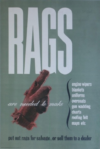
Rags - Mount Evans world war two vintage salvage poster onslows

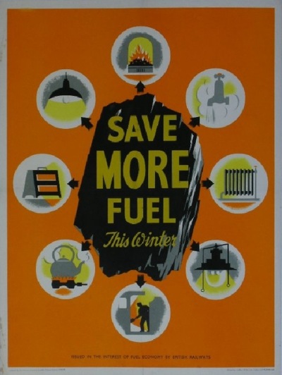
This Mount/Evans salvage poster is probably my favourite of the WW2 lots – and one I’ve never seen before as well.  Large tranches of the rest – unless you like H.M. Bateman cartoons – are more of historical than graphic interest.  Although, having said that, I rather like this railway fuel saving poster too.

railway fuel saving world war two vintage poster

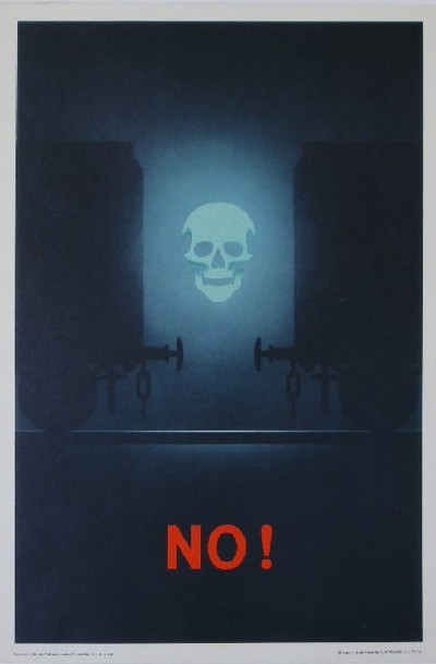
As well as this fantastically stark warning – also from the railways.

Railways Health and Safety Warning vintage poster

At an estimate of £70-£100, I might even think about that, were it not for the fact that I’d never ever put it up on the wall.

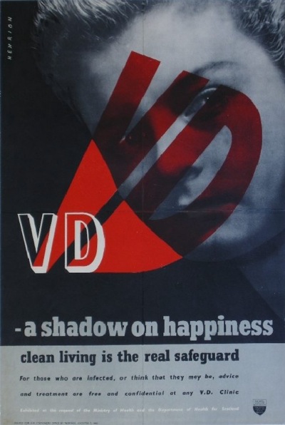
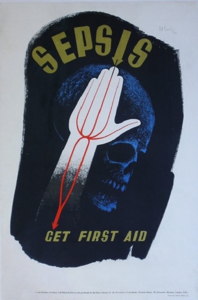
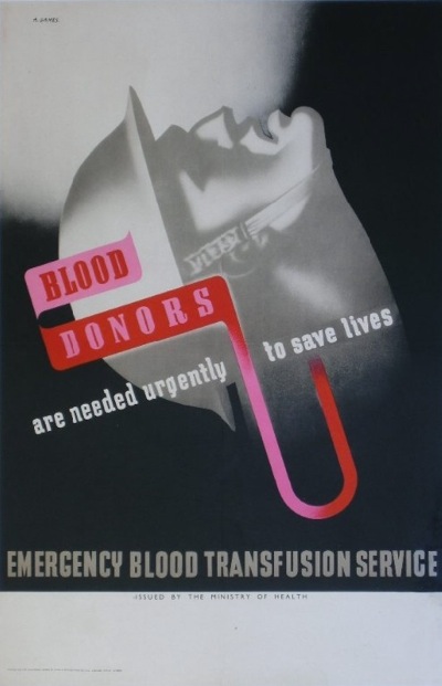
Then (lots 246 – 250 should you be looking for them) there are a small cache of classics, including Henrion, Keeley and three by Abram Games.

Henrion VD awareness world war two vintage poster

Pat Keeley Sepsis world war two vintage poster

Abram Games blood donors world war two vintage poster

Every one a classic, but all also sufficiently grim that I can’t see any of them going up around the house any time soon.

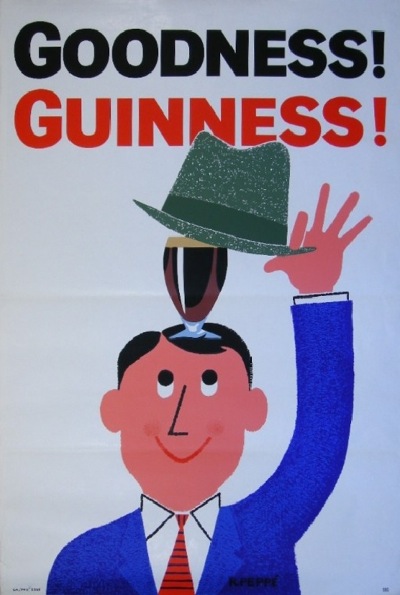
In the world of Guinness, meanwhile, there are a few Gilroy classics on offer, but I rather like this 1962 one by R Peppe, not just for being different, but it does help.

R Peppe Guinness vintage poster 1962

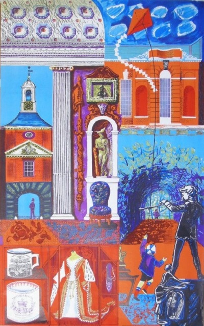
And after that, I just got a bit overwhelmed.  There are film posters, London Transport posters – including this 1953 gem by Sheila Robinson.

Sheila Robinson London Transport poster 1953 Royal London half of Pair poster

We once sold a poster of hers once; with hindsight I have no idea why.

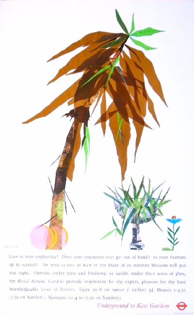
There’s also this 1964 design for Kew Gardens, which is by Tom Eckersley’s wife, Mary Kessel, poster trivia fans.

Mary Kessell vintage London Transport poster Euphorbia 1964

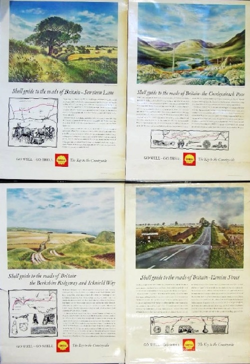
There are of course railway posters, including Terence Cuneo’s Pictures of Trains, lots of 1972 Munich Olympic posters about which I know nothing, and – as mentioned in my last post – industrial quantities of Shell educational posters, at least 22, although I might well have missed some.  The Hillier is still the best one on offer, although I am also a big fan of the David Gentleman series on The Roads of Britain.

David Gentleman Roads Shell educational poster onslows

There’s at least one missing here – The Great West Road with his wonderful image of Silbury Hill – and quite possibly more, but they’re still a great set on a deeply under-rated subject.  But I will not digress.

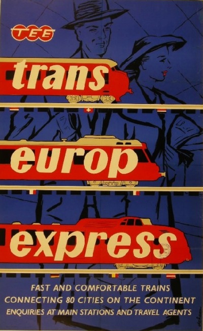
If your a fan of Kraftwerk, you might want to buy this.

Trans Europ Express vintage poster onslows auctions

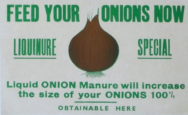
And finally (because I am rambling furiously and must stop) I like this, for no good reason at all.

Onions poster onslows auction

Surely that prize specimen has to be worth more than the £30-40 estimate.

This is of course a fantastically partial review of what’s on offer, and has almost certainly left out all the most valuable posters.  So please do and take a look for yourselves, and I’ll come back once the auction’s over and see what I missed out first time around.
Festival time

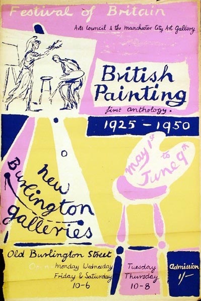
Mr Crownfolio has been fossicking in the furthest depths of the internet again.  And he’s found this.

British painting vintage poster for arts council exhibition 1951

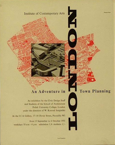
And this.

Town planning exhibition vintage poster 1951

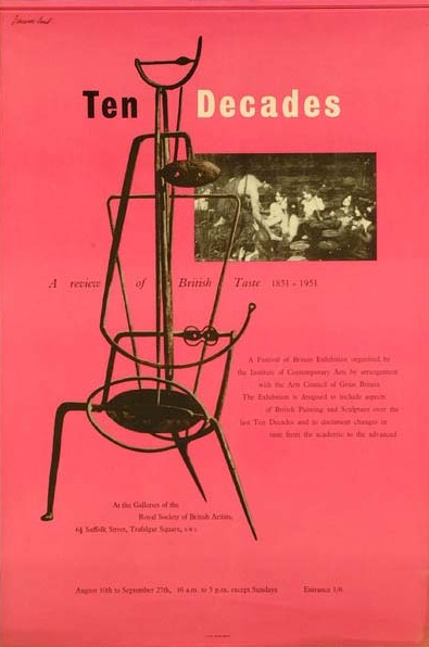
As well as this.

Ten decades of British taste vintage poster 1951

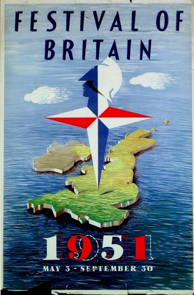
What links them all is this.

Festival of Britain map poster 1951

The Festival of Britain.  Or, to be more precise, the Museum of London’s rather wonderful Festival of Britain online exhibition and archive.  Not only does it have photos and reminiscences, it also has a searchable catalogue stuffed to the gills with wonderful posters and other ephemera.

Now I fell in love with the Festival of Britain when still in primary school, I have a vivid memory of the Radio Times doing a feature on the Festival in 1976, on its 25th anniversary, and wishing that I could have walked around in all of that primary coloured optimism myself.  It looked a great deal more fun than the 1970s.

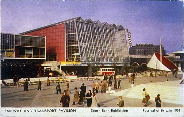
Festival of Britain postcard

This was clearly a formative experience, too, leading to a whole mis-spent life of 1950s collecting, a thesis, and, in the end, here.  The Radio Times has a lot to answer for.

If only I’d had all of this wonderful material to play with then.  The Museum of London’s archive is a result of a gift from Peter Kneebone, who combined being a key player in the Festival Office with being a keen epehemera collector.  Perfect.

There are some great things in there.  Mr Crownfolio says he has seen this Abram Games before, but I’m not sure that I have.

Abram games poster for model railway exhibition 1951 festival of Britain

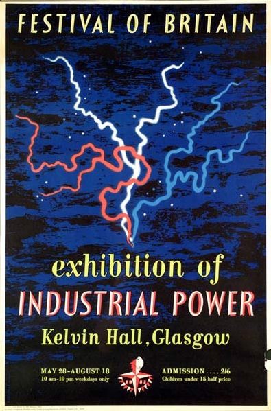
Or you might want to consider this Reginald Mount.

Reginald Mount exhibition poster Industrial Power Glasgow 1951 Festival of Britain

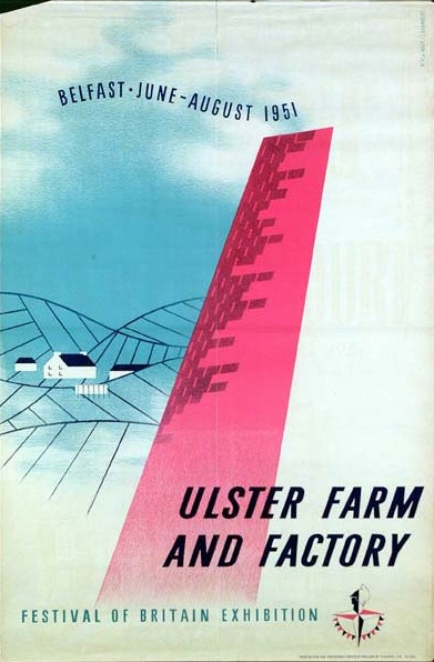
What’s particularly interesting about what Peter Kneebone collected is that it doesn’t always conform to our images of the Festival, which can tend to be stereotypical, generally involving the South Bank and the Skylon, possibly also the Festival Hall if you’re lucky.  The Reginald Mount poster above is a reminder that exhibitions and events were occurring all over the United Kingdom.  In Ulster, you could find out about Farm and Factory as well.

Ulster Farm and Factory exibition poster 1951 festival of Britain

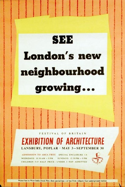
Furthermore, not all of the Festival disappeared in a puff of smoke at the end of 1951.  This ‘Living Architecture Exhibition’ (proof that Grand Designs Live is not a new idea in the slightest),

Another poster for Lansbury FoB architecture 1951

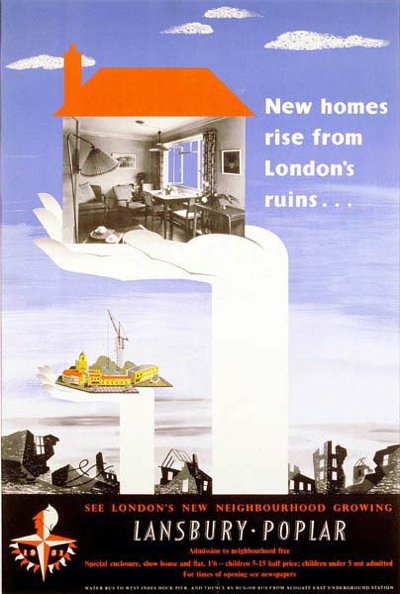
became the Lansbury Estate, which is still there.

New Homes living architecture exhibition 1951 festival of Britain

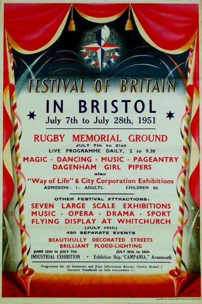
The images are also a reminder that, without hindsight, the Festival wasn’t the victory for soft Scandinavian modernism that it now seems to be.  Quite a few designers are harking back to the Great Exhibition of 1851 as much as they were looking forward.
Festival of Britain in Bristol poster Eric Fraser 1951

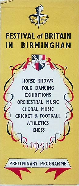
In this case, Eric Fraser, producing a generic poster to be used across Britain.  Some of the designs seem to refer even further back to the Regency, like this Birmingham leaflet
Birmingham city Festival of Britain leaflet

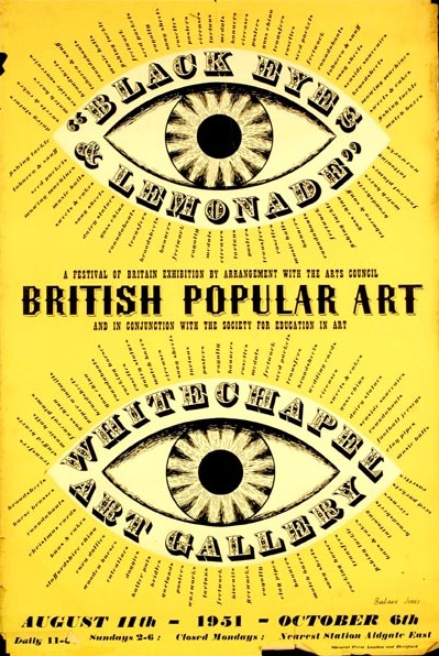
A vein of British  eccentricity and folk art also ran through the whole Festival; corn dollies and unicorns lurked within the modern buildings of the South Bank and elsewhere.  Here’s the incomparable Barbara Jones (about whom I will write one of these days), whose poster combines both Victoriana and whimsy.

British popular art 1951 exhibition poster Barbara Jones

What’s also great about the archive is the display; these are real, slightly battered pieces of ephemera, rather than air-brushed scans.  It’s good.  (And also reassuring given the condition of most of what we own.)

My only gripe would be that not enough designers are named.  I’m pretty sure that the Ulster Farm and Factory poster is by Willy de Majo, who designed the whole exhibition, but the Ten Decades poster has a signature that I just can’t read, or find anywhere else, and it would have been good to know.  But that’s my only, tiny quibble, so hurrah for the Museum of London, Peter Kneebone and their lovely archive.

Lucky Dip

As promised last week, it’s random image day – a whole heap of posters that I have discovered along the way but not managed to use in a post.  All sizes, all shapes, every one a great piece of design.

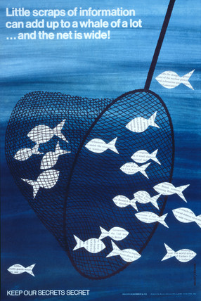
Here’s a Mount/Evans for starters – it’s from the V&A collection and I’ve never seen it anywhere else.

Mount Evans Keep Our Secrets Secret fish vintage poster COI

It comes from their prints website (that is prints that they sell you, rather than the Prints and Drawings Department), which tells me it comes from 1960.  One day I will rant about the impossibility of getting any kind of fix on what the V&A actually holds, but even describing what it does and doesn’t do is such a daunting task that it may take me a while.

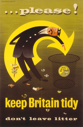
This Reginald Mount (the third of a set which were up on eBay a while back) also comes from there.

Reginald Mount Keep Britain Tidy poster park keeper

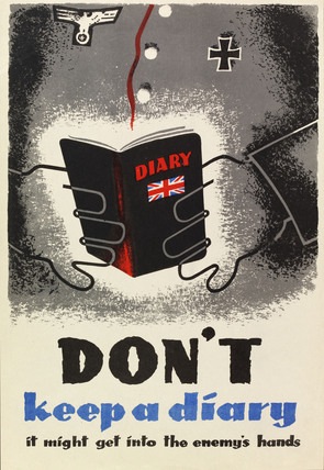
And I can’t tell you a single thing about this (which, again, I’ve never seen before) because their system is so byzantine and strange that I now can’t find it again.  But, is good.

Don't keep a diary vintage ww2 poster

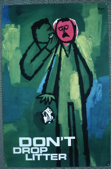
Not only Reginald Mount, but Hans Unger would also like you to Keep Britain Tidy, although he is rather more anguished about it.

Hans Unger Keep Britain Tidy 1964 COI vintage poster

And yes, that is a photograph of a poster pinned to a piece of hessian.  You’ve got to love the Design Council Slide Collection.  As well as the seventies.

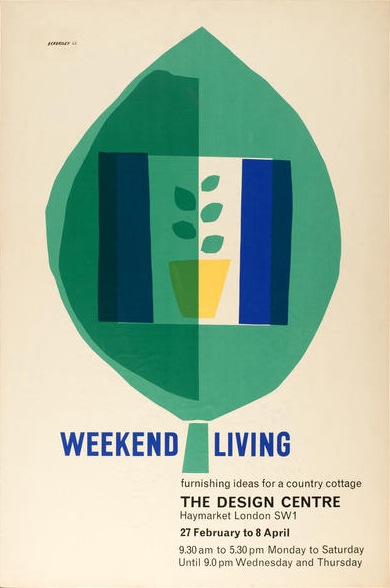
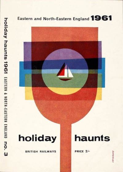
They also produced this pair of Eckersleys, which are a bit different to most of his work.

Tom Eckersley Weekend Living poster

Tom Eckersley holiday haunts brochure

Not sure about the dates for these, the Design Council puts the first one at 1980, but it looks earlier than that, about the same period as the brochure cover.  I’m also taking their dating with a pinch of salt, as they estimate the second one to be c1959-65 – despite the large black 1961 in the top right corner.

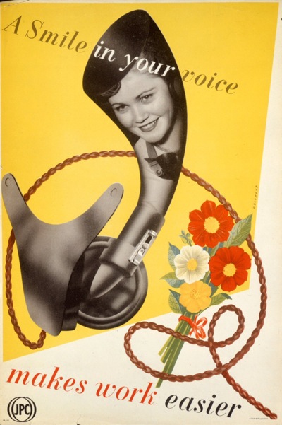
Meanwhile, back at the GPO, there are some very strange posters.  This one, by Beaumont, for example.

Beaumount a smile in your voice vintage GPO poster

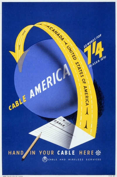
Apparently this is from 1957, although it looks earlier to me.  He was clearly saner in 1950 when he did this for them.

Beaumont cable vintage poster GPO

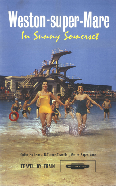
And finally, a random bit of early 60s kitch.  They must have really loved that diving board at Weston Super Mare, I’ve seen it on so many posters.

Weston Super Mare vintage British Railways poster

Good, now I can tidy them all away.  Only to start laying down some more, of course.

AP2 Part Two

Today, a second helping of the AP2 Artists Partners book.  (Is it a brochure?  a catalogue?  I’m not entirely sure how to address it).

Artists Partners cover image Patrick Tilley

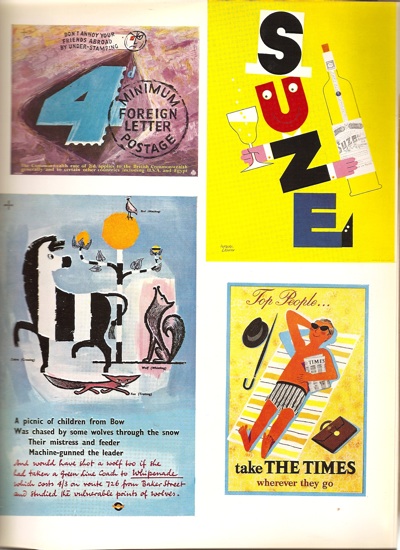
I ran through a few of the obvious highlights by the big names like Hans Unger, Saul Bass and Tom Eckersley last time, but there are plenty more treasures for your entertainment.

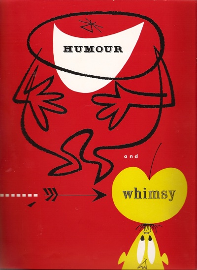
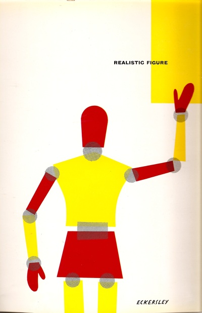
In fact, the sheer quantity of other stuff is one of the notable things about the book.  Most of what would now be seen as the big names are in the creative design section, but there are six other categories in the book, including realistic figure, humour and whimsy (section cover by Reginald Mount)

Reginald Mount AP2 artwork

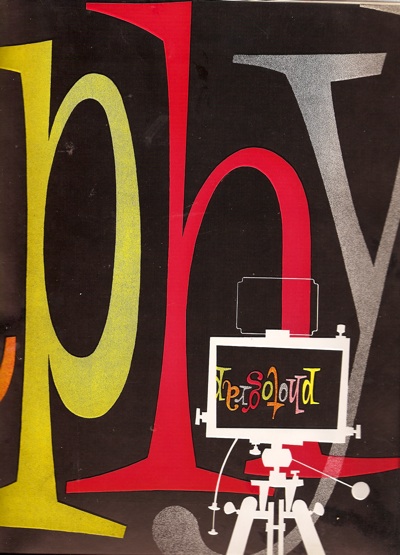
fashion and sophistication, photography ( a wonderful graphic by Heinz Kurth)

AP divider photography Hans Kurth

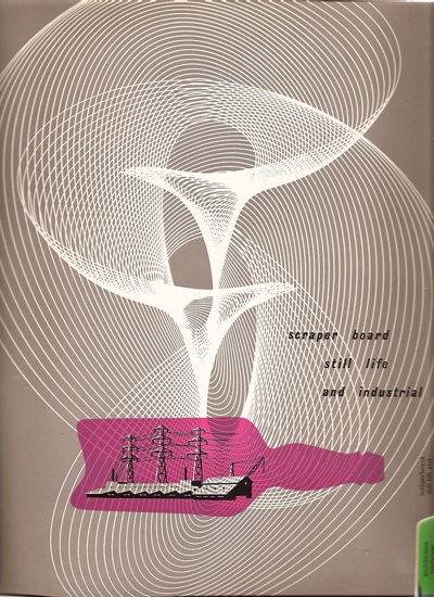
scraperboard, still life and industrial,

scraper board and industrial divider ap

and finally architecture, landscape and nature.

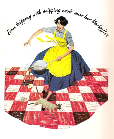
It’s a reminder, once again, how easy it is to recreate the past in terms of what we like best now.  For every classic bit of graphics, one equal and opposite bit of kitsch was created (although this is not just any old figure illustration kitsch, it’s Artist Partners kitsch by Rix).

AP tripping with dripping image

Good to know that about the dripping, too.

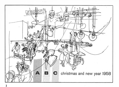
But that’s not to say that there aren’t some stylish things in the other categories too, such as this Christmas card for ABC Television, by Bruce Petty.

ABC christmas card AP

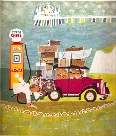
Or once again, Patrick Tilley, this time with a cover for a Shell almanac, filed under Humour and Whimsy.  No one would ever admit to doing whimsy any more, would they, it’s hardly cool; I think that’s rather a shame.

PAtrick Tilley for shell almanac graphics

Patrick Tilley is, incidentally, not only still alive but has spent the last forty years working as a scriptwriter and science-fiction novelist, rather than as a designer.  Perhaps that’s why his work has rather disappeared off the radar, despite being really rather good.  (And he’s got in touch with the blog too, which is very exciting, so there may well be some more of his work on show here in due course).

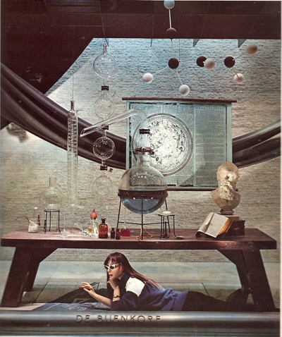
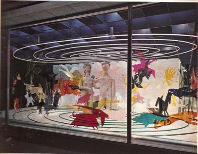
Almost as strange as that career change are these two window displays by George Him, for De Bejenkorf  (which seems to be a department store in Amsterdam).  The first one in particular, looks almost impossibly modern.

George HIm Shop Window AP

The second is just brilliantly odd.

George Him shop window 2

More of this kind of thing please.

Even all this hasn’t exhausted the almost bottomless reserves of this book.  So, next time the scanner and I get some quality time together, there will further delights to come.

Find me an artist. From 1953 please

Sometimes, writing about graphics can feel like a constant harking back to a golden age of British graphic design, long since lost to the evil forces of photography, Photoshop and general bad taste.  But not everything from that time has disappeared.

Like Artist Partners for example, who are not only still going but have set up a usefully informative website which covers their past as well as their present.  And their past was very glorious indeed.

Founded in 1950, the agency represented some of the biggest names in illustration, graphics and photography from the fifties onward.  There’s no point repeating their entire history, because they’ve done the job already.  Although I was particularly interested to see that Reginald Mount was one of the founding partners.  He’s a fascinating character who seems to pop up at all sorts of interesting points in the history of graphics, and I’d be interested in finding out more about him one of these days.

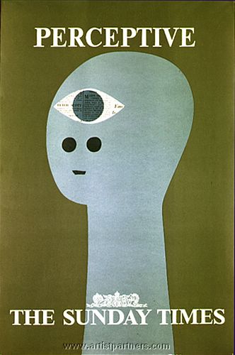
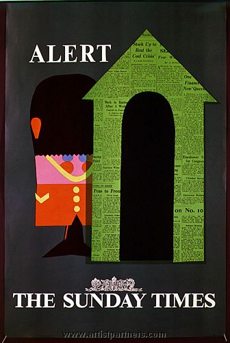
They’ve put together a small retro section on their website as well, with a few nice images, like these Sunday Times advertisements by Patrick Tilley.

Patrick Tilley vintage sunday times advertisement Patrick Tilley vintage sunday times ad

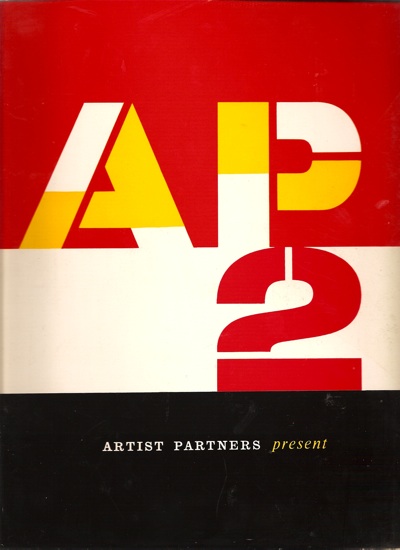
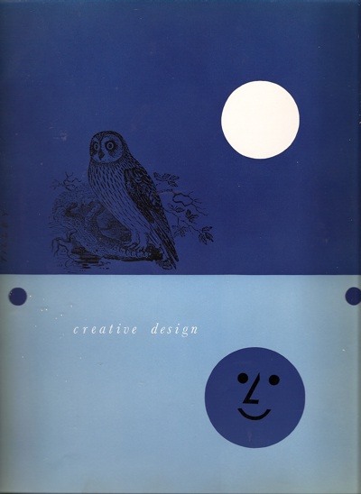
But it’s not the website that made me want to post about them, it’s this (the cover also, incidentally, designed by Tilley), which we’ve had on the bookshelves for a while now.

Cover of Artist Partners graphic design brochure

Dating from, I guess, the early to mid 50s, it’s a brochure for the artists represented by AP, and a very delightful book in its own right.  Here’s one of the section headings for example.

Divider from Artists Partners graphics book

Or this one, by none other than Tom Eckersley

Eckersley Artist Partners graphics book divider

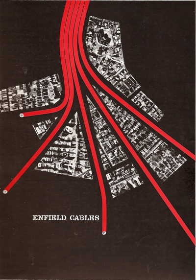
Oh to be sitting at at an advertising agency desk in 1954 and trying to decide who to commission.  Because there is such as wealth of wonderful talent in this book.  Amongst other people, Artist Partners represented Eckersley, Hans Unger, George Him, Eileen Evans, and of course Reginald Mount.  And even Saul Bass.  Here’s a trade advertisement for Enfield Cables.

Saul Bass Enfield Cables ad Artist Partners book

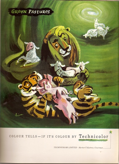
And a rather fetching advertisement for Technicolour by George Him.

AP George Him technicolour ad

My main sadness is that it’s only partially in colour, because there are simply hundreds of pieces which I haven’t ever seen before.  For every page like this

AP content various

(Two Hans Ungers – one GPO, one London Transport, a Leupin and another Patrick Tilley)

there are ten like this.

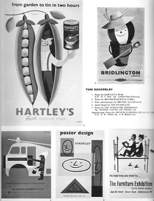
AP eckersley page

I’ve managed to find the peas one in colour at least for your entertainment.

Tom Eckersley Hartleys peas graphics

That’s more than enough for now, but I’ve still only barely scratched the surface of this wonderful book.  I’ll post some more images from it next week.

But if you can’t wait that long, Abebooks is offering one copy for sale.  I can’t tell you anything about the condition as it’s all in German – but let me know how it is if you can’t resist anyway (or, indeed, if you speak German).  Well it was there this morning, but now it’s gone.  Hope you like it.

Four posters in search of a story

I’ve always been interested in the afterlife of objects – how things survive long enough to become collectibles or heirlooms or even national treasures.  It’s generally a story of chance and – quite often – being so lost and overlooked that no one bothers to throw you away. It’s also a story that isn’t often told as part of design history; once an object has been created and made, that’s normally the end of it.  But often what happens next is at least as interesting, and can also be very revealing about how we appreciate, or disregard, the objects around us.

So, following on from yesterday’s post about just how little survives, here are a few of our posters with the tales of how they made it through to the twenty-first century.

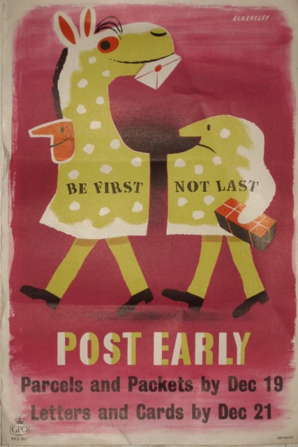
Tom Eckersley Post Early GPO poster
Tom Eckersley, Post Early for GPO, 1955, Crown Folio 15″ x 10″
Saved by a man who went into his local post office and asked them to keep for him all of the posters and publicity material that they had finished with.  (I will write more about this one of these days as it’s worth a whole post in its own right.)

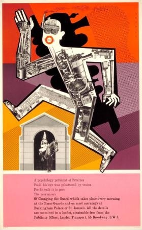
Henrion London Underground Vintage poster Changing Guard
F H K Henrion, Changing of the Guard for London Transport, 1956, Double Royal 40″ x 25″
Kept by a tutor in graphic design who used it in his teaching.

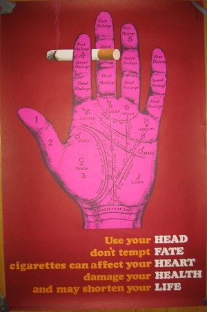
Mount Evans no smoking poster
Mount/Evans, Anti-Smoking poster for COI, 1965-ish, Double Crown 30″ x 20″
Bought at auction but I believe it came from the designers’ own archive.

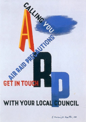
McKnight Kauffer ARP vintage poster
ARP Poster, Edward McKnight Kauffer, 1938, Crown Folio 15″ x 10″
Found in the roof of a scout hut.  The air rifle pellet holes had to be restored…

Patrick Bogue from Onslows also mentioned in passing that he once found original railway poster artwork being used as insulation in a loft space.  Can anyone better that?