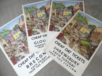
Havinden it all

She made me do it.  (Points to Shelf Appeal at the next desk).  She posted about Ashley Havinden and asked a question.  So then of course I googled.  And found this.

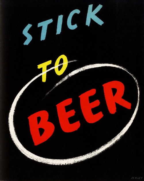
Ashley Havinden Stick To Beer poster

Which meant I had to post it.  I can’t tell you much about it though, other than that it comes from the Penrose Annual 1939 and really should be reproduced right now.  Who needs ‘Keep Calm and Carry On’?

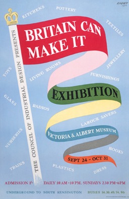
That alone would be enough.  But both Shelf Appeal and the search have reminded me that Mr Havinden was an interesting cove.  He was clearly a man of such prodigious talents.  As well as enlivening socks, it seems that he invented the idea of the brand as personality and was responsible for huge swathes of the Britain Can Make It Exhibition, including its poster.

Ashley Havinden Britain Can Make It Poster

But  he isn’t that well known these days.  Which is strange because I get the impression that just before and after World War Two, he was considered very influential indeed; the man who, along with McKnight Kauffer, brought modernism to Britain.

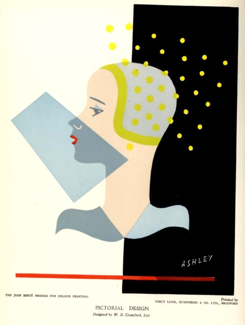
an illustration about printing Ashley Havinden

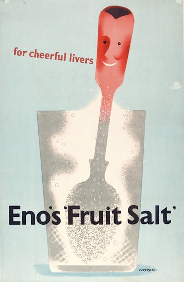
I think there are a couple of reasons for this.  One is that he spent most of his working life as an Art Director at the Crawfords Agency.  So not only did a lot of his work perhaps go out anonymously, but he was an art director as much as designer, a back room boy.  Which still made him very influential.  I’ve been flicking through Designers in Britain in search of him, and discovered that he commissioned Tom Eckersley, for instance, to produce this campaign for Eno’s Fruit Salts

Tom Eckersley Eno's Fruit salts advertisement 1947

(Eno’s went from McKnight Kauffer pre-war, to Eckersley in 1947; they always did have good taste in graphics).

But I think Havinden’s other problem is that he didn’t produce many posters.  Which is a daft reason for leaving someone out of the histories, but it is the lens through which graphics of the time are, mainly, viewed.

The few of his posters that I can find seem to have been produced for the war effort.

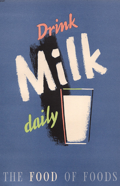
Ashley Havinden drink milk daily

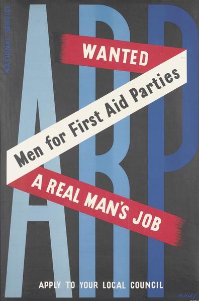
Ashley Havinden First Aid parties poster

Perhaps there are more – in which case, I’d love to see them.

I’ve got a few more thoughts on why he is perhaps not as well-known as he might be, but they’re going to have to wait until I’ve read this book (for which I also have to thank Shelf Appeal) in case I am completely wrong.

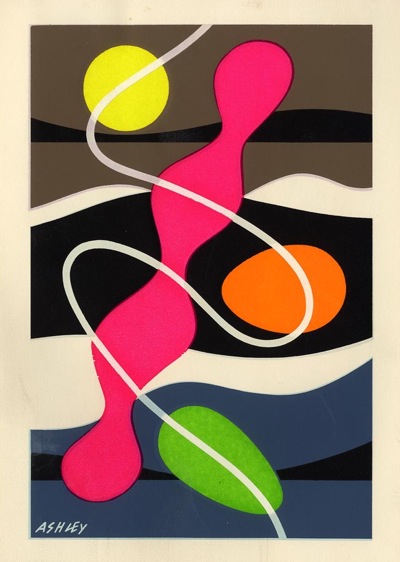
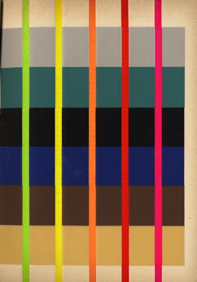
But whatever the book says, I definitely don’t think his obscurity is deserved.  Take a look at these images that he produced in the early 50s (from the 1953 Penrose Annual, which was also on the shelves).  They’re illustrating an article he wrote on “Designing for Fluorescent Printing” (top tip: use a dark background).  He was an artist and a modern, and rather a good one too.

Ashley Havinden from Penrose Annual 1953

Ashley Havinden Penrose Annual 1953

Modern or British?

“It may be clever and modern and progressive.  But it certainly isn’t English.”

That’s the incomparable Patrick Wright quoting from a ‘heritage journal’ called This England.  He’s talking about landscape and memory, but it struck a chord with me.

Because ever since I wrote about Paul Rennie’s Modern British Posters, I’ve been thinking about the relationship between modernism and British design.  It’s a very important undercurrent in the book, but one that he only spells out at the end.

Our collecting began, back in about 1982, with an interest in modern design. We discovered that, where the market existed, it was conceptualised around an idea of modernism as an international phenomenon of people, ideas and products that connected Moscow, Berlin, Paris and New York. In 1982, the words British and Modernism seemed like a contradiction in terms… Our interest in graphic design quickly began to define itself as an attempt to gather together irrefutable material evidence of British Modernism.
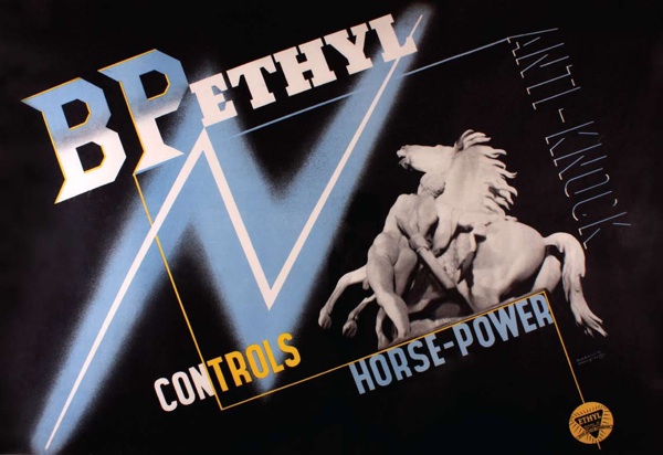
McKnight Kauffer BP Ethyl poster 1933

So in essence, the whole book – and of course the Rennies’ whole collection of posters around which it is based – is didactic.  His argument is for the existence of a specifically British approach to modernism, from early McKnight Kauffer to late Eckersley.
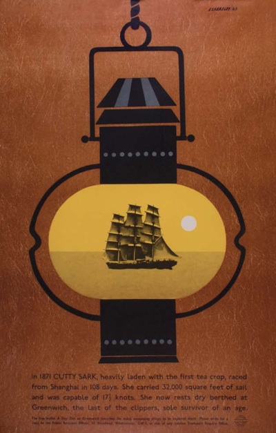
Tom Eckersley Cutty Sark London Transport 1963

There can be no doubt that this home-grown kind of modernism existed; the evidence is there in the shape of posters like these (Powers, 1934 and anon, 1938) and many, many more.  Just take a look at the book.
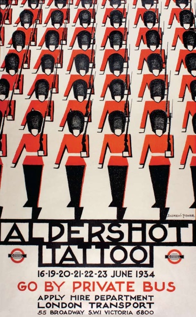
Powers Aldershot Tattoo poster

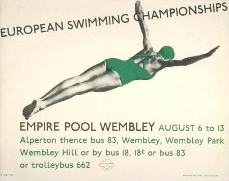
Anonymous LT swimming poster

Rennie is in good company when he wants to place Britain within the modernist tradition, as it’s a path that many other writers have taken before him.  Pevsner’s Pioneers of Modern Design has exactly the same aim.  Here the argument is that Voysey, Owen Jones and even William Morris are the fore-runners of German architectural, steel and glass, functional modernism.

But Rennie and Pevsner have more in common than just that.  They position themselves as swimming against the tide, having to make an argument for a kind of modernism which isn’t seen as naturally British.  (In the case of posters, it isn’t very British anyway; emigree designers must outnumber the home-grown modernists by at least three to one, but that’s another story for another day).
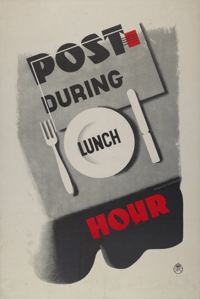
Edward McKnight Kauffer GPO poster
Edward McKnight Kauffer, GPO, 1937

This isn’t a view that only applies to buildings or posters, either.  It’s been said that Utility furniture scheme during World War Two and after was a chance for modernism to be imposed on the unsuspecting British public, who weren’t showing much inclination to embrace it any other way.  It’s also possible to argue (as I have before) that much modernism in posters operates in the same way.  During the 1930s institutions such as the GPO,  London Transport and Shell commissioned modern design in a seemingly medicinal fashion, because it was Good For the general public.
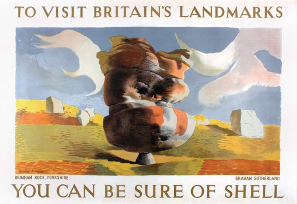
Graham Sutherland Shell poster
Graham Sutherland

I’m intrigued most, though, by what’s implicit here.  If modernism is seen as improving, then what is it trying to make better?  If modern design is being imposed on mainstream taste, then what is this style that it’s fighting against?  Can we say  what exactly is this natural British design?

Strangely, the answers to these questions aren’t as easy to find out as you might imagine.  Design history tends, even now, to think in terms of the narrative of modernism alone.  It’s a clean-lined and minimalist version of the Whig view of history, in which everything leads towards the ultimate fulfillment of civilisation, which can only be some  monochrome combination of Le Corbusier, the Bauhaus and Helvetica Neue standing triumphant over the death of ornament.  All of which tends to create some oddities in the stories they tell.

One is a kind of tortured argument, as designs and designers are jemmied into place to fit the party line.  Tim Mowl (a man who knows; his book Stylistic Cold Wars: Betjeman Versus Pevsner is worth quite a lot of your time, if not the £69.99 that someone wants for it on Amazon) calls Pevsner’s attempts to turn William Morris into a proto-modernist “obvious nonsense”.  Harsh, but fair.

Modern British Posters isn’t having to strain so hard, as the designs were there.  But, in Britain, if you only write about the modernist experience, quite a few designers and posters don’t make the cut.  Like railway posters, for example.
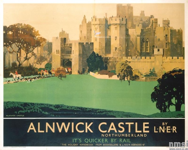
Alnwick castle fred taylor railway poster 1933
Fred Taylor, 1933

Because this is the other problem with surveying the material world only through the lens of modernism, particularly in Britain.  The vast majority of objects don’t get seen.  If you wanted to find out what furniture people who didn’t care for the Bloomsbury Set and pale wood were buying just before the war, or how the average, non-Arts-and-Crafts Victorian papered their walls, you’d be hard pressed to find out.  The books won’t tell you and nor, in the main, will the museums either (The Geffrye Museum is a notable democratic exception here).

It’s not even as though these things are criticised, or even described.  They are invisible, utterly absent from the story.

Yet such objects did exist, in their hundreds and thousands, these wing-back chairs and flock wallpapers, these Crown Derby dinner sets and aspidistra stands.  Which takes us back to the question I asked earlier.  Exactly what is ordinary British taste if it isn’t modern?  And if we don’t know, how can we find out?

These questions aren’t here just to be difficult (although of course that is part of the fun).  I’m also raising them because, perhaps, posters can give us some clues.

After all, not all graphic design flew the modernist flag.  In the same year that McKnight Kauffer produced his machine age version of BP petrol above, 1933, there were other styles and other designers at work too.  I’ve raided the National Railway Museum’s collection to find a selection from the same year.

Some of them are modernism incarnate.
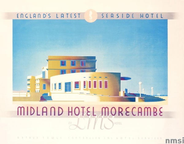
Midland Hotel Railway poster 1933

While others act like it had never happened at all.
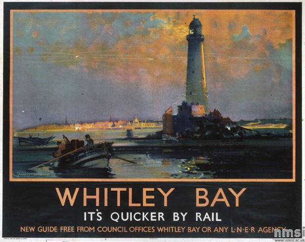
Railway Poster Frank Mason 1933
Frank Mason

Meanwhile yet more are modern, but at the same time not modernist.
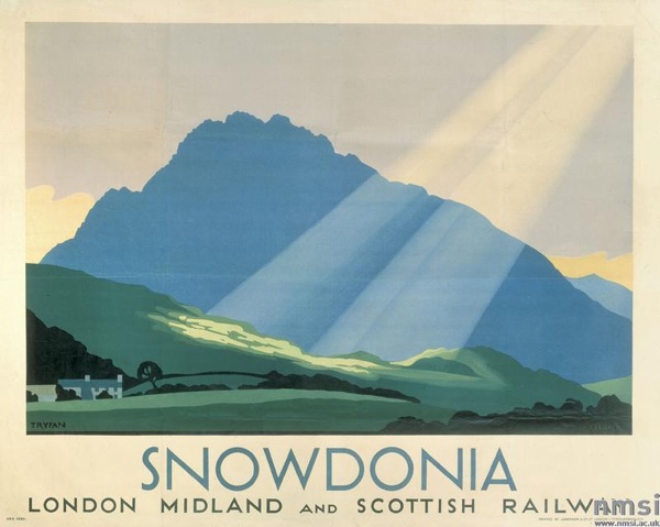
Snowdonia Charles H Baker railway poster 1933
Charles H Baker

This view is about as far from a celebration of steel, movement and urban frenzy as it is possible to get.  But at the same time it is still modern.  Go figure.

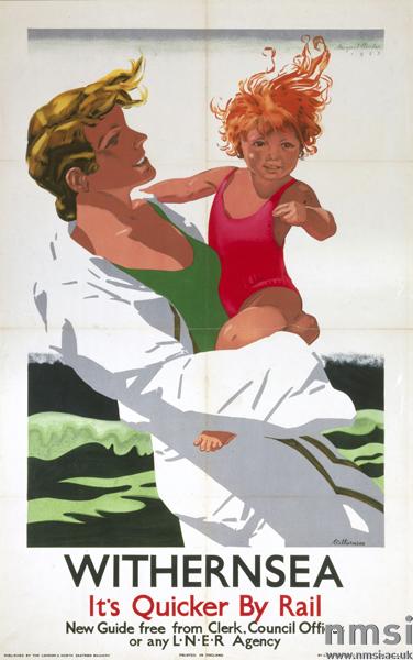
There are many many more too, from Fred Taylor to lesser known artists like Margaret Hordern below.
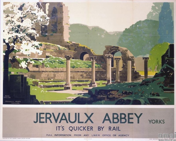
Fred Taylor, Jervaulx abbey railway poster

Margaret Hordern Railway poster 1933.

Now it’s not an accident that I’ve chosen railway posters as a comparison.  Because railway posters were popular.  They were popular then, when they were sold over the counter as art as well as being displayed in stations. (There’s a good description of how this worked in Yale’s Art for All book if you’re interested).

And they’re popular now.  Railway posters are probably the most collected and traded posters there are (and if you take eBay as any kind of sample, they’re certainly the most reproduced and pirated too).  Lots of people like railway posters, and I suspect they like them for all the reasons I’ve railed against them before.  They’re pretty, nice to hang on the wall, they look like a proper picture.  And by far the most popular of all are the pictures of the countryside.
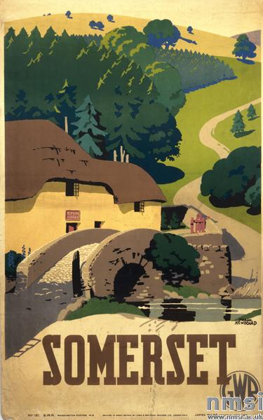
Somerset Frank Newbould 1936
Frank Newbould, 1936

Which starts to give us some clues about the nature of mainstream British taste.  It’s not the first time that this has been said, but railway posters seem to suggest that it prefers the rural to the urban, likes representation and tradition.  In which case, by the by,  modernism, with its paens to the city and the machine, never was going to have much of a chance, was it?

Now I know that this is an immensely contentious generalisation, and I’m rather hoping that lots of people will pile in with examples to prove me wrong.

But for the moment I still think it holds water; I might even argue that mainstream British taste hasn’t changed a whole heap since 1933 or before.  It still prefers the rural to the city, it likes flowers, leaves and pictures of things it can recognise.  And it still gets mostly ignored by writers and designers, architects and museums.  But you can easily find it if you look.  Here for example.
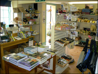
Interior of National Trust shop

The inside of a National Trust shop.  Does it get any more British than that?
Two for the shelves

Look what’s turned up on eBay.

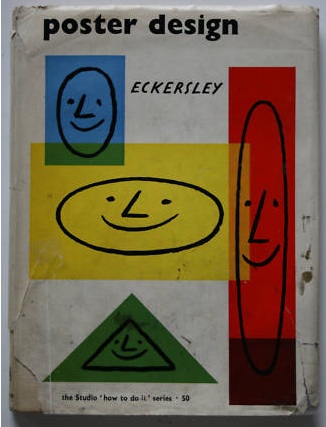
Tom Eckersley Poster Design book from eBay

Poster Design by Tom Eckersley.  Currently a complete steal at £6, but I suspect it will go higher, as the going rate on Abebooks is running close to £50.

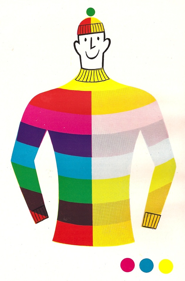
But mostly pleasing because it allows me to post this again.

]

Who knew colour separation could be such fun.

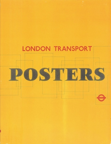
While we’re thinking about books on eBay, you could also also pick up “the definitive book on London Transport posters“.  Perhaps.

London Transport book from eBay

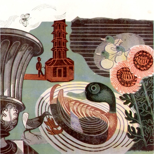
But you only get to see the book way down their listing; they’re advertising it via this rather lovely bit of Bawden.

Edward Bawden detail from LT book eBay

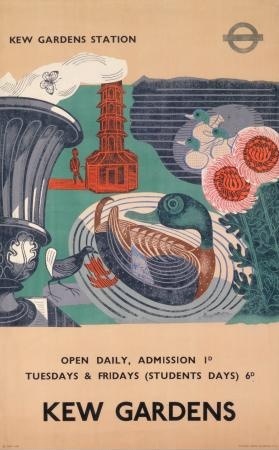
It comes from this 1936 poster for Kew Gardens.

Edward Bawden kew Gardens poster London Transport

This is currently at 99p (the book, not the poster), but again I’m sure that won’t last. Watch and wait.

Designer O’ Nine Lives

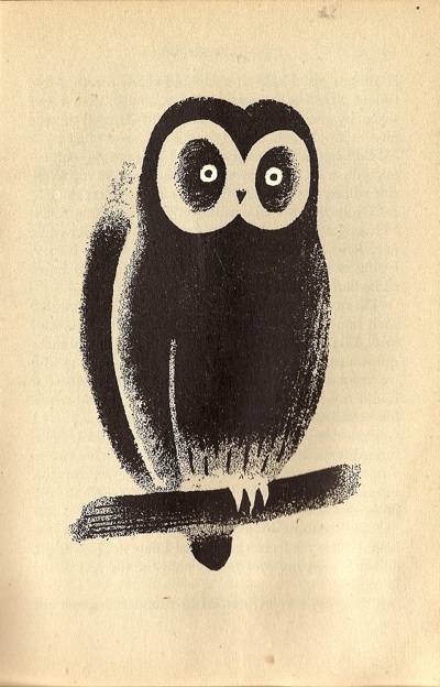
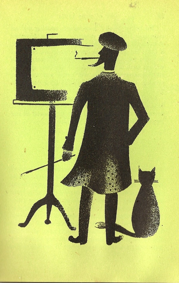
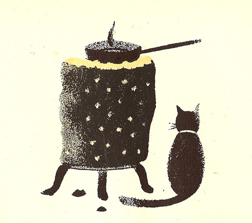
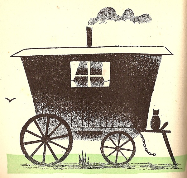
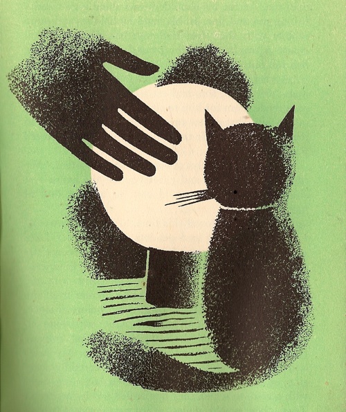
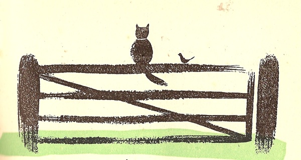
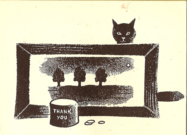
Not for the first time, or indeed the last, we’re exploring the cross-over between children’s illustrations and graphic design of genius, this time in the company of Tom Eckersley.

It seems to be fairly well known that he did the illustrations for a couple of children’s books, but it’s rather harder to actually catch sight of them.

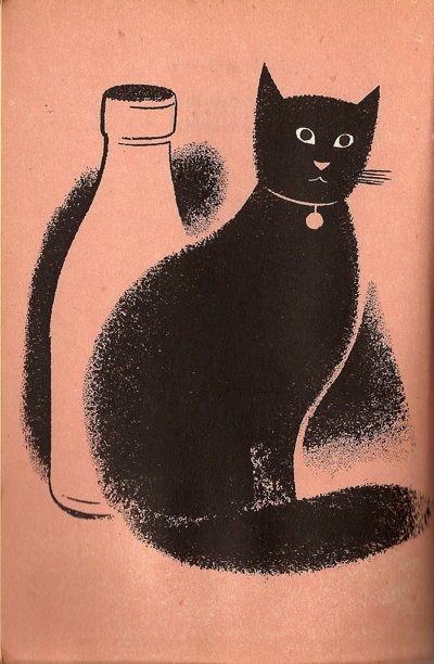
Tom Eckersley illustration for Cat O' Nine Lives

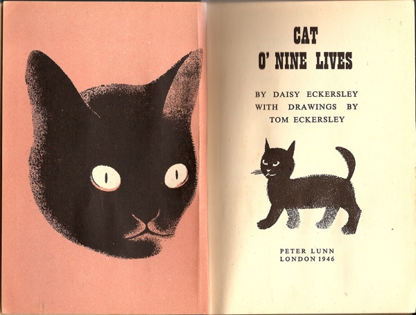
So today, here are some of the illustrations he did for Cat O’Nine Lives back in 1946.

Tom Eckersley illustration for Cat O' Nine Lives frontispiece

Quite apart from the design, the book has an autobiographical interest too.  It was written by his first wife Daisy, and is dedicated “To our sons: Anthony and Richard”.

Tom Eckersley illustration for Cat O' Nine Lives

I haven’t counted all the illustrations, but there are two kinds.  Some are full-page, inserted into the chapters on and with the whole page overprinted so that it is a different colour, like the owl and the artist below.

Tom Eckersley illustration for Cat O' Nine Lives

Tom Eckersley illustration for Cat O' Nine Lives

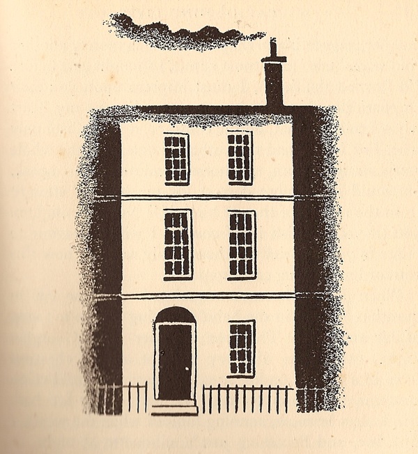
Then there are smaller illustrations at the start of each chapter.

Tom Eckersley illustration for Cat O' Nine Lives

Some are entirely black and white, a few have a single additional colour.

Tom Eckersley illustration for Cat O' Nine Lives

The paper quality isn’t the greatest, and the book itself is quite small (about 4.75″ x 7″), but given that it was printed just after the war this probably isn’t surprising.

Tom Eckersley illustration for Cat O' Nine Lives

What I find really interesting is how simple his illustrations are at this point in his career.  It’s as though he started out with an almost minimalist style, then became much more complicated and ornamental throughout the 1950s, and then, gradually, he unpicks this to become more and more simple once again.

Tom Eckersley illustration for Cat O' Nine Lives

You will notice that I say nothing about the story.  I quite like cats, but still find it fairly fey going.  But should you ever trip over it in a second hand book shop, don’t let that put you off.  As you can see, it’s worth it for the illustrations alone.

Tom Eckersley illustration for Cat O' Nine Lives

Auction thoughts

Once the dust had settled, I had hoped to come up with some conclusions about the Morphets bus and train extravaganza of last week.  But the more I look at the results, the more my brain becomes addled.  This isn’t just the result of the scale of it all, although that hasn’t got any better, it’s also because I’m not entirely sure there are that many conclusions to be drawn.

So let’s start with some simple thoughts.  Expensive posters sold for lots of money.

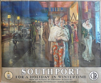
Southport Matania Vintage LMS railway poster

This went for £2400, which is pretty much what I’ve seen it go for every time.

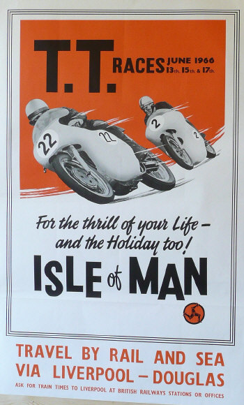
People still like to buy pictures of trains.  It seems that they also like to buy pictures of motorbikes too.

Isle of Man TT racing vintage railway poster

Any other reason for that fetching £300 rather escapes me.

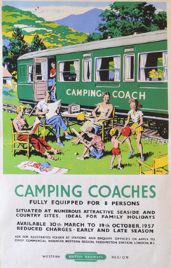
People like pictures which look like real things in general.  So this Riley fetched £500,

Riley Camping coaches vintage railway poster

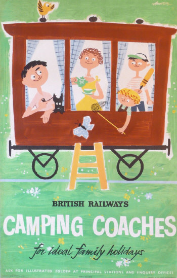
while the Amstutz of the same subject only went for £240.  (Apparently it is possible to go and stay on restored camping coaches even today.  I must investigate further.)

Amstutz Camping Coaches vintage railway poster

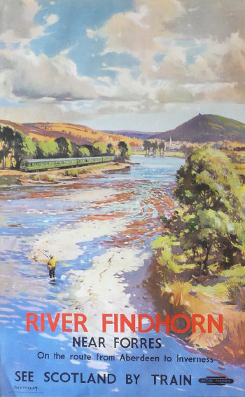
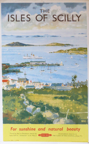
Most of all though, what people like to buy most of all are nice pictures of landscapes which look a bit like proper art.  So posters like these,

River Findhorn vintage railway poster

Scilly Isles Vintage railway poster

are highly desirable and go for £600 and £750 respectively.

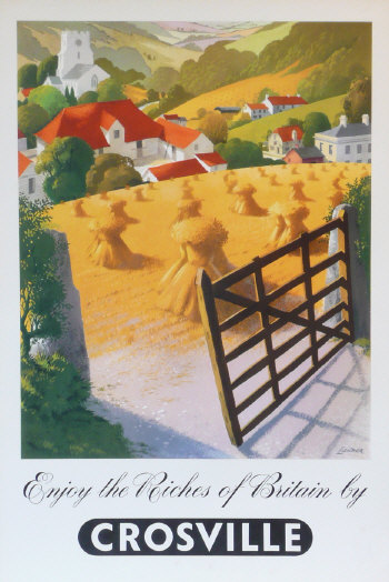
This rule seems to work for bus posters too – this Lander reached a very respectable £340.

R M Lander Riches of Britain coach poster

Although even I can see the appeal of that one.

But as I mentioned before, things which looked less like fields and more like design didn’t do so well.  The Paddens, Coopers and their like didn’t reach anything like the prices I expected.  There were a few exceptions to this which are worth taking a look at.

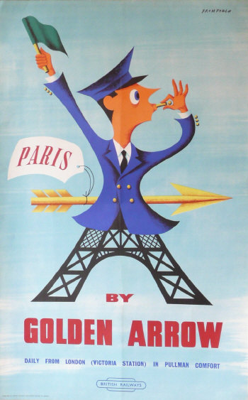
Firstly, kitschy 50s graphics seemed to be selling well – this Bromfield fetched £440.

Bromfield Golden Arrow vintage railway poster

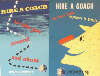
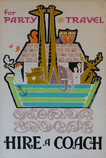
While at a lower level, this rather nice Studio Seven pair fetched £70, more than most coach posters were managing to do.

Studio Seven two hire a coach vintage poster

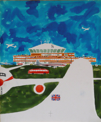
Even more odd was that, in a complete reversal of the normal situation, artworks fetched more than the original posters.  Royston Cooper’s airport artwork went for £320,

Royston Cooper original artwork for airport coach poster

when you could have picked up the poster, as one of a pair, for £38.

Daphne Padden original artwork for coach poster

While this Daphne Padden ark-work sold for £240, more than any of her individual posters made.  Go figure.

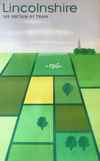
But there was one big exception to the rule that good design didn’t sell – although perhaps not quite so much of an exception considering that it is a picture of a field as well.

Tom Eckersley Lincolnshire vintage railway poster

Tom Eckersley’s Lincolnshire reached £550.  Two readers of this blog battled with us over it – we lost but it’s going to a good home over in Norfolk so I don’t mind.  Not too much anyway.

The thick of it

It’s impossible to get a sense of the Morphet’s sale while it’s still yelling away in the corner of my screen, but two brief observations from yesterday.

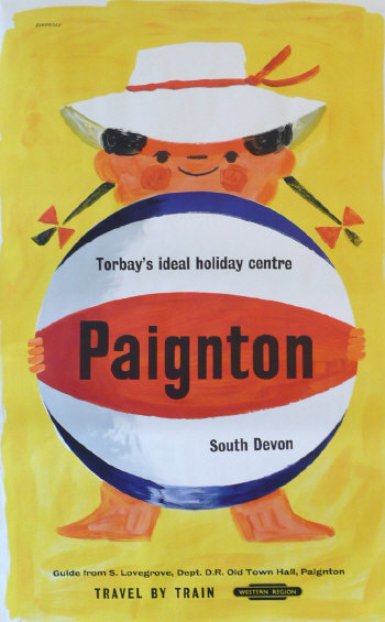
Firstly, what kind of a mad world is it where this costs £160

Tom Eckersley Paignton vintage railway poster from Morphets

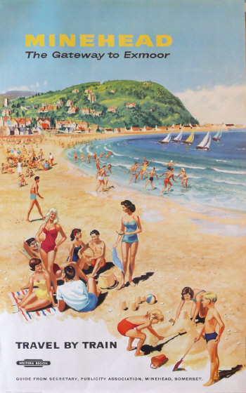
while this

Minehead Studio Seven vintage railway poster

costs hundreds more.  I don’t understand, I really don’t.

I also noticed this go past yesterday.

Jack Merriott vintage railway posters which are cheating

Same picture, four different towns.  That’s cheating.  But does anyone know where it is really?
But much more exciting is that we won this wonderful Amstutz.

Amstutz Camping Coaches poster

It’s been on this blog’s ‘About Us’ page since the very start.  And now it’s going to be on our walls.  Hurrah for that.

More on the sale next week, once I’ve sold all my household goods, cats and anything else that might meet the bill.  And built a few more walls to hang everything on.