Rather forgeta-bull

A curiosity today.  This.

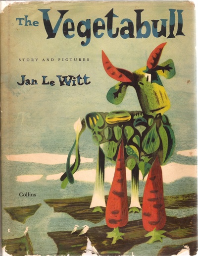
Cover for The Vegetabull book Lewitt Him

It’s a 1955 childrens book by Jan Lewitt, one half of the brilliant Lewitt-Him graphic design partnership.

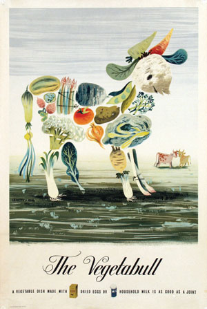
It’s not, I have to say, a great book, but makes it in here mostly because it is clearly a spin-off from one of my favourite posters, a Lewitt-Him design from 1943.

Lewitt Him Vegetabull vintage WW2 ministry of food poster

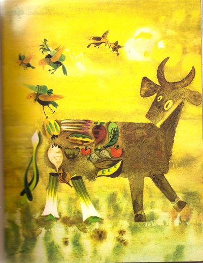
I’m rather tickled by the fact that Jan Lewitt liked the idea so much that ten years later he decided to give the image an entire backstory, rather like an author being forced to write a sequel because he’s created characters who just won’t leave him alone.

Jan Lewitt vegetabull book illustration 1

It’s just a shame that the plot (which involves far away islands, mandolin trees and a bull called Yorick) isn’t a bit more gripping.

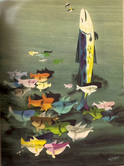
Jan Lewitt vegetabull book illustration two fish

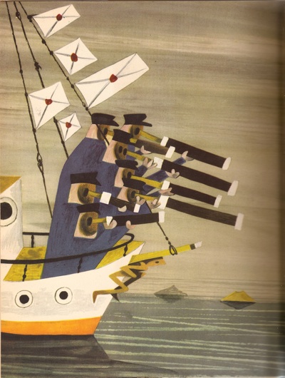
Although the illustrations are rather wonderful, in a grown-up kind of way.

Vegetabull book illustration Jan Lewitt sailors with telescopes

Should you fancy your own copy, it’s pretty widely available on the second hand book web, at prices ranging from £10 – £100.  You choose.

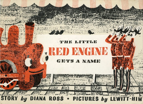
Two other incidental facts while I am here.  Lewitt-Him also did a couple of other children’s books as a partnership.  One is The Little Red Train, written by Diana Ross (not that one, I don’t think)

Little Red Engine Lewitt Him cover

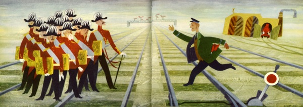
which you can find here (via Martin Klasch).  Both the story and illustrations are better if you ask me,

Lewitt-Him Little Red Engine illustration

to the extent that I might consider reading it to a real life small child.

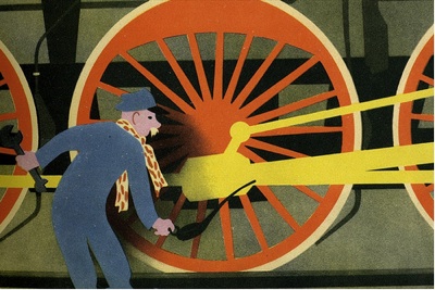
There’s also Locomotive, The Turnip and The Birds’ Broadcast, which I’ve never seen but a very nice man has posted the complete set of images on Flickr, so you can take a view for yourself.  My view is that it looks like the most delightful of the lot.  It is, however, as rare as hen’s teeth and proportionately expensive, so I may never get to find out.

Lewitt-Him loco book image

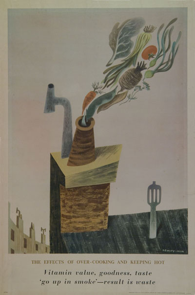
And finally, the Vegetabull poster wasn’t the only poster that Lewitt-Him did in this style.  I wanted to post one of the others simply because I never see it anywhere else.  So here it is.
Lewitt-Him Vitamin overcooking WW2 vintage poster ministry of food

Turning over several new leaves

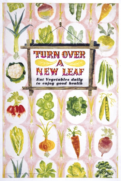
I’ve always liked James Fitton.  And I can say that with some confidence, as I had this postcard on my wall at university (quite some time ago now).  It’s one of his designs for the Ministry of Food, from just after the end of the war.

James Fitton Turn Over A New Leaf WW2 vintage poster

I’ve still got the postcard; more pleasingly, we also now own one of the original posters too.  It may have taken me twenty years, but I’m still quite chuffed about that.

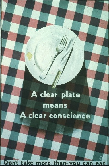
Even a cursory look at his poster designs reveals a man who had a whole range of styles at his command.  This Ministry of Food poster is from the same period, but can hardly be recognised as coming from the same hand (slightly pallid image from the Design Council Slide Collection).

James Fitton WW2 vintage poster clear plate

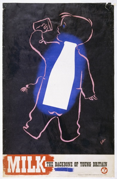
This milk poster is also from that era (and, trivia fans, is the one that you can see in the front of these images from Britain Can Make It).

James Fitton Ministry of Food vintage milk poster

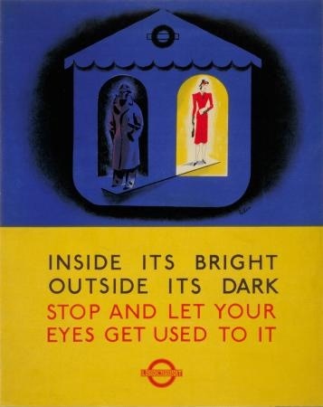
What that last poster does particularly show is Fitton’s use of really luminous colour (which must have been particularly hard to achieve with wartime/utility paper and printing materials).  His 1941 posters for London Transport (also here) have the same almost supernatural, and very appropriate, glow,

James Fitton WW2 poster london transport outside it's dark

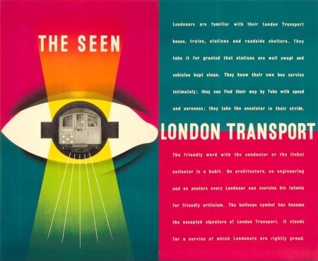
By 1948, they’re almost dazzling.  And of course in an entirely different style.

James Fitton The Seen London Transport vintage poster 1948

All of the above would, you’d think, would be more than enough to make him a revered and often-mentioned designer.  But it turns out that’s not the half of it.  The following is just an outline of what he achieved, the full shilling lives can be found here, here and here.

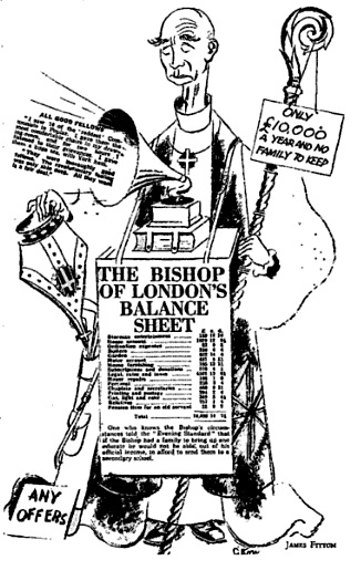
Throughout the 1930s, he was probably best-known as a cartoonist for left-wing periodicals such as the Daily Worker and Left Review.  His work was influential and seen as avant-garde at the time (as in the use of real newspaper print in the cartoon below).

James Fitton Cartoon for Left Review

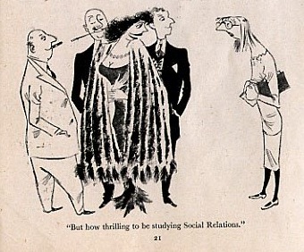
After the war, he continued working as a cartoonist and illustrator for magazines such as Lilliput.

James Fitton Cartoon for Lilliput

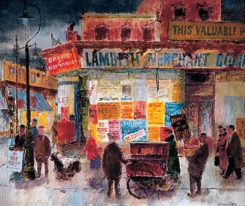
Then there was the painting.

James Fitton 1948 painting Brixton street scenet

(This 1948 Brixton street scene is now in the Museum of London).

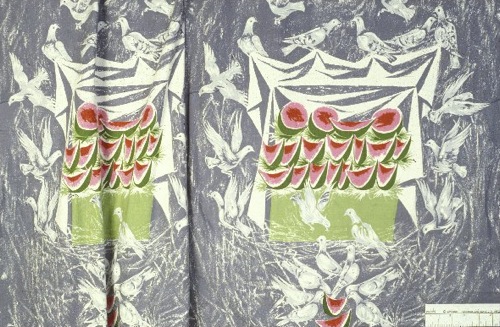
And he taught, he served on official bodies, and the Design Council slide collection suggests that he even found time to design some fabric too.

James Fitton fabric design Design Council slide collection

All of this while holding down a day job as the Art Director of Vernons, which he helped make into one of London’s leading advertising agencies.  I’m exhausted just reading about it.

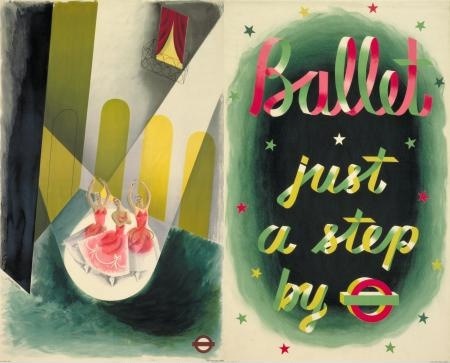
It may be that being able to work in so many disciplines is one of the reasons why he’s not so well known today; the collectors and writers about Lilliput don’t know about his posterworks, the cartoon historians have no idea that he’s also in the collection of the Tate Gallery and so on.  I think it’s a pity, and also unfair, as his poster designs are not only the equal of those by better known designers, but also have a haunting quality which perhaps carries over from his artworks.  In some ways I’d rather live with a Fitton on my wall (if anyone would like to send some, please feel free) than with many other posters.  Am I alone in thinking that?  Answers in the comments box below if you please. After this last rather lovely London Transport poster from 1937.

James Fitton vintage London Transport Poster Ballet 1937

Shine a light

This was sold on eBay on Friday.

Hans Schleger London Transport vintage poster

From 1944, it is a lovely piece of Hans Schleger/Zero in prime linen-mounted condition.  Mr Crownfolio and I did have rather deluded hopes of picking it up for a pittance, seeing as it was being sold in the States.  But it went for nearly £250 – unsurprisingly – which means that I can bring myself to tell you that the same seller has another one from the series on offer this week.

Hans Schleger ww2 vintage blackout poster london transport

In a way, I’m not really upset that we didn’t get the first poster.  It’s a classic, but I’m not sure I like it enough (certainly not £250 of enough).  Would it ever get framed and hung on the wall?  I don’t think so.

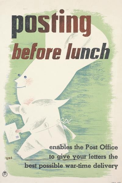
One of the reasons is that it may be a classic World War Two London Transport poster, but I’m not sure it’s a classic Schleger.  His posters are usually either a bit stranger, or at very least a bit wittier, like this GPO poster from just a year or two later (known in our house as the ‘Prawn Chef’).

Hans Schleger Zero GPO Posting before lunch poster

I wonder if there is a reason why his London Transport posters are so sensible.  Because the other thing that has struck me about the two offered on eBay is just how much they resemble other designers’ work on the same themes – and how much they all resemble each other.

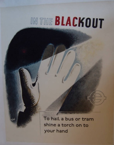
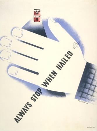
Here’s Tom Eckersley on the other side of the question – reminding bus drivers to stop when they are hailed in the blackout.

Tom Eckersley London Transport vintage WW2 blackout poster

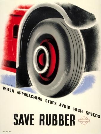
And also reminding the drivers to save rubber.

Tom Eckersley WW2 London Transport poster save rubber

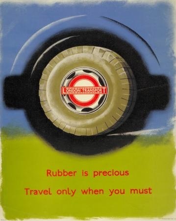
While James Fitton (whose work really does deserve more appreciation than it gets) informs the travelling public that they too can help save this precious wartime commodity.

James Fitton Save Rubber poster London Transport WW2

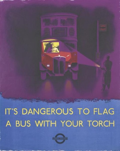
And finally, we’re pretty much back at the beginning again, as Fitton also tells us how not to flag down a bus during the blackout.

James Fitton blackout London Transport WW2 poster

Two things strike me from this series.  One is what a great designer James Fitton was, in particular for his luminous use of colour.  His posters easily stand up to the work of both Eckersley and Schleger.

The other – which was the thought that started all of this off – is that, for such a diverse set of designers, the results do have more in common than I would expect.  This is mainly in the way that they’ve all used a simplicity of technique, each poster illustrating the issue fairly literally with no visual puns or distracting images.  I wonder whether, somewhere in the heart of the London Transport wartime archives, there is a memo which says: This is war.  And safety.  So don’t let the designers get away with any of their clever-clever stuff.  Oh, and on the way out, make sure you give them an airbrush.  Perhaps I should write to the London Transport Museum and ask.

Fun and Games

Nice and simple today.  A high quality poster, in good condition, on sale on eBay.

Here it is, not occluded by the frame as it is in their picture.

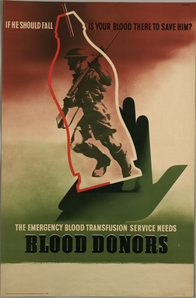
Abram Games blood donor WW2 vintage poster

It’s a very high quality item* to come up on eBay, and so I’m guessing that the price will end up being rather more than its current £3.45 when it ends on Sunday.  Either that or someone’s about to get the bargain of the century.  Watch that space.

*People probably do hold back from buying on eBay, especially when something looks as good as this does, fearing that it will be a reprint or a fake.  It’s a fair point, especially considering how many modern prints. fridge magnets and postcards come up every time you search.  But eBay are getting stricter these days, and the dealers are getting wise to this.  So any reprint or new poster will, generally say so somewhere in the listing, even if the print is tiny.

With something like this, expressly described as ‘vintage’ and ‘original’ in the listing, if it didn’t turn out to be the real deal, and you’d paid by Paypal, I think your case for getting a refund would be pretty watertight.

Which isn’t to say that there aren’t scammers, and that it’s safe to buy anything which looks half-way plausible.  Just that if I had the slightest thought this was going to go for under £150, I’d have a go myself, because it smells right enough to me.  But it won’t.  Anyone for a sweepstake on final value here?

And also, for those on a tighter budget, a poster that I’ve never seen before, but rather like despite myself:

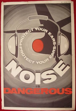
RAF noise poster from ebay

It’s an RAF poster, and I can’t find it anywhere else, other than on eBay here for just 99p as it stands today.  Something for every pocket, then.

Life (and design) During Wartime

Just because posters were produced at a time when some of the very best designers were working, it doesn’t mean that they were all great design, or even interesting.  This thought was brought on by a collection of posters on sale in Lewes next week.

The idea – 20 lots of wartime and post-war HMSO posters – sounds wonderful.  The reality is, sadly, rather less appealing.  The vast majority of the posters are pictures of tanks, aeroplanes or people fighting.  Dramatic, probably effective, but not for me.  Even the home front ones are anonymous, and more social history than art:

Let Your Shopping Help Our Shipping vintage WW2 poster (lot 591)

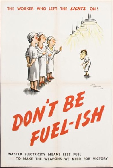
There are a collection of H.M. Batemans as well,

Don't be Fuelish vintage WW2 poster (lot 599)

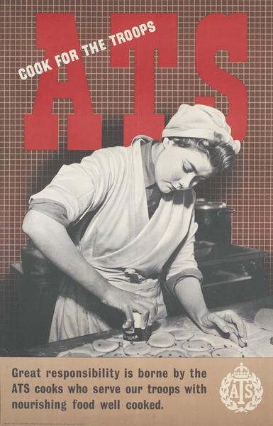
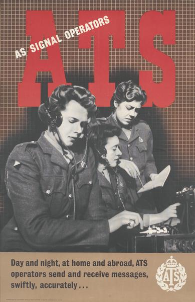
But to my mind, the best posters are a set of anonymous recruiting posters for the ATS, which I’ve never seen before.

vintage WW2 ATS recruiting poster (lot 606)

which are a rather nice mix of photomontage and snappy type.  If anyone has any info on the designer, do let me know; even the Imperial War Museum have them down as anonymous.

vintage WW2 ATS recruiting poster

But I still don’t even like these enough to go to the trouble of putting an absentee bid in and then, somehow, getting them transported from Lewes to Crownfolio HQ.

However, they’re still a salutary reminder about the quality of graphic design in the war vs the quantity.  I, certainly, have a tendency to imagine a bombed-out London plastered with one beautiful poster after another, all the work of Abram Games, Lewitt-Him or James Fitton.  The reality, however, probably looked nothing like that, and most walls were covered with exhortations, pictures of planes, speeches from Churchill and rather average illustrations.  The ones we cherish now were the exception, not the rule.

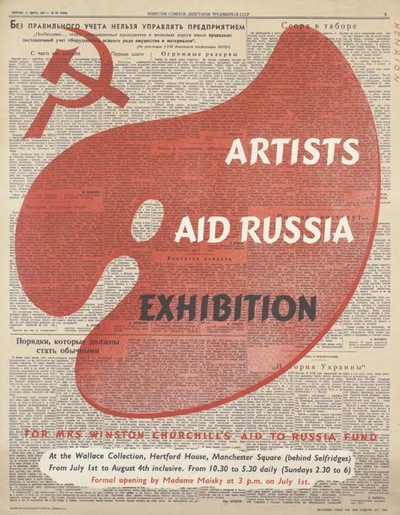
Still, some of them were great.  In the course of researching the auction lots, I came across this, a Henrion I’d never seen before.

Henrion artists and russia ww2 vintage poster

Now if that comes up for auction, even in the Orkneys, I’ll be making a serious bid.

Collect Posters Carefully

These thoughts are the result of what was quite literally fall out from my previous musings about poster sizes.  When I was scanning Eckersley’s illustrations, his obituary (from The Times, August 18 1997) dropped out of Poster Design.  And it told me something I didn’t know.

I’d always been aware of his being Tom Eckersley, O.B.E., but I had no idea that he’d got the honour in 1948, at the age of just 34.  It was in recognition of his contribution to the war effort.  Which looked like this.

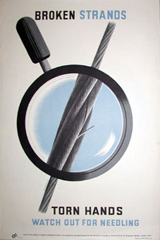
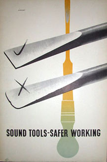
Tom Eckersley Rospa poster

And also this, amongst many, many others.

Tom Eckersley Wartime ROSPA poster

He was awarded the honour for all of his posters for the Royal Society for the Prevention of Accidents – and possibly also for the fact that he designed all of these posters while at the same time drawing maps for the RAF as his day job.  I find it really interesting – particularly in light of the current backlash against ‘Health and Safety’ – that this campaign was seen as such a central part of wartime propaganda, to the extent that Eckersley was, as far as I know, the only wartime poster designer to be honoured in this way.  Although please do correct me if that’s wrong.

But I’m not just telling you this because it’s an interesting snippet.  ROSPA, who commissioned all of these posters, have als0 put up an interesting archive of all of their World War Two Safety Posters, with images from Abram Games and Arnold Rothholz as well.  So there are lots of lovely images for you to look at, and a bit of history as well.  (If you want to follow the trail any further, it leads, with a certain inevitability, to Rennies who have many more posters on their site).