Some Decorative Drawings

Clearly I have the willpower of a small amoeba.  I write about something on here, but then I don’t just walk away, oh no.  I only have to go and buy it.  Like,  say, Motif, which I wrote about only last week.

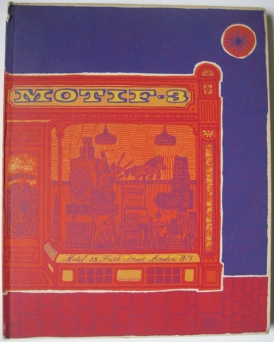
Motif 3 art journal of brilliance front cover by John  Griffiths

The good news is that we didn’t get the whole set of thirteen for £650, just two for rather less than that.  One of which is the one above.  But it’s the right one, because it has the shopfront illustrations in it.  And they are, frankly, brilliant.

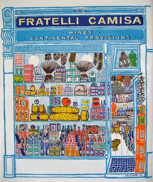
Motif 3 John Griffiths shopfront pictures Fratelli Camisa

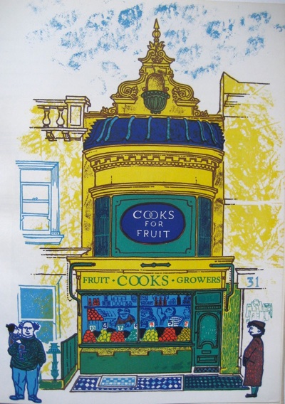
That’s my favourite, not just because it is utterly bright and enticing, but also because I used to go there, sometimes, in my London days.  And look at the little dog peering out of the door.  But the other illustrations are just as wonderful too. Here is Cooks Fruiterers in Brighton.

John Griffiths shop front illustrations from Motif 3 1959

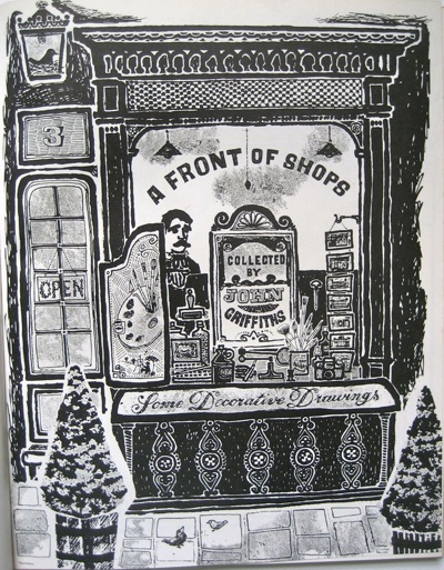
Pretty much all I can tell you about them is that they’re by John Griffiths.  Here’s his title page for the set.

Motif 3 shopfronts by John Griffiths title page

Now the style of these Decorative Drawings isn’t entirely surprising.  They could sit quite happily alongside the work of David Gentleman and Roger Nicholson from about the same time, as well as John Minton too; each part of the same neo-Romantic version of Britain in the 1950s.

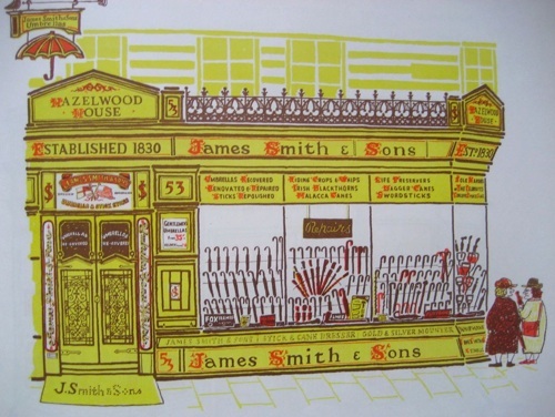
Smiths Umbrella shop John Griffiths Motif 3

And in their love of the myriad heaps of objects to be found within British shops –  here cooks’ striped aprons and white jackets for waiters – these drawings have obviously been born out of Eric Ravilious’s High Street.

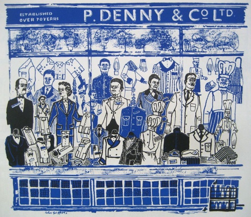
P Denny John griffiths Motif 3 work of brilliance

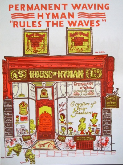
At the same time, though, Griffiths is very much doing his own thing.  This isn’t a representative High Street, rather a celebration of architecture and idiosyncracy.

Hyman waves shop front illustration John Griffiths Motif 3

In his championing of Victorian and Regency architecture, Griffiths is very much ahead of his time, along with pioneers like John Betjeman.

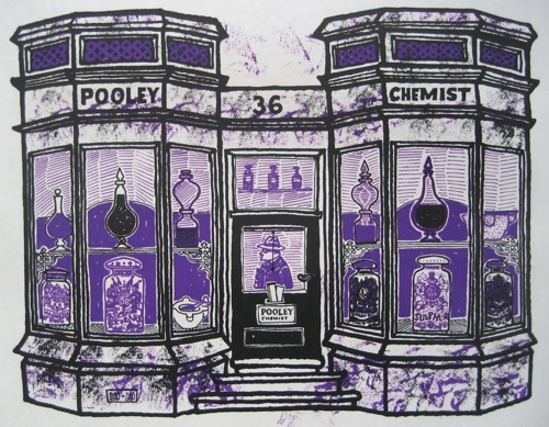
pooley chemist JOhn Griffiths illustration from Motif 3

But in his eye for the eccentric and quirky, he’s out on his own.  There are some great snippets of text accompanying the drawings.  The chemist above occasions the following comment:

Pooley the Chemist in Wimbledon Village took over what was a doctor’s house in 1825.  The manager almost apologised for the poor display in the windows and said they had lost their best jars in the war.  But what they have left are fine enough.

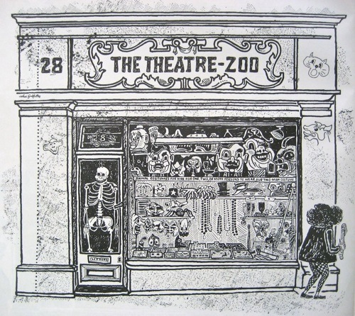
But it’s this which wins hands down, an animal costume shop off St Martin’s Lane.

Theatre Zoo John Griffiths Motif 3

He assured me it would be easy to change a lorryload of students into a cartload of monkeys.  A midget dressed in a bright red jacked with black and white check tights suddenly walked by whilst I was drawing the façade and I did wonder for a moment.

And there goes the midget, off on the right hand side of the picture.

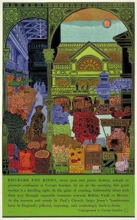
Motif can tell me almost nothing about John Griffiths other than that he was born in 1926 and designed a mural and theatre for the Garden Section of the British Pavilion at the Brussels International Exhibition 1958.  Irritatingly, the internet can’t tell me much more.  He designed a poster, Rhubarb and Roses, for London Transport in 1965.

John Griffiths Rhubarb and Roses 1965 Vintage London Transport poster

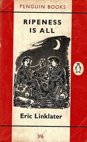
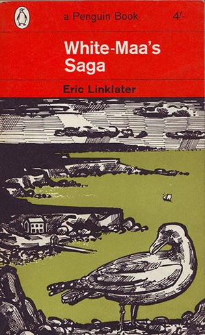
As well as quite a few covers for Penguin Books in the late 1950s and early 1960s.

John Griffiths penguin book cover ripeness is all

John Griffiths Eric Linklater book cover penguin

But that’s it.  Does anyone else know any more than that?  I hope so.

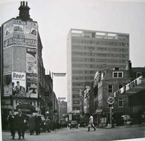
Finally, an extra treat from Motif 3.  Reyner Banham is writing about new office blocks in London, including this one for Thorn Electric at Seven Dials.  I’ve been past it so many times, but had no idea it was by Basil Spence.

Reyner Banham picture Basil Spence office block seven dials with posters

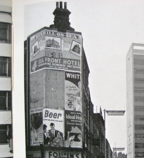
But that, you won’t be surprised to learn, wasn’t what caught my eye.  Because here are some posters too, as they were meant to be seen.

Banham poster detail

Proof, as if any more were needed, that not all posters were ever design classics.  Although I think we could do with a few more along the lines of Beer – Best Long Drink in the World!
Death and the Poster Designer

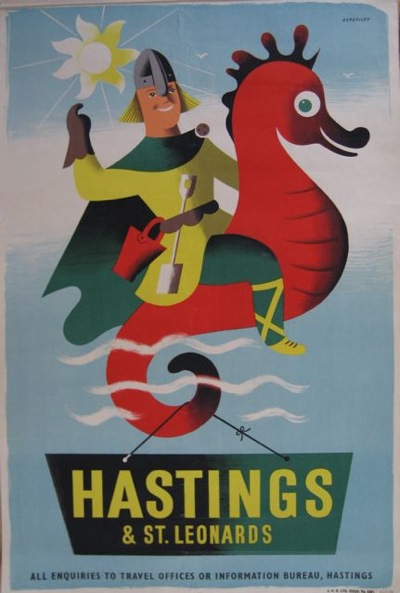
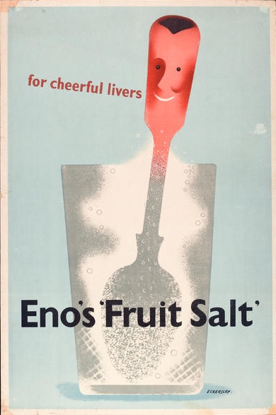
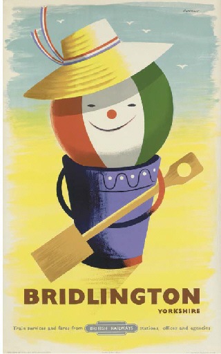
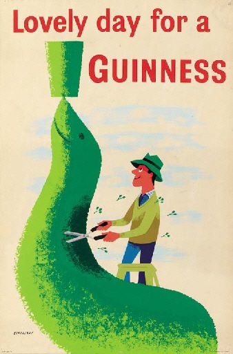
I’ve always loved the smiliness of Tom Eckersley’s posters.

Tom Eckersley vintage hastings travel poster
Hastings, n/d

Between the late forties and the mid 1950s, his work is filled with cheerful characters, from spoons to beach balls.

Tom Eckersley Enos Fruit Salts advertisement 1947
Eno’s Fruit Salts, 1947

Tom Eckersley Vintage British Railways poster Bridlington 1955
Bridlington, British Railways, 1955

And of course people.

Tom Eckersley Vintage Guinness poster seal topiary 1956
Guinness, 1956

So I was rather disappointed to discover that Eckersley himself didn’t like these posters later on in his life – he said that he wanted to get rid of the whimsy and the smiling faces as they almost made him angry.  Which seems a harsh judgement on something so delightful.

Then, a couple of months ago, I read an interview with the poet Jo Shapcott, in which she discussed her experience of having cancer.

I ask whether that period changed her sense of the world. She says it did, dramatically. “When Dennis Potter was dying, he filmed that famous interview, in which he talked about looking out of the window, and observing the blossominess of the blossoms with an increased urgency and joy. And I think that does happen to cancer survivors – apparently it’s really common to feel euphoria[.]

But it was her final words which really struck me – and, strangely enough reminded me of all of the posters above.

Does she still feel the euphoria she did at the end of treatment? “I do,” she says. “All these years later, it hasn’t gone away.”

Because perhaps we – and also Tom Eckersley himself – have been doing the 1950s a disservice.

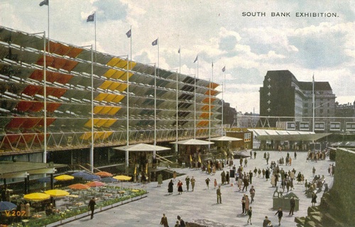
It’s really easy to characterise the early 1950s as an era which was almost feeble-witted.  See the women gladly strap on their floral pinnies and get back into the kitchen while the men take their pipes, sow the vegetable garden and tidy out the shed.  Imagine their pleasure in a brand new fridge or washing machine.  Look at their simple-minded delight in the primary colours and pretty shapes of the Festival of Britain or happy posters with smiles on.

Festival of Britain postcard

All of which is rather patronising, and, I think, wrong.

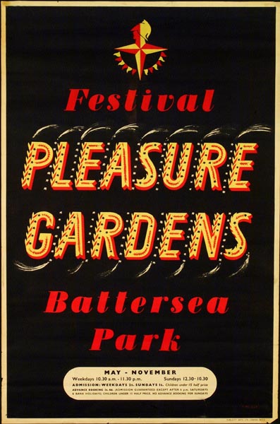
Because these are not a new generation of air-heads but the people who have lived through six years of war. For the first time it’s not only the men on active service who’ve faced death every day, but the women and children, the clerks and the old men too; they have all spent years in which they knew that they might not make it through to the next morning.  Having lived with death breathing down their necks for so long, might they not feel euphoria too once it has departed?

Festival of Britain Battersea Pleasure Gardens vintage poster 1951


They weren’t being dim when they they enjoyed the simple pleasures of their home, or the visual delights of the Festival of Britain.  Rather than a child-like wonder, it was the more c0mplex pleasures of people who have been through the fires and survived.  Perhaps, in fact, they were both more clever and more alive than we are now?

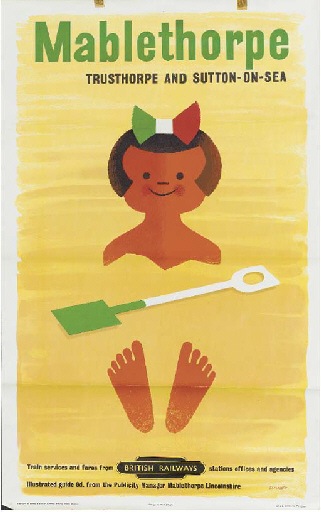
Tom Eckersley vintage British railways poster Mablethorpe

To be fair to Tom Eckersley, he himself partly knew this.  Because he also said of these posters that they were done sincerely. It was just that he couldn’t ever do them again.  Maybe, in the end, the euphoria does fade after all.

March Mad Hatters

Real life has rather got in the way of blogging for the last week, so apologies for that.  It’s also meant disorder here at Crownfolio Towers.  Yesterday, an unopened envelope turned up underneath a pile of newspapers.  It turned out to contain this.

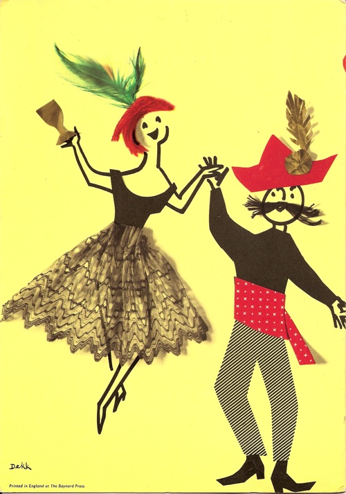
Dorrit Dekk Mad Hatters Menu card SS Arcadia design

We bought it on eBay for no better reason than it looked rather fun, but it turned out to be by Dorrit Dekk; her signature’s on the reverse.

Dorrit Dekk menu SS Arcadia Mad Hatters Ball reverse

It’s another P&O menu, this time for the Mad Hatter’s Ball Dinner on the SS Arcadia in 1962.  The chef recommends Jellied Turtle Soup.

I, meanwhile, recommend the P&O archive.  This is something that I’ve been meaning to mention for a bit, after it suddenly appeared in amongst a Google search a few weeks ago.  There are posters, brochures, luggage labels and much more.

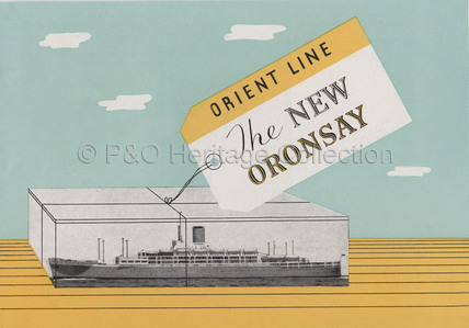
SS Oronsay travel brochure 1951 P&O Collection

The online selection is by no means comprehensive – there are, for example, only about 6 menu cards on show, which is about as many as we’ve got ourselves.  But it’s still much better than nothing at all.

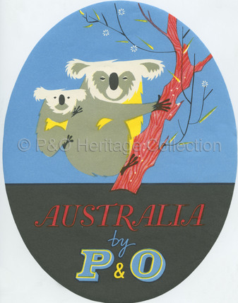
P&O Koala luggage label from collection

And there are some truly wonderful posters in there as well.  But I’ll come back to those in the next couple of weeks, because they really do deserve their own post.

The website also has a rather useful guide to where you can see pieces from the P&O collection in museums.  I can heartily recommend a trip to the River and Rowing Museum in Henley, which houses John Piper’s Landscape of the Two Seasons, designed for the Oriana in 1960.

Mural designed by John Piper for Oriana 1960 in River and Rowing Museum

The painting is much more spectacular in real life, not least because it’s monumentally large.  But it’s a very rare reminder of the almost industrial quantities of design and and art which were produced for P&O’s liners in the late 1950s and 1960s – other than that, it really is just the menus which remind us of the style in which it was once possible to sail.

One of the many, many things I have to do this week is book a trip on Brittany Ferries; I don’t think the experience will bear much comparison with the golden days of P&O.

Tweet tweet

Half term is taking its toll this week and so my attention (and sometimes my self) has mostly been elsewhere.  Normal service next week, I promise.

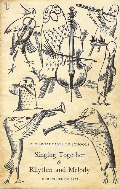
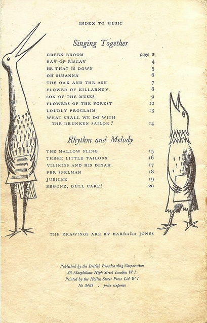
Still, there need be no excuses for not only more Barbara Jones, but, even better, more birds by Barbara Jones.

Barbara Jones BBC Schools Singing Together booklet

These come with the kind permission  of  Mike Ashworth and his amazing Flickr stream of stuff.  I can’t tell you any more than it says on the cover, other than that it cost him 5p and that is very much a bargain.

Barbara Jones BBC Schools booklet Singing Together 1957 from Mike Ashworth

Apparently there were a whole box of them in the shop, somewhere in Essex.  I wish I knew more than that, but I don’t.  So for the rest of us, it’s £11 on Abebooks.  Ah well.

Alert

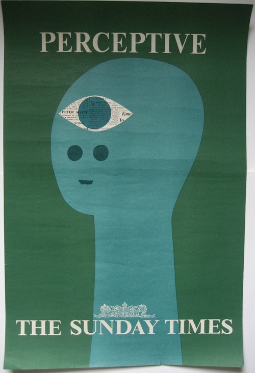
I mentioned a while ago that we’d got something interesting on eBay.  Well now they’ve arrived so you are going to have to suffer a bit of crowing.  Because it’s not only this.

Patrick Tilley Sunday Times Vintage 1960s Posters Perceptive

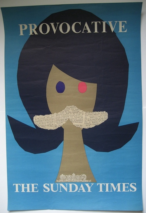
But also this.

Patrick Tilley Sunday Times Vintage 1960s Posters provocative

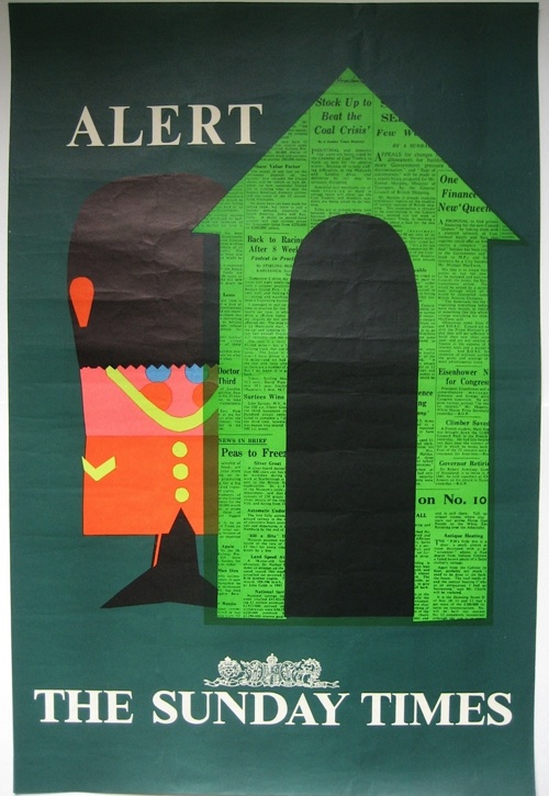
And this too.

Patrick Tilley Sunday Times Vintage 1960s Posters alert

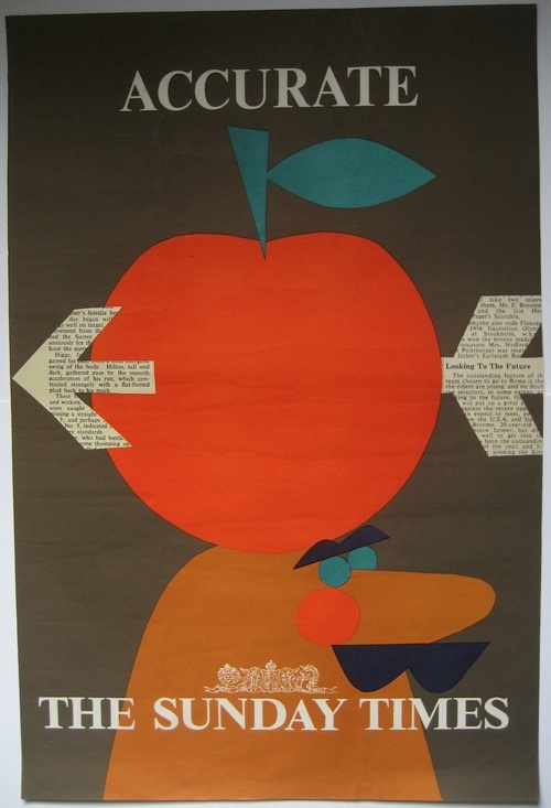
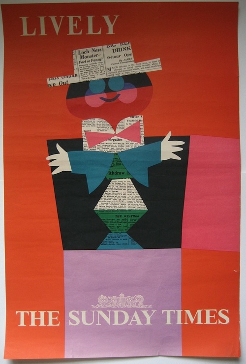
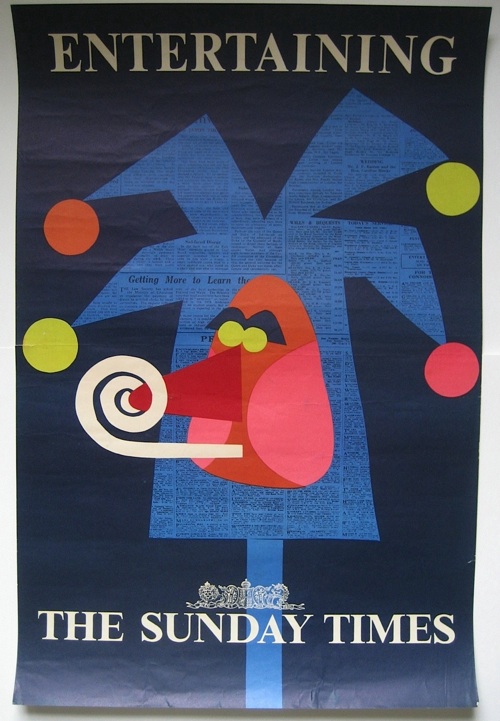
Along with the other three posters in the set.  As mentioned before on here, they were designed for the Sunday Times by Patrick Tilley sometime in the 1960s, and I’ve never seen one in the wild before, never mind six.

Patrick Tilley Sunday Times Vintage 1960s Posters Accurate

Interestingly, they look much better in reality than as scans or digital images; something I think to do with the collaged newsprint showing much more.

They came from a dealer in the U.S. who had in turn bought them from the widow of a man who had worked in the print industry and travelled to Europe a lot on business. He clearly brought back things that he liked from his travels.  And then kept them.

Patrick Tilley Sunday Times Vintage 1960s Posters Lively

They were originally up for sale on eBay, and as I mentioned on Monday there’s an interesting cautionary tale here about the ways in which eBay can fail.  Which is mostly that if something isn’t already popular, people won’t be searching for it and so it won’t be found.

I’ve never seen a Patrick Tilley poster up for sale, so we never search for them – and nor, I will hazard, do many other people.  So, up on eBay without the right keywords and no one finding them, this amazing set of posters only reached $20, which wasn’t anywhere near the reserve.  We then did a bit of negotiation and got them for rather more than that.  Although it still feels like a fair price. But maybe only to us, who knows.

Patrick Tilley Sunday Times Vintage 1960s Posters Entertaining

That’s Entertainment

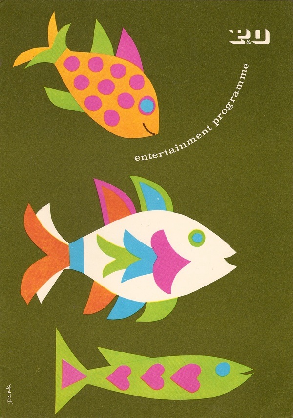
Today’s post has been brought to you courtesy of our postman, who rang the doorbell just as I started wondering what to write.  He was bringing us another classic menu by the wonderful Dorrit Dekk, at a guess from the early to mid 1960s.

Dorrit Dekk entertainment menu Canberra P&O

As ever, it’s not just a great design, it’s a window into another, vanished, world.  Would you care to meet our entertainers on this cruise around Fiji and the Solomon Islands?

“The Limits” – Beat Group
H.R. Hardie, Esq. – Lecturer from Sydney Stock Exchange
The Rory Irvine Trio
The Lee Kennedy Quartet
Sue Shakespeare, Disc Jockey

Oh brave new modern world that has Disc Jockeys in it.  And I haven’t even started on the Pyjama Dance or Golden Nugget.  I hope your weekend is as much fun as that.