Things

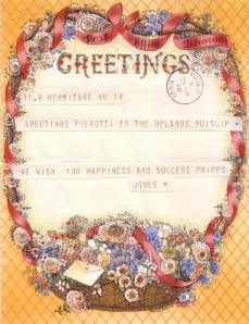
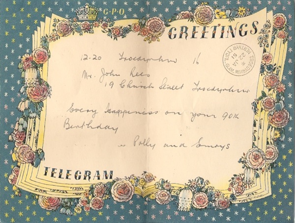
Which lead on to other things.  Like this greetings telegram.

Claudia Freedman greetings telegram 1950

It came from the local ‘Antiques and Collectors’ (i.e. 1970s cookery books, artificial flowers and old tools) market just near me.  A rare gem in amonst the flotsam, then.

Its main story – and why this telegram exists at all – is that it was sent by some people to someone else.  To John Rees, in fact, in Troedyrhw in Wales who was celebrating his 90th birthday.  He must have been well-loved, because he got a whole clutch of these, all written in the same hand by his local Post Office.  I hope he had a lovely day.

He was lucky to get anything as decorative, because it turns out that this design was the first Greetings Telegram to be produced after World War Two; his birthday was 22nd Jan 1951, and these were only reintroduced on 20th November 1950, as paper rationing was finally eased.  So it’s also a historical document of sorts, a reminder of a time when the world of austerity was finally ebbing away and pretty things just for the joy of themselves were permitted once more.

He was twice lucky because the first design they chose was also very good.  There’s a tiny signature in the bottom right hand corner which, when I squinted at it, seemed to say Freedman.  The lettering also looked a bit like his work, at which point I started to wish that I had bought the whole batch.  But I couldn’t quite persuade myself (or Mr Crownfolio) that the first word was Barnett, so went off to do a bit of digging.

What I discovered was that my instincts were not far off, as the design is actually by Barnett Freedman‘s wife, Claudia.  There’s a very good article on the blog Adventures in the Print Trade about both of their work, which gave me this biography:

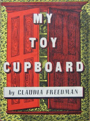
She was born Claudia Guercio in Formby, Liverpool, of Anglo-Sicilian parentage. She studied at Liverpool School of Art and the Royal College of Art. Working initially under her maiden name, she took the name Claudia Freedman on her marriage to Barnett Freedman in 1930. Compared to her husband, Claudia Freedman’s output was relatively small, but works such as the autolithographed book My Toy Cupboard (undated but published in the 1940s by Noel Carrington’s Transatlantic Arts) show that she had a talent equal to his.

Which then led me to finding the telegram in Ruth Artmonsky’s book Bringers of Good Tidings: Greetings Telegrams 1935-1982 where it is listed under her maiden name of Guercio.

The piece on Adventures in the Print Trade makes two crucial points, that her work, unlike her husband’s, is now pretty much unknown, and that there was never very much of it in the first place.  These two things may be connected.

They illustrate her very rare wartime book, My Toy Cupboard and it’s worth going over to the blog to see the rest of it, as it is wonderful.

My Toy Cupboard Claudia Freedman from Adventures etc...

But there is a bit more out there to be found.  Perhaps unsurprisingly, the trail also led me to Mike Ashworth’s Flickr stream (which will one day be declared a National Monument of Ephemera and preserved for posterity).

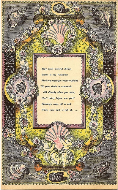
Claudia Freedman Shell advertisement 1950

Claudia Freedman designed this ad for Shell in about 1950, he tells me.  It’s a fantastically complex thing and must, I guess, have been designed for magazines as it could never have been reproduced in newsprint.

And finally, I came back full circle to not only a blog I have visited before but also another telegram.  This one was sent to A. Muriel Pierotti on her appointment as General Secretary of the National Union of Women Teachers in 1940, and so is now kept in the archives of the NUWT.

Claudia Freedman greetings telegram 1940

Despite the fact that it was sent during wartime, it is nonetheless decorated – the ban on these didn’t come into force until 1943.  I hope Muriel Pierotti enjoyed her appointment as much as Mr Rees enjoyed his birthday.

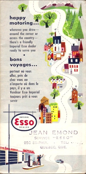
Not all objects are so forthcoming however.  I also bought this map of Ontario at the same stall.

Esso map montreal quebec 1950s

There is no artist’s name, no clue at all, just a very endearing town and the name of a garage on the back.

Esso montreal map back

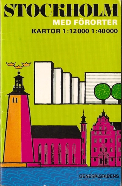
The only story here is mine; I bought it mainly because I have a stack of my father’s old maps teetering on the windowsill in the bedroom waiting to be sorted through one day.  My father loved maps very much.  Top of the pile is this Stockholm map, which he must have had when we used to live in Copenhagen and he travelled to Stockholm for business quite regularly.

Stockholm map from I do not know when but courtesy of ALN Walker

The Swedes clearly have no problem with being both historical and modern at the same time.  Unlike us Brits.

When I saw the Ontario map, it reminded me of the Stockholm one because it seemed to have the same sunny optimism about the city it portrayed, so I bought it.  And that’s the end of the story.
retromonochrome

A slight digression today, but as I shall be producing a wide range of 1950s graphics to support my case, I think it’s probably allowable.

For the last few months I’ve been writing a small book for Shire about 1950s Modern, looking at all the different ways that being modern was expressed in the design of the time.  And frankly, my retinas have been so seared by all the technicolour involved that they are only now starting to recover.

G Plan catalogue page 1956

This is G-Plan in the mid 1950s, adhering to the then universal tenet that one colour simply isn’t enough, and that the real fun in interior design is to be had with contrast, the bolder the better.

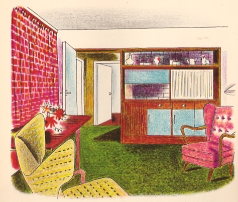
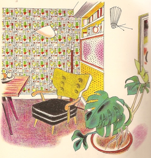
Want more proof?  Here is my prize exhibit, Noel Carrington’s 1953 book Colour and Pattern in the Home, which is so wonderful that I could quite happily scan the whole thing for your entertainment.

Noel Carrington Colour and Pattern in the Home doctors house

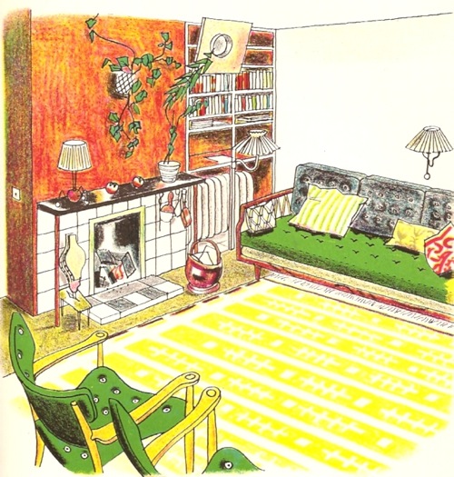
The illustrations are lithographs by Rowland Collins and are wonderfu in their own right.  But he’s not off drawing only the most avant-garde of houses – the interior above is in a doctor’s house in Tunbridge Wells, hardly a hotbed of revolution.  While below is the living room in a Georgian house in Norfolk.

Noel Carrington Colour and Pattern in the Home Georgian norfolk

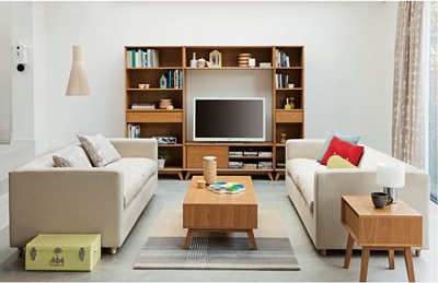
What struck me most after a couple of weeks of staring at this kind of thing, is how completely we have managed to forget 1950s colour.  There is a complete deluge of splay-legged, contemporary-styled furnishings out there to be bought, so much so that it’s a wonder that the retro antiques trade still exists.  But almost none of it is bright.  Here’s John Lewis’s current contribution to the flood.

More John Lewis retro furniture

While here is another one by a company called Plumo.

plumo

By way of reminder and contrast, here’s another image from Noel Carrington.


another one from Noel carrington book

There seems to be an almost complete amnesia about the high colour levels of the 1950s.  Instead, they have been replaced with a palette of grey, oatmeal and a slightly sludgy moss green.  The irony is that these are the colours that 1950s designers set themselves against, as one designer remembered.  ‘The days of varnish, brown paint and porridge wallpaper were served notice in 1951.  We were no longer afraid to start with white and then use any colour or combination from the rainbow.’

Does this matter?  On one hand it doesn’t at all.  Of course fashion revives things with a different twist, and styles never come back quite the same.  But I find it interesting for a couple of reasons.  The first is a very simple one, which is that it’s a reminder that history isn’t a fixed account, but always being rewritten and reinterpreted.  This applies to the visual sphere as much, if not more, than any other version.  So when the 1950s were first characterised, the kitsch appreciation of the style focussed on atomic design and eccentric pattern choices, along with New Look clothing.  Now there’s a demand for a more sophisticated kind of 1950s, that which would have been created by an architect furnishing his first house in Canonbury.  But even then, it’s not a complete recreation, because the colour has definitely been drained away.

John Lewis refined puritan

And I think this also tells us something about how we perceive history.  Back in the 1950s, colour was seen to be the most modern thing there was.  Not only did the birth of polyeurethane paints make it easier to put on the walls, new plastics meant it could also appear on everything from kitchen tables to dustpans for the first time.
Wareite Dining Room

This is Wareite, the British challenger to Formica, and one which got its name because it was made in Ware, Herts.  I do wish people still named things this way.

So the home was bright then, very bright.  But the thing is, colour is still something we see as modern now.  Should you go shopping in John Lewis to find your retro furniture, you will also discover some pretty bright objects in there too (in some cases, like silicone kitchenware, also born from new materials too).

John Lewis playnation 2012

So if colour is modern now, it definitely couldn’t have been modern 60 years ago.  Therefore we must look at the 1950s through a sepia-porridge filter in order to see what we want.  Even if the reality was actually somewhat different.

more. loud. furniture.

I do think that the patch of pink at the back is the extra touch which marks out this design as being truly 1950s in its pursuit of contrast.

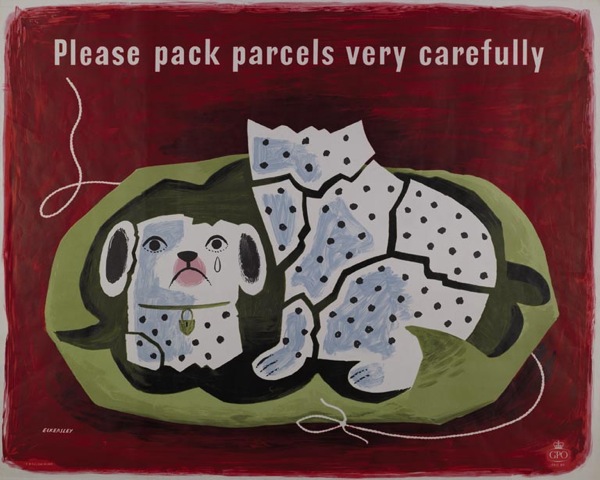
One final thought, is that despite years of looking at 1950s posters, I still find these illustrations startlingly bright.  Which suggests to me that although poster artists of the time did use a fair amount of colour, unsurprisingly for an object which is meant to grab people’s attention, they never got quite as contrasty as the interior designers did.

Tom Eckersley vintage poster Please pack parcels very carefully GPO 1957

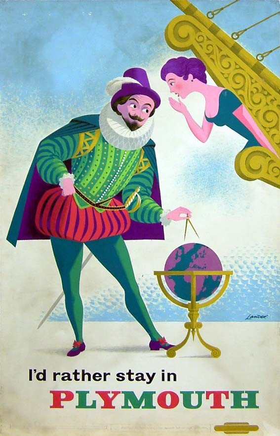
There are a couple of exceptions to this.  Lander was quite fond of some near-fluorescent colours on occasion.

Lander Plymouth artwork British Railways 1961

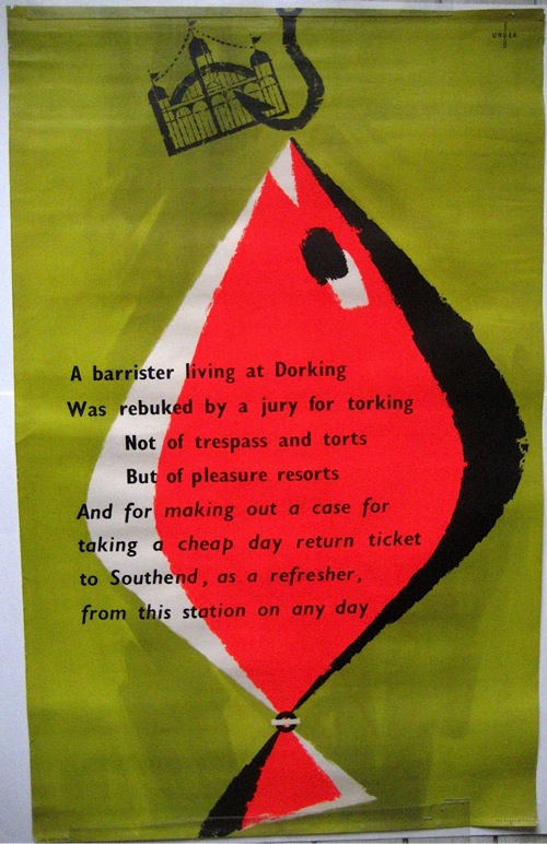
As was Hans Unger.

Hans Unger vintage London Transport poster fish Southend wonderfullness

But I wonder whether, perhaps, it just wasn’t the done thing.  A good poster was meant to arrest the viewer’s attention by the wit and economy of its design.  To do that by just using a bright colour or three would have been the easy route.  In fact it would have been close to cheating.  Not the done thing at all.

Midcentury

We used to go to Midcentury at Dulwich before we left London to go west, but that’s a long time ago now, and they certainly didn’t sell any posters at it then.  But now they definitely do.

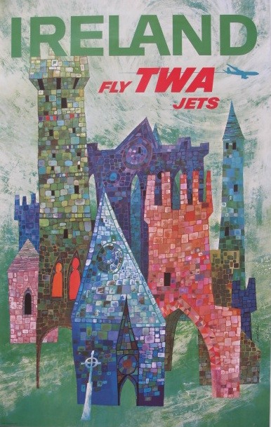
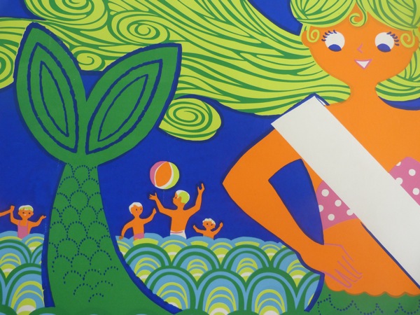
The next one’s tomorrow, and in a set of coincidences which make it look as though I have been planning this all week, you will be able to buy posters by both David Klein and Daphne Padden there.

David Klein Ireland travel poster from Travel on Paper

Daphne Padden coach poster for seaside

The David Klein is being sold by Travel on Paper, who will also be bringing a few very apt coach and railways posters along.

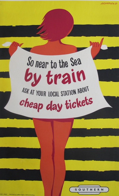
Bromfield Southern Region so near to the sea 1950s vintage poster

(I know that poster’s been on here before, and I still don’t know what it’s trying to tell me).

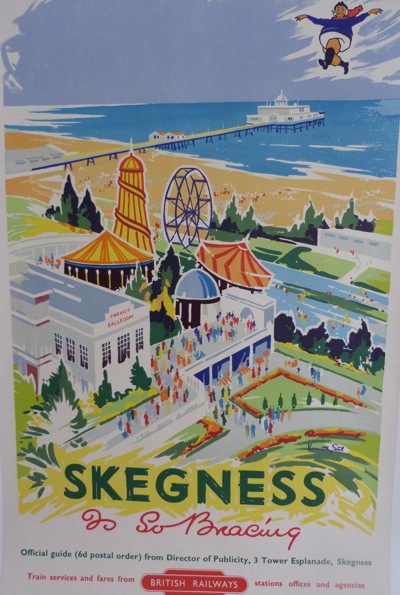
While Dan from Modernish will be selling the Padden, along with this technicolour gem.  Beware flying fishermen.

1950s vintage British Railways poster Skegness

One day I must do a small but important post on ‘Imagery of the British Fisherman in travel posters 1920-1960’.  Bet you can’t wait.

Anyway, there are other dealers there too, including Kiki Werth so there will definitely be more on offer.  And if anyone does go, can they come and report back here please.

It’s 1959, OK

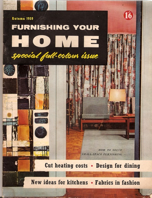
This has been sitting on my desk for a few weeks.

Furnishing Your Home 1959

Now, I’ll be the first to admit that it’s not a great example of graphic design nor interior styling.  But it has been making me think.

Because this is Autumn 1959, the calendar is about to turn over into the 1960s.  That’s not the only thing which is going to change either, as there’s a new design style in the offing too.  You can see it here, the splayed legs of the contemporary have become straight, the acid bright colour contrasts have become more muted, the typefaces starting to go less Victorian, more sleek (although that yellow script is still hanging on grimly from the jollier 1950s).

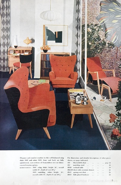
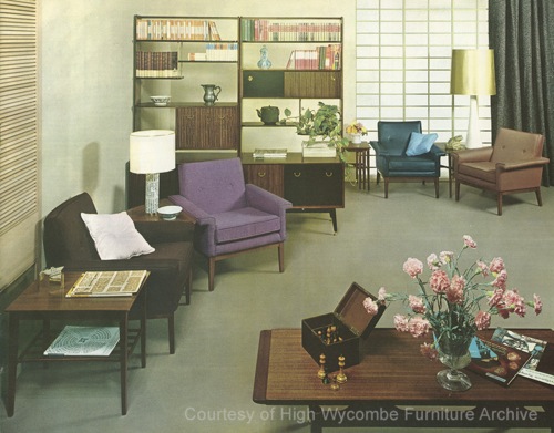
In short, what seems to be happening here is that Britain is, finally, getting the hang of International Modernism.  Here’s another dose of it for you, a G Plan room from from 1962 (and while I’m here, I can’t commend its source, the High Wycombe Furniture Archive, too highly, at least if you want to look at industrial quantities of G Plan and Ercol furniture).

High Wycombe G PLan room 1962

Robin Day was doing this kind of thing even earlier than that, as I’ve mentioned on here before.

Robin Day exhibition stand for ICI Royal Agricultural Show

It’s the Mies van der Rohe Pavilion reconfigured in Shepton Mallet; not something which happens often enough really.

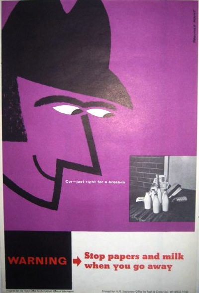
Seeing as this claims to be a blog about graphics, here’s a a couple of more relevant examples, by Reginald Mount from 1962 and Hans Unger from 1966.

Reginald Mount vintage CoI poster 1962 home safety

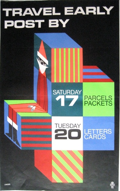
Hans Unger vintage 1966 GPO poster

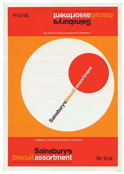
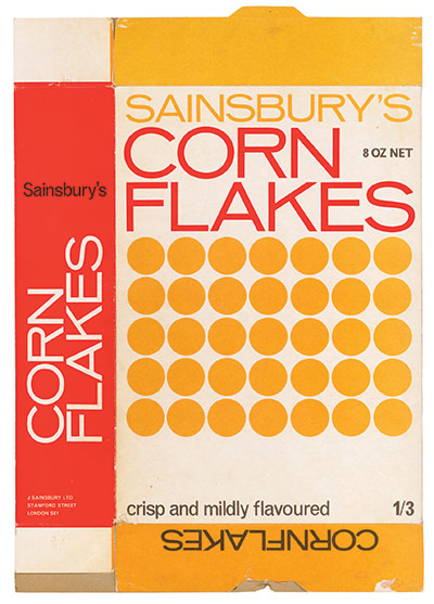
I also think the Sainsbury’s graphics also represent a similar trend – no, they are what a modernist supermarket ought to look like, albeit one modulated through the idiosyncratic colour choices of the 1960s and 70s.

Sainsburys Own Label biscuit genius

and cornflake modernism

Now – and this may be a deficiency in my reading rather than anything else – I don’t think I’ve ever seen the 1960s described in these terms.  As Pop art, yes, as Mod, that too.  But not as modernism. Have I missed this somewhere?  And can you point to it if I have?  Because I think I’d like to know some more.

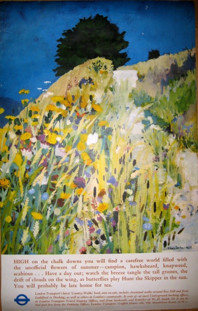
Having said all that, in the interests of balance I do have to report that a cruise through our posters, at least, also reveals a huge quantity of design which does not conform to this theory in the slightest – take this 1967 London Underground poster as just one of many examples.

Vintage London Transport poster 1967 Christopher Hill Chalk Downland landscape of the gods

The British love of both landscape and whimsy tends to trip up the modernist impulse in graphic design perhaps more than in other places.

Then there was psychedelia to take on board shortly afterwards to boot.

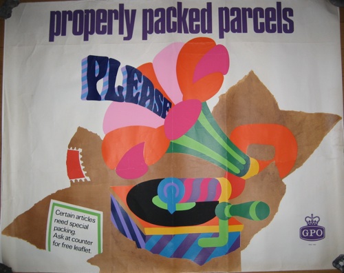
Properly Packed Parcels Please tom bund 1968

So perhaps the argument holds more true for interiors.  Or perhaps it’s not the case at all.  But I would like someone elses’s thoughts please.

Mr Black will see you now.

I haven’t finished with exhibition design, not by a long way.  A copy of Misha Black’s Exhibition Design recently arrived in the post. He’s a much droller read than Beverley Pick – as well as designing some rather nice exhibitions too – so parts of that will definitely be appearing on here one of these days.

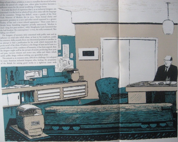
But in the meantime, that reminded me of Motif magazine, to be precise issue 4, because I photographed this ages ago and then left the results languishing.  For here is Misha Black himself, waiting to see us in his office.

Mischa Black in his office from Motif Issue 4 Edward Hughes

He’s writing about taste, style and the Industrial Designer, and I should probably read it thoroughly one of these days.  Although the essays of this period on the moral arguments for good design over popular taste are not among my favourite things, as they mostly tend to pontifications.  This issue of Motif is from 1960, though, so they are coming to the end of the the line; any moment now his arguments will be exploded by Pop.

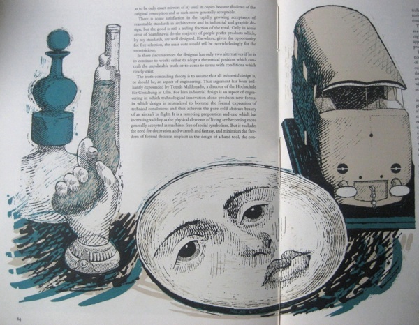
The drawings, however, by Edward Hughes, are lovely.  Here is the miscellania on Misha Black’s shelves.

Misha Black's shelves, from Motif 4, Edward Hughes

It’s pretty good issue all round, really.  There’s an article on

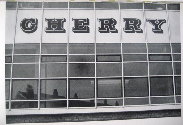
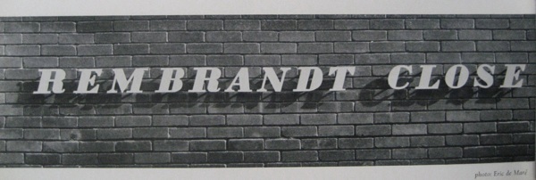
Typography on buildings

featuring such delights as this.

type on building one

And this.

more type on buildings

Although Mr Tracy isn’t very impressed with the one above at all.

A plastic version of fat Bodoni italic: debased – the serifs have been thickened and the counters have been squared off – presumably to make the letters easier to produce.  This letter form has no relationship (either of harmony or contrast) with the wall surface or the architectural style of the building.

That’s them told.

Also in there are pearly kings and queens, illuminated advertising in Piccadilly Circus and antiquarian prints; truly there is something for everyone here.

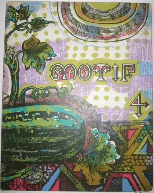
But my favourite thing of all is the cover.

MOtif 4 cover Laurence Scarfe

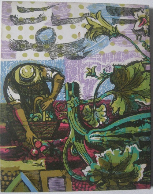
It’s by Laurence Scarfe, who is clearly someone I ought to know more about.  Here’s the reverse.

Laurence Scarfe Motif reverse

We’ve just been offered some space to grow vegetables in, and that is what it is going to look like at the end of the summer.  For definite.

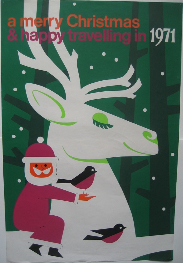
Happy Christmas

From Daphne Padden and the coach companies.  And all here at Quad Royal of course.

Happy Christmas poster Daphne Padden 1971 Coach companies

As befits my BBC past, there will be some repeats over Christmas and New Year; a normal service will return in January.  Have a good time until then.