Sad sack

This post is very simply two good things which have arrived on my desk recently.  The first is this Central Office of Information poster from 1950, photographed as well as I can manage under the rather folded circumstances.

CEntral Office of INformation Production poster 3

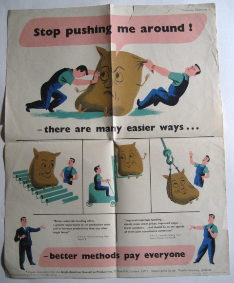
I know it’s from 1950 because that is when, apparently, the Anglo-American Council on Productivity produced their report on Materials Handling.  Now I have researched this quite a bit more in the hope of finding an interesting backstory, but have to report that there is no such thing; the truth is entirely dull and intermittently depressing.

Post-war American aid to Europe, including Britain, didn’t just consist of dollars, it also came in the form of technical assistance, of which the Angl0-American Productivity Committee was just one part.   At this point, American companies were two to three times more efficient than British ones, so you would have thought that paying attention might have been worthwhile.  But British companies didn’t want to hear: they thought they knew best, that you bullied and cajoled your workers not co-operated with them, that specialists were inferior. And so nothing happened.

Which is sad, because it means that this rather endearing little poster is actually a portent, the first sign of what would in the end happen to British industry in the 80s and beyond, as companies never put their raw materials on rollers but carried on heaving the sacks instead.

Meanwhile, on the further subject of inefficiency, how to run a railway.

Royston Cooper Railway leaflet want to run a railway?

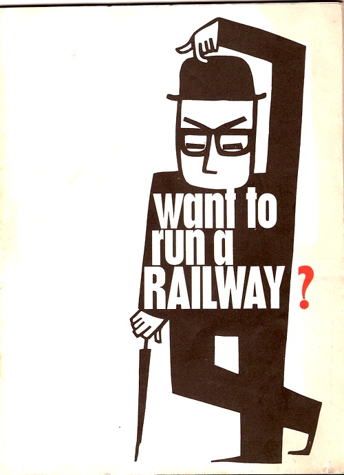
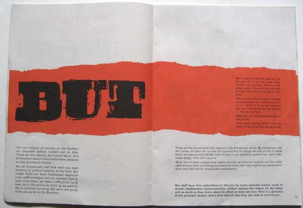
The truthful answer to the question posed by this little booklet is no I don’t, thank you.  But it has gained houseroom because it is by Royston Cooper, who designed the insides too.

Royston Cooper railway leaflet fault spread

The whole thing is excellent, and dates from 1962, as this final page tells us.

Royston Cooper railway leaflet end design

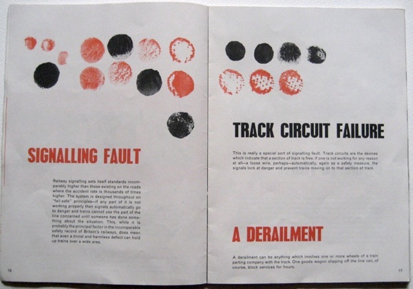
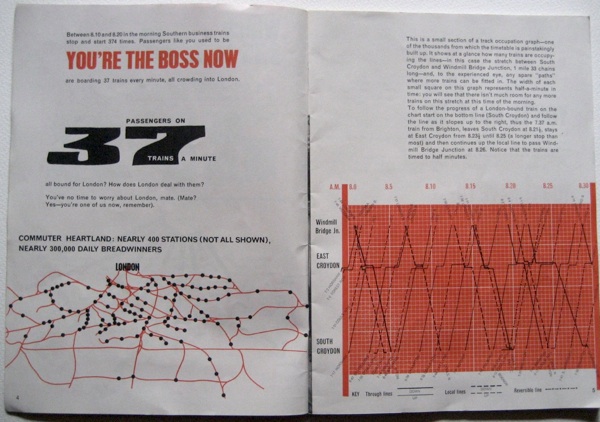
The content, funnily enough, despite my almost total lack of interest, isn’t bad either.  The point of it is to prove that it’s actually harder than you think to run a railway, lots of things can go wrong and so please can you be very nice to Southern Railway when they do.

Royston Cooper Railway leaflet spread

We could probably do with a reprint now.

Royston Cooper but

Industrial

You arrive here today to find me eating my own words.  To be specific, these words – and these as well – about the lack of posters depicting the industrial North.

The cause of this is the catalogue for the new Talisman railwayana auction, which has just arrived in the post,

Talisman March 2012 auction cover

By far the best thing in the auction is the poster which is part shown on the cover, lot 321.

LNER quad royal pictorial Poster “East Coast Industries served by the LNER”. A dramatic image by Frank H. Mason of a blast furnace in full production. Folds, minor edge tape stains and nicks and two very small corner losses. A superb poster otherwise.

Such a superb poster that I wanted to find a proper illustration of it to post on here.  I couldn’t, so this, from the catalogue, is the best I can offer.

Frank Mason East Coast industries smelting poster

On my travels, however, I found  another one from the series in the National Railway Museum collections via the NMSI.

‘East Coast Industries’, LNER poster, 1938.

While this depiction of a blast furnace has been sold at various times by both Onslows and Christies.

Frank Mason East coast industries blast furnace poster

They all date from 1938, so we have ourselves a series here.

There is a fourth one in the NRM collections, although it’s less overtly modern and mechanised than the rest.

'East Coast Industries’, LNER poster, c 1938.

There’s also one further poster, a kind of post-script to the series, which is this World War Two effort.  It’s also by Mason and was produced just a couple of years later with a very different message, although a somewhat similar aesthetic.

The Lines behind the Lines’, BR poster, 1939-1945.

From all of which, two conclusions.

The first is that there is more to Frank Mason’s work than I’ve previously given him credit for.  I’ve always known he was good. but somehow never found him interesting.  Those top three posters, however, really are triumphs of modernism in the most pernickety sense of the word.  Mason isn’t just using a modern sttyle, he is also trying to make these industrial processes heroic and glamorous.  And I think he succeeds.  (Note also the almost complete absence of people in these posters, the industries are so modern that they practically run themselves.  I’ll be coming back to this idea in another post one of these days.)

The second conclusion is that I was wrong about the absence of Northern industry in the visual language of railway posters.  Clearly, these places and industries are represented, at least in the period between the late 1920s and World War Two.  What instead has happened (as in the very similar case of World War Two posters) is that people later on have chosen not to reproduce, or buy, or sell these posters in any great number.  They have in the main not been written into the later narrative.  So perhaps it’s not the 1920s and 1930s I should be complaining about at all.  It’s us that have chosen to forget the steelworks and the collieries and the Midland s and the North.  The attitude is almost understandable now, when they’ve been eviscerated.  But perhaps the forgetting was where the problem started to begin?  Either that, or it’s the way in which we were persuaded that what happened to these places in the 1980s was OK.

Great Central Ladybird

The New Year has hardly begun, but the first auction is already upon us.  Held by Great Central Railwayana, it takes place on 19th January – and there are quite a pleasing crop of posters included.  Although, as ever with railwayana auctions, there are no estimates and very little in the way of dates either.  I will persevere regardless, although not without saying once again that if they did include estimates I’d probably punt a few more bids their way.  But that’s their loss and, in the most part, my gain.  I think.

Anyway, if you’re sitting comfortably we’ll begin.  I will skate over the vast numbers of topographical posters.

Pitlochry British Railways Poster McIntosh Patric

They are there, they look like this kind of thing, I have nothing much to say about them really.  Well, except that the catalogue pictures are weirdly washed out.  I’ve fiddled with the exposure and saturation a bit, simply to stop this post looking like it’s been produced in Sepiatone, but I have no idea what the actual posters look like.  They can’t all be that insipid, can they?

Although if you do want a classy bit of topography, you could do worse than this Fred Taylor, I must say.

Rred Taylor Ripon Cathedral railway poster

The Ladybird school of mildy kitsch retro illustration is also very well-represented.  I offer you just a couple of samples here, there are plenty more where these came from.

Rothesay Isle of Bute Figis poster British Railways 1950s


Harwich-Dovercourt Bay BRitish Railways poster Fryer


Or for the full kitsch blow out, there’s always this.

Butlins, British Railways poster 1950s


But if you like the 1950s, there are better things to spend your money on.  Like this Lander, for example.

Largs Ayrshire Lander poster British Railways 1950s

I don’t think I’ve ever seen it before, and I rather like it.  Also included in the sale is this, which must be among his earlier works.

Ross on Wye Lander poster GWR

Although I have to say, this poster raises more questions than it answers.  It’s not that it doesn’t look like his other stuff – I’m quite happy to believe that he was working in this kind of style in the 1930s.  But up until the Second World War, and possibly beyond, Lander was head of the Ralph and Mott drawing office and, as far as I know, not signing things with his own name.  So what’s going on here?  Was this one of the few posters produced in the name of the old railway companies just after the war?  I have seen one or two of those before.  Or is he moonlighting?  Or what?  I may never know.

I also like Alan Durman‘s somewhat sidelong take on 1950s topography too.

Alan Durman Tunbridge wells british railways poster 1950s


But for once, my two favourite posters date from before the war.  If we weren’t saving up our money for new windows, I’d definitely be bidding on this Frank Newbould.

Frank Newbould camping coaches poster LNER

If I thought we could afford it, we’d might well  be bidding on this Tom Purvis too.  But fortunately we’ve got one already.

Tom Purvis East Coast baby yellow railway poster

Once upon a time ago on eBay, we were lucky enough to get a chewed up copy to restore.  But that was many years ago, when posters were cheaper.  I doubt we’d even be able to afford that these days.

Missing in Action

At some point over the weekend, Mr Crownfolio and I happened across a BBC4  documentary about British war films of the 1950s.

The programme itself felt like a bit of a missed opportunity to me.  The way in which the British had to come to terms with what had happened in World War Two by endlessly processing and reprocessing the history is fascinating – and something which continues almost to this day as stories like Bletchley Park are slowly revealed.  But the programme got rather diverted by getting an interview with Virginia McKenna and giggling over Sylvia Syms’ cleavage instead.

However I’m rather glad we stuck with it as, towards the end, this appeared.

League of Gentleman film poster quad royal

It’s good, isn’t it?  But I have no idea who it’s by, and the internet can’t seem to enlighten me – something which isn’t made any easier by the fact that any search for League of Gentlemen inevitably gets confused by rather a lot of Royston Vaisey.  Although I can tell you that the Swedish version is possibly even better.

League of Gentleman swedish film poster

But can any of you tell me who it’s by, as I’d really like to know?

Just to add to the confusion, there’s also a crown format version, which I am guessing is by a different hand.  Although I can’t identify this artist either.

the-league-of-gentlemen-movie-poster-1960-1010209065

Answers, if you have them, to the comment box at the bottom of the page please.

Who let the dogs out?

By popular request, it’s Christmas sausage dog time  again.

Lewitt Him vintage GPO Christmas poster 1941

Thanks to Lewitt-Him (above) and Beaumont (below), and of course to the presiding spirit of British Whimsy.

Beaumont Post Early Sausage Dog vintage 1950 GPO Poster

Dogs are clearly better that getting organised for Christmas than I am.

Pause

This post is basically me waving the white flag of surrender for the next week or so while the house move finally takes place.  But instead of a white flag I thought I would offer you a pale poster instead.

Vintage Post Office Savings Bank poster Combs pre war

I know this isn’t in the best condition ever, but it’s interesting enough to be worth looking at anyway.  I know precisely nothing about it (the Post Office Savings Bank posters aren’t archived on line yet) except that it is good and that I don’t think I’ve seen very many pre-war POSB posters before now, if indeed any.  Oh and the signature says, I think, Coombs, but I am none the wiser for that either.

I’m hoping to be back within a week, not least because the Onslows catalogue for the December sale is now up.  But perhaps you could all go and have a look and crowd-source some opinions for me in the meantime.