Plain Sailing for Women

Three things you might want to know about Tisbury in Wiltshire.  Firstly, it has a very nice rural station, drowsy in the Adelstrop kind of way on a summer’s afternoon.  Second, Mr Crownfolio’s forefathers made the clock in the village church.  Last and probably most interestingly of all for most readers of this blog, it has a second-hand bookshop which is at this moment selling some posters on its website.

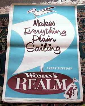
Woman's Realm vintage newsagents poster

They’re not the best examples of graphic design you are ever going to find (the one above is probably my favourite of the bunch).  But they are rather interesting, because they’re a kind of poster which doesn’t normally survive.  This particular batch came from the attic of a newsagents.  They would have been changed in the shop almost every week, and the old ones were just obsolete and so thrown away, apart from this one newsagent who clearly stuffed them into the attic for whatever reason and forgot about them.

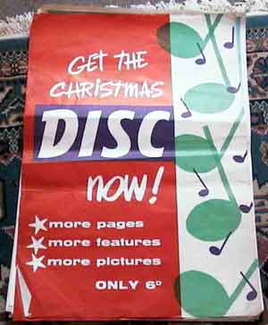
Christmas disc newsagents poster

So regardless of what you think of their style, they’re probably very rare.  And as such they’re a useful reminder that we just don’t get to see most of the graphic design produced between 1930 and 1960, only a tiny proportion actually survives.

The other important thing to remember is that it does tend to be the good stuff which survives too.  Not only are average posters like these less likely to be kept in the first place, but most of the reference materials available today (I’m thinking about Graphis and the Modern Publicity annuals here) are also only selecting the best.  The mediocre just disappear from the record.  So a cache like this is design history gold dust, regardless of whether you’d like to have them on your wall or not.

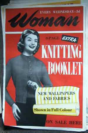
Knitting booklet newsagent poster

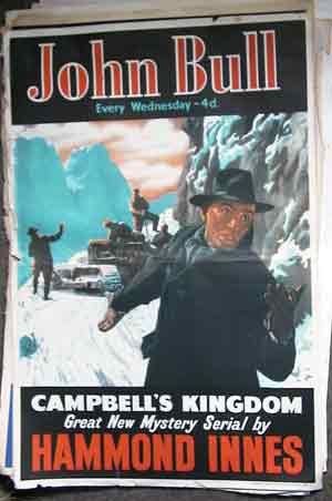
But there’s more to these posters than just being a sample of the forgotten graphic design of the 1950s.  They also give us a view into the highly gendered world of the decade where men need action and adventure – note also that men are identified with John Bull, i.e. Britain itself.

John Bull poster

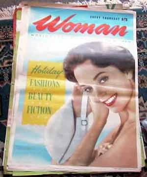
While women, separate to the body politic, need only to think about holidays and clothes.

Woman magazine newsagents poster

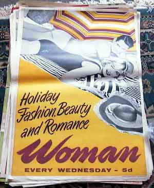
Woman magazine newsagents poster

Oh, and romance too.

Now the above may seem like a statement of the blindingly obvious, but it’s a point worth making because, strangely enough, this kind of gender-defined vision doesn’t actually happen much in posters of the same period, and this is something that I’ve been meaning to comment on for a while now.  In fact the posters of the 1950s are probably aimed more at a neutral audience than even a newspaper is today.

I will expand on all of this in a longer post one of these days*, but just to give you an example, the Guardian illustrated a story about the Ivy on its business pages yesterday with an image of Keira Knightly, who has apparently eaten there now and again.  The presumption is clear, that any reader of these pages, is a man, and so would rather look at Keira Knightly than a picture of some food, a male chef or the front of the Ivy.  So why don’t 1950s advertising posters usually do that?  I genuinely don’t know.

*One of the reasons I haven’t written the post yet is that I have lost one of my key exhibits.  It’s a railway poster depicting a man carrying a tray of tea (including a china teapot) across the beach to his family.  My idea of holiday heaven, but I can’t trace it, so if anyone knows the poster I mean, can you let me know what resort it’s for?

Rus vs Urbe

I have three ideas bobbing around in my head today, along with a suspicion that they are in some way connected, even if I can’t quite identify how yet.  The only way to find out is to write them down, so apologies in advance if it turns out that they aren’t.

Let’s start with the most tangential, the North Sea Radio Orchestra.  Who are brilliant, but so far off the topic of this blog that I won’t say much more than that, except that they are very English, historically rooted and pastoral (and thus also connected to yesterday’s post) but also modern.  Trying to find out a bit more about them, thougb, I was struck by – that’s struck in the sense of really quite irritated by –  a review of one of their concerts.

“it’s frequently a fine and lovely thing. But in some ways it can’t help feeling like a retreat… Certainly there are moments of beauty, but ultimately it’s like stepping back into an alternate, pre-war England where rock’n’roll – not to mention mass industrialisation and immigration – never happened. Which is fine for a night, but I wouldn’t want to stay.
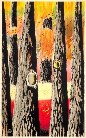
Vintage London Transport Poster Autumn Woods Keith Cunningham 1950
Out and About: Autumn Woods, Keith Cunningham, 1950

The implication here is that the modern world of cities and tarmac has wiped out the rural and romantic aspects of Englishness for good.  Even at face value this is a fairly contentious statement: I live in a small town, the countryside is not very far from my front door and I can say with some certainty that, despite the factories, Tesco and a global economy, the fields and hedges are still there.  But more to the point – at least for this blog – this sets out very clearly one point of view in a problem that I keep coming back to on Quad Royal, that of Englishness and modernism.
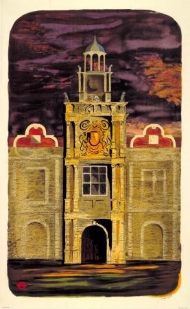
Out and about: country houses S John Woods vintage London Transport poster 1950
Out and About: Country Houses, S John Woods, 1950

For the reviewer (one Ben Graham, you can read his whole review here if you want), the modern tarmacadam world  has made the ‘old’ version of Englishness, rooted in the pastoral and the historic, in the tracks over the fold of the hills, irrelevant.  The real world is only now contained in the fluid city, in machines and cars and – for him at least – loud electric guitars.  And while I’ve made the argument sound a bit daft here, this is in the end the central narrative of modernism.  Only things which represent the streamlined bustling city can be modern, the rest is pointless, even reactionary.  By which standards the English regularly and repeatedly fail at being modern in any way.
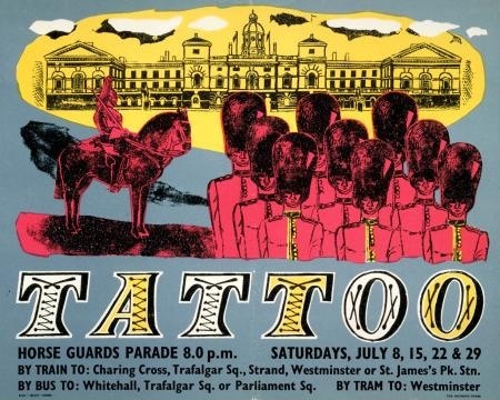
Tattoo, by unknown artist, 1950 vintage London transport poster
Tattoo, Anonymous, 1950

Another story is, though, starting to gain some currency (in this book this book for starters), which is that the British/English were producing modern design, and thinking about it very hard; it’s just that what they produced was a different modern which maintained a connection to older traditions as well.  We live in a country which has both landscape and cities; modernism’s inability to reflect this was the failure, not us. So modern British design doesn’t always look like you expect.  (And modern British music might not always have an electric guitar in it either).

All of which brings me back to Graphis 31, the survey of British Graphic design in 1950.  Now, if ever there was a moment in which Britain wanted to be modern, this has to have been it.  A whole new post-war world was being built in which everything was going to be different, preferably with bright colours and all mod cons (this is, I know an over-simplification and I’ve put the opposite point of view on here before now, but I think it’s nonetheless true that if ever there was an urge for total modernity in this country, the early 1950s was that time).
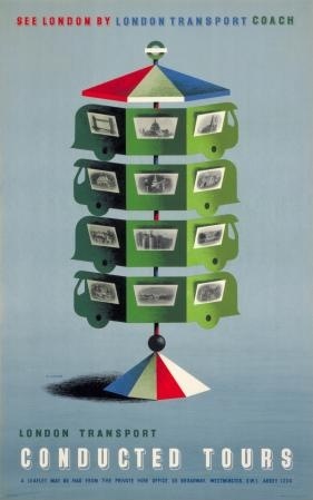
See London by London Transport coach, by Abram Games, 1950
See London, Abram Games, 1950

But when you look at the Graphis, the work just isn’t as ‘modern’ as you’d expect. Where I was struck by this most was in the case of the London Transport posters.  Six are illustrated, and yes, some of them have the clean lines and modern styling that might be thought to signify this new world.
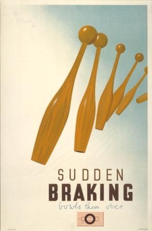
Pat Keely vintage London Transport poster internal Communications 1945
Sudden Braking, Pat Keely, 1945

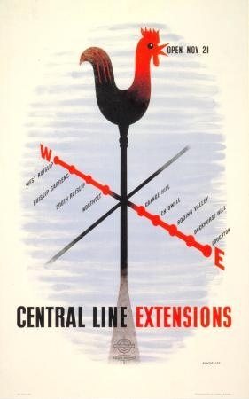
Tom Eckersley vintage London Transport poster 1948 Central Line Extension
Central Line Extensions, Tom Eckersley, 1948.

But quite a few of them don’t.
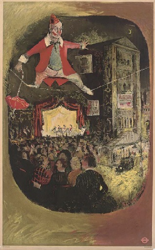
Lewin Bassingthwaite, The Circus, Vintage London Transport poster 1949
Lewin Bassingthwaighte, The Circus, 1949
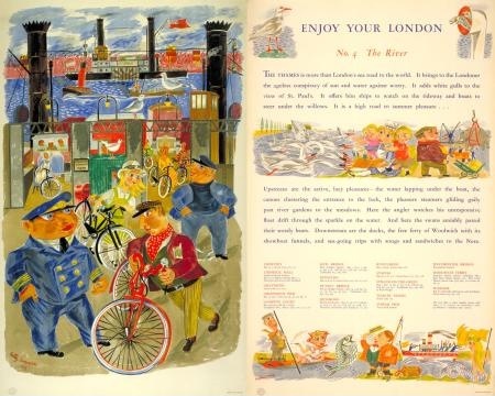
Betty Swanwick, enjoy your London the River, London Transport poster 1949
Betty Swanwick, The River, 1949

While this one just hovers somewhere in between the two.
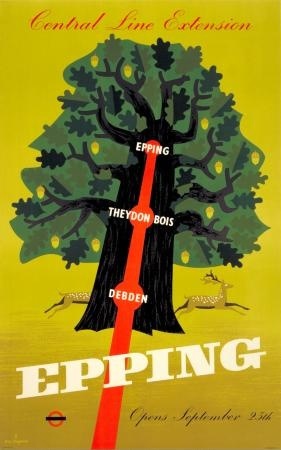
Epping; Central line extension, by K G Chapman, 1949 vintage London Transport poster
Epping, C K Chapman, 1949

All of which brings me, by accident, to an idea that I’ve mentioned before, which is to take a slice through 1949 or 1950 and see just what the design really did look like then.  I’ve always had London Transport posters in mind for this project, because it’s quite a comprehensive archive and one with, if anything, a bias away from conservatism (compared, say to product advertising), so it would be a tough proving of the theory.

Graphis has in some ways already run that test for me. The majority of the posters they reproduce are from 1949 (a year when, at least judging by the LT Museum archives, not that many posters were printed in that year  anyway).  I’ve supplemented this throughout the post with posters from 1950.  And in terms of numbers at least, the victory is on the side of what we might as well call romanticism (i.e. the style of Graham Sutherland or John Piper) rather than the clean lines of International Modernism.  What’s more, much of the modern design comes from the pen of just two designers, Tom Eckersley and Abram Games.
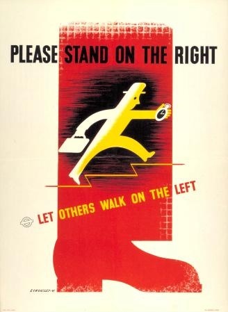
Please stand on the right, by Tom Eckersley, 1949  London Transport poster
Please Stand On the Right, Tom Eckersley, 1949
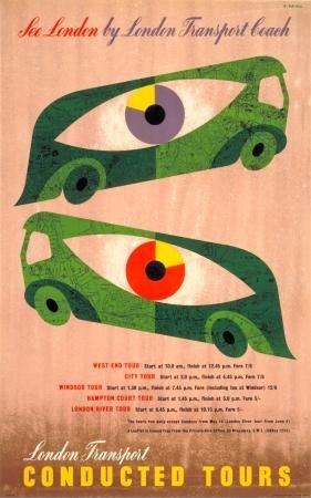
See London by London Transport coach, by Abram Games, 1950 vintage poster
See London by London Transport Coach, Abram Games, 1950

Although an honourable mention must also be made for this Bruce Angrave, just because it is great.
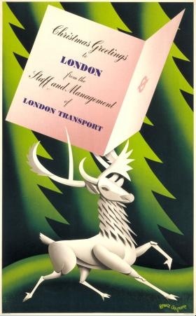
Christmas greetings to London, by Bruce Angrave, 1949 vintage LT poster
Christmas Greetings to London, Bruce Angrave, 1949

It’s also notable just how many designs use rural imagery too.  Now this may be a function more of London Transport than the mood of designers at the time; after all, one of the purposes of the posters was to get people to use the Underground more, taking leisure trips out to the far flung – and still unspoilt – fringes of the network.
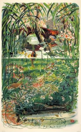
Out and about; the streams, by Peter Roberson, 1950 vintage London Transport poster
Out and About: the streams, Peter Roberson, 1950

But even the images of urban life, of art galleries and street markets, are done in a similar style.
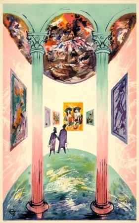
Enjoy Your London; no.3 art galleries, by R Scanlan, 1949 London Transport poster
Enjoy your London: Art Galleries, R Scanlon, 1949
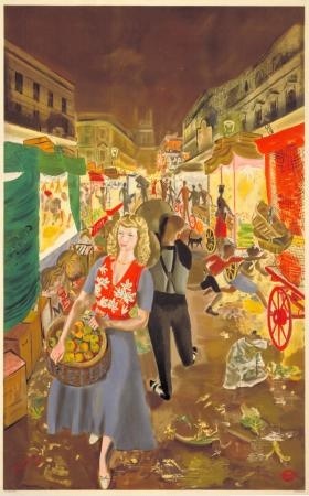
Enjoy your London; no.2 street markets, by A R Thomson, 1949 London Transport poster
Enjoy Your London: Street Markets, A R Thomson, 1949

So does this mean that all those designs weren’t modern?  Far from it.  Because remember what I said up there about Sutherland and Piper?  These were modern artists in the Britain of the 1950s, working in a new style.  I’d be quite happy to bet that if you were a commuter standing on a Tube platform in 1949 or 1950, these posters would have seemed fresh and exciting, as modern as can be.  Even though they don’t always represent the mechanised city in action, in the appropriate style.

Which leads me to two thoughts.  One is that modern can perhaps only be judged at the time – if it seemed new, different, exciting to the eye of a bystander when it was produced (worthy of inclusion in Graphis, say) then it was modern.  From a distance it’s all to easy to exclude things that don’t fit our historical preconceptions of a time, so perhaps we’re not necessarily best placed to judge.

The other is that British or English modernism is perhaps more subtle and balanced than its European counterpart.  To paraphrase Patrick Wright, we are always aware that we are living in an old country, and so we have to include this past into our depictions of the modern world, otherwise we are not telling the truth.  The fields and their earthworks are always still there, however many industrial units we build.
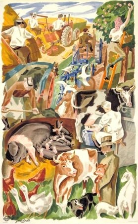
Out and about; the farms, by James Arnold, 1950 London Transport
Out and About: the farms, James Arnold, 1950

Which means that modern design doesn’t have to have clean lines and sharp edges all the time.  And our music doesn’t have to be rock and roll either.  In which case I’d very much like to recommend I A Moon by the North Sea Radio Orchestra.  It’s very modern, you see.
Everday good design

There are a few ideas that I want to pursue on the blog at the moment – I haven’t forgotten, for example, that there is more to be said about Graphis in 1950.  That will get said soon, but for today I’m going back to my thoughts about how children shouldn’t be fobbed off with second-rate design, because it made Mr Crownfolio remind me about these (and I shouldn’t have needed reminding as Shelf Appeal mentioned them in dispatches recently too).

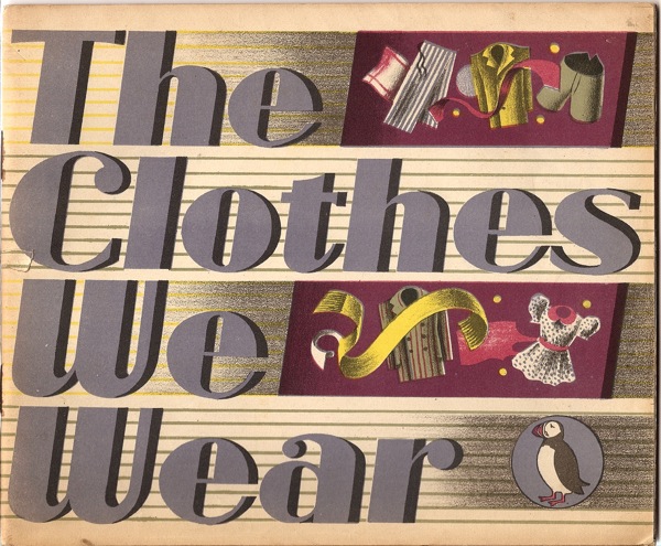
Puffin Picture Book The Clothes We Wear cover

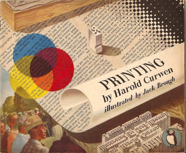
These are Puffin picture books, produced between 1940 and 1965, and they are things of beauty.

Puffin Picture Book Printing harold Curwen

I’m not going to give you a full history of how and why they were produced, partly because it’s Friday, but mainly because there has been a book produced about exactly that, called Drawn Directly to the Plate and available here. (And do get it there, because they’re charging just £20, while the only copy on Amazon is priced at £85.  Nice work if you can get it).  It’s a bit of an odd book, because it veers between serious history and collectors’ handbook, sometimes within the same paragraph, but it’s still a useful introduction to a slightly different side of British graphic design.

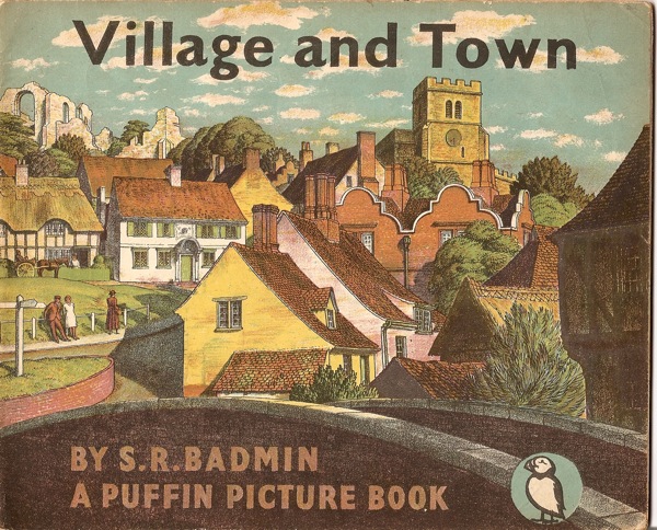
Puffin Picture Book Village And Town badmin cover

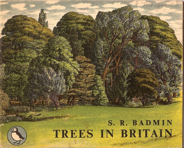
This difference is one of the interesting things about these books, because the illustrators are, in the main, a very different set of people to those who designed posters, even Shell posters.  Although S R Badmin did produce several wonderful books for them over the years.

Puffin Picture Book SR Badmin Trees cover


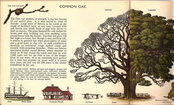
Puffin Picture Book Badmin trees oak inside

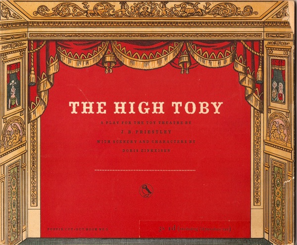
Anna Zinkeisen who designed posters for London Transport before the war also illustrated one – a book which contains all the scenery and characters you need to stage Priestley’s play.


Puffin Picture Book High Toby Zinkeisen

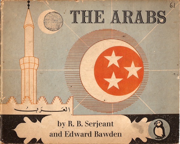
As did one other celebrated artist.

Edward Bawden The Arabs Puffin Picture Book

But that’s about it.

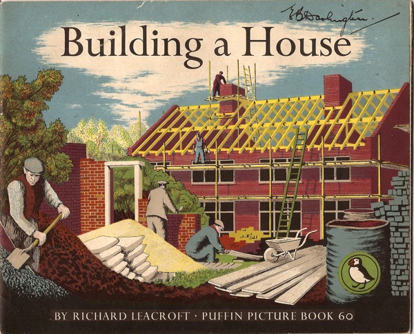
Now this may be a result of one of the other interesting things about these books, which is they are produced by autolithography, i.e. the illustrators drew straight onto the lithographic plate.  This was partly a way of keeping the costs down, but it did also give the books a distinct and appealing style.  You get most of a sense of it with the covers, which are the most complex parts of the whole books.  There are colour spreads inside, but they tend to have a more limited palette.

Puffin Picture Book Building a House

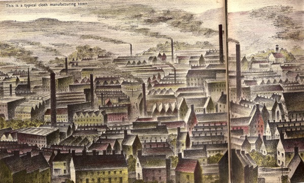
Most of the books do have a wonderful double page illustrated spread in the centre too, but unfortunately the format won’t fit in the scanner, so you’ll just have to take my word for that.  Here’s as much of a typical cloth manufacturing town as I could fit in.

Puffin Picture Book clothes cloth town

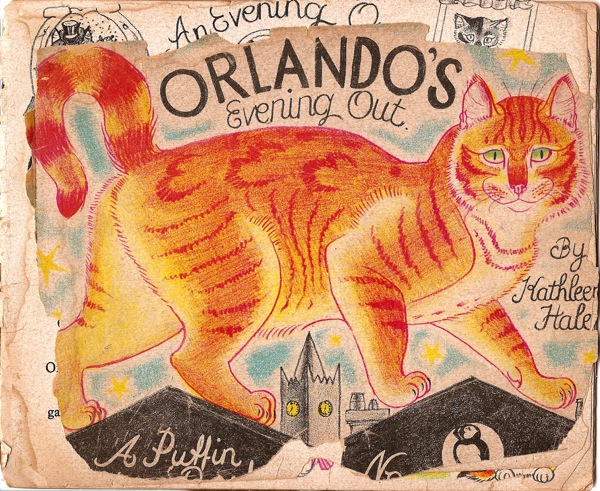
The format is pretty much the only thing which links the titles, which range from practical handbooks on woodwork through factual introductions to storybooks – including the wonderful Orlando The Marmalade Cat, who was clearly much loved even at the time.

Puffin Picture Book Orlando's Night Out Kathleen Hale

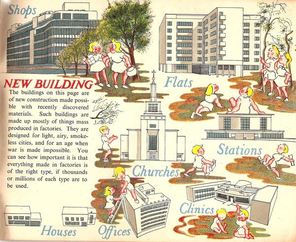
If they have anything in common though, it is the post-war faith in modernity.  So many of the factual books end with the idea that we are now building a better world, quite often in concrete, or at very least light wood and glass.  (This is the back cover of the Badmin book above, by the way).

Puffin Picture Book S R Badmin village and town reverse

Puffin Picture Book Gordon Russell Furniture inside spread

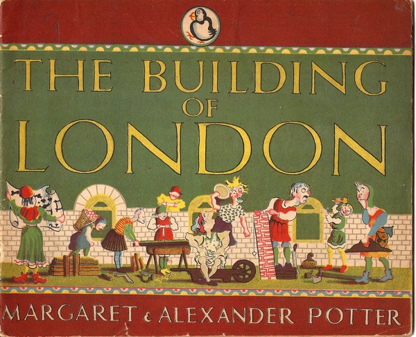
Despite this, there is also an enormous range of styles in the series, perhaps unsurprisingly given that they were produced over more than twenty years.  This book is one of the most idiosyncratic (although, as you will note, it is still very much in favour of the modern).

Puffin Picture Book The Building of London

Puffin Picture Book Building of London inside spread

But the most important thing about them is that once again, these are illustrators and designers taking children seriously.  And not with a £75 collectors edition, but in the form of cheap, everyday books.  A whole series of them.  But these days we have so little faith in social equality that we certainly can’t believe that everyone deserves good design, least of all children.  When they deserve it most of all.

A Miserable Reflection

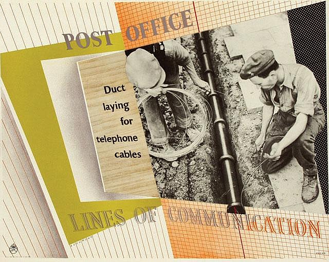
In trying to put together the history of the Post Office : Lines of Communication posters last week, I spent some time wandering within the BT archives.  Where I found this.

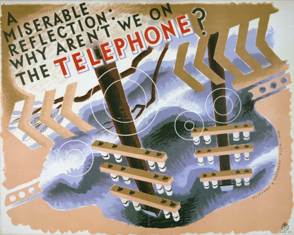
Clifford and Rosemary ellis vintage GPO poste 1935.

Which does, truly, justify the existence of the entire archive on its own.  It’s by Clifford and Rosemary Ellis, it’s from 1935, and it is bonkers.  I also have no idea what it means.  Answers on a postcard please, if you have any.

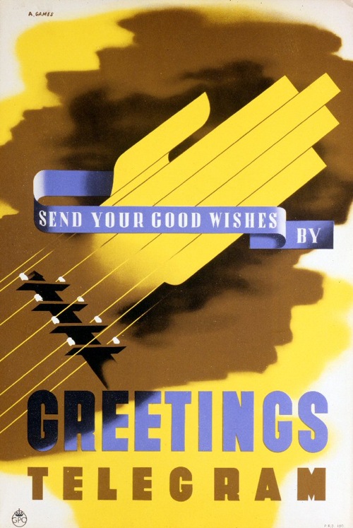
Now I’ve mentioned before that the BT online archive is quite a curious and obscure thing, which may perhaps be why this Abram Games has lurked there unnoticed for so long.

Abram Games vintage GPO poster greeting telegram 1937

On the other hand, its obscurity may have something to do with the fact that the archive’s search facility is, how shall we say this, a bit challenging.  A search for Abram Games doesn’t bring it up, while a search on Greetings telegram just produces a deluge of material; I only found this by putting in ‘Good wishes’.

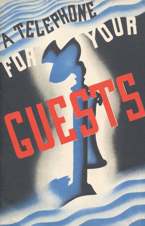
But there is good news on this front, because BT do now have a  more accessible way of looking at some of these images, which is the interestingly named Telefocus Media Gallery, a title which for some reason just makes me visualise the Post Office Tower, but never mind.  It’s mainly aimed at picture researchers, but it does have a reasonably browsable gallery of images, including both of the ones above and plenty more besides.

A telephone for your guests vintage GPO poster 1937

Be warned though, there are still lots of pictures of Busby and trimphones in there, so take care.

I did also discover a bit more about the Lines of Communications posters while I was there.  Mainly that there is also an artwork by Abram Games for the series.  All I can tell you about it, because there is no illustration, is that it features ‘twelve coast radio stations working to ships’ and is, once again, artwork.  If anyone fancies a stroll down to Holborn in order to tell me whether it’s as good as the rest or not, feel free.
More strangely, I found this.

Beaumont, lines of communication, vintage GPO poster

It’s by Beaumont, and it is an actual poster which seems to have made it out into the world rather than just existing as artwork.  If possibly just once, because I’ve only found it in a single auction, which was Van Sabben’s last sale just a few months ago.  (They regularly get interesting GPO posters for each sale, and I would like to know where from).  But this one isn’t where it ought to be in the BT Catalogue – not even its artwork – so the mystery just deepens.  Any more thoughts anyone?

See Again

The end of the summer holidays loom, normal order will be restored soon.  But in the meantime, here is proof that not all good design either comes from a known designer or has been seen and seen again.  I love every single one of these designs, and they deserve to be better known.

In the course of some auction research, Mr Crownfolio came across the Murphy Radio site.  Now, generally, this bears the same relation to poster design as railway name-plate auctions do.  Actually, no, it’s even more frightening; there are circuit diagrams.
A murphy circuit diagram, don't ask me which one

This is for the Murphy A26 RG radiogram for use with AC Mains, since you ask.

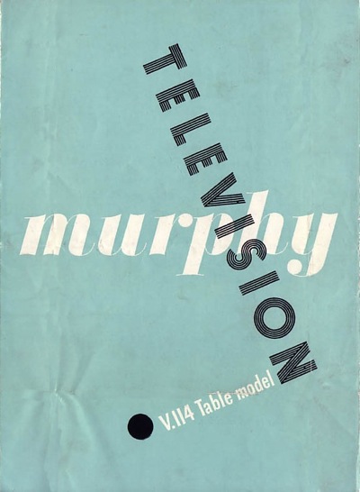
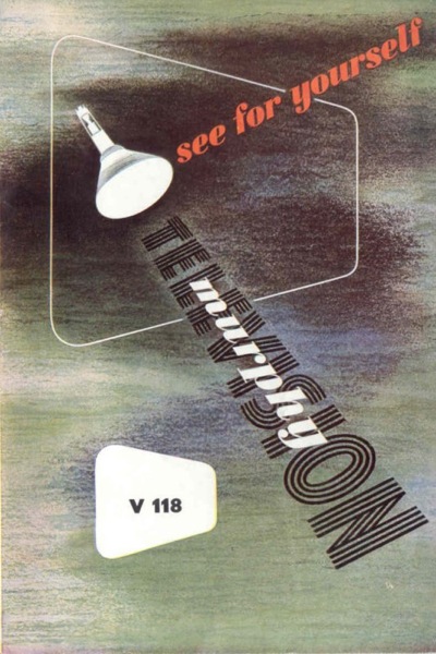
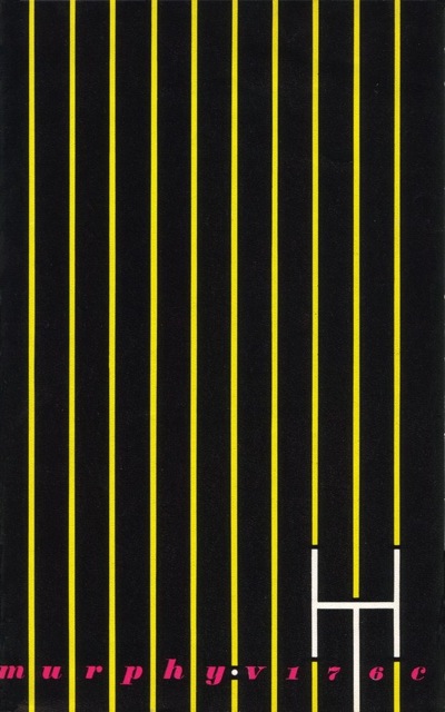
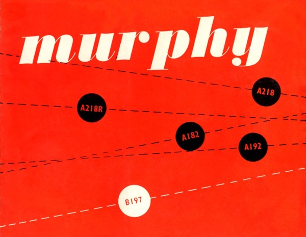
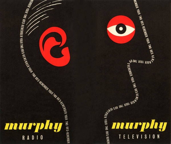
But also on the site are pages and pages of leaflets and brochures.  And they are great.  All of the following are  from 1948-49 and are incredibly sharp for their era.

Murphy leaflet 1

Mprhy leaflet 2

Murphy brochure 3

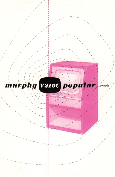
In fact, the graphic design was considerably more modern than the televisions themselves.  This brochure

another Murphy brochure

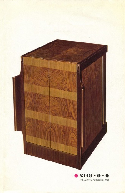
is for this television.

large wooden television not living up to graphic style

Unlike the brochure, the woodwork hasn’t moved on from the 1930s.  In some ways this is surprising, because much of the company’s graphic design was done by James Reeve, who also designed many of the televisions.  I was going to say that I like the brochures better than the products, but then I would say that, wouldn’t I.

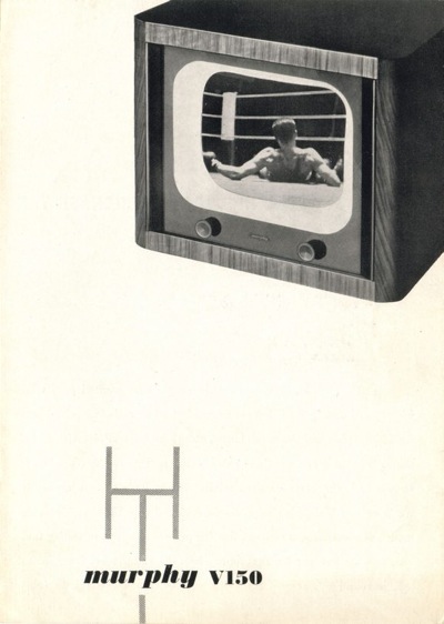
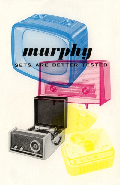
There are plenty more great pieces of design as we go into the early to mid 50s.

yet another murphy brochure

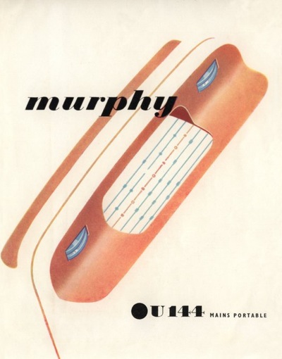
When we also enter the era of the portable (ish) radio.

Another Murphy catalogue cover

Murphy Irish catalogue

best bit of design there is here

I swear, it’s almost like looking at European posters it’s that good.

The great work continues until 1960.

1950 murphy television brochure

What I find extraordinary, apart from the fact that I haven’t seen these before, is that an internal employee, whose main job was designing television sets, produced all of the above. He clearly knew his graphic design – especially considering that the likes of Abram Games and Reginald Mount were designing posters for Murphy television – but that can’t account for all of it.  James Reeve was certainly a very clever man, bordering on undiscovered genius.

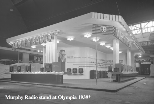
Furthermore, he is definitely hiding his light under a bushel.  He’s written an ebook about his designs – which you can find here – and it’s all about televisions.  Although I can give you this wonderful image of the Murphy stand at Olympia in 1939 – I’m guessing for the Ideal Home Show.

Murphy stand Olympia 1939

But it is possible to find out more.  There’s an exhibition at Mill Green Museum in Hatfield, all about Reeve’s work and including some of his poster designs.  So if someone could pop over and tell me if the rest of his work is as good as this stuff, I’d be very grateful.

Nothing New

Worried about your Facebook presence?  Not sure how to optimise your Twitter account for the benefit of your business?  Finding all these modern communications just a bit confusing?

Well you would have been just as worried about new media eighty years ago, or it seems.

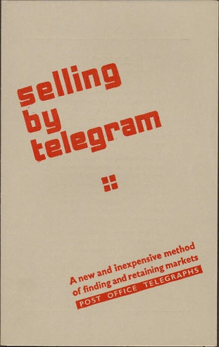
Selling By Telegram leaflet from eBay

The leaflet, should you want to take comfort in the easier choices of an analogue age, is for sale on eBay right now.  Stop.