Jam and newspapers

Temple Gate in Bristol, 1961.  Which, I can testify, looks nothing like that now.

Posters on display in Temple Gate Bristol 1961

But just look at those posters on the right.  This is not just because, as ever, it’s both rare and wonderful to see posters out in the wild, but also because, taken as a group, they are not bad.  Admittedly I wouldn’t pay money for the Chivers one, but the design for Rozalex (bottom left) is rather good, as is the utterly unidentifiable one above it.  In case you’re wondering, Rozalex is a barrier cream to keep off dirt and you can still buy it today.  Should you wish.

Also interesting is the Guardian advert.  Is that them feeling that they have to keep up with Patrick Tilley’s adverts for the Sunday Times?  I will have to investigate…

Addendum:  I’m pulling this up from the comments, because it’s a great photo of the CWS poster in another location – Roman Road to be precise.

Roman Road 1960s with poster

The image comes from East London History.

And the other posters are, as is so often the case, not that good.

At Home

I probably can’t apologise long and hard enough for the absence of any blog posts recently, but works on Crownfolio Towers have rather taken precedence for the last month.  I now know more about lime washing than, frankly, I ever wished to.

Please have this James Fitton by way of recompense.

James Fitton Abbey Road poster

A normal service will – I hope – return in the New Year.

Worth it in the long run

I am rushing in just to tell you about Great Central Railwayana.  I’ve had the catalogue for ages, and been meaning to write about it for ages, and now, suddenly, the auction is this Saturday.  I blame the builders.

Once again, there are a good selection of posters on offer, ten times the number that you’d find at a railwayana auction even a few years ago, but I’m finding it hard to get overly excited about them as they mostly consist of the usual suspects, like Terence Cuneo.

1950 Terence Cuneo British Railways poster Tay Bridge Dundee
Terence Cuneo, 1950.

And nice pictures of landscapes from the 1950s, there are lots of those.

Wye Valley Gyrth Russell British Railways poster 1955
Gyrth Russell, 1955.

Although as seaside posters go, this one is quite special.

1955 Henry Stringer Clacton on Sea British Railways Poster
Henry Stringer, 1955.

While this bit of Dorset coast is an unusual departure from Alan Durman’s usual subject matter and style, but rather good with it.

Alan Durman British Railways Poster Dorset

And, after his star turn at the Great Northern Auction, they’ve also dug out another unusual Lander which I quite like.

1955, Reg Lander Bournemouth British Railways poster
R. M. Lander, 1955.

I also like this poster, although for no particular reason that I can articulate.

1955 Greene Ribblesdale British Railways poster
John Greene, 1955.

It’s green, will that do?  As is this one.

Badmin Derbyshire dales British Railways poster 1950
S. R. Badmin, 1950.

There is another Badmin coach poster lurking in there too, which might end up being a bit of a bargain, as coach posters often are at railway auctions.

Enjoy the Riches of Britain by Lincolnshire Road Car Company Ltd S R Badmin Coach poster

There on the other hand, it might not.

But if you want good design, this Karo has to be the best poster in the sale by a long chalk.  It will be interesting to see what it goes for.

Travel In Rail Comfort - It's Worth It In The Long Run' by Karo British Railways poster

Also on my favourites list is this Kelly, which I’ve written about before.

Kelly new brighton British railways poster spade 1955
Kelly, 1955.

Its (even better) pair was up in the Great Northern sale a couple of weeks ago.

Kelly new Brighton British Railways poster 1955

You may have noticed that I didn’t mention it.  But sadly we were outbid, quite considerably.  Hey ho.  Prices were generally quite high there, especially considering that it’s a brand new sale, but that’s a subject I’ll come back to next week.

But if you really want good design, the best example in the sale isn’t actually a poster.  It’s this.

Hans Schleger London Transport bus roundel

That’s Hans Schleger’s design work for London Transport there, from 1957, and very good it is too.

Pictorial posters, cheap

I’ve never come across Bristol Railwayana Auctions before now. Given that there are only two posters in their current sale, this is perhaps not so surprising.

They are, however, about to auction this.

GWR poster advertising how to buy posters

It’s image-free and tatty (and the best thing that the catalogue can find to say about it is that it  has a ‘superb GWR roundel in the centre’.  Which it does.

But it’s also a brand new bit of evidence in my never-ending quest to find out How Posters Survive (most comprehensive outline of which is here).  Until now, I don’t think I had any record of the GWR selling posters, and yet here they are, at some point in the 1930s judging from the graphic design, selling Double Royal and Quad Royal posters to the public.  I’d like to order this one, if you don’t mind, and will be writing to the Superintendant of the Line forthwith.

GWR AIr services poster Ralph and Brown 1932

From which the main conclusion is that almost all the posters which survive in any number were sold to the public one way or another.  And that this is something that requires some proper archival research. Preferably by me.  If anyone has a grant going, please let me know.

Also at the Bristol auction is this:

Colour Blindness test with skeins of wool etc. in original box which is not marked, but was rescued by a Bristol Barrow Road fitter, also in the bottom of the box a loco repair card from BBR loco no 9711

Which I find intriguing, because surely the time for a colour blindness test is not when you are already that close to the locomotive?   Perhaps someone can enlighten me,

I’ll be going through  more of the railwayana auctions next week, but GCRA is tomorrow, and so cannot wait.

Fortunately for both my bank account and my need to get this post out quite fast, there is not a lot to report.   Well there are tons of posters, but they are mostly quite bland.

Exteter Cathedral British Railways poster linford

Except this one, which is making me laugh for all the wrong reasons.

Come out for easter LT poster 1920s

The only poster I am remotely drawn to is this Amstutz, but then he’s always good value.

Thornton Cleveleys BRitish Railway poster Amstutz

Although I’ve never seen this Worcestershire one before, and I would have noticed it as it is a pretty exact representation of my grandmother’s cottage.  Sadly I don’t think it actually is hers, as it’s just a bit too far south, but it’s a close run thing.

Worcestershire Wilcox British Railways poster

Weirdly, the same poster is also coming up at the GWRA auction in November, whose preview looks a lot more exciting.  But I’ll deal with that, and much else besides, anon.

Egging it

If I use the words Philip Larkin and 1963 in the same sentence, you pretty much know what’s coming next, don’t you?

Sexual intercourse began
In nineteen sixty-three
(which was rather late for me) –
Between the end of the “Chatterley” ban
And the Beatles’ first LP.

(rest of the poem here if you want)

I suspect that part of the reason that Larkin’s thoughts are so often used, almost in danger of becoming a cliche, is that they express for us something that isn’t otherwise easily said.  At some point in the early 1960s, there was not just a sexual revolution but a sea change across all of British culture.  Virginia Woolf noted a similar moment fifty years before:

On or about December 1910, human character changed. I am not saying that one went out, as one might into a garden, and there saw that a rose had flowered, or that a hen had laid an egg. The change was not sudden and definite like that. But a change there was, nevertheless; and, since one must be arbitrary, let us date it about the year 1910.

What Larkin saw happening was the end of what you could call the ‘long 1950s’, which lasted from 1946 until, well, about 1963.  For these seventeen years, Britain was still very much defined by being a country recovering from the Second World War, a country that wanted a fairer and more equal society, refrigerators for all, but most of all a nation that wanted a quiet, decent life.  It’s no accident that this era lasted for seventeen years either, because what 1963 marks is the coming of age of the first children for whom the war wasn’t a defining experience.  They didn’t need the reassurance of a quiet life after chaos, for the simple reason that all they had known was peace.  The result, of course, was the 1960s.

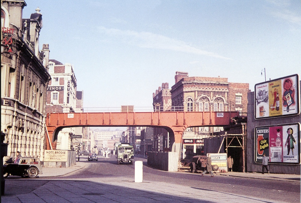
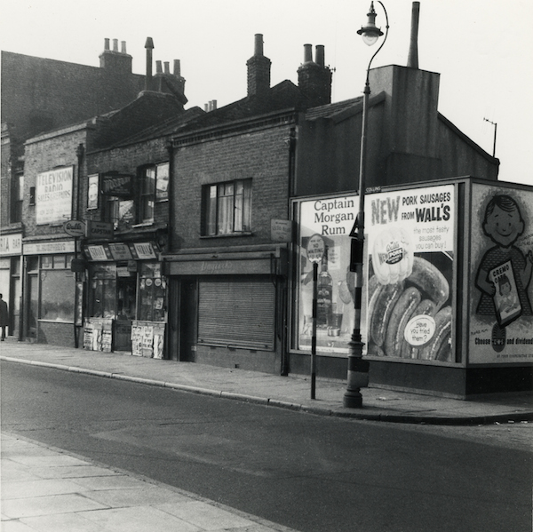
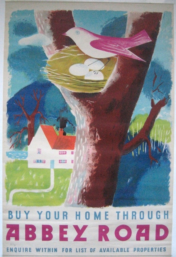
What provoked these thoughts, oddly enough, was the arrival of these posters at Crownfolio Towers.

Go To work on an egg poster- girl

Go to Work on an egg classic poster -

With blessed thanks to eBay, which coughed the pair of them up at an entirely reasonable price.

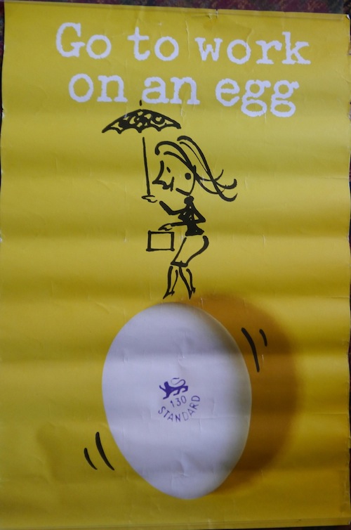
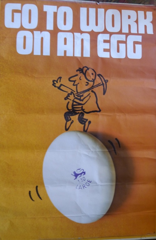
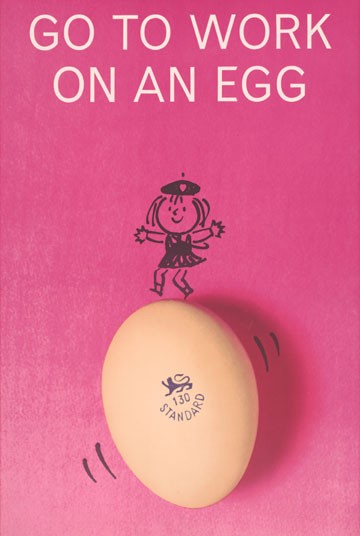
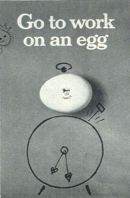
These are of course posters from one of the classic advertising campaigns of the 1960s and 1970s, ‘Go To Work on an Egg’, a campaign so famous that it has its own website.  The campaign started in 1957 with television ads starring Tony Hancock but, as far as I can tell, these posters date from 1964-5.  At least that’s when they were winning awards.

There are others too.

Go To Work on an egg pink poster Egg Marketing Board

Go to work on an egg alarm clock poster Egg Marketing board

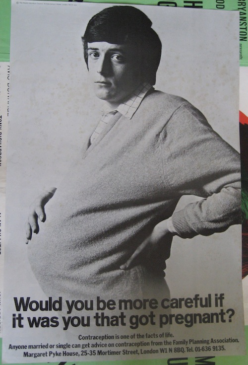
And of course there is a debate or controversy or whatever you will about whether Fay Weldon or Salman Rushdie invented the slogan.  I can’t say I’m particularly fussed.

Because what’s interesting about these posters, at least for me, is that I would like to hang them on the wall.  Which is unusual for posters of this period – and by this period I mean any time after 1963.

At various points in time we have bought ‘good’ – i.e. critically acclaimed – posters from after the 1950s, such as this Saatchi and Saatchi legend.

Saatchi and Saatchi pregnant man poster

Or this protest poster by David Gentleman.

David Gentleman protest poster

While I admire them, I can’t in truth say that I love them.  And I most definitely don’t want to hang them on the wall.

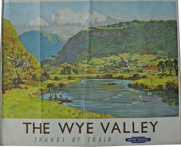
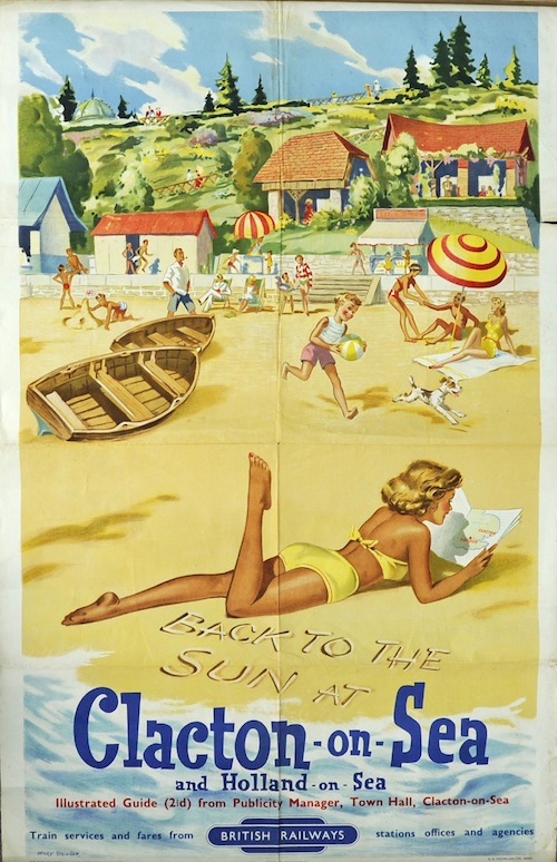
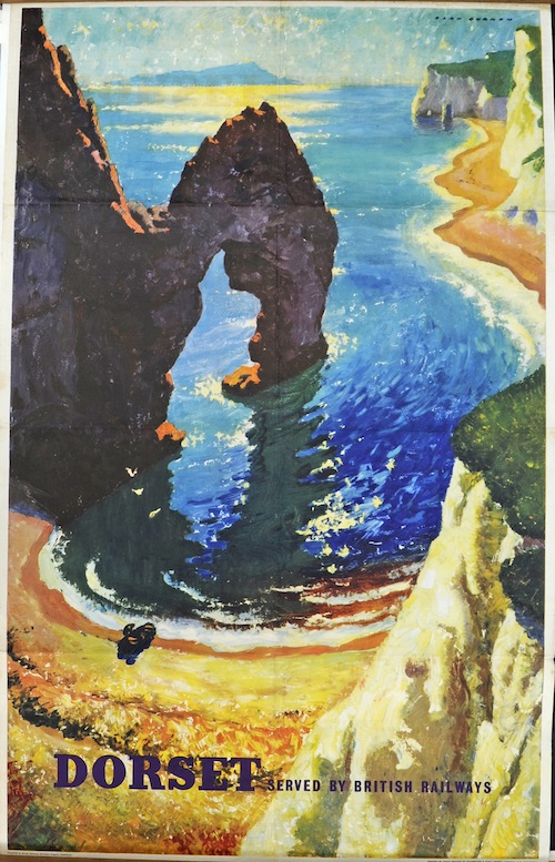
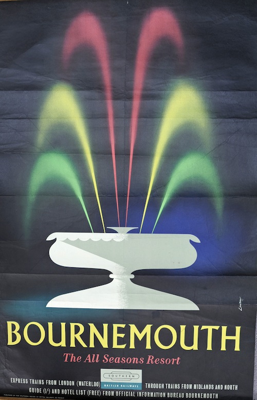
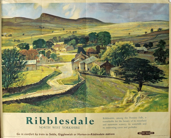
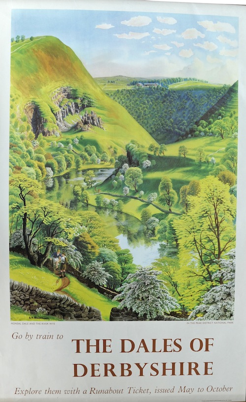
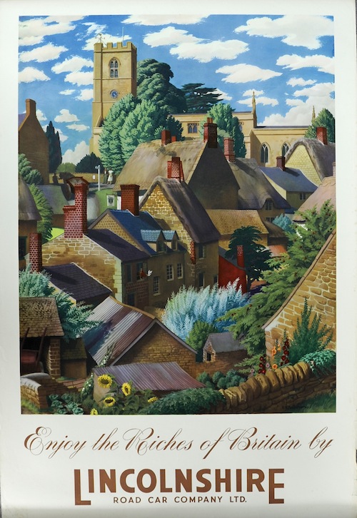
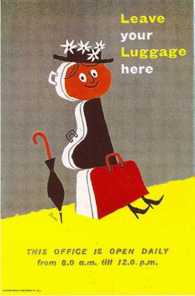
Whereas I can go through editions of Modern Publicity from the late 1950s and early 1960s and covet really quite a lot of what was on offer in there.

harry Stevens tilling group luggage poster 1958

Tom Eckersley Omo poster 1962 Modern Publicity

So what changes at the end of the long 1950s?

A proportion of it is down to simple practicalities, most importantly the rise of television means that people are spending less energy and creativity on posters.  It’s possible that this also means that posters have to try a bit harder to get noticed, hence the increased use of shock tactics.

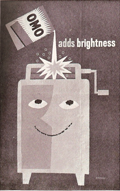
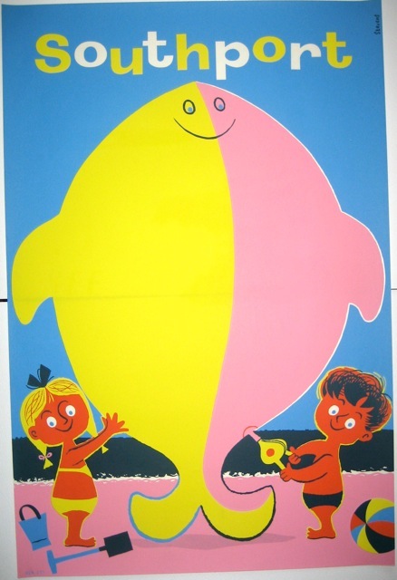
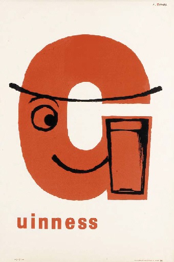
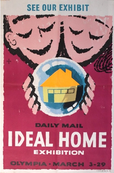
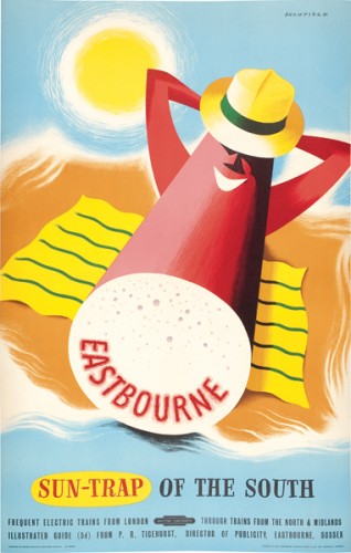
But I’d also argue that there is a much deeper change in what we might call the mood of poster designs.  As demonstrated by that Tom Eckersley Omo poster above, the 1950s is the decade of the grin.

'Mablethorpe', BR poster, 1960.Artwork by Eckersley.

Tom Eckersley vintage hastings travel poster

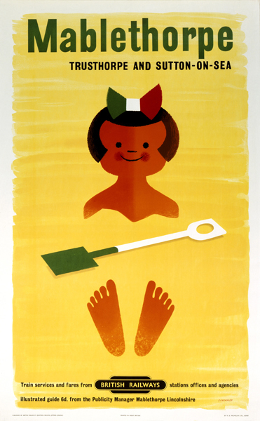
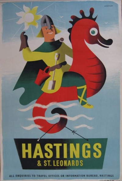
I’ve written about this in the context of Tom Eckersley before, about how it’s very easy to dismiss these posters as child-like and simplistic when actually they are the result of much more complex emotions, of relief at the end of the war and a resultant ability to take pleasure in very simple things.  It’s also worth noting that if I’d had a washing machine in 1962, I’d be pretty chuffed too.

And of course Eckersley by no means had a monopoly on the grin.  Here’s Harry Stevens at it as well.

harry Stevens vintage southport coach poster 1950s

Harry Stevens Boulogne vintage travel poster 1959

And it forms the basis of one of Abram Games’ most famous posters.

Abram Games Guinness poster 1957 big G

I could go on.

Hans Unger (1915-1975) Daily Mail Ideal Home Exhibition Olympia, original poster printed by S H Benson

And on.

Eastbourne vintage travel poster 1950 Bromfield British Railways

And on.

E Tatum train to the continent poster 1958

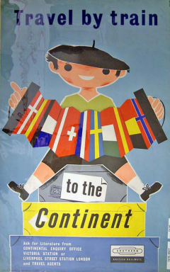
As I tried to point out in the Eckersley post mentioned above, this is may look like a simple, child-like joy, but it is nothing of the sort.  It’s much more complex and adult than that, stemming from the chance to savour the simple pleasures of life – train trips to the continent, a pint of Guinness, a washing machine – which are all the more appreciated after the dislocatons and horrors of the war.

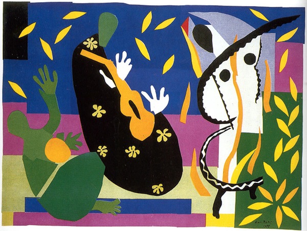
This is the simple joy of a late Matisse painting.

Matisse collage, who knows what

Or of William Blake’s Songs of Innocence.  (I was forced to read these as a snarky seventeen-year -old for my A-Levels, with the entirely predictable result that I thought these were a set of feeble-minded rhymes about lambs skipping and that the grown ups clearly had no taste.  It’s only now, as a grown-up, that I can see Blake’s point at all.)

But when a new generation arrives, a generation which has not passed through any of the hardships of war, this subtle emotion can’t survive any more.  So it’s out with the old, goodbye to the grins and the taking pleasure in life, and in with shock tactics, subversion and generally getting a rise out of the grown ups, something which could only be done if you had no idea what they went through.  And while the results are often admirable, I don’t often want to hang them on the wall.

Exposition

It’s a rare thing, the intersection between Quad Royal and literary fiction, but by Jove I think we have found it.  Or perhaps I should say, by Barbara Jones!

Jonathan Coe expo 58 cover

The work in question is Expo 58 by Jonathan Coe. Now this – if you have my mindset at least – was always going to be a promising subject, because the whole novel is centred around the British Pavilion at the Brussels Exposition of 1958.  And here it is.

British Pavilion Brussels Expo 1958

The British Pavilion has turned up on here before, mainly because its catalogue was designed by, of course, Barbara Jones.

British brochure Brussels Expo 1958 cover Barbara Jones Illustration

And it’s very good.

Brussels Expo 1958 catalogue for British Pavilion Barbara Jones illustration

More of it here if you like.

Mr Coe has done his research too because, lo, here on page four of the novel is our hero (ish) flicking through this very booklet.

This afternoon, in the middle of February 1958, Thomas was checking the proofs of a pamphlet he had helped to put together for sale outside the pavilion: ‘Images of the United Kingdom’.  There was a small body of text, interspersed with attractive woodcut illustrations by Barbara Jones.  Thomas was checking the French version.

Which, as it happens, is the one featured here.

Brussels expo 1958 British pavilion brochure page spread cow

Although if those are woodcuts, I am quite prepared to eat a model Atomium.

I obviously have to tell you to read the book, because clearly anyone with an interest in post-war design and international exhibitions needs as much encouragement as they can get.

But – and I am only half way through – I have to say that it’s probably the only reason to read it, because the rest of it is well, a bit odd.  The experience is, well a bit flat and dull.  I can see that some of this might be my own prejudices; if I’m going to imagine myself at the Brussels Exposition, I’d like to be shown every single design detail that I would have noticed if I was there, please.  And I’m not, it isn’t a very visual book, which is a bit odd considering that it’s about a giant extravaganza for the eyes and senses.

I suspect thought that plenty of people would find it a bit of a cardboardy book.   I can see how this has happened.  The narrator is, deliberately, a bit of a dull chap.  Which is, in some ways, fine, because boring people should deserve to be in books as much as anyone else.  Except they don’t, because they’re not that much fun to read about.

The thin-ness of the telling is also, in some  ways, a kind of period detail.  People did publish novels just like this in the 1950s, and lots of people read them.  So perhaps it is just one giant post-modern joke on itself.

I really hope that’s true, because the alternative is, and I am beginning to consider this, that it just isn’t that good a book.