Deja vu all over again

I seem to have come back from holiday only to wander into a fold in time, because at least some of the posters on offer out there seem strangely familiar.

Lets start with Dreweatts in Bristol, who are once again selling the work of Percy Drake Brookshaw.

Percy Drake Brookshaw Boat Race poster 1927 London Transport
Percy Drake Brookshaw, 1927, est. £150-200

This is not a new thing, in fact it’s something which has been going on almost since the very beginning of this blog.

Percy Drake Brookshaw Wimbledon tennis London Transport poster 1928
Percy Drake Brookshaw, 1928, est. £200-300

The only real change being that they have got slightly more realistic in their estimates.

Percy Drake Brookshaw shell poster cricket just out 1933
Percy Drake Brookshaw, 1933, est. £300-400

Although I can’t remember these posters ever coming up before.

Percy Drake Brookshaw Green Line posters 1936 London Transport
Percy Drake Brookshaw, 1936, est. £200-300

Once again, they are provenanced from the artist’s family by direct descent.  I can only imagine, with some envy, the stack of posters they must have had before they started selling.

Elsewhere in auctionworld, a curiosity in Bloomsbury’s British Art Sale.  Even they describe it as ‘a macabre vision’.

Betty Swanwick RA (1915-1989) Safety First!' a macabre vision for a Ministry of Transport poster
Betty Swanwick, est. £1,000-1,500

It’s a design for a poster, although not one I’ve ever seen.  Maybe even the ministry thought it was a step too far.  There are some examples of her painting up for sale too – I rather like this.

Betty Swanwick RA (1915-1989) The Gardeners
Betty Swanwick, est. £1,500-2,000

Although the price is once again a reminder why we collect posters rather than fine art.  I’m sure there are lots more wonderful things lurking in that auction too, but I don’t dare take a very close look in case I start spending money which is meant to be used for house renovation.

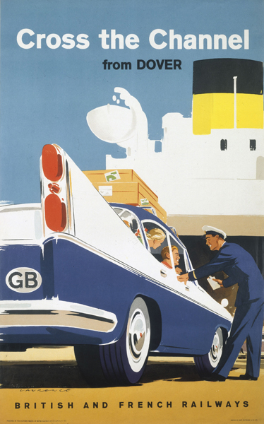
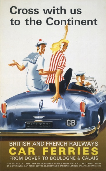
Meanwhile on eBay, there’s more on offer than I’d normally expect to find in the doldrums of August, and they’re proper posters too.  The kind that you might normally expect to find in auctions.  Let’s start with a handful of classic railway posters.  Well, post-war classics at least.

British Railways poster

That – by Ronald Lampitt and dating from 1952 – is my favourite, but there’s also this Lander, which I don’t think I’ve ever seen before.  Or at least not noticed.

Lander British railways poster 1952 Northern Ireland

But it’s this Kenneth Steele which seems to be the most popular with the bidders so far.

British Railways poster loch ness Kenneth Steele

The price as I write stands as £221, with more than four days to go.

Also doing well are a set of three Empire Marketing Board posters from the 1930s.

Chas Pears Empire Marketing board poster Gibraltar

The Gibraltar example above, by Chas Pears, has already reached £122, but you can still have his version of the Suez Canal for a bid over £5.59 if you like.

Chas Pears Empire Marketing board poster  Suez Canal 1930s

Finally, an oddity from our old friends PosterConnection.  I don’t suggest that you actually buy this, what with it costing $400 and all, but it’s worth a look.

London Transport poster Music in London, by Hans Unger and Eberhard Schulze, 1964

It’s by our old friends Hans Unger and Ebhard Schulze, but it’s not a plain mosaic, rather it’s a collage with a bit of mosaic in.

The poster is also missing the text beneath  – here is the LT Museum copy by way of comparison.

Music in London, by Hans Unger and Eberhard Schulze, 1964

Although whether that makes it worth more or less I have no idea. Any thoughts?

Foreign

We have now returned, after a fortnight which did look, at times, like this.

Sadly I couldn’t find a poster for our nearby resort, the delightfully named Tranche-sur-Mer, or Slice-on-Sea, so you’ll just have to believe me on that one.

Quite a lot of this was also consumed.

Back to things British shortly, when I’ve worked out what, if anything, has happened in my absence.  Do let me know what I’ve missed.

Ferry nice

Oh heavens, I have just discovered a world of previously undiscovered and mostly rather kitch treasures, found by putting ‘ferry poster’ into various archives.  Unfortunately I can’t possibly fit them all in, because the purpose of this post is simply to say that Quad Royal is off across the channel for the next two weeks.

'Cross the Channel from Dover', BR poster, Laurence 1960

But I can’t stop at just one, so this is how I would like you to imagine us travelling.

'Cross with us to the Continentâ??, BR poster, 1963.

Mr Crownfolio will be wearing the sailor’s hat.  Au revoir and see you in a fortnight.

Bon Voyage British Railways poster Leonard Richmond

Loves a sailor

An errand sent me rummaging through our stack of Daphne Padden bits and bobs the other day.  This made me realise two things.  One is that they really ought to be in an archive box, something which has been on my to do list for too long. The other – more relevant here – is that I never got round to scanning much of it in order that you lot could take a look at them.  It’s time to make amends, clearly.  Here’s a thoughtful bird to start with.

Daphne Padden sketch of bird

For those who weren’t around last year (where were you?), the executive summary is as follows.  After Daphne Padden’s death in 2009, a lot of her posters came up for auction in 2010.  We got in contact with the executors after this, and ended up buying a miscellany of drawings, sketches, designs and, well, other stuff which hadn’t been included in the auction.

Most of the archive has gone to the Brighton University Archive of Art and Design where it can be consulted by historians and designers (more exciting developments on this next month too) but we kept a few small pieces that we might want to display one of these days.  I posted pictures of a few of them when they arrived, but but promised more.  That was some time ago.  Oops.

This was the item which particularly made me feel remiss.  I swear I had never seen it before, although Mr Crownfolio assures me I have.

daphne padden design for sailor coach poster 1950s

It’s done in real detail but very small (just over 10cm high) and in a little paper folder, so I like to think that this was what she presented to the coach company as a proposal.  This is of course the poster commission which resulted, although it does exist with a couple of different varients in its lettering.

Daphne Padden Royal Blue vintage coach poster sailor 1957

She obviously liked this series of posters a great deal.  I’ve posted this study before, but it was all part of the same collection of things she kept over the years.

Daphne Padden old salt artwork

Along with this much rougher sketch, on a torn piece of brown paper.

Daphne padden sketch of sailor on brown paper

There’s nothing similar for any of her other designs, so she must have felt a real sentimental attachment for this one.

Also of interest are a couple of proofs for British Railways leaflets.  This one is helpfully stamped 1963.

Daphne Padden proof for British Railways leaflet 1963

Along with them is one finished leaflet, which looks as though it’s from a slightly different series.

Daphne Padden British Railways leaflet 1960s The English Lakes

(In case you also worry about these things as much as I do, the BR in-house printing department definitely did the inside on this one, it’s not very exciting at all.)

Once again, I would have had no idea that she’d designed these without this evidence.  I also have no idea where to start looking for them in the great sea of ephemera out there, so if anyone can point me at some more, I’d be very interested to see them.

Finally, there is this.  I have no idea what it is for or even if it was by her at all, but  I rather like it.

A sketch.  Possibly by Daphne padden

What do you think?


Sightseeing

The combination of house renovation and school holiday means that the blog has been a bit neglected recently.  By way of apology, here’s a very lovely bit of Abram Games, very much on an appropriate theme for the holidays.

Abram Games Sightseeing coach tours leaflet London Transport

Some closely related posters were on here the other day, but this isn’t it, rather it’s the leaflet which must have been part of the same campaign.  West End or City, do you think?  Or how about a trip out of town to Windsor, tea included in the fare?

What always strikes me about these kind of leaflets is how different the bulk of the typesetting is from the cover – the British Railways Holiday Haunts guides are another good example.  Outside we are in a modern and exciting world; inside it’s business as usual.

Abram Games sightseeing coaches leaflet london transport inside

I can only imagine that it was the covers and posters which got sent out to designers, while the rest was always done by the in-house design team.

In the end, though, I’m not sure that I mind that much – the mismatch is part of the period charm.  Nowadays everything would match, and every element of the design would chime with every other.  But would it be better as a result?  Perhaps not, just different.


All join hands – panic!

Two things have sent my thoughts along the same path recently; an obituary of Eric Sykes in the Guardian, and this Goons record from 1956.

Mr Crownfolio insists that you press play, please, before reading any further. Thank you.

Bloodnock’s Rock ‘n’ Roll Call is worth considering in its own right; this was one of the first chart records with ‘rock and roll’ in the title and got to number 3, but it’s now almost completely and inexplicably forgotten in favour of the Ying Tong Song.

The connection between the two, and the probable reason that the record has been neglected, is the army.  The listeners to the Goon Show record probably knew very little of rock and roll, but the lyrics assume they all understand military language and mores, and furthermore will enjoy their subversion.

From the Guardian obituary, meanwhile, here’s Eric Sykes on the importance of the army to comedy in general.

Sykes [… ] believed that the only way Britain would get another crop of writers like Milligan, Frank Muir, Denis Norden, Speight and himself would be through the reintroduction of conscription. “Take ‘away the necessity of earning a living,” he said, “provide food and bed so that you can just sit on your backside for two years and you will find that the violinist will practise his violin, the language student will learn a language and the comedian will create comedy. It’s no good expecting it to come from people who are in boring, undemanding jobs, for they have already half-settled for what they’ve got. Conscription is an obvious staging post. A war is even better if you can keep alive.”

This connection between army life and comedy is interesting in its own right, but it’s also a way in to a very different take on the 1950s.  It’s easy, from here, to draw that decade and it’s reaction to the war in very simplistic terms.  Here are happy people, happy to take simplistic pleasures now that the conflict is over.

Tom Eckersley Hastings poster

Here are are a legion of housewives, driven back to the home but secretly discontented.

AP tripping with dripping image

Here are cheerfully bright colours in reaction to the porridge colours of the preceding decade.

Noel Carrington Colour and Pattern in the Home doctors house

We imagine the whole population, used to being ordered about, partaking of this life without dissent.  A conformist decade, in short.

But for almost the entire male population  of the country, and a considerable proportion of the women too, the experience of war is also the experience of the army.  While this means discipline, it also breeds a kind of insubordination and irrationality in reaction, even if it’s not actually spoken out loud at the time.

This bubbling up of silly voices and absurd responses is an important facet of the Goon Show.  It takes even clearer form in Kingsley Amis’s Lucky Jim, where Jim Dixon’s interior monologue is precisely this kind of anarchic response to authority figures and the comedy relies on the gap between expected deference and the desire to say something very stupid indeed.

In many ways this kind of hysteria feels like a much more authentic reaction to the stresses of war than simply choosing to paint the living room tomato red.

So, then, of course, I started to wonder whether the same impulse made itself felt in posters.  And of course it did.

Henrion London Transport poster 1956 Changing of the Guard

I’m sort of used to this Henrion poster by now, but it is really, very odd indeed.  In fact the whole set is.

F H K Henrion Hampton Court London Transport poster 1956

They’re all from 1956, so contemporaneous with Jim Dixon and the Goons.  This pair of Ungers come from the same year too.

Hans Unger London Transport poster 1956

Hans Unger whipsnade poster 1956 London Transport zebra

The last one is particularly peculiar if you ask me.

Now I know that this kind of nonsense rhyming has a long tradition in English, but I still think that the urge to put it onto posters is a sign of the times.  Although I would guess that the commissioning process didn’t let much of this kind of oddity and anarchy into print.

But I also think that its influence can be seen more widely as well.  Take this Abram Games, for example.

See London by London Transport coach, by Abram Games, 1950

Or this Tom Eckersley.

Conducted tours, by Tom Eckersley, 1957  London Transport

They’re both examples of classic 1950s poster design, in the way that they engage in a kind of visual punning, making a shape or an object mean two things at the same time.  It’s a style that owes something to surrealism, certainly, but I would also argue that its original impulse comes from the same place as Bloodnock’s Rock ‘n’ Roll Call, the desire to do the opposite of what is expected.

Conducted coach tours, by Abram Games, 1952  Published by London Transport

What’s gone wrong with our version of the 1950s is the 1960s.  Because we see that as the decade of youth, rebellion and subversion we, almost without thinking, need to make the decade which came before it conformist and rather dull.  While large swathes of it probably were quite a lot like that, it’s still unfair on the people who weren’t to forget them entirely.  And if we do remember the desire to answer back to the sergeant-major in a silly voice, perhaps it can also help us to look at the graphic design of the times in its wider cultural context.

Remember, send only 2/6 for a copy of this record.