Say it with a poster

This week really isn’t going according to plan, and as a result I have not had much time to write.  Apologies for this.  I would like to say that the service will get better next week, but it’s the school holidays and I have a pub to rebuild.  Hey ho.

Not all of this unexpectedness is bad, however.  One good thing is that Quad Royal has been noticed.  To be precise we’re one of the Top 50 Blogs of 2012 in BBC Homes and Antiques Magazine, sandwiched between All Things Considered and Spitalfields Life, which is illustrious company indeed, and I am very grateful.

Christopher Greaves Say It With A Poster London Transport Poster 1933

Shall I tell you what they said too (just in case you can’t be bothered to click on the link)?

 The authors of this informative, thought-provoking blog are two avid poster collectors, ‘Mr & Mrs Crownfolio’, with quite particular tastes – namely British posters and graphics from the Forties, Fifties and Sixties. Read it for the content (you’ll learn a lot), the images (fabulous) or the details of upcoming auctions.

You may consider me very chuffed indeed.

Chelsea Flower Show, by T V Y, 1938 London Transport poster

The other surprise was advance notice of the Christies October Poster sale.  Yes, October, really; I was a bit hornswoggled too.  But this is not your average Poster Auction, oh no, this is a London Transport Museum Poster Auction.  Once again, I’ll let someone else do the talking.

The Museum manages one of the greatest poster collections in the world, thanks to the vision and legacy of one man: Frank Pick. When Pick became manager of the then failing Underground Electric Railway in the 1900s he initiated a modern, colourful, poster campaign which has been continued ever since. […] Fortunately, London Transport (as the Underground became known from 1933) kept duplicate copies of most of the posters it produced, and it is from this collection of spares that the selection offered for sale is drawn.

Although that doesn’t really give you a sense of the scale of the auction at all.  You really need to imagine that they are selling all the London Transport posters you have ever seen, in museum condition, and then adding a few more on for good measure too.  And then a couple more after that, just in case.

South Kensington Museums, by Edward Wadsworth, 1936 London Transport poster

Taking individual posters out of context doesn’t really do the sale justice though, the e-catalogue, with its thematic arrangement, is much more impressive.

Kew Gardens pages from Christies London Transport sale catalogue

Normally I find these page-flicking simulacra rather annoying, but in this case it’s well worth the effort.

Wimbledon

This is not only because of the scale of what is up for sale, although that is impressive enough.  But they’ve also included pictures of the posters out in the wild, at Tube stations.

Like this poster.

To the theatres, by Cecil Walter Bacon, 1934 London Transport poster

Seen here at Osterley Station.

Bacon theatres poster 1934 at Osterley Station display

There is also a photograph of poster nirvana, the London Transport Advertising Store in 1933.

London Transport Advertising Store 1933

Another strong case for inventing time travel if you ask me.

There are 153 pages to go through, so all I am going to do in this post is scrape the surface of what is on offer.  I’ll go back nearer the time and look more closely at prices and individual posters.  I may even have to, heaven forfend, pay Christies for an actual copy of the catalogue just so that I can take it all in.

Smoke abatement, by Beath, 1936 London Transport poster

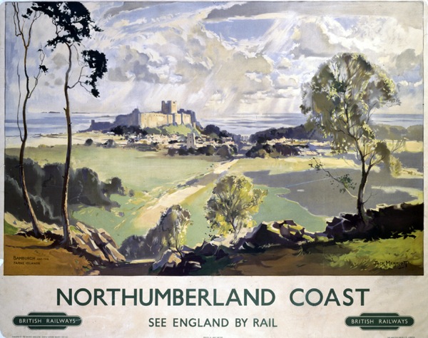
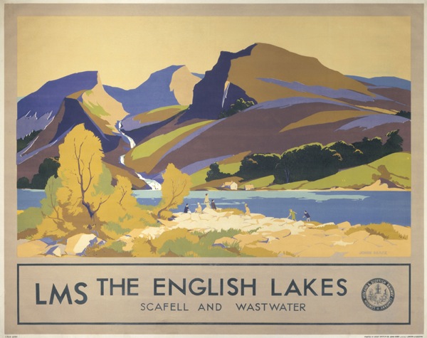
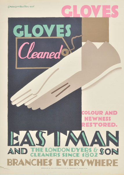
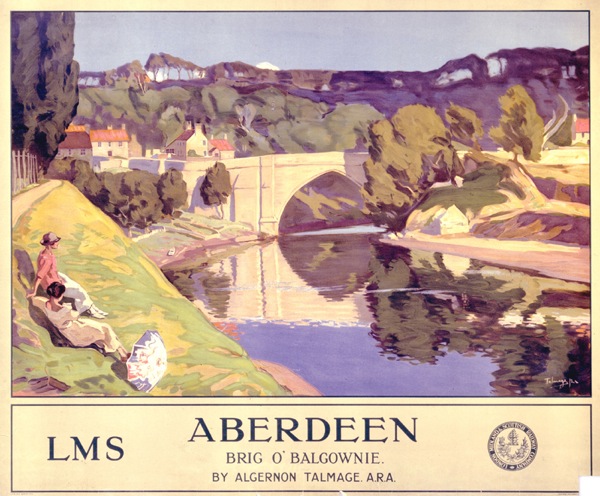
But one thing does strike me on a general level.  In the nicest possible way, these are not my posters.  There is the odd exception, like this Edward Bawden.

Edward Bawden City pair poster London Transport 1952

We sold a copy of the pictorial side of that pair poster a few years ago.  And as is the case with almost every single half-decent poster that we have ever sold, I now wonder what on earth we were up to.  But never mind.

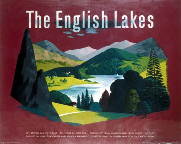
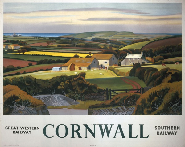
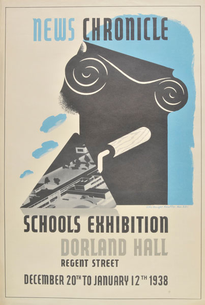
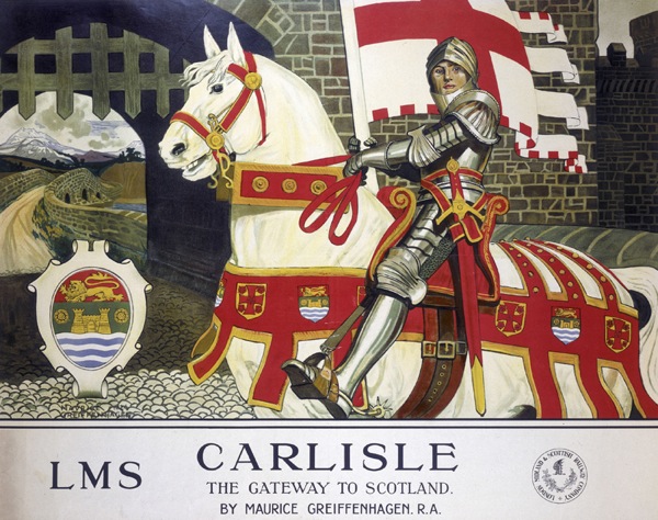
I also like this one too.
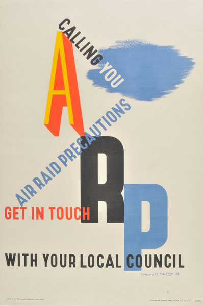
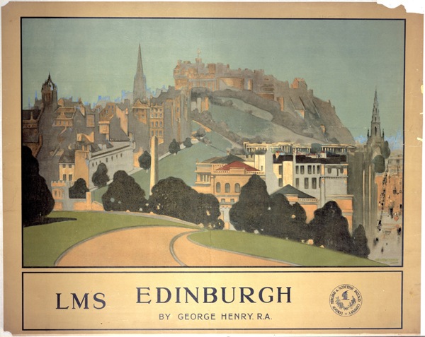
Earls Court, by Edward McKnight Kauffer, 1936 London Transport poster

And this one.

London Transport poster Misha Black and Kraber 1947 At London's Service

Not that I can afford any one of them, but never mind.

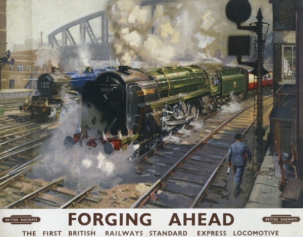
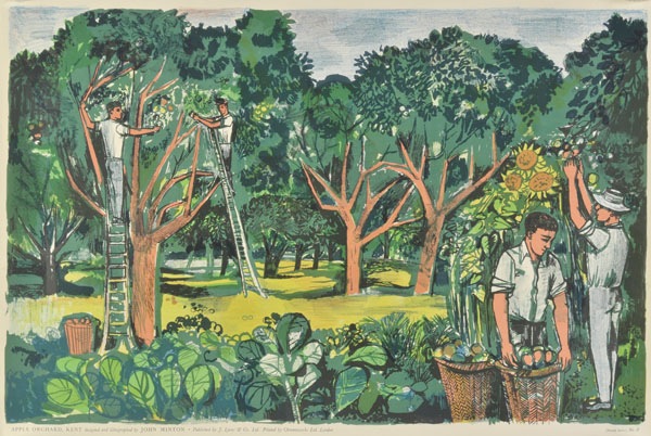
But these are almost entirely pre-1950s London Transport posters.  I can pick out the modernist ones, but there is also acres and acres of Deco and decorative to wade through in the catalogue.  But not a scent of very much at all post-war, bar the odd Bawden and this Abram Games.

London Transport at London's service, by Abram Games, 1947 London Transport poster

Now this isn’t an accidental choice, I don’t think.  The museum has made an interesting decision here, about what to sell and why – at least assuming that they have similar duplicates of the later posters too, which I am sure they do.  The Transport Museum, along with Christies,  may be guessing that the pre-war Deco-style posters have reached the top of their value.  Whereas the later posters are worth hanging on to because their worth may yet go up further.

Now no one is ever going to admit this out loud, so it can only ever remain guesswork on my part.  And of course all the Museum are doing are trying to be canny investors in their stock, which in this case is posters.  They’re hoping that they are getting out at the peak of the market – but they might be wrong and the market might yet go up further.  No one knows for sure, not even this owl.

London Transport poster Heath, owl, by Clifford Ellis and Rosemary Ellis, 1933

But if they are right, then would you want to buy a poster from this sale? Well you would if it was one you’d been after for ages and wanted to hang on your wall, that would be very sensible.  But if you are buying it as an investment?  Particularly considering the, um, quite optimistic valuations on what’s on offer (or, if I am more cynical, the decision to put every poster at £1200+ apart from the really expensive ones).

Anyway, we’ve got plenty of time to consider this between now and October.  But there is method in Christies’ madness; the announcement is now because 60 of the best posters are going to go on show at their King Street salerooms from now – I think – until 24 August.    This might just be worth a visit.  Because I don’t think I am going to be buying anything.

[And yes, the names of the poster artists aren’t on there yet because I have run out of time – this will be fixed at the weekend I promise!]

Hip Hip Hurray

I’ve got lots of things to say about all sorts of things, including the Goons, army life and Graphis, but no time to say them in.  So all of those thoughts will have to wait for a day or two.  Shall we throw our hats in the air instead?

James Mawtus Judd greetings telegram 1963 GPO

I’ve mentioned this greetings telegram before, and now we’ve got round to buying one. It’s by James Mawtus Judd, who is still as ungoogleable as he was last time I tried to look.

He did two other poster designs, at least that I can find.  They are both in the BPMA online archive,  both also dating from 1962, the same as the telegram.

James Mawtus Judd pack your parcels carefully poster gpo 1962

James Mawtus Judd GPO poster careful packing happy opening 1962

And that, my friends, is it.  After that – or indeed before it – nothing at all.  I imagine, given the date and the fact that he was clearly very good at design, that he then went off and worked in an advertising agency where he wasn’t allowed to sign things.  Or made television commercials instead, perhaps.  But if anyone knows differently I would love to hear the story.

Me, Grayson Perry and the railway poster

I mentioned a while ago that I was trying to be nice about railway posters.  It’s all Grayson Perry’s fault.  We came late to his Channel 4 series about taste, and it’s only available on 4OD for just a few more hours, but I am sure it will get repeated because it was one of the best pieces of television I’ve seen in a very long while ( as an ex-tv person, I have high standards).   There wasn’t a poster in sight, just plenty of spray tan, Jamie Oliver tableware and cushions with pictures of labradors on, but it’s still got me thinking about what I do and don’t approve of on this blog, and why.

Grayson Perry All in the best possible taste working class

One of the reviews described Perry as being ‘like one big, walking open mind’, and that was the real pleasure of the series.  He managed to enjoy every visual environment he came into, and to treat them all with equal respect.  That picture above is him dressed up for a night out with the girls in Sunderland, so it isn’t the kind of respect you might expect, but it was very genuine.

Perry had obviously been reading his Bourdieu about how class and wealth are the determinants of taste – his script even used the phrase ‘cultural capital’ when talking about middle class people with the confidence to buy art from junk shops.  But he wasn’t just spouting the jargon, Perry walked around clearly believing that everyone’s choices in decor, clothes, even tattoos, were as valid as anyone else’s.  It was a rare and refreshing spectacle.

So why am I banging on about this, other than to persuade you that the series is well worth three hours of your time when it is finally repeated.  Well, it made me think about a lot of things again and one of them, perhaps strangely, was how I categorise railway posters.  Here’s Exhibit A (all posters courtesy of the NMSI today).

British Railways poster showing Bamburgh Castle and the Farne Islands. Northumberland, Jack Merriott.

I found it really quite hard to choose this poster, a typical landscape one, as I kept being tempted by ‘more interesting’ ones on the search.  So that’s my taste laid bare.  Now for an even harder task, I’m going to find a Terence Cuneo and post that too.

1951 British Railways poster Terence Cuneo Forging Ahead

It won’t come as any surprise to you that I do not love this sort of thing. But lots of other people do, clearly; his works go for thousands and there is a statue of him in Waterloo Station.  I don’t think there’s a statue of Tom Eckersley yet, but I much prefer this.

'Mablethorpe', BR poster, 1960. Tom Eckersley girl on beach

Or even, for a fairer comparison with the posters above, this.

British Railways (London Midland Region) poster. Artwork by Lander. 1951. lovely

Not only am I ranking these in a hierarchy of taste which is not based on a coherent theory, in fact on nothing more than my own personal opinion, but I’m also, in the process, implicitly criticising other people for liking pictures of fields and trees.  Or, indeed, trains.

Now on the one hand this is fine.  Not even Grayson Perry would argue against personal taste.  It is what it is, and what’s the point of having a blog and writing thousands and thousands of words without pay unless it is to indulge your own taste and opinions.  But I think he would be trying to find the good in the other things too.  And in the case of these railway posters I may be able to manage it.

John Mace English Lakes LMS poster 1930s

Instead of categorising these posters as not-an-Eckersley and therefore failures, it’s possible to see them as a natural development, and a very democratic one too, of one of the key strands in British art, the landscape painting.  In the period both before and after the war, when fine art was off on a continental, abstract and primitivist path, British landscape artists were never going to be in fashion.  Unless they were very lucky, they were going to find it hard even to be seen as fine artists.  But that didn’t mean that the art died out, it just went somewhere different for a while, on to posters.  (There’s a lot more that could be said in this argument, but that can wait for another post).

'Cornwall', GWR/SR poster, 1936 Adrian Allinson

In seeing these as inferior to the more abstract poster designs by artists like Games and Eckersley, I’m just expressing the cultural preferences (or perhaps prejudices) of my kind; I’ve been brought up with the narrative of the progress of fine art and so the more graphic designs are, clearly, superior.  I don’t have the money to buy a Picasso, but I will flex my cultural capital by putting a poster on the wall instead.  See my discrimination at work, even if I can’t afford the real thing.

But other people with other backgrounds might have a very different opinion.  Imagine being brought up in the landed gentry, in a house stocked with eighteenth and nineteenth century watercolours alongside the pictures of dogs and pheasants.  If you didn’t have the money for fine art, a railway poster might look very appealing indeed.  It’s just a different story, that’s all.

In the course of the series, Grayson Perry, as well as exploring, makes a series of tapestries about the people he’s met and their tastes. The programme would be worth watching for these alone; they’re based on Hogarth’s Rake’s Progress and are wonderful.

Grayson Perry Vanity of Small Differences tapestry

Their collective title,though, is The Vanity of Small Differences.  Which pretty much sums up the situation with railway posters, because there isn’t that much difference between them in the end, just the slight distinctions of personal taste.

'Speed to the West', GWR poster, 1939 Mayo

Well except for the pictures of trains.  I still haven’t managed to get my head round those yet.  But I will try, I promise.

Paddenalia, inter alia.

I’ve been meaning to post this for ages, and now the Jubilee has been and gone but I’m carrying on regardless.  They’re Marks and Spencers’ Jubilee packaging designs – this is the tin we bought.

Marks and Spencers Jubilee shortbread tin

Remind you of anyone?  To me, there is a definite touch of Daphne Padden about them, particularly this pigeon.

M&S Jubilee packaging for teacakes - pigeon

And of course she designed for Marks and Spencers too.

Daphne Padden Marks and Spencers Christmas cake design

But this isn’t them raiding their archives, they are apparently by an illustrator called Phil Hankinson.  I must drop him a line and ask whether he likes Daphne Padden or whether it is just a happy accident.

Marks and Spencers Jubilee teacake packet

The pictures (because I ran out of time to take them myself and we’re still eating the shortbread anyway) are borrowed from H is For Home’s blog about the packets.  They did it properly, and on time, not like me.

While we’re on the subject of Daphne Padden, a few of her paintings (and a couple of her father’s too) are up for auction tomorrow.  It’s a saleroom close to where she lived, so I wonder what the connection is?

Daphne Padden bird watercolour paintings
Daphne Padden, est £30-50

Dominic Winter’s forthcoming sale, meanwhile, contains a small set of McKnight Kauffer posters, which are worth taking note of because they include this one which I’ve never, ever seen before.

McKnight Kauffer elephant ballet
McKnight Kauffer, 1942, est. £400-600

Yes, that is for an elephant ballet to the music of Stravinsky.  I will let the catalogue explain more…

This advertised the extraordinary Circus Polka, an act featuring fifty elephants in tutus ridden by similarly-clad dancers, which brought together the remarkable talents of the dancer and choreographer George Balanchine (1904-1983), the composer Igor Stravinsky (1882-1971), and the circus manager John Ringling North. By 1942 Stravinsky was an established composer living in Hollywood, and Balanchine was a well-known choreographer and the founder of the American School of Ballet. The elephant ballet was performed during the 1942 season entitled Holidays, in New York’s Madison Garden building where Barnum’s circus had performed since 1881.

These two are also discoveries for me.

McKNight Kauffer Eastman Gloves poster 1926 Dominic Winter
McKnight Kauffer, 1926, est. £200-400

McKnight Kauffer Schools exhibition News Chronicle 1938 poster
McKnight Kauffer, 1938, est. £100-150

This is considerably more familiar, mind you.

McKnight Kauffer ARP poster home front world war two Dominic Winter
McKnight Kauffer, 1938, est. £100-150

There seems to be an unerring rule that wherever the McKnight Kauffer ARP poster is offered for sale, the Pat Keely treatment of the theme must also be there too, and it applies here just as always.

Pat Keely ARP Calling You poster home front 1938 Dominic Winter
Pat Keely, 1938, est. £100-150

I wonder whether these went out together, and whether quite a few were saved together by their recipients as souvenirs of what must have seemed, even then, to be a turning point in Britain’s history.  Later on in the war, the pressure to salvage paper must have been greater, and so fewer posters survived.  Or do these ones exist in great numbers because of an enormous print run?

Also for sale are a couple of Lyons prints, of which my favourite is this John Minton.

John Minton Apple Orchards Lyons Print Dominic Winter
John Minton, 1951, £200-300

More obscure, but quite enticing despite this, are a collection of Edward Bawden and John Aldridge wallpaper samples.

Edward Bawden wallpaper design Dominic Winter
Edward Bawden, c1940s-50s, est £300-500

But then they’re just as expensive as a good poster, and quite a bit smaller, so perhaps not.

While we’re on this kind of track, shall I draw your attention to a few things worth noticing on eBay as well?  Top Quad Royal tip is this Hans Unger, although it comes with a rather aggressive start price of £193.  But it’s still nice.

Hans Unger 1959 London Transport poster theatre

We have a copy ourselves, but one which could probably win a competition  for worst preservation and condition of a poster ever.  It’s so bad that I am too embarrassed to put a picture of it on here.  Mr Crownfolio is saving it for when he retrains as a poster conservator, but even then it may still be beyond rescue.

This earlier London Transport poster is rather less my personal cup of tea but probably a bit more of a bargain at £120.  It’s by Alan Sorrell and dates from 1938 and is, if you ask me, a rare example of neo-classicism in poster design of the times.

London transport poster 1938 Alan Sorrell river

While this is an interesting and quite rare Home Front poster for just £39.99.  This campaign was one of the rare early succeses for the Ministry of Information. who generally spent the first two years of the war getting everyone’s backs up.

Home front poster Go To It World War Two ministry of information 1940

But then that price probably reflects the fact that while it is a very important piece of historical ephemera, most people, including me, don’t actually want to sit and look at it all day.

A sentiment that also applies in even greater measure to this.

1960s southern region train map thingy

Advertised as a ‘fantastic train poster from the 60s70s’, it has a Buy It Now price of  £175, but then the seller clearly had a crisis of confidence because the opening bid is set at £10.  What am I missing here?  Can any train fans enlighten me?


Posters on Parade

When I was trying to find some festive-looking posters the other day, my search, rather wonderfully, came up with this in the Science and Society picture library.

Poster wagon railway poster display for Blackpool carnival

We find ourselves at Blackpool station in 1925, and the cart is getting ready to take part in Blackpool Carnival.  Here’s what’s on display:

London, Midland & Scottish Railway display pulled by four horses. The display comprises railway posters designed by ‘eminent Royal Academy artists’: ‘Aberdeen’ by Algernon Mayow Talmage; ‘Carlisle’ by Maurice Greiffenhagen; ‘Edinburgh’ by George Henry; ‘The Peak District’ by Leonard Campbell Taylor; ‘The Night Mail’ by William Orpen; ‘Northern Ireland’ by Julius Olsson. The display is to be used in the Blackpool carnival.

This is clearly a fabulous thing simply for existing.  But it’s also interesting in that adds a new layer to how railway posters were shown – and therefore perceived – at the time.

'Aberdeen' by Algernon Mayow Talmage;LMS railway poster, 1924.

We’ve covered quite a bit of this ground on here before, mainly thanks to David Watt’s fine essay on Yorkshire railway posters, which I wrote about a while back.  He makes the point that railway posters are rather unusual because they are displayed at railway stations and so the viewer can assume that they are advertising rail travel, rather than just places.  So they don’t need to show trains or say ‘Travel By Rail’ and this makes them, in his words, semi-detatched from ‘mundane commercial purpose’.  As a result, these posters occupied a middle ground between fine art and the grubbiness of actually selling things.  (This status obviously has implications for modern day collecting of railway posters too, but that’s another thought for another day.)

'Carlisle: The Gateway to Scotland', LMS railway poster, 1924.Maurice Greiffenhagen

These particular designs are more explicit than most about this connection with fine art.  All of the posters on the wagon come from a set of sixteen commissioned by the LMS from Royal Academy artists; they are indeed fine art being displayed on a poster.

As such, they link up with another idea that has come up before, the sense of public bodies using artists and painters in particular for their posters as a form of social good.  I’ve discussed this before in the context of the GPO, Shell and London Transport posters.

The involvement of Shell shows that it wasn’t an attitude that was confined to state-own entities alone, and a similar ethos of public service seems to have been present in the railway companies before the war.  This wasn’t just confined to their publicity; the LNER kept open lines that were running at a loss because they felt that people needed access to them.   So these posters clearly fall into an established tradition of posters which are on the borderline between fine art and advertising, and which are produced, in part, because they are felt to be part of the railway companies’ duties to the wider society they serve.

What’s so interesting about the carnival cart above, though, is that is shows that the LMS had a slightly different attitude to the audience for these posters than I would have imagined – and it’s one that I find rather endearing.

'Edinburgh', LMS railway poster, 1924 George Henry

Until now I’ve always thought of these these posters being on display in stations, where passengers could inspect or ignore them at their will, or in occasional exhibitions (more on these here if you’re interested), where I would have imagined the audience was predominantly middle class.

But at Blackpool, the LMS is taking these posters out, which in itself shows a degree of pride that I wouldn’t have expected, but what’s more it’s taking them out in front of an audience which is probably not quite so genteel and alongside dancing girls, giant dogs and, er, people dressed up as food.

blackpool carnival procession no date

So the LMS is positioning the posters not as ‘high culture’ being foisted on the working classes from above, but very much as part of a thriving and quite varied popular culture.

There are a few other hints too, that this point of view might have prevailed.  This series of posters was one of the LMS’s best-sellers, with Carlisle a particular favourite.  But when I was looking to find the particular posters on display on the cart, I also found a reference to a colour print of William Orpen’s Night Mail.  There are no dimensions given, but I imagine that this would have been a much more affordable version than buying a copy of the original poster.  (And who did buy those? I would love to know.)

Dunluce Castle, Northern Ireland LMS railway poster, 1924 Julius Olsson

Perhaps we need to rethink what the fine art elements of railway posters meant at this time, and indeed later on when they were used by other companies in the same way.  We see something that was imposed on an ultimately indifferent population who were not interested in art, and this may indeed be how the original commissioners of the posters too.  But it’s possible that these images were enjoyed and taken up by a much wider variety of people than we, slightly snobbishly, tend to imagine.

Lend a hand

There’s a certain inevitability about the fact that now I’ve written the Home Front Posters book, a whole heap of new information about World War Two posters has popped up in various places.  This isn’t entirely a painful discovery, and not just because I am now resigned to the fact that while research could go on indefinitely, books do have deadlines.  Because today’s exhibit is that particular joy, a brand new archive.

What’s happened is that the National Archives have digitised a significant chunk of their wartime posters and are distributing them via Wikipedia.  (There’s a full explanation here if you want to know more).  It’s very exciting because there are a large number in there that I’ve never seen before.  Here’s a rather nice Dorrit Dekk to begin with.

Dorrit Dekk World War Two propaganda poster Staggered Holidays

This isn’t just an act of altruism but also a kind of crowd-sourcing, because the archives don’t have much information about many of these posters and they’re asking for people to help with everything from attributions to translation of foreign-language posters.

Part of the challenge, particularly with matching artists to designs is that these aren’t printed posters but the original artworks, quite often without the signatures that the finished item would have.  So it ends up being a process more like finding the provenance of a painting.  For example, we have this Eileen Evans, signed.

Lend a Hand on the Land Eileen Evans World War Two propaganda poster

Which makes it a fairly reasonable guess that these two posters in the National Archives are also by her.

Lend a Hand potato harvest farming holiday camp poster artwork eileen evans national archives ministry of information

Lend a hand with the potato harvest farming holiday camp world war two poster eileen evans ministry of information artwork

In fact I’m confident enough about that to have amended the description for each of those.

Only 350 of the 2,000 designs in the National Archives have been uploaded so far, but what’s already striking is how many of these I’ve never even seen before.  Take this Pat Keely for example.

Pat Keely wait for daylight world war two blackout poster artwork national archives

I think he owes McKnight Kauffer an acknowledgement on that one. Keely’s quite well-represented in the selection that are up so far, again often with previously unseen posters.

Cross at the lights world war two blackout poster national archives Pat Keely

What’s difficult, though, is to interpret what these previously unknown designs actually mean.  Are these for posters which were printed but are as yet unreported – whether that is because a copy never survived, or perhaps does exist but has not yet been digitised by the Imperial War Museum?  Or are they designs which were not actually ever produced?  In many ways. my bet would be on the latter.  Artworks which never went to the printers would be far more likely to survive.

Then on the other hand, this artwork is in there, for a poster which was very definitely printed in quite large numbers.

Make do and mend world war two poster ministry of information artwork

There’s not an obvious conclusion to be had.  Except perhaps that – because of wartime haste, limited record-keeping and the only accidental survival of what were intended to be very ephemeral bits of paper – we’ll probably never have the definitive list of World War Two Home Front posters, never mind their dates and artists.

It’s also worth remembering that this collection is very partial. The artworks all came from the Ministry of Information, but they were by no means the sole source of posters during the war.  Both National Savings and the Ministry of Food, two of the highest-spending departments at the time, commissioned their own advertising, so very few of their designs, if any, would turn up in the MoI’s archives.   And that’s without considering other poster producers, from British Railways to the Army.  Even so, there are still some delightful surprises in there.  It may not be the greatest design ever – apparently by the mysterious Xenia – but I love the idea of Village Produce Associations a lot.

Xenia poster artwork village produce associations

So I am very happy to report that Google reveals many VPA’s founded during the war are still going today.  Hurrah.

That kind of continuity after the war is also apparent in the poster designs.  It’s easy to believe, as I’ve said on here before, that all wartime posters stopped as soon as hostilities ceased, but that’s far from the truth.  Many campaigns, from salvage to fuel saving, just continued unchanged.  This fuel saving poster – in the great tradition of bossy shouty slogans – could date from during or after the war.

Turn that Gas down World War Two austerity fuel saving poster national archives

Other campaigns, meanwhile, were reversioned for the peace.

Dig for Plenty world war two poster reversioned for austerity post war national archives

Dig for plenty world war two austerity poster national archives artwork

It’s also fascinating to see some of the very definitely post-war designs produced by the new Labour Government to persuade people that the continuing austerity was necessary – a much harder job than wartime propaganda.

We work or want post world war two propaganda poster national archives

Wages and salaries can only go up with production post war propaganda poster national archives

These seem to me to be much rarer than the wartime posters, presumably because, by this stage of post-war austerity, no one at all wanted to keep them as a souvenir.

There’s plenty more to be seen in there too – including this Percy Drake Brookshaw artwork for – well for what?

Percy Drake Brookshaw apple picking artwork for something national archives

So why not take a look and see what I’ve missed out.