Ashley Appeal

Today’s Friday special – and it is quite special – is brought to you by Ashley Havinden.

Sales Appeal cover 1955 Ashley Havinden

Unfortunately, the interior of the magazine finds it hard to live up to that cover.  For a start, it is mostly in black and white – this is one of the few other bits of colour.

Shelf Appeal stripes for boxes

What’s more it is the run up to the 1955 Packaging Exhibition at Olympia and so the advertisers mostly want to tell us about their stands and their packaging in quite some detail.  There are even some samples included.

Sales Appeal packaging sample

Which is not to say that the magazine is not interesting.  It would be worth the price of admission for this insight into the world of the travelling salesman alone.

Sales Appeal Travelling salesmen cases ad

But the articles in the magazine are considerably more progressive than the advertising.  There are articles on both Donald Brun and Herbert Leupin to start with.  Sadly they’re only illustrated in black and white, but here are a couple of the posters illustrated, re-found in colour.

Donald Brun Zwicky cat 1946

Herbert Leupin Suchard poster 1952

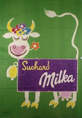
And I can now also tell you that Donald Brun lived in a house which dated back to 1382.  So there.

In addition, there’s an interesting ‘Designer’s Diary’ musing on contemporary design and functionalism, which managed to take in everything from toilet brushes and buses to an exhibition of catalogues.    If I’m reading it right, I think the toilet brush is the winner.

I don’t know much about Sales Appeal, the phrase is so common as to be effectively ungooglable.  I suspect it may be a later incarnation of Shelf Appeal, which was definitely around in the late 1930s, when both McKnight Kauffer and Tom Eckersley designed for it.

Shelf Appeal card

Which makes this picture from the magazine particularly pleasing, because I know how much it will appeal to the other Shelf Appeal.  This is inside Simpsons of Piccadilly, whose main designer was Ashley Havinden.  And if that wasn’t enough, there’s a cut-paper display to boot.

Simpsons Havinden

A very up to date shop display, apparently, and just look at how those shirts are wrapped.

Lions in My Own Garden

Ebay can still, sometimes, come up with the goods.  Like this.

John Burningham Lionland Frieze 1966 front cover

For once it is possible to judge something by its cover, and so this is indeed a wall frieze by John Burningham, from 1966.  Mr Crownfolio watched the auction like a hawk for the ten days it was on, and was pleasantly surprised to get it for not that much money at all.

What’s more surprising is that inside, the whole thing is intact.

John Burningham Lionland Frieze 1966

Even though I can’t really photograph it in a way that shows you that.  At least not without turning the blog by 90 degrees.  So here goes anyway.

John Burningham Lionland Frieze 1966

It is the story of how the lion king and his family are tamed by a girl and a boy.

But I’m sure that much of the fun was in having it on your bedroom wall and making up  stories to fit the pictures yourself.

John Burningham Lionland Frieze 1966

What the whole thing looks like together can be seen on the front and back cover (furnishings by Heals, children’s clothes by Pollyanna).

John Burningham Lionland Frieze 1966 whole cover

It seems, from the brief amount of research I have done, that he did a number of these including Birdland, Storyland, Jungleland and Wonderland.

Jungleland and Wonderland were approved of by the Design Council, and I have the slides to prove it.

John Burningham Jungleland Frieze 1966

John Burningham Wonderland Frieze 1966

While this very comprehensive John Burningham blog also has pictures of Birdland, which I do like the look of a lot.

Birdland

One is probably enough though.  It being all in one long strip does raise some rather interesting framing problems.  Well, either that or blutack it to the wall.

It’s 1959, OK

This has been sitting on my desk for a few weeks.

Furnishing Your Home 1959

Now, I’ll be the first to admit that it’s not a great example of graphic design nor interior styling.  But it has been making me think.

Because this is Autumn 1959, the calendar is about to turn over into the 1960s.  That’s not the only thing which is going to change either, as there’s a new design style in the offing too.  You can see it here, the splayed legs of the contemporary have become straight, the acid bright colour contrasts have become more muted, the typefaces starting to go less Victorian, more sleek (although that yellow script is still hanging on grimly from the jollier 1950s).

In short, what seems to be happening here is that Britain is, finally, getting the hang of International Modernism.  Here’s another dose of it for you, a G Plan room from from 1962 (and while I’m here, I can’t commend its source, the High Wycombe Furniture Archive, too highly, at least if you want to look at industrial quantities of G Plan and Ercol furniture).

High Wycombe G PLan room 1962

Robin Day was doing this kind of thing even earlier than that, as I’ve mentioned on here before.

Robin Day exhibition stand for ICI Royal Agricultural Show

It’s the Mies van der Rohe Pavilion reconfigured in Shepton Mallet; not something which happens often enough really.

Seeing as this claims to be a blog about graphics, here’s a a couple of more relevant examples, by Reginald Mount from 1962 and Hans Unger from 1966.

Reginald Mount vintage CoI poster 1962 home safety

Hans Unger vintage 1966 GPO poster

I also think the Sainsbury’s graphics also represent a similar trend – no, they are what a modernist supermarket ought to look like, albeit one modulated through the idiosyncratic colour choices of the 1960s and 70s.

Sainsburys Own Label biscuit genius

and cornflake modernism

Now – and this may be a deficiency in my reading rather than anything else – I don’t think I’ve ever seen the 1960s described in these terms.  As Pop art, yes, as Mod, that too.  But not as modernism. Have I missed this somewhere?  And can you point to it if I have?  Because I think I’d like to know some more.

Having said all that, in the interests of balance I do have to report that a cruise through our posters, at least, also reveals a huge quantity of design which does not conform to this theory in the slightest – take this 1967 London Underground poster as just one of many examples.

Vintage London Transport poster 1967 Christopher Hill Chalk Downland landscape of the gods

The British love of both landscape and whimsy tends to trip up the modernist impulse in graphic design perhaps more than in other places.

Then there was psychedelia to take on board shortly afterwards to boot.

Properly Packed Parcels Please tom bund 1968

So perhaps the argument holds more true for interiors.  Or perhaps it’s not the case at all.  But I would like someone elses’s thoughts please.

On Show

For those of you in or near London a public information broadcast.  Friend of this blog, Neil Jennings is mounting an exhibition next week at the Art Workers Guild in Queen Square in Bloomsbury.  The cast list looks wonderful, including as it does Edward Bawden, Barbara Jones, Barnett Freedman and Kenneth Rowntree.  And this poster too, apparently.

Michael Middleton 1936 vintage LT poster

It’s by Michael Middleton, who’s new to me, and dates from 1936, apparently.

Anyhow, the show is open Mon, Thursday and Friday for the next couple of weeks, starting on the 5th and you can go and see it if you like.

King listing

All I seem to do at the moment on this blog is write about eBay.  In part this is because I’ve got my head thoroughly stuck into writing a book instead, and so there isn’t much mental bandwidth left for thinking about posters.  (A normal service will be resumed in due course, I promise).  But it’s also because eBay keeps chucking wonderful stuff at me.  Take a look at these.

Complete set of King Penguins end on

What you are seeing there is a complete set of King Penguins, curently at £235 without having reached their reserve.  But I don’t really mind what they sell for because the photographs – and obviously the books themselves – are artworks in their own right.

King Penguins one

King Penguins again

A comprehensive condition report which is at the same time a thing of beauty.  I like that.

King Penguins further

King Penguins final

And this is just a small selection, there are loads more on the listing if you’d like to take a look.

While I’ve got your attention, you might also like to know about these posters.

Tom Eckersley vintage London College of Printing library poster

Tom Eckersley vintage poster national Business Calendar Awards

Tom Eckersley vintage wildscreen poster butterfly

Three late Tom Eckersleys, all with a starting price of £50, but be warned, the bids have started to come in already.

Without linen on backside

At last.  I’ve been banging on about PosterConnection’s shop on eBay for quite a while now – its selection is enough to persuade me to be interested in foreign posters every so often.  Now, finally, they are also selling some British designs.  And good ones too.  Pick of the pops has to be this Daphne Padden.

Daphne Padden Royal Blue vintage coach poster sailor 1957

They are asking about £250 for it, and I can’t work out whether that’s a reasonable price or not.  This is mainly because the last time I saw one of these going past an auction was at the final Morphets sale, where the prices were definitely depressed by the sheer quantity of what was on offer.  What is this worth? Do any of you lot know?

A few other British posters are on offer, of which my favourite is this poster by Harry Stevens from 1960.

Southern Coach vintage poster boy at seaside Harry Stevens 1960

Once again, there is also the chance to see Britain from the foreign point of view.  Which can be quite different, because I definitely don’t remember Manchester ever looking like this.  With the possible exception of the air colour, that is.

Swissair Manchester poster Harry Ott 1951

But I do rather like this cricketing lion.

Cricketing Lion Host Buzas 1960 vintage travel poster

He could almost be by Royston Cooper, but in fact he’s the work of one Host Buzas in 1960.  Good show.

Oh, and in case you’re wondering about the title, that’s how all of these posters are described.

There’s good stuff elsewhere on eBay too at the moment.  Perhaps most urgently, I need to point you at this Abram Games poster, which is a lovely joyful one without bullets or dead people or blood in it.  I know that’s not his fault, he was working for the Army so it was part of the job description, but I do find the results quite hard work sometimes.

Vintage Abram Games army civvy street poster world war two

The bloke who is selling this had the experience which I can only dream of; they bought a new house and found a whole roll of these posters up in the attic.  They’re in very good condition too.  I know this for certain because we’ve already bought one, and very lovely it is too.

While we’re on the subject of attic finds, you might want to watch the Antiques Roadshow on Sunday, because a Scottish woman brought in fifteen Keep Calm and Carry On posters – story here, and indeed everywhere else.  This brings the total known to exist to somewhere round about twenty and they are apparently worth £1,000 each; although how they’ve worked that out when no one has ever auctioned one before and the rip-offs are plastering the internet like bad grafitti I don’t know.  And if they say on the show – as I am pretty sure they will judging by the news story – that they were produced for use in the event of invasion when this is not true I will shout at the television.  So there.

Rant over, back to eBay.  A couple of posters we are probably not going to buy are these two Festival of Britain designs. They are wonderful, but their prices are already soaring into the stratosphere with a couple of days to go.

Festival of Britain vintage poster Abram Games

Festival of Britain vintage poster Abram Games

Festival of Britain is such a lovely searchable term, isn’t it.

For those of us without a bottomless wallet there is both this Amstutz, from 1967 (the sellers has a number of other GPO posters but I can’t quite get excited about them).

Vintage GPO guide poster Amstutz 1967

And then this psychedelic oddity.

boots poster, mad, black and white

They’re both being sold abroad, so might not go for that much.

Finally, this is not a poster, but might be of interest to one or two of you.

how to draw like Ashley havinden

I’d like to be able to draw just like that.  Now off you go, I’ve got a television to shout at.