Woof Woof

So, why, you may be wondering, am I bothering you with 1950s children’s ephemera today?  Evocative and delightful, to be sure, but what’s the reason for its being here?

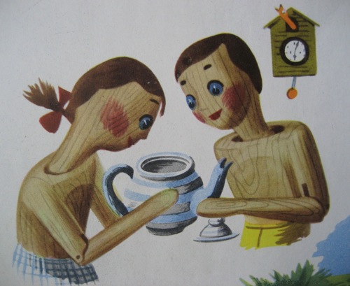
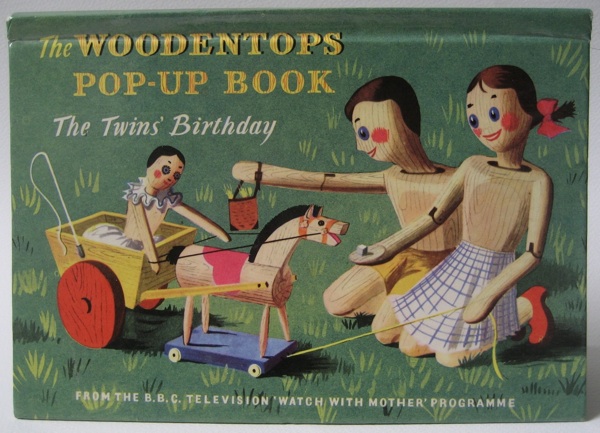
Woodentops pop up book cover illustrated Barbara Jones

Here’s a clue.

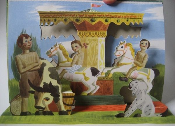
Woodentops pop up book Twins Birthday fairground pop up

The roundabout and its flying fairground horses have turned up before on here.  And in each case they are the work of Barbara Jones.

In amongst all of her ephemeral works like murals and exhibition designs, the fact that she also designed The Woodentops tends to be forgotten.  But surely the series must have reached more people than anything else she did.

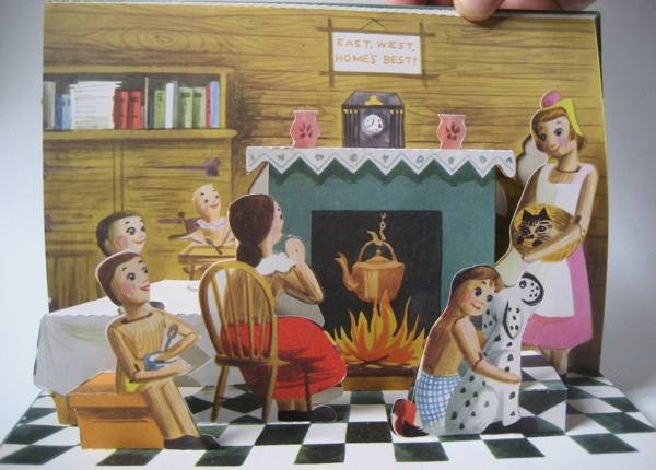
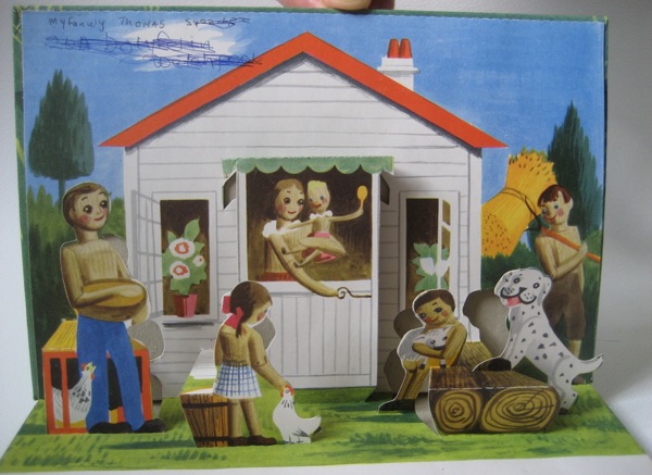
Barbara Jones Woodentops twins birthday final pop up

Apart from a few rare survivals, the series has pretty much disappeared, which means it’s hard to see what she created.  But there were also three spin-off books of which this pop-up design is one.

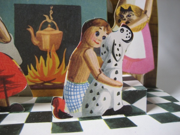
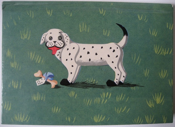
The fairground scene is the clearest hint that she was still using her own interests and style even while designing for children.  But Spotty Dog, who definitely has a bit of Staffordshire china in his breeding, is a reminder of her interest in folk art.

Barbara Jones close up spotty dog woodentops pop up book

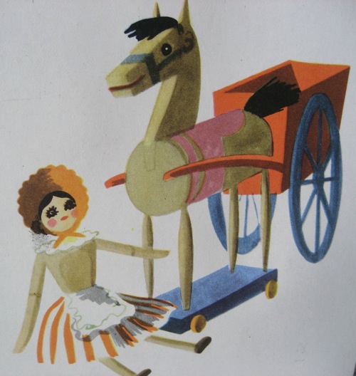
While some of the twins’ birthday present toys must have looked a bit old-fashioned, even in 1955.

Woodentops pop up book illustration toys Barbara Jones

So although the drawings were a bit more sharp-edged than her usual work, the sensibility and eye are still very recognisably the same.  Which I love, because there is no reason at all why children shouldn’t have art and illustration of the highest quality.

Woodentops Barbara JOnes illustration of twins

Now at this point, I’d usually be complaining that no one would ever commission someone as left-field as Barbara Jones to design a book or series these days.  But for a change that isn’t true.  Of course there is plenty of sub-standard stuff out there (I’m looking at you, Peppa Pig spin-off books), but, as I’ve been discovering over the last four years, there is also a wealth of fantastic children’s illustration and animation too.

Barbara Jones Woodentops pop up book first page

What we’re really missing these days is someone as idiosyncratic as Barbara Jones designing and illustrating books for grown ups instead.  But that’s a whole other story.
Back cover of Barbara Jones Woodentops pop up book

By Eck

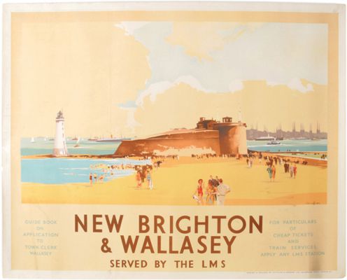
Hurrah, an auction; it feels as though we haven’t had one of those for ages.  Even better, an interesting auction too.  It’s Great Central Railwayana (9 April, Stoneleigh Showground, just in case you’re in the area).  As it’s a railwayana sale, there is of course a lot of this kind of thing, here by Claude Buckle.

New Brighton and Wallasey Vintage Claude Buckle

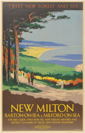
Because it’s a railwayana sale, there are also no estimates (why is that?) or dates either, so I can’t tell you very much about any of these posters. I can tell you that I quite like this one, more for its use of ‘twixt’ than its slightly archaic style.

New Milton vintage railway poster Danvers

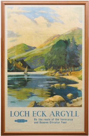
And that I had to post this one, if only so that I can say by Eck.

Lock Eck vintage British railways poster Frank Sherwin

Which is of course exactly what the picture shows.

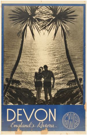
Other than that, there is an early example of a photographic poster, which is rare, but not exactly pleasing on the eye.

devon 1930s photographic vintage railway poster

Although I do rather want one of those swimsuits.

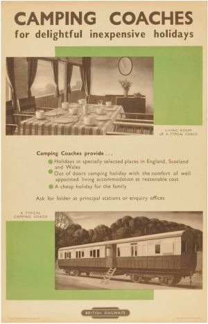
And another chance to revel in the delightfulness that is the camping coach.

Vintage Railway poster camping coaches with photographs British Railways

As well as this Bromfield poster, which is simply good.

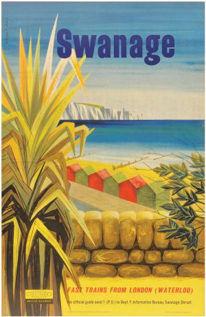
Bromfield Swanage vintage Railway poster

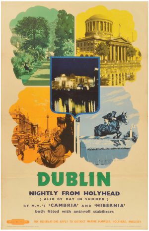
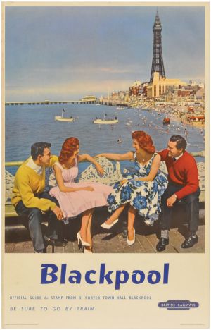
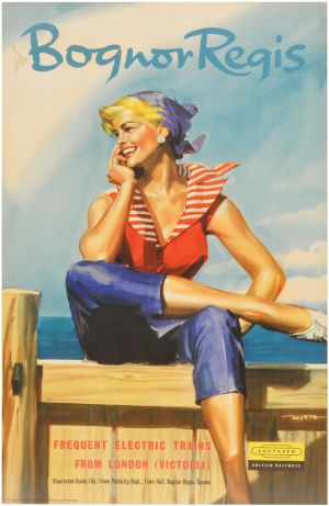
But the real reason that I’m enthusiastic about this auction is that they seem to have stumbled across a previously unknown treasure trove of kitsch, advertising Dublin, Blackpool and Bognor Regis for starters.

Dublin vintage British Railways poster

Blackpool vintage British railway poster photographic

Bognor Regis vintage British Railway poster

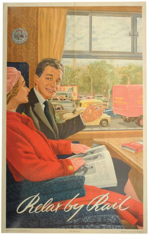
The Ladybird school of illustration is quite well represented, with not just Bognor above, but also this classic.

Relax by rail - vintage British Railways poster

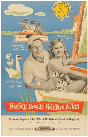
There are more besides, but my poster of the sale, for its pure distillation of 1950s camp has to be this one.

Norfolk Broads vintage British Railways poster

Oh I do wish there were estimates so I knew whether or not I could afford it.

Beck indeed

While I pointed out the P&O archive a while back, I also said that I wanted to come back to it.  And there’s one very good reason for doing so; his name is Richard Beck.

Richard Beck Vintage P&O poster orcades 1937

The handful of posters that he produced for P&O are that rare thing, home-grown British modernism.  And it looks first class.

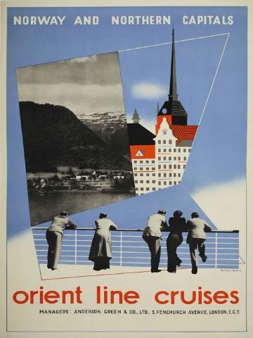
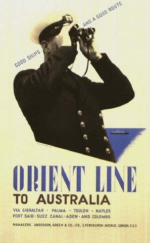
Orient Line Cruises to Norway vintage travel poster Richard beck 1937

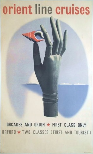
Beck seems mainly to have been active in the late 1930s.  All these three posters for the Orient Line apparently date from 1937.

Orient Line Vintage travel poster Richard Beck 1937

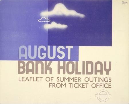
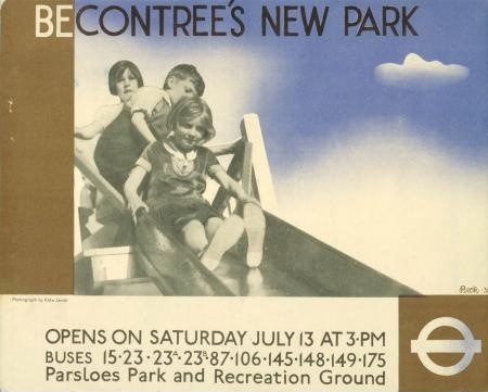
At about the same time, he was also working for London Transport – these two panel posters were designed in 1935.

August Bank Holiday vintage London Transport poster Richard Beck 1935

Beckontree Park vintage London Transport poster 1935 Richard Beck

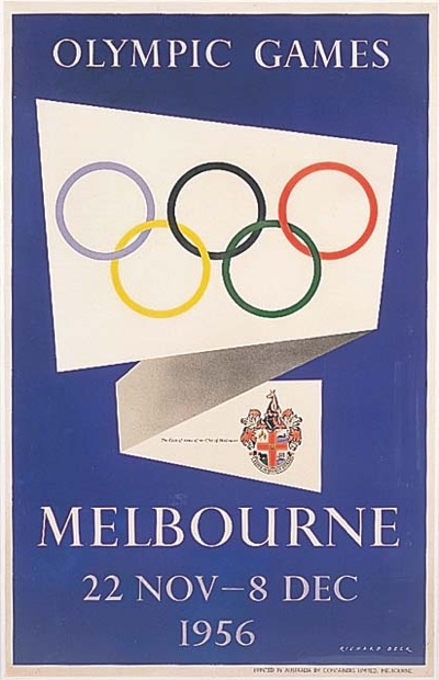
But even before the start of World War Two, Beck seems to disappear from the record for a while.  He next pops up as the designer of this.

Richard Beck vintage poster 1956 Olympics Melbourne

For a change, though, it’s possible to account for all of this, because there are a couple of decent biographies of him out there on the web – the best here.

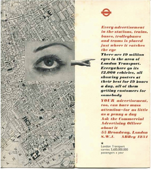
To start with, his early work looks as European as it does, because he studied at the Blocherer School in Munich, so was far more exposed to European modernism than the average British designer.  Hence his uber-modernist designs for London Transport, like this leaflet.

Richard Beck leaflet for London Transport 1930s

Secondly, he then disappears because he went to the other side of the world.  In 1939, he went to New Zealand as design consultant for the British Pavilion at the Wellington Centennial Exhibition.  And he never came back; instead he migrated to Australia, serving in the Australian Imperial Force during World War Two and then setting up a design consultancy in Melbourne when the war was over.

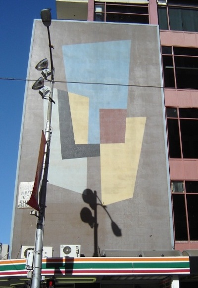
Mural on Hosies Hotel Richard Beck Melbourne Olympics 1956

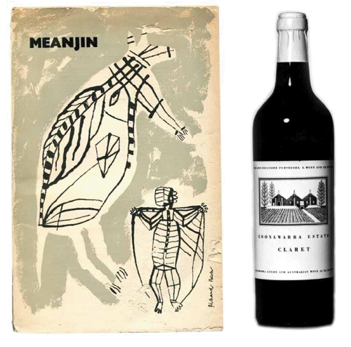
He did very well, too, designing not only for the Olympics (the mural above still exists in Melbourne, although it was apparently once much brighter) but also for a whole range of clients and companies, including stamps for Australia Post and the new decimal currency.  And Australian wine too.

Richard Beck wine design 1950s

Beck did well for himself.  But one of the reasons I find his story so interesting is that he wasn’t the only one.  Just as British design after the war was revitalised by an influx of European designers, it seems that Australian design was also very much shaped by immigrants.  Pieter Huveneers designed for at least as many Australian institutions as Richard Beck.  Did the world of British graphic design seem too closed and old-fashioned for these designers, or was the appeal of a new sunshine life simply so appealing after the rigours and horrors of World War Two?  We may never know.  But if there’s an Australian Crownfolio reading this who has some of the answers, I’d love to hear from you.


Save Your Bit

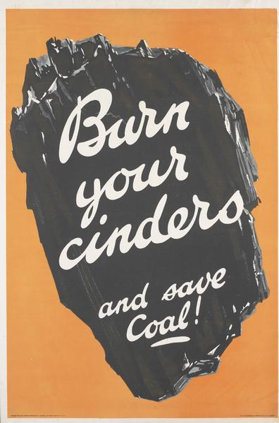
I’ve been rummaging around in the VADS picture archives again, and to my delight have discovered that the Imperial War Museum have uploaded many, many more war posters recently.  I’m not even a quarter of the way through them yet, but this set did particularly amuse me.  They start off fine, even if I don’t actually know what the first one is on about.

Burn Your Cinders vintage WW2 Board of Trade propaganda poster VADS IWM

Even the next one seems fairly reasonable, if a bit depressing.

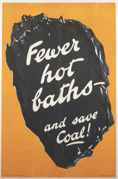
Fewer Hot Baths vintage WW2 Board of Trade propaganda poster VADS IWM

But they won’t stop there, oh no.

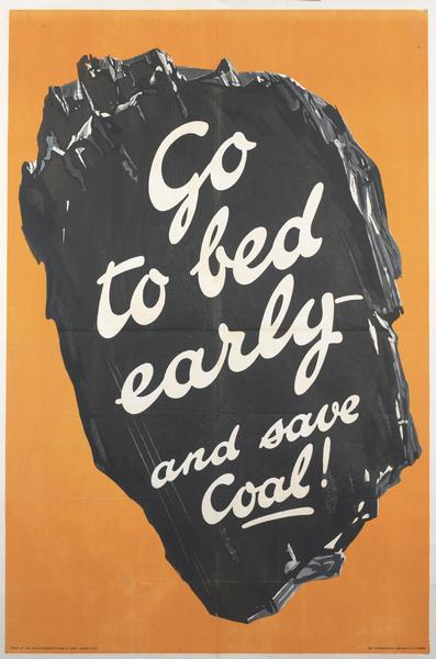
Go To Bed Early vintage WW2 Board of Trade propaganda poster VADS IWM

And although I can find it funny now, it probably wasn’t then.  From this distance it’s easy to rhapsodise over the Blitz Spirit and everyone pulling together, but sometimes the Second World War must have felt like really grindingly hard work.  Especially when you were being ordered about by posters like that one on every street corner and in every shop.  It would have been enough to make me stay up late out of defiance.  Perhaps it’s fortunate that they weren’t reliant on me to win the war.

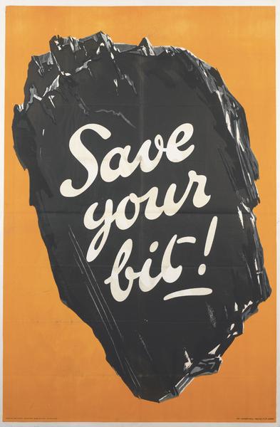
Save Your Bit vintage WW2 Board of Trade propaganda poster VADS IWM

Some Decorative Drawings

Clearly I have the willpower of a small amoeba.  I write about something on here, but then I don’t just walk away, oh no.  I only have to go and buy it.  Like,  say, Motif, which I wrote about only last week.

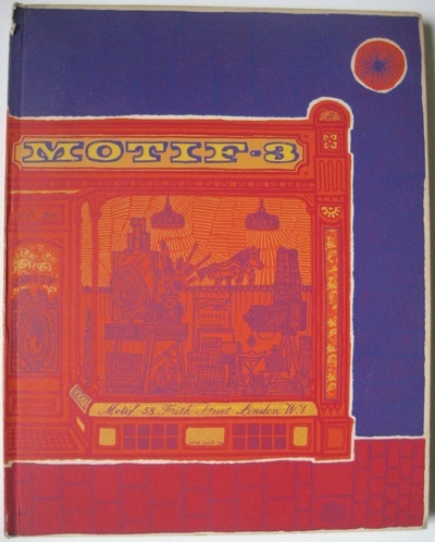
Motif 3 art journal of brilliance front cover by John  Griffiths

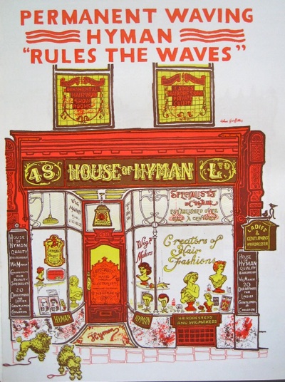
The good news is that we didn’t get the whole set of thirteen for £650, just two for rather less than that.  One of which is the one above.  But it’s the right one, because it has the shopfront illustrations in it.  And they are, frankly, brilliant.

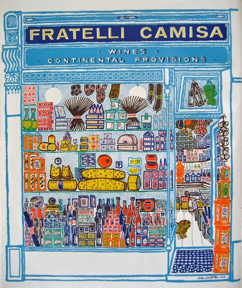
Motif 3 John Griffiths shopfront pictures Fratelli Camisa

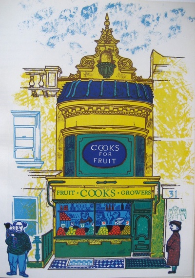
That’s my favourite, not just because it is utterly bright and enticing, but also because I used to go there, sometimes, in my London days.  And look at the little dog peering out of the door.  But the other illustrations are just as wonderful too. Here is Cooks Fruiterers in Brighton.

John Griffiths shop front illustrations from Motif 3 1959

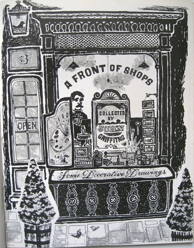
Pretty much all I can tell you about them is that they’re by John Griffiths.  Here’s his title page for the set.

Motif 3 shopfronts by John Griffiths title page

Now the style of these Decorative Drawings isn’t entirely surprising.  They could sit quite happily alongside the work of David Gentleman and Roger Nicholson from about the same time, as well as John Minton too; each part of the same neo-Romantic version of Britain in the 1950s.

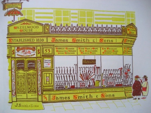
Smiths Umbrella shop John Griffiths Motif 3

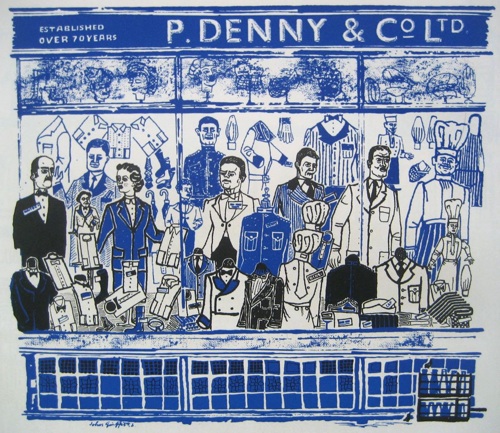
And in their love of the myriad heaps of objects to be found within British shops –  here cooks’ striped aprons and white jackets for waiters – these drawings have obviously been born out of Eric Ravilious’s High Street.

P Denny John griffiths Motif 3 work of brilliance

At the same time, though, Griffiths is very much doing his own thing.  This isn’t a representative High Street, rather a celebration of architecture and idiosyncracy.

Hyman waves shop front illustration John Griffiths Motif 3

In his championing of Victorian and Regency architecture, Griffiths is very much ahead of his time, along with pioneers like John Betjeman.

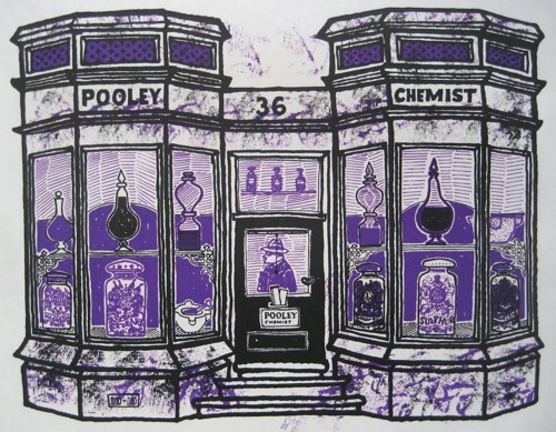
pooley chemist JOhn Griffiths illustration from Motif 3

But in his eye for the eccentric and quirky, he’s out on his own.  There are some great snippets of text accompanying the drawings.  The chemist above occasions the following comment:

Pooley the Chemist in Wimbledon Village took over what was a doctor’s house in 1825.  The manager almost apologised for the poor display in the windows and said they had lost their best jars in the war.  But what they have left are fine enough.

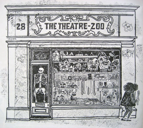
But it’s this which wins hands down, an animal costume shop off St Martin’s Lane.

Theatre Zoo John Griffiths Motif 3

He assured me it would be easy to change a lorryload of students into a cartload of monkeys.  A midget dressed in a bright red jacked with black and white check tights suddenly walked by whilst I was drawing the façade and I did wonder for a moment.

And there goes the midget, off on the right hand side of the picture.

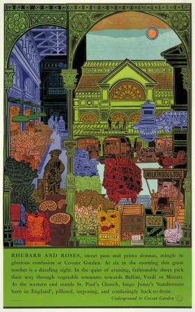
Motif can tell me almost nothing about John Griffiths other than that he was born in 1926 and designed a mural and theatre for the Garden Section of the British Pavilion at the Brussels International Exhibition 1958.  Irritatingly, the internet can’t tell me much more.  He designed a poster, Rhubarb and Roses, for London Transport in 1965.

John Griffiths Rhubarb and Roses 1965 Vintage London Transport poster

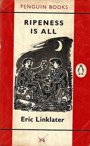
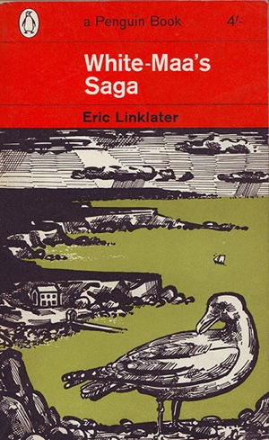
As well as quite a few covers for Penguin Books in the late 1950s and early 1960s.

John Griffiths penguin book cover ripeness is all

John Griffiths Eric Linklater book cover penguin

But that’s it.  Does anyone else know any more than that?  I hope so.

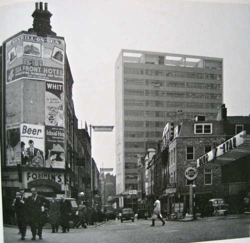
Finally, an extra treat from Motif 3.  Reyner Banham is writing about new office blocks in London, including this one for Thorn Electric at Seven Dials.  I’ve been past it so many times, but had no idea it was by Basil Spence.

Reyner Banham picture Basil Spence office block seven dials with posters

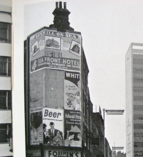
But that, you won’t be surprised to learn, wasn’t what caught my eye.  Because here are some posters too, as they were meant to be seen.

Banham poster detail

Proof, as if any more were needed, that not all posters were ever design classics.  Although I think we could do with a few more along the lines of Beer – Best Long Drink in the World!

Death and the Poster Designer

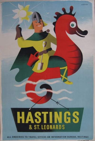
I’ve always loved the smiliness of Tom Eckersley’s posters.

Tom Eckersley vintage hastings travel poster
Hastings, n/d

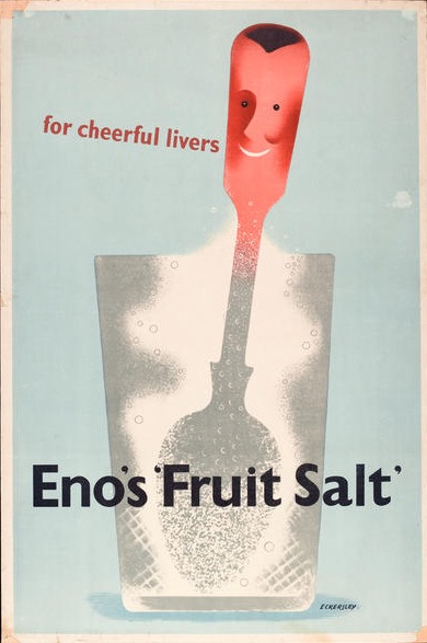
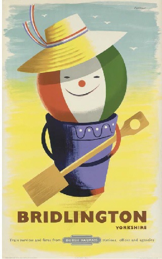
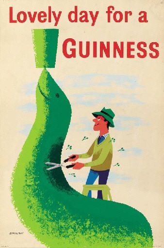
Between the late forties and the mid 1950s, his work is filled with cheerful characters, from spoons to beach balls.

Tom Eckersley Enos Fruit Salts advertisement 1947
Eno’s Fruit Salts, 1947

Tom Eckersley Vintage British Railways poster Bridlington 1955
Bridlington, British Railways, 1955

And of course people.

Tom Eckersley Vintage Guinness poster seal topiary 1956
Guinness, 1956

So I was rather disappointed to discover that Eckersley himself didn’t like these posters later on in his life – he said that he wanted to get rid of the whimsy and the smiling faces as they almost made him angry.  Which seems a harsh judgement on something so delightful.
Then, a couple of months ago, I read an interview with the poet Jo Shapcott, in which she discussed her experience of having cancer.

I ask whether that period changed her sense of the world. She says it did, dramatically. “When Dennis Potter was dying, he filmed that famous interview, in which he talked about looking out of the window, and observing the blossominess of the blossoms with an increased urgency and joy. And I think that does happen to cancer survivors – apparently it’s really common to feel euphoria[.]
But it was her final words which really struck me – and, strangely enough reminded me of all of the posters above.

Does she still feel the euphoria she did at the end of treatment? “I do,” she says. “All these years later, it hasn’t gone away.”

Because perhaps we – and also Tom Eckersley himself – have been doing the 1950s a disservice.

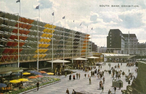
It’s really easy to characterise the early 1950s as an era which was almost feeble-witted.  See the women gladly strap on their floral pinnies and get back into the kitchen while the men take their pipes, sow the vegetable garden and tidy out the shed.  Imagine their pleasure in a brand new fridge or washing machine.  Look at their simple-minded delight in the primary colours and pretty shapes of the Festival of Britain or happy posters with smiles on.

Festival of Britain postcard

All of which is rather patronising, and, I think, wrong.

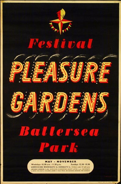
Because these are not a new generation of air-heads but the people who have lived through six years of war. For the first time it’s not only the men on active service who’ve faced death every day, but the women and children, the clerks and the old men too; they have all spent years in which they knew that they might not make it through to the next morning.  Having lived with death breathing down their necks for so long, might they not feel euphoria too once it has departed?

Festival of Britain Battersea Pleasure Gardens vintage poster 1951


They weren’t being dim when they they enjoyed the simple pleasures of their home, or the visual delights of the Festival of Britain.  Rather than a child-like wonder, it was the more c0mplex pleasures of people who have been through the fires and survived.  Perhaps, in fact, they were both more clever and more alive than we are now?

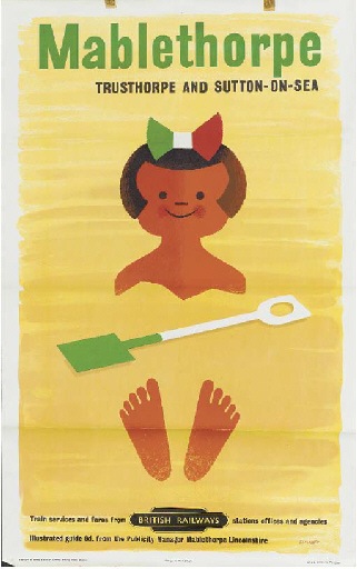
Tom Eckersley vintage British railways poster Mablethorpe

To be fair to Tom Eckersley, he himself partly knew this.  Because he also said of these posters that they were done sincerely. It was just that he couldn’t ever do them again.  Maybe, in the end, the euphoria does fade after all.