In another place

I keep trying to contemplate posters, but my brain isn’t complying and wants to think about archaeology instead.  So, for one day only, the stone circles of Wiltshire as represented in graphic design.  Only on Quad Royal.

Although our first offering isn’t all that.

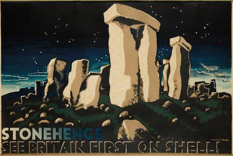
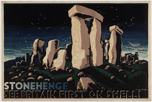
mcKnight Kauffer Stonehenge vintage Shell poster 1932

Despite the fact that it’s in the collections of both the V&A and MoMA and therefore has to be a Modern Classic, I don’t really like it.  There’s too much artistic licence in the hilliness and the surrounding stones for my taste, although I will give it points for being a very interesting collision between high modernism and an almost 18thC romantic view of wild landscape at night

But I have another grievance against the poster which is that I don’t really like Stonehenge either; it’s a freak and an abberation rather than a proper stone circle.  That is a serious point, not just prejudice.  The shaped and stacked lintels of Stonehenge may have become our default idea of what a stone circle looks like (I would say ‘icon’ except that I’d hate myself afterwards; a shame because the word used to represent a useful concept before it became debased).  But no other stone circle in the country looks anything like this.  And you only have to go twenty five miles along the road  – still staying in Wiltshire – to find the real thing.

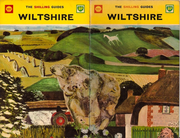
Shell Shilling Guide to Wiltshire Keith Grant

…it does as much exceed in greatness the so renowned Stonehenge as a Cathedral doeth a parish church.

That’s what John Aubrey said about Avebury in the seventeenth century, and it’s still true today.  Which is why Keith Grant was wise to choose its stones for the cover of the Shell Shilling Guide to Wiltshire.

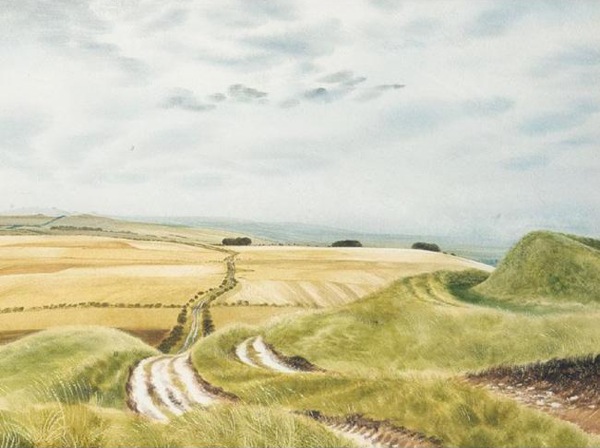
That’s not the only time Shell got it right, either.  The Ridgeway is the prehistoric track which leads across the high downs to Avebury (now walkable as a tidy National Footpath all the way from Tring), and David Gentleman included it in his ‘Roads’ series of posters.

David Gentleman Ridgeway shell poster llustration

This is not the poster but the original artwork.  David Revill posted a comment on the blog the other day to say that he had bought this very picture at the auction of Shell’s original artworks in 2002.  I am envious.

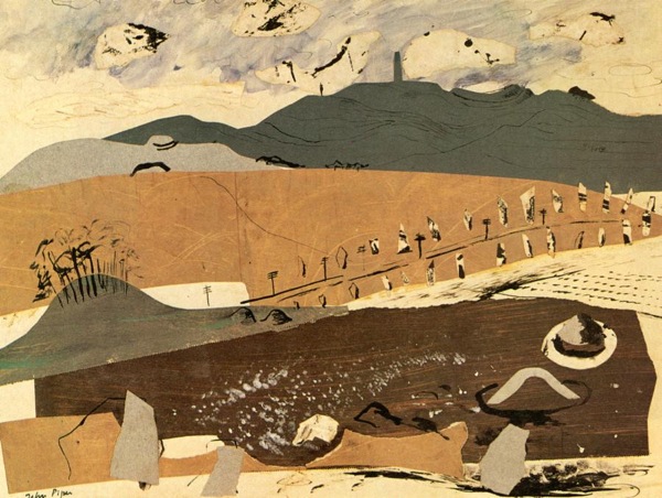
My favourite picture of all though (and yes, I have said this before) is John Piper’s Archeological Wiltshire.

John Piper Archaeological Wiltshire - genius

I would quite happily mortgage the cats for a copy of that, and probably throw in a few posters too, but it seems there is only one and it lives in a museum in Scotland.  But if anyone knows differently, please do say.

I think that’s actually better than the picture below, even though Nash’s re-imagining of Avebury is far more known.

Paul Nash equivalents for the megaliths

Nash’s colours are just a bit too weedy for me to really love this – and the hill fort in the background is about to topple forwards any minute now.  But seen from the present day, it is a remarkably prescient painting.  The hills all over the Wiltshire downs are now covered in geometric bales, cubes and cylinders, which turn his surrealist imaginings into reality every year.

With a bit of luck I have now got that out of my system and a normal service, in which we talk about posters, will resume tomorrow.
New Term

It’s September, school has started (in the case of small Crownfolio, for the very first time) and the auction season is getting back into gear too.  First in the queue are International Poster Auctions in New York, whose Auction of Rare Posters is on Sept 8th.

Most of what’s on offer consists of things that Americans like and I don’t (Barnum and Bailey Circus posters, Art Nouveau, that kind of thing) but there are a few British gems on offer.

Quite a few of these are pre-war London Transport posters like this Dora Batty, but there’s nothing wrong with that.

Dora Batty vintage London Transport poster 1933 up for auction
Dora Batty, 1933, est. $1,000-1,200

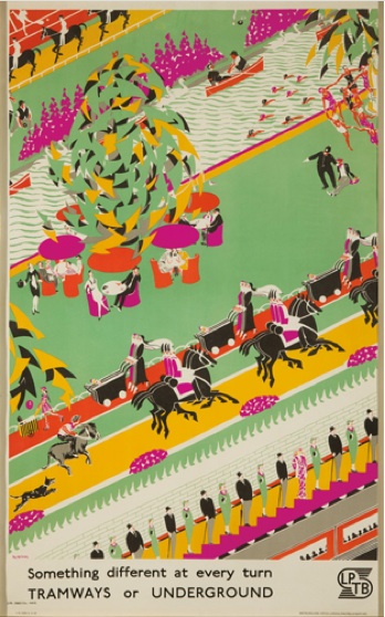
This Roy Meldrum is less often reproduced but also rather fine.  It seems to have an odd familiarity to me, but I don’t know whether this is because it looks like a mixture of so many other images from that period, or simply that I used to own a postcard of it once upon a time.

Roy Meldrum vintage London Transport poster 1933 Something Different
Roy Meldrum, 1933, est. $1,700-2,000

There are also a couple of McKnight Kauffer classics up for grabs.

McKnight Kauffer The Flea vintage London Transport poster 1926
E. McKnight Kauffer, 1926, est. $1,700-2,000

McKNight Kauffer Stonehenge vintage shell poster 1931
E. McKnight Kauffer, 1931, est. $3,000-4,000

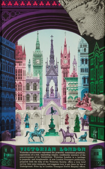
But my favourite is much later than any of these, as it dates from 1973 and is by David Gentleman.
David Gentleman vintage London Transport poster Victorian London 1973
David Gentleman, 1973, est. $700-1,000

Clearly prices rise as posters cross the Atlantic: this poster went for just £130 on eBay last month, much to the disappointment of at least one reader of this blog.

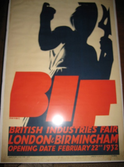
Elsewhere on eBay, it’s still a bit quiet.  This Tom Purvis is out of focus, a bit battered and in the U.S., although that doesn’t seem to be deterring the bidders.

Tom Purvis British Industries Fair 1930s poster on eBay

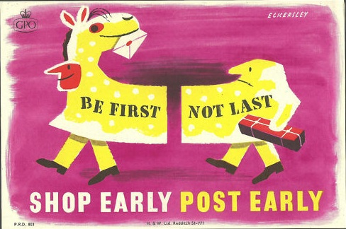
It is also my bounded duty to point out that Cyclamon has yet another of these small but perfectly formed Eckersley GPO posters for sale on a Buy It Now for £35.

Tom Eckersley vintage GPO poster for sale on eBay

I don’t think he’s printing them.

Time future contained in time past

I have to face the fact that I do not know where most of the collectables in this house have come from.  I can account for almost every table and teaspoon, but not it seems the ephemera, the posters and the books.  Especially not the books.  I came across two Hans Schleger exhibition catalogues while looking for something else the other day.  “You’re going to say that you’ve never seen those before,” said Mr Crownfolio, and he was right.  But I’m sure I haven’t.

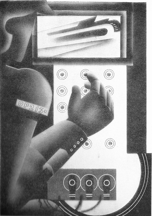
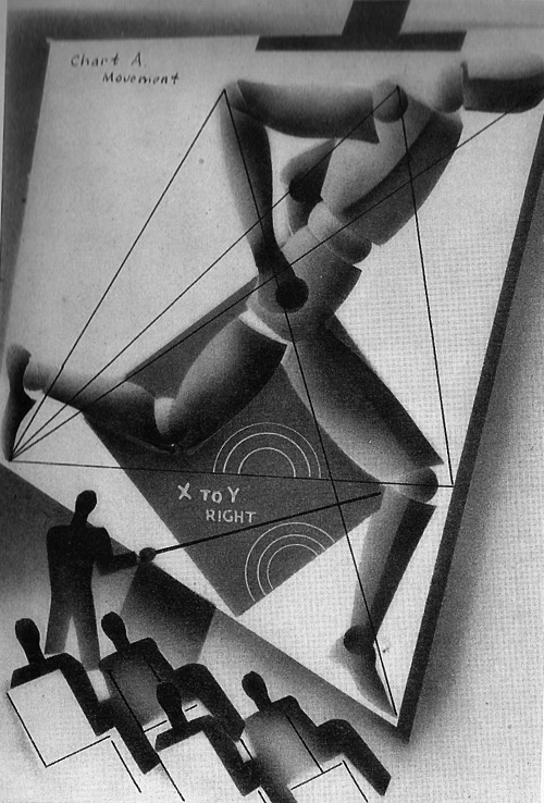
Still, those are for another day; today’s post is a different unaccountable book instead.  We’ve had it for a while, that’s all I can tell you.  It’s The World in 2030 by the Earl of Birkenhead, illustrated by Edward McKnight Kauffer.

McKNight Kauffer Earl of Birkenhead illustration world in 2030 everyday life

Having been thinking about McKnight Kauffer on here recently, I got this down from the shelf.  And then when Shelf Appeal in turn posted another of his illustrations, it only seemed fair to continue the conversation.

But what a great subject for Kauffer this is: how better to express the future than in the modernist style?  Reaching its apotheosis in the final illustration, the future as seen in 2030, a double layer of a future so exciting that it can’t quite be expressed.  Although looking, in the end, quite a lot like a London Transport poster.

McKNight Kauffer Earl of Birkenhead illustration world in 2030 the future

But, as is the way of prophecies, the book is less revealing about the future than about the time in which it was written.  The first, long, chapter for example is all about the future of war.

McKNight Kauffer Earl of Birkenhead illustration world in 2030 the future of war

While this illustration is for ‘The Amenities of 2030’

mcKnight Kauffer Earl of Birkenhead Amenities illustration world in 2030

Amenities isn’t a word that sings the future to us any more, is it?  Local amenity societies, town planning, public conveniences.  It’s a word which wears a cardigan and slippers these days.  But it was young and futuristic once too.

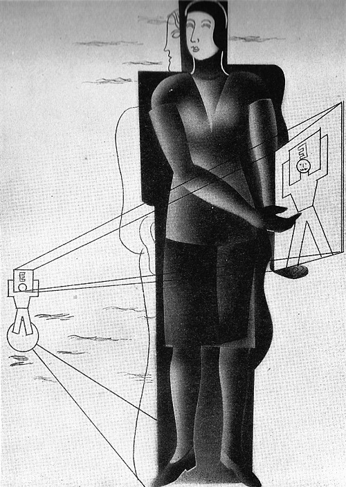
As so often with these books, I can recommend the illustrations more than the text.  Birkenhead was an M.P., Lord Chancellor, great friend of Churchill and sensible enough to commission Kauffer, but his views haven’t aged as well as the illustrations.

An average woman is more valuable to the state than the average man: but the most gifted woman is less valuable to the state than an exceptional man.

She doesn’t look very  pleased with her proposed lot either.

McKnight Kauffer Earl of Birkenhead Woman n 2030 illustration

It seems to be fairly expensive on Abebooks at the moment, although I’m sure we didn’t pay such monies for it.  Then again, what do I know?

That’s modernism, that was

This may not be the cause of great excitement for many of you, indeed it may not even be news, but the Journal of Design History is now freely accessible online.  Which has let me get hold of an article that I’ve been wanting to read for ages, John Hewitt on ‘The ‘Nature’ and ‘Art’ of Shell Advertising in the 1930s’.  Fortunately it turned out to be as interesting as I’d hoped.

Frank Dobson, vintage shell poster 1931
Frank Dobson, 1931

One idea in particular struck a chord, as it links in with the themes that I’ve been mulling over here recently.

By 1930 Shell had come to realise that any whole-hearted endorsement of modernisation was problematical.  The transformation of the environment, occasioned by increasing suburbanisation and expanding commerce and predicated on a dramatic expansion of the motor car industry intensified during the 1920s and 1930s provoking vigorous and sustained resistance from influential lobbies of middle class opinion.

All too soon it had become impossible to see the brave new modern world – as epitomised by the car – as wholly good.  Even worse, advertising itself was seen as a problem of modernity, as enamel signs and billboards sprouted.  So Shell’s advertising changed round about 1930, something which is often ascribed to the arrival of Jack Beddington at the company.  He was part of it, but as Hewitt points out, there was also an important cultural shift taking place.  Hewitt’s essay explores how Shell reconstructed its public image in terms of art and nature, making the threatening motor car seem much more part of a wholesome and quintessential British identity.

Which is undoubtedly true, but there is also another way of seeing it.  Because the change in their advertising was also a flight away from modernism.

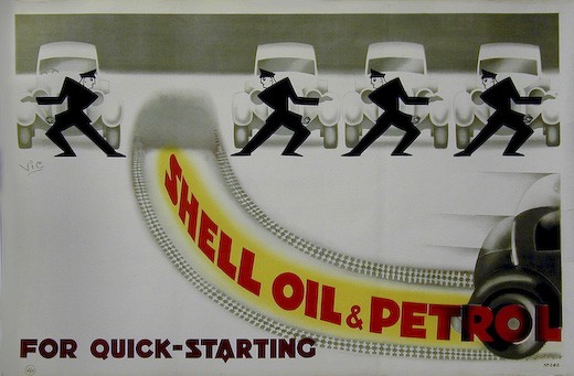
Vic vintage shell poster quick starting pair 1930
Vic, 1930

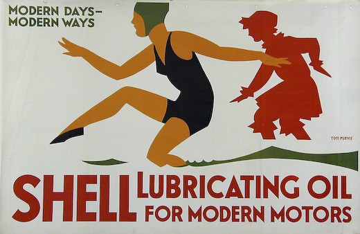
Until Beddington’s arrival, Shell had primarily been selling its products on their technical qualities.  And the underlying language of that was very often modern.

Vintage Shell poster lubricating Tom Purvis 1928
Tom Purvis, 1928.

But when Jack Beddington arrived, he instituted a very different approach.  There was almost no direct selling of the qualities of the product; instead he tried to build up an image for the brand.  And this image was initially based on the English landscape and nature.

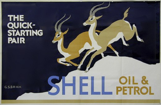
The clearest expression of this is in the ‘Quick Starting Pair’ posters.  Before 1930, these had used images of animals, but often treated in a very schematic way.

G S Brien, Quick Starting, chamois, 1929
G S Brien, 1929

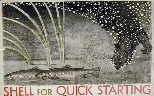
But these were then replaced by much more naturalistic images.

Vintage Shell poster Kennedy north 1931
Kennedy North, 1931

As Hewitt points out, there is a tension between the technological idea and the imagery here which doesn’t necessarily make for successful advertising.

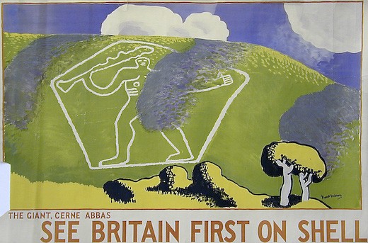
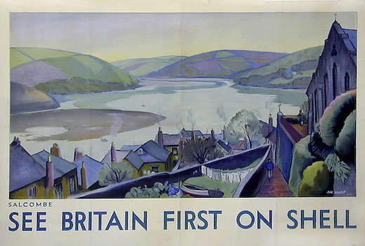
But it was the major landcape campaigns that Beddington, and indeed Shell posters in general, are most associated with.  These began with See Britain First on Shell.

Hal Woolf 1931 vintage Shell poster salcombe
Hal Woolf, Salcombe

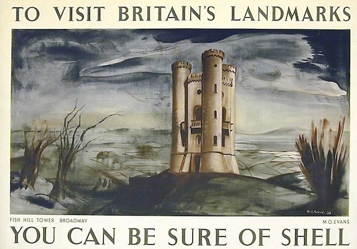
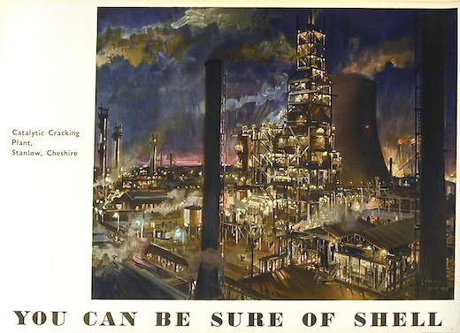
Followed in turn by ‘You Can Be Sure of Shell’.

Merlyn Evans vintage shell poster 1936
Merlyn Evans, 1936

This is not only a very different kind of advertising, it is expressed in a very different visual language.  But it’s not simply a retreat back to traditional landscape painting.  This is still a very living idiom in the Britain of the 1930s, and the posters tap into the vein of British romanticism identified by Alexandra Harris and others before her.

Vintage Shell poster lord berners 1936
Lord Berners, 1936

Which is why I think this essay, and the changes it describes, are worth going into at such length.  Because this retreat from modernism doesn’t just happen in Shell posters.  I would argue that it is happening in many other places – and not just the graphic arts. Romantic Moderns contains a discussion of Virginia Woolf’s Between the Acts which shows how modernist writing was shifting as well.

I find it hard to be surprised by this, though.  Living in Britain in the 1930s, between the Great Depression and the onset of war, it must have been almost impossible to maintain any faith in the endlessly improving effects of modernity.  The evidence against it was easy to see.  And if you don’t believe in modernity, perhaps the jagged edges of the machine age aren’t going to feel very comfortable either.

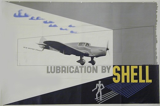
Of course, reality is always much more complicated.  But by looking at some of the exceptions within the Shell posters, it becomes possible to see how some of these complexities worked.  Because there were still modernist posters being commissioned – here’s an example from McKnight Kauffer in 1937.

McKnight Kauffer vintage shell poster 1937

Celebrating its achievements of this sleek new aeroplane is still, perhaps a safe place to use a modern visual vocabulary.  Even if only one was every produced in the end.  Other technical advertising was done in this style too.

McKNight Kauffer vintage shell poster 1936
McKnight Kauffer, 1936

But campaigns that could be construed as selling a technical advantage didn’t necessarily use modernism as the decade progressed.

Percy Drake Brookshaw, Summer Shell vintage poster 1933
Percy Drake Brookshaw, 1933

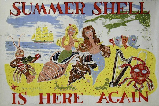
Jack Miller vintage shell summer shell poster 1936
Jack Miller, 1936

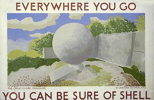
The other way in which Shell could be said to be using modernism was in its choice of artists like Graham Sutherland, Ben Nicholson, Paul Nash and Tristram Hillier.  But as Hewitt points out, these artists might be called modernist, but that wasn’t really the way they were being used by Shell.

Graham Sutherland Shell poster vintage 1932
Graham Sutherland, 1932

Nor was the use of modernist artists a means by which Shell could celebrate its identification with modern technology… They were involved in the campaigns that played down any references to the modern qualities of speed and power.

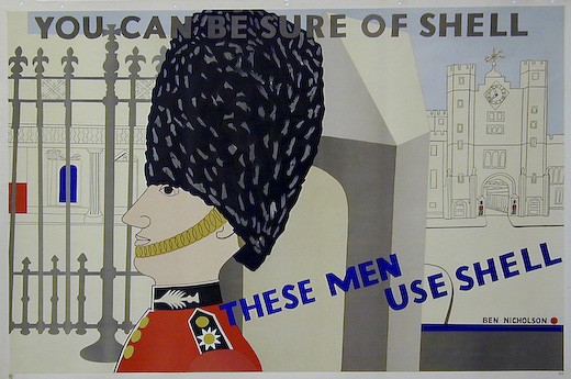
Ben Nicholson vintage shell poster 1938
Ben Nicholson, 1938

The visual language was hardly defiantly modern either; none of these posters were very likely to frighten the horses as they raced past on a Shell lorry.  The modern artists had moved on too.

Hewitt also points out that these artists were not in a majority.  For every poster extolling the modern charms of film stars in an equally modern style,

kathleen Mann vintage shell poster 1938
Cathleen Mann, 1938

there was at least one with a much more traditional point of view.
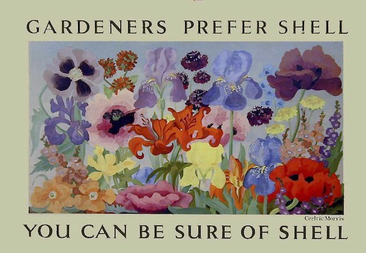
Cedric Morris Gardeners Prefer Shell vintage poster 1934
Cedric Morris, 1934

This is possibly another case where hindsight gives us the wrong view of a period.  The ‘modern’ Shell posters – particularly the ones by the modernist artists – are much more interesting and collectable for us now, so we tend to privilege them and make them seem more normal than perhaps they were at the time.  But in writing this I’ve been through the online images from the Shell Collection.  And what’s there is a very different set of posters to the ones that are normally reproduced, whether in a book or a Christies catalogue.  Sometimes the hunt for modernism can be a self-fulfilling prophecy.
One final footnote.  Shell’s advertising did take on a much more modern tone again in the 1950s.

Vintage Shell poster John Castle 1952
John Castle, 1952

Machinery and technological progress had become not just acceptable, but worth celebrating, one way or another.

Terence Cuneo Vintage Shell poster 1952
Terence Cuneo, 1952.

Modernism was once again possible in the 1950s .  Which is a thought I will be coming back to again one day.

Golf and pageantry

The weather is grey, the economy going into a tailspin, but still those auctions keep on coming.  This week’s offering is from The International Poster Center in New York.

Because it’s in New York, it’s heavy on the usual suspects of Art Nouveau, bicycle posters (which for some reason that escapes me are disproportionally collected and expensive), French travel posters and so on.  Although I do quite like this Cassandre, if only as a terrible warning of what television might do to you.

Cassandre 1951 vintage poster for Phillips television
Cassandre, 1951, est. $1,400-1,700

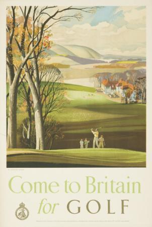
Naturally there are golf posters too, although here at least there is a small amount of British interest.

Rowland Hilder come to Britain for golf vintage travel poster
Rowland Hilder, est. $1,200-1,500

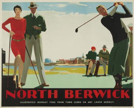
North Berwick vintage travel poster golf Andrew Johnson 1930
Andrew Johnson, 1930, est. $2,000-3,000

People with lots of money do choose the oddest things sometimes.

Elsewhere there are a few more British odds and ends, although they tend towards the traditional, you might even say stereotypical view of Britain.  Golf and pageantry, that is probably what we mean to the Americans.

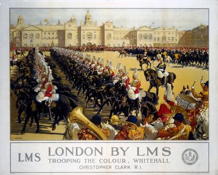
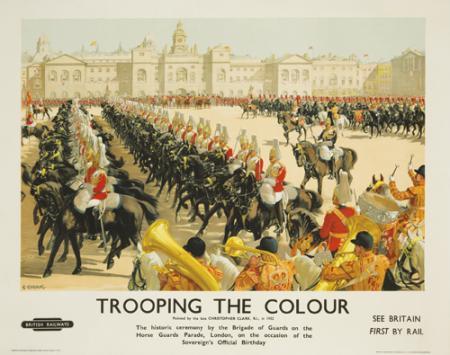
Christopher Clark Trooping the Colour poster 1952 vintage travel british railways
Christopher Clark, 1952, est. $1,500-2,000

Seeing as we’re here, the poster above raises an interesting question about dating.  The auction house have dated it as 1932.  Which is approximately when the picture was painted, but given that it was previously issued in 1930 as an LMS poster, I’m not even sure that that’s quite right.  Here’s the earlier poster from 1930.

Christopher Clark earlier 1930 for LMS vintage railway poster using same image

But neither of these are really the date of the poster, as the British Railways logo shows – it was actually printed in 1952.  So which is the answer ?  I suppose it depends whether you’re seeing this as a print of the painting, or as a poster itself.  I’d date it at 1952 on that basis – what do you reckon?

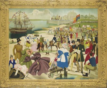
Along the same lines is this, which might as well be a print of a painting rather than the Southern region poster it claims to be.

Anna Zinkeisen Southern Region poster Laying of Foundation Stone at Southampton Docks
Anna Zinkeisen, 1938, est. $2,000-2,500

The frame is particularly bemusing, because the description says merely,

B+/ Slight tears at horizontal fold.

but the image on NMSI has no such frame.  So what is going on here?  Search me.

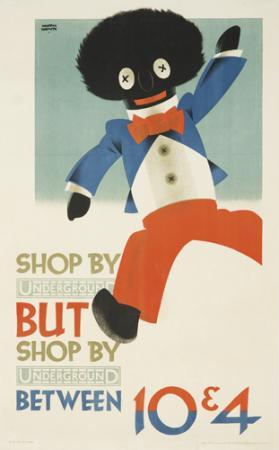
Fortunately there are a couple of pieces of modernity to lighten the day.  Like this Austin Cooper, even if the image is stubbornly retrograde today.

Austin Cooper golliwog vintage London Transport poster Shop between 1928
Austin Cooper, 1928, est. $1,200-1,700

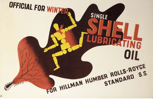
Along with this McKnight Kauffer.

McKnight Kauffer vintage shell poster lubricating oil 1937
McKnight Kauffer, 1937, est. $1,000-1,200

Now the McKnight Kauffer isn’t alone, because one thing that the New York auction does have going for it is an interesting selection of Shell posters.

Vintage Shell poster friend to the farmer Applebee 1952
Leonard Applebee, 1952, est. $700-900

Vintage Shell poster friend to the farmer Hussey 1952
Harold Hussey, 1952, est. $700-900

These two are the most pedestrian of the bunch, but I’m putting them here because the estimates seem quite high.  I can say this from a position of some confidence, given that we bought one of these on eBay for the grand sum of just £12.50 a few years ago.

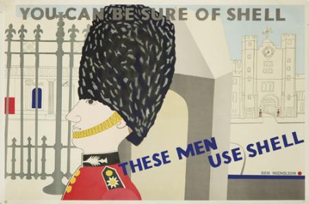
This Ben Nicholson, however, is great.

Ben Nicholson vintage shell poster Guardsmen use Shell 1938
Ben Nicholson, 1938, est. $800-1,000

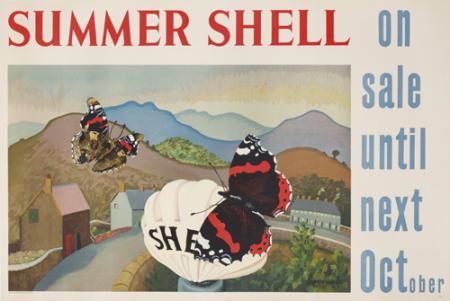
But I also rather like this, by Sir Cedric Lockwood Morris.

Summer Shell vintage poster by Cedric Lockwood Morris
Cedric Morris, 1938, est. $800-1,000

I like it and him even better for having read this fantastic reminiscence.  Anyone who gets into a fight with Munnings has a lot going for them.

Should any of these take your fancy, you can bid online via LiveAuctioneers.  But I have to warn you that buyers’ commission comes in  at a rather painful 22.5%, and then you’ve got to get the thing back over the Atlantic too.

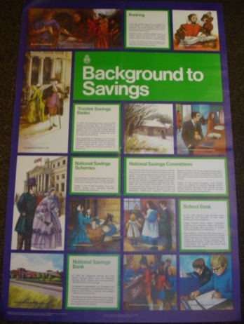
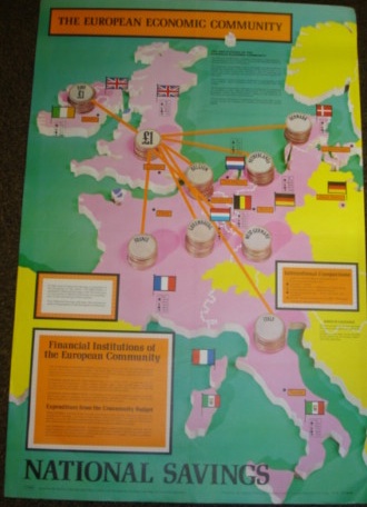
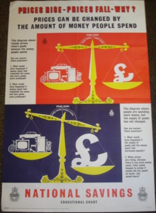
All of which makes eBay seem an attractive option.  If only there was anything out there to buy.  All I can offer you at the moment is a lot of rather late Public Information Posters.  Which I’m mainly pulling out to reinforce a point I’ve made before, which is that National Savings posters are rarely design classics.

Vintage National Savings poster from ebay Background to Savings

Vintage National Savings poster EU map

vintage national savings poster inflation

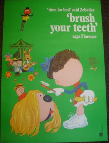
The only one I come close to liking is this incentive to teeth-brushing.

Magic Roundabout brush your teeth vintage public information poster

But I’m not sure I’d pay the £9.99 they’re asking, although I am sure someone will.

The best lot I can find at the moment isn’t even a poster.

Porgy and Bess LP cover by Reginald Mount

The cover design for this LP is by Reginald Mount.  But it would be wasted tucked away on a shelf.

There was one good thing on eBay this week, but we bought it.  So I’ll share that with you when it arrives.

Books and Canons

Right, back to the bookstacks once more.  In a way I’m rather pleased that there’s a backlog of things I need to write about, it shows that posters and graphic design are starting to be taken seriously.  But more than most, today’s book is both necessary and useful.

Paul Rennie GPO Poster Design book cover

It’s GPO Design by Paul Rennie, a neat guide to the posters of the GPO.  Evem better, it’s reasonably priced and available.  That doesn’t sound like much to ask, but in this case, it’s about time.  Because until now, the only book ever written on GPO design was published by a private press in a limited edition, and went for £320 at auction the last time I saw a copy.  Which makes me particularly grateful for this.

What you get is a fairly straightforward run through the history and structures of the GPO as it affects poster design, the varying kinds of GPO posters and what they were meant to achieve, and a look at some of the artist and designers who worked on the campaigns.  Plus of course, lots of lovely posters to look at.

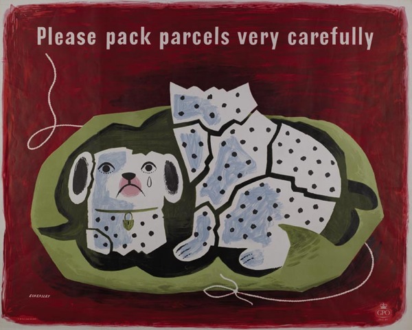
Tom Eckersley vintage poster Please pack parcels very carefully GPO 1957
Tom Eckersley, 1957

It’s simple, but given that absolutely nothing else is available, it’s exactly what’s needed.

So, for example, I now know why so many GPO schools posters survive compared to the commercial campaigns: they were sent out in their thousands to schools, where they were so much more likely to be kept, or at least thrown to the back of a cupboard, compared with the ones sent out to Post Offices.

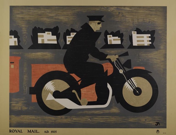
John Armstrong vintage GPO educational poster 1937
John Armstrong, educational poster, 1935

Although, I have to say, I don’t find the designs of the school posters half as satisfying as the commercial ones, as they have a tendency towards the dreary.  The only exceptions being the McKnight Kauffer ones, which are rather fine.

McKnight Kauffer, vintage GPO educational poster 1937
McKnight Kauffer, educational poster, 1937

The book has provoked me to some thoughts, though.  Although they’re not really criticisms of the book itself, as it is meant to be a brief and straightforward run through.  My target is probably more design history as a whole, as reflected in this particular text.

What is starting to bother me is the existence of an established hierarchy of designers.  At the top of the tree are those who were also fine artists.  The chapter on individual designers here begins with Paul Nash, and moves on to ‘fellow member of Unit One, theatre designer and surrealist’ John Armstrong’, only later moving on to the poster designers themselves.

Implicit here is the idea that design itself is not enough, it is better (whether that is aesthetically more pleasing or simply more worthy) if it has been touched by the hallowed hand of fine art.  Alone, it does not deserve the attention.

Perhaps it is possible that posters designed by artists are generally better, although I’m not sure I subscribe to this point of view.  But where it really gets irritating is the continual reproduction of this Vanessa Bell design.  It turns up everywhere that GPO design is discussed.

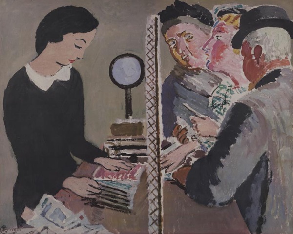
Vanessa Bell unused post office design 1935

Now, this is a failed poster.  It was rejected by the GPO and never used.  Even Bell herself didn’t think the design worked.

I don’t know why it has been so, but for some reason it has taken me ages to do anything I thought would do at all – I think partly because of the difficulty of getting several figures into a small space and yet making them tell at a distance. I have stood about in Post Offices until your employees looked so suspicious I had to leave! – and yet I don’t know that in the end what I have done has much resemblance to a Post Office. However, there it is…

Letter from Vanessa Bell in BPMA archive, quoted in essay by Margaret Timmers

It is possible to see the design as an example of where art and commercialism failed to meet, and Rennie does discuss it in this context briefly.  But I don’t think that this alone is enough to account for its ubiquity.  Because this isn’t just art, it’s Bloomsbury art.  And Britain loves the Bloomsberries, to the extent that it can skew our critical and historical judgement sometimes.

But even when we get the artists out of the way, the book still chooses to comment on the prevailing list of designers, from Austin Cooper and McKnight Kauffer at the top, then moving down to the post-war brigade of Eckersley, Henrion, Schleger et al. (How and why this canon has developed is an interesting question and one I’ll come back to another day as this post is already quite long enough as it is.)

Hans Schleger vintage GPO poster design 1945
Hans Schleger, 1945

Partly this annoys me because I got my critical grounding in English Literature during the late 1980s, where any belief in the Canon of Dead White Males was to be stamped on as a sign of a backward and outmoded way of thinking.  I’m probably not so extreme about it now, but the ingrained urge to stamp hasn’t quite gone yet.

But again, I also think that it can get in the way of us seeing what is really there.

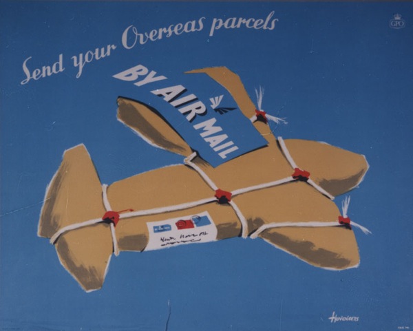
Pieter Huveneers vintage airmail poster 1954
Pieter Huveneers, 1954

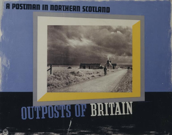
Because one of the joys of the GPO Archive is that they commissioned a wide range of artists, some of whose work I’ve never seen anywhere else.  (The illustrations of the book do reflect this, by the way.)

For example, I was furtling around in there this morning for another reason altogether and came across this, which I have known and liked for ages.

Derrick Hass postcards crab vintage GPO poster
Derrick Hass, 1954

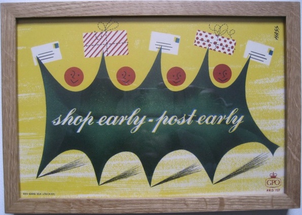
It’s by Derrick Hass, who also did this Christmas design, as seen on here before.

Derrick Hass shop early post early vintage GPO Poster holly

Now it turns out, after I got curious, that Derrick Hass went on to have an extraordinary career in advertising, working as an art director in most  of London’s top agencies for almost forty years, and winning prizes for his work into the 1990s.  His life and work is an important part of graphic design history, and one I’d like to know more about.

But if we only keeps looking at what we already know, histories like that will fall by the wayside.  So it’s fantastic that one book on GPO Design is at last available, but now we need a much bigger one too.  One which tells all the stories.