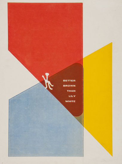
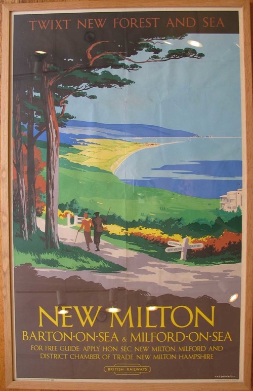
Peaceful charm

I’m not really supposed to be here at all, what with it being the Easter holidays and so on.  But Great Central Railwayana have sent me the catalogue for their forthcoming auction, and guess what, it’s got posters in it.  So I thought you might like to know.

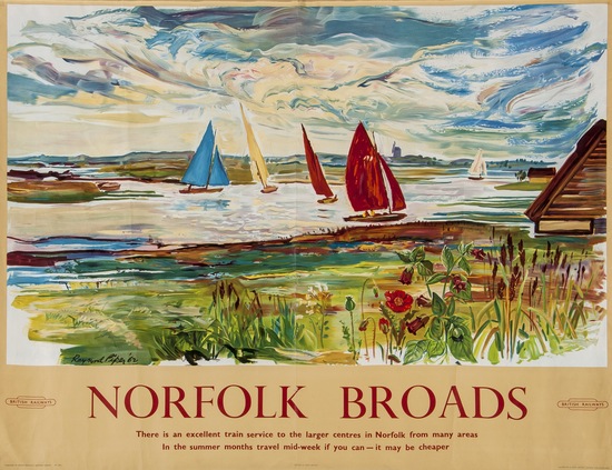
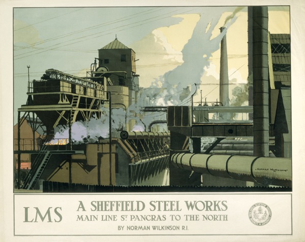
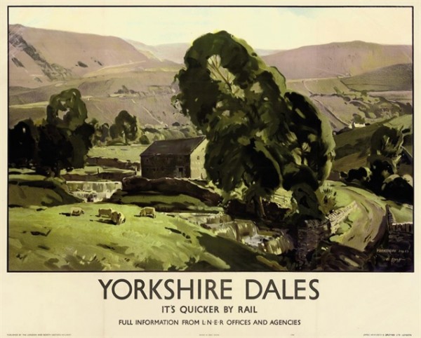
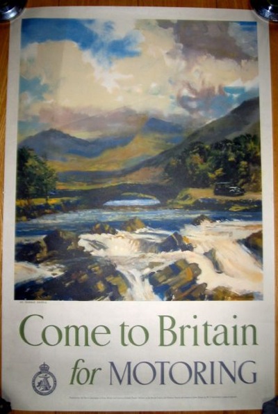
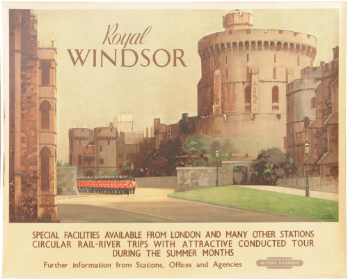
That said, I can’t quite work myself up to a fever pitch of excitement about the selection; rarely have I seen an auction so full of posters which look exactly as I’d expect railway posters to look.  This Claude Buckle is probably my favourite of the very many that there are on offer.

Claude Buckle Somerset

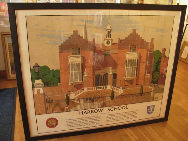
Although there are several others which just look wierdly pedantic and over-detailed, like Ladybird drawings except without the kitsch appeal.  Fred Taylor is not on form in this one.

Fred Taylor Royal windsor british railways poster

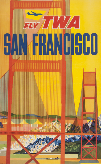
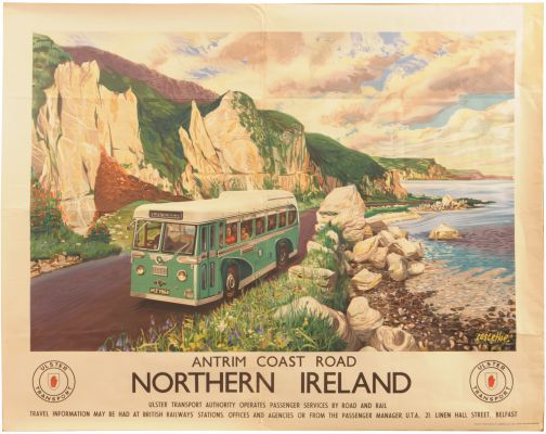
While this, by Costelloe, comes from the Observer Book of Bus Spotting.

Northern Ireland poster costello

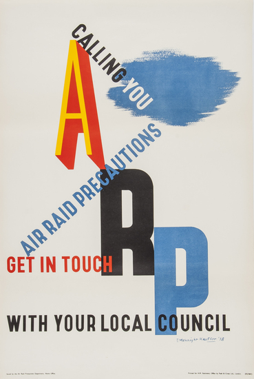
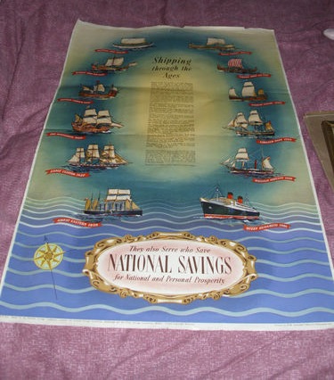
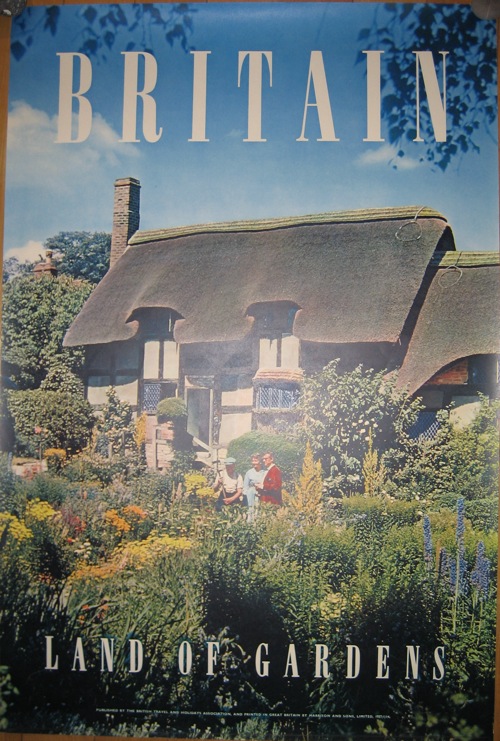
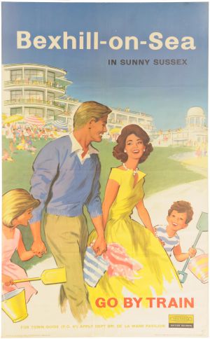
The area of design where Ladybird illustration shades into kitsch is also present, as with this anonymous effort.

Bexhill British Railways poster 1950s

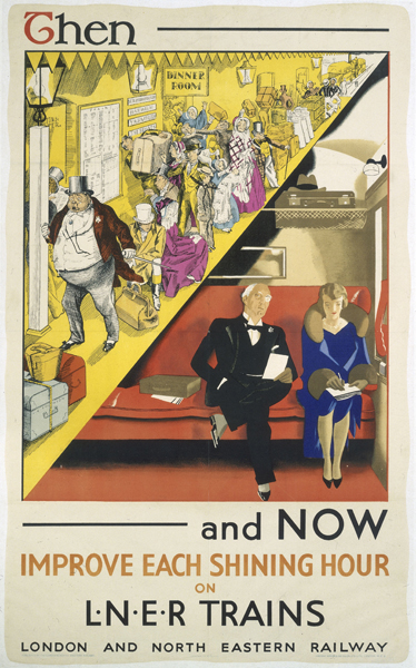
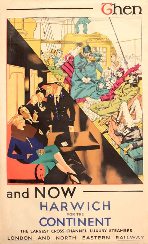
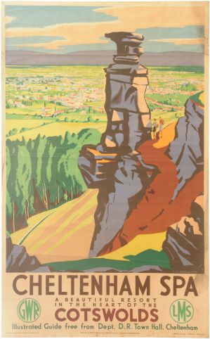
But if railway posters we must have – and it appears we must – there are some to like as well.  This series have always been amongst my favourites, because, I think, the typography isn’t boxed off in a frame.

Cornwall British Railways poster

And I’ve always been a sucker for that Festival of Britain-esque typeface anyway.

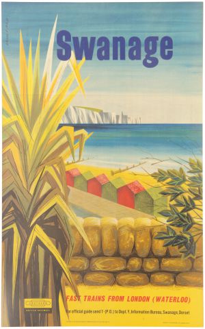
This Bromfield for Swanage is also rather good.

Bromfield British railway poster swanage

And I like this one as well, although I am unable to give a coherent explanation as to why.

Bon Voyage British railways short sea routes poster

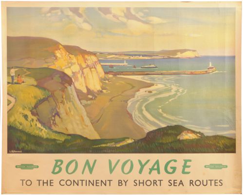
Maybe I just need a holiday.

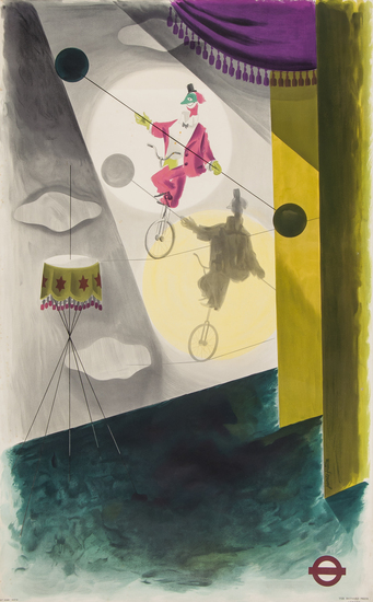
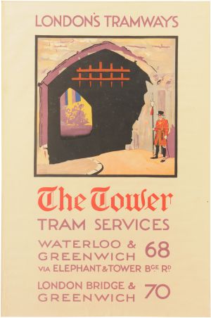
Just to keep us all on our toes (see, I was paying attention) there is also a single London Transport poster, by Frank. M. Lea

Frank M Lea The Tower tram poster

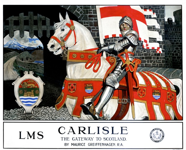
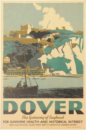
Perhaps the most interesting set of posters, though, are these three, which to me all look to be stylistic cousins.

Cheltenham Spa British Railways poster birtwhistle

To be specific, they are all railway posters with a distinct resemblance to classic Batsford book covers, as designed by Brian Cook.

Gregory Brown Ullswater travel poster

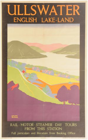
None of them are, though  – the first one is by Birtwhistle, the middle one by Gregory Brown and the very striking version of Dover below is by D. W. Burley.

Burley Dover Southern railway

I’d like to think that it’s someone with particular taste selling their collection, but it’s probably just chance.

You might even include this 1946 Walter Spradbery in the collection too if you were feeling generous.

Thames Valley railway poster walter spradbery

I’m always rather intrigued by these posters which, although they date from just after the war, still have the ghost logos of the old railway companies on them.  It always makes me wonder what people knew, or at least what they wanted to believe. The Railway Executive had been running the railways for six long years, and surely, after the General Election, people must have known that nationalisation was coming.  But these few posters still slipped out, as though someone, somewhere, wanted to believe that it would be possible to carry on as though nothing had changed.  Even the image here reeks of that kind of nostalgia, as though the art deco days of before the war could still be reached, just a few stops further down the train line.  Or am I being too fanciful?

This, of course, is a a railwayana auction, which means that there are no estimates and I do not have the foggiest what any of these posters  might fetch. But I am going to make a resolution about that, and at some point in the next week or so (school holidays permitting, which they don’t much), I will go back through a couple of old railwayana catalogues and take a look at achieved prices.  And then, probably, curse all the bargains I have missed.  Never mind.  I’d quite like to know what this would go for too.

spratts sign

Unpeopled

We’re going a bit off-piste today, heading for a change towards those heady days of modernity before the Second World War.

That we’re doing this is all the fault of regular correspondent medieval modernist who pointed me at this particular set of posters a while back.

A R Thomson Improve each shining hour LNER poster

And every since then I haven’t been able to stop thinking about them.   But then it’s rare that you get such a set of posters so determined to be object lessons in modernity.  In each one of them, the fusty, over-detailed, over-crowded Victorian era is ttransformed, thanks to the potent magic of LNER, into a chic, clean-lined, highly futuristic scene.

A fine advertising message, you might say, and you’d be right.  But there’s a lot more going on here than just the steam railway  being dragged into an art deco world, so much so that it’s hard to know where to begin.

LNER Harwich crossings poster a r thomson

Let’s start with the artist, A. R. Thomson.  Now I’ve only started researching him today, so I’m afraid that this post won’t contain the benefit of the information in his biography, Tommy: A Biography of the Distinguished Deaf Royal Painter A.R.Thomson, which I am about to order for the grand sum of one new pence.  There is a clue there in the title, but he does seem to have been a quite extraordinary character.

6ft 5ins tall; He was deaf, and also did not speak, his wife helping as business manager. He spoke through his brush. Conducted conversations by making lightning sketches.Studied under painter illustrator and poster designer John Hassall [died 1948] and historical scenes/portraitist Sir William Quiller Orchardson [died 1910].

Since we’ve been talking about murals recently, here is one that he produced for the Science Museum. It’s fourteen feet long.

A R THomson combine mural for science museum

Two other things stand out for me though.

Vintage London Transport poster Street Markets Thomson 1949

One is that he designed this Street Markets poster for London Transport in 1949 (which means that there is a short bio of him on their site as well).  It’s one that I’ve always loved, and occasionally regret not buying at Morphets.

The other is that, at the 1948 London Olympic Games, he was the last-ever winner of the Gold Medal for Painting, which is such a mind-boggling idea that I am unable to process it properly.

He seems to have done quite a lot of poster work during the war, I imagine that he wasn’t called up because of his disability.

A R THomson Fighting fit world war two propaganda poster


post office savings bank tank poster a r thomson

All of which is a massive, but fascinating detour from the point at which westarted, so let’s return to his very peculiar set of posters for the LNER.

A r thomson then and now lner poster flying scotsman

Because despite the modern tour de force that is the Flying Scotsman, there is a deep anxiety underlying these posters.  The trips to the seaside, the carriages, the outdoors games  – even the very railway itself – are all old ideas.  The job that he pictures want to do is to persuade us that  these institutions have all changed with the times.  There is an interesting incongruity here.  Perhaps the most committed users of modernity are those who feel that they have something to prove, that their product might, in fact, date from the past.  Whereas if you are producing a car or a washing machine, it can look exactly how it wants, because it is modern in its very existence.

What’s also absolutely fascinating for me, though, is how this modernity is represented.  The smooth streamlining of this period of modernism/modern design is a vlsual cliche now, we all know what it looks like and it has been revived and reused so many times that it is no longer exciting or surprising.  But here, butted up against the visual clutter that it wants to replace, we can start to see it as it would have been felt back then – stark, surprising, and, for me at least, quite chilly.

LNER poster Then and Now golf ar thomson

When we were discussing these posters in the comments before, medieval modernist suggested that

there seems to be new higher order in the alternative vision, where simplicity and order are prized over chaos

This is true.  And I think that there is a big clue in the word chaos there, because one thing that these posters make me feel very strongly is the effect of the First World War on these designs.  Modernity was an attempt to impose a very rigid kind of order on the world, one that was felt to be very necessary after the chaos, horrer and ultimate disorder that was the trenches.

Now this isn’t something that can ever be proven, just as we will never be able to say for certain that the slightly simple cheerfulness of much 1950s design was a reaction to the next war.

But the big clue for me is in the people.  The Victorian scenes are teeming with humanity, but in contrast modernity requires very few people indeed.  And absence was perhaps the biggest legacy left by World War One.

Sea bathing LNER then and now ppster a r thomson

I don’t think this is just because time has made us forget, although this has to be a big part of it.  I suspect too that it was something that many people who lived in the 1920s and 1930s could bear to articulate fully either.    The reason I think of this is that there is a spine-tingling passage in one of HV Morton’s tours of England, which I can’t lay my hands on right now in which he describes the raw new stone and lettering of the war memorials that are in every village and town that he passes through, and the pain and memories caused every time they are seen.

So the lack of people in these posters – in the posters of this period in general – isn’t just because people clutter up the place and machines are just so much more modern to look at.  That is part of it, but the absences are also more profound.  People are missing in this modern world, killed by the machines of modern warfare, and by their absences they can be still counted amongst us, without us having to speak of them.

Is Your Letterbox Efficient?

I was just thinking that it had all gone very quiet on the auction front, when what should come along but a whole auction full of posters at Bloomsbury.

It’s an interesting hotch-potch with almost every form of poster you can think of represented in the mix.  So there’s foreign posters and railway posters.

PIPER, Raymond NORFOLK BROADS railway poster
Raymond Piper, est. £200-400

Alongside ski posters and London Transport posters.

FITTON, James (1899-1982) CIRCUS, London Underground lithograph in colours, 1937 London Transport poster
James Fitton, 1937, est. £200-300

UNGER, Hans (1915 - 1975) PIMLICO, London Underground offset lithograph in colours, 1972 poster
Hans Unger, 1972, est. £200-300

I’ve never seen that Unger before, although it’s not, in my book, one of his best.  The pricing is a bit, well, interesting as I can’t see that the Unger and the Fitton are in any way comparable in quality, but according to the estimates, they are.

In addtion, there are plenty of poster types that have been mentioned on here before, such as David Klein posters and aeroplane posters with lots of blue skies in them.

Note the increasing prices for David Klein; had I had the foresight and money to buy some a few years ago, I would be thoroughly quids in.  But I didn’t, and anyway, I would only have wanted to keep them.

KLEIN David (1918-2005) SAN FRANCISCO, Fly TWA offset lithograph in colours, c.1958, poster
David Klein, 1958, est. £1,400-1,800

LEWITT-HIM LEWITT (1907-1991)HIM (1900 - ) AOA USA lithograph in colours, 1948 poster
Lewitt-Hi, 1948, est. £150-250.

Another poster that I keep mentioning on here is this McKnight Kauffer from 1938.

KAUFFER, Edward McKnight ARP lithograph in colours, 1938,
McKnight Kauffer, 1938, est. £140-180

As ever, it turns up with the matching Pat Keely.

KEELY, Pat Cokayne (?-1970) ARP lithograph in colours, 1938 poster
Pat Keely, 1938, est. £140-180

My theory about this – and I have said this before but I think it’s worth repeating – is that these posters come up so often because they were deliberately saved.  They were, I believe,  the first propaganda posters issued by the government in advance of World War Two.  So they were a novelty, and also a harbinger of a great event that I am sure quite a lot of people could see coming.  So, if the chance arose, they saved them for posterity, or the grandchildren, or for all the other reasons that make people keep otherwise insignificant pieces of paper.

Move forward two years and the whole British population is drowning in slogans and propaganda, coming at them from newspapers, leaflets and the radio, as well as from posters.  So the last thing they want to do is keep one as a reminder.  In any case, there are so many, which one to choose?  So the latter posters survive in dribs and drabs, mostly saved by accident.  But these first ones, people knew they were important and they kept them.

Fortunately, not everything in the auction is something seen before.  This, for example, has to be one of the least obvious posters ever.

ANONYMOUS BETTER BROWN THAN LILY WHITE offsetlithograph in colours, c.1960ANONYMOUS BETTER BROWN THAN LILY WHITE offsetlithograph in colours, c.1960 poster
Anonymous, c. 1960, est. £200-400

Artist not known, but more than that I have no idea what it is on about either.  Nor, it appears, does Bloomsbury.  Any ideas anyone?

Most exciting, for me at least, are these.

ECKERSLEY, Tom (1914-1997) POST EARLY. GPO lithograph in colours,  poster
Tom Eckersley, est. £150-200

This is just one of five, yes count ’em, five sets of GPO posters, each with ten posters in them.  Including, in this lot, a reminder of what a good designer Harry Stevens is at his best.

STEVENS, Harry (1919-2008) BY AIR MAIL. GPO lithograph in colours, 1951,  poster
Harry Stevens, 1951, est. £150-200

I would bid on them, but judging from our last experience with the Dorrit Dekk lots, these will go for a lot more than the estimates.

AITCHISON YOUR LETTERBOX…GPO lithograph in colours poster
Aitchison, est. £150-200 

And I’m not surprised.  This values them at £15-20 a poster; I reckon they’d go for more than that on eBay.  Although I don’t, to be fair, know what the other posters are, they may all be dogs of the first order.

BROMFIELD FOREIGN LETTER. GPO lithograph in colours, 1951 poster
Bromfield, 1951, est. £150-200

We’ve emailed Bloomsbury to ask what they are, and when we get an answer, I’ll let you know.

Love and money

A proper post is brewing and will follow tomorrow, but this is just a brief appearance to let you know that all your Valentines poster needs are solved.

Dorrit Dekk post office savings bank love poster

I’ve mentioned this Dorrit Dekk poster before, and now it has appeared on eBay, not once but twice.  It ought to go really, it’s just the kind of thing that would sell for a lot more in the right kind of shop, even if it is mounted on some kind of board.

While we’re on the subject of eBay, can I also just remind you that the Quad Royal Daphne Padden prints are also now available on that esteemed shopping site.

Daphne Padden gardener print to buy

They’re very competitively priced, especially when compared with this little gem.

New milton vintage british railways poster

The auction has ended, but until last week it has been on offer for £1,350.  A figure which completely boggled my mind because in the auction at which we bought the Eckersley last week, a copy of this went for, I think, about £300.

Now normally, I would laugh and point, saying that this hasn’t even been restored and how much do you expect me to pay for a frame?  But that’s not going to work here.  For one thing, the auction has been ended because the item is no longer available, which I suspect means they have sold it.  More tellingly than that, they received a Best Offer on it of £1,200.  Really, truly I do wish I had the sheer gall to be a dealer.  I’d make a fortune.  But I have no such ability in me, so you’re all safe.

All of which means that I can make no comment on their one remaining poster, except to say that if you would like to buy this Norman Wilkinson poster for £1,850, you know where you can go.

Norman Wilkinson Harrow School LNER poster

Meanwhile, for those of us without the best part of two grand burning a hole in their pockets, this National Savings poster of Shipping through the Ages currently has no bids at just £3.99.

National Savings shipping through the ages not pretty poster

Or this slightly more appealing example of the National Savings genre could be yours for £6.99

National Savings Club poster

Or we could all just give up and collect thimbles.

Northern return

Last year, I wrote about depictions of the industrial North of England in posters, or rather I pointed out their rather conspicuous absence.  At which point I got quite a lot of comments, mostly saying that I was wrong, and pointing me at posters like this.

Norman Wilkinson Sheffield Steelworks LMS poster

Which is, I am forced to admit, is exactly what I was complaining didn’t exist, a railway poster of Northern industry.  There are, as it turns out, a whole series of Norman Wilkinson posters doing the same sort of thing, including the Runcorn design that I included in the original post, and  a few more to boot.

‘Grangemouth Docks’, LMS poster, Norman Wilkinson industrial  'A Midland Coalfield', LMS poster, c 1935.

'Lanarkshire Steel Works', LMS/LNER poster, c 1935.

I have to say that that last one is the best Norman Wilkinson I’ve ever seen, and if anyone wants to send me a copy feel free.

But Wilkinson wasn’t the only artist working in this series – this poster is by Frederick Cayley Robinson.

Frederick Cayley Robinson Cotton poster LMS 1924

Now on the one hand I clearly am wrong, there are quite a few posters of Northern Industry.  At the same time, though, I don’t think this changes the argument.  The Cayley Robinson poster is dated to 1924, which is the same date as I have seen given to a couple of the Norman Wilkinson posters.  Railway poster dating is not an exact science – the NRM itself dates them to 1923-48 – but I’d hazard a guess that these are all part of the same series.  Which means that putting these kind of images on a poster was, possibly, tried once as an experiment and then never done again.

Now this might have been because the Board of Directors of the LMS thought it unseemly, but it might be because they discovered that this kind of poster didn’t play well with the public.  And at this time, they were able to be reasonably certain about what was and wasn’t popular, because not only did the company sell copies of its posters to the public, it took some notice of how they were doing too.  In 1924, they were able to comment that this poster, by Maurice Greiffenhagen, was selling to the public “in large numbers” (more on this here if you’re interested).

‘Carlisle, the Gateway to Scotland', LMS poster, 1924. Maurice Greiffenhagen

There may be an implicit comparison here with the industrial scenes, or at least I’d like to think so.

None of this can be proven, of course, but what is the case is that this series does seem to have been the only one, which I think means that my overall point about the scarcity of these images (and especially after World War Two when a new technological and manufacturing Britain was going to take over the world) still stands.

But what about the Lake District and the Yorkshire Dales, people complained in the comments.  What about posters like this (any excuse)?

Lander (Eric dates unknown) The English Lakes, original poster printed for BR(LMR) by Waterlow

Or indeed these, and many others like them?

Edwin Byatt Vintage railway poster 1940

Lune Valley 1950 poster Percy Drake Brookshaw

They are northern, granted, but they aren’t industrial which is the real gap in the imagery.  But as ‘mm’, who commented, points out there is another interesting divide to be found between northern and southern landscapes.  It’s a diversion, but it’s one well worth taking.

Maybe the northern landscapes are too wild and untamed to be fondly remembered in the sense you mean. Perhaps it is a safe, cultivated landscape we yearn for or think of as British!

I think this may be true, and it’s worth remembering that the Lake District only became popular, rather than being seen as a rather frightening and uncivilised wildness at the start of the eighteenth century.  There is definitely an ‘otherness’ to these places.

There is something else going on here too, which is a kind of conflation.  Englishness becomes a shorthand for Britishness.

Britain Land of Gardens poster for American tourism early 1950s

While England in its turn tends to be represented by the Southern.

Old england National Savings poster heritage

I thought we should have a few dog-ugly posters by the way, as it was all getting a bit safe and pretty further up there.

All of which means that, however much we admire the Lake District, or Scotland, or the Peak District, it would look a bit odd to have one of the images of these areas with ‘Britain’ or ‘England’ stuck at the bottom.  Although like all good generalisations, there are of course exceptions.

Come to Britain for motoring vintage tourist poster

All of this is covered in much more depth and complexity in David Matless’s peerless book Landscape and Englishness, and now that this has emerged from storage (hurrah) I will have to reread it and, I suspect, post on the subject again.

For the last word, however, I must return to the comments.  Nick S posted this wonderful bit of writing by Harry Pearson which comes, it turns out from a book about football.  But bear with me on this one, it’s not simply relevant, it sums the whole thing up to perfection.

In the North-East, England, or the notion of England, seems a long way off. The North-East is at the far corner of the country but it is separated by more than just miles. There is the wilderness of the Pennines to the west, the emptiness of the North Yorkshire moors to the south and to the north, the Scottish border. The nearest major city to Newcastle is Edinburgh, and that is in another country. Sometimes the North-East seemed more like an island than a region. And there was more. As a boy, I can remember looking through one of those colour illustrated encyclopaedias and coming upon a full-page picture that caught my attention. There were cottages festooned with hanging baskets, burgeoning gardens, white picket fences, a village green, a duck pond, a cricket match, a district nurse on a bicycle, and, doubtless, a future prime minister sitting outside a thatched pub sipping warm beer. The caption underneath read ‘An Everyday English Village Scene’…. this caption was clearly a mistake. Because I lived in an English village and it didn’t look anything like that!

“Twenty years later I went to see a friend of mine in Sonning-on-Thames. It was a hot June day and as we walked across the churchyard I realised that this was, spiritually if not figuratively, the village in the encyclopaedia…. This was England. England, their England. It wasn’t like the North-East at all.

Which is why you won’t often find a picture of a Northern scene with the caption ‘England’ or ‘Britain’ on it.  And even if you do, it definitely won’t be showing their industries.

Typewriter dream of elysian fields

Less eBay, more auctions today, which makes a change.  The main excitement, at least it is if you are me, is a pair of Graham Sutherland posters up for sale at Wooley and Wallis in Salisbury.  This is the catalogue image.

Graham Sutherland How Sweet I roamed London Transport poster 1936

From the text, it appears that the other poster on offer is this (image from the London Transport Museum site).

Graham Sutherland field to field London Transport poster 1936

While I am sure that the catalogue knows what it’s talking about, it’s nonetheless a bit odd, because both of these designs were originally conceived as London Transport pair posters.

London Transport how sweet I roamed pair poster 1936 Graham Sutherland

Graham Sutherland from field to field London Transport pair poster 1936

Given the choice, I think I’d rather have the two on offer.  Not that this opinion is in any way relevant, because the estimate is £2,500 to £3,500, a sum of money which is completely unaffordable if you are currently pouring all of your savings into restoring a knackered old building.

I have to say, though, that if we weren’t being so daft, I’d be tempted.  I don’t know why – after all we’ve never spent anything like that much on a poster before.  So then I doubt my motives for wanting these; is it because it is they are lovely posters, or is it because I like the status of owning not just any old poster, but a Graham Sutherland London Transport Poster.  Am I still in thrall to the idea of the artist even despite buying mass produced images?  Quite possibly.

All of which navel-gazing sent my mind back to the mahoosive Christies London Transport Sale, where the other great Graham Sutherland poster is on offer for £1,500-2,000.

Graham Sutherland London Transport poster 1936

Which I also love, but am also not going to buy, because we need carpets and that’s the end of it.  Except to say that I should probably return to Graham Sutherland’s posters on here one of these days.

Anyway, back to the matter at hand.  Lockdales, an auction house in Ipswich, have a handful of British Railways posters coming up in October.  They are actually quite to my taste, as they’re mostly post-war and just a little bit quirky.

British Railway poster, Broadstairs, The resort with a charm of its own
est. £150-250

British Railway poster, Frederick Griffin, Southend on Sea, Westcliff on Sea, leigh on Sea, Thorpe Bay, Shoeburyness
est. £150-250

Lune Valley 1950 poster Percy Drake Brookshaw
est. £100-150

The third one is by our old friend Percy Drake Brookshaw, and rather fine it is too.

I am mildly amused by this lot, which has been subject to some rather comprehensive cropping and so is described only as “town by an ocean”.

town by ocean auction lot British Railway poster, Alasdair Macfarlane

Shall we turn this into a parlour game?  Can anyone name that railway poster?  (I can’t).

To round this off, there are one or two things on eBay that are worth your time and attention, starting with this.

Derrick Sayer London Transport artwork

Which is a piece of artwork for a London Transport poster, by Derrick Sayer and dating from, so the listing says, the 1940s.

It doesn’t look as though it was ever produced, as there’s no trace of it in the London Transport Museum collection.  Mr Crownfolio says that it reminds him of this Schleger.

Hans Schleger 1937 Highway Code exhibition Charing Cross

I think he has a point there.  The colours also remind me of James Fitton’s work at about the same time.

James Fitton World War Two blackout poster London Transport

I could go on, but I won’t.

Finally, this.  A classic architectural work, with an early Tom Eckersley, well Eckersley Lombers cover to boot.

THE MODERN HOUSE IN ENGLAND Marcel Breuer WALTER GROPIUS Tecton cover Tom Eckersley

Currently at £12.50, but with four days to go, I think it will go higher.  And I have some more Eckersley for you in a week or so too.