Selective Vision
As I mentioned at the time, the two Paignton posters in the forthcoming Christies Sale got me thinking. To be precise they’ve made me wonder why these two posters keep coming up for auction when the rest of Reginald Lander’s vast and varied output doesn’t.

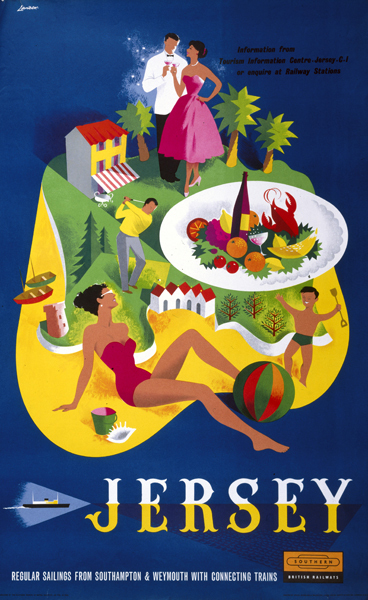
There’s a simple answer, which is that these particular posters are a bit reminiscent of Abram Games, and so are seen to be good and therefore get sold by Christies. Lander did some more in this vein, such as this Jersey design: these come up too, just not as often as Paignton.
Which is fair enough, but it’s a thought worth unpicking a bit further, mainly as a reminder that the market does not equal design history which in turn does not equal what was produced at the time.
Let’s start at the far end of that. Lots and lots of posters were designed in 1958 when Lander’s designs were first produced – I can find over 120 on the National Railway Museum catalogue alone. So in part the Paignton posters must keep appearing because quite a few of them were saved when they were produced (there is a chance, of course, that there are just four or five of them, endlessly doing the rounds of auctions, but I’ll discount that for now). In the case of railway posters this probably means that people bought them for themselves because they particularly liked them.

Now this may be people choosing an excellent piece of contemporary design as decoration, but may also be because, depicting such holiday sundries as a deckchair and a bucket and spade as they do, the images make rather good holiday souvenirs. Perhaps also more people went to Paignton; or it may even be that Paignton Town Council spent more than anyone else on its publicity and so printed loads more posters. Even at the moment of production there are a mindboggling set of reasons why some posters might survive in greater numbers than others.
But that’s only the beginning of it. Because then, from all of the railway posters which do survive, Christies and collectors together do a kind of negotiation about what is ‘interesting’. Interesting, in this sense, is pretty much interchangeable with ‘valuable’.
For whatever reason – perhaps, as I mentioned above a resemblance to the work of Abram Games, a perception that they are ‘good design’ or even just because people still like a cheery picture of a deckchair or a bucket and spade – these posters are now seen as having greater worth than many others. More worth, for example, than those newsagents advertising posters which I posted on here the other day (and then as a result ended up getting the one below on eBay for a tenner).

But there’s nothing definitive about these decisions; while I don’t think the Woman magazine poster is as good as the Lander, is the Paignton poster really sixty or even eighty times better? That’s what the Christies’ estimates would like you to believe, but I don’t think so. And will the relative values be the same in five or ten years time? Who knows.
But Christies are not only making relative judgements, they are also performing a kind of selection. They’d never sell our Woman poster, because it wouldn’t reach anything near their minimum lot value. So some posters are on the inside, others are excluded. Some are seen, some are unseen, and it is thus much harder for the unseen ones to be part of the argument, or indeed the history.
But even that is not the end of it. Because here I am, sifting through what’s on Christies – and elsewhere – to point at the things that I like. There’s a personal opinion in there, for certain; I mostly ignore posters like the one below, even though Christies value it at £800-1,000, over the Lander, because I don’t have anything to say about them.

And don’t even get me started on Terence Cuneo.
But that kind of selection is what happens on the surface. What I’m also doing as I wander about the internet looking for posters, is filling my mind with images, each and every one of which have a small effect on what I think, and write, about their history and design. The same is true for every single person who’s thinking about them too. But what I get to see – however hard I try – is such a tiny segment of the whole, which has been pre-selected by everything from the marketplace to 1950s holidaying habits. Such a partial view, in fact, that it’s hard not to conclude that my opinions are in the end, not really much use at all.
Clearly you can’t take a word I have to say on the subject seriously. Which is a shame, because I also wanted to tell you that the rest of Lander’s output is seriously under-rated. I did blog about this last year (please do take a look, you will enjoy him) so I will content myself by saying that he did a good line in sharp colours as well as the more tasteful stuff.

We have both of these posters (in a tatty state, so the above image is of the original artwork from NMSI instead). Plymouth does come up now and then, but I’ve never seen the Morecambe one anywhere else at all. For whatever reasons.

Although while I was double-checking that just now, I did find this. Which is now definitely on the wanted list.


