Shop Early Post Early

Apologies in advance if this post ends up being a bit like the parish newsletter today, but there are a few things I’d to tell you about, even though they aren’t entirely related.  So bear with me, and the flower rota will be at the end.

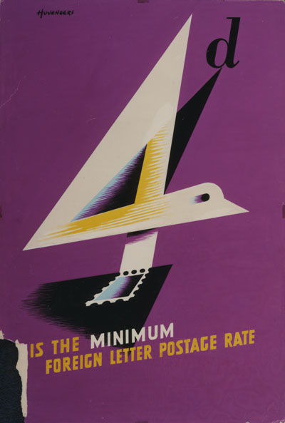
Firstly and also excitingly, the BPMA have also got in contact with Pieter Huveneers, and he is going to answer some questions on their blog in January.  So if there’s anything you’d like to ask him about poster design, the GPO or being a design guru in Australia, now is your chance.  All the details are on their blog.

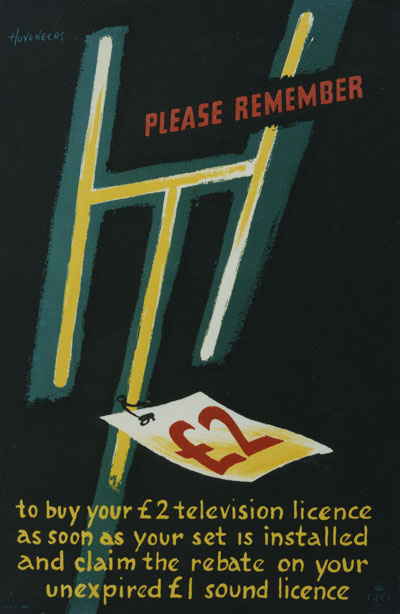
Huveneers vintage GPO poster artwork 1952

The artwork above with the bite taken out of it is from their collections, as is the poster below.

Huveneers vintage television licence GPO poster 1953

This is of course a poster announcing the arrival of a medium – television – which would in the end kill the poster itself stone dead.  Still, Huveneers wasn’t to know.

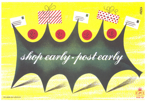
While I’m on the subject of the BPMA, they are once again selling lovely poster Christmas cards, including this lovely Hass.

Derek Hass 1950s vintage GPO post early shop early poster. gotta love it

But there are a whole range of designs, quite a few of which have already featured on Quad Royal before now, and you may find them here.

Most of the rest of our parish consists, as ever, of eBay.  In summary, there are some nice posters out there; however people mostly want rather larger sums of money for them than we – along with I suspect most of the rest of the parishioners – are prepared to pay.  With that in mind, here’s the best of the bunch.

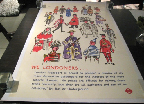
Dorrit Dekk vintage London Transport poster Londoners

Your starter is a lovely Dorrit Dekk, mounted on linen too.  Starting price, £224-ish (it’s in America), although it doesn’t deserve that on the grounds of the foreshortened photography alone.

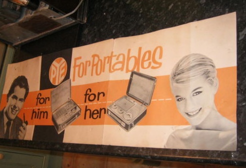
Another photography award goes to the seller of this Pye Radio poster, who has managed to photograph it looking like a giant billboard on the A4.

Pye Radio vintage poster

It is in fact only 74cm long, which probably also means that £49.99 is a fairly optimistic valuation.

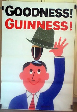
Vintage guinness poster r peppe hat 1962

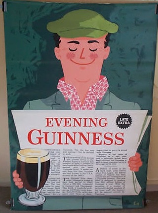
Guinness Evening news

All of which means that when both the above Guinness posters start at a slightly more reasonable £99, I am pleasantly surprised.  The top one is, I think, by R Peppe and dates from 1962, although the listing doesn’t tell you any of that.  The other one I have never seen before in my life, and all I can find out is that it might be by someone called E Hanna, so if anyone can enlighten me further about it, please do.  Rather good, though, don’t you think?

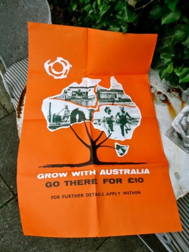
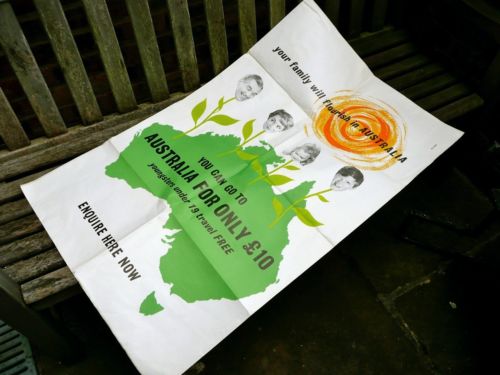
Cheaper, and possibly even more fantastic still, are these two Australian emigration posters.

Vintage Australia emigration poster

Vintage australian emigration poster

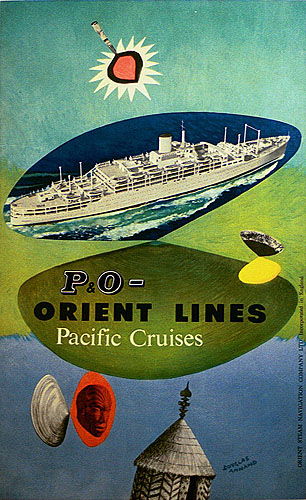
The listing (which in turn wins a prize for being one of the longest I have ever encountered) describes them as being possibly the work of Douglas Annand.  A brief trawl through google leaves me unconvinced, but he did do this poster.

Douglas Annand vintage P&O poster 1950s australia

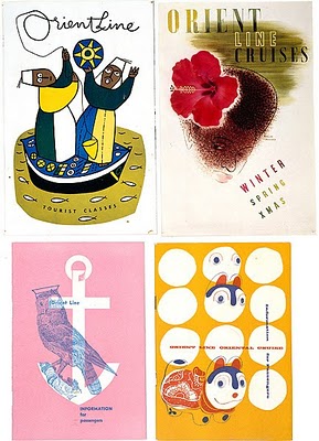
And also these rather great P&O Menu cards too (via this Australian blog).

Douglas Annand vintage P&O menus

Regardless of whether he did those other two posters, they are very still good.  Even better, both auctions started at a thoroughly reasonable £9.99, but with bids already in I am expecting them to go higher.

Digression over, I can also tell you that it is possible to buy expensive posters in places other than eBay.

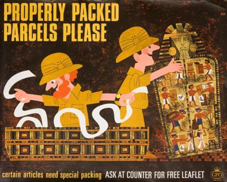
Vintage GPO properly packed parcels please poster 1966.

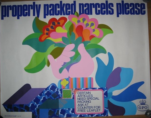
This GPO poster is up for auction by Poster Auctions International with an estimate of $400-600.  I’m usually quite fond of this series of posters, but this one has to be one of the least appealing.  So have this one as a palate cleanser instead.

Properly Packed Parcels Please Tom Bund poster 1967

There that’s better, isn’t it.  All that remains a reminder that the Church Christmas Fair is this Saturday and Holy Communion is at the usual time of 11.30 on Sunday.  See you all then.
Refined Lard

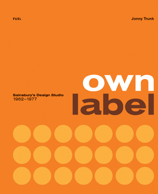
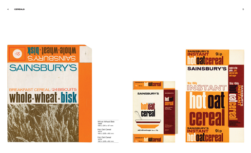
Today something alarming but also brilliant, the Sainsbury’s Own Label book by Jonny Trunk.

Sainsburys Own Label cover

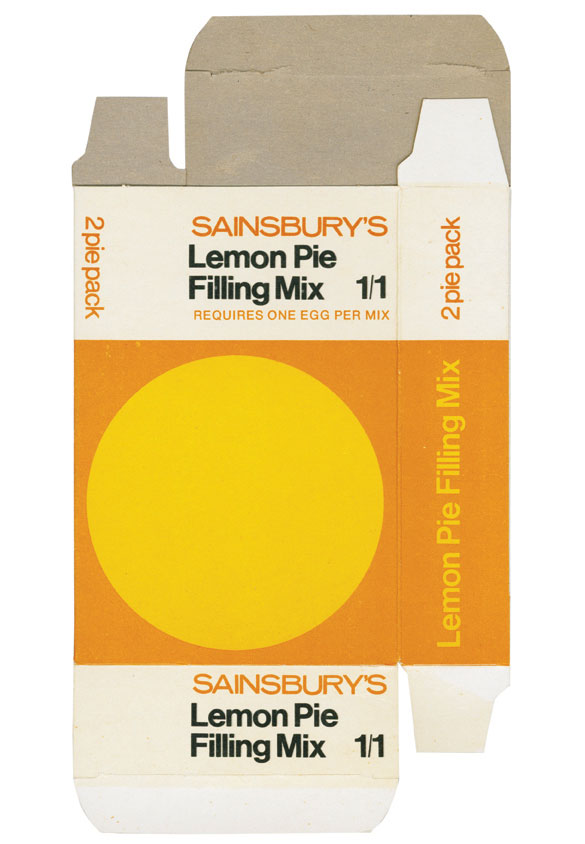
It’s alarming because I’m now old enough for people to be digging up forgotten bits of my past and selling it as retro.  In this case, supermarket packaging.

Sainsburys Lemon pie mix


We always shopped at Sainsbury’s when I was small, so these designs do have a Proustian whiff of being six years old for me.

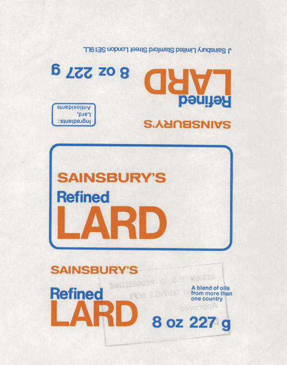
Lard Packaging sainsburys own label book

As for brilliance, the design speaks for itself, even if I wouldn’t fancy eating too many of the contents.  But in a way, that’s a further compliment to the vision of the design.  Who would feel today that a lard wrapper was worth spending good design time on?  Not many people I suspect.  (If you want to follow this thought further, there’s an interesting Creative Review article which compares the designs in the book to what’s on offer today, even if it does wimp out of the conclusion that most design now isn’t half as good.)
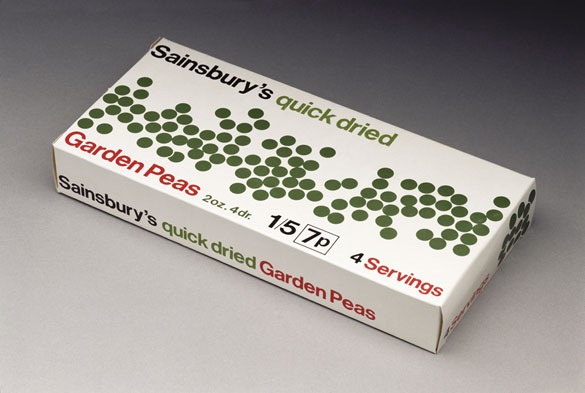
dried peas

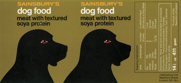
Sainsburys dog food label

The book is also an interesting portal into a moment in design which doesn’t get spoken about as much as it ought to, particularly in terms of graphic design.

I’ve always thought of the period between about 1962 and 1967 as the brief moment when ‘proper’ modernism was finally taken on board by British designers, even if it was only an interlude between Scandewegian light wood and psychedelic curliques.  This book is a reminder that while it might not have lasted for long, the takeover was total.  What’s more, it wasn’t just high end manufacturers and poncey magazines embracing the style; instead it was part of the design of everyday life, just as good modernism should be.

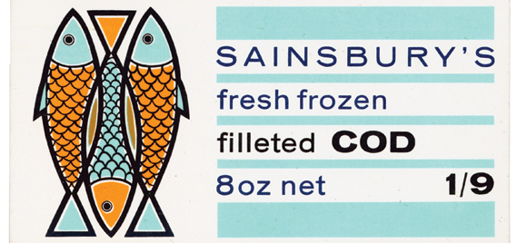
cod packaging sainsburys

Imagine a whole supermarket full of design of this force and ambition.  It’s something I will probably never see again, and never properly appreciated when it was in front of me either.

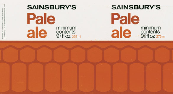
Pale Ale

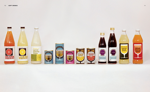
The Sainsbury’s designs in the book start in 1962 but go all the way through to 1977, although I imagine that the most striking designs here date from the earlier period of the studio’s work (somewhere I have an early 1970s Party Dip package which is definitely more psychedelic than anything on show here). But I haven’t read the book yet, so will doubtless have more to say when it does arrive.  Here’s a preview of just a few of the delights inside.

book spread


I thought I’d mention it in advance though because it is a limited edition print run.  A few copies are available from the designers, Fuel, or you can wait until Amazon get their copies in.  But once they’re gone, they’re gone.

While you wait for your copy to arrive, it’s also worth reading Jonny Trunk’s account of how the book came to be.  I tend to believe that the most interesting ideas come out of people following their own eccentric enthusiasms rather than making a calculated decision about what other people are interested in, and this is a classic example of that happening.  Well done that man.

Brave New World, again

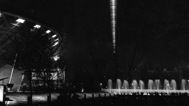
I’ve just got round to watching Saturday night’s Festival of Britain programme, and wanted to draw your attention to it as it’s only  on iPlayer until this coming Saturday.  (Apologies, as ever, to those of you who are outside the UK and so can’t get hold of it.)

Festival of Britain at night promo for BBC2 documentary

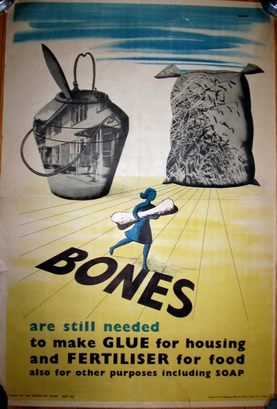
There are quite a few things to enjoy about the programme, not least seeing Dorrit Dekk interviewed on the television, and what’s more also spotting an archive picture of her with this poster in the background.

Bones vintage 1946 public information poster propaganda

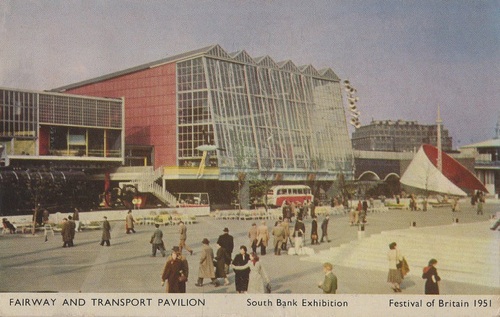
She wasn’t alone either, as they’d interviewed a whole host of original designers and visitors.  Even better than that though, the programme is stuffed full of  tons of contemporary colour footage of the festival, set to some great music.  Whichever researcher found the calypso Festival of Britain song, which included amongst many memorable lines a paen to the Charing Cross pedestrian bridge, deserves a medal.  And the editor too, for letting the whole  thing run without interruption, so just sit back, put your feet up and let the festival spool past.  (If you can’t be bothered to watch the programme, shame on you, but the song is by Lord Kitchener and you can find it here.)

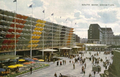
Festival of Britain transport pavilion postcard

There were, of course, irritations too.  The same care in casting had not been applied to the modern day pundits, so representing the historians we had Dominic Sandbrook, who is it seems a compulsory part of any programme about this era, and Jonathan Glancey (ditto, any programme about the history of design and much else besides).  Which meant, perhaps unsurprisingly, that the conclusions were no great shakes either.  The Festival was very happy (this is probably true, but I’d still like another point of view one of these days).  The Festival was Very Influential on architecture and design (stated, but never proven, and almost impossible to deal with given the programme’s almost infinitely all-encompassing definition of modernism).  Council flats made people very happy in the 1950s (yes, but can we not try a little bit harder).

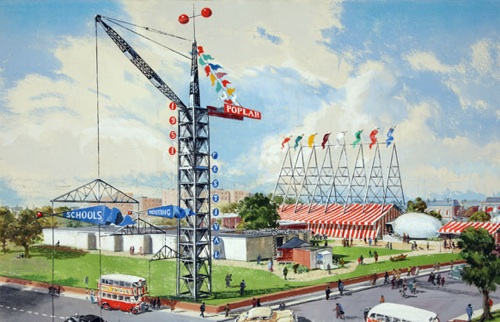
Architecture exhibition at Poplar

From all of this waffly unthinking, though, a couple of nuggets did manage to emerge.  Despite Dominic Sandbrook’s ubiquity, he may yet have a purpose.  He pointed out, and it’s true, that the Festival was a version of the future, not necessarily in the way it looked, but in its emphasis on technology and science, which prefigured the white heat of the 1960s.  Interesting idea, give that man a television programme.  Oh, hang on a minute, perhaps not.

The other thought came from one of the architects.  Talking about how grey and depressing Britain was in the run up to the Festival, he said that no wonder the the whole country looked run down, because almost every house hadn’t had a coat of paint outside for the last ten years.  It’s a small point, but one which makes that shabbiness as imaginable as can be.  No wonder the Festival’s bright colours were so different, so appealing.

Festival of Britain postcard

In another place

I keep trying to contemplate posters, but my brain isn’t complying and wants to think about archaeology instead.  So, for one day only, the stone circles of Wiltshire as represented in graphic design.  Only on Quad Royal.

Although our first offering isn’t all that.

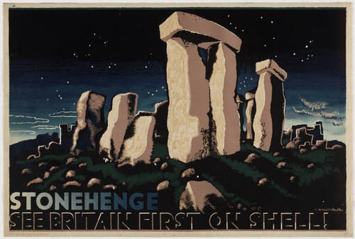
mcKnight Kauffer Stonehenge vintage Shell poster 1932

Despite the fact that it’s in the collections of both the V&A and MoMA and therefore has to be a Modern Classic, I don’t really like it.  There’s too much artistic licence in the hilliness and the surrounding stones for my taste, although I will give it points for being a very interesting collision between high modernism and an almost 18thC romantic view of wild landscape at night

But I have another grievance against the poster which is that I don’t really like Stonehenge either; it’s a freak and an abberation rather than a proper stone circle.  That is a serious point, not just prejudice.  The shaped and stacked lintels of Stonehenge may have become our default idea of what a stone circle looks like (I would say ‘icon’ except that I’d hate myself afterwards; a shame because the word used to represent a useful concept before it became debased).  But no other stone circle in the country looks anything like this.  And you only have to go twenty five miles along the road  – still staying in Wiltshire – to find the real thing.

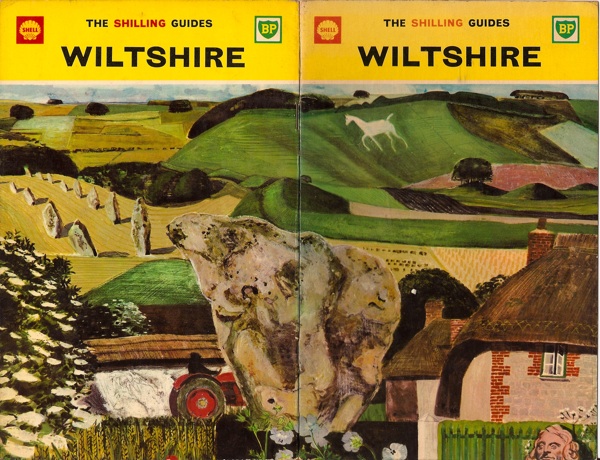
Shell Shilling Guide to Wiltshire Keith Grant

…it does as much exceed in greatness the so renowned Stonehenge as a Cathedral doeth a parish church.

That’s what John Aubrey said about Avebury in the seventeenth century, and it’s still true today.  Which is why Keith Grant was wise to choose its stones for the cover of the Shell Shilling Guide to Wiltshire.

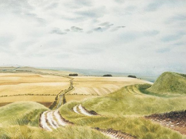
That’s not the only time Shell got it right, either.  The Ridgeway is the prehistoric track which leads across the high downs to Avebury (now walkable as a tidy National Footpath all the way from Tring), and David Gentleman included it in his ‘Roads’ series of posters.

David Gentleman Ridgeway shell poster llustration

This is not the poster but the original artwork.  David Revill posted a comment on the blog the other day to say that he had bought this very picture at the auction of Shell’s original artworks in 2002.  I am envious.

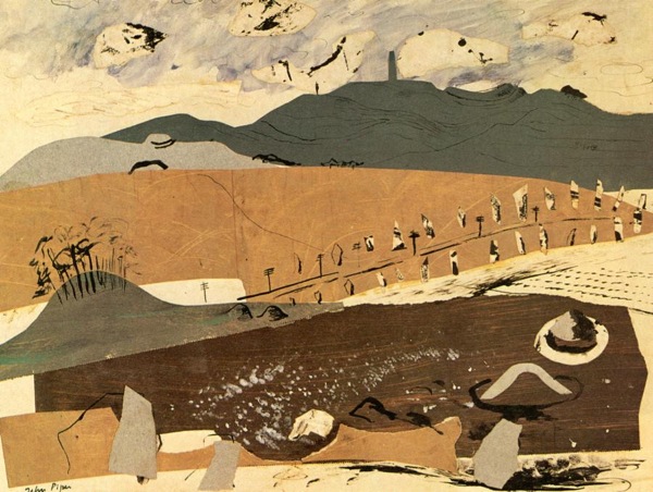
My favourite picture of all though (and yes, I have said this before) is John Piper’s Archeological Wiltshire.

John Piper Archaeological Wiltshire - genius

I would quite happily mortgage the cats for a copy of that, and probably throw in a few posters too, but it seems there is only one and it lives in a museum in Scotland.  But if anyone knows differently, please do say.

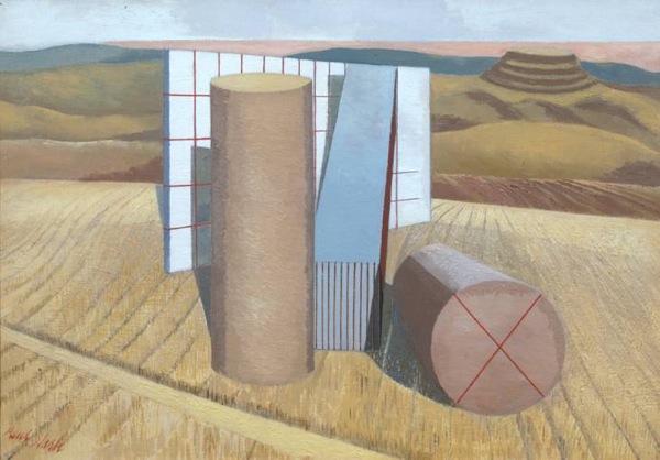
I think that’s actually better than the picture below, even though Nash’s re-imagining of Avebury is far more known.

Paul Nash equivalents for the megaliths

Nash’s colours are just a bit too weedy for me to really love this – and the hill fort in the background is about to topple forwards any minute now.  But seen from the present day, it is a remarkably prescient painting.  The hills all over the Wiltshire downs are now covered in geometric bales, cubes and cylinders, which turn his surrealist imaginings into reality every year.

With a bit of luck I have now got that out of my system and a normal service, in which we talk about posters, will resume tomorrow.

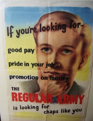
Chaps like you

A bit of a miscellany today, of which the most notable items are these.

They’re a pair of 1940s government information posters, but what makes them different is that they’re not wartime posters but date, I am reasonably sure, from just after the war.

old government public information posters from eBay

The message is certainly right for the times.  World War Two itself may have been over, but the sense of emergency hadn’t gone away because the end of American Lend-Lease finance meant that the bill now had to be paid.  What was needed now was more National Savings and even more production for export earnings.  So, just as during the war, sheaves of posters were produced exhorting the nation to greater effort.  The government’s publicity budget in 1946 was nearly £3m, almost as much as it had been during the war; by contrast, in 1938, they had spent just £257,000.

It wasn’t just the quantity of posters which carried on, plenty of the wartime messages didn’t change either, and in many cases the austerity slogans are almost indistinguishable from those produced while the war was on.

Bones vintage 1946 public information poster propaganda

The ‘still’ is one clue in the poster above (which is ours and so not for sale on eBay right now),  but it is definitely post-war, because it was designed by Dorrit Dekk, who only joined the Central Office of Information in 1946.  But without that attribution it would be almost impossible to give a definite date to it.

But what’s really interesting about all of these posters, and what makes the pair for sale on eBay so unusual, is that in comparison with the wartime posters, very few of them survive.  And I think there’s probably a very good reason for this.  During the war, it was clear to everyone that this was a moment of great historical importance and so at least a few people saved the posters as souvenirs or documents or whatever you care to call them.  After the war, though, the austerity and effort had been a noble cause was now just a relentless grind in a grey, bombed-out, rather cheerless country.  It wasn’t a time that many people wanted a memento of.

There’s another reason, too.  People were sick of posters telling them what to do.  Six years of almost constant exhortation and instruction had left their mark, and no one wanted to listen any more.  All of which make these eBay survivals both rare and unusual.  Although whether they are £140 worth of rare is another question altogether.

Mind you, they’re not along as there seems to be quite a lot of expensive on eBay at the moment.  At first this London Underground poster doesn’t look unreasonable at £140, because it is lovely.

Vintage 1939 London Transport poster from Kiki Werth on eBay

But then it is only 10″ x 12″, so that’s quite a lot of money for a small bit of paper.  Mind you, if I start thinking like that, I’ll never buy anything again.

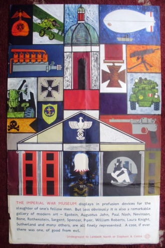
Elsewhere, this 1960s London Transport poster for the Imperial War Museum is definitely overpriced with a starting price of £125.

Andrew Hall 1965 Imperial War Museum poster London Transport

While this pair of school prints are at least starting at a reasonable £40 and £30 respectively, although I suspect they may go higher.

Michael Rothenstein school print


Leonard Tisdall School print

The first is by Michael Rothenstein, the second by Leonard Tisdall, both rather good.  I’ve written about the school prints before, but it’s probably worth pointing out that it’s yet another example of artists in the 1940s and 50s taking work for children seriously.  Good art was a very important part of the new world they were building; I wonder where that impulse has gone now.

Finally, a rare feature which is things liked by Quad Royal turning up on television.  Doesn’t happen often, so twice in one night is nothing short of a miracle.  Firstly, a set of Fougasse Careless Talk Costs Lives posters turned up on the Antiques Roadshow, where Mark Hill valued them at £1,000-1,500.  Mr Crownfolio, on our sofa, said £750.  Any thoughts as to who might be right there?  Then, straight after this on BBC Four, The Secret Life of the Airport featured Margaret Calvert talking about designing signs and typefaces for Gatwick.  That bit’s about 10 min from the end, but the rest of it is worth your attention for some cracking archive footage too.

Today’s lesson

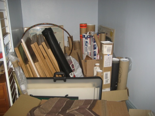
Which is, don’t move house if you own lots of posters.  The picture below is the corner of my study.  There are some more Quad Royals behind the sofa too, and a ton of smaller ones scattered everywhere else.

too many posters

Most of those aren’t going to make it onto the walls in the forseeable future either.  This is a) because we’ve moved to a rented house for the moment in the hope of finding a lovely renovation project which doesn’t seem to exist at the moment and b) the walls of the aforementioned rented house are made up of equal combinations of old plaster and air, and so wouldn’t stand most of what we’d like to throw at them.  Anyone got a hotel for sale?  The corridors would be ideal for poster hanging.

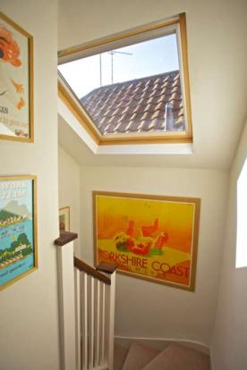
Now that we’ve moved out, I was going to post some pictures  of the old house so that you could see the posters in situ without too much of my life being out there on the internet.  But when I came back to look at the photos, it seemed that the estate agent had prioritised the rooms rather than the posters.  Can’t think why.

Tom Purvis travel poster on our old walls

The one above is the only real exception, and it’s a bit out of character too, what with the poster being pre-war rather than post war.  Never mind.

A normal service should be possible from here on, with some news of poster auctions ahoy either tomorrow or Tuesday, depending on how it all goes.