Guilty pleasures

I can’t remember how this poster came to my attention, but it’s been waiting for me to post it for a while. It’s interesting for a couple of reasons.

Well, three really, because one of them is that it’s stark raving bonkers. Photographic bedwarmers, to advertise petrol. How very modern, and yet curiously not. Brilliant.

The first more sensible reason is that it’s the work of Maurice Beck, who I’ve written about before, albeit very briefly. Working with Helen McGregor, he was a key photographer at Vogue between the wars. They took the well known series of images of Virgina Woolf wearing her mother’s dress.

You can see more of his works in the National Portrait Gallery. And he did a few, very interesting posters for London Transport.

Maurice Beck Staff Insurance vintage London Transport poster 1931

What I’ve discovered more recently is that he was also Jack Beddington and John Betjeman’s preferred photographer for the Shell Guides.

This isn’t entirely surprising, because he also contributed photos to the Architectural Review.

Possibly his contribution has been under-rated because John Piper took so many great photographs for his own guides. Still, the two men got on, because the Tate holds pictures of Beck, taken by Piper, clearly church-hopping together for a guide.

Given those connections, it’s surprising he only did one poster for Beddington at Shell. Perhaps the oddity of it was more than he’d expected, and he preferred to send him out photographing Regency architecture and churches.

What’s also surprising is that I can’t find out much more about him. He had a daughter, who married into the lower reaches of the aristocracy, but by whom I do not know. All these stories are about his step-mother, Lily Adams Beck, who was popular esoteric novelist at home in Canada, travelled widely and was a strict Buddhist vegetarian who despised the west and died in Osaka. She’s quite the distraction.

So, any information, please do let me know.

But that’s not the only thing this poster made me consider. Junior Crownfolio – I am no longer permitted to call her small – raised a very interesting point the other day, which is should we be collecting these posters at all. After all, they are promoting the consumption of fossil fuels.

But, but, but– I hear you cry. These are works of great design, classics, they look great on my wall. Yes, but will people think differently in ten years time?

The truth is, I suspect they might. As anyone with even a passing knowledge of Quad Royal will know, Mr Crownfolio and I are massive fans of Daphne Padden. And yet there are a pair of her posters which we’ve never considered buying.

Because they advertise cigarettes. We’d never even think about hanging them on our wall.

So I can’t help thinking that my offspring may be onto something. Perhaps, in the future, most people will feel the same way about posters promoting carbon fuels. Let’s see, shall we.

the taste sensation

Really quite a long time ago, I put these two posters up on here.

Dan Fern Vintage Cadburys Crunchie poster 1960s

Mainly because they’d appeared on eBay and I rather liked the look of them.

Dan Fern Vintage Cadburys Crunchie poster 1960s

And also because they fantastic, and furthermore because they are by Dan Fern, who was Professor of Illustration when I was at the RCA.

I am clearly the only person ever to have noticed them because a few weeks ago, someone emailed Quad Royal HQ to ask me about them and how they were sold. I knew nothing more than I had said, but a brief bit of googling came up with this rather splendid image which is pretty much all of the answer I needed.

You send off your 3’/-, along with three Crunchie wrappers, and get four posters, and a mind bending experience to boot. The other two are by Chris McEwan, who also had a long career in illustration after this.

And I, at least, also learned that Crunchie bars were once made by Frys rather than Cadburys.

So I thought you should know as well.


Palaver

In writing about Lilian Dring, I returned to the subject of Empire Marketing Board poster hoardings with their fantastic and unique layout

Empire Marketing Board posters as complete strip

It’s been a while since I considered this properly , so I set off into the internet to see if there was new research and the change to find out more.  I have now returned, clutching information.

The first thing to tell is that there were lots of hoardings, and they were all over the place.  By 1933, the EMB had their specially designed frames in 1,700 locations, which were always in towns and cities to maximise the number of people who saw them.

Cheap ‘solus’ sites were preferred, at railway termini and outside factory gates, government and municipal buildings, avoiding the need to book space on ordinary, commercial hoardings.

But these mammoth poster boards weren’t the only means of publicity.  Much like government posters in the Second World War, the Empire Marketing Board put posters wherever they could.  They produced window bills and cards that could be placed in car windows, Scouts and Guides were recruited to distribute their material, and posters were sent to schools, post offices and theatres.  In many ways the poster campaign does look like a dress rehearsal for the poster onslaught of the war.

But the most exciting thing I found is this picture.  It’s an actual photograph of an actual Empire Marketing Board poster site at work – taken, it seems, by an individual rather than for publicity purposes.

Empire Marketing Board poster on street

Clearly an interested individual though, judging by the notes about length and the individual posters.

The series on display here, about the Gold Coast (now Ghana), and how it was being improved by the actions of the British Empire, is the work of Gerald Spenser Pryce.

Sorting Cocoa Pods - - Empire Marketing Board poster Gerald Spenser Pryce Gold Coast prosperity

Three of the posters are in the collection at Manchester City Art Gallery who have, in a pleasing act of openness, put all of their Empire Marketing Board collection up on Flickr.

Talking drums Gerald Spenser Pryce Empire Marketing board

I’ve managed to find a fourth on Pinterest, so am currently only missing the central image, but the photograph shows the title which is Takoradi Harbour, and it seems to be a wide shot of the harbour buildings, which, the next poster tells us have been bought by the British.

What’s really interesting about seeing this set in situ is it makes me realise how the viewer is meant to interpret the posters.

Many of the Empire Marketing Board’s artists turned the set of posters into one giant display, like the Paul Nash above, or this Austin Cooper.

Austin Cooper vintage Empire Marketing Board poster set Order by Telephone

Both of these connect the whole design across the poster, and are conveying a very simple idea about how to shop.

Pryce’s message is more complex, and so is the way his series of designs work.  Instead of being unitary, the viewer is meant to read them from left to right, taking the sequence of posters as though it were a comic strip.

So as well as all the facts about Empire Trade and harbour building, they are also telling a story.  This begins with the hard and basic labour of harvesting cocoa pods, and we see a relatively un-modern society which communicates by the talking drums.  But then the British arrive and build a modern new harbour, and the Empire, in the form of an officer in white tropical uniform with a particularly unfeasible hat, now talks to the native chiefs as well.

Takoradi Harbour - - Empire Marketing Board poster Gerald Spenser Pryce Gold Coast prosperity

The result, in the final poster, is that the inhabitants of the Gold Coast, the lucky recipients of the benefits of Empire, have been brought into the modern, mechanised world.

Maganese Ore - Empire Marketing Board poster Gerald Spenser Pryce Gold Coast prosperity

They are so lucky that they have also acquired hats, and more Western clothing, along, it seems with a managerial class – seen on the far left of the poster.

Now, generally, my feeling has been that the advertising of the Empire Marketing Board has received more flack than it deserved.  Yes it was the product of a colonial and unequal society, and yes some of its posters were undeniably racist.  But many of its posters appear to be more neutral and egalitarian – and this is particularly true of the more modern sets of posters, by people like Cooper and McKnight Kauffer which are the ones, inevitably, which I and other design historians tend to gravitate, because we are like crows and like shiny glittery things.

This series makes me more uncomfortable, because it’s dramatising the underlying ideology of empire and of empire trade.  It’s easy to dismiss simple racism when it crops up in the images, because we don’t do that any more.  But Spencer Pryce’s posters tell of a more subtle process, of exploitation and asset stripping, which is in some ways harder to look at.

The lesson is, look harder at the things which we think are unworthy, or which don’t fit our narrative of modernity.  Sometimes there are more interesting things to be learned than the bright slogans of modernism can show us.


This post is brought to you almost entirely by firstly a paper called ‘Food and the Empire Marketing Board in Britain, 1926-1933’ by Peter Atkins, and also by a PhD thesis written by Tim Buck.  He’s the person who found the picture, but I can’t trace him anywhere, so I hope he doesn’t mind me borrowing it.  His thesis also suggests that Spencer Pryce may have had some reservations himself about the process of modernisation when he undertook a research visit to Africa, but that’s a whole other kettle of fish.  The final poster picture comes from Books And Things, via Pinterest.

I am what I am

Sigh.

I really, really didn’t want to be right about Lilian Dring; that she was forced into the female arena of needlework after being pushed out of the world of poster design.  But I am.  That’s exactly what happened, and I am furious.

David Bownes, of Twentieth Century Posters fame, scanned and sent over images of the (small) catalogue for what I believe is the only exhibition of her work, at the Orleans House Gallery in Richmond in 1989.

The very first paragraph sets out the stark truth.

It was never Lilian Dring’s intention to be an embroiderer.  She has not in over fifty years ceased to think like the graphic designer she was trained to be and which circumstances beyond her control prevented.

The biography gives the exact details of how this happened.  She was a very able art student, who excelled at Kingston School of Art and then got a scholarship to the Royal College of Art, as one of the first four students on the Poster Design course (has this course ever been studied, or do the archives not exist?  If anyone can tell me the answer to this, I would love to know).

Some of the pictures reproduced in the catalogue may be of her student work, although the book, I think, was published.

Lilian doing student work 1920s

She studied at the RCA for three years and, as a promising talent, was offered a fourth, but had to turn it down because of her mother’s failing health.  Men, I will note, aren’t often expected to make this kind of choice.

The next section of the catalogue is entitled ‘What Might Have Been’.

For Lilian the 1930’s were “the lean, mean years”, when all the talk was of depression, recession, dole queues and the gathering clouds of war.  It was the worst possible time for a young free-lance graphic designer to establish herself.  She had done some fine work at College and now, lugging her portfolio up and down Fleet Street, she showed her stuff to anybody who could be persuaded to look at it, but the answer was always the same: they liked her work but could not use it – at least not at present.

The catalogue seems to suggest that the only two commissions she ever received were the Youth Hostelling posters preserved at the V&A and the London Transport poster which was never produced.

So instead she got married, made toys for her friends’ children out of scraps and gradually turned this craft into a way of making a living.  (She divorced after the Second World War and so supported herself by her work all her life).

I’m not going to talk much about her needlework, because plenty of other people have and it’s not really the business of this blog.  But I would just like to show you one of her works from 1947.

Lilian Dring 1947 embroidery.

It melds together past and present, eighteenth century and twentieth.

The text on the left is by the Countess of Winchelsea and reads:

My hand delights to trace unusual things/And deviates from known and common ways/Nor will in fading silks compose/Faintly the inimitable rose.

On the right is Dring’s own response to this.

O Kindred Spirit, I do agree/Expressions should be unhampered, free/Admit few conceptions, keep less rules/Be individual, not set in schools.

On the one hand, quite literally, this is her artistic manifesto, her statement that she can do what she likes with embroidery – and she did, kettle fur and all.

But the texts can be read in more than one way; at the same time, there seems to be to be a mourning, and perhaps even a rage against her lot..  Because composing in fading silks is exactly what she did end up doing.  Her expression was never unhampered and free; instead she was put into a box marked ‘suitable artistic expression for women’  and made to stay in it.

The story is all too common: the most unusual thing about Lilian Dring was that she told the truth about what had happened to her.  And every single one of you should be as filled with feminist rage at this as I am.

Not small.

Having said that nothing new and interesting has turned up for a while, I am just about to prove myself wrong.  But that’s probably a good thing.  At least I think it is.

Anyway, I was looking at the V&A’s collection of Empire Marketing Board posters (as anyone might do on a quiet afternoon) and my search turned up this.

Lilian Dring Youth Hostel Poster 1940

Or rather these, as there are three images in the one record.

Lilian Doing Youth Hostel Association poster 1940

Lilian Doing Youth Hostel Association poster

The description is:

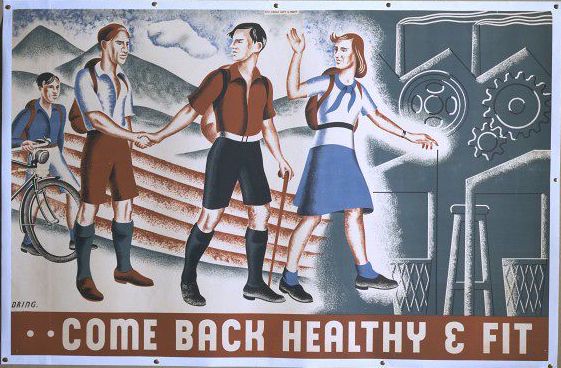
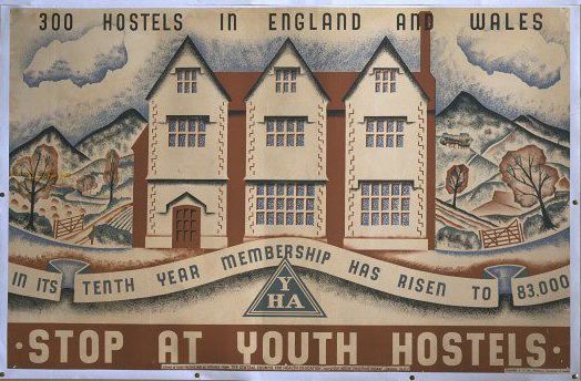
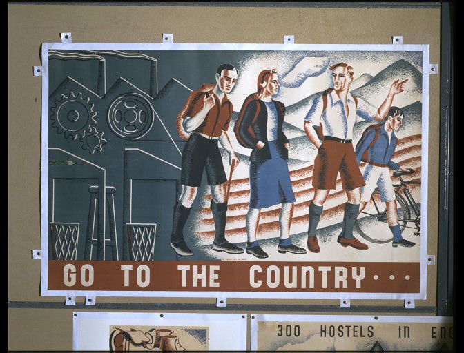
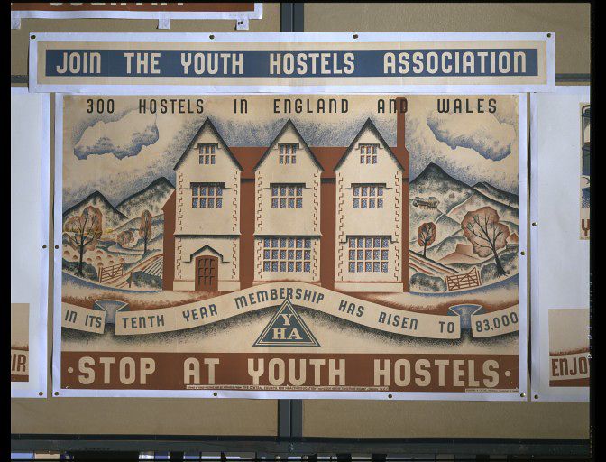
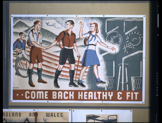
Join the Youth Hostels Association. Poster, originally printed on 7 sheets, 2 of which were later cut by the artist, issued by the Central Council of Health Education through the Agency of Abbey Arts Ltd.

They were designed by Lilian Dring (which auto-correct wants to change to everything but her actual surname), and produced in 1940, all of which is fascinating for at least three reasons.

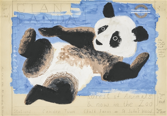
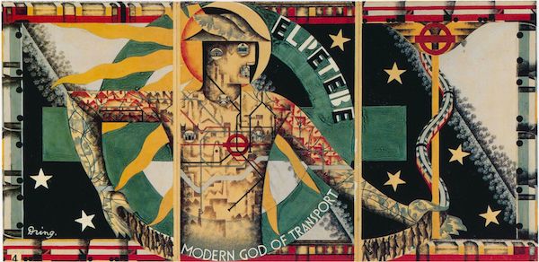
Firstly, there aren’t enough posters out there by Lilian Dring.  I’ve seen very few examples of her work at all, and yet she designed this amazing, albeit never used poster for London Underground.

Lilian Doing modern god of transport London Transport poster

It’s brave, it’s heroic, its modernist – and by a woman designer.  I think she should have been as famous as McKnight Kauffer.

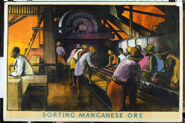
On top of that, these posters were produced in 1940.  At this point, almost all commercial poster advertising was prohibited, and the Ministry of Information was pumping out posters of every which kind telling the British population what to do, join, eat and save.  It’s really quite surprising to find another government body engaging in what could be seen as inessential postering on this scale; I genuinely had no idea that this had happened.  It makes me wonder what else got advertised in the first year or two of the war – and that’s quite an important question.  In the later years of the way, people complained about the omnipresence of propaganda.  But if, in 1940, the government’s poster efforts were surrounded by other kinds of messages, it would have made their impact very different.

But one more interesting detail – to me the most fascinating one of all – is lurking in the object history note.

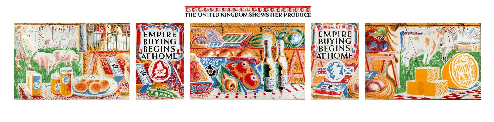
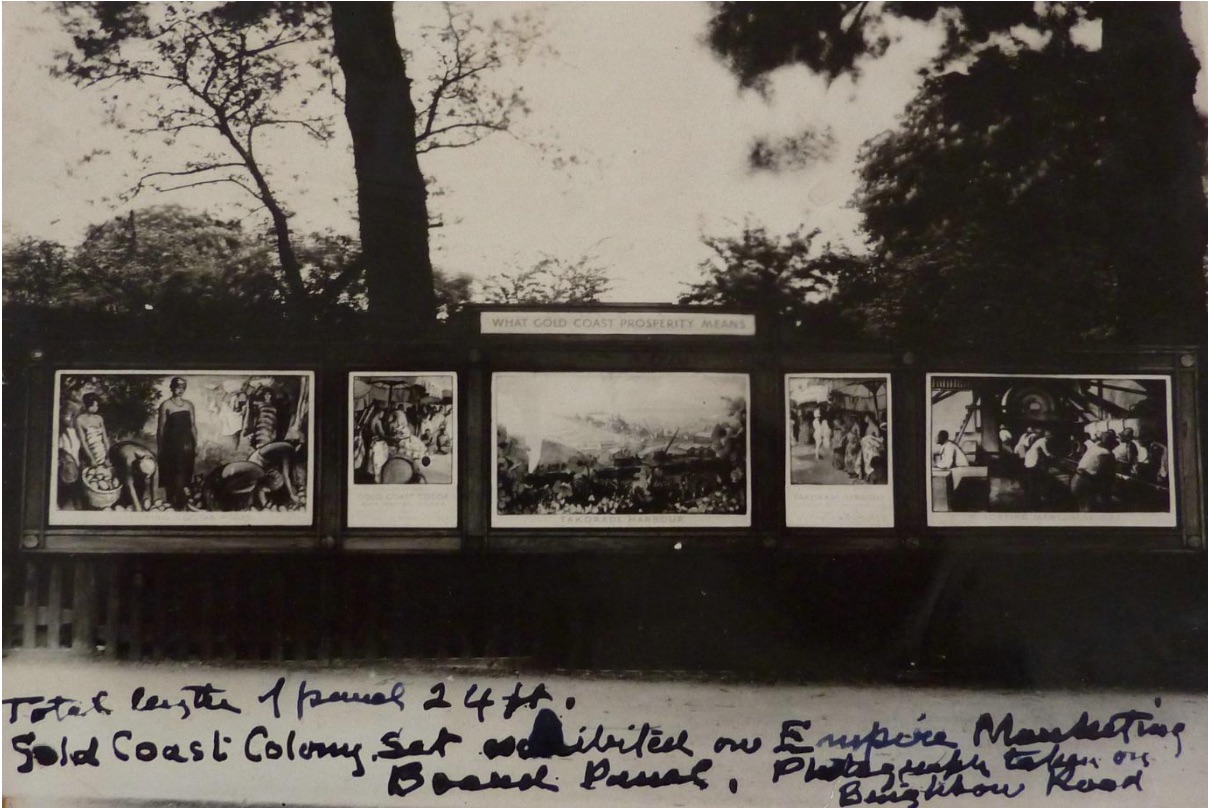
The poster was printed to the same format as the Empire Marketing Board posters on the hoardings for which it was placed in November 1940.

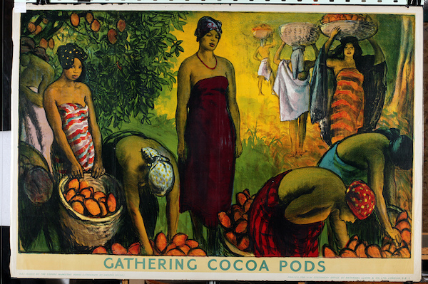
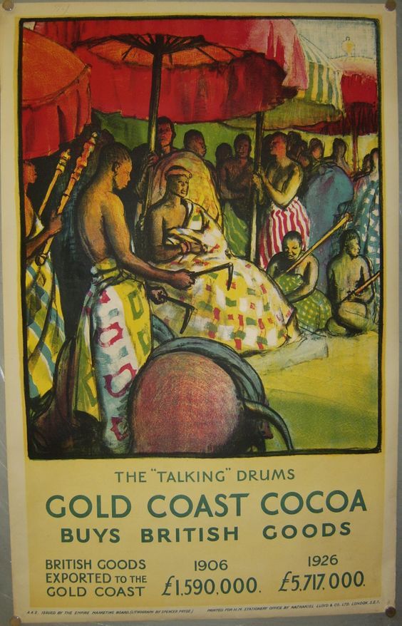
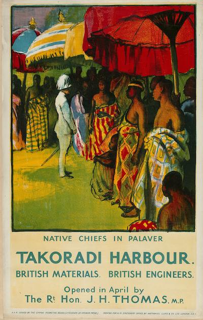
Now one of the many notable things about the Empire Marketing Board poster campaigns were that they were designed for their own, unique, set of hoardings.  I’ve written about them in detail elsewhere but they were elongated and set apart, designed to take a very specific set of formats.

Austin Cooper vintage Empire Marketing Board poster set Order by Telephone

That’s three 60 x 40″ 4-sheet posters, two 40 x 25″ Double Royals and then a title strip at the top, in this case by Austin Cooper.

And if we look at the full pictures in the V&A’s catalogue, not only do the Dring posters work as a sequence in just the same way, there are clearly three more in the collection which I’m guessing would fill the remaining slots perfectly.

Lilian Dring YHA poster 1940

Lilian Dring YHA poster 1940

Lilian Dring YHA poster 1940

All of which raises some ideas which I’d never really considered before.  The Empire Marketing Board had something like 1700 of its own poster sites in towns and cities across Britain, but it only produced posters between 1927 and 1933.  So what happened to those hoardings after the EMB ended?  Did they get taken down, or did they moulder and rot?  Or, as these posters suggest, were they used by other semi-official, non-commercial advertisers?  Because these posters were produced in 1940, seven years after the EMB stopped using them.  That’s a long gap, and suggests it was filled by something in the meantime. Will I ever know the answer to that?  Probably not.  But it’s still an interesting question.

When I started writing about these posters, that was the sum total of my thoughts.  But then, I thought, I should probably find out a bit more about Lilian Dring.  So I did.

Despite being one of the first students on the Royal College of Art’s Poster Design course, she ended up working in textiles.  Now, maybe textiles were always her one real love, I don’t know, but at the same time it’s a course which quite a lot of women end up following.  Step away from the big, dominant poster work, that’s for the men – instead why don’t you go off and do something a bit more, well, crafty?

I can’t help reading that kind of narrative into the story of how she changed direction.

She began stitching in 1931 on her mother’s hand-operated 1912 Frister & Rossman machine.  […]  Her early work, undertaken during the Depression and using scraps, included rag dolls, given as presents to friends’ children, and later the ‘personal pillows’ and ‘music cushions’,  which always illustrate articles about Lilian. Recycling thus became a major influence in her life and work.

Now Dring did go on to be quite avant-garde in her use of recycled stuff and I really like the sound of what she was doing.

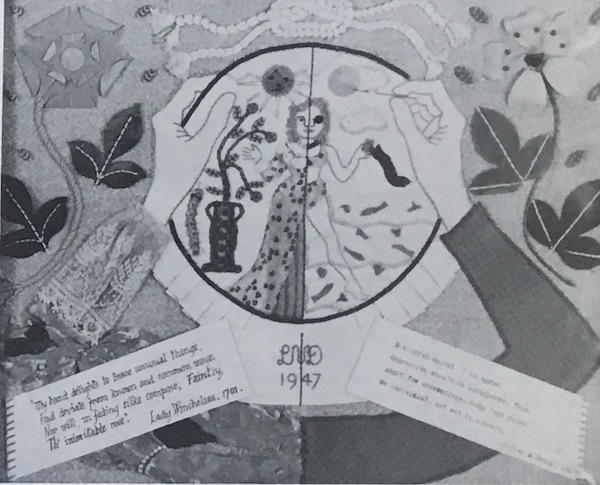
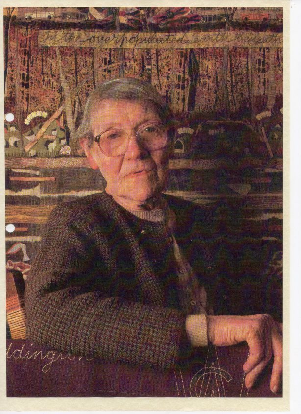
Her reaction to WW2 was illustrated by a piece called ‘Parable 1’ made in 1941 to cover a bombed out window, by then she may have been living in Twickenham, where she died in 1998.  It was in three layers with quotations from Exodus (20, v.4.): In the Heavens above: fighter planes and barrage balloons; In the Earth beneath: bombed-out buildings & ambulances; ‘And in the Shelters (sic) under the Earth: people sleeping in air-raid shelters.  She appears to have been deeply disturbed by both the destruction caused by warfare, and later by that caused by pollution of the environment.  Most of her work featured appliqué – […] and in a similar work, ‘Parable 2’ made in 1972 (the year after she made a red presentation stole for Canon Blair-Fish, the then Vicar) she used can-pulls, dead gladioli stems and even fur from her kettle.

Parable 2 is behind her in this picture, although I can’t identify the kettle fur in there.

Lilian Dring

I really hope she did exactly what she wanted to do – that textiles were her choice and decision, not something forced upon her by circumstance and the lean times of the 1930s.  At the same time, I can’t square those small scraps of reused fabric with the woman who created a set of posters too dramatic and expensive for even Frank Pick to produce, or even the expansive YHA posters.  Perhaps she had art in her that had to come out somehow, any which way she could find, and the world told her textiles, not posters.

Women artists and designers are so often made small in this way, pushed into work which can be marginalised or even ignored.  All that talent unseen, when it could have been stretched across the biggest billboards in the land; instead it hangs in private houses, or the far end of dark churches.  I hope she was happier than I am about it.


All quotes, and the picture of Lilian Dring, are from this website about embroidery in Surbiton, where St Mark’s church contains a number of ecclesiastical embroideries that she designed and made.

It’s not you, it’s me. Or maybe it’s them.

Even the least attentive people will have noticed a slight absence of content on Quad Royal recently.

A fair amount of this is because my brain has been tangled up in other things, like hoarding and the world of objects in general, as opposed to the tiny sub-set of that constituted by British posters and their designers.

The life of stuff - cover image

Now that the book has gone out into the world, I have moved on to wrestling with a whole mess of thoughts to do with paths, grass, chalk landscapes and Julian Cope, along with how we think of ourselves as British.

And yes, I know what you’re thinking and right now it doesn’t make much sense to me either. But I live in hope that it might yet turn into a communicable idea.  Perhaps.

None of this has left much time or spare head space for thinking about posters, but equally, whenever the guilt overwhelms me and I think I should write something, I don’t know what to say.  And I don’t think this is entirely my fault.

Some of it undoubtedly is the result of all my other distractions, and some of it is down to circumstances.  The more posters and poster-related stuff I see, the less chance there is of something new and surprising turning up.

At the same time – and I’d be interested to see what the rest of you think about this statement – I think there is a shortage of new and surprising posters out there for me.  To my mind it feels as though, more and more, auctions are choosing safer and more predictable posters: so pictorial railway images and London Underground bankers are doing well.  World War One posters, thanks to the centenary, are staple auction fodder (although I don’t think I’d ever give one houseroom myself) and World War Two propaganda seems to have settled in as a regular as well.

Dig for victory world war two propaganda poster 1941

But again, what this means is that the same posters turn up over and over again, while the more niche ones seem to have disappeared entirely.

There are some practical reasons why this might be happening.  Back when we started buying posters, by far the most interesting sources were usually when designers either died or downsized, and their own collections came on the market.   Inevitably that has pretty much come to an end – although  over the last year or so a whole cache of works by Clifford and Rosemary Ellis appeared across a selection of sales.

ellis clifford and rosemary giant panda design

They’d both died twenty or more years ago, so I am guessing that these had been handed down once already.

Clifford and Rosemary Ellis appledore shell framed

Designers seemed to have a habit of not only collecting their own stuff but also the work of other designers that they admired, and in the past this was one of the ways in which some of the more interesting and rarer posters I’ve seen have come up for sale.

Amstutz camping coaches railway poster

On top of this, though, I also think that the market itself has changed.  Obviously, offering tried and tested posters which you know are going to sell is a pretty good way to make money if you are an auction house, so I can’t blame them for what they’re doing.  Stick with the familiar and nothing will go wrong.

But what’s failed to happen – and I have to say that I am fairly disappointed in this – is for other, newer markets to emerge.  Specifically, people don’t seem to be interested in buying the modern post-war posters which I love possibly above all others.

Tom Eckersley properly packed parcels please dog

When I first started writing this blog, the work of Hans Unger, Tom Eckersley, Hans Schleger and Harry Stevens would pop up regularly in amongst the other, more usual, offerings.  But now this doesn’t happen very much at all.

Such Turkeys Macfisheries Hans Schleger Zero poster 1950s

I really don’t understand why this is happening.  We live in a world where all the dark brown furniture of our parents and grandparents has been cast to one side in favour of Danish teak and Ladderax; every furniture shop is full of pastiches of 1950s contemporary armchairs, and reproduction fabric prints of the time are available in even the smallest of fabric retailers.  And yet no one, it seems, wants the posters.  Their worth is, at best, the same as it was six or eight years ago.  And it’s all wrong.  But nonetheless, it is.

Mr Crownfolio has a theory that there were never that many of these posters available in the first place, a first wave of interest flushed them out into the market place and auction house and now they are all in the hands of people who love them and don’t want to sell them on (and we can possibly plead guilty to this).  So it’s only the less desirable posters which come back onto the market.

It’s certainly a more cheery thought process than mine.  Really, though I have no idea – and this is very much an introductory set of thoughts, so if anyone has any better ideas, or actual experience of what is going on, please do say.