stuff

So, my attention was rather diverted from Quad Royal towards the end of last year on account of this.

The life of stuff - cover image

First the bad news, it’s not about posters at all.

Despite that, it may yet be of interest to a few of you because, amongst other things, the book is about how things come to mean and what we read into them.  So in some ways it is a much wider application of what I do with posters on here, which is to stare at them very hard and see what might be understood from them.*

At the same time, it’s also very different, what with being a memoir and taking in museums and hoarding and the history of napkin rings and all sorts of other things besides, so I won’t be offended if you don’t read it.  In any case, it’s not coming out until May.  But if you do decide you want to get it, it’s available online, or you can trundle down to your lovely local bookshop and get it there.

Next post will be back to posters, or at least vintage design, I promise.


*I’ve been fascinated by this ever since taking an MA in Design History, where I was intensely frustrating to my tutors because I wasn’t particularly interested in what they considered to be the core of the subject, which was how things came into being.  I wrote about what bits of china might have meant to the people who owned them instead.

As the book shows, this is still what I’d rather write about – only now I think I’d defend myself a bit harder.  Because looking at things in terms only of who designed them and why is missing a big part of the picture.  It’s not quite discussing books only in terms of the history of authors and printing, but it’s getting close to it.  Much of literary criticism is based on re-readings and re-interpretations of a book, rather than restricting itself to what the author intended, or discovering which kind of desk it was written on, so I don’t see why we shouldn’t look at objects in the same way.  And that includes posters.


there is still the museum

Never apologise, never explain.  Only it has been rather a long time, for which I am sorry.  I hope that the new look (and concurrent ability to be seen properly on a mobile device) are some small consolation.

I will explain the gap properly in the next post (the short version being that I have discovered there is a limit as to how much writing even I can do in a day), but in the meantime I need to tell you that I will be appearing in real life next week, in that London.

I’m speaking as part of an event at the London Transport Museum which accompanies their Poster Girls exhibition, along with properly qualified people like Oliver Green and Ruth Sykes.  I will discussing how women designers portrayed women between the wars, which will mostly involve going on about this Dora Batty poster at inordinate length.

Dora Batty There is Still The Country London Transport 1927

It’s a good looking piece of design, but it’s also kicking great holes in the expectations of what women are meant to do on posters, which can only be a good thing.

If you can’t make it, I also wrote most of it down as an essay in the exhibition catalogue.  I’d like to be able to tell you that the exhibition itself is lovely, but as I had flu instead of going to the private view, I can’t yet.  Proper verdict next week, and in the meantime, perhaps I will see you there.

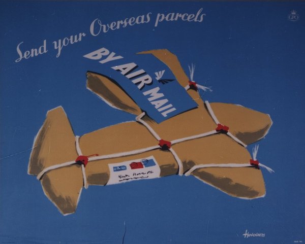
Pieter Huveneers

I’m really sorry to have to share the news that poster designer Pieter Huveneers has died on 14th June.

He was 92 and died in Australia, where he’d become one of the country’s leading design consultants, creating logos and corporate images for some of the biggest companies there.

During his time in Britain, he also designed some truly excellent posters.

Pieter Huveneers Royal Mail airmail poster

If you want to know more, I’ve written about his career in both posters and beyond here.

Irregular column

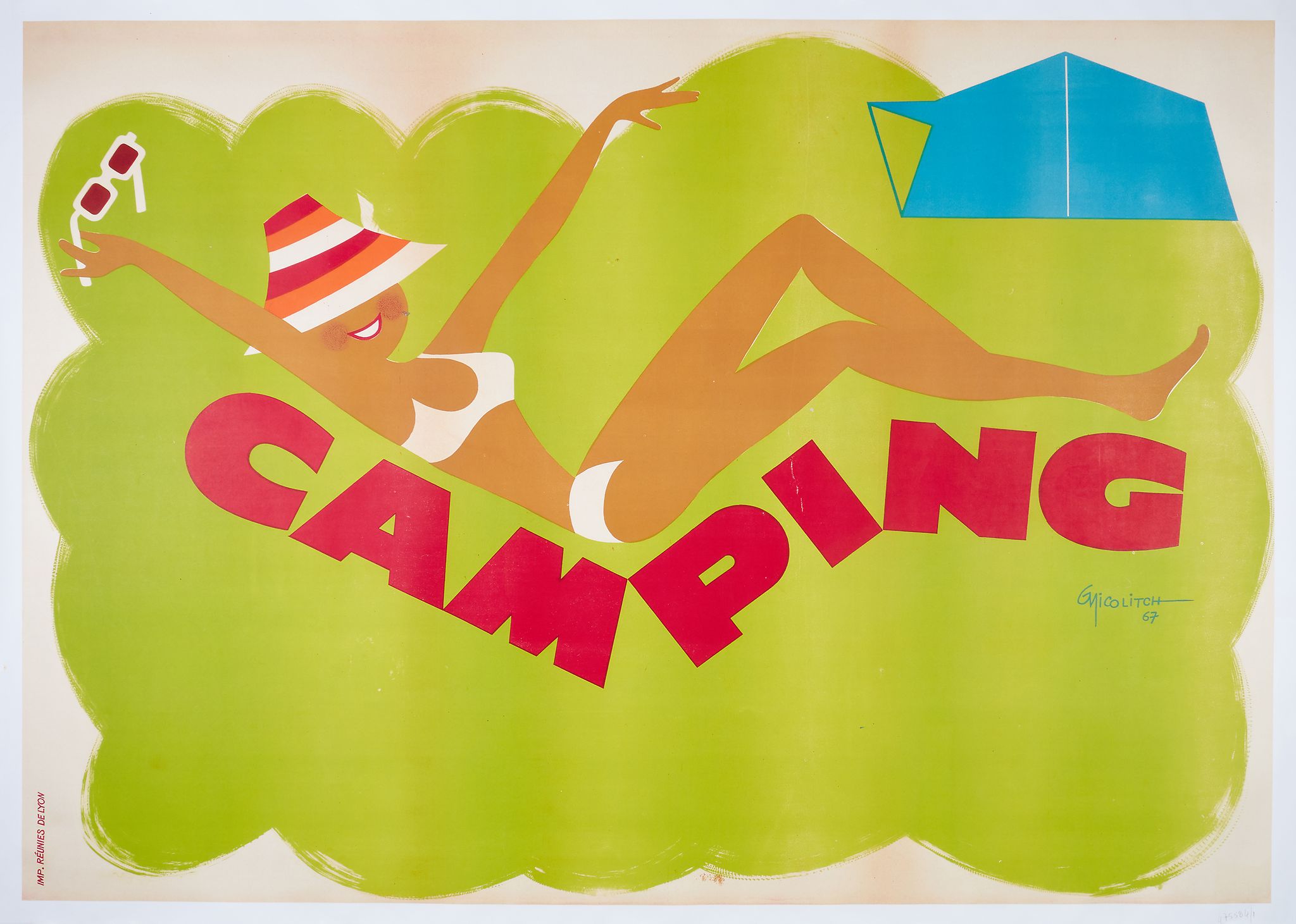
At last, something which looks remarkably like a full-on poster auction at Dreweatts/Bloomsbury in a couple of weeks time, even if it has been achieved by the now-standard cutting and shunting of posters and film posters into one big, mis-matched sale.  Still, there are enough delights in the first half to entertain us, such as this frankly wonderful French poster from 1967.

NICOLITCH, G CAMPING lithographic poster in colours, 1967

It’s foreign, so I’m afraid I don’t have anything to say apart from how lovely it is, and also how distant the image is from my own experiences of camping.  I may be making the mistake of doing it in Britain of course.

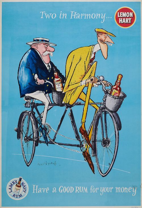
Probably the most surprising item in the sale is this Ronald Searle poster for Lemon Hart and Lamb’s Navy Rum.

SEARLE, Ronald (1920-2011) TWO IN HARMONY, Lemon Hart offset lithograph in colours

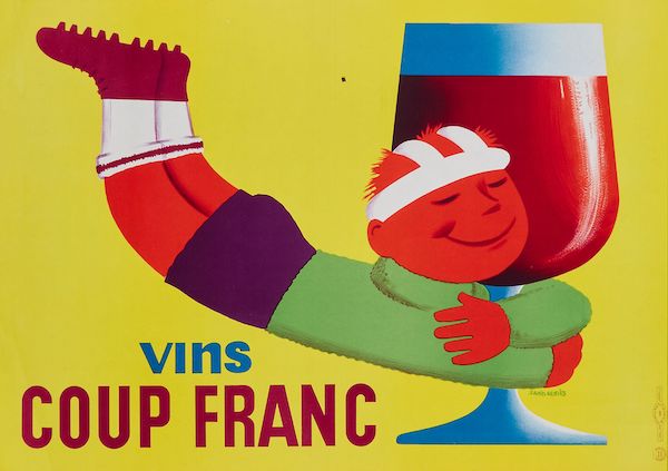
It’s an example of that rare thing, a British commercial poster.  I’ve never fully got to the bottom of why so few of these survive in comparison to the continent, where commercial posters, selling products, are the mainstay of their auctions.    Even this sale has managed to dig out several examples, of which this is just one.

french wine poster GENIES, Saint VINS COUP FRANC lithographic poster in colours

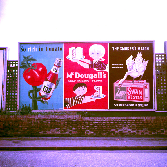
I can think of several reasons why this disparity between Britain and the Continent might happen, of which the main one is poster sizes.  Whenever we see commercial posters of the 1950s and 1960s in the UK, they are most often in giant billboard formats.  I’ve posted various pictures of these on Quad Royal over the years, but this image gives you the general idea.

More Posters on Walls including Patrick Tilley and Donald Brun

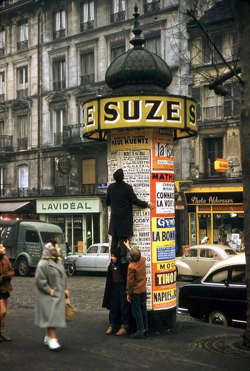
In contrast I used to think that Continental posters were made, more, for the kind of poster-display pillar that you still find all over Paris, which, I have discovered in the course of writing this, are called Morris columns.

colonne morris paris 1957

Or Colonnes Morris if you are one of the people in that picture.  The result of them, though is that posters mostly survive in a format which people can display on the walls of their houses (I wrote before about buying a billboard poster, it’s not an experiment I propose to repeat).

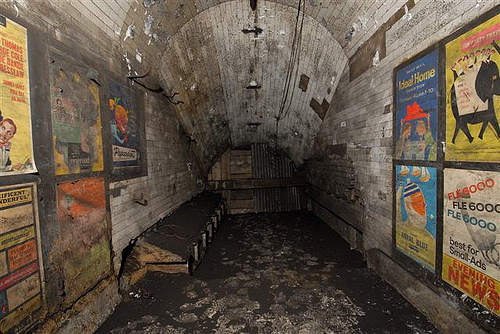
The problem with this is that commercial posters were made in the same convenient sizes in the UK, for display on London Transport and the railways.  The posters of Notting Hill Gate are the best demonstration of this.

wide of disused passageway Notting Hill Gate tube station

As well as LT’s own posters, there are commercial advertisements as well.

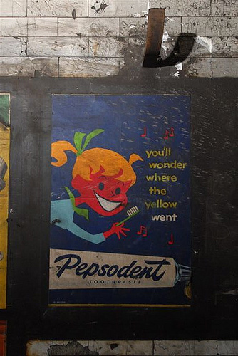
Vintate pepsodent toothpaste ad Notting Hill Gate

If the French wine poster is sale-worthy, then so is the Pepsodent.  Yet these British examples very rarely turn up in auctions.  The differences must be cultural rather than practical, and I suspect are to do with reasons which means that the posters were never saved in the first place.  I will mull these thoughts over further another day.

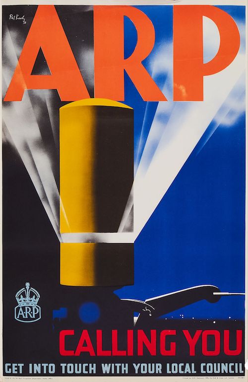
Meanwhile, there is an auction to attend to.  You will be pleased to hear that it contains many of the usual suspects including Lewitt-Him airline designs, Guinness posters, and the two ARP wartime posters that are contractually obliged to be sold at least twice a year. Here’s the Pat Keely one, you can guess the other.

keenly pat arp siren 1937 poster Ww2 home front

If you do want to know more about them (along with my theories about why so many survive), it’s all here.

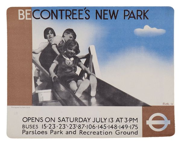
There are also a range of London Transport posters, most of which I like rather than love, the one exception being this clean and slightly chilling piece of Proper Modernism by Richard Beck.

BECK, Richard (1912-1985) BE CONTREE'S NEW PARK offset lithographic poster in colours, 1935,

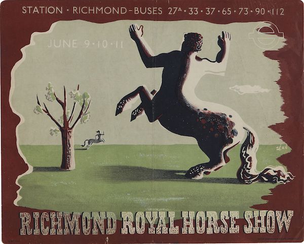
Unusually, there are quite a few of these lovely, small (cheap, frameable) panel posters in the sale, including this fantastic Zero, where modernism is starting to shade into surrealism and romanticism, both movements that would come to a stuttering halt at the war.  Although the lettering managed to wait and make a delayed return in the early 1950s.

ZERO,Hans Schleger (1898-1976) RICHMOND ROYAL HORSE SHOW, London Underground lithographic poster in colours, 1938

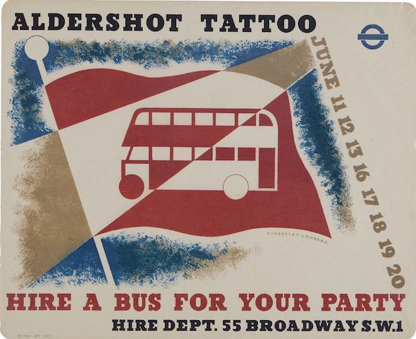
Or you could go for this Eckerley-Lombers.

ECKERSLEY, Tom & LOMBERS, Eric ALDERSHOT TATTOO, London Underground lithographic poster in colours, 1936

Both the last two posters come with four other panel posters in the lot and an estimate of £100-150.  And they’ll fit on your walls.  What’s not to like.

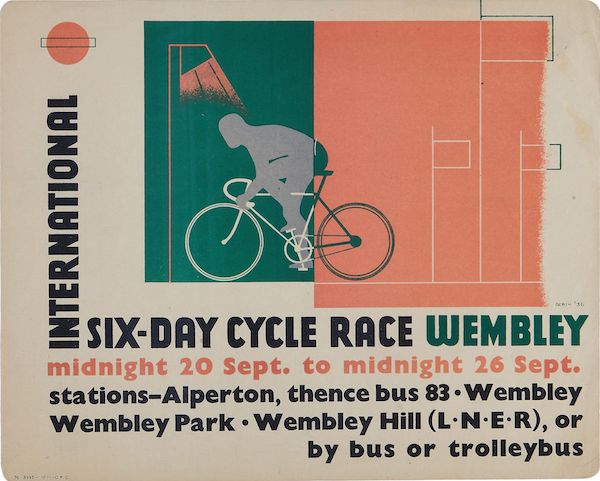
I have always been interested in Beath, mainly for the reason that he produces a classic species of clean-lined modernism and I know nothing whatsoever about him, although the catalogue tells me that his middle names are Myles and Fleming.

BEATH, John Myles Fleming (1913-1991) INTERNATIONAL SIX-DAY CYCLE RACE, WEMBLEY. London Underground lithographic poster in colours, 1936

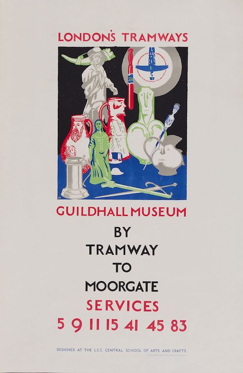
In addition,  this extremely atypical and early James Fitton is worth noting, if not loving.

FITTON, James (1899-1982) LONDON'S TRAMWAYS,Guildhall Museum lithographic poster in colours, 1925

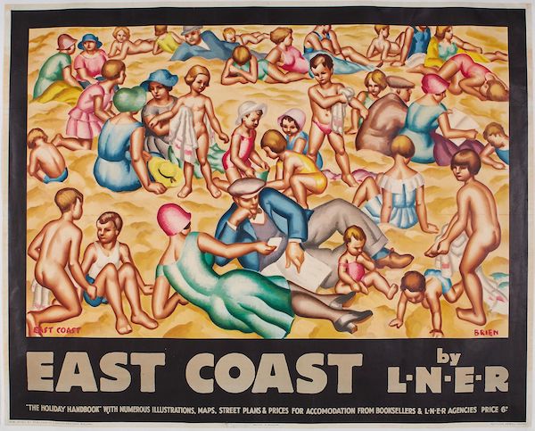
Elsewhere, out of a small selection of railway posters, my preference is for this Stanislaus Brien, which is bonkers and about as close as railway posters get to modern art in the 1930s.

BRIEN, Stanislaus G EAST COAST by LNER lithographic poster in colours

It also features people wearing their best clothes on the beach, which is one of my recurring obsessions.

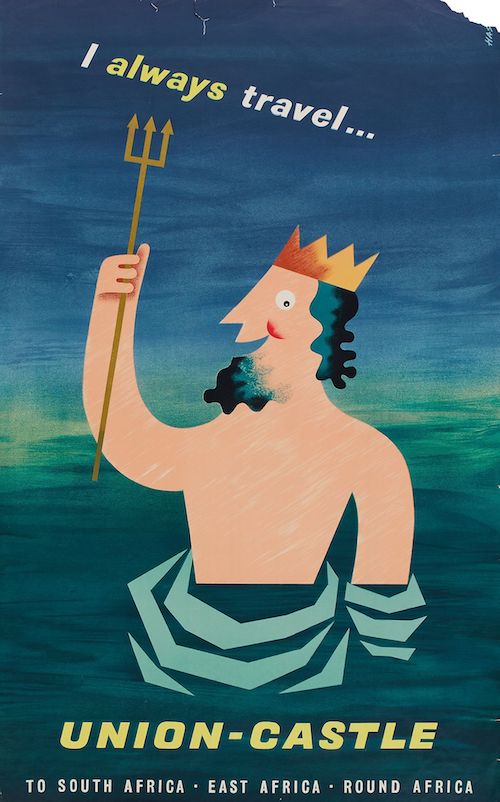
Finally, your best bet for a slightly damaged bargain is this Union Castle Line travel poster, which is like the offspring of Daphne Padden and Harry Stevens.

Union castle line cruise poster has

The auction has it down as anonymous, but I’m pretty sure that the torn top right corner reads Hass.  Whatever, it’s a great design and not one I’ve ever seen before, which is always pleasing.

It’s 1949, OK

I was, of course, on the trail of something else altogether when I found this.

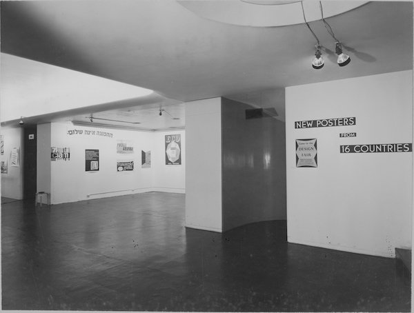
New Posters Exhibition 1949 Moma

It’s an exhibition at MoMA, New York in 1949, displaying – as the wall tells you – new posters from sixteen countries.

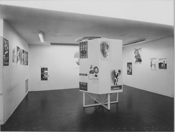
Second view of new posters exhibition Moma 1949

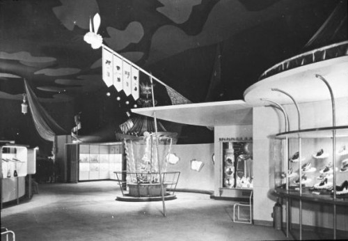
I’m very taken with the sparse layout.  If this show had been appeared in Britain in 1949, I’d have assumed that the design ended up this way because of the privations of post-war austerity.  But in fact it doesn’t work like that at all.  Britain, in 1946, with no money, raw materials or time to expend on exhibition design, produced Britain Can Make It.

Shop Window Street at Britain Can Make It 1946

Which was, in truth, mental.

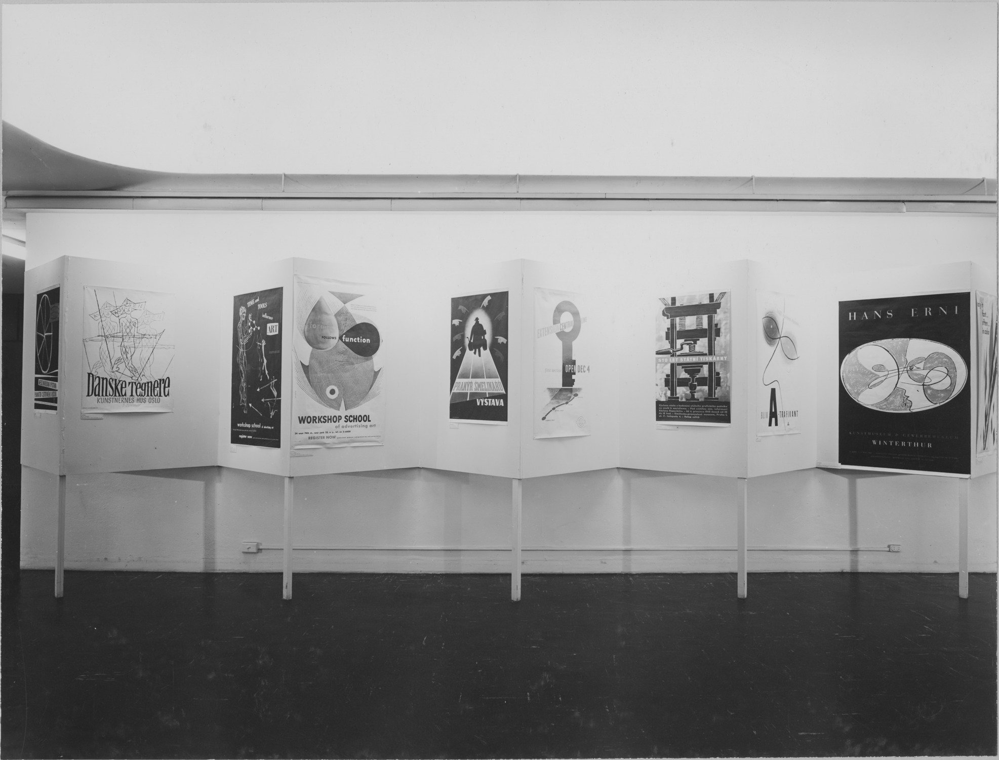
America, with all the plasterboard, paint, metal and ingenuity it can want, produces this instead.

MoMA 1949 poster exhibition

Go figure.

The pictures here are all from MoMA’s website, but perhaps even more interesting is that they have also reproduced the exhibit checklist from the show as well.

So I can tell you that in the middle picture above, the posters on the right hand side are all RoSPA posters, just as they look to be.  But better than that, we can start to seek out some of the exhibits.

The brief for the exhibition was to show non-commercial designs, in part as a response to the use of posters for propaganda purposes during the war.  Their publicity notes that there is increasing use of well designed posters, particularly in England.

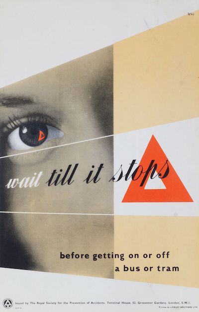
The British are well-represented in the exhibits, predominantly by RoSPA posters like this Schleger.

Hans Schleger Wait Till It Stops ROSPA poster

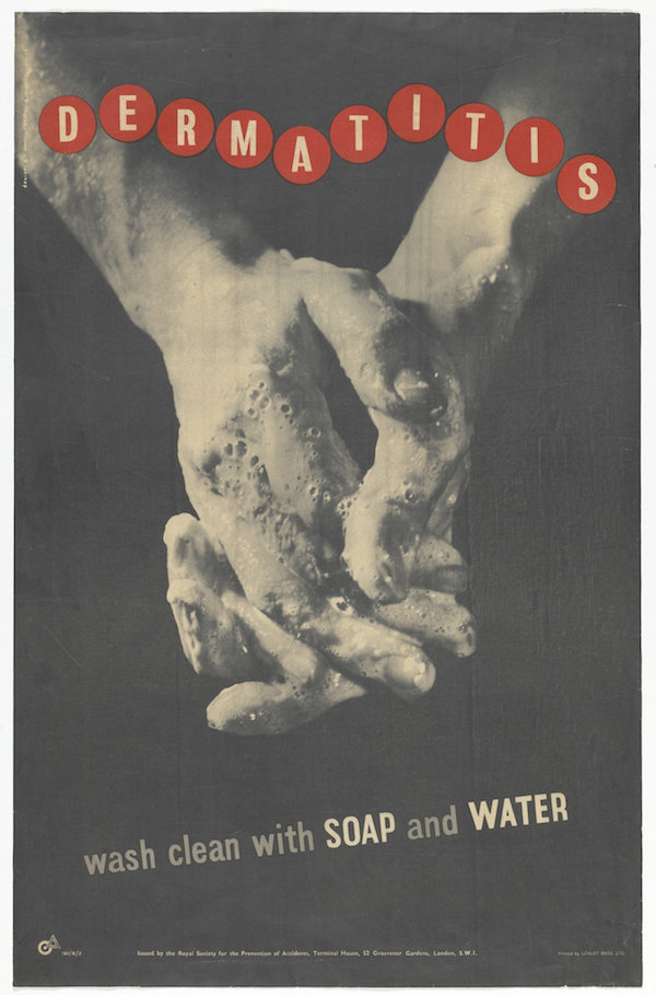
Along with this less well known George Morris example.

Dermatitis George Morris poster for ROSPA 1949 ash

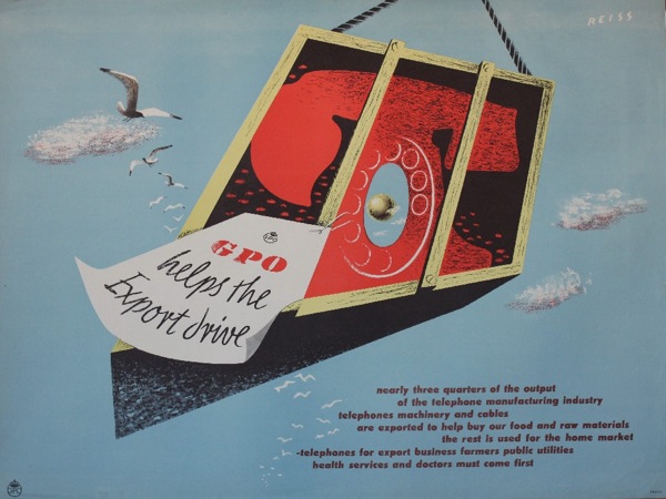
There’s also a Manfred Reiss GPO poster about helping the export drive, which might well be this one, although there is at least one more in the series.

Manfred Reiss, vintage GPO poster 1950 helps the export drive

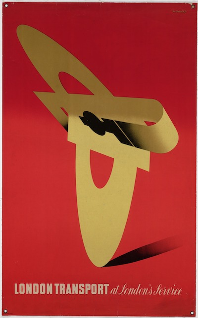
Others are harder to track down.  There’s an Abram Games poster whose only description is ‘London Transport’.  This doesn’t narrow things down very much, but given that this one is of the right date and in the MoMA collections, I’ll take a punt. (If you want to know more details of the punt, it looks as though lots of the works in the 1949 exhibition entered the MoMA collections as ‘gift of the designers’ in 1953.  Which this one did as well.  So there.)

Abram Games LT poster 1947

It’s also sparse enough.  The more I look through these posters, the more I can see that the aesthetic of the exhibition design is also that of the exhibits as well.  The curators have chosen minimalist posters, with some elements of photography in places.  The whimsy of the British early 1950s is hard to find, although traces do exist.

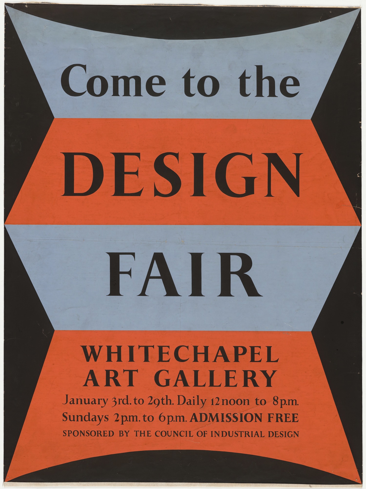
Peter Hatch come to the design fair poster

If only just.  That’s by Peter Hatch, and you can see it on the right in the first picture.

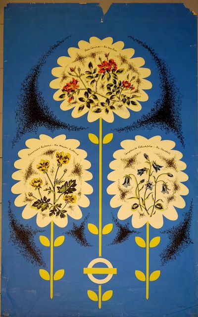
But British neo-Romanticism is almost nowhere to be found.  That’s not what posters do, at least not in MoMa-world.  The only exception is this wild card, by Nora Kay for London Transport.

Nora Kay London Transport Pair poster 1948 wild flowers

Nora Kay went to the Royal College of art, that’s all I can tell you about her.  (The picture is similarly anonymous, as it came from Pinterest, although I think via Rennies, but it’s not on their website any more so I hope they don’t mind.  The poster seems to be as elusive as its designer.)

If I had more time, I’d try to reproduce the entire exhibition, if only so that I could walk round it in my head and see what late 1940s America thought the future might look like, at least in terms of graphic design.  But that will have to wait for another day.

Untitled

I’ve been thinking a lot about hoarding recently – of various different kinds – which reminded me that this post probably deserved another airing.  Two questions, has any more been written on this subject, and just what is the etymology of a poster hoarding anyway?


What do these four posters have in common?
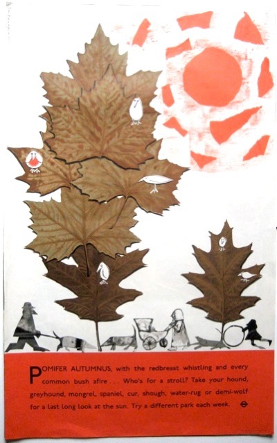
John Burningham for London Transport vintage poster autumn
John Burningham, London Transport, 1961
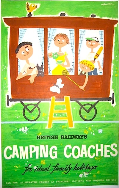
Andre Amstutz Camping Coaches poster British Railways
Andre Amstutz, British Railways, 1956
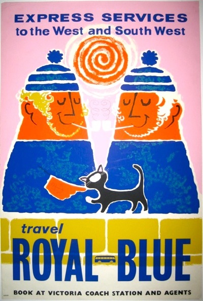
Royal Blue Daphne Padden Coach Poster c1957
Daphne Padden, Royal Blue Coaches, c. 1957
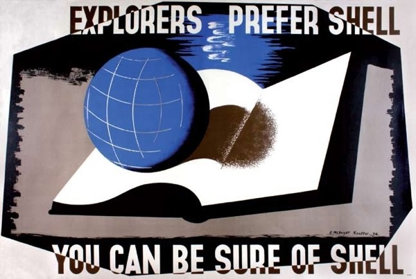
McKnight Kauffer for Shell 1934
Edward McKnight Kauffer, Shell, 1934

Well, three out of the four of them are on the walls here, but you’re not really expected to know that.  Perhaps more to the point is that they represent four out of the five areas of ‘collectable’ posters: railways, London Underground, Shell and coach* posters (the fifth for me would be World War Two posters, for what it’s worth).

*This may be wishful thinking on my part, but we do seem to have quite a lot of them now (thanks to Malcolm Guest, mainly) and so they are at very least collectable by us.  Anyone else?

But those four areas also share something more than just being collectable.  In each case the companies they are advertising owned the hoardings that the posters went on.
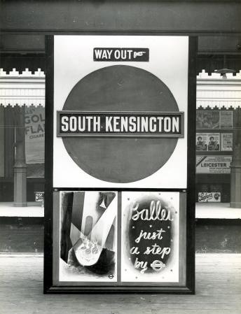
South Kensington Station January 1938

That’s reasonably obvious for the bus, tube and train stations – but Shell posters were also designed to be displayed on the vans which delivered petrol to the garages.
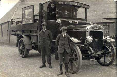
Shell van displaying poster on side 1925

Now set down like that it doesn’t seem like so much of a blinding revelation.  But it isn’t, as far as I know, something which has been much commented on.  And yet it had a big impact on their posters.

The most obvious example is that all of these companies had a much greater incentive to produce posters than anyone else.  Not only was this in effect a subsidised form of advertising for them, but they also needed to churn them out in order to fill up spaces when they hadn’t sold enough commercial advertising.
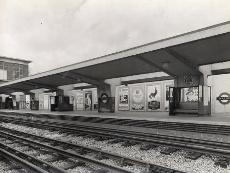
Enfield West station with advertising visible

Here’s Enfield West Station in 1934, with a McKnight Kauffer poster for Eno’s Salts clearly visible on the hoardings.

They also continued to produce posters in great numbers later on, when the poster had ceased to be the main medium for advertising, because the spaces were still there and still needed filling.

In addition, there may have been more reason for the companies  to produce ‘artistic’ and possibly also more subtle posters, because this will have a very direct effect on the station environment.  Although this probably worried Frank Pick more than it did the owners of Victoria Coach Station.
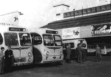
Victoria Coach Station 1962

I’ve also read an interesting suggestion that in the early days, London Underground commissioned lots of posters of wide open spaces to counteract the perceived claustrophobia of the tube, but I don’t think there’s any proof of that.
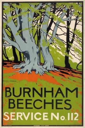
Burnham Beeches walter spradbury 1912
Burnham Beeches, Walter Spradbury 1912

Now originally this was going to be my only point, that all of these people owned their hoardings and so had to invest more in posters and poster design than other companies, which in turn may be one reason why their posters are collectable.  And that this hadn’t really been noted until now.

But then I found a really interesting article by David Watts (insert Jam or Kinks record into your head here as you wish) about pre-war depictions of Yorkshire in railway posters.  It’s an exemplary look at how posters worked and were consumed, rather than just what they looked like, and backed up by a ton of research.  The world of posters could do with a lot more of this kind of rigorousness (not that I’m volunteering to read 200 volumes of railway company internal correspondence, you understand).

One of his points is that the context of railway posters is all-important.  They didn’t need to have pictures of trains on, because they were posted up in stations.  The fact that they were advertising railway travel rather than just the location pictured could be asssumed.
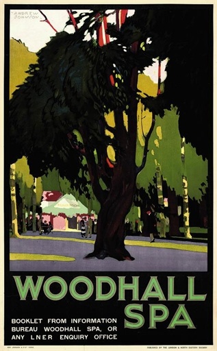
Woodhall Spa vintage railway poster
Andrew Johnson, no date

The same is true of London Transport posters.  They can just say Go to Uxbridge.
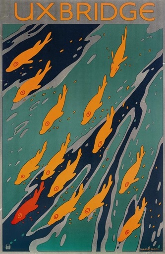
Uxbridge London Transport poster Charles Paine, 1921
Charles Paine, 1921

That you’d use the underground to do so is implicit in the fact that the poster is displayed at a tube station.

But, as Watts points out, this contextualisation of the posters has other implications.

…omitting any visual reference to rail travel allowed posters to be detached easily from their ‘mundane commercial purpose’.

So the companies, as I’ve mentioned before, could promote their posters as examples of good design for the masses, and even as fine art, in part because they didn’t need to say Go By Train in large letters at the bottom.

Now Watts argues that this made railway posters at least a rather poor form of advertising.  And he does put forward some evidence that the train companies themselves thought this way by the early to mid 1930s too.  Images of trains, or at least the idea of train travel did become more prominent after then – as in the Tom Purvis that is coming up at Christies next month.
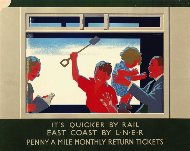
Tom Purvis 193o LNER poster

But he also says – and I think that this is entirely right – that the fact that the posters were semi-detached from their commercial purposes is one of the factors that has made them so collectable.  They exist in a limbo between fine art and outright commercialism, and are so more appealing than an advertisement for Eno’s Fruit Salts or Gilette Razors.

Although it is worth remembering that it’s only because the companies were promoting them as ‘art’ that these posters are available to collect at all.  Shell, Underground and railway posters were all available for sale to the public when they were first produced, so they do survive in attics and collections, while the most commercial billboard posters weren’t and so aren’t.  (I’ve mentioned this in passing before, but really ought to pull together all the sources on this one day, because it’s not said often enough.  Even here.)

But I think there’s also another way in which the context affected railway posters in particular (although the same is probably also true of London Transport and coach posters to some degree as well).  Watts points out how much the railway posters are selling an image of ‘deep’ England, by which he means an archaic, un-modernised and highly rural vision of the countryside.  Now whenever this vision is called up at this time, it is almost always intended as a direct contrast to the modernity, ribbon development and speed of the 1920s and 30s.
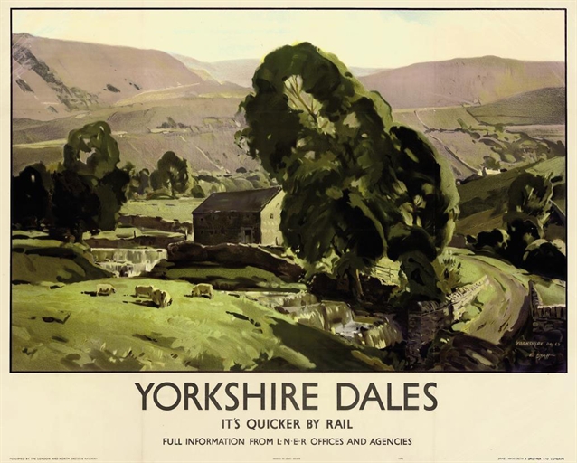
Edwin Byatt Vintage railway poster 1940
Edwin Byatt, 1940

But in the railway station, that contrast is always there anyway.  Most of these poster would have been displayed in an urban setting, and even where they were put up at local stations, there was the machinery and bustle of the railway itself.  So the posters are also using their context to suggest that there is an alternative, an escape.  And that’s something else that they don’t need to spell out in words at the bottom.