Superlative, he says

Watch out, there are auctions about.  Admittedly not the poster extravaganzas which are Christies and Van Sabben, but auctions nonetheless.  First under the microscope is GWRA in Leamington on May 19th.  This is a railwayana auction which means that there is an awful lot of this kind of thing.

Vintage Railway Poster British Railways `Bath The Georgian City - Travel By Train` by Watkiss
Chris Watkiss, 1952

Along with even more of this kind of thing too.
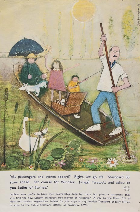
Vintage Railway Poster, `Ilfracombe - On Glorious Devon`s Ocean Coast` by Harry Riley
Harry Riley, 1957

vintage railway Poster `Woolacombe & Mortehoe - Britain`s Best Sands, by Henry Riley
Harry Riley, 1960

Like all railwayana auctions there are, infuriatingly, no estimates whatsoever.  But the catalogue compiler does seem to have been getting a bit enthusiastic.  The top poster, for example is ‘arguably the best of” all Bath posters, while the bottom one is ‘ one of the best seaside posters from the 1950’s’.  While,. the posters are quite nice, I could still have an argument with both of those statements but can’t  work up the energy today.  Please go right ahead if you would like to.

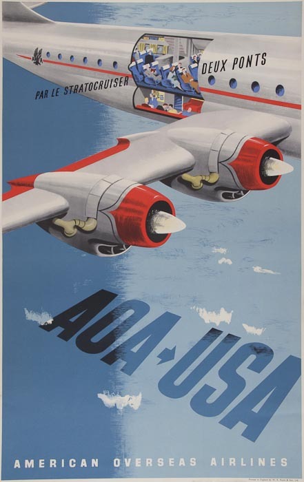
In amongst the hyperbole, though, one or two items worthy of note.  My opening offer to you is a somewhat grubby Eckersley.

Vintage British Railways letterpress poster with top image of jockeys by Tom Eckersley
Tom Eckersley, 1961

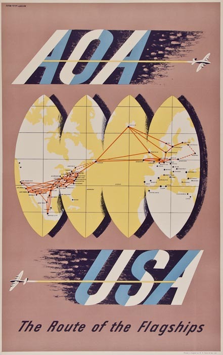
This is in slightly better condition and will probably fetch a lot less in Leamington Spa than it would have done at Christies or Sotherans.

vintage railway Poster ` Sunny Rhyl for a Healthy Happy Holiday` by Leonard
Leonard, n/d

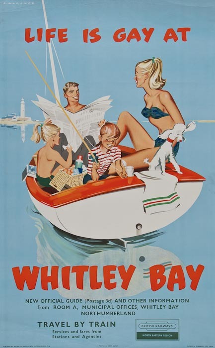
While this one I just love.

vintage railway Poster `Margate - Britain`s Finest Resort - Go By Train`
PG, 1961

That has to be worth a punt of someone’s money, doesn’t it?

Meanwhile, in Norwich can I present the auction with the longest and most convoluted title ever:

Tinplate and Diecast Toys, Rare Early Documents and Newspaper Editions, Railwayana, Posters, Uniforms, Silver and Watches.

The auctioneers are James and Sons, and it takes place on May 5th.

In amongst that heterogeneous selection of, well, stuff, there is one little gem, by Hans Schleger, aka Zero.

Station Poster by Zero `Holliday Haunts`  vintage British Railways 1960s
Hans Schleger, 1960s, est. £30-40

I like that a great deal.  It’s pretty much the only interesting poster they have, although I am starting to develop a sneaking affection  for this one too.

Vintage British Railways Station Poster 1960 by Hasler
Hasler, 1960, est. £25 – 50.

What makes it worth more than the Zero, though, I do not know.  Do you?

Give that penguin a fish!

A recent acquisition on eBay was a few copies of Modern Publicity from the late 1950s and early 1960s.  I was going to share their delights with you anyway, but when I looked into the archives I realised that I’ve never actually blogged about this properly at all. Then when I looked a bit harder I discovered that Designers in Britain has only ever been mentioned in passing as well.  As both are rather fabulous resources, I will endeavour to put at least some of this to rights over the next few weeks. But first, a brief introduction.

Modern Publicity is an international annual, published by The Studio group, which covers what would now be called graphic design – posters, printed material, packaging and trade marks – from around the world.  In contrast, Designers in Britain does what it says on the tin and only deals with UK design and designers, but includes everything from letterheads to large pieces of industrial machinery.  While both of them suffer from being predominantly printed in black and white, they are nonetheless well worth your attention.  Not only do you get to look at lots of wonderful pieces all in one place, but they’re also fascinating insights into what critics and designers thought was good at the time it was produced.  Which isn’t always the same as the things we like now.

So, what did people admire in the late 1950s and early 1960s?  Or to be more precise, which pieces of graphic design were considered good enough to stand next to the cream of international design?  One answer is not the designers that you might expect.  Tom Eckersley gets just one poster included in the two Modern Publicity annuals from the 1950s.

Eckersley Aer Lingus vintage European route poster

You’ll be relieved to hear that he does rather better in 1962, with three designs included, amongst them this Omo poster which I’ve never seen before.

Tom Eckersley Omo poster 1962 Modern Publicity

Abram Games also receives a rave review in 1958 for this Guinness poster, which is chosen to open the entire book.

Abram Games Guinness poster 1957 big G

Only where both name and product are already household words is such a method possible.  To adopt the plan for an unknown advertiser would be to court disaster.

After that, it all gets a bit more unexpected.  I’ve mentioned before that Harry Stevens is very popular in these kinds of publications, and that’s as true in these annuals as it ever was.

harry Stevens tilling group luggage poster 1958

harry Stevens victoria coach station poster 1957 from Modern Publicity

Printed in lemon, vermilion, cobalt, orange, pink and black, the caption says.  I don’t think black and white is really fair on it, do you?  And should you have a copy in colour, please do let me know, I’d love to see it.

An even more surprising regular is Ken Bromfield.  Now he comes up every now and then on here, mostly as a designer of quite nice railway posters.  But the editors of Modern Publicity love his work – he gets four pieces of work in the 1959 edition alone, including this poster.

ken bromfield artwork for windsor poster 1960 it says on NMSI

This is the artwork from the NMSI collection, because I can’t find the actual poster anywhere.  But he’s clearly an artist I should take a proper look at one of these days.

There are also a few unexpected gems to be discovered, like this poster by Lander.

R M Lander Folkstone poster 1958 in black and white sadly

I can’t find a decent picture of this anywhere, which is really frustrating as it looks great, and must look even better in colour, (and I am getting quite close to having another rant about the inadequacies of the National Railway Museum catalogue as a result of my looking too).  Again, any pointers gratefully received.  Or indeed copies of the poster.

There are others of this ilk as well – it’s always worth being reminded of this London Transport poster by Edwin Tatum.

Vintage London Transport Poster natural history museum Tatum 1956

I’m also happy to see anything at all by Arpad Elfer, although these penguins are particularly splendid.

Arpad Elfer penguins DH evans poster 1958

There’s plenty more where that came from.  Here, just as an example, are Karo and Zero together on one page (did you see what they did there?).

Karo WH Smith ad and Zero Macfisheries ad from Modern Publicity

What a world it must have been with those advertisements in it.

Then there are the people I’ve just never heard of before.  Who, for example was Petronella Hodges?  She did this.

Petronella Hodges G Plan booklet 1958

And this too.

Petronella Hodges cutlery leaflet J Walter Thompson 1958

But she appears precisely nowhere in Google.  A mystery, it seems.  But the clue lies in the small print.  Both of these designs were produced by J Walter Thompson, so my guess would be that Petronella Hodges was an art director there at the end of the 1950s.  Quite apart from conjuring up images of a British version of Mad Men, it’s also a pointer to a very specific change that was going on.  The jobbing freelance designer would become an increasingly rare species, with only the very best surviving.  More and more, this kind of design would be done in house at the agencies, by this new breed of Art Director.

In amongst all of this, I realise that I’ve hardly even mentioned the 1962 edition, and there’s lots going on in there, as even the British make the move from whimsy to modernism.  So that will have to get a post to itself another day.  In the meantime, have a couple more rare gems from the late 50s, by Abram Games and E Tatum, again.  There’s someone else I’m going to need to find out more about, isn’t it…

Abram Games green rover ticket poster 1958

E Tatum train to the continent poster 1958

Be prepared

Hurrah, an auction.  It’s about time we had a nice chunky set of British posters for sale, and it’s Bloomsbury Auctions who are obliging this time, on the 16th February.

Once again, there are incalculable quantities of airline posters.  Where do they all come from? I don’t remember them being in auctions a few years ago, and suddenly they are omnipresent.

Lewitt Him vintage airline poster AOA stratocruiser 1948
Lewitt Him, 1948, est £300-500

Lewitt Him AOA vintage airline poster 1950
Lewitt Him, 1950, est. £400-600

Well, there are at least six.  Some of them are indeed the usual Lewitt-Him AOA designs, but there are also other designers working for other airlines for a change.  This one is by Willy de Majo, who deserves a post all of his own one day.

Willy de Major vintage BOAC airline poster 1948 South America
Willy de Majo, 1948, est. £600-800

My favourite of them all is probably this Schleger design for BEA, which I don’t remember ever having seen before now.

Hans Schleger BEA poster hand
Hans Schleger, est. £700-900

It’s also reminded me that when I wrote about these wide blue skies in the airline posters the other day, I left something out, something I only realised last week when I was thinking about the afterlife of surrealism in graphic design.

vintage BOAC poster 1948 airline flags
Anon, 1948, est. £350-450

Because as well as being a remaking of wartime skies and vapour trails, these clear skies with their spotting of clouds are also the heavens across which surrealist visions drift.

BEverley Pick vintage airline poster BOAC
Beverley Pick, est £500-700

Certainly Schleger’s airline skies aren’t much different to his pre-war dreams; it’s just different kinds of flying I suppose.  Maybe it did seem unreal to get to places so quickly, I don’t know.

Laurence Fish, life is gay at whitley bay, vintage travel poster
Laurence Fish, est. £200-400

Apart from the airlines, I can also offer you the undervalued dose of kitsch above, along with a neat Lander and a John Burningham that every household should own.

RM Lander Isle of Man vintage travel poster
R M Lander, est, £ 150-250

John Burningham vintage London Transport poster boat 1964
John Burningham, 1964, est £100-150

Beyond that the posters that most appeal to me are, strangely enough, mostly pre-war.  Mind you, who could resist this.

Blackpool vintage LMS travel railway poster
Anon, est. £200-400

While the idea of ‘J B Priestley’s England’ is one which hasn’t really lasted, making this poster an interesting curio.

Austin Cooper vintage railway poster J B Priestley Good Companions
Austin Cooper, est. £150-250

These two, meanwhile, are just quaintly likeable.

D M Earnshaw vintage London transport poster 1938 party
D M Earnshaw, 1938, est. £100-150

Freda Lingstrom school picnics vintage poster 1930
Freda Lingstrom, 1930, est. £200-300

None of which, though, really adds up to much other than some posters which I enjoy but probably won’t buy, along with a couple of interestingly low valuations on one or two lots.  I shall be particularly interested to see what happens to the Burningham and Whitley Bay posters when they come up.

There are also a very few posters on offer at Dominic Winter’s auction tomorrow, but they do include one or two interesting wartime and pre-war ones.  This Abram Games falls, like so many of his wartime posters, into the category of admirable but I wouldn’t want to have it on my wall.

Abram Games vintage army ordnance poster c1943
Abram Games, 1943, est. £300-500

Then there is this  McKnight Kauffer ARP poster.

McKNight Kauffer vintage propaganda poster ARP 1938
Edward McKnight Kauffer, 1938, est. £200-300

We have a smaller version of this and I was considering it the other day, because it is an odd one.

Although I quite like it as a piece of graphic design (enough to have the air pellet holes removed and get it framed, so a fair bit of like), I’m not sure it’s successful as a poster.  But then it does have an almost impossible task to fulfill.  The design dates from 1938, so just before the war; it needs to make people aware that there is a need for them to do something, but at the same time it can’t spell out the detail of what might happen and frighten people (“you will all be bombed in your beds and die without ARP, so there”).  So it ends up being a bit vague and ineffectual; perhaps they thought that people would have read the papers and would be able to fill in the details themselves, or maybe they just wanted to be woolly at this stage, I don’t know.

Dominic Winter are also selling an ARP poster by Pat Keely in the same sale, and I’m not sure his design is much more convincing.

Pat Keely vintage arp world war two propaganda poster 1938
Pat Keely, 1938, est. £200-300

What do you reckon?

Thinking in numbers

For anyone who thought the infographic is a modern phenomenon, the London Transport Museum is here to set you right.

They’ve just created a new display of graphics about numbers, which I am mainly drawing your attention to because this Schleger is both fantastic and not often seen.

Hans Schleger vintage London Transport poster 1938.

Interestingly, it’s from 1938.  These kind of explanatory posters with factual graphics are sometimes ascribed to the war, with its accompanying need to explain to the people, but clearly the trend had begun before the conflict started. This design by Theyre Lee Elliot is even earlier, from 1936.

Theyre Lee Elliott 1936

(I’m guessing from the press release that this is in the exhibition from the description, apologies if you go there and it isn’t…)

In fact a fair chunk of the exhibition seems to be dedicated to proving that the infographic goes back quite a long way further than we might think.

Irene Fawkes 1924 vintage London Transport infographic poster

The design above, by Irene Fawkes, dates from 1924 and there are plenty more of that ilk in the exhibition, although they are mostly in a pre-war style that I can’t get too excited about.

Charles Shephard 1923 Vintage London Transport poster

But what this makes me think, perhaps even more than how far these kind of explanation goes back, is that what seems to be missing are their modern equivalents.  I know there are exceptions to this – a few years ago London Transport produced a set of posters explaining why escalators needed to be replaced, which were placed on the hoardings around the work which weren’t graphically exceptional but were interesting and informative.  In the main, though, it doesn’t feel as though public bodies feel the need to explain to us what they are doing any more. Or am I missing something?

Heinz Zinram vintage London Transport poster 1960s

The above is by Heinz Zinram (at least he took the photographs) and dates from 1965.  Just as true today though.

And thanks to Macca, who pointed me at this exhibition in the first place, for which I am very grateful.

Quite a Lot

Incoming at Crownfolio Towers has been the story this week.

Three times in the last couple of weeks a job lot of posters has come up on eBay and, as no one else seemed to want them very much, three times they’ve ended up as ours.  Net result, more posters than one household strictly needs (35 in total, if you must ask).

So we are now the go-to people for vintage dental hygiene,

Vintage 1950s dental hygiene poster Ministry of Health CoI HMSO

food hygiene posters

Vintage Food Hygiene posters Ministry of Health CoI

and 1960s road safety messages.

Dixon of Dock Green RoSPA cycling proficiency poster

Lucky old us.

Now, these kinds of lots are interesting for a whole heap of reasons, many of which I’ve gone over on here before.  They’re a window into sets of posters which might otherwise have disappeared entirely.  I can’t imagine there are too many collectors of posters about dustbin hygiene management, to start with.

Ministry of Health vintage 1950s dustbin hygiene poster CoI

Or supersized flies.

Guard food against flies vintage CoI Ministry of Health poster

Lots are also interesting because they tend to preserve bad posters along with the good, and quite a few of the posters we have bought are, if I’m honest, second-rate.  But then, if we’re just writing about what’s graphically appealing, is that a proper reflection of what really happened? To start with, we’re writing a story that’s going to change every time tastes alter.  Although some posters might never make it back into fashion.

Rabbit Teeth Matter vintage tooth care poster

If they were ever there in the first place.

What’s more, there’s quite often something to be learned from seeing a group of posters together, even if it’s just the taste of the person who collected them at the time.  These lots offer an insight into some of the less glamourous jobs the CoI were doing in the 1950s and 1960s.

CoI ministry of health vintage food hygiene poster

While the RoSPA posters do give a real sense of an entire campaign, probably at about the same sort of time.

Vintage ROSpa road safety poster 1960s

Vintage RoSPA road safety poster 1960s

Vintage RoSPA road safety poster 1960s

All of which is the intellectual justification, but an even bigger reason for buying job lots like these is the hope, never far from the mind of the collector, that lurking in the pile might be a hidden gem.  And we did get lucky this time; the dental health set included this Reginald Mount which I’ve never seen before.

REginald Mount tooth care poster for ministry of Health CoI 1950s

Which considering that the entire set only cost us 55p, really has to be a bargain.

I also quite like this RoSPA poster, even if it is a bit battered.

Vintage RoSPA road safety poster 1950s

But for us, lots have a particular compulsion.  This is because, once upon a few years ago, we bought a huge lot of posters from eBay, based only on a single shot of a pile of posters spread on someone’s floor. Admittedly that pile did seem to contain a Guinnes poster, two 1950s London Transport posters and quite a bit more, so we bet quite a lot of money on it, having both promised each other that there would be no recriminations if it turned out that we had spent a lot of money on a pile of rubbish.

Fortunately, it was worth every penny. Below are just a couple of the unexpected joys that came out of the package when it finally arrived.

Macfish of lovelyness by zero

Sheila Robinson poster as part of heap

There were plenty more too – most of the classics in our collection came from that one single purchase.

We’ll probably never get anything like that again. But even so, it’s still almost impossible to pass on a lot of posters when we see one, just in case.

What is the range of activity of the commercial artist in Britain?

That’s what this copy of Graphis is asking in 1950. (And yes, the cover is by Tom Eckersley).

Cover of Graphis 31 1950 Tom Eckersley cover

Unfortunately for us, most of the answers are in black and white, apart from this design for Kia-ora by Lewitt-Him.

Lewitt Him Kiaora advertisrement 1950

And this Christmas advertisement for Simpsons of Piccadilly.

Simpsons of Piccadilly advertisement 1950

I think there may have been some more at some point, but my copy seems to have a page missing.  By way of compensation, I’ll try and find colour versions of the posters and illustrations they’ve reproduced where I can.  Still, it’s worth putting up with the black and white because there is some wonderful stuff included in their survey of British design.  I would like this Lewitt-Him showcard whatever colour it turned out to be.

Lewitt Him panda showcard from Graphis

Oddly, one of the things that makes this article particularly interesting is the small print.  Each image is credit twice, once to the artist and/or illustrator and once to the advertising agency which commissioned it.  Which means that, for a change, it’s possible to see how posters and advertisments came into being.

Let’s take Crawfords, for example (I would happily take almost anything from Crawfords’ considerable output if anyone is offering).  Their art director was Ashley Havinden, who did produce some of the illustrations for his own press advertisements.

Design for Wolsey advertisement, illustration by Ashley Havinden

Even within a single campaign, more than one artist might be used though; so this cartoon is by John Parsons.

Wolsey advertisement illustration by John Parsons

(Apologies for the wobbliness of the scans, but I don’t want to damage the magazine.)

At the same time, Havinden was also commissioning entire campaigns from other designers, like Tom Eckersley’s work for Gillette.

Tom Eckersley vintage poster Gillette goat 1950

As well as Eno’s Fruit salts, which was also produced by Crawfords.  A different format of this advertisement is reproduced in Graphis;  the French caption provides the extra explanation that Enos is ‘un digestif’.  I think, if forced to make a choice between some French pastis and a glass of Enos, the pastis would win every time.

Tom Eckersley Enos Fruit salts ad 1950


These double attributions of the advertisements, thougb, are a useful reminder that designers of the period were not artists, producing whatever they liked, but were working within a very commercial framework, receiving commissions from people they knew, often, I imagine, to quite a tight brief.  This is something that can get forgotten as we collect and admire posters today; increasingly they become detached from their original purpose and seen as artworks rather than functional pieces of design.  But that’s not how they were originally produced at all.

This is a point also made, in a slightly different way, in the essay which goes with these illustrations.  The author, Charles Rosner, thinks that the standard of posters and other commercial art has declined considerably since the war. The only high points are provided by what he calls ‘the cultural and social activities in advertising’, by which he means commissions from the BBC, London Transport, the Arts Council and the GPO.  By which he is also implying designs which aren’t contaminated by the need to sell things.

it's a wartime poster by hans schleger and we've got one too

But were these high-minded designs really better?  From this distance it’s hard to say for sure because so little British commercial advertising survives.  But take this page of F H K Henrion’s work.  The poster designs for the government health campaigns are more in the international modernist style with which I tend to associate him.

This wasn’t all he could produce though.   Take these fine fish for example.

(I’m rather fond of the sheep too, which is why it’s here, even though it’s not actually by Henrion).

On the opposite page are also a couple of his better-known designs for Punch.

a punch poster by henrion

But which of these are better?  Public information edges or Punch decorative? I find it hard to say, but then my pro-modernist bias probably isn’t as strong as some people’s.  What do you lot reckon?

The text makes an interesting point about posters as well.  Remember, this is 1950, and television advertising hasn’t been imagined yet, but posters are already seen as being in decline, and for reasons I’ve never seen put before.

 Posters are victims of the great speed of modern traffic, congestion of town streets, squeezing out of hoardings from town centres to areas with less appeal in publicity value, and town and country planning regulations, with only vague definitions of the places where hoardings are still allowed to stand.

So the golden age of the poster was partly caused by the fact that people were moving slowly enough to look at them.  Now there’s a thought.

But the article isn’t all about answers, it’s also made me ponder a couple of questions too.  This post is going on a bit, so I’ll return to them in the next few days.  For now you can just have this rather wonderful Lewitt-Him artwork as a clue about the first.  It is illustrated in Graphis, but if anyone has sighted it anywhere else other than the GPO archive, I’d like to hear from you.

GPO vintage Poster lewitt him lines of communication 1950